Tag: UX (user experience)Page 1 of 3
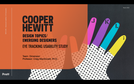
We wanted to understand how Cooper Hewitt museum’s website visitors view the visual hierarchy of the Design Topics and Emerging Designer pages while browsing content on mobile devices. We conducted an eye-tracking usability study with 8 participants and made recommendations to clarify some of the website language and make the site more mobile-friendly.
Students from this semester’s “Usability Theory & Practice” course present highlights from three client-facing usability projects – for Columbia Libraries, Pratt SAVI, and the NYC Open Data Portal – and reflect on lessons learned from their experience, from communicating with the client about the project’s scope to presenting their final analysis and recommendations directly to the client via a face-to-face presentation.
Usability report detailing the overall usability of the Morgan Library and Museum website along with four concrete recommendations to improve the website for both new and returning visitors.
An overview of the various user-centered steps in the journey to redesign the website of the Huntington Historical Society. By combining design principles, many stages of user testing, and analysis of user data, Four Corners Design produced a new information architecture for the Huntington Historical Society website and a design prototype.
A story about re-designing UbuWeb, an independent resource dedicated to all strains of the avant-garde. The goals of the re-design were to (1) make the website accessible to non-specialists; (2) improve the organization of Ubu’s content; (3) improve the site’s visual design; (4) increase user engagement; and (5) maintain UbuWeb’s unique aesthetic and identity.
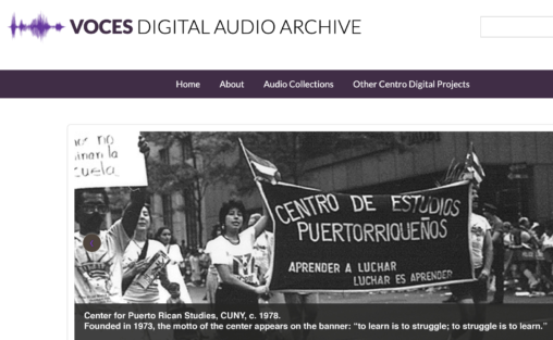
Coral will introduce the Voces Digital Audio Archive, an online archive created by students in LIS 665 that documents the Puerto Rican diaspora. Includes a discussion of digitization, curation, metadata and experience design of this collaborative project with the Archives of the Center for Puerto Rican Studies (CUNY).
Details a multi-stage research and design project to help the Asia Society Museum better engage with its visitors. Components include new outreach and communication strategies, a re-designed entryway and check-in process, and a new interface for their touch-screen kiosk.
In order to gain insight into the usability of the MTA’s website, a team of evaluators from Pratt Institute’s School of Library and Information Science conducted a Heuristic Usability Evaluation. To facilitate improved display and access to current content, the evaluators suggest a reorganization and streamlining of the homepage, clearer labeling on the Schedules & Fares page, and the addition of further visuals to aid the user in their selection process.
For the past 150 years, Dime Savings Bank of Williamsburgh has become the community bank for the Brooklyn area, garnering loyal, lifelong customers and a well established reputation. In an effort to aid Dime Bank in better serving both their loyal customers as well as prospective ones, three evaluators from Pratt Institute’s School of Information and Library Science conducted usability tests on Dime Bank’s website.
This design story documents the process of redesigning the Bronx County Historical (BCHS) website. BCHS presents a wide range of historical materials, is active in fundraising, and hosts monthly public events. It places a great deal of importance on its website in promoting its mission and sharing its resources, but does so in a crowded digital environment. New York City is home to many historical and cultural organizations that are in competition with BCHS for attention and fundraising dollars.
A story of how We’re From Geocities, a design team from Pratt Institute, used information architecture and interaction design best practices to re-design the website of National Film Preservation Board.
