Tag: information visualizationPage 1 of 2
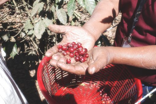
The Journey of Coffee visualizes qualitative data on plant growth, processing methods, coffee bean varieties, brewing styles, global movement, and fair trade. Through watercolor and vintage style illustrations…
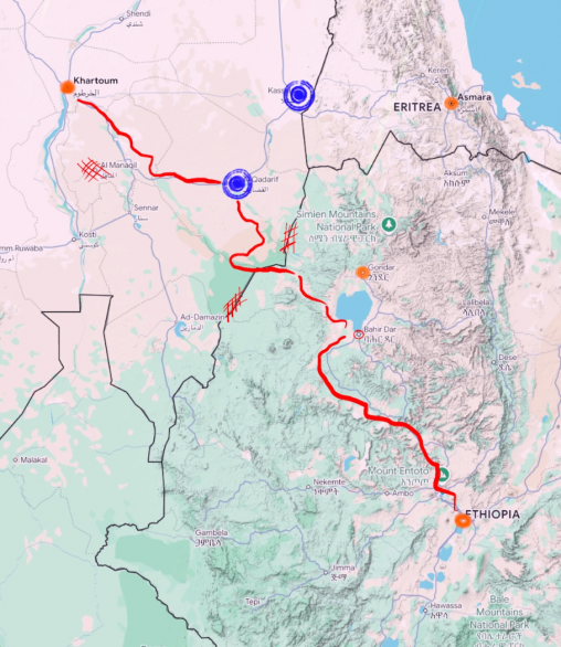
This project focuses on refugees from Ethiopia (and what is now Eritrea) in the late 80s to early 90s. Using conflict and elevation data along with testimonials from former refugees, a corridor was created to estimate.
An infographic depicting the achievements and career timelines of Roger Federer, Rafael Nadal and Novak Djokovic.

Once seen as distant and technical, cybersecurity threats now rival terrorism in their reach and impact. This exhibit draws on the last five years of FBI IC3 data…
“Word Portraits” is a paper quilt composed of 12 hand-embroidered tiles, each one pairing a word in Arabic with its Portuguese equivalent. Stitched in black and green thread…
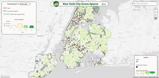
Marc Molta The New York City Green Spaces web map connects people to publicly accessible green spaces in New York City. Community Gardens, selected Parks Properties, and Block-level…
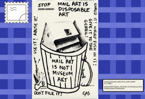
Participatory, democratic, and unique, Mail Art is exchanged via the postal service, and facilitates creative connections among artists across the world. This art form arose as a way…
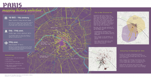
A research project in three parts, showing how the layering of multiple datasets over both the present-day map of Paris and selected historical maps can illuminate the timeline…

An Information Visualization project covering all the details about Space Missions since 1957!
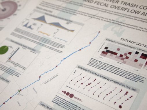
Six students in Professor Sula’s Information Visualization class analyzed two datasets concerning the environmental quality of the Bronx River provided by the Bronx River Alliance (BxRA). A large-scale poster was created for the BxRA to display in their new headquarters.
This data visualization project explores the Bechdel Test, a pass-fail condition under which two female characters must hold a conversation about any subject other than a man, as applied to American films. This visualization combines data from bechdeltest.com and IMDb to explore the representation of women and reception by audiences.
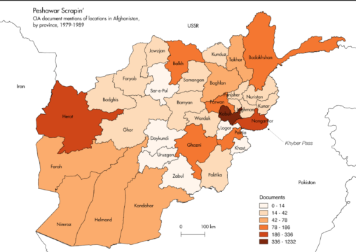
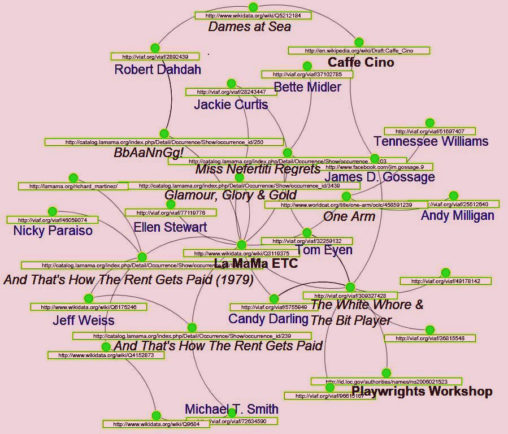
Peshawar Scrapin’ is an exercise in rapid subject tagging of poorly-described of textual material. Using automatic and human-curated methods, I scraped 7,000+ PDF documents on the Soviet-Afghan War from the CIA’s website, expanding the CIA’s deficient metadata with the names of relevant persons, factions, places, and concepts.
Mock grant proposal to support the improvement of the British Museum’s existing provenance linked data for its collection of 100,000+ Egyptian-made cultural artifacts. The expansion of the British Museum’s provenance linked data will allow the museum’s collection to be more fully represented in linked data visualizations, while making visualizations of the artifacts themselves more comprehensive, improving scholars’ capacity to research the histories of these artifacts and those of the cultures that produced them.

This video is part of my final project for Data Librarianship. It is the longer of two videos we had to create to demonstrate skills we learned in class. This video describes how to upload a dataset and create a simple map on Carto, a browser-based, freemium mapping platform.
To celebrate the 200th Anniversary of Mary Shelley’s Frankenstein, this digital humanities project maps the letters in both Frankenstein and Dracula providing a representation of Gothic literature during the 19th Century.
This project originated as a paper reporting on the experiences of archival producers in the field of historical documentary production. Based on those conversations, I created a visualization of data comparing gender and production credits across American Experience documentaries from 2015 to 2017.
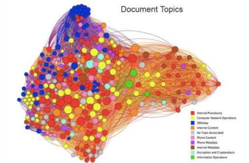
This network study visualizes every available document from the Snowden Document Search, a collaborative online repository between Courage Foundation and Transparency Toolkit, and the extent to which its content shares geopolitical connections with other documents.
The seven participants of this panel, in addition to myself, attended this year’s Generate New York conference as a group. This trip was put together by UXPA@Pratt and was paid for by the GSEF Committee. We’ll be discussing some key takeaways and common themes from this year’s conference.