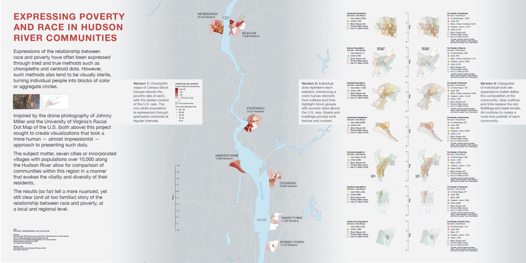
Expressions of the relationship between race and poverty (or similar comparisons) are often expressed through tried and true methods such
as choropleths and centroid dots. However, such methods also tend to be visually sterile, turning individual people into blocks of color or aggregate circles.
This led me to ask:
Can we visualize data that explores the connection between race and poverty in a more human — and presumably empathetic — manner?
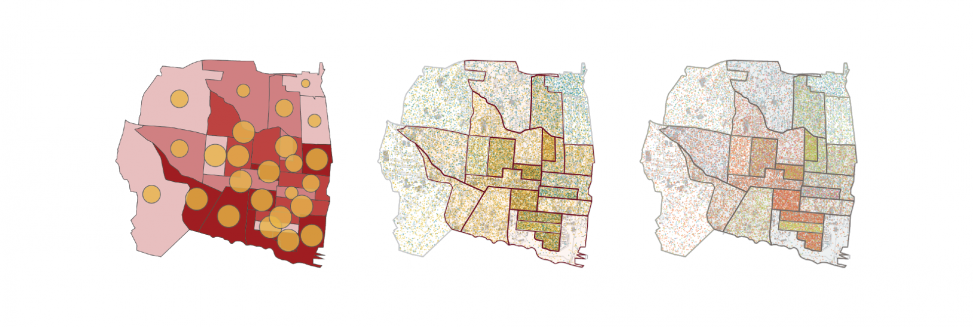
Version 1
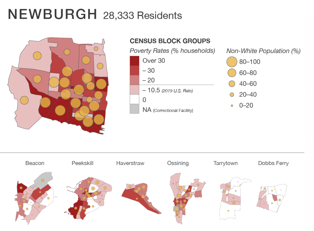
The first step was creating one of the more standard choropleth-and-centroid visualizations, looking at my intended test subject of race and poverty in various Hudson communities.
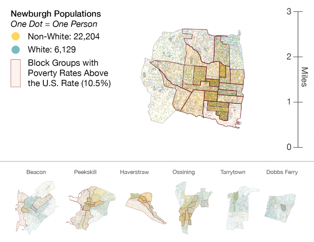
Versions 2 and 3
Inspired by drone photography and the University of Virginia’s Racial Dot Map of the U.S., I explored two versions of dot density maps with an underlying texture of roads and building footprints. Unlike the choropleths we see for quick review in annual reports or mailers, these are intended to be vibrant and ‘real,’ suggestive of the life of each community — and therefore rewarding of considered review and thought.
The first broke the population into two groups and used red outlines and overlays to denote areas with high poverty rates.
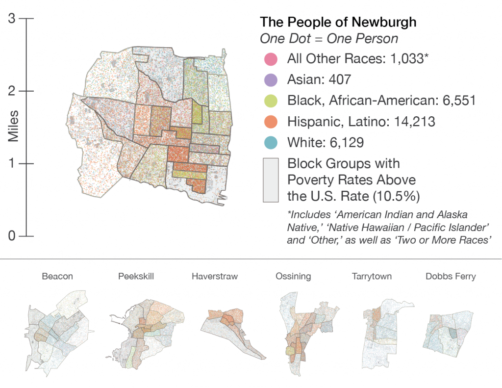
For Version 3, I broke the population down further to better — though not perfectly — reflect the diversity of each population. Concrete decisions were made regarding naming of the legend, and categories were alphabetized to subvert traditional hierarchies.
Bringing It All Together
The ‘final’ product is a 72″ x 36″ wall display — a poster that tells the story of the project, while indicating the possibilities of using Version 2 or 3 as zoomed-in explorations of Version 1. Such an approach could work in a display such as this, or in interactive form.
Further exploration on this topic is required to find just the right aspect of color and texture that communicates the true identity of a community, while also telling a compelling data story. With that in mind, those final steps would also require a close inspection of the communities and the specific topic being explored. •

Latest posts by Michael Kelly (see all)
- An Alternate SCOTUS Portrait - May 10, 2021
- Expressing Poverty and Race in Hudson River Communities - May 3, 2021
- Every Purple Flaw: U.S. State Portraits - May 3, 2021