The final (for now) interactive version of this project can be found here.
This project aims to present an unironic, non-partisan collection of U.S. State portraits using existing U.S. News and World Reports rankings, augmented by data from the Census Bureau and Bureau of Economic Analysis. Individual states, regions and a full national map allow for comparisons across multiple categories.
Star Portraits
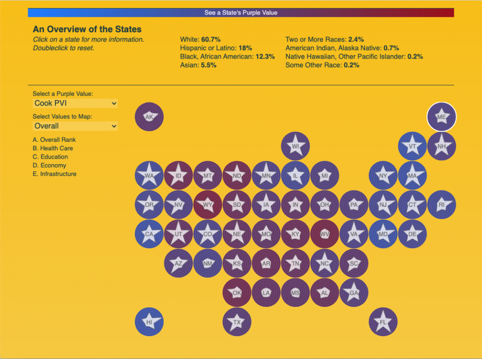
At the heart of this project is the star portrait, a modified radar graph indicating state rankings in five categories. Since no state ever ranks highest in all areas, each portrait is an inherently flawed version of what we see on the U.S. flag. The purple background for each state is then assigned a value that can be changed in each visualization.

Comparing States
The first visualization is a map of all states, which allows the user to select individual states, as well as different ‘Purple Values’ and categories to define the star portraits.

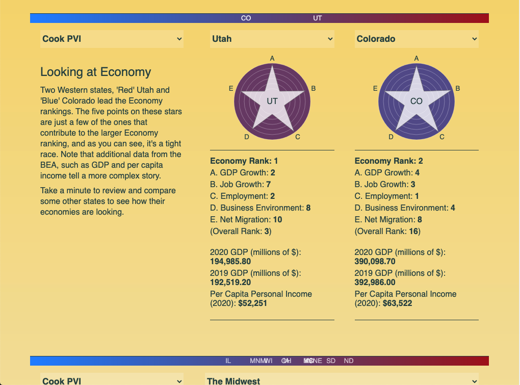
This is followed by sections on select portrait topics, specifically Economy and Overall Rank. Users can select states to compare, and receive additional detailed information for each one.
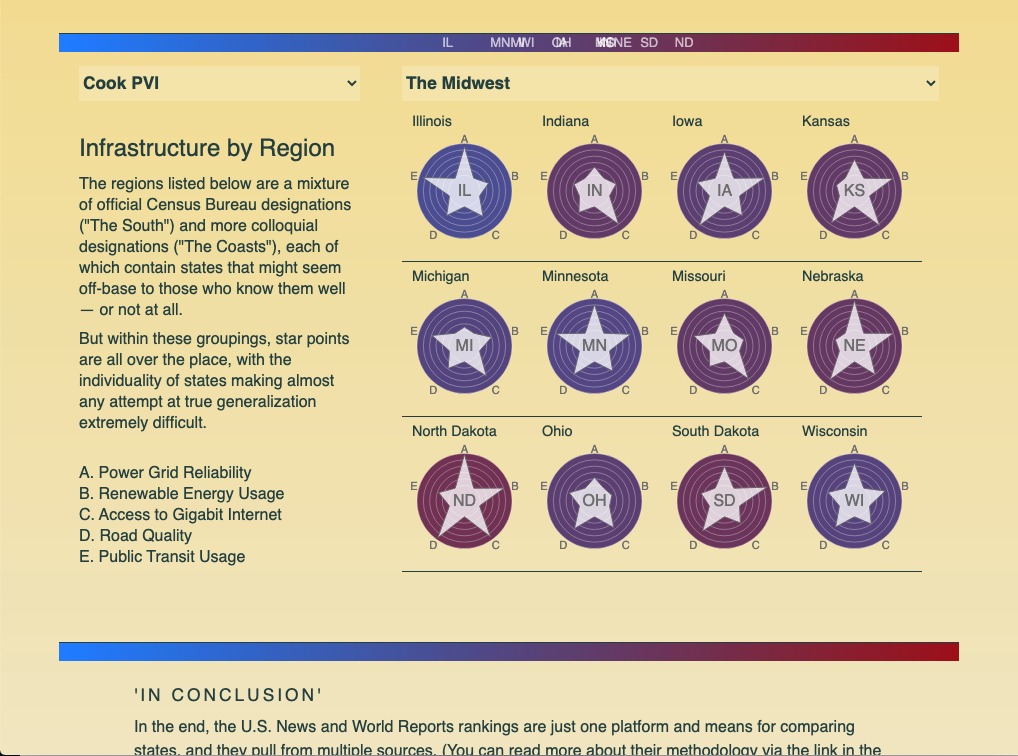
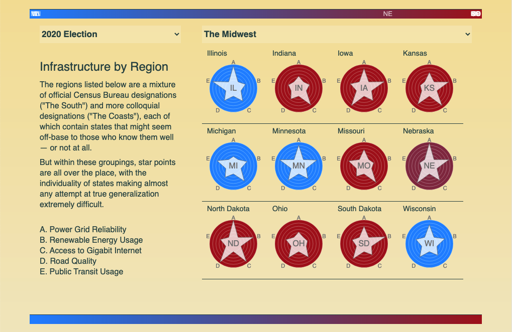
Finally, there is a section allowing for comparison of groups of states as regions — some formal, some less so.
As noted, the ‘Purple Value’ can be changed, so that one can swap between the nuanced Cook Report Partisan Value Index and the (almost) binary 2020 election results.
Due to the possible values and regions that can be explored, this project remains open, with the plan of adding other ‘Purple Values’ and categories. For now, you can check out the full page to explore all 50 states. In addition, a kind of sibling project examining U.S. Supreme Court Justice ideology (which laid foundation for this project) can be found here. •

Latest posts by Michael Kelly (see all)
- An Alternate SCOTUS Portrait - May 10, 2021
- Expressing Poverty and Race in Hudson River Communities - May 3, 2021
- Every Purple Flaw: U.S. State Portraits - May 3, 2021