If Time is Money, Bank of America Users are Paying a Hidden Tax of Digital Friction Every Day.
This project details a strategic redesign aimed at eliminating this usability debt. Through rigorous user research and Information Architecture (IA) validation, we architected a new system centered on clarity. Our key finding, “The Less & More,” reveals that financial confidence isn’t achieved by minimalism, but by strategically matching information density to the user’s specific intent.
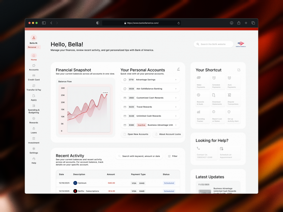
Eliminating Usability Debt: A Strategic UX Redesign of Bank of America Website
The strategies that led to the success include:
Unified Banking Ecosystem
Consolidated previously fragmented tools (like account opening vs. management) into a single, standardized framework, aligning with users’ financial knowledge and mental model, reducing the cognitive load required to relearn interfaces.
Utility Over Clutter
Successfully balance the bank’s marketing agenda from the user’s workspace. By shifting distracting cross-sells into a uniform layout, users can now focus entirely on task completion.
Context-Driven Action
Bridged the gap between financial information and user action by introducing contextual links (e.g., proactive Requirement Checklists) right at the point of need, designed to significantly reduce application drop-off rates.
Handy Links
Yung-Wei’s Case Study ↗: emphasis on the home, credit card, and account pages
Christina’s Case Study ↗: emphasis on the transfer & pay experience, rewards and deals, and spending and budgeting