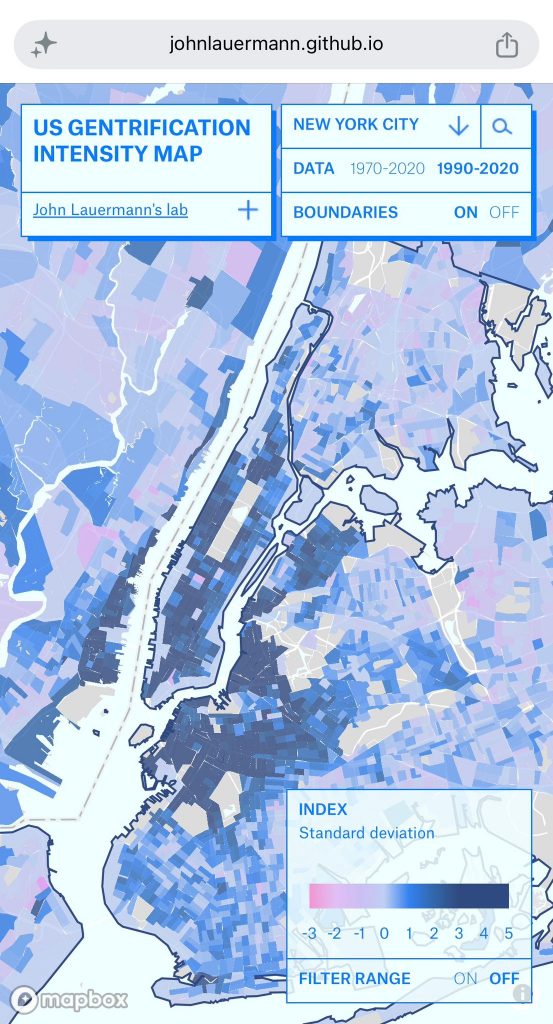
The National Gentrification Intensity Map is an interactive web dashboard visualizing tract-level gentrification intensity across US communities. It supports exploration through two time periods (1970–2020 and 1990–2020), filtering by index range, community selection, address search, and a detail panel displaying data by tract.
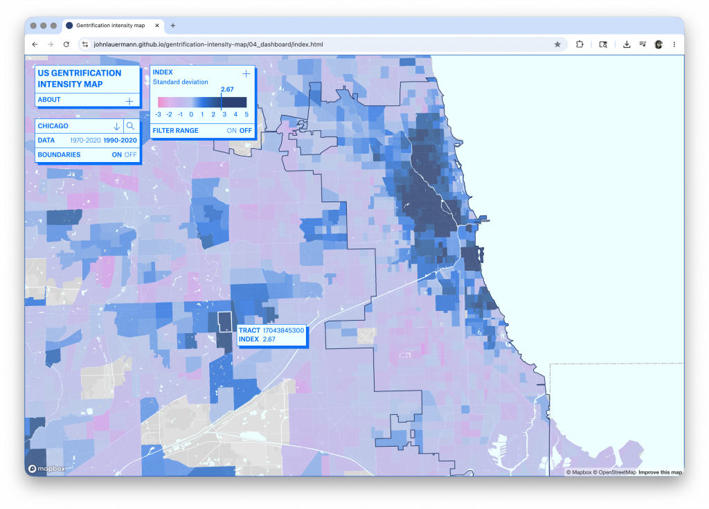
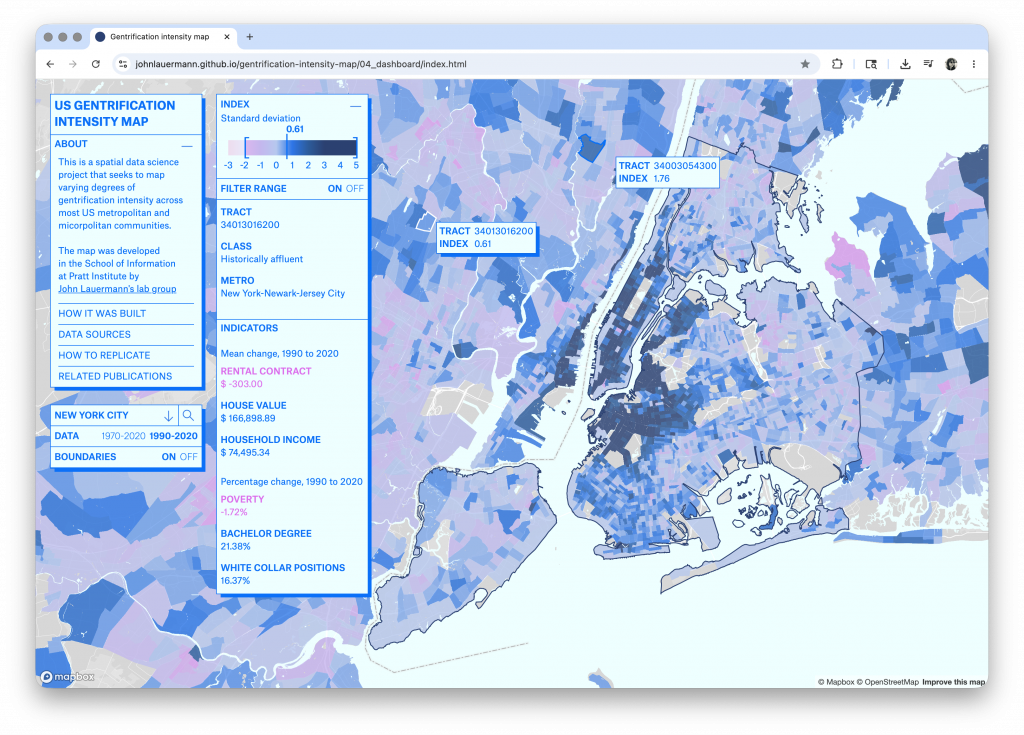
Gentrification is one of the most consequential and contested processes reshaping American cities, yet it remains difficult to study at scale. This project presents an interactive web dashboard that visualizes the National Gentrification Intensity Index, developed by John Lauermann’s lab
group, across U.S. metropolitan and micropolitan communities at the census tract level. The index synthesizes multiple socioeconomic indicators, including housing value change, income dynamics, and demographic shifts, into a single standardized score expressed as standard deviations from
the mean. The dashboard supports two analytical time windows: 1970–2020 and 1990–2020, enabling longitudinal comparisons of gentrification patterns across a half-century of urban change.
Methods
The project was defined in three moments: data preparation, interface design, and interaction logic and development. Tract-level gentrification scores are uploaded to Mapbox as vector tilesets via the mapboxapi package, which interfaces with the Mapbox Tiling Service (MTS). One tileset is
created per time period.
The basemap is configured in Mapbox Studio, while the gentrification layer colors and symbology are controlled programmatically through Mapbox GL JS, keeping the visual logic in the codebase rather than locked in the Mapbox studio. The dashboard interface is built in HTML, CSS, and vanilla
JavaScript, without any frontend framework. Layout adapts to mobile viewports using CSS grid and a max-width: 720px media query, with touch-specific interaction handling.
Map behavior is driven entirely by Mapbox GL JS methods: addSource() and addLayer() initialize the tilesets; setFilter() applies dynamic range queries to the map layers; hover and click events populate an on-screen data panel with tract-level index details. An address search bar fetches suggestions from the Mapbox Geocoding API, and a municipality dropdown allows direct navigation to any metropolitan community in the dataset. A draggable dual-handle range filter on
the legend lets users mask the map to a selected band of the index, applied simultaneously to both time-period layers. The dashboard also includes an About panel providing contextual information across four sections: How It Was Built, Data Sources, How to Replicate, and Related Publications. It
is then deployed as a static site on GitHub Pages.
Critical Reflection
The primary design challenge was making a dense, technically derived index legible to a general audience without oversimplifying its meaning. The detail panel, which shows the underlying indicator values for any selected tract, was an attempt to keep the index interpretable.
The preliminary presentation at the Research Open House was a great opportunity to observe the user experience and collect feedback. Visitors consistently reached for the search bar first, confirming that address-based entry is the most natural starting point. The range filter also drew
interest, with users exploring it to isolate high-intensity clusters. Feedback also mentioned two features to be implemented in a further step: a reset-zoom button to return to the municipality view, and a preference for a flat 2D map rather than the slight perspective tilt that Mapbox’s default pitch introduces.