Introduction
Building on my final project from the Information Visualization class with Prof. William Geary, this project focuses on improving awareness and interpretation of the Addenbrooke’s Cognitive Examination (ACE-III), a 15–20 minute assessment used by doctors to evaluate cognitive health across five domains: attention, memory, fluency, language, and visuospatial skills.
As a caregiver to a loved one with Alzheimer’s, I’ve experienced how difficult it can be to understand cognitive decline without accessible data. MRI scans and clinical evaluations are costly and infrequent, ACE-III offers a more practical, trackable alternative for regular check-ins.
What is the ACE-III test?
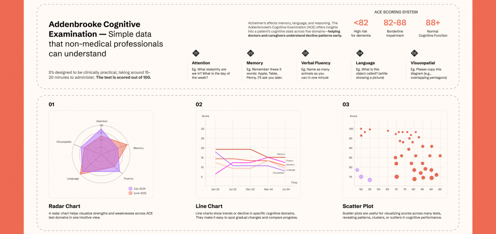
The Addenbrooke’s Cognitive Examination III (ACE-III) is a standardized cognitive screening tool commonly used to detect early signs of dementia or monitor changes in cognitive function over time. It is composed of tasks and questions that test five core domains:
- Attention (18 points)
- Memory (26 points)
- Verbal Fluency (14 points)
- Language (26 points)
- Visuospatial Skills (16 points)
Patients score out of 100, and the interpretation ranges as follows:
- 88 and above: Normal cognitive function
- 82–88: Borderline impairment
- Below 82: High risk for dementia
By analyzing these scores, caregivers and doctors can identify patterns and provide early interventions.
Project Goal
To design visualizations that make ACE-III results more understandable and actionable for two distinct audiences:
- Caregivers who need clear, jargon-free insights
- Doctors who require quick identification of trends, sudden drops, and outliers
Working with the ACE
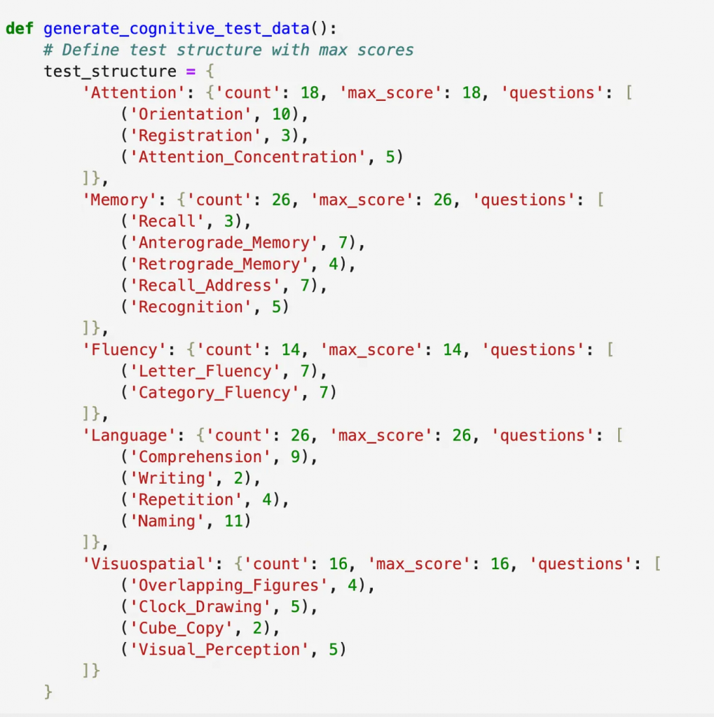
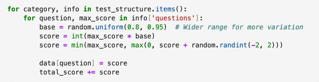
To prototype the visualizations, I used Python to create synthetic datasets that mimic score patterns seen in progressive cognitive decline, plateauing, and sudden drops, common in patients with Alzheimer’s.
Visualizations Created
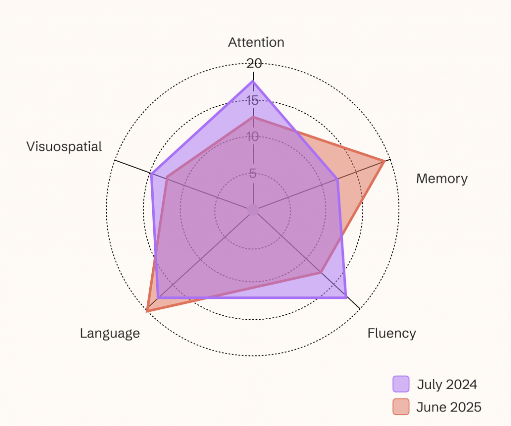
Radar Chart
Offers a snapshot of a patient’s current cognitive profile, comparing all five domains at once. Ideal for spotting relative strengths and weaknesses in a single glance (usually compared against past tests).
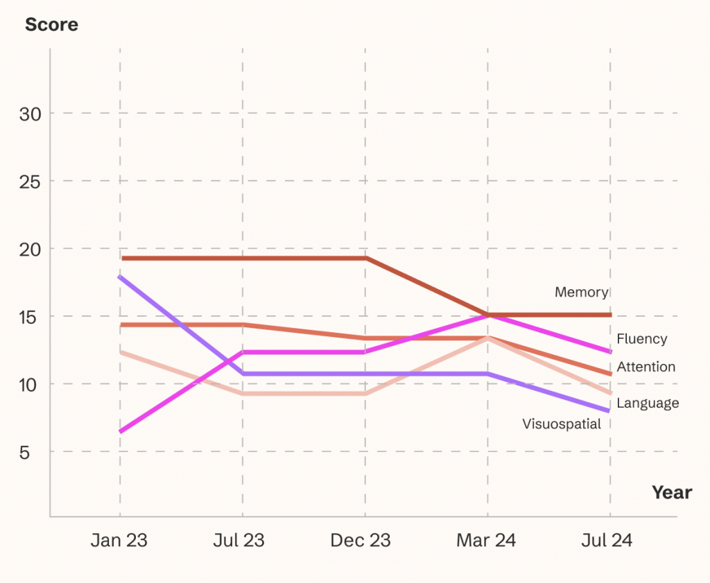
Line Chart
Displays trends across time for each domain, helping clinicians monitor long-term decline and identify sudden changes that may need intervention.
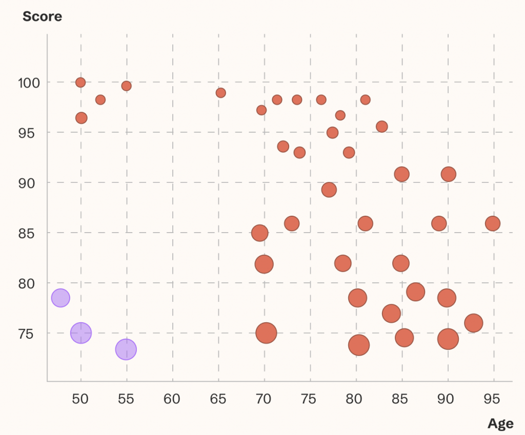
Scatter Plot:
Shows domain scores relative to age or test number, ideal for helping doctors to identify outliers and high risk cases amongst a large sample pool.
Conclusion
This project demonstrates how thoughtful data visualization can transform raw cognitive test results into meaningful insights. By making ACE-III and other cognitive test results more accessible, we can support better collaboration between caregivers and clinicians, improving trust, empathy, decision-making, and early intervention.
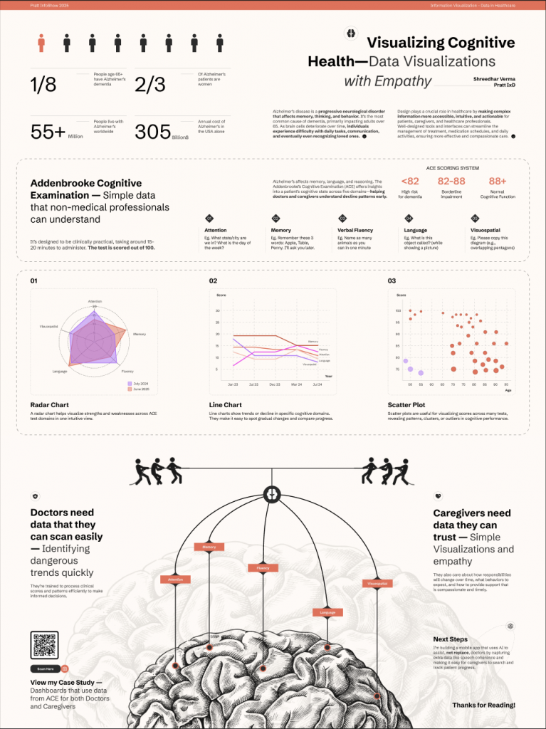
Poster
Latest posts by Shreedhar Verma (see all)
- Visualizing Cognitive Health: Data Viz in Healthcare - May 5, 2025