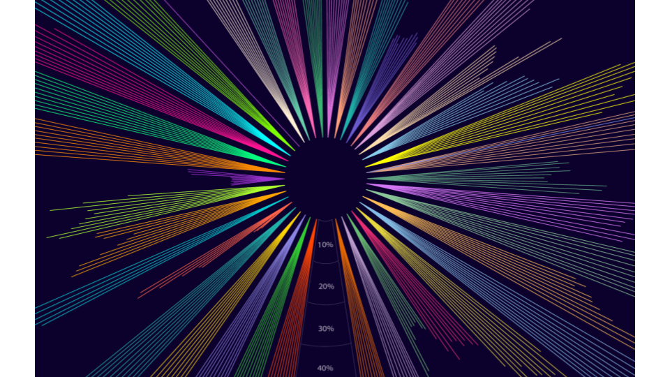
General government debt-to-GDP ratio measures the gross debt of the general government as a percentage of GDP. It is a key indicator for the sustainability of government finance.
It is difficult to visualize this data to span across a long period of time. This causes issues in readability to notice any trends or factors affecting the change in data
My solution: Creating a circular timeline chart to represent a decade of data
Due to the limitations of current graphic design softwares, I had to digitally handcraft each stroke and spacing leading up to 17 hours of work on this project. I tried using ChatGPT to identify a range of colors that work with my palette, which was only partially successful.
Specifications:
Original Size: 80 x 160 in
Total Time: 17 hours
Tools: Adobe Illustrator
Colors: 20
