Bluestockings: Organizing information to facilitate empowerment and challenge oppression

Question

What is the main mission of a “traditional” retail bookstore? Simple – to sell books. And how does a bookstore meet that mission? Display configurations and shelving tactics are used to get people to buy books, or any product for that matter. But what about a bookstore that’s mission isn’t just to sell books? What about a store that wants to offer more – to offer resources both to empower and create a safer space for its patrons?
How does an independent and radical bookstore like Bluestockings, present and organize its resources in order to meet their mission of inclusivity and challenge oppression?
Bluestockings

Bluestockings is a volunteer-powered and cooperative radical bookstore, cafe, and activist center in the Lower East Side of Manhattan, NY. Their mission is three-pointed :
1) distribute literature and resources about oppression, intersectionality, community organizing, and activism;
2) maintain a space for dialogue, education and reflection where all people are respected; and
3) build community connections, knowledge, and skills.

With this mission, Bluestockings strives to empower people to challenge oppression by embodying, “the principles of intersectional, trans-affirming, gender nonconforming, and sex-worker affirming feminisms and support liberatory social movements.” In this effort to create an , “equitable, cooperative, and free” society, Bluestockings offers over 6,000 books and zines on a wide range of topics.

Note: I will be mostly referring to Bluestockings  as a “center”, as I think it is an encompassing term that best reflects their mission.

History

Bluestockings was founded in 1999 by Kathryn Welsh as a bookstore and community space for women. It was named after The Blue Stockings Society, a women’s educational movement and literary discussion group from the 18th century in England. Like today, the bookstore was collectively operated and volunteer-run. However, due to financial distress, the collective disbanded in 2002. In 2003, Brooke Lehman purchased Bluestockings, the collective was reestablished, and the store reopened with an expanded focus on radical politics and activism.

The Plan

I planned a visit to Bluestockings to learn more about the way the center organizes information to facilitate empowerment and challenge oppression. For my structured observation I intended to review the following:

  • The resources available
    • This includes an exploration of titles and common topics
  • The setup, layout, and distribution of resources
    • This includes a survey of the headings used for describing/dividing sections and organizing the information available in the center
  • How patrons used and interacted with the space and its resources

Expectations

In relation to the three main components of my observation, I expected to see the following:

  • A variety of resources available covering a wide range of topics
  • Use of alternative headings and categories related to minority or marginalized groups and feminisms
    • moving beyond the expected Fiction, Mystery, Romance, etc.
  • Patrons using the space as a center for community and engagement
    • to meet, discuss, and plan ideas

What I Observed and Learned
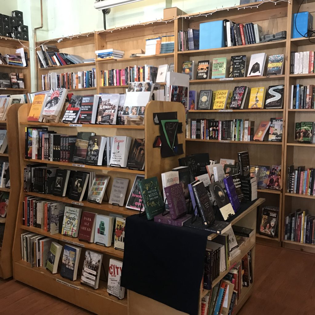
I went to Bluestockings on April 6, 2019. Upon entering, I was welcomed by a warm greeting and noticed people working, reading, and collaborating in the sitting area. Immediately to the left was a selection of zines, journals, and coloring books.  To the right, the checkout counter and cafe. A majority of the space was occupied by books on bookshelves and tables. The back wall displayed Bluestockings totes and t-shirts, alternative menstrual products, and “other oddly hard-to-find good things.”

Two tables of books stood near the middle of the store. The tables were stacked with a mix of books on a range of topics – feminism, incarceration, the environment, queer and gender studies, racial studies, radical education – with no heading to label them. In this way, these tables seemed to offer a non-hierarchical, uncategorized approach to organizing resources. This setup would seem to facilitate serendipitous discovery.

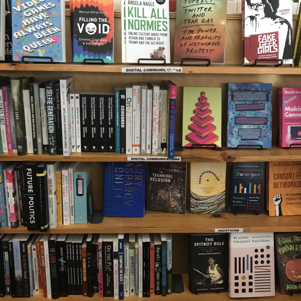
The rest of the titles offered were arranged by category with headings for different sections. 54 categories were surveyed:

Feminisms       Sexuality & Relationships           Radical History
Science & Technology Sex Work Radical Education
Violence & Trauma       Intersex           Hex the Patriarchy
Police & Prisons       Transgender            Activist Strategies
Race & Racism       Gender Studies           Feminist Fiction
  #Blacklivesmatter       Feminist Masculinity           Music
Black Studies       Queer           Art & Media
Indigenous Peoples Studies Queer Fiction           DIY Cookbooks
Libros para Niños       Asexuality             Spirituality
Latin American Studies       Critical Theory            Health Healing & Accessibility
(Im)migration & Diaspora      Digital Communications   Parenting & Pregnancy
Global Justice       Environment & Food Systems   Animal Rights
Post Colonial Fiction     Asia                 Comics & Graphic Novels
Class & Labor      Africa           Sci-Fi
Anarchism                       Middle East           General Fiction
Marxism & Autonomism        New York City         Featured Fiction
Political Theory       Urban Studies & Geography    Poetry
  Economics       Literary Nonfiction           Young Adult

A table labeled “Events” displayed 8 books with date tags on them. I talked with someone who worked at the center to learn more about the programs and events they offered. As it turns out, the center hosts an event nearly every day, if not multiple in one day. The date tags on the books signify the date of an upcoming event centered around that book. Some of these events highlight an author, editor, or contributor of the book. Other events aim to offer a safe space to discuss ideas, foster community, or simply read. In fact, on the day I visited there was a silent book club taking place. A calendar on the Bluestockings website shares all of the upcoming events.

Takeaways

In order to meet their mission, I expected that Bluestockings would organize their resources in a way that would facilitate inclusivity and challenge oppression. One way I imagined they could achieve this would be to employ a varied array of headings to organize their resources. With 54 different headings, Bluestockings did just that.

As mentioned earlier, the two ‘No Category’ tables appear to facilitate serendipitous discovery. With no categories to influence you, they also provide a relatively unbiased opportunity to discover titles. Of course in a store dedicated to selling radical content, you can expect to find books that fit that description, but the fact that there is a label-less table is worth noting.

Hosting events is a non-organizational method the center employs to reach their mission. Events like the silent book club create a welcoming environment to read at one’s one pace and be inspired by what others are reading. It rids the pressure associated with the commitment involved in a traditional book club, but still provides the sense of community. The dozens of posters, fliers, and notices for events taking place outside the center further exemplify Bluestockings’ effort to build a supportive environment and sense of community.

Representation matters. Words matter. The granularity in the more than 50 sections used to organize Bluestockings’ collection challenges the idea of neutrality in classification by recognizing the importance and power of language. In Emily Drabinski’s, “Queering the Catalog: Queer Theory and the Politics of Correction,” she talks about this power. She says, “in terms of organization and access, libraries are sites constructed by the disciplinary power of language.” Drabinski talks about libraries, but this would seem to hold true for bookstores, as they also use headings to organize information. Drabinski asserts, “subject headings, often cast by catalogers as a kind of pure, objective language, are not; where and when and by whom subject headings are used makes all the difference in terms of meaning.” While working to expand subject headings and more accurately organize material about social groups and identities is productive, Drabinski makes clear that emphasis on “correctness” is not. For, “even when subject headings are updated to reflect current usage…they do not account for all the other words users might use to describe themselves.”

With design layout being a major component to organization, I am reminded of Costanza-Chock’s recent work, “Design Justice: towards an intersectional feminist framework for design theory and practice.Costanza-Chock discusses the history and principles of design justice. According to Costanza-Chock, “design justice rethinks design processes, centers people who are normally marginalized by design, and uses collaborative, creative practices to address the deepest challenges our communities face.” She may have been talking about larger scale and more deeply rooted design decisions, but I would argue design justice would apply on a smaller scale. In this way, the layout and organization of books and information could be designed with the principles of design justice in mind.

Design and organization are evidently powerful tools and should be treated as such. From my observation, it seems Bluestockings has employed design justice principles to meet their mission. They have created a space and organized it in an effort to, “sustain, heel and empower,” to provide “liberation from exploitative and oppressive systems,” and to work towards, “sustainable, community-led” outcomes. Bluestockings is evidently a notable community institution that fosters community and provides a space for learning and empowerment.

They also just have a lot of good books. I bought two.

By Tina Chesterman
Info 601, Professor Chris Sula

References:
Costanza-Chock, S. (2018). Design Justice: towards an intersectional feminist framework for design theory and practice. Design Research Society 2018.

Drabinski, E. (2013). Queering the Catalog: Queer Theory and the Politics of Correction. The Library Quarterly: Information, Community, Policy, Vol. 83, No. 2
Activity Theory in Young Users of Digital Technology: an observation of the iGeneration

Introduction

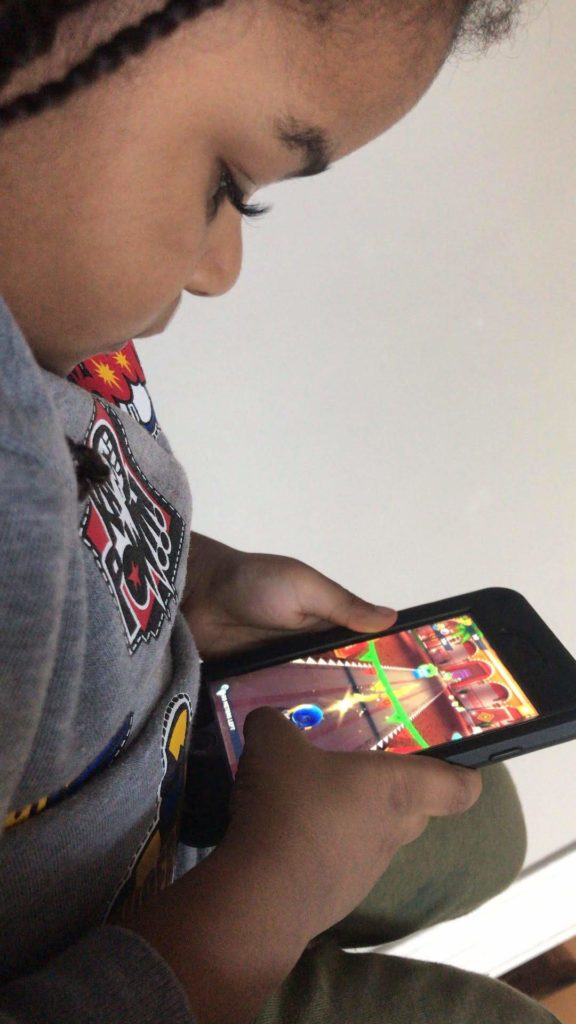
A field study observing the digital interaction of young users was conducted on a second-generation, three-year-old boy of Afro-Indo Caribbean descent. The observation was conducted in the observer’s home.

The purpose of the study was to better understand the intuitive use of young children. How do they know to navigate and interact with features as they do? How do they learn these behaviors in unsupervised environments? How are their behaviors reinforced and applied across devices?

Many of these questions were a result of the above curiosities and a desire to better understand the cognitive processes at play as noted by Kuhlthau:

“A model representing the user’s sense-making process of information seeking ought to incorporate three realms of activity: physical, actual actions taken; affective, feelings experienced; and cognitive, thoughts concerning both process and content. A person moves from the initial state of information need to the goal state of resolution by a series of choices made through a complex interplay within these three realms (MacMullin & Taylor, 1984). The criteria for making these choices are influenced as much by environmental constraints, such as prior experience, knowledge, and interest, information available, requirements of the problem, and time allotted for resolution, as by the relevancy of the content of the information retrieved” (p. 362).

The structure of this field report was a combination of interview and observation. The purpose structure was due primarily to the subject’s age.

Disclosure

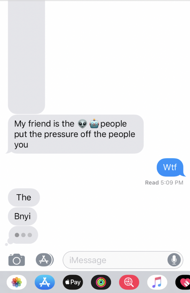
The subject of the observation is the observer’s nephew. Alluded to below, one of the many reasons why this observation was informally conducted was due to general curiosity. This initial curiosity began when noticing the subject’s use of mobile devices but, most recently, when he began sending nonsensical messages. The messages were initially thought to have been a prank by the subject’s mother but upon further inquiry, and frequent occurrences, the messages were a combination of drawn shapes or autocompleted phrases that were illogically constructed.

Screenshot of chat messages sent between the subject and the study's author.

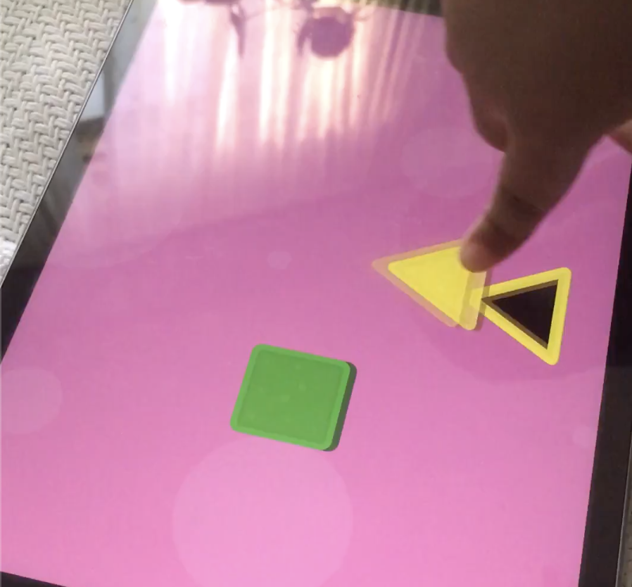
Observations within the scope of this study included 1) how interaction changed or remained the same across an iPhone and iPad 2) interaction with specific features and implicit restrictions imposed on the user (e.g., inability to read or write).

“Motivation for doing the work”

According to “The Ethics of Fieldwork” by PERCS: The Program for Ethnographic Research and Community Studies – Elon University, listing motivations for conducting such studies better align the researcher with the outcome of the intended study and the benefits to the research field as a whole.

For many reasons, this study was not formally conducted. However, there are two reasons worth noting within the scope of this report. The first reason is due to the little experience the observer possessed in field studies containing child subjects. Leveraging practices from the readings within the study resulted in applying generalized techniques and procedures intended for adult subjects to a child subject.

Outlined later in greater detail, this posed many issues as one would expect the application of techniques and procedures reapplied in very different circumstances. However, motivation for pursuing this study prompted an attempt and a review of not only this study but also the review of unique requirements for child subjects. Hence, the second reason why the observation was not formally conducted: to better understand at what scale technology impacts early childhood development.

Possible Harms: skewed results due to the misuse of techniques and procedures.

Possible Benefits: generated interest to pursue, rectify, and advance this study.

Techniques

General tasks were assigned:

  1. Interact with a mobile feature
  2. Find and watch your favorite YouTube video
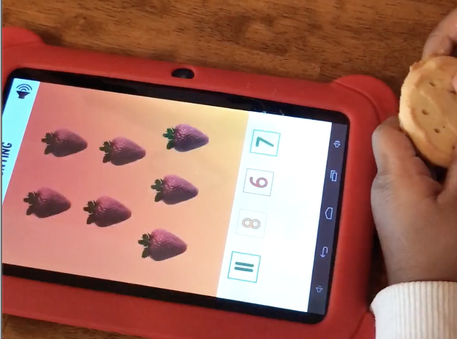
  3. Play an educational game
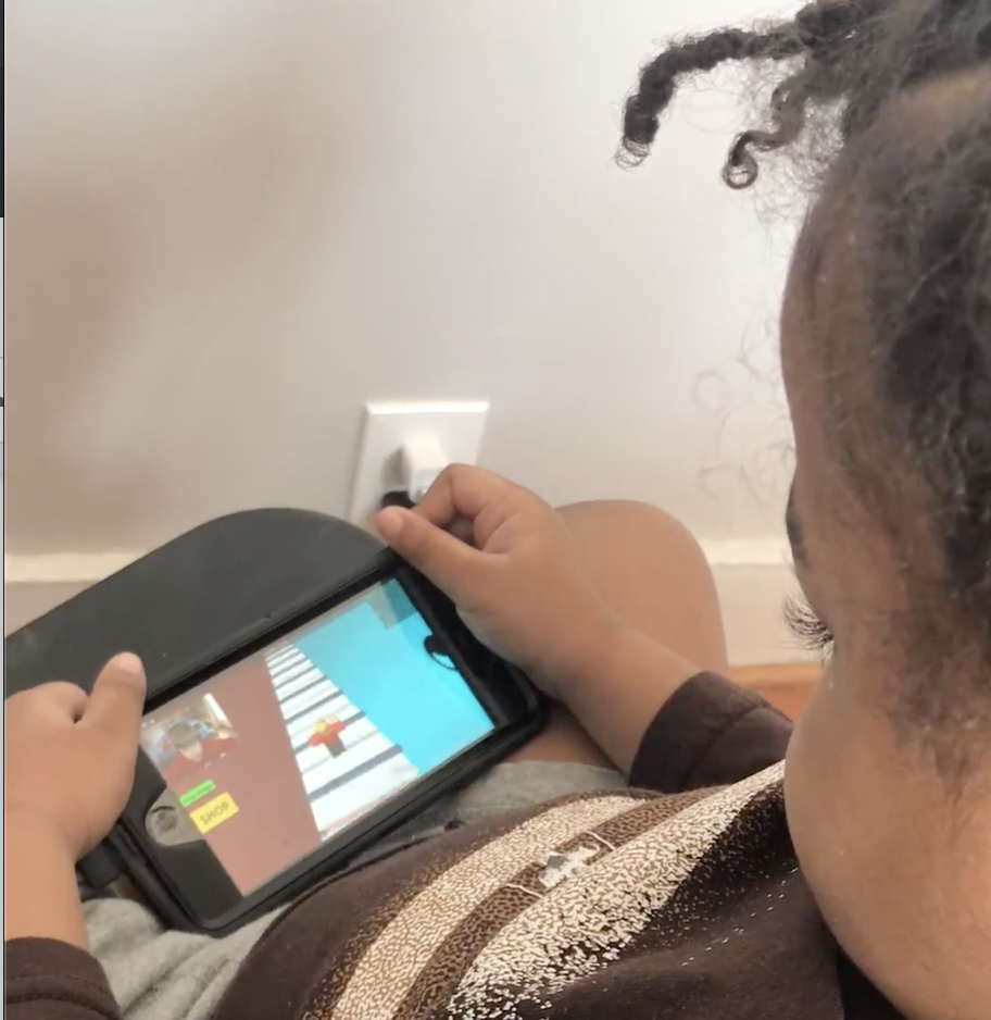
  4. Play a non-educational game
Subject playing the mobile app game "Grom Skate" on an iPhone.

As the subject worked through each task, some intervention and rewarding were required. Having known the subject, the tasks created were short in length–sufficient enough for possible naps or breaks–and the entire observation spanned across several hours. Snacks were rewarded for good behavior and for completing a task without interruption.

After completing the above tasks, the subject was closely observed to document any behavior which didn’t occur while completing those tasks.

Questions and notes from the observation

  • Activity Theory: in-practice
    • How would his actions change if the technology changed as Nardi claims, “Activity theory holds that the constituents of activity are not fixed but can dynamically change as conditions change” (p.38)?
  • Attention span: what does his actions say about the effect of technology on youth users’ ability to focus?
    • Never completes viewing of videos and tends to navigate to either the search bar or another video within 30 seconds to 2 minutes of viewing.
    • Viewing videos of greater interest last longer than 2 minutes but are never fully completed.
    • When a task was issued, the subject wanted to continue on longer for all tasks but the educational game. For the educational game, the user became frustrated unless there was sufficient guided intervention.
    • Voyeurism and the gaming culture: the subject’s attention was only kept when watching YouTube videos of others playing videos games or playing with toys.
  • Distributed Cognition (Nardi, p. 38): pattern recognition?
    • Participant cannot read nor sufficiently write. However, he is able to search YouTube videos he’s previously watched but is unable to search newly watched videos. To return to new videos, he taps the arrow icon to return to the video.
    • How he searches is by typing in the first few letters he remembers from the videos he’s views frequently. For retained previous search results, he reviews the list and selects which is most recognizable. He watches and then returns to the search bar if the video isn’t what he wanted. If the video is what he was looking for, he scrolls to the recommended videos to find new content and selects those items or searches content from the same channel of the video he’s currently viewing.
  • Signifiers and affordances
    • Participant understood the significance of the hamburger menu, toggles, touchscreen interface features such as swiping, device volume control and locking mechanisms, and other navigational signifiers such as the back/forward and up/down arrows.
  • Interaction
    • iPhone and iPad
      • YouTube and either a mobile app/feature.
    • No major differences in interaction other than the subject’s level of comfort and which device he preferred to use when.
      • The iPhone was generally used when sitting up.
      • The iPad was generally used when laid back.
  • Intervention
    • The study would be better conducted in a more controlled environment/location, without the mother nearby and by an individual with a balanced relationship.
    • Observer’s relationship with the subject was unbalanced. This required swapping between the mother as an instructor to guide him through exercises.
      • With the mother, the subject was at ease and felt less intimidated by the instructions and how they needed to be carried out.
      • The subject preferred guided instructions as opposed to unguided instructions. While guided instructions were more successful with the observer, they weren’t as successful as with the mother.
      • The subject enjoyed general instructions with sufficient freedom to navigate and course-correct by intuition than delegated navigational instructions.

Conclusion

The above study would do well with well-controlled environment, an unrelated observer with sufficient trust, and a well-vetted plan of tasks.

Additionally, prior to an observation containing child subjects, it would be helpful to know positive and negative triggers, learn what they like and what they dislike, review popular content for that age group and test the level of interest on the subjects, provide ideal rewards for completed tasks, and create a balance reward system.

Overall, this observation did provide an opportunity to analyze the subject’s behavior more closely and to develop a thoughtful hypothesis. Nardi explains that “activity theory recognizes that changing conditions can realign the constituents of an activity” (p. 38).

My original assumption that technology results in specific behaviors in young users has shifted to a hypothesis which accounts for the bidirectional relationship between any user and technology: technology reinforces or redistributes behaviors in young users which may predict their usage of other technologies and platforms, and related social behaviors.

References:

Kuhlthau, Carol C. “Inside the Search Process: Information Seeking from the User’s Perspective”, “Journal of the American Society for Information Science 42(5): 361–371. https://ils.unc.edu/courses/2014_fall/inls151_003/Readings/Kuhlthau_Inside_Search_Process_1991.pdf

McGrath Joseph E. “Methodology matters: doing research in the behavioral and social sciences”. https://lms.pratt.edu/pluginfile.php/876402/mod_resource/content/0/mcgrath-methodology%20matters.pdf

Nardi, Bonnie A. “Studying Context: A Comparison of Activity Theory, Situated Action Models, and Distributed Cognition”. https://lms.pratt.edu/pluginfile.php/876415/mod_resource/content/1/nardi-ch4.pdf

PERCS: The Program for Ethnographic Research & Community Studies, “The ethics of fieldwork”. Elon University. http://www.elon.edu/docs/e-web/org/ percs/EthicsModuleforWeb.pdf

Wilson, T. D. (2000). “Human information behavior.” Informing Science 3(2): 49–56. https://www.ischool.utexas.edu/~i385e/readings/Wilson.pdf

Observing and Listening with Decolonize This Place

Decolonize This Place is a protest organization started in 2016 described as “centering around Indigenous struggle, Black liberation, free Palestine, global wage workers and de-gentrification”. The organization has been getting considerable press since they began protesting at art museums and considered (from an ironic source) one of the changemakers to the art world for 2019.1  

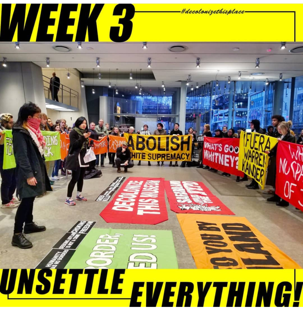
I attended and observed the third week of a continuing protest to remove Warren B. Kanders from the board of trustees at the Whitney Museum. Kanders is the majority owner and CEO of Safariland, a manufacturer of personal safety products, military defense, and law enforcement products including tear gas which had been used in the recent conflicts at the US-Mexico border. On this day of the protest, an open letter signed by over 120 artists, critics and academics was delivered to the Whitney and posted to the website, Verso, which was a notable increase in awareness since the protest started in December.Decolonize This Place plans at this point to continue their weekly protest until some sort of action or response is taken by the Whitney’s board.

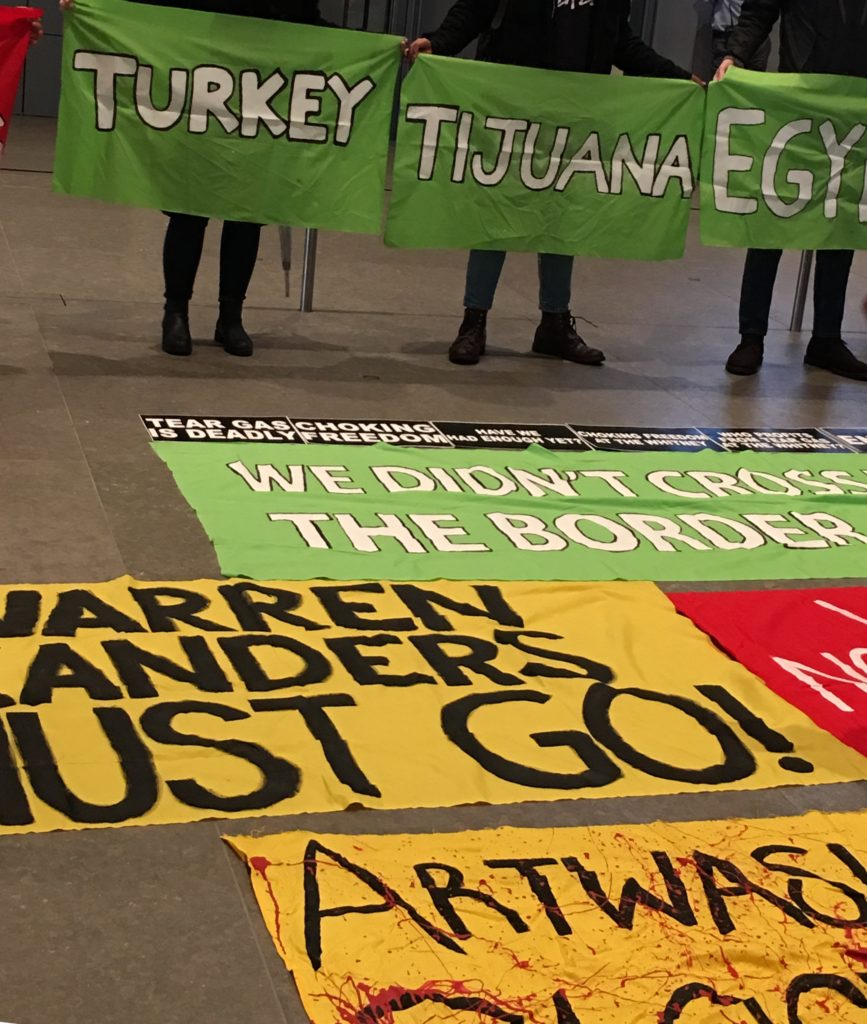
When I arrived, the lobby of the museum was calm as the protesters were a bit late. The security guards were ready but relaxed and expecting the weekly assemblage, but I overheard their enthusiasm at the prospect that the protesters may not show. Once the organizers started to arrive, the larger group became apparent; they were asked to hold banners and gather in a circle to get started. The banners displayed the names of countries where tear gas has been utilized in recent conflicts including Standing Rock, Baltimore, and Egypt, for example, and also noted white supremacy and art washing. The final organized group looked like it was approximately 60 to 70 people. It appeared at this point that the protest would address wider issues than simply the Whitney board.

There was an MC for the group who started the dialogue and introduced the issues at hand – removing Warren Kanders from the board and the use of tear gas as a weapon of war. To get things started the he asked if there was anyone in the crowd that had signed the open letter and if so, would they stand up and say a few words. No one responded presumably because no-one was in the crowd, or, I could only assume that if some of the crowd was connected to any person within the museum, they may have been hesitant to speak up. Students from NYU picked up the mic at this point, addressing colonization in higher education. The students called out their own school and others including Columbia and Pratt. It was at this moment that I really couldn’t associate their cause to the main issue, but they did get the momentum started which led other speakers to address art washing, gentrification and the control of corporate money in all institutions.  

The next question presented to the group was if anyone had experience with tear gas. This created an interesting shift in the energy of the crowd. First, a woman spoke up and explained she was in the military and had experience with tear gas in training drills. Next a man contributed his story about living in the West Bank and experiencing tear gas during a demonstration. His address to the group was about the use of tear gas as a weapon of war and a weapon to oppress. He went on to say that he respected what Decolonize was doing and wanted us to realize that the more we get used to oppressive behavior the more it desensitizes us. He stressed that the protesters work is important in keeping people aware of what tear gas is used for and that we should not be complacent. These comments brought the issue back around and this is where the protest started to get a bit heated.  

Decolonize This Place image courtesy of Instagram

It’s worthy to note that simultaneous to the protest was free Friday admission to the museum. Most of the general visitors did stop and look and some were interested (I believe the man who had lived in the West Bank joined in before his visit) and some were dismissive. I overheard some in the crowd think it was just about the current administration but didn’t seem to be interested generally. One unfortunate man was on his phone presumably poking fun at the protest, possibly he was in awe – maybe he had never seen such a thing in action – but he got called out for his privilege, which turned borderline aggressive but the protesters kept control. 

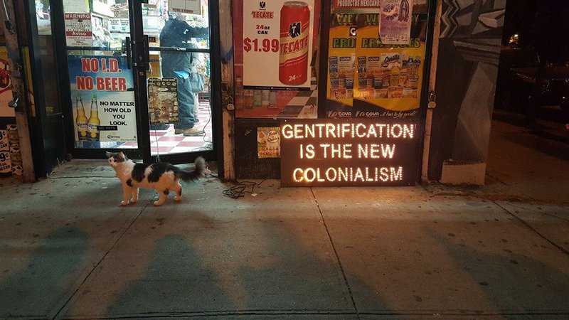
The phone incident caused the momentum to increase further which brought the issues around to the ultra-rich supporting the arts and being the decision makers, which led to the topic of gentrification of the neighborhood and the funds it took to bring the Whitney to the meat packing district. This was an interesting point which I hadn’t considered because I remember the neighborhood representing a very different part of New York City and certainly not having high end vendors gracing the streets. I found this pertinent to the larger discussion in how the art world in general has contributed to gentrification under the guise of “revitalizing” the community.3 It is this gentrification and questionable funding that contribute to continuing colonization. 

“Gentrification is the New Colonialism,” by Mi Casa No Es Su Casa, Image courtesy of Pinterest through ArtSpace

Observing protest, thinking about real change and watching the emotions it can bring up can be conflicting.  Even though I support the cause, I still couldn’t help thinking about the privilege one has in this country to protest no matter what their cause or economic status. There is also the question of where funding would come from to make arts accessible and protected. I was able to speak informally with one of the organizers for Decolonize This Place, Ben, and ask him this question. His response was that arts institutions should have community involvement and should be publicly funded – similar to the principals discussed in Costanza-Chock’s Design Justice theory. Although I recognized his point, I still needed to mention that with the current structure of fundraising and where arts funding comes from in this country, we may have a long road to before we see this type of structure. Ben agreed but acknowledged that if there are open lines of communication when appointing board members to these institutions, there would be a “better way to vet the candidates and draw a red line on how funding is obtained”. If this were implemented there would be slow change, with the ultimate goal to avoid “toxic philanthropy”. Again, I couldn’t help but be divided on this point as the pragmatist in me sees money as force that is not easy to influence. That was until I spoke to one protester who, in her address to the group, asked us to consider the net worth of our subject, Warren Kanders. A man who’s worth $700 million through manufacturing defense products gets to decide on where the Whitney is built, what the Whitney will exhibit, and how the Whitney will pull in revenue all while not considering the community that resided there before and what served and built that community. It was then I realized that this is why we protest. While Kanders is not a decision maker in the administrations that carry out policies that utilize Safariland products, there is a value placed on these products by the larger society. Perhaps we need to question what and who we place our value on and consider when those values oppress communities with less power. Protest may not produce change immediately and our causes may be broad, but we need to get the conversations started, see how we feel about it in later generations and watch how that can evolve. 

Resources

  1. https://observer.com/2019/04/arts-power-50-list/
  2. http://www.artnews.com/2019/04/05/warren-kanders-verso-books-open-letter/
  3. https://hyperallergic.com/350186/learning-from-decolonize-this-place/

COSTANZA-CHOCK Sasha,  Design Justice: towards an intersectional feminist framework for design theory and practice 

Cultural Production & Social Movements: Exploring the Interference Archive

The word interference typically has negative connotations; in today’s capitalist landscape it can invoke the disruption of efficiency and streamlined workflow. In the context of activism, interference is necessary for dismantling oppressive structures. The Interference Archive in Brooklyn operates under this ethos: “to use the collection as a way of preserving and honoring histories and material culture that is often marginalized in mainstream institutions.”  Their standards align with ML Caswell’s idea of archival representation—as posited in “’The Archive’ Is Not an Archives: On Acknowledging the Intellectual Contributions of Archival Studies”—as “an ongoing collaborative process that welcomes diverse input, not an end-product (such as a finding aid) that presents an authoritative or definitive voice” (Caswell, 10).

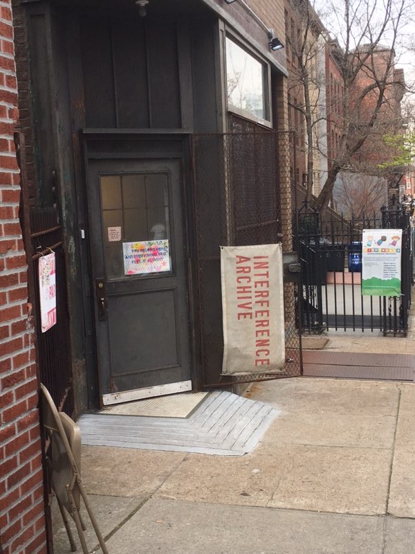
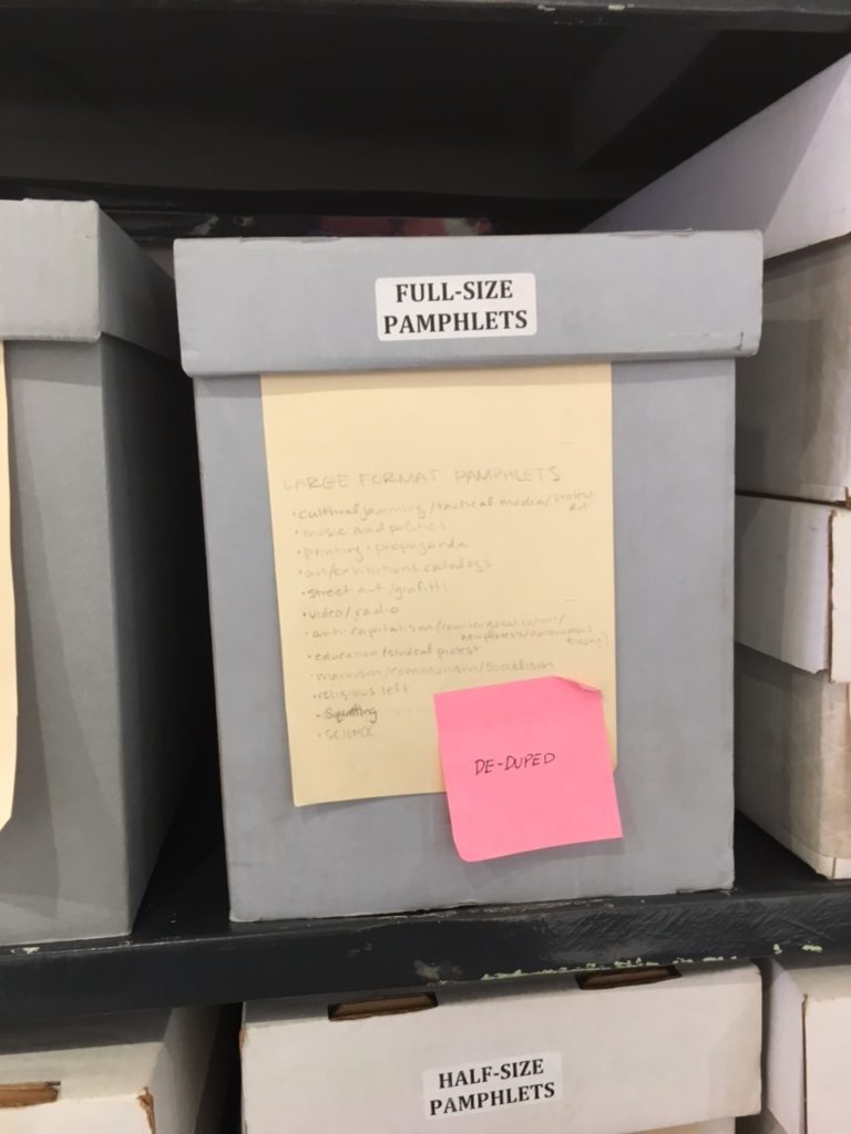
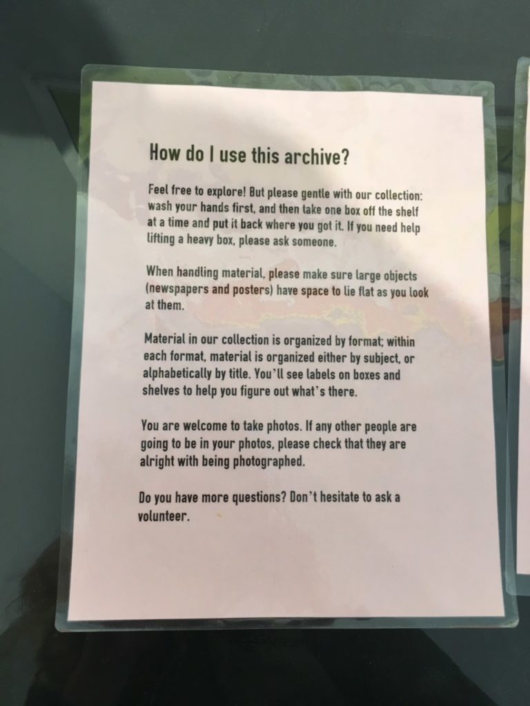
Founded in 2011, the archive is located in an unassuming gallery space at the intersection of Park Slope and Gowanus. It is an entirely open-access, open-stack archive, meaning that anyone from the public is free to enter during operating hours and browse the endless shelves of ephemera. For the easily distracted and endlessly curious like myself, the space is a dream. There are flat file shelves of posters, newspapers, stickers, buttons, and pamphlets from various activist movements, as well as a whole library of books and records in the back, and a shared work area with the independent publishing company Common Notions. The archive is open four days a week and is entirely volunteer run. Whoever is staffing at a given moment acts as a de-facto catalog, in addition to assisting in collection processing, stabilizing, and creating finding aids.  

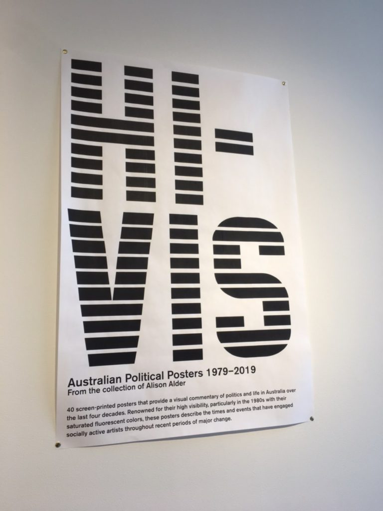
One of the first boxes that I browsed through contained records of anarchist infoshops from the Beehive Collective, an anarchist group located in Washington DC in the 1990s. In addition to their open stacks, the Interference Archive also curates exhibitions open to the public. A collection of Australian political posters from 1979 to 2019 is currently hanging in the front hall. The posters run the gamut of environmental activism campaigns to art festivals. The next exhibition, also posters, will be curated in partnership with The Poor People’s campaign, an organization for income equality founded by Dr. Martin Luther King Jr.

I had the fortune of being able to wander the Interference archive—no appointments are necessary—and speak to one of its founders, Kevin Caplicki. Kevin, whose background is actually in graphic design elaborated on the accessibility fostered by the archive. “Our collection policy is anything that’s produced in multiples, via grassroots social movements, that communicates their demands. The materials are international on scale and the idea is to provide a public space where all of these materials can be accessed by anybody because we, as a counter-institution, to engage with this material to understand radical history.” His description also brought to mind John Gehner’s hope for the future of libraries, “The promise of the social exclusion/social inclusion framework is that we don’t have to dwell on one particular aspect of a person or community—their income, age, gender, race, ability level—but simply on the fact that many people are forced to live on the margins and cannot participate in society as equals. Remedies are rarely immediate or easy, but libraries are well-equipped to do more and better” (Gehner, 45).

In the current political landscape, the archive serves as a space of dynamic conversation, where ephemera collected from past movements can enrich activism today. “We want these materials to inspire people to reproduce these kinds of resistance and organizing,” Kevin says. “Ideally, browsing the archive will inspire people to get organized now or create graphics now. Hopefully we can progress to a world that we want to live in.”

Kevin also elaborated on the manifold challenges that come with maintaining an entirely volunteer run community archive. For one thing, only a small portion of the archive is digitized just because resources for that equipment and manpower are limited (the archive is entirely donation based and community supported as well). “Labor and time are the biggest limitations. We do have monthly sustainers that donate that covers overhead costs.” As a horizontally run space, there are different groups that run different projects, but there is always a shortage of volunteers.

The archive often gets researchers, which Kevin says is a good excuse to figure out new points of access to the archive. The process of working with researchers usually starts by finding out what topics they are interested in, if they are interested in working with different formats. From there, the volunteer and researcher will just start pulling boxes and exploring.

“We try and find different new ways to create finding aids to guide people through the materials. As a staffer, I am here to go on the adventure of exploring the archive with visitors.”

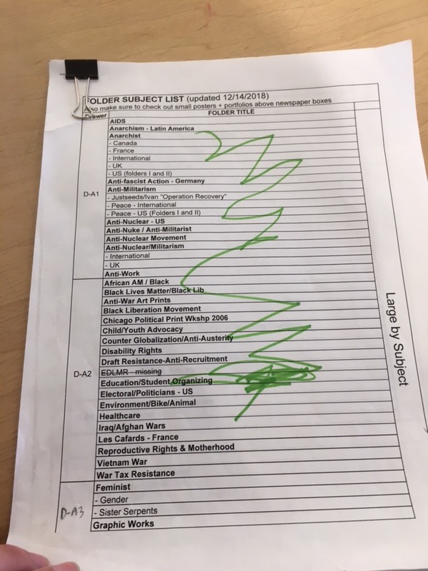
The space itself is meticulously organized. I was able to look through a finding aid of posters, organized in flat file cabinets in the back of the archive. “We want people to be able move from specific to general and vice versa whenever they need to,” Kevin says of the archive’s finding aids. On the poster finding aid, the posters are arranged into folders, which are listed by subject and geographic location. There are also finding aids for documents, stickers, and buttons.

The staff is a mixture of archivists, librarians, artists, activists, and others from the community. When I arrived, a group was in the process of stabilizing issues of the Globe from the 1960s. Some used gloves to handle the papers.

The space is truly dynamic: in addition to exhibitions, the archive also features film screenings, workshops, panel discussions, and can serve as a political organization space. As I left, I immediately began looking forward to when I could return again. The archive is always in need of volunteers and a simple email is all you need to get started. There are no library science or archive work prerequisites. In a neighborhood of rapid gentrification, the Interference Archive stands out as elevating the communities that have been overlooked in development.

Citations

Caswell, ML. “Archives on Fire: Artifacts & Works, Communities & Fields.” Reconstruction: Studies in Contemporary Culture, vol. 16, no. 1, 4 Aug. 2016, pp. 1–21.

Gehner, John. “Libraries, Low-Income People, and Social Exclusion.” Public
Library Quarterly
, vol. 29, no. 1, 2010, pp 39-47.

By Sarah Goldfarb, Info 601-01 (Structured Observation Assignment)

Observation at the Whitney Museum of American Art – Programmed: Rules, Codes and Choreographies in Art, 1965-2018

(Photo credits: Christopher Ku, Instgram: cawriskoo)

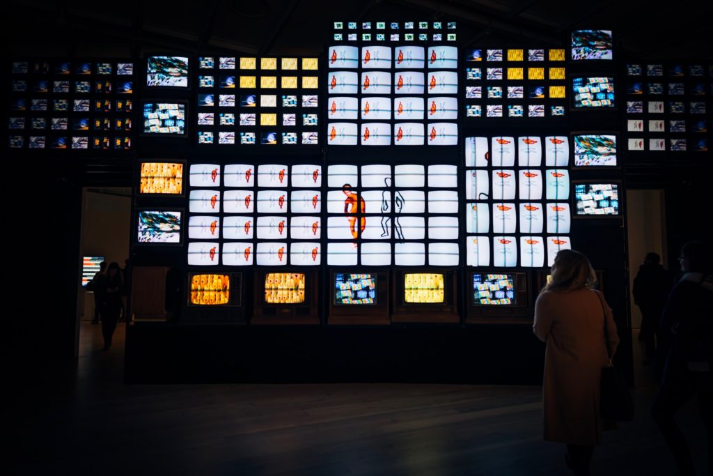
On March 29th 2019, I visited this exhibit and was transfixed by the main installation, which is a floor to ceiling panel of television sets. It is important to note that when I visited the exhibit, the museum was also showcasing its final weekend of their Andy Warhol exhibit. There was also an organized protest that was taking place at 7pm during the museum’s pay-as-you-wish period. The museum was jam packed with ticket buyers, members, and security staff. Although it was a high capacity evening, my access to the museum’s Programmed exhibit was smooth and calm.

The content in this exhibit celebrates art through programmable codes (or instructions) and how these codes can be used to manipulate the artists’ medium (computerized program or image sequence). All of the pieces in this exhibit were created through various types of computer programs, which were used to establish the structure and color of the piece. They are grouped in one of two sections: “Rule, Instruction, Algorithm”, which focuses on the rule-based conceptual art practices prior to digital art technologies and “Signal, Sequence, Resolution”, which focuses on the coding and manipulation of the moving image. Walking through the exhibit it was hard for me to differentiate between these two groups since nearly every piece has some sort of tech-based manipulation applied to it.

This exhibit is very open and full of content.  Navigating the exhibit can be overwhelming because there was music playing from the main attraction, Nam June Paik’s Fin de Siecle II (pictured above) and other installations around it. Adding to the noise from the installations are the human noises produced by the visitors and employees. I also noticed many people gravitated towards the multimedia content more so than a piece that did not openly appear to have a tech component to it.

Photo credits: Whitney Museum of American Art

Tilted Plane (pictured above) is a great example of one installation receiving more “people time” than other pieces. I think a big part of why this installation attracted more visitors than others is because of how “instagrammable” it looked. Jim Campbell created this piece in 2011 to project a two-dimensional image into a three-dimensional space. To do this, he placed modified LED lights at specific locations on a circuit board to mimic pixels in a low-resolution display. The viewer would enter at the spot Whitney staff has sectioned off as the entrance, which allows you to see the initial sight of birds taking off and landing. But as the viewer moved along, the image becomes distorted, and random, creating the illusion that you are no longer looking at a specific thing, but something abstract.

Being immersed in Tilted Plane not only gave me a serious case of dizziness (a warning sign was placed outside the installation about this) but also immediately reminded me of Bates (2003) and her discussion on natural and represented information. According to Bates, these forms of information allow for organization of knowledge and representation of this knowledge through other means. When applied to how the pieces in this exhibit was created, I can’t help but think about the process in which each artist came up with their initial concept (encoded information), their process of creating such pieces (embodied information), and the completion or exhibiting of their piece (exosomatic information).

Another piece from the exhibit that I found interesting is The Interactions of Coloreds by Mendi + Keith Obadike.  It is important to note that this installation was not as popular as Tilted Plane, but exhibited some important themes that should be looked at. This interactive piece invited the viewers to look at the conceptual website created by the artists to see how skin color has effected online commerce and ad-targeting. However, as the gallery attendant for the exhibition explained to me when I had trouble figuring out how to use the installation, the website built by the artists is not updated in real-time and tends to lag. Their website can be accessed here

Their “product” is a system that can help companies judge their customers or employees based on their hexadecimal color (the HTML equivalent of color). To add an interactive component to their website, they include a link that brings their viewers to a Google Doc questionnaire, which is to be filled out to compile the hex code for the viewer. Compiling this information is no different from Big Data firms collecting information from their users to better direct ads towards them to sell a product or sway them towards voting for a specific party or person. On the darker side of things, sometimes even limiting our access to important resources is a flaw in the types of systems offered to us in the real world. Costanza-Choke (2018) argues about these design injustices, where dominant groups oppress those who are often underrepresented because of their lack of access to resources that will help voice their concerns.

This installation reminds me of Sephora’s Color iQ, a “beauty service” tool that scans the surface of your skin to match makeup users to a host of foundations appropriate for their skin tone and color.  Each Sephora customer that has used this service is then matched up with a 4-digit and letter combination code that is linked to specific shades in the brands they carry. From a consumer point of view, this tool is useful since it gives me a curated look at products from brands that are guaranteed to work for me. But looking at it from an information science student’s point of view, I wonder how that information has been used since then.

Overall, Programmed is an exciting exhibition looking at alternate forms of art through digital manipulation. While pieces that had great aesthetic appeal harnessed more attention from visitors, other pieces had more alluring underlying themes that provoked viewers to look at them more closely.

Tiffany Chan, Info 601 – 01

References:

·           Bates, Marcia J. (2006). “Fundamental forms of information.” Journal of the American Society for Information and Technology 57(8): 1033–1045.

·           Costanza-Chock, Sasha. (2018). “Design Justice: Towards an Intersectional Feminist Framework for Design Theory and Practice.” Proceedings of the Design Research Society 2018.

I spent an hour observing the Glossier flagship store as an information space.

I’ll be honest, for a long time I thought the millennial-favorite cosmetic brand Glossier’s flagship in NYC was invite-only. I’d seen the NYC showroom’s pale pink, the enticingly instagramable interior on the feeds of Instagram influencers. It was so lavish in comparison to a Sephora or Ulta; I didn’t think they’d let the public pour in. This changed once I saw the now ubiquitous plastic pink bag and bubble-wrapped pouches in the hands of the masses on the 4 train. My manufactured mystique around the showroom’s accessibility made Glossier a perfect information environment subject to observe.

Putting an ecommerce gloss on retail

Glossier’s part of a new class of neoliberal disruptors in the retail space for women. They use a social-conscious capitalist model: A body-positive, female empowerment brand that turns buying cosmetics into an act of resisting the patriarchy. Glossier’s picture-perfect showroom is an information environment similar to other retail brands that started as direct-to-consumer companies with NYC flagships, like Casper or Away. Their idea is to bring their recreate their beloved e-commerce experience in person.

An empty flagship via WWD.com

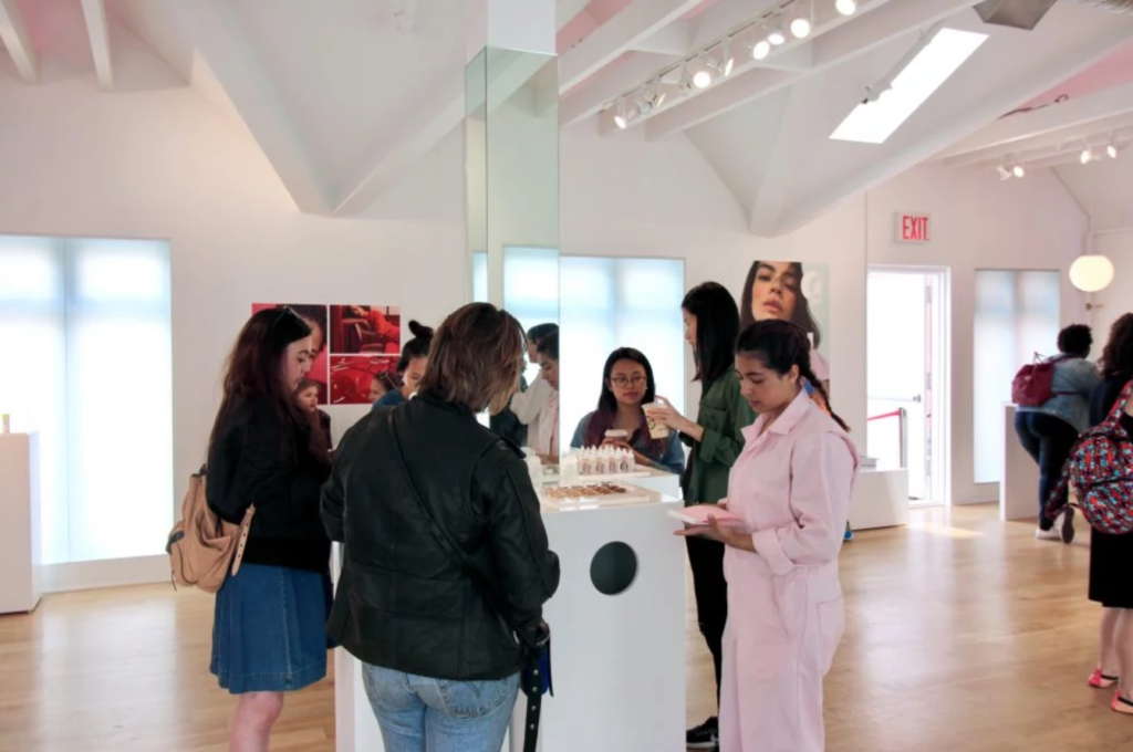
Once the doorman swings open the door on Lafayette street, you’re confronted with a pink-velvet cavernous staircase (I had to inquire about wheelchair accessibility, as an alternative to the stairs was not easily discoverable) that leads to a large, open-concept space with mirror-lined walls and more shades of pink decor. The crowd was large and surprisingly young. Mobs of girls no older than 14 painting their faces in such a plush setting; like a child trying on lipstick in mom’s bathroom.

Mascara as information

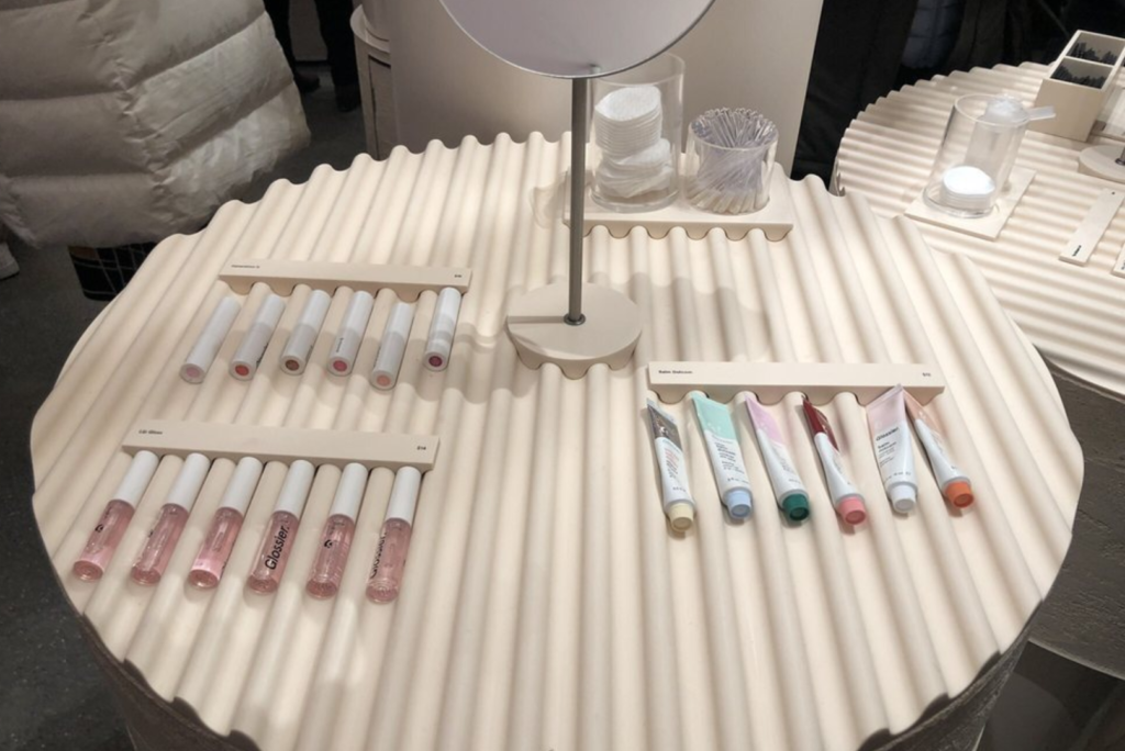
At Glossier, the information, or products, are extremely inviting. Unlike Sephora where the products are in high display cases at an angle, Glossier’s information lays flat on low-lying tables. The many tables have ridges that signify they can be picked up, and where to place them after. Also on the table are testing materials that make the products try-able for the masses. Cups filled with bite-size mascara wands, eyeshadow brushes, and eyeliner sticks are key signifiers that green-light trying the information. The products on the tables themselves are missing their application tools so the users must use a sample-size wand or brush to access the product. In other makeup stores like Sephora, or even the counter at Saks, I’ve never seen a testing product manipulated it such a way. Wouldn’t the users want to see the product in its entirety before using? Isn’t setting out the disposable application tools clear enough? Apparently, it’s not clear and can be a real hygienic concern. Glossier’s limited product testing design method is more user-centric than I thought.

Get in the groove: Try the products at Glossier

In the “wet room”, users can test the products with one of the many sinks that line the walls. When I took a peek, no one was full-on washing their face. A couple of giggling girls were taking a picture of the moisturizer. I asked an employee, Glossier’s information intermediaries, and she said people are a little tentative to lather up in-store. However, once someone takes the plunge, others follow. I’m familiar with this herding mentality from the behavioral economics book Nudge. This was a clear indication that within information environments, social norms can often serve as a barrier to access.

Cosmetic tech

Glossier information intermediary with iPad

Once you find a product you like, purchasing requires face-to-face contact with one of the intermediaries. Glossier is set-up like Apple’s genius bar, except the geniuses holding iPads specialize in makeup and skincare and adorn baby pink jumpsuits. The pink intermediaries are extremely friendly, but don’t overstep; I observed most of them smiling along the outer rim of the floor. Users went to them only when needed, dissimilar to the constant “can I help you find anything” at other retail spaces.

Glossier’s checkout system reminds me of a gas station in New Jersey; You can really do it yourself, but they won’t let you. A Glossier employee will scan your products with the iPad and then have you enter in all your information. On the interface, it has a place to enter a promo code, but I heard an employee tell the users they had to purchase the items online if they wanted to use the promo code. They could still pick up their products today, but downstairs where the other online pick-up orders are sent. I’m sure there’s a technological back-end reason for this promo process, but why include the promo line in the in-person checkout, to begin with?

Conveyor belt via Yelp

An info show

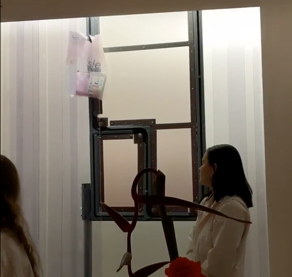
Once you’ve purchased your products with Apple technology in the hands of an intermediary, the pick-up process becomes kind of clunky. You’re told to wait in the waiting room, where there are more jumpsuit-fitted employees behind a counter with a vertical conveyor belt on the wall. A horde of people is anxiously awaiting one of the pink jumpsuits to grab their pink bag from the conveyor belt and call out their name. After witnessing the iPad and conveyor belt, it seemed so odd their process of delivery was to scream a name out, instead of implementing an arrival screen, like at an Airport. The employee had to continual repeat names, and to be completely honest, did not seem thrilled about it. The conveyor belt was a slow process and visually interesting. However, I wasn’t able to capture my own video as one of the intermediaries shouted “no photos.” I had to wonder if employee agency conflicts with the designed space; I just don’t see another reason for the expensive conveyor belt display but for social media fodder.

While there are some design hiccups, I think Glossier did a fair job of turning their seamless ecommence interface into a IRL retail space. I didn’t originally view the information environment as accessible, so upon entry, I was pleasantly surprised by the user-centric design.

References:

Buckland, M. (1991). Information as Thing. Journal of the American Society for Information Science. Jun1991, Vol. 42 Issue 5, p351-360. 10p.

Norman, D. A. (1990). The design of everyday things. New York: Doubleday. 

Thaler, Richard H.,Sunstein, Cass R. (2008) Nudge :improving decisions about health, wealth, and happiness New Haven : Yale University Press,

The New York Public Library of the Performing Arts

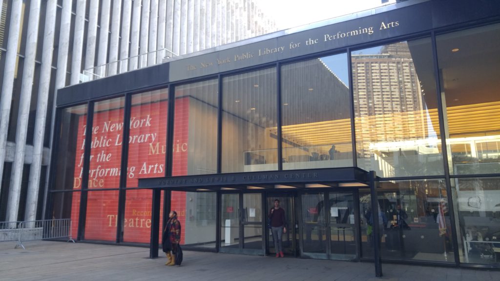
On the first warm day in April, I decided to visit my favorite branch of the New York Public Library, the New York Public Library of the Performing Arts, Dorothy and Lewis B. Cullman Center (LPA). One of Manhattan’s research libraries, LPA is tucked between the Metropolitan Opera House and the Vivian Beaumont Theater at Lincoln Center Plaza. Upon entering, visitors can stop at the front desk for information about other NYPL research libraries’ locations and business hours and to pick up some LPA publications. Only feet from the entrance, I was already getting a sense of the knowledge infrastructure of cultural and educational activities that both reinforces and is reinforced by LPA’s commitment to performing arts (Rubin, 1-2). I flipped through a booklet of Spring 2019 LPA Programs and Exhibitions, excited to see what was in store. Unfortunately, the latest exhibitions had been removed in late March, the upcoming exhibitions would be ready in mid-April, and no performances or workshops would be taking place that day. Lucky for me, the front desk administrator informed me that I could still catch an exhibition about Uta Hagen, an actress and teacher, on Level 3 and provided a brochure of Hagen-related LPA events taking place in April.

Behind the front desk, the Donald and Mary Oenslager Gallery, a large exhibition room, stood empty and the Plaza Corridor Gallery, a wall exhibition space, stood blank as well. Further down on Level 1, I found self-service copier rooms, a circulation desk, biographical circulation items, and public Internet stations. Most visitors on this floor were sitting at the Internet stations to view or listen to reference materials. The main reference materials on Level 1 are Song Index, Scores, and Recorded Sound items, ranging from Madrigals to Yiddish Songs. The Song Index shelves feature an interactive audio installation exhibit, Archives of Sound. Signs instruct visitors to put on headphones hanging from the shelves and to flip nearby switches in order to hear snippets of archived sheet music. I couldn’t take advantage because the exhibit was temporarily unavailable, but I was instantly reminded of Karim and Hartel’s designation of music information retrieval, and art in general, as a “higher thing” in information science. I was curious to see if LPA would live up to Karim and Hartel’s vision to recognize the “informational facets of higher things in life” (Karim, 1133-1137).

Most of LPA’s circulation items can be found on Level 2, including books, scores, CDs, DVDs, videos, and reviews. Each aisle presents staff picks of books related to the performing art on the corresponding shelf. At the circulation desk, I found two useful handouts. “A Guide to Circulating DVDs” lists the types of DVDs found in each aisle. For example, DVD Biographies C-Z can be found on Aisle 7. It also includes a guide to DVD types (“DVD 782 encompasses opera and musicals”) and how LPA organizes  DVDs. I was surprised to find out that LPA alphabetizes most DVD types by letter, but not within letter. The second handout, “Circulating Scores Chart”, lists the types of scores, their call numbers, and the aisles where they’re located on Level 1. The circulation desk also provides a request form for visitors who are interested in viewing or listening to audiotapes, videotapes, or other media from LPA’s Jerome Robbins Dance Division. Most visitors on Level 2 were either browsing items in the reading room or using the computers.

Finally, I headed up to Level 3, where visitors can really take advantage of one of the world’s largest collections of performing arts materials. LPA’s special collections are the Billy Rose Theatre Division, the Jerome Robbins Dance Division, the Music Division, the Rodgers and Hammerstein Archives of Recorded Sound, and the Reserve Film and Video Collection. Their contents inform and expand the debate surrounding Buckland’s question, “What is a document?” (Buckland, 4-5). In addition to things like manuscripts, photographs, and published and unpublished work relating to performers, the Special Collections also boast objects such as set models, audio recordings, and phonograph cylinders of live Met Opera performances from the early 20th century. Bags and outerwear are not allowed on Level 3. To enter, I had to go through a mandatory coat check and leave everything except the items I would be using: my pen, notebook, and phone. Once inside, visitors can check out items to their library cards for the duration of their visit – items are not allowed to leave the walls of Level 3. Black cabinets of subject specific card references for Music, Recorded Sound, Dance, Film, and Theatre line the walls. Visitors can use these card catalogs, the online catalog, or the archival materials search portal to identify and request items for research. Most Special Collections items are housed offsite and need to be requested in advance to allow for transportation. I observed many visitors studying books, magazines, and microfilm in the reading section nearby. Delicate items, such as rare books, clippings, and sheet music are only released in the Special Collections Reading Room, where I saw a number of visitors conducting research. Special Collections visitors are required to submit a registration form and adhere to the Special Collections Photography and Photocopy Policy.

Towards the end of my stroll about Level 3, I found the Uta Hagen exhibit that I had heard about at the front desk. I also happened upon smaller, more niche exhibits, like one about music in the time of Jane Austen. As I was exiting Level 3, I noticed that the wall across the coat check had been transformed into a large bulletin for information about upcoming performing arts events. I expected to find ads for major performances at Lincoln Center, but was pleased to see that there were mainly posters hung by visitors who were both publicizing their own forays into the performing arts and contributing to the knowledge infrastructure that props LPA. Overall, I was impressed by LPA’s institutional support for a focus on higher things in information science, how it highlights the information value of pleasurable things like the performing arts, and the way it invites visitors to participate in the city’s performing arts culture.

References

Buckland, M. (1991). Information as Thing. Journal of the American Society for Information Science. Jun1991, Vol. 42 Issue 5, p351-360. 10p.

Karim, J. & Hartel, J. (2007). Information and Higher Things in Life: Addressing the Pleasurable and Profound in Information Science. Journal of the American Society for Information Science and Technology, 58(8), 1131-1147.

Rubin, R.E. & Janes, J., (2016). The Knowledge Infrastructure. (1-30). Foundations of Library and Information Science. Fourth Edition. Chicago: ALANeal Schuman.

INFO 601-02 – Observation


Museum of the City of New York

Due to a friends recommendation, I recently visited the Museum of the City of New York to learn more about the city I’ve been living in for the past 4 years.  New York City is so rich with history and culture, that mentioning NYC to anyone can bring up a different range of emotions, feelings, and thoughts.   The Museum is filled with close to 450 historic physical objects and images as well as contemporary video, photography, and interactive digital experiences that give an insightful and intimate look of New York City from it’s early beginnings to now.

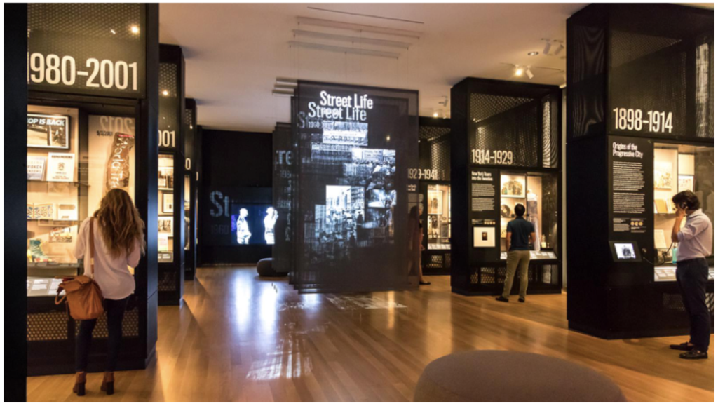
As I walked into the museum I was immediately introduce to an exhibit called “New York at Its Core”.  This exhibit, in a nutshell, answers the question of “What makes New York New York?”   

The exhibit covers the history of New York from 1609 through 2012 with various sections dedicated to specific timeframes each with supporting artifacts.  Framed around the key themes of money, density, diversity, and creativity, New York City’s history and future come alive in this first-of-its-kind exhibition, through the stories of innovation, energy, struggle, and the vision of generations of immigrants, politicians, tycoons, dreamers, master builders, and ordinary New Yorkers. [MCNY].  I specifically liked how this exhibit used both physical and digital objects to illustrate and inform visitors of the rich history of NYC.  More on the use of interactive screens later.

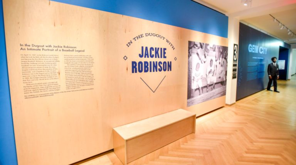
A few floors above, I was excited walk through the Jackie Robinson exhibit, “In the Dugout with Jackie Robinson”.   

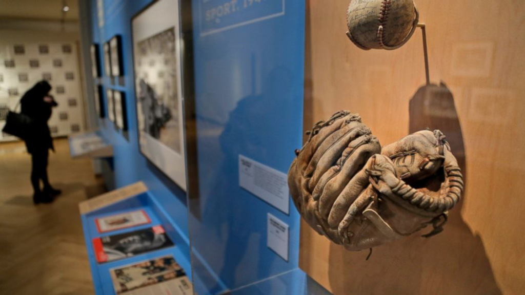
The avid baseball fan in me was excited to see the various memorabilia and rare footage (video and photos) of Jackie Robinson and his family, as well as the published magazines covers and articles from popular publishers outlining his career and life story.  The collection of materials gave an intimate portrait of a baseball legend struggles, challenges, obstacles, and success on and off the field.  This exhibit in some ways made me think about how each person has a story and it can be documented by the person and people around them that gives a glimpse into the past.

As I walked through these museum, I noticed the variety of people (races, ages, gender, etc), exhibits/collections and how they intersected and connected us (as people and visitors). It reminded me that even if you aren’t an avid baseball fan or from NYC, museums bring together people from different backgrounds, forms connections, and educates (or informs) them about topics that they may not have known or interested in.  Museums are unique in that they tend to offer a neutral place for discussion, thought and experience; similar to libraries they can serve as a platform for promoting innovation within our communities.  Of course the degree of education by these institutes are based on how well they are curated, the type of content they contain and the more, importantly, willingness/openness the visitor is to receive information. Not only is it important to enable the passing of information but also enable the reception/receiving for it (i.e. via technology or learning how to interpret/process information as a user/visitor).

Reinforcing Bucklands ideals, museums are a great example of Information systems and the physical objects within them are great examples of Information-as-thing.  Moreover the Museum of the City of New York itself is a document.  But what is a document, according to Buckland, by definition a document is any source of information, in material form, capable of being used for reference or study or as an authority.  [Buckland]  The concept of “document” opens up a broader perspective, which creates, rather than limits understandings of the human relationship with information. This expanded concept of “document” as sign/semiotic helps us understand user experience in ways not previously explored in the convergence of museums and information studies. [Lantham]

Neither information-as-process nor information-as-knowledge are considered tangible because they cannot be measured or touched. [Buckland]  In order to use, manipulate or handle information, we must communicate it.  Information can be so large and vast, no matter what form it takes whether digital or physical, that it can be quite overwhelming when viewing or consuming it, regardless of the setting (library, museum, book, internet, etc).  

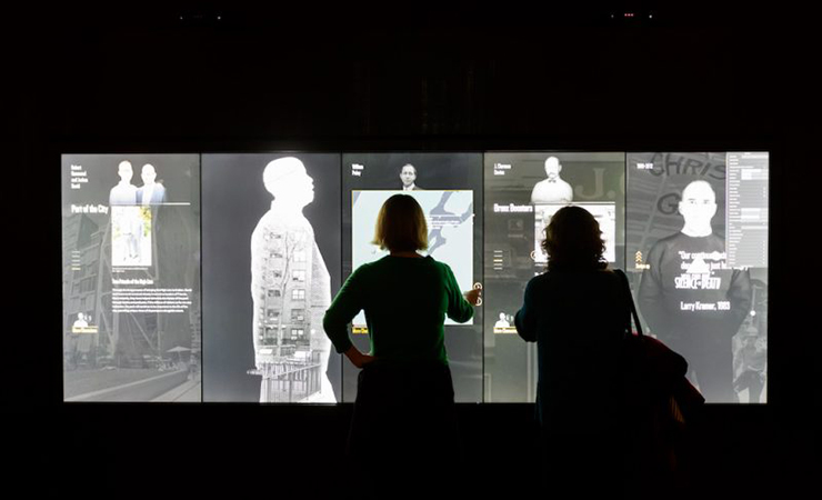
Museums, specifically, are curated in a way that allows information to be accessible without overbearing the user/visitor.  I never really though of User Experience in the field of libraries or museums as I naively thought of UX only in the field of computers.   An example of how technology is changing the way museum and visitor engagement is changing is with the introduction of interactive screens.  In the “New York at Its Core” exhibit at The Museum of the City of New York, there are interactive elements that introduce visitors to 70+ historical figures who represent New York City’s characteristic diversity such as Jean Basquiat, Patti Smith, Joel Ross, etc.  See image below for reference.

As described by Don Norman in the Design of Everyday things, these interactive elements are extremely effective and its use of affordances, signifiers, immediate feedback, and mappings presents a strong example of user-centered design.  They are easy to use and understand for people of all ages and abilities and has a simple design that enables discoverability of the countless amount of information.

In closing, as technology changes and how people consume information, so will industry and institutions change. Museums are having to adapt to these changes not necessarily out of reluctance but necessity and are beginning to embrace new forms of communication, storytelling, and engagement. 

Bibliography

Museum of the City of New York, Available online: https://www.mcny.org/nyatitscore [Accessed on April 10, 2019]

Micahel Buckland, Journal of the American Society of Information Science48, no. 9 (Sept 1997): 804-809

Kiersten F. Latham, “Museum object as document: Using Buckland’s information concepts to understand museum experiences”, Journal of Documentation, Vol. 68 Issue: 1, pp.45-71,https://doi.org/10.1108/00220411211200329

The Cooper Hewitt Experience

When purchasing admission tickets to The Cooper Hewitt Museum, I was asked “would you like the Pen?” To which I was a little confused having not visited the museum before. The ticketing agent was kind to demonstrate the use and functionality of the Pen and left me with a greeting “happy exploring!”

The concept for the interactive Pen originated from Local Projects working with Diller Scofidio + Renfro and was designed to enhance the Cooper Hewitt experience by allowing visitors to “collect” objects from around their galleries. All visitors receive a Pen with their admission ticket containing a dedicated web address corresponding to their visit where they can access all the objects they have collected from their visit. Visitors may press the flat end of their pen to a ‘+’ icon on the museum labels to collect objects and explore them in more detail at interactive tables situated around the museum. The Pen combines two technologies where its interface with interactive tables employ conductive materials common to touchscreen styli and its interface with museum labels employ near-field communication technology. The interactive tables, designed by Ideum, allows visitors to explore and manipulate the objects they have collected, discover related objects, retrieve contextual information, learn more about the designers, design processes and materials, watch and share videos and even sketch their own designs.

According to Jake Barton, principal and founder of Local Projects, “[f]inding the right balance between digital and physical was really an iterative process developed over time together. Here is the Pen, it’s going to make visitors active, it’s going to reinvent the museum experience and turn audiences into participants, but it won’t do it at the expense of the traditional galleries, which will remain artefact-based and without digital technology” (Wright, 2017, p. 123).

In thinking of employing the digital in museums, it is important to consider what the right balance of the physical and the digital would be for the institution. Where can digital technologies be employed, and where it should not be? What level of comfort do different aspects of the museum have in delivering a digital experience? And, most importantly, what is the nature of such digital experiences?

With regards to the Cooper Hewitt, the Pen has become synonymous to their museum experience as it is interwoven into most aspects of the institution. The ticketing agents spontaneously encouraged visitors to use the Pen, even personally showing young children and elderly visitors how the Pen is used. The Pen encourages discovery, has a low barrier to entry, part of the ecosystem of the museum and is an important tool to accessing information in the museum (Bove, Crow, & Husney, 2014, p. 17). The Pen also seeks to ensure a ‘look up’ experience where visitors can be compelled enough to engage with the exhibits without need to use their mobile devices to take photos with. During my visit, I observed only a handful of visitors were taking photos, though not often, and promptly putting their phones away to continue with their use of the Pen. Having become a ubiquitous part of a visit to the Cooper Hewitt, the Pen is unlike the mobile apps / guides of other museums that visitors might be unlikely to adopt and cannot achieve large-scale transformation to a digital experience. 

The interactive tables offered visitors an opportunity to “play designer” where they could view their collected objects, were prompted “what will you design” and “what will inspire you” where they could then draw, manipulate and explore the museum’s collection to their liking. There was ease to the use of the interactive table however it seemed intimidating too. I observed visitors hesitant to use it at first but were encourage by museum staff to simply discover the functionalities of the interactive table. 

As I returned my Pen to leave the museum, I was reminded once again that I could revisit all the objects I have collected on the Cooper Hewitt website. Having accessed the website with my designated code, I found some objects to lack the images and metadata I had seen on the interactive table. This was a little disappointing as I was hoping to show my family overseas what I had seen in the museum. According to Chan, new loan forms and donor agreements were negotiated and by the time objects began to arrive for installation at the museum in 2014, all but a handful of lenders had agreed to have a metadata and image record of their object’s presence in the museum (2015). As such, these constraints do limit the post-visit experience of using the Pen.

Considering some of Norman’s design principles (2013, p. 72), 

  1. Discoverability — The Pen’s flat side has the same ‘+’ symbol as those on the museum labels. As such, it is possible to determine its possible actions however not explicitly obvious, aided by guidance from museum staff. 
  2. Feedback — When saving an object with the Pen, it lights up and vibrates when the action is complete, proving immediate feedback when an action is executed. 
  3. Affordances — The Pen afford holding like any regular pen and is helped with a wristband to prevent visitors from dropping it.
  4. Constraints — The Pen is limited to 2 actions—saving objects and drawing on the interactive tables. Its design allows ease for this interpretation.

Recommendations / Reflections

Though I found the overall experience of using the Pen throughout the museum to be positive, the layout of the museum was confusing and did inhibit my discovery of exhibits. No doubt the Carnegie Mansion is a beautiful setting for the museum but the narrow doorways and lack of signages made it difficult to navigate. The only indication of what exhibitions were showing was located in the stairwell. The museum could consider adding a map to the interactive table to aid in navigation.

While using the Pen, I thought of accessibility issues as the use of the Pen requires sightedness and is not user-friendly to those who are not. The museum had many other accessibility services available like assistive listening devices, reduced rate tickets, passenger elevator and large-print labels. However, I found it a shame that the technology vital to the Cooper Hewitt experience was not accessible to all.

Overall, the Cooper Hewitt provided a successful example of how digital technology can be employed by museums to enhance visitor experience and their exhibitions where at every stage and aspect, the Pen is interwoven into how the museum is operated.

References

Bove, J., Crow, A., & Husney, J. (2014). The Pen Process. Design Journal. November 2014, 15-17. 

Chan, S. (2015). Strategies against architecture: Interactive media and transformative technology at Cooper Hewitt. Retrieved from https://mw2015.museumsandtheweb.com/paper/strategies-against-architecture-interactive-media-and-transformative-technology-at-cooper-hewitt/

Norman, D. A. (2013). The design of everyday things. New York, NY: Basic Books.

Wright, L. (2017). New frontiers in the visitor experience. In A. Hossaini & N. Blankenberg (Eds.), Manual of digital museum planning (109-130). Lanham, MD: Rowman & Littlefield.

INFO 601-02 (Assignment 3 / Observation) – Jamie Teo