Observation at the Copper Hewitt Smithsonian Design Museum

Copper Hewitt museum is a constantly innovative place which always gives me surprise. During this visit, the new exhibition content has brought me new information experience. The first step after entering the museum is to purchase admission tickets. The museum staff gave me an interactive pen and asked me if I have been here before. Since this is my second visit, I had understood the functionality of the pen and felt excited and looked forward to the actual use of it.

The current exhibitions is inclusive of Nature by Design, Rebeca Méndez Selects, Moustiers ceramics, Iridescence, Immersion Room, Models & Prototypes Gallery and Scholten & Baijings in the Process lab (“Cooper Hewitt, Smithsonian Design Museum”). The innovative exhibits in museum brings people brand-new feelings in all the aspects of sense, hearing and touch.

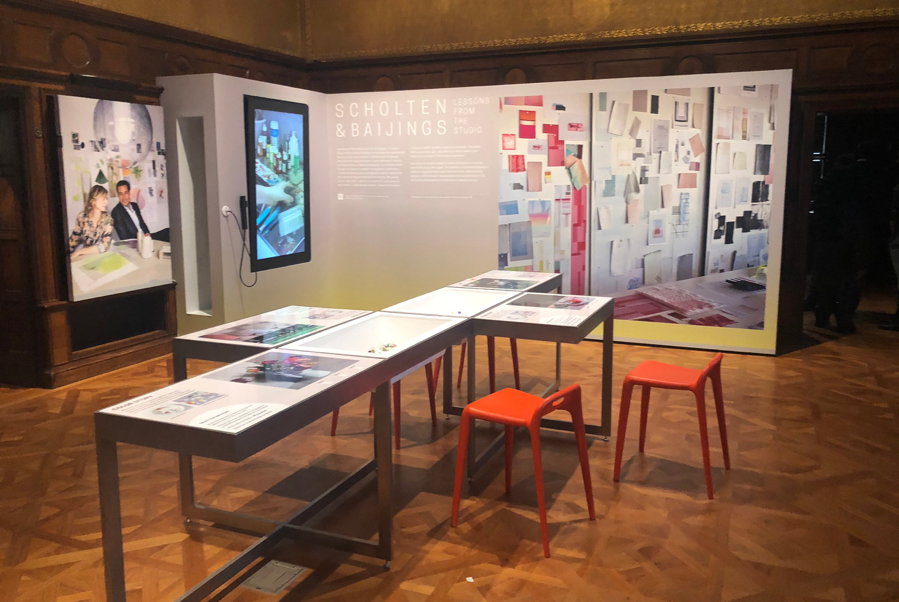
The installation in Process lab invites visitors to explore the design process of contemporary industrial design studios by themselves. The lab shows some industrial crafts and a number of interesting details about the making process of tableware, furniture, and textiles. Some objects from collection are available for touch and two interactive tables are offered for color experiment.
Process Lab

Immersion Room is a creative space where visitors can draw their own wallpaper designs and experience the full-scale projection of pattern on the walls around them. At the same time, visitors can select wallpapers from museum’s extraordinary collection and see them projected on the walls, accompanied by audio clips about the information of that particular design or designer. Multiple types of information give visitors immersive experience, which helps them find inspiration and learn to create.
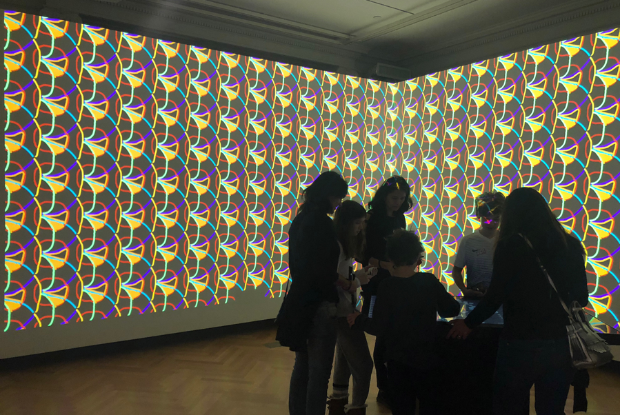
Immersion Room

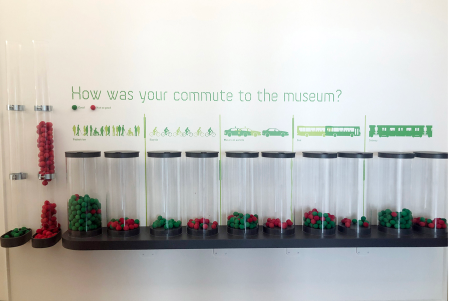
There is a new project at the second floor “How was your commute to the museum?” which analyzing the commuting process of visitors. Visitor can pick a small red or green ball and put it into one of the transparent buckets which corresponding to a certain type of commuting. The green ball means “good” experience while the red one means “not so good”. The commuting types including pedestrian, bicycle, motorized vehicle, bus and subway. These soft color balls arouse interest of visitors to participate the project, which provides statistical data for future strategies on enhancing museum experience.
Copper Hewitt has made some intriguing digital innovations in the field of interaction, among which interactive Pen and touchscreen table are the two major innovative features of museum. Both interactive pen and touchscreen table give visitors the new experience compared with traditional museum experience.

Interactive pen gives visitors the opportunities to immerse in the process of seeing and feeling exhibits instead of taking pictures busily or using traditional museum App. By aligning and pressing the flat end of the Pen to any object labels, visitors can collect and save objects from around the galleries. Then all the saved exhibits information will be accessible online for future read. Meanwhile, the pen is also used to explore and manipulate the objects that visitors have collected on the touchscreen table. Copper Hewitt converted the pen to a piece of consumer hardware by cooperating with an international team, as stated on the museum site, “Like so many of the objects in the museum’s galleries, it is the product of a collaborative, international industrial design process, exemplifying how designers solve real-world problems.”

According to the introduction of interactive table on museum website, touchscreen tables uses projected capacitive touch technology, offering the same resolution as tablets and smart phones, which enables visitors clearly observe the details of exhibits and get inspiration. This visitor technology emphasized the play experience and displays the specificities of a design museum. Interactive table is not only a “collection browser”, but also a “play designer” that offers various materials, modes and object scenes for drawing three-dimensional model types by visitors themselves.

Copper Hewitt Museum’s innovation on digital experience shows that it attaches great importance to the interactive experience between visitors and exhibits. By building interactive digital entity space, it transforms the traditional one-way display platform into an interactive space for public participation. More broadly, it reflects a digital transformation trend of cultural institutions. With the rapid development of information technology, especially the coming of big data era, our social lifestyle is facing the situation of being changed profoundly by IT, and so does people’s cultural life. As the closest cultural contact with the public, cultural institutions can no longer meet people’s requirements change and diversity according to existing service mode. Therefore, many cultural institutions around the world have been exploring and practicing digital construction in recent years, such as innovating institute website and mobile app or creating virtual experience projects.

Digital and emerging media is helping cultural institutions successfully meet their missions by various digital strategies. According to Xingya Wang, being more accessible, engaging content and generating revenue are what museums are focusing on based on their strategies, and digital innovations give museums these possibilities.

In order to be more accessible, museums are providing audience with more open access to collections and making museums websites more accessible. Take National Portrait Gallery as an example. In recent years, National Portrait Gallery is not only extending the range and methods of viewing digital images of their collections and addressing the importance of open and sharable sources, but also prioritizes investment in redesign of its website to create seamless user experience. To enrich the content, there are many museums have embraced digital media as a creative method. Among them the Metropolitan Museum of Art is one standout. The Met is regarded as a potent, full-fledged media company because its digital achievement (Baker, 2015). Begin from 2011, the Met has been working closely with industrial organizations to develop apps, 3D print interactive objects and virtual reality experience for the museum. The Met also built a 70-person digital media team in order to formulate and implement effective content strategies in media-saturated landscape. Experimental initiatives including content creation and content distribution. Besides, using digital methods to generate revenue and funding of museum is another trend. Digital activities or products including digital funding model, better UX design, online courses, paid onsite multimedia tour, self-serving ticketing and so on.

Meanwhile, many cultural institutions are also involved in the field of digital technology education for public. For example, Tate, an institution that houses the United Kingdom’s national collection of British art in a network of four art museums (“Tate”), has built a Digital Learning Studio to increase participation and attraction. As a multi-use space for making and learning about digital technology, the studio offers a wide range of learning programs including courses, workshops and development projects.

The digital transformation of cultural institutions is a digital practice which redefines the interaction between public and institutions. According to Dalbello, “Public conversation is at the core of heritage practices involving artifacts and their digital representations”. In this sense, through digital transformation, cultural institutions are extending their role to become participates in a broader discourse with the public.

Reference:

“Cooper Hewitt, Smithsonian Design Museum”. Cooper Hewitt Smithsonian Design Museum, 2019, https://www.cooperhewitt.org/.

“Tate”. En.Wikipedia.Org, 2019, https://en.wikipedia.org/wiki/Tate.

Wang, Xingya. “Review Of Different Museum Digital Strategies”. Museums And Digital Culture – Pratt Institute, 2018, https://museumsdigitalculture.prattsi.org/review-of-different-museum-digital-strategies-6ec009d2f80b.

Baker, Dillon. “Museums, The Next Media Companies: Why The Met Built A 70-Person Media Team”. Contently, 2015, https://contently.com/2015/05/12/museums-the-next-media-companies/.

Dalbello, Marija. (2009). “Digital Cultural Heritage: Concepts, Projects, and Emerging Constructions of Heritage.” Proceedings of the Libraries in the Digital Age (LIDA) conference, 25-30 May, 2009.
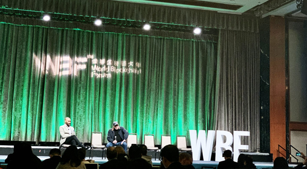
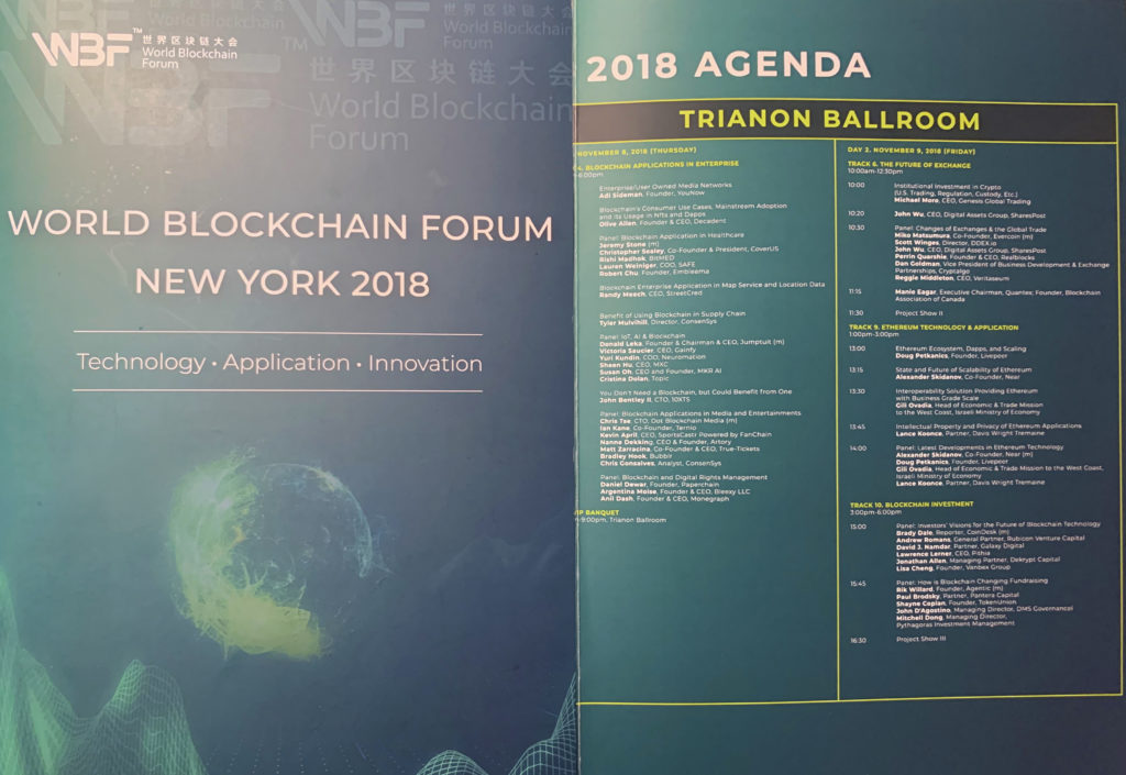
Event report: The World Blockchain Forum (WBF)

The events are held in New York City almost every day. I’m glad to have a chance study here. Through the activities I attended, the most impressive event is the World Blockchain Forum.

A brief introduction of WBF: The World Blockchain Forum (WBF) was incorporated in New York in 2017. Located at Wall Street New York City, WBF focuses on the frontier of global blockchain technology, which is committed to building the “Davos Forum” in the field of informational technology. WBF strives to establish a platform to establish an interconnected and thriving social community to share the cutting edge resources of blockchain technology.

The event was held in the Hilton Hotel in 2018. The conference hall had a huge space to hold hundreds of people with green brand everywhere. STO and Stable currency was the main topic of this event. Unfortunately, I just heard the speech about the introduction part and the conversation with Jeffery Wernick who was the earlier Bitcoin investor and VC of Uber and Airbnb. Behind the hall, there is a room for the exhibition for the application of blockchain technology in different fields. Most of them are Game or Financial Companies.

First, they start to talk about the founder of blockchain technology, Satoshi Nakamoto. He published the paper called Bitcoin: A Peer-to-Peer Electronic Cash System. However, no one knows who he is. People only know he is Japanese American. On April 20th, 2019, one bitcoin equals 5,317.67 $. Even though people start to doubt its value, they still trying to buy some bitcoins into their pockets. Actually, everyone hopes the bitcoin can maintain its value since investors have invested a bunch of money. Bitcoin’s price isn’t stable. I guess it’s one of the reasons to sell a Stable currency to poor money. For now, the most successful winners in blockchain are those people who brought the bitcoins at the very first time with incredibly low price. However, this will mislead people’s general understanding of blockchain technology, people may think that blockchain is only about trading bitcoins which creates a bias of this field.

From the basic definition of blockchain, Michael Crosby explained that,  a blockchain is essentially a distributed database of records, or public ledger of all transactions or digital events that have been executed and shared among participating parties. Each transaction in the public ledger is verified by the consensus of a majority of the participants in the system. Once entered, information can never be erased. The blockchain contains a certain and verifiable record of every single transaction ever made. Through this view, the most obvious difference between blockchain technology and the conventional network is that blockchain is built by the decentralized system while the old network is controlled by the central machine. This difference gives the user a transparent database in blockchain technology. Once a block is built, the records in it can’t be modified. Plus, the blockchain serves a permanent record of all kinds of information on a blockchain network. It’s a revolutionary technology challenges the old network that database can be decentralized from the centralized server.

The blockchain technology has a huge potential value for many kinds of fields. It can be used for the banking system, healthcare, government, etc. As David F. Bailey said it’s hard to find an industry that can’t benefit from improved transparency, seamless execution of tasks and distribution of trust around the planet. People don’t know where blockchain technology finally triggers out but they still have faith in it. According to Jeffrey Wernick, the application in the blockchain that’s driving blockchain with the solution might not actually be blockchain but might be some of the derivatives that people who are trying to be to build decentralized scalable platforms that might not end up being on the blockchain. Therefore, people may not only use blockchain to trade bitcoins but also learn the way that blockchain deals with the database system which could provide a more transparent, more decentralized channel that may influence people’s living behavior. Take trading as an example, people can easily build trust by exchanging blockchain because it can’t be revised.

Nowadays, people from different fields try to manipulate blockchain technology to develop some creative way to solve a practical problem. Michael Painter, a senior program officer at the Robert Wood Johnson Foundation, pointed out health information infrastructure challenges keep us from solving our major healthcare problems. For instance, the lack of a useful, safe health data infrastructure dramatically inhibits our ability to harness new powerful technology, like artificial intelligence. Blockchain technology was just emerging when JASON tackled these health information questions, so it could not assess its promise or pitfalls. Blockchain technology, nevertheless, could arguably offer novel ways to get us closer to that elusive health care infrastructure-like helping with information exchange, privacy protection, and control. He was unsatisfied with the old information system because doctors can’t get the valid data to finish the healthcare development including artificial intelligence. What blockchain technology can provide is a block of solid useful data with trusted privacy system that solve their worries. Moreover, blockchain technology can also give contribute to complete global payment. For years, making global payments has been challenging for both businesses and individuals since bank fees associated with international money transfers continue to increase. In this sense, Rachel Wolfson, Blockchain technology and cryptocurrency journalist, points out that the application of blockchain technology is impressive for solving the main challenges facing international payments, McCaleb also has plans to make the Stellar Network to make a progress on that. If people from all over the world can make a deal with bitcoin, the world trade system will be more efficient and transparent.  

Through this event, I recognized that blockchain technology draws big attention from society, not only because bitcoins become more and more expensive but also because blockchain technology has huge potential in many kinds of fields, such as financial service, healthcare, etc. I have faith that blockchain technology can make more progress in the future.   

Work Cited

“World Blockchain Forum New York 2018 – the Premiere Blockchain Summit.” New York – World Blockchain Forum, newyork.keynote.ae/.

Michael Crosby, Technology: Beyond Bitcoin, AIR Issue No.2, June 2016

David F. Bailey, President, BTG Inc, Blockchain 2.0.

Michael Painter, JD, MD, is a senior program officer at the Robert Wood Johnson Foundation. Blockchain technology in healthcare: perfect answer or a new source of questions? Distributed, 03.

Rachel Wolfson, (Blockchain technology and cryptocurrency journalist), How the Stellar Network is reshaping the global payments industry.

Observation: Cooper Hewitt

Cooper Hewitt, Smithsonian Design Museum is a design museum located in the Upper East Side’s Museum Mile in Manhattan. It is one of nineteen museums that fall under the wing of the Smithsonian Institution and is one of three Smithsonian facilities located in New York City. I have been there twice. The first time was a field trip with professor Nada. It was a pretty impressive experience, different than visiting other museums. I didn’t see many traditional paintings but the contemporary design works. According to the introduction of Wiki, it is the only museum in the United States devoted to historical and contemporary design. Its collections and exhibitions explore approximately 240 years of design aesthetic and creativity. The second time I visited there was to finish the observation assignment so that I intentionally noticed more details.

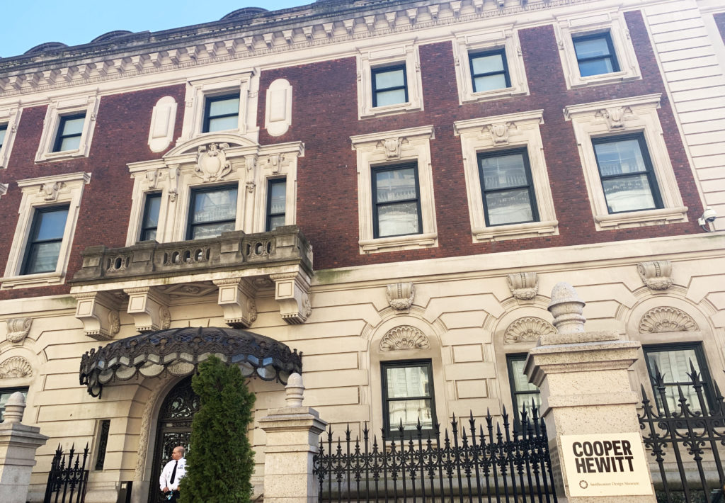
This museum has a perfect location in New York, near the central park. I remembered clearly it was a sunny day. Trees, flowers, people, river, all the things are so wonderful around this museum. However, it’s hard for me to recognize it’s a contemporary design museum because of its classical architecture style. I thought it might be a traditional museum as others in Europe. No matter the colors or decorate details of this building, it’s really hard for me to associate Cooper Hewitt with contemporary design.

I love this museum. The exhibitions include many masterpieces. The visiting experience is so comfortable because of the digital pen that visitors can use it to create their personal digital archive through the picture code. After they back home, they can see the interesting design works they picked up on the official website by entering the unique code on the tickets. It’s really a good way of sharing the database through the network. On the other side, it can be defined as a good transformation design. People feel more relaxed when they walking in the museum instead of taking pictures by smartphone all the time. To be more specific, the digital archive is a record of human history. In a similar way, the design is all about human requirements. In order to stay objective in the digital archive, scholars come up with an idea called archival studies thinking, a comprehensive understanding of records. I can see it’s a great record arrangement in Cooper Hewitt. It divides the exhibition into several parts; the first floor is Tablescapes and Process Lab; the second floor is Nature by design, Iridescence and Immersion Room. This arrangement leads the visitor to understand design comprehensively. According to Caswell, value is another core archival studies concept and it doesn’t mean archivists have to keep everything. When choosing an archive, archive users have to make decisions to choose the relevant important records (6). This decision is also connected with the structure of power in special events or society. For example, the artworks visitors choose to record by the pen are not only because the works are beautiful, but only because I notice the work are made by the famous designer who made a big influence on society, like Paul Rand.

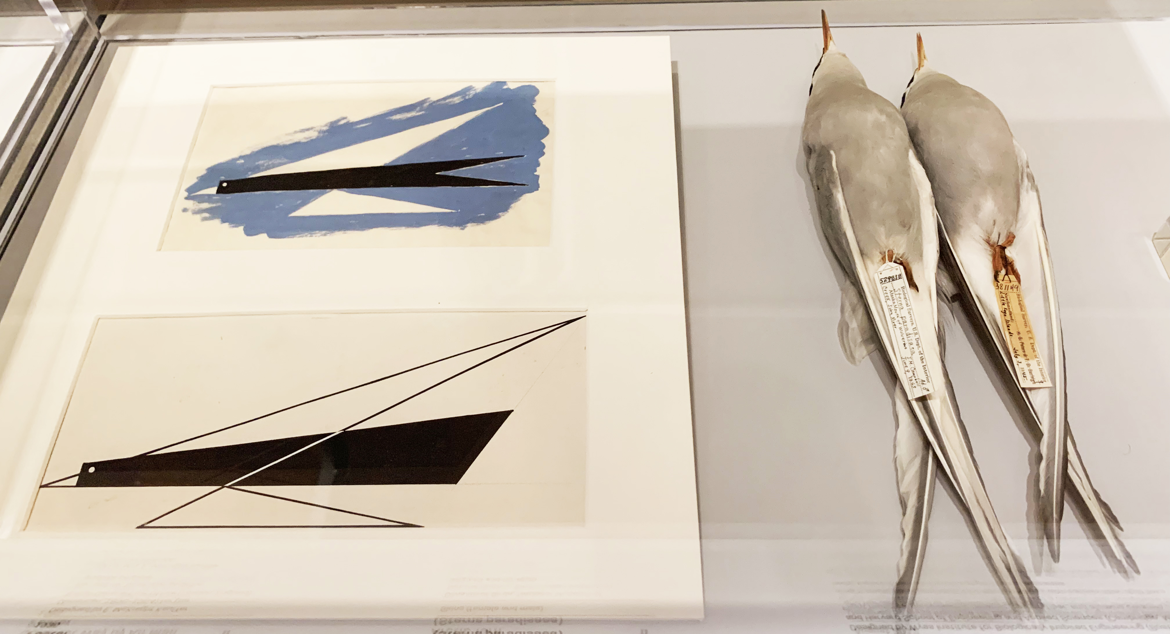
The first-floor permanent exhibition called Rebeca Mendez Selects is pretty unique. As Norman contends we humans are biological animals. We have evolved over millions of years to function well in the environment, to survive. We are analog devices following biological modes of operation. People learn from nature, get inspired by nature. In that exhibition space, many birds specimen are shown by the clear display. From a broad view, the exhibition shows graphic design, fashion design, product design, painting, jewelry design, and those works are all related to the birds’ specimens by imitating its colors and shapes. For example, there is a necklace made by the black feathers, the introduction of it shows, from utilizing real feathers, in the case of Mecky van den Brink’s necklace, to imitating their appearance, as for Tone Vigeland’s hammered-nail necklace, there is no end to the influences of birds on designers. By visiting this museum, people can have a deep understanding of design, not only seeing the beauty of surface but also decoding the visual form because Cooper Hewitt exhibits the process of how to make this design instead of complete results.

Process Lab makes me feel so familiar and moving. It reminds me of the college time being a design student, working all day with materials to find potential usage. The more imaginations designer create, the more ideas will come to their mind. That’s the very beginning of every design project, start with a model, a material and finally make the experiment ideas into real. The Process Lab perfectly shows the process of how to make a design product. It has different colors of papers on the table, the visitors can make their own design style which makes them feel more involved in the design field. Moreover, the video in this lab is also professional. It describes how designers use fabric to develop multiple kinds of textures to make design works.

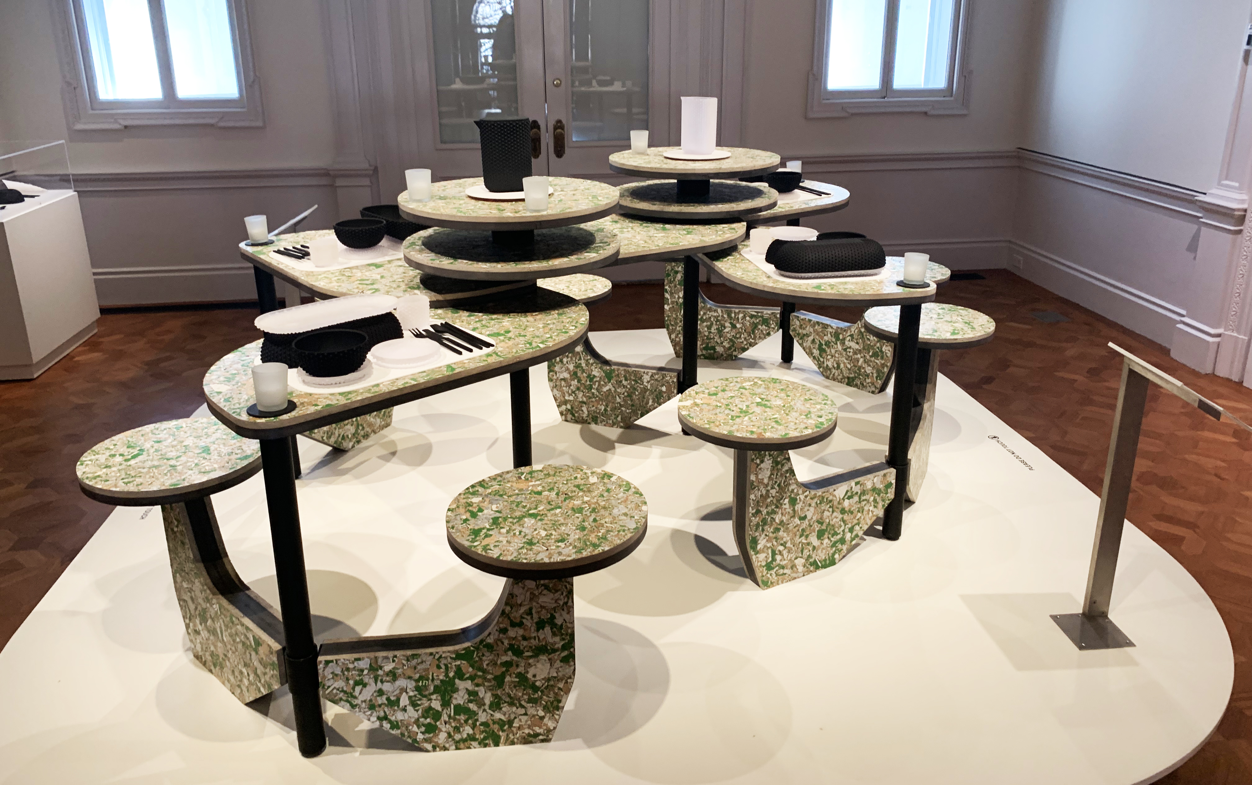
From my perspective, the most treasurable advantage of this museum is that it not only shows the design works but also help people understand design thinking. Another impressive design exhibition is called Table Scapes: Design For Dining. The designer uses rubber material to produce tableware. It has a special texture on the back of the bowl. The colors are very simple, only black and white so that I can’t notice the difference between those products for the first time. By observing the details, I feel very respectful because designers have to think a lot before they make those details. For instance, how to make it more functional, how to improve its beauty. It recalls words said by Paul Rand, the designer of IBM, the design is relationships. In contemporary society, design thinking doesn’t only belong to designers, everyone is equipped with this skill, a way to read and understand the world. To be more specific, the design process can be divided into three basic parts, researching background, finding problems and solutions. Almost all the jobs need researching process before people get into their work. Traditionally, when people talk about design, they think about arts, graphic, beauty. However, the design has become a way to solve multiple problems, including networks and management. In this sense, everything happens has its own value especially the problems.

To sum up, the Cooper Hewitt Museum is unique and professional. It has many masterpieces. Every design exhibition in it with high quality. Also, it makes good use of digital archive in a smart way, to let the visitor bring design works to their home through the internet. I would definitely check the exhibition lists to plan another visit in the future.

    Work Cited

“Cooper Hewitt, Smithsonian Design Museum.” Wikipedia, Wikimedia Foundation, 12 Apr. 2019, en.wikipedia.org/wiki/Cooper_Hewitt,_Smithsonian_Design_Museum.

“The Archive” is not an archive: Acknowledging the Intellectual Contributions of Archival Atudies Michelle Caswell

Norman, D. A. (1998). The Invisible Computer: Why Good Products Can Fail, the Personal Computer is So Complex, and Information Appliances are the Solution. MIT Press. Chapter 7: Being Analog

Observation: The Bronx Museum of the Art’s Useless Machines Exhibition

Recently, I went to the Bronx Museum’s “Useless: Machines for Dreaming, Thinking, and Seeing” exhibition. The exhibition was created to highlight the opposite purpose of machines. Rather than creating machines to produce labor or fulfill a practical duty, the exhibition featured artists all over the world who constructed or depicted useless machines “to praise inutility.” The exhibition was a direct “reaction to the materialistic values promoted by capitalist society.” The artists created a collection of machines to stir dreams, feelings, critical thinking, and ironies. I thought this exhibition was interesting because of its purpose to create something useless and meaningless out of machinery. In class, we talked a lot about machine learning, artificial intelligence and how we currently live in a machine culture. And according to Sengers, machines are embedded into every aspect of our lives:

“We are no longer…simply supplied by machines; we live in and through them. From our workplaces to our errands about town to our leisure time at home, human experience is to an unprecedented extent the experience of being interfaced with the machine, of imbibing its logic, of being surrounded by it and seeking it out…” (Sengers, 2000, p.5).

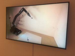
Fernando Sanchez Castillo, Method on the Discourse, 2011, video screen shot

I thought that the exhibits at the museum highlighted what Sengers explained as the “shortcomings in technology.” The collection was a mixture of video, digital photographs, interactive sculptures and robotic machines behaving in curious ways. One exhibit by an artist named Fernando Sanchez Castillo displayed a video (pictured above) of a military robot that was originally designed to disarm explosives creating a painting in a slow, sarcastic manner. It was interesting how the artist inverted the function of the military robot by turning it into an artistic device. Technology is what we create it to be and as we rely on technology and machines to carry out dangerous or important tasks for us, the magnitude of its presence is felt even more when machines fail to (or are reprogrammed) complete the tasks we program it to do or they become useless. Transforming a machine so crucial as a bomb deactivating robot into a mere painting device changed the value of it as it was stripped of its former programmed task. This showed how machines can be used and recreated for other things than what it is originally meant for.

Unlike the artists, computer scientists are trained to identify these shortcomings and make solutions to those problems (Sengers, 2000, p.5). However, they are also blinded-sided by their myopic focus on improving machinery and not on the cultural context the machine is being made in (Sengers 2000). Thus, there can be unintended consequences of designing or creating a machine without discussing the need for it, the context it is being made in, and how it can be used in other ways if placed in a different environment.

I went to this particular exhibition with the intention to observe how visitors interact with the pieces within the space/ environment of the museum. But when I got to the museum, I found that visitors were not allowed to touch any of the art displays even though some of it incorporated interactive features for people to try out. I wanted to see if people were more inclined to go to the interactive exhibits which included displays of machines, video and robotic devices rather than the “non-hardware”/non-machinic ones such as photographs or drawings. Unsurprisingly, I found that people were more drawn towards the machine and robot displays. This brought to mind Norman’s Being Analog chapter, in which he explained why humans are inherently analog beings while technology and machines are created to be digital (2008).

According to Norman, “the world is not neat and tidy.” The world is naturally analog but with the advancement of technology and machines, people are forced to fit the world into digital models. Computers are logical and strict. Humans are unreliable and dramatic beings who are susceptible to making errors even if they are forced to behave in a machine-like way. Norman has described a world where technology destroys the mercurial essence of humans, but does not take into an account a world where both technology and humans are seamlessly integrated. Technology is no longer a separate entity of our world. AI and robots are becoming more human-like while humans are using advanced technology to enhance physical bodies and improve their health. In addition, AR devices are being created to integrate the real and the digital.

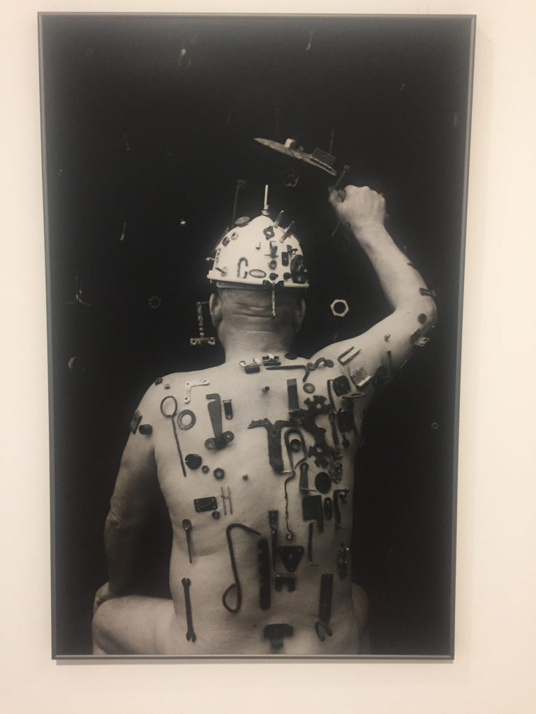
Algis Griškevičius, Toned photograph

We are constantly interacting with machines and technology that someday maybe we will become as one–a concept that artist Algis Griškevičius depicted in his photographs at the museum. The photograph showed a nude man with numerous tools stuck and screwed into his body as if he was a living magnet or a hybrid. Within the scope of the exhibition’s theme of depicting useless machines, I found this photograph very telling of the future we may live in. The tools on the man’s body seemed useless, placed in a illogical or unhelpful way. It’s there because it can be; they are tools without purpose. Soon, perhaps we will live in a future world where technology is not only all around us, but just another extension of our bodies.

The exhibition’s concept of “praising inutility” reminded me of how technology cannot be studied separate from its cultural context in which it is made in. Even though the exhibition wanted to depict the uselessness of technology and machines, I realized by doing just that they created meaning out of the displays by making it art. Thus, the machines and collection of pieces were useful in an artistic setting of a museum but they, of course, will not be useful in a non-artistic setting.

References:

Sengers, Phoebe. “Practices for a machine culture: A case study of integrating cultural theory and artificial intelligence”. Surfaces, vol. 1,  2000, p. 2-58. www.pum.umontreal.ca/revues/surfaces

Norman, Don. “Being Analog”. The Invisible Computer, 2008. https://jnd.org/being_analog/

Observations of a User Experience MeetUp: UX For Change NY & The Immigrant Advocate Network

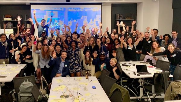
Group photo at the end of an energizing UX design hackathon.

On Monday, April 8, 2019 from 6 to 9 PM about 70 participants attended a workshop aimed to redesign how immigrants and advocates connect on immigrationlawhelp.org. The workshop was organized on MeetUp by the New York Chapter of UX for Change and was hosted by Convene (101 Greenwich St.). Additionally, members from The Six, an innovation and strategy consultancy, were present as well as team members from the client organization, The Immigrant Advocate Network.

According to the event invite, “One of their primary platforms, Immigration Law Help (www.immigrationlawhelp.org), strives to connect individuals with legal resources and advocates based on specific parameters such as detention centers served, type of immigration legal services, zip code, etc. While ImmigrationLawHelp.Org maintains the only national directory of its kind, there are opportunities to improve the current user experience and functionality. The vision is to provide a marketplace to connect users with legal providers leveraging dynamic content based on user-specific parameters.”

My intentions for attending the event was to learn more about how UX hackathon-type events are run and to observe the following:

  1. Structure of the event – Background, agenda, facilitators, participants, space, etc.
  2. Background research – Who did the research for requirements? What methods were used? How will designs be tested to ensure success with defined audience? Generally, how participatory was the target demographic engaged to gather requirements for improvements?
  3. How were teams divided and what tools were employed for the process?
  4. How were ideas/proposals generated within the group(s)?
  5. How were ideas presented?
  6. What was the level of success of the event and by what measure?

Upon arrival to the event, I was impressed how nice the space was and how many people were already there. Many attendees were talking and there was food and drinks so the atmosphere was very lively. The work tables had Post-Its, Sharpies, and stickers for each seat and a large projector screen displayed a PowerPoint presentation while portable whiteboards were scattered around the perimeter. There were some materials about current immigration issues posted in a couple places as a means, I assume, to generate empathy for the target users of the site we would be analyzing.

Our host, Kandis O’Brien, who co-organized the event spoke a bit about the mission of UX for Change, which “connects non-profit organizations with the UX community to raise awareness of how the discipline of User Experience Design can contribute to the goals of any organization.” Then she introduced a representative from the Immigrant Advocates Network (IAN) to speak a bit about their mission, products, and services, and to introduce the website for which there were seeking design help. Rodrigo Camarena, the Director of IAN, described how individuals who classify as DACA, people under temporary protective status, and asylum seekers are currently threatened by our current political climate and how IAN is a non-profit, legal, tech organization that seeks to connect their network of over 8,000 national members with immigrants who need legal and other types of help.

The website, immigrationlawhelp.org was created in 2011 and is not responsive, does not fully support all languages, does not meet accessibility standards, and is text heavy. IAN are pursuing a re-design that helps to increase empowerment and engagement among the immigrant site visitors and families who have a variety of languages and backgrounds. Rodrigo mentioned that, based on site analytics, it is mostly visited during business hours—with peaks during times of crisis, which signals that legal and non-legal advocates may be the primary users of the site.

After the introductions, each table of participants operated as a group and we began with created Lean Personas based on the information we received from the client. From that, we created “How Might We” Post-Its to try to narrow in on the key problem our group should aim to solve through design. Then we used the whiteboards to create a User Journey that might address the problem based on our Persona and HMW’s.

After the team work, we individually began a “Crazy 8’s” sketch session to ideate eight ideas for the translation of the User Journey into an interface. With that exercise complete, we each chose one of our ideas to then extend into three interfaces as a more developed feature. In our groups once more, we all voted with our stickers to decide which solution (or combination of interfaces) we would present as a group. We loaded images of our solutions into a Google Slide document and each group presented on their thought process and outcomes.

I was surprised at how similar each group’s solutions were given that we all had different personas (i.e. ‘immigrant’, ‘family member of immigrant’, ‘service organization’, or ‘legal advocate’). The client team members expressed gratitude for the help and seemed genuinely interested in the solutions that were presented. The organization was open to continuing the conversation after the event if anyone was interested in volunteering.

From a UX student perspective, I was encouraged that all of the activities we completed were mentioned (in some form) of Jentery Sayers’ “Before You Make a Thing” including: personas, user stories/journeys, wireframes, and paper prototypes. And the mission of IAN seems in line with the point about “resisting oppression” through engaging directly with the power of technology and to examine the “default settings” and for whom and by whom technologies were built.

Personally, I was impressed not just with how organized the entire event was, but also how diverse the UX participants were, which is encouraging in terms of how important participatory models for design should be in the field, as discussed in Sasha Costanza-Chock’s “Design Justice: towards an intersectional feminist framework for design theory and practice.” Having groups that are vested in helping non-profit organizations who have limited budgets while also helping students and other new to the UX field get experience and connect for future volunteer opportunities is a mutually beneficial situation and I’m glad for the experience.


References

Costanza-Chock, Sasha. (2018). “Design Justice: Towards an Intersectional Feminist Framework for Design Theory and Practice.” Proceedings of the Design Research Society 2018. https://ssrn.com/abstract=3189696.

Sayers, Jentery. (2018). “Before You Make a Thing: Some Tips for Approaching Technology and Society.” Retrieved from https://jentery.github.io/ts200v2/notes.html.

Field Report: The Whitney Museum of Modern Art

On Friday, April 12th, I attended the Whitney Museum of Modern Art. The Whitney is an eight-floor contemporary art museum located in Manhattan, NY. Their focus is on presenting the full range of twentieth-century and contemporary art with emphasis on living artists. Aside from the exhibitions inside the museum, the building is beautifully designed. It is also located between the highline and the Hudson River. There is a view of the city or the river from any window or terrace. For the purpose of my observation, I was particularly interested on two artworks located on the sixth floor. These artworks seemed to be a combination of technology and art. 

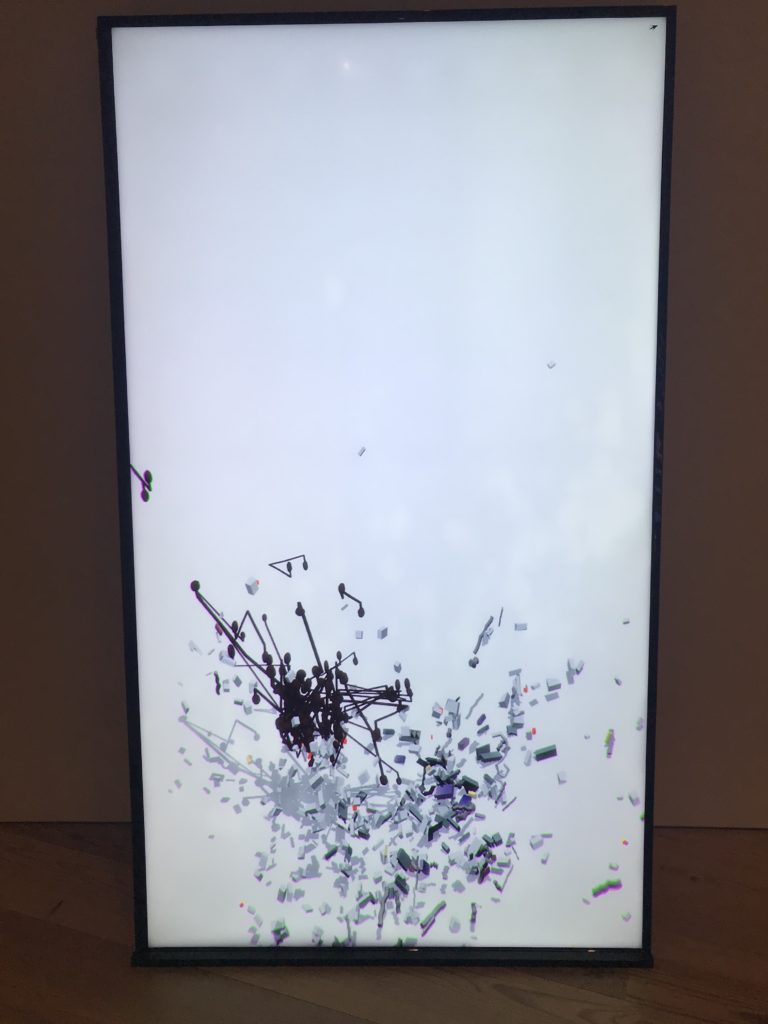
Figure 1: “Baby feat. Kiera” by Ian Cheng

The first piece that I was found interesting was “Baby feat. Kiera” by Ian Cheng (See Fig. 1). In this piece, Cheng’s software enables audible conversation between three online chatbots whose voices then animate a swirl of debris. It does so by using Wi-Fi to query three different customize chatbots from different services to create the impression that they are “talking” to each other. The debris on the screen repeatedly coalesced and disintegrated, exhibits strange patterns on the screen. The chatbots are programmed to be “intelligent,” with basic learning abilities such as expanding their dialogue. However, because this piece queried responses from three different chatbots, the conversation was not cohesive. Instead, it was simply a series of words or sentences that did not have any particular flow. It was interesting to listen to some of thing that were said by these bots because sentences were incredibly complex.

In the article Fundamental Forms of Information, Marcia J. Bates provides a definition of information as being “all the patterns of organization of matter and energy,” which I thought was perfect for this piece due to the eccentric pattern of the debris as well as the incoherent conversation between the chatbots. This piece also prompted me to think of Don Norman and his idea of the human versus computers. In his essay, Being Analog, he says that “human languages still defies complete scientific understanding,” which I feel can be both supported and opposed by this piece. The chatbots in “Baby feat. Kiera” are programmed to be able respond to humans, learn from their responses, and expand their dialogue because of these responses. I feel that being able to learn from conversation is a humanistic element of conversation, which is emulated here. Moreover, the conversation that they are having is incoherent, representing a very non-human conversation. The visuals along with the audio represent artificial intelligence that is lifelike but also mechanistic, so I feel that the argument could go either way. 

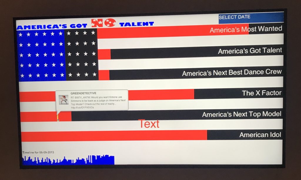
Figure 2: “America’s Go No Talent” by Jonah Brucker-Cohen & Katherine Moriwaki

Another piece that I enjoyed was “America’s Got No Talent” by Jonah Brucker-Cohen and Katherine Moriwaki (See Fig. 2). This piece is a data visualization of Twitter feeds related to reality television shows such as American Idol, America’s got Talent, and America’s Best Dance Crew over a few years. The piece displays tweets that were sent and how much bias was gathered for each program based on retweets. By using horizontal bars in the shape of an American Flag, the visualization measures the success of TV shows linked to their social media presence. The artists for this piece successful connect the internet and the TV while clearly demonstrating the effect of a social media presence. 

I feel that this piece was relevant to our conversation on big data and algorithmic culture. I am not entirely sure of the method or tools that were used to make this visualization, but I know that it needs a complex sequence of computational analyses. The tweets that are used in this piece could be defined as “big data” due to the fact that it was a such a large volume of data that was growing exponentially in a short amount of time (“What is Big Data and Why it matters). 

There were several other pieces that incorporated technology as well but I choice to focus on “Baby feat. Kiera” and “America’s Got No Talent” because I found them most interesting. They were also the pieces that I spent the most time interacting with. I spent most of my observation simply observing and trying to understand the different patterns and conversations that were taking place in “Baby feat. Kiera.” I noticed that other museum attendees did not spend nearly as much time as I did with these pieces. Instead, it seems like attendees on this floor weren’t as interested in these pieces as they were pieces on other floors.

References:

Bates, M. J. (2006). Fundamental forms of information. Journal of the American Society for Information Science and Technology,57(8), 1033-1045. doi:10.1002/asi.20369

Norman, D. (2008, November 07). Being Analog. Retrieved April 16, 2019, from https://jnd.org/being_analog/

What is Big Data and why it matters. (n.d.). Retrieved April 16, 2019, from https://www.sas.com/en_us/insights/big-data/what-is-big-data.html

The Optimistic Road Ahead

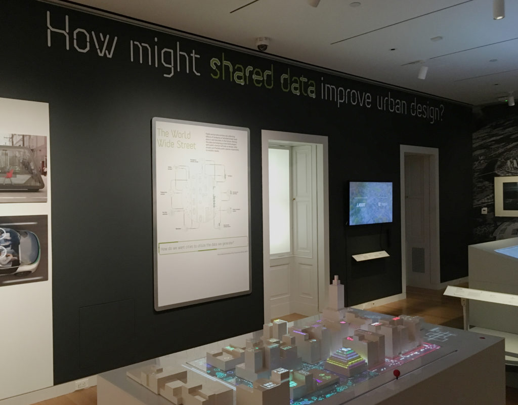
One section of The Road Ahead, with Cityscope (2018) in foreground

From December 14, 2018 to March 31, 2019, The Road Ahead: Reimagining Mobility at the Cooper Hewitt, Smithsonian Design Museum presented forty design projects, ranging from interactive platforms to urban design. Noting that “We are at an Inflection point”, the introductory text on the wall proposed that “the works presented here are meant to be catalysts for conversations about how we might live in the future” The attempt to start these conversations was framed by six questions that ran across the top of the exhibits including, most intriguingly for me, “How might shared data improve urban design?”

Having briefly visited the exhibit previously, I went in with a couple of questions at the ready myself (some of which I will combine to frame the comments below). The general goals were to observe both the exhibit itself and specific projects as environment and methods for gathering and presenting data.

In an attempt to observe a larger and broader population, I went on a pay-what-you-wish evening (and the second-to-last day of the exhibit), arriving early to review all exhibits and then stepping back to observe more of how they were experienced.

How did the exhibition itself collect and display data? How did an exhibit about mobility move visitors?

The visitor’s introduction to the data collection aspect of the exhibit actually started on the ground floor, with a display that asked “How was your commute to the museum?” The question was to be answered — and those answers collectively visualized — through the use of foam balls (Green = “Good”; Red = “Not too good”). This was the only interactive exhibit-specific wall graphic, but it did engage and prepare the visitor for the interactive world of touch screens and post-its in the projects two floors above.

However, this clever prelude was then undercut in the exhibit itself by framed infographics that seemed out of context or less effective than the projects exhibited. Some were predictive (Three Futures of Urban Transportation); some diagrammatic (Contested Curbs). Some were explanatory (How We Move); some illustrative (Letting go of the wheel). Collectively, they could have helped navigate a visitor through the exhibit, but instead they felt like projects of their own, ones that did not always rise to the level of the work with which they shared the space. Instead of directing traffic, they added to it, a congestion made all the more troublesome by the exhibit’s confusing start.

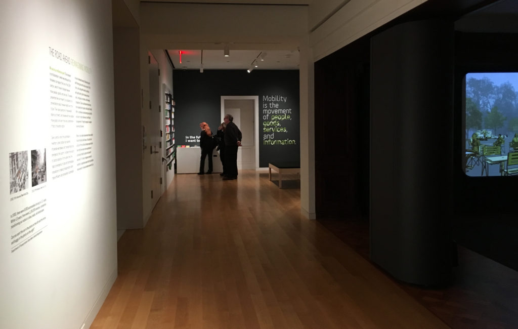
Upon arrival, and after reading the introductory text, viewers were presumably expected to move toward the opening section of the exhibit, which invites one to listen to experts and offer one’s own thoughts before diving into the projects on display. Instead, I watched visitor after visitor turn right to investigate a sound installation designed specifically for Cooper Hewitt called Sounds of the Future City (2018), which enticed them with bells, whistles and video projections, before depositing many of them out the other side — into the middle of the exhibit. This was a particularly unfortunate detour for an exhibit that states, just twenty feet from this misdirection: “Mobility is the movement of people, goods, services, and information.”

How did individual projects utilize data to tell a story? In an exhibit that aims to start conversations — that explores ‘convergence of data and technological innovations’  — to what degree do these presentations speak to and engage the visitor?

Here we come to the heart of the observation. These questions naturally overlapped in various projects and so will be addressed collectively here. Within such a dense and at times overwhelming show, the comments below will focus only on some of the projects that were most data-focused, sorting those into three areas I noted, with overlaps existing across them.

Data as Tool

As an awareness of the role of data becomes more prevalent in society, its visualization becomes an object of wonder, with the intermediary steps of the process presenting their own sense of “Look what they can do!”

The short video City Data Analytics: Modes of Travel and Commuter Walking Times (Zaha Hadid Architects, Habidatum, 2017) from the Walkable London Exhibit showed a clear visualization of data relevant to pedestrian and other metropolitan traffic. It proved a point, established patterns, but did not offer a specific ‘solution.’

The same might be said of City Scanner (MIT Senseable City Lab, 2018), a congregation of six sensors that sits atop the cab of a municipal garbage truck, gathering six kinds of data that are then visualized to show patterns and occurrences. The “think of what we could do with this” mentality was evident in the last line of its description: “City Scanner could be used to help inform decisions about public health, security, and overall better services for citizens.” Could be.

What differentiated the Los Angeles Mobility Data Specification (LADOT/ITA, 2018), however, was that this video actually spoke to how this ‘neat tool’ of data, in the form of a common vocabulary and standard, shared in real time as a software platform, could be used to efficiently manage issues of changing street capacity and public safety. This was a tool in use.

Data as Assurance

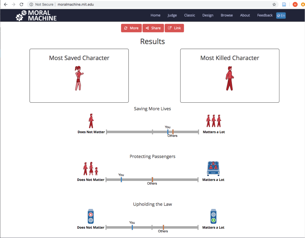
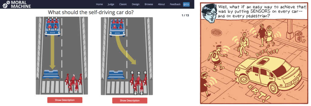
If the exhibit had a project that seemed the most fascinating to the audience the evening I visited, it was The Moral Machine (2016), an online tool created by the Scalable Cooperation Group at the MIT Media Lab to gather data related to human decisions as to which lives should be saved by a driverless car in various scenarios; a decision that was often made by one of a pair of visitors that commentated on each others’ judgments and processes:
“This is so funny… They die….”
“That was you. That was everyone else.”
“I don’t want to kill a cat…”
“This one you shouldn’t have to think about. Just kill the dog!”
And the almost unsettling: “I love judging…”

‘Assurance’ may not seem quite the right word for an interface that presents one with moral decisions, but at the heart of the project is the assurance that we are speaking with, and gathering data from, people ‘just like you’ as we make decisions about these autonomous vehicles.

Some issues arise at the end, when the machine evaluates your decisions and states whether or not a characteristic such as gender “matters a lot” in your decisions, when it cannot truly know, based on the limited data set. (It is worth noting that the original online version does offer more disclaimers, as well as a follow-up questionnaire asking one to explain their reasoning.)

The complement to all this judging was the Sensor Visualization video (Waymo, Google Creative Labs, Framestore, 2018), a very effective presentation that explains and visualizes how Waymo’s self-driving cars ‘see’ objects, pedestrians, lights and other factors to make one’s riding experience stress- and accident-free. Safe, clean projections of paths and labels for speed and distance from the car assure the viewer that Waymo has the data and as such has everything under control. It offers an assurance that there is measurement going on behind the scenes.

Data as Play

While the Moral Machine can feel like a particularly challenging game of Would You Rather?, Cityscope (City Science Group, MIT Media Lab, 2018) was Lite-Brite with building blocks, inviting viewers to redistribute structures on a street grid to visualize two possibilities of traffic density (shared vs owned driverless cars) on city streets. It was fun to move the structures around and note the changes, but it must be noted that despite its promise, and obvious ability to draw interest, Cityscope appeared to fail in communicating its intended message. This was one of those cases where the label for the project was behind the viewer. So everyone wants to play with it, but few understand it. This was exacerbated by the unfortunate choice of red (owned) and green (shared), which already tilts one toward preferring the latter, with the red definitely feeling like an indicator of intensity. All of this could be summed up in an exchange I witnessed at the table:
“Do you think red means…?”
“It’s congestion. Or something….”

Part of the ‘vehicle inspiration wall’

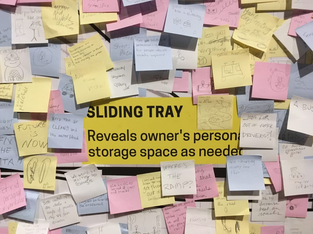
In contrast, The Future of Automobility (2014, 2017) from IDEO brought Design Thinking into the exhibit as a means of presumed research. This project invited visitors to contribute their ideas via Post-Its to a ‘vehicle inspiration wall.’ A kind of ‘free work,’ it excited the spirit of play and brainstorming in many visitors, who drew pictures and layered Post-It upon Post-It (ignoring the walls precisely drawn grid) with ideas fanciful and serious (e.g. ziplines; BAN ALL CARS).

So while acting as a tool and providing assurance, our interaction with data (whether in collection or review) can also be fun, which is a great way to engage visitors who might not otherwise consider these issues.

A Contrast

Of course, whether functioning as a tool, an assurance or a game, all of these projects were Good.

That is to say: collectively, The Road Ahead was largely about the solutions — or rather the possible solutions. It presented the problems of the world as mountains to be climbed through data and design and asked “How might we…?” In the terminology of Dan Geer shared in Terms of Service, the show’s “Tomorrow Questions” (Keller & Neufeld 8) are what-ifs of potential; “What will I gain?” Not “What will I lose?”

But, what if one combined the Moral Machine and Waymo, identifying certain members of society — those who ‘matter less’ — as it makes decisions?

The introductory text to the exhibit states “no one really knows where these mobility transformations will take us…” This is true. Before making a thing, Jentry Sayers asks us to envision “two dramatically different scenarios: one where the results are ostensibly positive, and one where the results are ostensibly negative.” (Sayers) This exhibit is only the first half of that equation. And if Cathy O’Neil, in defining ‘Weapons of Math Destruction’ speaks to the “authority of the inscrutable” which attempts to obfuscate and force acceptance (O’Neil), an environment such as The Road Ahead works through design and interactivity to make it more visible, providing, perhaps, an authority of the genuine.

It’s difficult not to look at an exhibit such as this and see in all these streets and cars the drawings from Terms of Service of car trackers and insurance premiums, pedestrian sensors and the internet of things — the connecting of dots from or by even the most (seemingly) innocuous, or even beneficial of sources to troubling ends. (Keller & Neufeld 13, 15, 23)

Yet in a world where suspicions of those connections are easier and easier to raise, The Road Ahead suggested a smoother ride than much of what we have been reading recently; an optimism and a welcome contrast to the data harms and big data that we know are the underbelly or other side of much of this technology. It offered assurances, tools, and a little bit of the play that makes any future seem a little more creative, and a little more promising.

– Michael Kelly, Info 601, Professor Chris Alen Sula

References:
–  Keller, Michael & Josh Neufeld. (2015). “Terms of service: understanding our role in the world of big data.” Al Jazeera America. http://projects.aljazeera.com/2014/terms-of-service/#1.
– O’Neil, Cathy (2015). “Weapons of math destruction,” Personal Democracy Forum 2015. https://www.youtube.com/watch?v=gdCJYsKlX_Y.
– Sayers, Jentry (2018). “Before You Make a Thing: Some Tips for Approaching Technology and Society.” https://jentery.github.io/ts200v2/notes.html  

Field Report – Exploring the Morris Museum

For my observation, I decided to go to the Morris Museum in Morristown, New Jersey to observe their current exhibit titled “Pen to Paper: Investigating Famous, Historical Letters.” When I saw this current exhibit online, I figured this would be the perfect exhibit to talk about the preservation of these letters and what this exhibit tried to tell the world about the famous people who wrote them. With that goal in mind, I went to the Morris Museum to view the exhibit. However once I arrived I realized that the museum also had a “traveling exhibit” about music boxes from the Guinness collection, which I found far more interesting.

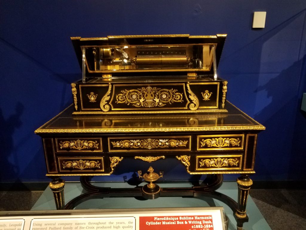
One of my favorite pieces from this collection was the Plerodiénique Sublime Harmonie Cylinder Music Box and Writing Desk (pictured below).

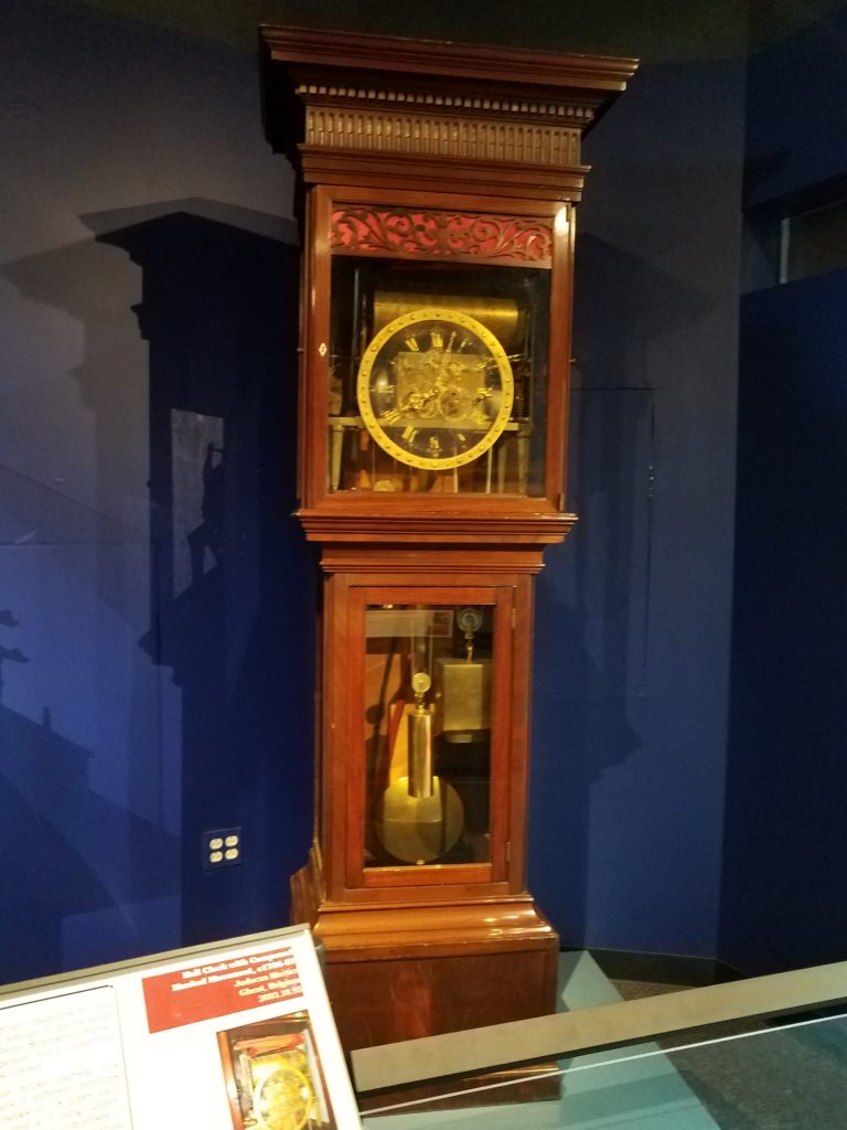
Another one of my favorite pieces was the Hall Clock with Compound Music Movement.

What interested me about this part of the exhibit is that they showed a lot of artifacts that had dual purposes, such as the music box that is also a desk and the clock that is also a music box. It was interesting to see that these items were created to have more than one function.

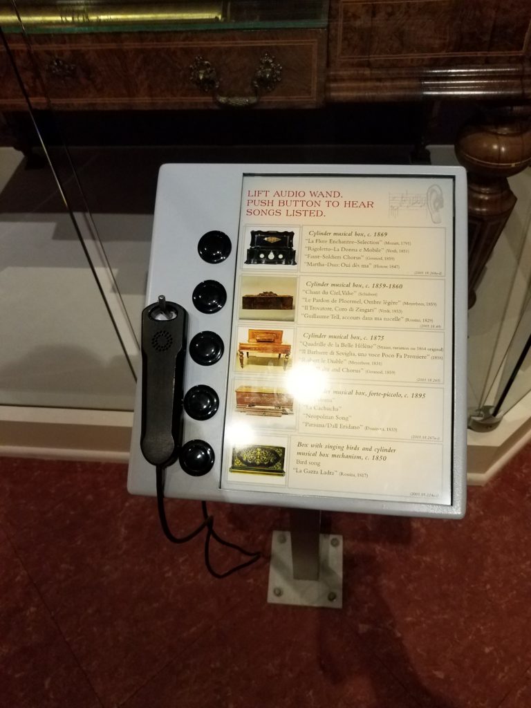
Another aspect that I enjoyed about this exhibit was that it encouraged the viewer to interact with the collection. There were display stands that had a hearing device and buttons that the viewer could press to hear what music from the presented time would sound like.

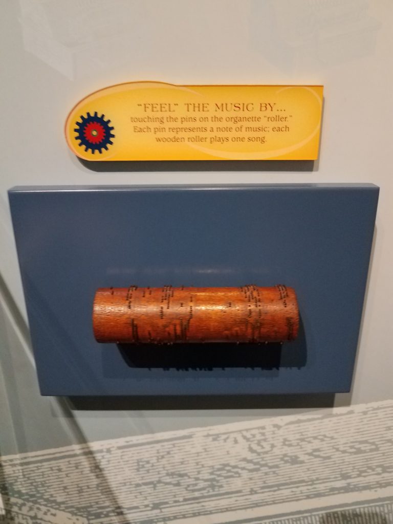
There was a wooden roller set out with pins. This was how songs used to be played during the time that these music boxes were created. It is was explained that each pin represented a note and each roller represented a song.

There was even a game that could be played at the end of the exhibit. For this game, you would put your hand on a speaker and try to feel the different vibrations that the different sounds made.

One of the reasons why I enjoyed this part of the museum so much was that it showed a time where technology was much different than it is now. These music boxes are major technological advancements when they were first created in the 1700’s-1800’s, even though in current society music boxes may not be considered a technology to a general viewer.

While touring the museum, I was surprised how small all the other exhibits were compared to the Guinness collection. I think this showed the emphasis that the museum wanted to place on this collection. I believe this is also the reason why I was much more fascinated with the Guinness collection over the other exhibits.  But even though the other collections were smaller, it seemed that the museum still made a conscious effort to show the comparison of older technology to newer technology.

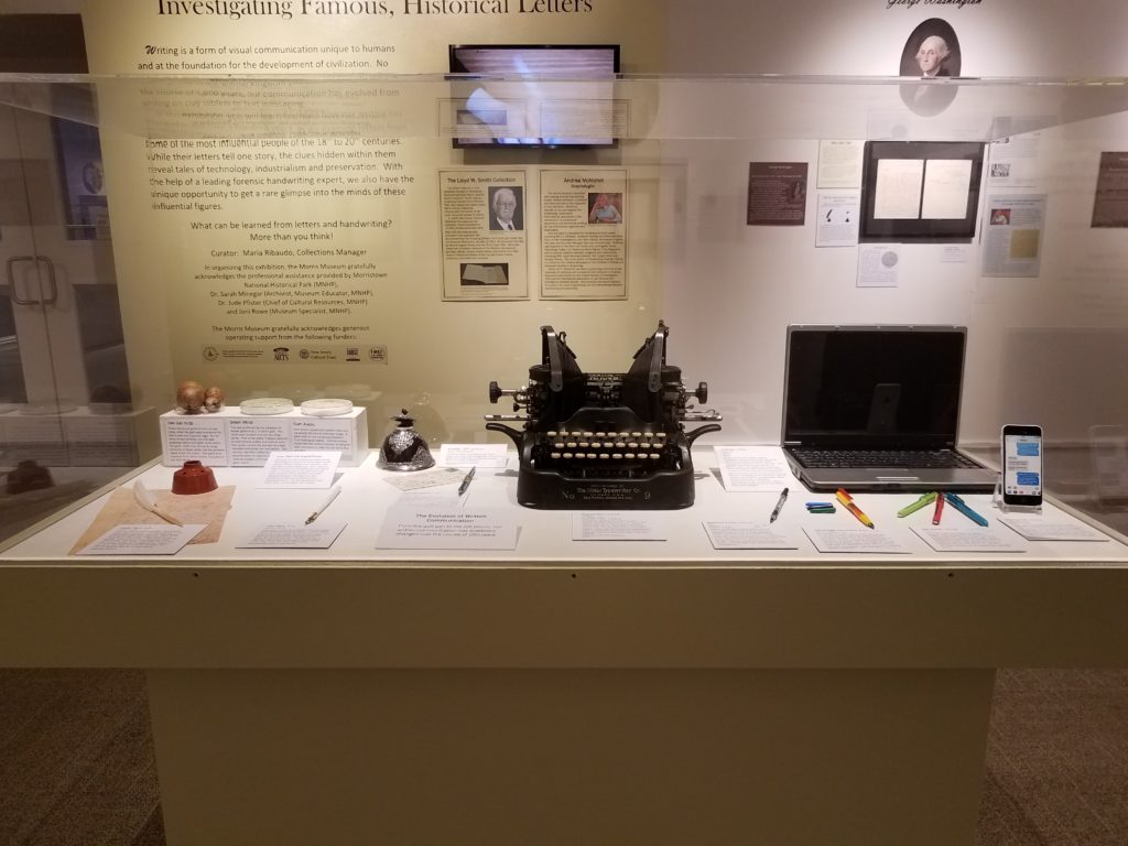
In the picture below, you see that the museum showed how writing has changed throughout time in their Paper to Pen collection. When I was reading Jentery Sayers article on technology throughout time, I couldn’t help but think about the collections that I saw at the Morris Museum. Originally I thought about the music boxes and how they could be considered “technology instrumentalism”m which means that they were a neutral technology. But then I realized that the Pen to Paper collection could be an example of “technology determinism” which is technology used for social progress. As Sayer mentioned most of these pieces from these two collections would be considered “symbols of progress, modernity, efficiency, and mastery over nature” (Sayers).

In this picture it shows elements that could have been used to make different colors of ink that would be used to write or draw, it shows a few ink wells, different types of quills and calligraphy pens, a typewriter, laptop, and cellphone.  As the picture implies, these all became means of communicating. Just in this one picture, we can see the progress and change of technology throughout time.

What I found most interesting about this exhibit was its incorporation of current technology into the collection itself. It almost felt like the current technology used for this collection overshadowed the idea of the collection which was looking at old letters from famous people in history. I say this because in the room, just below one of the displays, there were two pairs of headphones and IPads that were showing a short film. Then on the wall, there was a television that told about the making of quill pens and how society portrays old quill pens wrong in movies since most of the time the hair of the feather is cut off to make it easier to hold. It just seemed like the focus was mostly on the current technology since the letters left a lot of white space on the wall, while the television area took up a lot more space and the museum had changed the color of the wall to draw attention to it (which you can see in the picture with the display of past/current technologies that is above). Also, the short film and the television were both a form of white noise in the room, which grabbed my attention and probably the attention of a general viewer, which took my attention away from the famous letters.

In the end, it was nice to see the different exhibits that the Morris Museum had on display. It was interesting to see their way of incorporating technology into their exhibits as a way to attract the audience to engage with their collections. Because of my experience with museums and my interest in continuing to work in a museum, it was interesting and educational to see how other museums use technology. 

References:
Sayers, Jentry. (2016). “Technology” in Keywords for American Cultural Studies,” ed. Bruce Burgett & Glenn Hendler. NYU Press. http://keywords.nyupress.org/american-cultural-studies/essay/technology.

Morris Museum. Morris Museum. morrismuseum.org/.

Observing Human Information-Seeking Behavior at Roosevelt Island.

On April 13th, Saturday, ‘The Cherry-Blossom Festival’ was held at the Four Freedom Park at Roosevelt Island. The festival was organised to celebrate Roosevelt Island’s blooming cherry blossom trees and was also featuring traditional and modern Japanese performances and Cultural Fair.
The festival was free, and registration for the event was voluntary and was only there for organizers to estimate the number of people attending .

It was encouraged to take public transportation for the event as there is limited parking space available at Roosevelt Island. The modes of transport in and out of the island available were – subway, tram, ferry, bus and car.

The first sign of trouble which was visible while arriving to the island was that the waiting time to take the tram was no less than 2 hours. But at least the Subway and the Bus traffic was moving smoothly. Even after arriving the Island via the Subway, people were greeted with an extremely crowded subway station. But at this point all everybody desired was to escape the subway station and rush towards the necklace of cherry blossom trees present at the island.

While at the island, people enjoyed the beautiful displays and performances. The problems began when people started heading back home. The island had drawn such a crowd that all the modes of transport were jammed. The line to the subway station grew so long that the end of it was not visible. The bridge, tram, Subway, NYC Ferry, and bus service all experienced crowding and delays. The crowding got even severe after 1:45, when the NYPD briefly asked MTA to bypass the Roosevelt Island stop so that paralyzed F trains could move again.

This was the point where there was a sudden switch in the behavioral pattern of the attendees. It went from ‘relaxed, enjoying the beauty of spring’ to ‘Need to find means to get off the island at once’.
The surge of urgency and frustration seemed contagious. The people started gathering information to select the best possible mode to get off the Island.

The characteristics that were witnessed in their behavior were closely related to the characteristics stated by Ellis in ‘ Wilson, “Human information behavior”’
which are:

Starting: the means employed by the user to begin seeking information, for example, asking some knowledgeable colleague.
Chaining: following footnotes and citations in known material or “forward” chaining from known items through citation indexes.
Browsing: “semi-directed or semi-structured searching;”
Differentiating: using known differences in information sources as a way of filtering the amount of information obtained.
Monitoring: keeping up-to-date or current awareness searching.
Extracting: selectively identifying relevant material in an information source.
Verifying: checking the accuracy of information.
Ending: which may be defined as “tying up loose ends” through a final search.

It started with people asking MTA staff or visible event organizers the best means (of transport) which might take the least possible time. When no substantial answer was given to them they started chaining which in this case might just be following directions given to them by fellow attendees of the festival, who might’ve been trying to leave since an hour earlier, thus, having more experience in that current scenario.

Then they started browsing the different options available for getting off the island. Differentiating them by an estimate of time it might take if they opt for each of the available options, or in what direction of the city it would take them. They kept monitoring the progress of the lines, whether they were moving, or the amount of people present in the lines for the Subway or the Bus.

People then extracted the data which seemed relevant to them, making decision, for example selecting to travel by bus, because the line seems the shortest and they would definitely get a seat when the bus arrives. But still kept verifying the time when the bus would arrive by messaging the number present with the details of the bus, which informed them of the estimate time of arrival and current distance of the bus from the stop.
But in the end they still kept a track of whether the subway line was moving faster, so they could switch the mode they selected according to their observations.

The search for any sort of information begins with the need to solve the problems being experienced by the users. During the festival, the attendees faced a problem and looked for methods in which they could solve the problem. Even though everyone unknowingly followed the simple basic method of narrowing down to their preferred mode of transport, the ultimate decisions taken and the reasoning behind those decisions were all distinct. The process incorporated a series of encounters with information within the space rather than a single incident from which a decision was made.

References:

  1. Wilson, “Human information behavior”. – Ellis, D. (1987). The derivation of a behavioural model for information retrieval system design. Information Studies. Sheffield, University of Sheffield.
    http://inform.nu/Articles/Vol3/v3n2p49-56.pdf
  2. Kuhlthau, Carol C.”Inside the search process: Information seeking from the user’s perspective” “Journal of the American Society for Information Science’ 
    https://ils.unc.edu/courses/2014_fall/inls151_003/Readings/Kuhlthau_Inside_Search_Process_1991.pdf
  3. https://www.fdrfourfreedomspark.org/public-programs-events/2019/4/13/roosevelt-island-cherry-blossom-festival

Practical Learning and Identity in an International Context

A field report by Peter K. Defenderfer

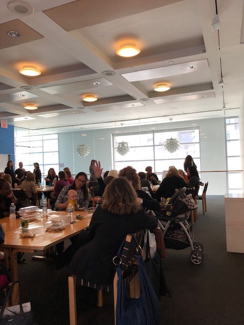
I attended a few panels at the Early Child Development Symposium at Scandinavia House, where I already work, held in conjunction with Sarah Lawrence college. The event’s full title is actually quite long, and includes a clause at the end about expanding the Nordic-American dialogue on early education. So, in the foundation’s terms this was not a “rental” event for them, but the panels were not exclusively reflective of issues centered in the Nordic countries either. One speaker with many perspectives was from northern Italy, another Danish and Turkish, and some American. It was general in international connections, about migrants, identity, pyschology and their negotiating in practical and positive teaching. 

I gathered a lean in almost all the panels (roughly three or four total, in full or in part) toward practical learning, that is deconstructing essentially xenophobic biases, and toward inclusive and possibly origin-revamped image maintenance. Early in an anthropology class, where I was my first semester of college, you might quickly learn the terms (and difference between) ‘cosmogony’ and ‘cosmology.’ When studying a culture as we could parallel in any classroom setting a cosmogony or origin story would seem constant and important. Just as say the Aborigines traditionally represented almost all abstract facets of their life through a concept called the Dreaming, which they represent in art, it might seem unfair that other cultures are grazed with narratives that are not as vibrant or affirming. The presentation of origin stories and heartened images in multicultural settings via somewhat autonomous and probably always equivocating teachers seems to be acknowledged as a point of constant debate. 

And somewhat collusive with diffusing threadbare and inconsistent narratives, the stated goals of the Sarah Lawrence Early Childhood Development Center—long name, but from what I can tell it’s basically a preschool and kindergarten school with an research branch—have much to do with practical learning; and this emerged as one of the encompassing if not satisfactory lights at the end of the tunnel to most of what the panelists discussed. The mission statement near the top of the Sarah Lawrence center’s website for example readily dishes anecdotes of having children make applesauce in an age when they might otherwise be adept with a microwave, etc. But aside from flippant examples, the question of the right level, and nature, of stimulation and identity presentation feels compelling.

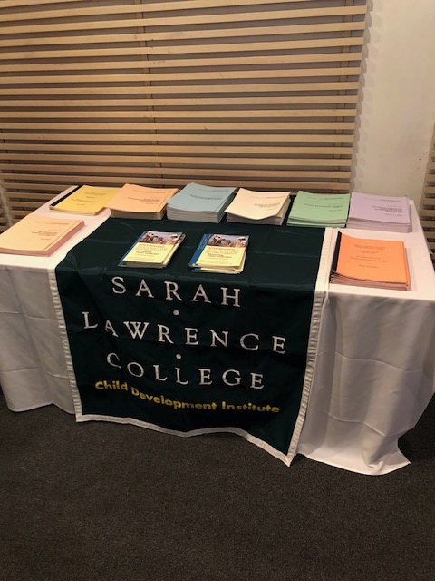
There were two Sarah Lawrence students (undergraduates, I guess) helping with the event and also a table outside the main auditorium covered in academic papers from the center’s past researchers or teachers, bound in soft color covers and often with a sub-labeling “occasional paper series.” Not all these papers were terribly recent either. They were freshly printed for this event but some were from 1999 or 2000. To make a few notes about attendance and composure, it was mostly all women in the auditorium (audience varying slightly panel to panel) and this was even acknowledged at one point, one of the women said something like “we’re all women here” in a tone and impression I guess would call maternal since other comments were made about mothers’ instincts for these issues, but “thank you to any men who are here.” Aside from that there was a chatty, inclusive and rarely slightly feisty tone to the audience comments. With regard to the two Sarah Lawrence students assisting, I did catch one memorable exchange between them and one of the Scandinavia House building managers. The in-house restaurant had made generous and upscale box lunches for the entire event, including vegetarian options, but the two Sarah Lawrence students claimed there was hardly anything in these for them, and asked if their outside lunches could be paid for because one of them was vegan and the other was gluten-free. The building manager with lightly tugged patience said the restaurant would be able to handle it. I needed to include this because I don’t know how it is either relevant or irrelevant, and Joan Didion wouldn’t be remiss to include it. 

The event’s deplorable title

One of the consistent themes I certainly connected with was the role of pathogenic environmental factors, or harm, overstimulation and chaos, be them either racially-originated or from circumstantial direct and indirect human factors. This seemed essentially like one of the points that branched to multiple subjects throughout the symposium, such as migrant and refugee identities and media coverage, and government intervention. For example some time was spent on the role of media in refugee coverage. Gary Evans, an ‘environmental and developmental psychologist’ from Cornell, was talking about human interest stories as portraying refugees as in need of support, which is claimed as a turnoff to “western” people, but moreover I had the impression of a confluence of both image and identity maintenance with domestic environmental factors as incredibly predictive and affecting of children, or on people any of age for that matter. 

One way to state the connection it seems to me is they are both curated, ‘soft’ factors in way—not inherent, and not a specific teaching instruction that could be theorized about in an either successful or unsuccessful gauge. Evans also mentioned IQ tests (setting aside the problems with that) as less predictive of grades than pathogenic environmental factors. The question of what is an inherent trait or temperament practically feels like it could be connected to direct teaching styles, or rather intended learning outcomes, while the effect of implied outcomes and environmental impositions that are not intentional in the same way (dysfunctional family members, stimulation breaching to chaos and anxiety) mount a second, comparably invisible force which holds much to bear on productivity.

Similar to my idea of implied image and environmental factors as invisible, Evans from Cornell commented on the role of “involuntary attention” as integral to motivation for voluntary attention or rather intentionally instructed tasks. The image on the involuntary attention slide was a typical fountain the plaza of some building. Evans suggested that this didn’t require the same kind of attention as an instructed task, but a child’s ability or freedom to engage with it, as an environmental factor but one that isn’t overbearing, was facilitative of them being able to tackle an intended task more at will, or less emerging from a place of clutter. 

This stretch of that panel also allowed them to reemphasize motor skills as the obvious and crucial way we learn and become familiar with the world. As tooling with objects around the house (provided they are safe) is substantiating, so too we might gather is the freedom to loosely focus on a fountain, or whatever else is innocently present in urban or natural settings. 

And with regard to deconstructing these other, human-implied factors, it seems to me to reach the core concerns of the Information Science field: Intersectionality, design, and also I would say a crucial and structural address of the question “what is productivity?” or “what is creativity?” Along with certain design approaches, a reasonably abstract answer to that starts to feel as predictive and perhaps in a better and more open way than unattended implications from existent axises people may just incline to rely on.