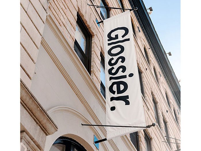
I’ll be honest, for a long time I thought the millennial-favorite cosmetic brand Glossier’s flagship in NYC was invite-only. I’d seen the NYC showroom’s pale pink, the enticingly instagramable interior on the feeds of Instagram influencers. It was so lavish in comparison to a Sephora or Ulta; I didn’t think they’d let the public pour in. This changed once I saw the now ubiquitous plastic pink bag and bubble-wrapped pouches in the hands of the masses on the 4 train. My manufactured mystique around the showroom’s accessibility made Glossier a perfect information environment subject to observe.
Putting an ecommerce gloss on retail
Glossier’s part of a new class of neoliberal disruptors in the retail space for women. They use a social-conscious capitalist model: A body-positive, female empowerment brand that turns buying cosmetics into an act of resisting the patriarchy. Glossier’s picture-perfect showroom is an information environment similar to other retail brands that started as direct-to-consumer companies with NYC flagships, like Casper or Away. Their idea is to bring their recreate their beloved e-commerce experience in person.
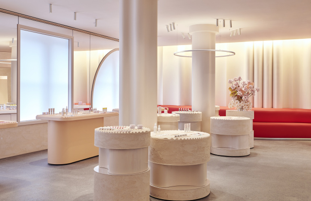
Once the doorman swings open the door on Lafayette street, you’re confronted with a pink-velvet cavernous staircase (I had to inquire about wheelchair accessibility, as an alternative to the stairs was not easily discoverable) that leads to a large, open-concept space with mirror-lined walls and more shades of pink decor. The crowd was large and surprisingly young. Mobs of girls no older than 14 painting their faces in such a plush setting; like a child trying on lipstick in mom’s bathroom.
Mascara as information
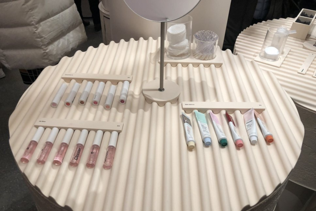
At Glossier, the information, or products, are extremely inviting. Unlike Sephora where the products are in high display cases at an angle, Glossier’s information lays flat on low-lying tables. The many tables have ridges that signify they can be picked up, and where to place them after. Also on the table are testing materials that make the products try-able for the masses. Cups filled with bite-size mascara wands, eyeshadow brushes, and eyeliner sticks are key signifiers that green-light trying the information. The products on the tables themselves are missing their application tools so the users must use a sample-size wand or brush to access the product. In other makeup stores like Sephora, or even the counter at Saks, I’ve never seen a testing product manipulated it such a way. Wouldn’t the users want to see the product in its entirety before using? Isn’t setting out the disposable application tools clear enough? Apparently, it’s not clear and can be a real hygienic concern. Glossier’s limited product testing design method is more user-centric than I thought.
In the “wet room”, users can test the products with one of the many sinks that line the walls. When I took a peek, no one was full-on washing their face. A couple of giggling girls were taking a picture of the moisturizer. I asked an employee, Glossier’s information intermediaries, and she said people are a little tentative to lather up in-store. However, once someone takes the plunge, others follow. I’m familiar with this herding mentality from the behavioral economics book Nudge. This was a clear indication that within information environments, social norms can often serve as a barrier to access.
Cosmetic tech
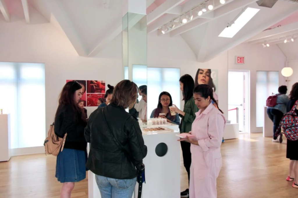
Once you find a product you like, purchasing requires face-to-face contact with one of the intermediaries. Glossier is set-up like Apple’s genius bar, except the geniuses holding iPads specialize in makeup and skincare and adorn baby pink jumpsuits. The pink intermediaries are extremely friendly, but don’t overstep; I observed most of them smiling along the outer rim of the floor. Users went to them only when needed, dissimilar to the constant “can I help you find anything” at other retail spaces.
Glossier’s checkout system reminds me of a gas station in New Jersey; You can really do it yourself, but they won’t let you. A Glossier employee will scan your products with the iPad and then have you enter in all your information. On the interface, it has a place to enter a promo code, but I heard an employee tell the users they had to purchase the items online if they wanted to use the promo code. They could still pick up their products today, but downstairs where the other online pick-up orders are sent. I’m sure there’s a technological back-end reason for this promo process, but why include the promo line in the in-person checkout, to begin with?

An info show
Once you’ve purchased your products with Apple technology in the hands of an intermediary, the pick-up process becomes kind of clunky. You’re told to wait in the waiting room, where there are more jumpsuit-fitted employees behind a counter with a vertical conveyor belt on the wall. A horde of people is anxiously awaiting one of the pink jumpsuits to grab their pink bag from the conveyor belt and call out their name. After witnessing the iPad and conveyor belt, it seemed so odd their process of delivery was to scream a name out, instead of implementing an arrival screen, like at an Airport. The employee had to continual repeat names, and to be completely honest, did not seem thrilled about it. The conveyor belt was a slow process and visually interesting. However, I wasn’t able to capture my own video as one of the intermediaries shouted “no photos.” I had to wonder if employee agency conflicts with the designed space; I just don’t see another reason for the expensive conveyor belt display but for social media fodder.
While there are some design hiccups, I think Glossier did a fair job of turning their seamless ecommence interface into a IRL retail space. I didn’t originally view the information environment as accessible, so upon entry, I was pleasantly surprised by the user-centric design.
References:
Buckland, M. (1991). Information as Thing. Journal of the American Society for Information Science. Jun1991, Vol. 42 Issue 5, p351-360. 10p.
Norman, D. A. (1990). The design of everyday things. New York: Doubleday.
Thaler, Richard H.,Sunstein, Cass R. (2008) Nudge :improving decisions about health, wealth, and happiness New Haven : Yale University Press,