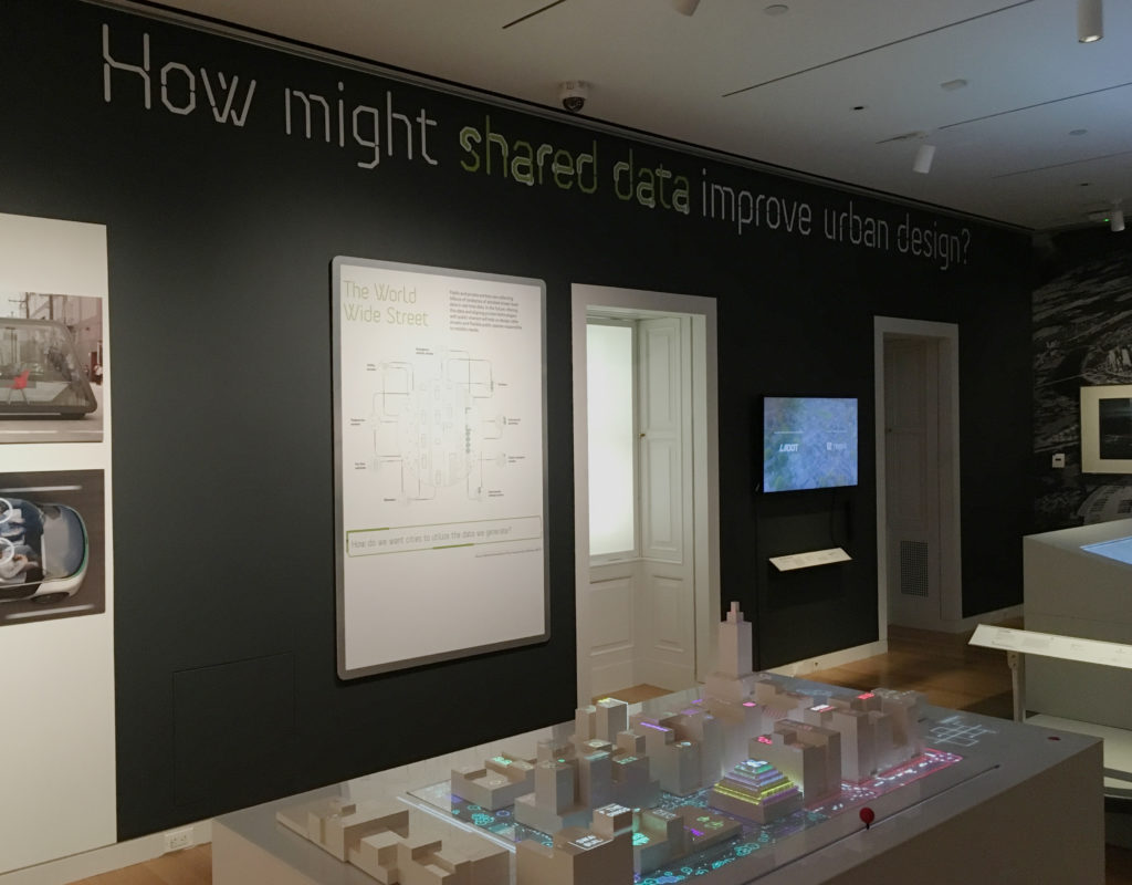
From December 14, 2018 to March 31, 2019, The Road Ahead: Reimagining Mobility at the Cooper Hewitt, Smithsonian Design Museum presented forty design projects, ranging from interactive platforms to urban design. Noting that “We are at an Inflection point”, the introductory text on the wall proposed that “the works presented here are meant to be catalysts for conversations about how we might live in the future” The attempt to start these conversations was framed by six questions that ran across the top of the exhibits including, most intriguingly for me, “How might shared data improve urban design?”
Having briefly visited the exhibit previously, I went in with a couple of questions at the ready myself (some of which I will combine to frame the comments below). The general goals were to observe both the exhibit itself and specific projects as environment and methods for gathering and presenting data.
In an attempt to observe a larger and broader population, I went on a pay-what-you-wish evening (and the second-to-last day of the exhibit), arriving early to review all exhibits and then stepping back to observe more of how they were experienced.
How did the exhibition itself collect and display data? How did an exhibit about mobility move visitors?
The visitor’s introduction to the data collection aspect of the exhibit actually started on the ground floor, with a display that asked “How was your commute to the museum?” The question was to be answered — and those answers collectively visualized — through the use of foam balls (Green = “Good”; Red = “Not too good”). This was the only interactive exhibit-specific wall graphic, but it did engage and prepare the visitor for the interactive world of touch screens and post-its in the projects two floors above.
However, this clever prelude was then undercut in the exhibit itself by framed infographics that seemed out of context or less effective than the projects exhibited. Some were predictive (Three Futures of Urban Transportation); some diagrammatic (Contested Curbs). Some were explanatory (How We Move); some illustrative (Letting go of the wheel). Collectively, they could have helped navigate a visitor through the exhibit, but instead they felt like projects of their own, ones that did not always rise to the level of the work with which they shared the space. Instead of directing traffic, they added to it, a congestion made all the more troublesome by the exhibit’s confusing start.
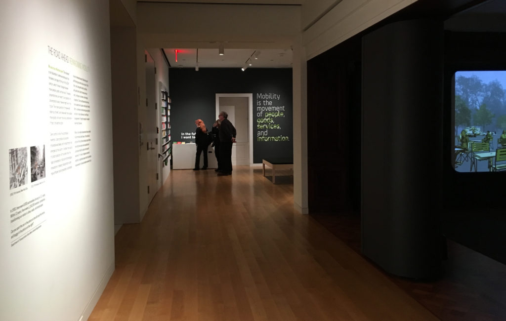
Upon arrival, and after reading the introductory text, viewers were presumably expected to move toward the opening section of the exhibit, which invites one to listen to experts and offer one’s own thoughts before diving into the projects on display. Instead, I watched visitor after visitor turn right to investigate a sound installation designed specifically for Cooper Hewitt called Sounds of the Future City (2018), which enticed them with bells, whistles and video projections, before depositing many of them out the other side — into the middle of the exhibit. This was a particularly unfortunate detour for an exhibit that states, just twenty feet from this misdirection: “Mobility is the movement of people, goods, services, and information.”
How did individual projects utilize data to tell a story? In an exhibit that aims to start conversations — that explores ‘convergence of data and technological innovations’ — to what degree do these presentations speak to and engage the visitor?
Here we come to the heart of the observation. These questions naturally overlapped in various projects and so will be addressed collectively here. Within such a dense and at times overwhelming show, the comments below will focus only on some of the projects that were most data-focused, sorting those into three areas I noted, with overlaps existing across them.
Data as Tool
As an awareness of the role of data becomes more prevalent in society, its visualization becomes an object of wonder, with the intermediary steps of the process presenting their own sense of “Look what they can do!”
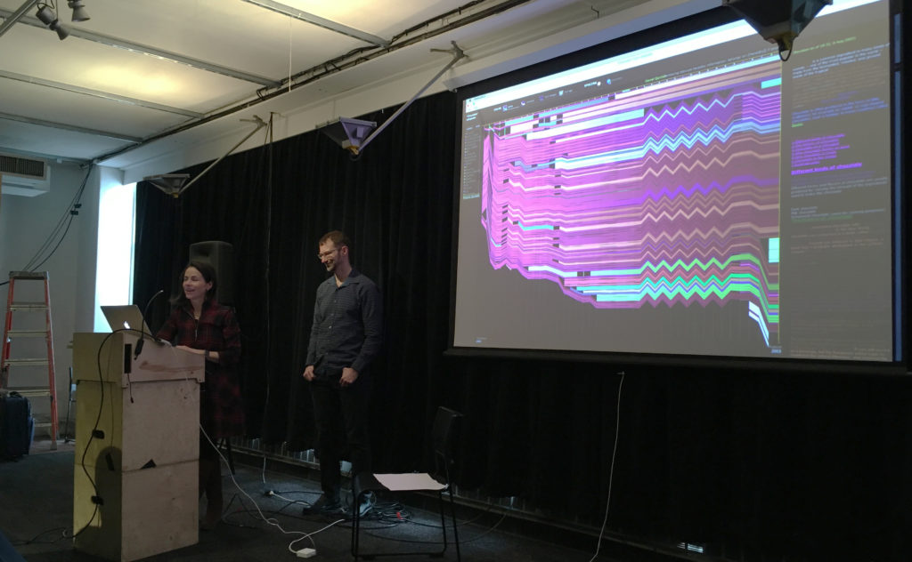
The short video City Data Analytics: Modes of Travel and Commuter Walking Times (Zaha Hadid Architects, Habidatum, 2017) from the Walkable London Exhibit showed a clear visualization of data relevant to pedestrian and other metropolitan traffic. It proved a point, established patterns, but did not offer a specific ‘solution.’
The same might be said of City Scanner (MIT Senseable City Lab, 2018), a congregation of six sensors that sits atop the cab of a municipal garbage truck, gathering six kinds of data that are then visualized to show patterns and occurrences. The “think of what we could do with this” mentality was evident in the last line of its description: “City Scanner could be used to help inform decisions about public health, security, and overall better services for citizens.” Could be.
What differentiated the Los Angeles Mobility Data Specification (LADOT/ITA, 2018), however, was that this video actually spoke to how this ‘neat tool’ of data, in the form of a common vocabulary and standard, shared in real time as a software platform, could be used to efficiently manage issues of changing street capacity and public safety. This was a tool in use.
Data as Assurance
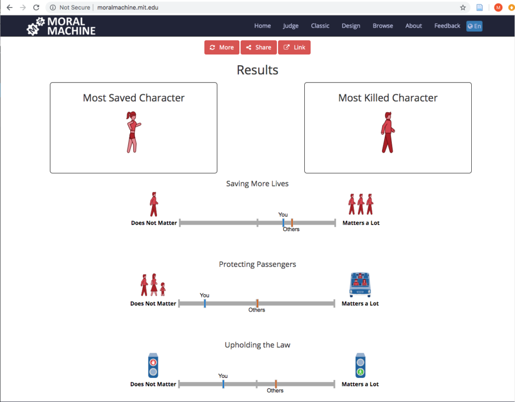
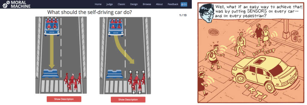
If the exhibit had a project that seemed the most fascinating to the audience the evening I visited, it was The Moral Machine (2016), an online tool created by the Scalable Cooperation Group at the MIT Media Lab to gather data related to human decisions as to which lives should be saved by a driverless car in various scenarios; a decision that was often made by one of a pair of visitors that commentated on each others’ judgments and processes:
“This is so funny… They die….”
“That was you. That was everyone else.”
“I don’t want to kill a cat…”
“This one you shouldn’t have to think about. Just kill the dog!”
And the almost unsettling: “I love judging…”
‘Assurance’ may not seem quite the right word for an interface that presents one with moral decisions, but at the heart of the project is the assurance that we are speaking with, and gathering data from, people ‘just like you’ as we make decisions about these autonomous vehicles.
Some issues arise at the end, when the machine evaluates your decisions and states whether or not a characteristic such as gender “matters a lot” in your decisions, when it cannot truly know, based on the limited data set. (It is worth noting that the original online version does offer more disclaimers, as well as a follow-up questionnaire asking one to explain their reasoning.)
The complement to all this judging was the Sensor Visualization video (Waymo, Google Creative Labs, Framestore, 2018), a very effective presentation that explains and visualizes how Waymo’s self-driving cars ‘see’ objects, pedestrians, lights and other factors to make one’s riding experience stress- and accident-free. Safe, clean projections of paths and labels for speed and distance from the car assure the viewer that Waymo has the data and as such has everything under control. It offers an assurance that there is measurement going on behind the scenes.
Data as Play
While the Moral Machine can feel like a particularly challenging game of Would You Rather?, Cityscope (City Science Group, MIT Media Lab, 2018) was Lite-Brite with building blocks, inviting viewers to redistribute structures on a street grid to visualize two possibilities of traffic density (shared vs owned driverless cars) on city streets. It was fun to move the structures around and note the changes, but it must be noted that despite its promise, and obvious ability to draw interest, Cityscope appeared to fail in communicating its intended message. This was one of those cases where the label for the project was behind the viewer. So everyone wants to play with it, but few understand it. This was exacerbated by the unfortunate choice of red (owned) and green (shared), which already tilts one toward preferring the latter, with the red definitely feeling like an indicator of intensity. All of this could be summed up in an exchange I witnessed at the table:
“Do you think red means…?”
“It’s congestion. Or something….”
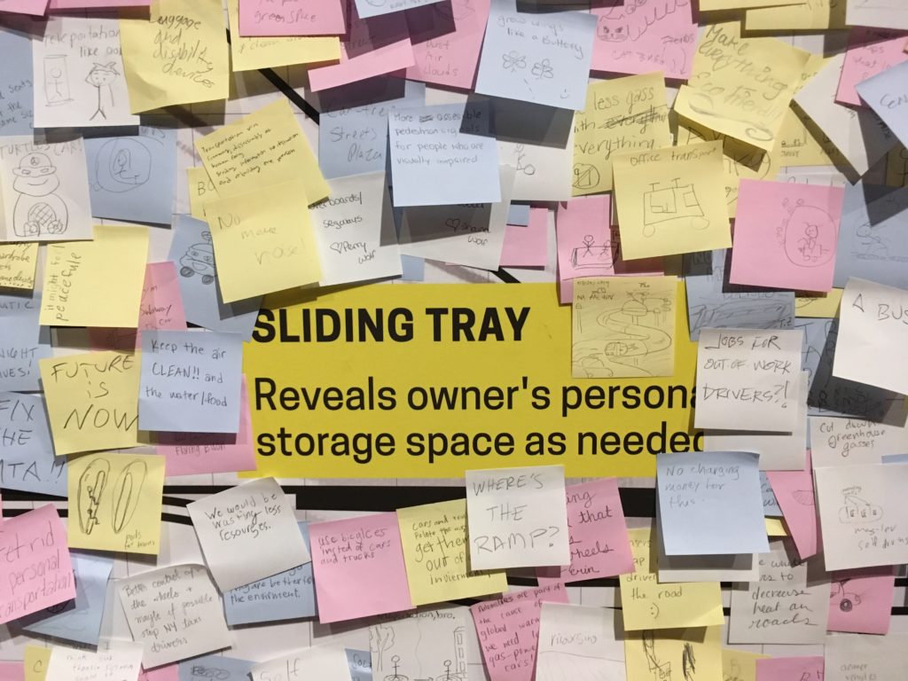
In contrast, The Future of Automobility (2014, 2017) from IDEO brought Design Thinking into the exhibit as a means of presumed research. This project invited visitors to contribute their ideas via Post-Its to a ‘vehicle inspiration wall.’ A kind of ‘free work,’ it excited the spirit of play and brainstorming in many visitors, who drew pictures and layered Post-It upon Post-It (ignoring the walls precisely drawn grid) with ideas fanciful and serious (e.g. ziplines; BAN ALL CARS).
So while acting as a tool and providing assurance, our interaction with data (whether in collection or review) can also be fun, which is a great way to engage visitors who might not otherwise consider these issues.
A Contrast
Of course, whether functioning as a tool, an assurance or a game, all of these projects were Good.
That is to say: collectively, The Road Ahead was largely about the solutions — or rather the possible solutions. It presented the problems of the world as mountains to be climbed through data and design and asked “How might we…?” In the terminology of Dan Geer shared in Terms of Service, the show’s “Tomorrow Questions” (Keller & Neufeld 8) are what-ifs of potential; “What will I gain?” Not “What will I lose?”
But, what if one combined the Moral Machine and Waymo, identifying certain members of society — those who ‘matter less’ — as it makes decisions?
The introductory text to the exhibit states “no one really knows where these mobility transformations will take us…” This is true. Before making a thing, Jentry Sayers asks us to envision “two dramatically different scenarios: one where the results are ostensibly positive, and one where the results are ostensibly negative.” (Sayers) This exhibit is only the first half of that equation. And if Cathy O’Neil, in defining ‘Weapons of Math Destruction’ speaks to the “authority of the inscrutable” which attempts to obfuscate and force acceptance (O’Neil), an environment such as The Road Ahead works through design and interactivity to make it more visible, providing, perhaps, an authority of the genuine.
It’s difficult not to look at an exhibit such as this and see in all these streets and cars the drawings from Terms of Service of car trackers and insurance premiums, pedestrian sensors and the internet of things — the connecting of dots from or by even the most (seemingly) innocuous, or even beneficial of sources to troubling ends. (Keller & Neufeld 13, 15, 23)
Yet in a world where suspicions of those connections are easier and easier to raise, The Road Ahead suggested a smoother ride than much of what we have been reading recently; an optimism and a welcome contrast to the data harms and big data that we know are the underbelly or other side of much of this technology. It offered assurances, tools, and a little bit of the play that makes any future seem a little more creative, and a little more promising.
– Michael Kelly, Info 601, Professor Chris Alen Sula
References:
– Keller, Michael & Josh Neufeld. (2015). “Terms of service: understanding our role in the world of big data.” Al Jazeera America. http://projects.aljazeera.com/2014/terms-of-service/#1.
– O’Neil, Cathy (2015). “Weapons of math destruction,” Personal Democracy Forum 2015. https://www.youtube.com/watch?v=gdCJYsKlX_Y.
– Sayers, Jentry (2018). “Before You Make a Thing: Some Tips for Approaching Technology and Society.” https://jentery.github.io/ts200v2/notes.html