Observation: The Oculus Transit Hall

Located at Lower Manhattan, The Oculus is the new transportation hub connecting The NJ PATH train to 11 NY subway lines; a must-see tourist attraction with marvelous architecture design; and an enjoyable shopping center with over 50 stores. As a multi-functional building serving users with diverse purposes, the information environment could be overwhelming. In March 18th, I experienced The Oculus as a NJ-NY commuter, to see whether the necessary information is clearly delivered to me, and observe how other users interact with information under their specific goal.

Layout of The Transit Hall

The Transit Hall is a 3 stories, 350 ft by 115 ft column-free elliptical space, with #1 train and PATH Station at the west end, E train station and the passway to Fulton Center at the east end, as well as two entrances and viewing platforms at street level.
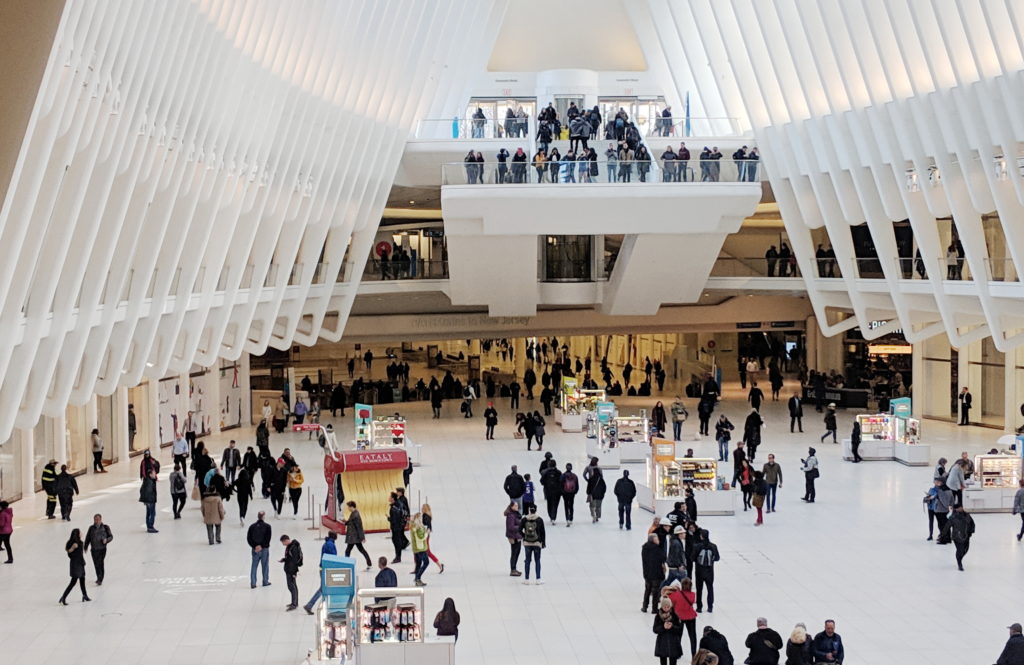
The Oculus Transit Hall ©Xin Su

Upon exiting PATH station from underground, you could see ticket machines and printed information boards on both sides along the walls, and the #1 train entrances on the Oculus level. Walking up the stairs in front of you to the Oculus level, you would see several small kiosks, a sitting area, and the huge stairs leading you to the lower Mezzanine Level, for the exit to Fulton Center (A/C/4/5/J/Z/W/R lines) at the other end of the Transit Hall. The spatial structure was very obvious and easy to understand. I think the architect created an intuitive information environment, guiding different user groups in unnoticeably-designed separated circulation routes. Commuters walked straight down the hall for transition. Shoppers tend to stay closer to the curving edges where the stores are located. Most tourists entering from street would exit immediately after taking photos at the platforms.

Ticket Purchasing

There were 5 kinds of ticket machines outside The PATH station, 2 for both MetroCard and SmartLink (card and cash/card only), and 3 for SmartLink only (blank card/2 trips/10 trips with card), which make it a bit complex for first time users. During my observation I saw several people failed at their first attempt, because of the language barrier or trying to use cash on a card-only machine, or wandered around the area trying to figure out which machine to use. There was no information booth nearby so they eventually had to ask other passengers for help.
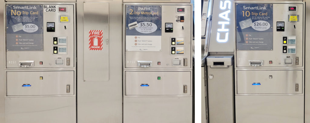
SmartLink Ticket Machines (Left: Blank Card / Middle: 2 trips / Right: 10 trips with card ) ©Xin Su

The MetroCard/SmartLink ticket machines provided 8 different language interfaces, which was intended to help foreign visitors to purchase ticket by their own. However, for me the overall English-Chinese translation was poor and some of the vital information, for example “trips” and “Unlimited Passes”, was not translated at all, which means passengers with no English knowledge can not complete the process without additional help. Furthermore, although PATH accept both MetroCard and SmartLink, the information was not displayed until you entering the ticket gate with you tickets purchased.

Suggestions:

  • Reduce the types of ticket machine to avoid confusion and failure
  • improve the translation to better serve foreign users
  • Notified the users that both MetroCard and SmartLink are accepted by PATH on the information boards and ticket machines

Maps

3 types of map were available in the Transit Hall. PATH/Subway System Maps, both printed and electronic, could be found inside and outside the PATH/Subway station. Floor Plans for vertical transportation and transit direction were placed at every entrance/vertical circulation core, on the wall or as mobile stations. A Directory of Stores outside the PATH station occupied a whole wall.
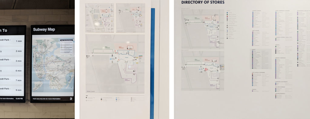
Maps (Left: Electronic Subway Map / Middle: Floor Plans / Right: Directory of Stores) ©Xin Su

Stores and transit information were illustrated separately, all the maps were positioned at “decision points”, and “perpendicular to the view’s line of movement and sight”, which made it convenient for different users group to acquire information (Calori & Vanden-Eynden, 2016, p103). However, maps at the less crowded places provided incorrect “You Are Here” information. And none of the maps showed whether the subway entrance have access to both directions or a single direction. In addition to that, printed 2D maps might be difficult for some users to interpret and create a “mental map of the site”(Calori & Vanden-Eynden, 2016, p6). Printed and electronic Subway System Maps in the station were placed next to each other,  providing duplicated information. The electronic Maps were in low resolution and can not be enlarge, so many information were unreadable.

Suggestions:

  • Ensure information on the map is correct
  • Add detail information regarding the subway line direction
  • Provide 3D and interactive maps for users to explore the direction

Signage System for Wayfinding

Similar to the Floor Plans, identification and directional signs could be found at every decision points, on the wall or under the ceiling, and were organized in hierarchy to allow users quickly scan through. Several directional signs with same content were placed along the route, so users could confirm their decision and verify the arrival at the destination.
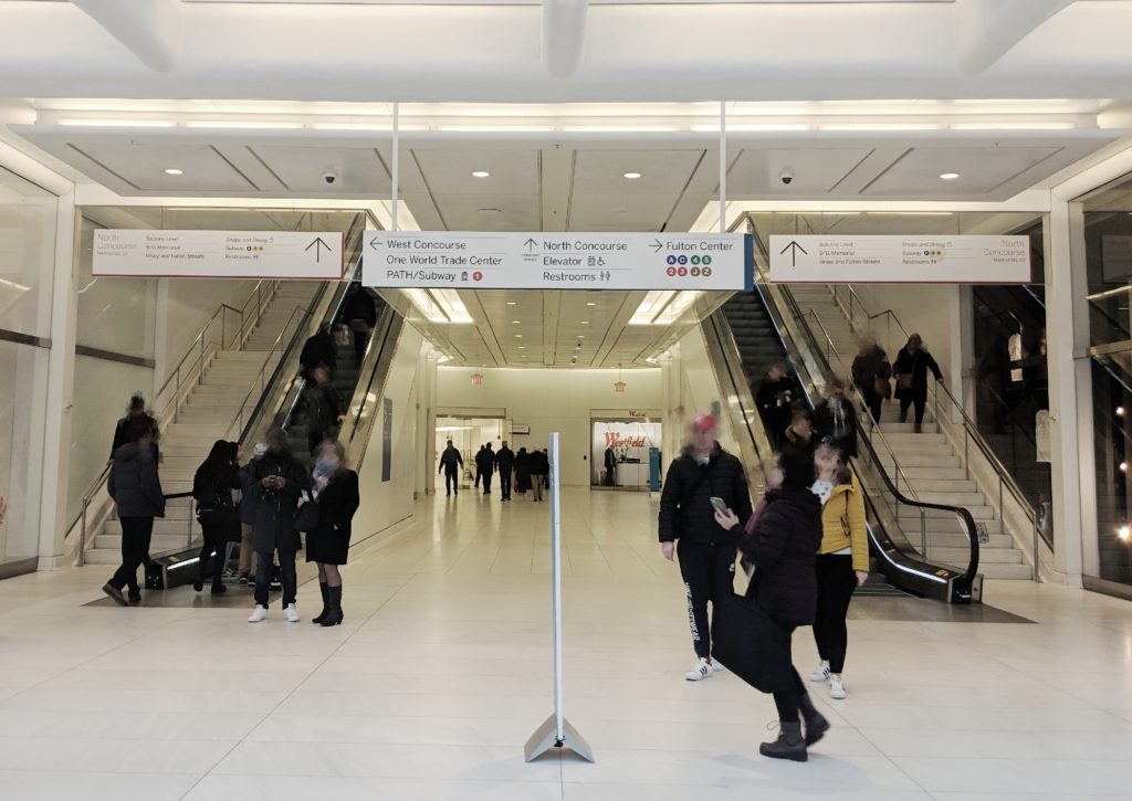
Hanging signs and mobile sign station at a decision point ©Xin Su

However, during the observation I saw visitors asking staffs for direction after they read through the signs and I believe there were a few reasons. First, some signs offered “contradictory” information which in fact was accurate. For example, at one decision point, the upper sign on the wall displayed the 1 train entrance was to the left while the sign right underneath it showed that the entrance was to the right. There were indeed entrances at both direction, but anyone who was not familiar with the area would definitely feel lost after reading the signs alone. And this kind of “competing” information can be seen all over the place. Second, signs provided incomplete information. The train entrance for single direction was not indicated on the signs and will lead users to the wrong way. In addition to the permanent signs, mobile sign stations were placed at multiple location, which may cause anxiety. I saw about 10 signs upon exiting the PATH station, leaving me a very negative impression.
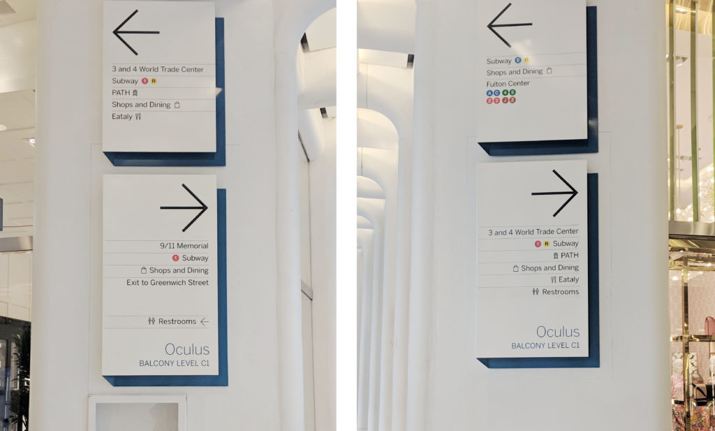
Signs with “contradictory” information ©Xin Su

Suggestions:

  • state only the nearest entrance at one decision point
  • Add detail information regarding the subway line direction
  • Reorganize the information to reduce the total amount of signs at one decision point

Staff

There was only one concierge desk located at Oculus level, which may not be sufficient considering the daily traffic. And the location was neither illustrated on the maps nor listed on the signs. You could find staffs at every decision point and gate. Although I believe that is due to the security concerns, they would offer help when being asked. However, at crowded spaces they might not be visibly in their dark uniform.

Suggestion:

  • Add more information booth, and provide the location information on maps and signs
  • Change the uniform color to make staffs more visible when needed

Reflection

The experience illustrates how information works as thing (eg. ticket machines, signs, maps), process (eg. reading instructions, signs and maps) and knowledge (eg. successful completing the task) (Buckland, 1991). However, due to its quantity and complexity, it would be useful to introduce the fourth state – interactive information (eg. interactive map, multi-language interface) into the information system, allowing users to freely explore and acquire the information they need (Marchionini, 2008). These four stages are interconnected, any tiny mistakes occur in one state will cause error in the next one.

The insights and lessons I learned from its information-communication designs can be applied in my future work as users follow the same process to navigate in physical and virtual world. “The virtual worlds of software are worlds of cognition: ideas and concepts presented without physical substance” (Norman, 2004, p80). A clear and communicable information system design is especially essential in virtual world, since the users cannot get clues from anything other than your design, and as they are not physically restricted in a space, they can easily switch to other available options.

INFO 601-02 Assignment 3: Observation by Xin Su

Reference:

Calori, C & Vanden-Eynden, D (2015). Signage and Wayfinding Design. Hoboken, NJ: John Wiley & Sons, Inc.

Norman, D.A. (2004). Emotional Design: Why We Love (Or Hate) Everyday Things. New York, NY : Basic Books.

Buckland, M. K. (1991). Information as Thing. Journal of the American Society for Information Science, 42(5), 351-360.

Marchionini, G. (2008). Library & Information Science Research, 30(2008), 165–174.

For more information about The Oculus
NYC Subway and Human Interaction

New York City’s Subway is one of the oldest and most efficient public transit systems that the world has seen. It started operating in the year 1904 and runs 24 hours on every day of the year. The Subway transit is also the most used metro system of the world, by a countless and diverse population. 

The Subway lines run through Manhattan and branch out into the boroughs of Brooklyn, Queens, and Bronx. It is a network of extensive structures and many junctions, of which I have made observation of one – Times Square 42nd Street/Port Authority Bus Terminal(PABT). 

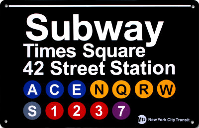
This Subway station complex is located under PABT and Times Square at the intersection of 42nd Street, 7th and 8th avenues, and Broadway. Every train has a distinct color and number or alphabet associated with it. The 42nd Street Times Square station offers access to multiple lines. 

42ndTrainStation-trains

All the lines are bi-directional, running towards uptown and downtown. There are local lines which stop at every station, and there are express lines that make stops at fewer stations. Most lines, except a few, run 24 hours with higher frequency on weekdays.

NAVIGATION AND TECHNOLOGY 

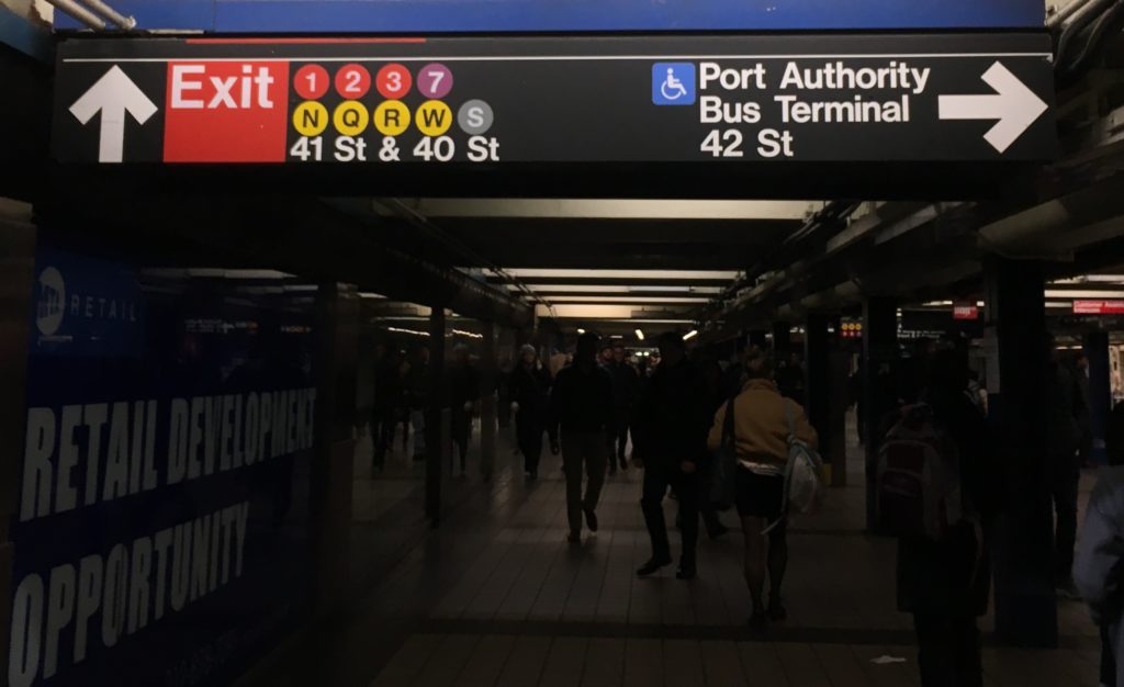
The Subway system has a very well designed way-finding system which poses hardly any challenge to its users. It uses consistent visual language, universally accepted icons, and smart placement to make navigation through the enormous space easy. All signages are on non-reflective black surfaces with white legible sans serif text. The signages mark uptown and downtown trains with their specific icon. Use of icons and text together reinforces information, the “S” with “Shuttle” for instance. While the train icons are invariably placed on the right of the text, icons for ramps and wheelchairs go consistently on the left. 

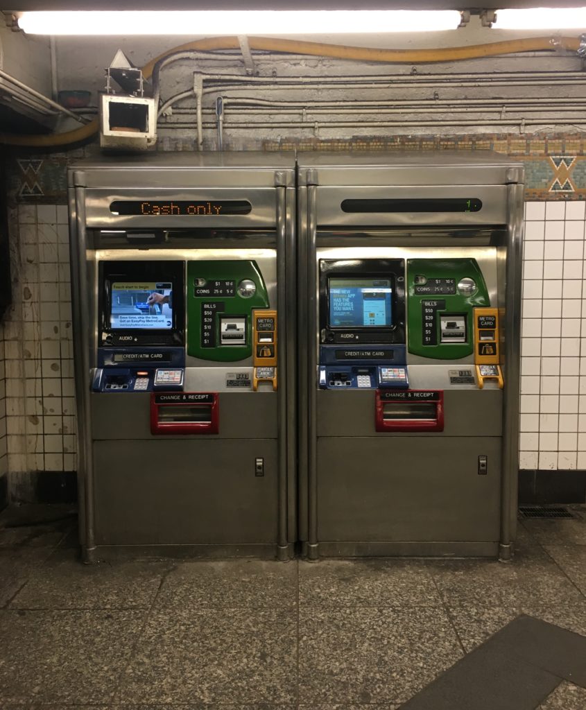
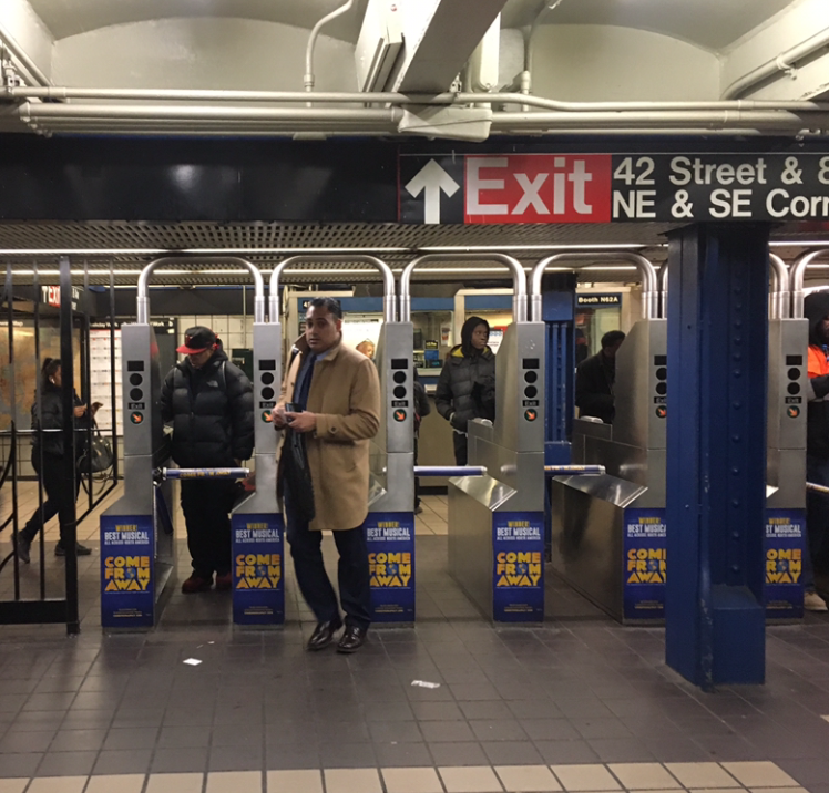
A user’s initial point of contact with the Subway system’s technology is at the entrance where he finds a Metrocard vending machine. The machine accepts cash, debit or credit cards and is effortless with touch screen and comprehensible instructions. The system is quick and economical with $1 for the Metrocard itself, and preset values that the user can choose from to put charge on the card. Moving further the commuter enters the station through turnstiles which use a card reading technology. 

Metrocard-vending-machines

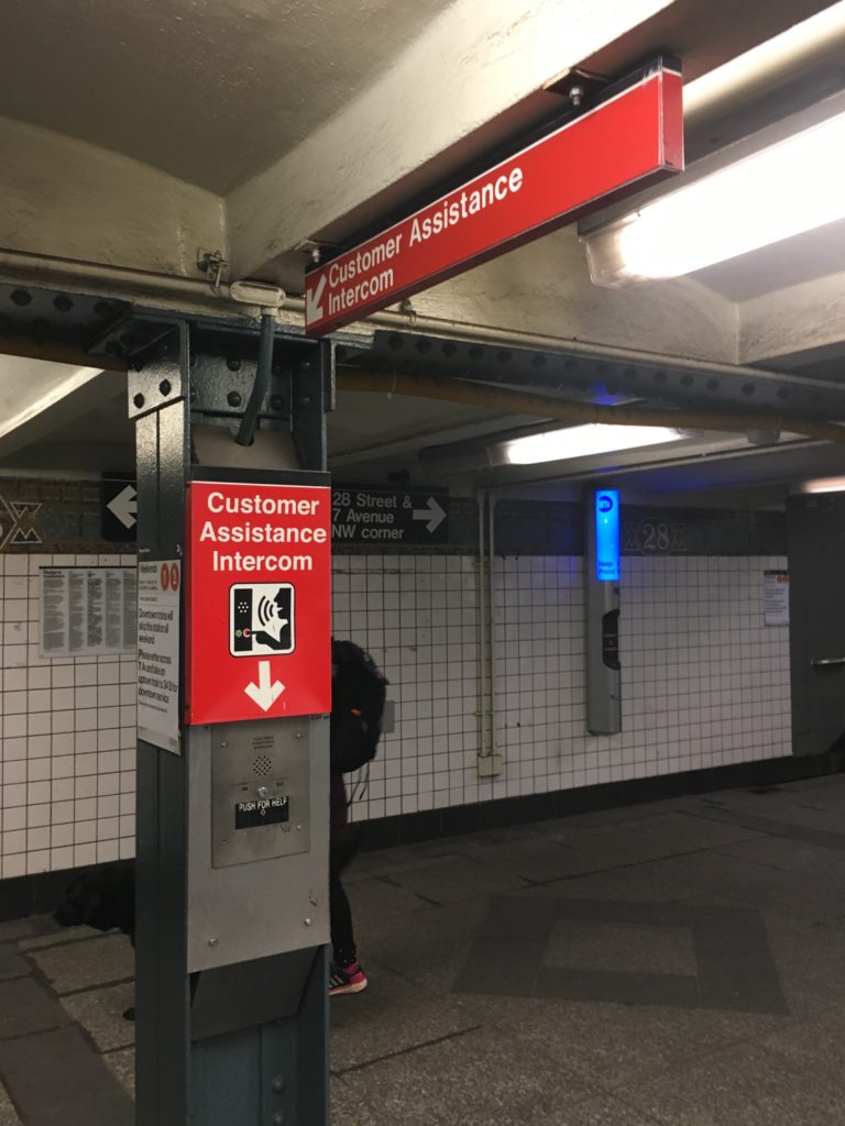
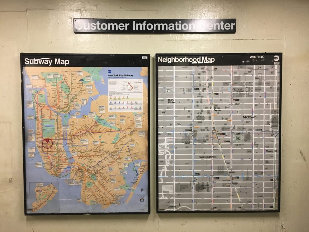
Throughout the Subway premises Customer Assistance Intercoms and Emergency Intercoms are easily accessible. The smart positioning of speakers allow system announcements to be audible all over, without any hindrance from the commotion. The station has Subway maps at frequent spots and Neighbourhood maps and entrances/exits. 

Maps-at-Subway-entrance-exit

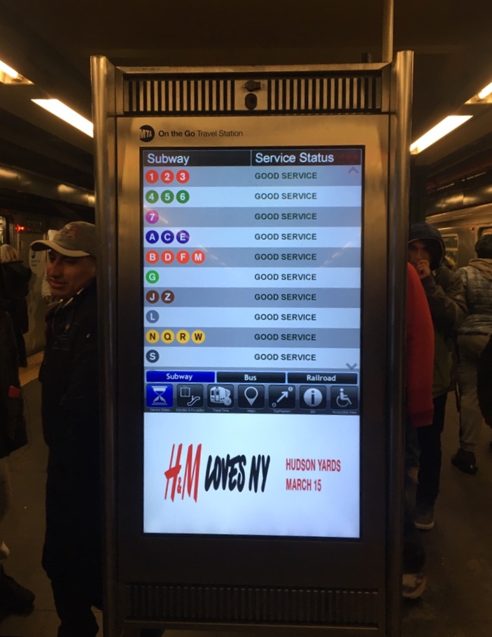
Moreover, a recent addition of interactive touchscreens has augmented navigation. These all-in-one customer information devices allow one to select a destination station, in response to which the screens display possible routes with time estimates. Aside from information on train schedules these screens also offer recommendations for points of interest at select locations, information about escalators and elevators, outages and train delays, or if planned work is coming up. However, commuters don’t seem to use this technology as often. 

Interactive-screen-at-Subway-platform

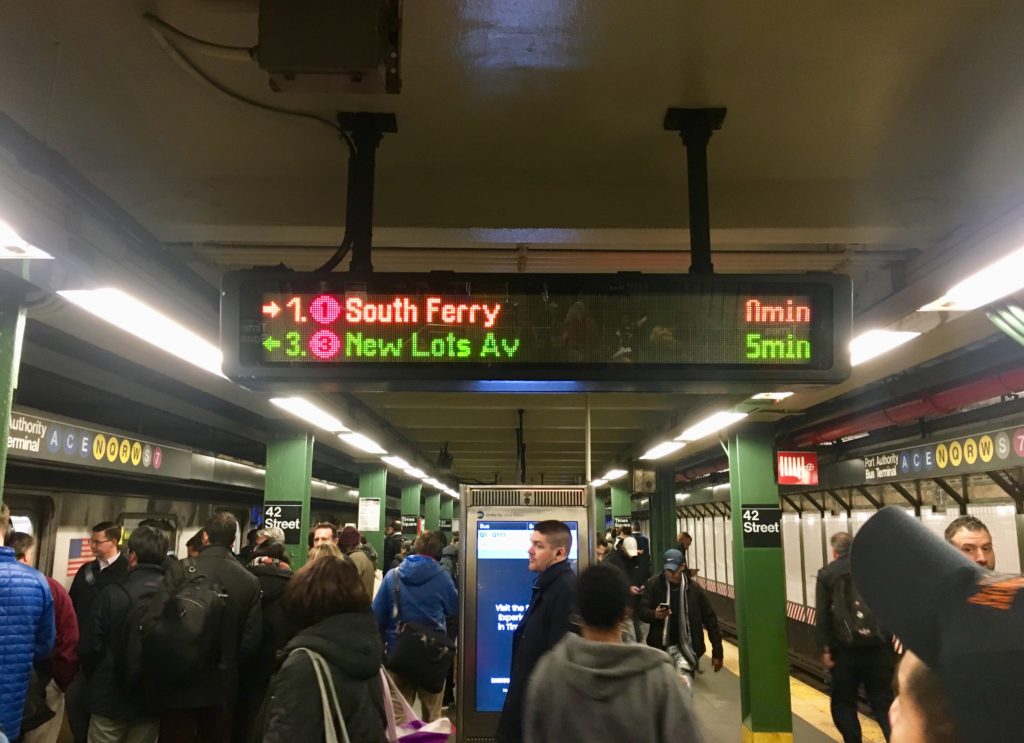
All platforms have digital screens displaying ETA for their respective trains. 

Screen-displaying-trains-ETA
S

There are multiple apps designed specifically to aid Subway navigation, for example MTA Subway Time.

The 42nd Street Station, as all Subway stations, has several entry/exit points spanning across surrounding blocks with supplemental northwest, southwest, northeast and southeast corners, marked “NW”, “SW”, “NE” and “SE” respectively. There are two underground passageways to PABT allowing easy transfer to interstate buses.

CONVENIENCE AND EXPERIENCE

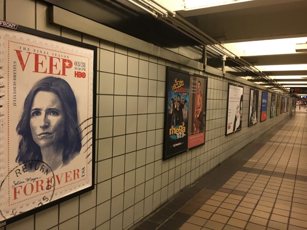
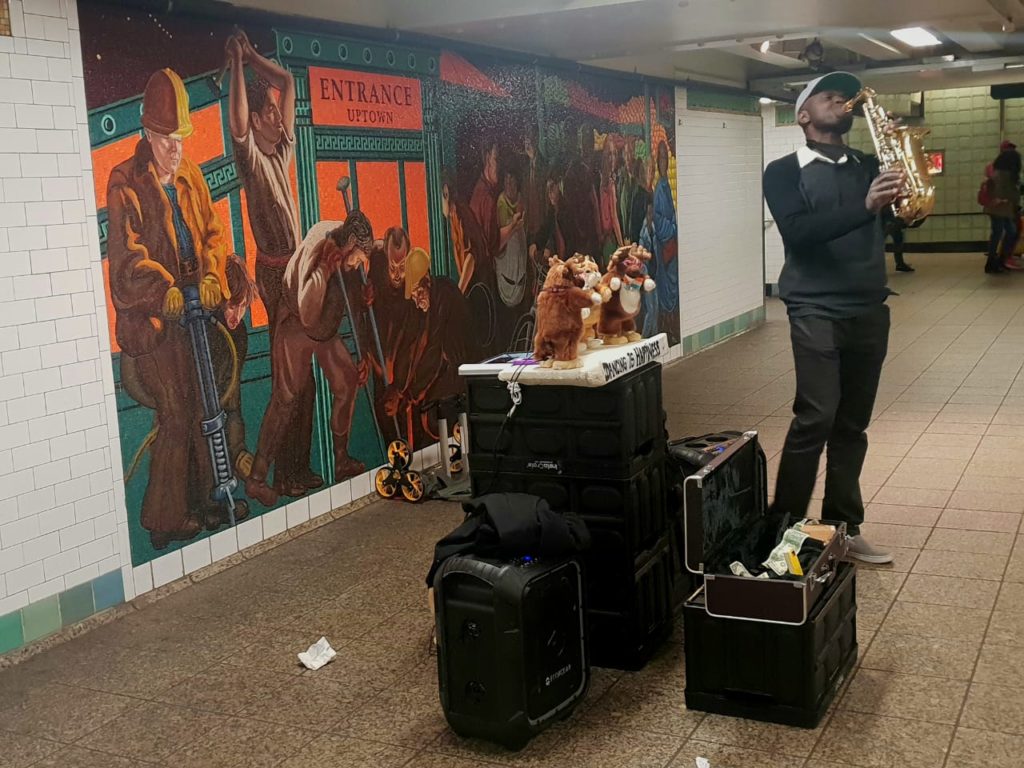
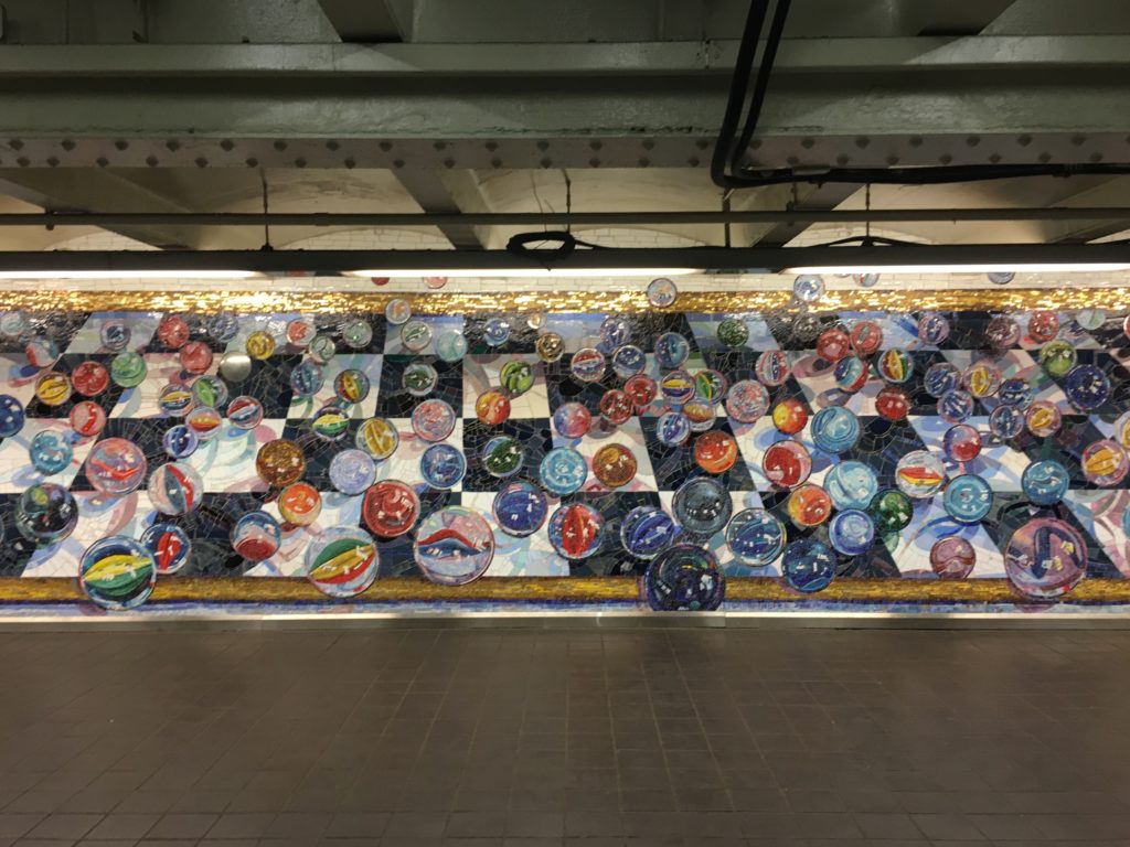
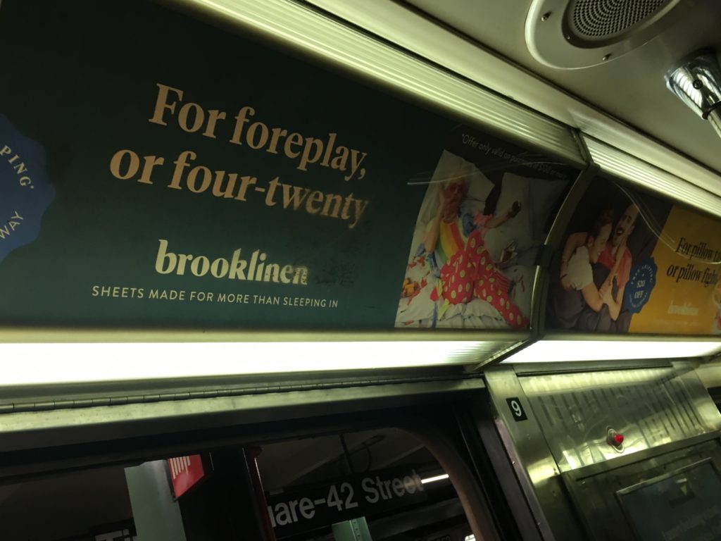
ATMs, convenience stores and trashcans are easy to locate. The subway is safe, and well monitored by surveillance cameras and police. Several posters advertising tv shows, web series and brands among other things, offer a sense of familiarity and make the experience less daunting. Also serving the same purpose are the artworks on the walls. Musical performances are a regular affair at the station, which also becomes a platform for artists to showcase and sell art. This makes the Subways less monotonous and more entertaining. Yellow strips at the edge of the platforms mark a safe distance from the rail tracks. These strips are embossed to prevent slipping. A set of benches are placed at the platforms for senior citizens and physically challenged.

Advertising-posters
Musical-performances
Artworks

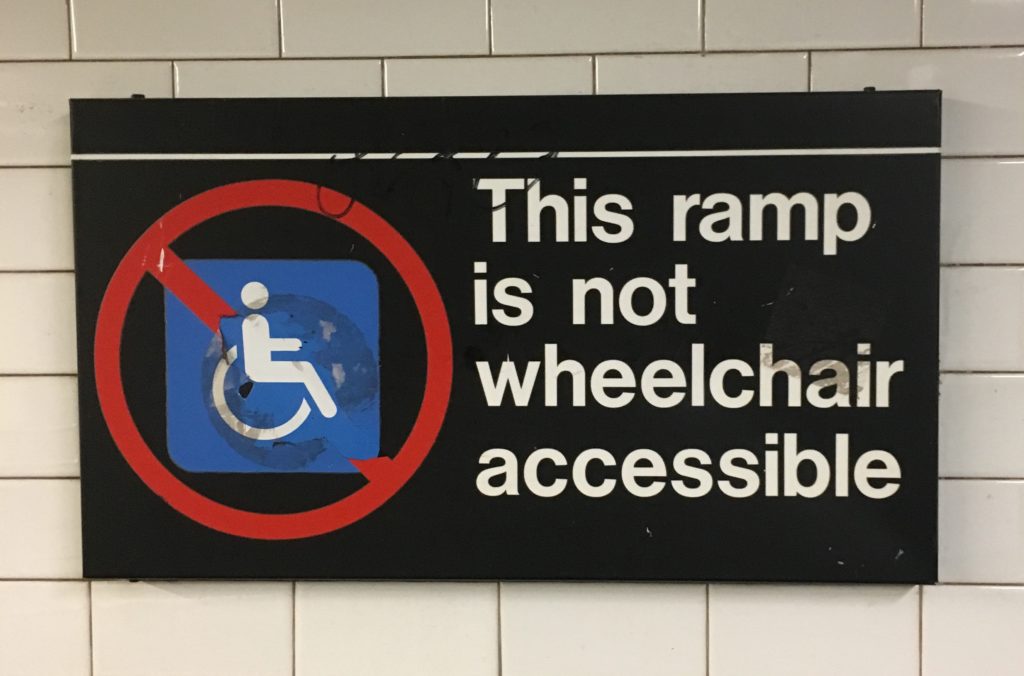
An attempt to incorporate inclusive design has been made through the use of braille, ramps and elevators, but it fails to be efficient. 

inefficient-inclusive-design

ON THE TRAIN 

Every train’s icon, number/alphabet and route is visible on it. Red bulbs light up on both sides of the automatic doors when they are open. Many advertising posters on the insides of the trains offer comfort and interaction. There are poles and railings for standing commuters to hold onto. Newer trains have digital display of the trains route with current and next station highlighted, but the old trains only have a poster of the trains’ routes. To complement this, system announcements alert the passengers of the upcoming and current stations. There is priority seating for disabled and senior passengers. Clear instructions for events of emergency are displayed with assistance intercoms and emergency brakes.  

Posters-in-train

OBSTACLES AND SUGGESTIONS

The Subway system is extremely well planned and functional, and given its technological structure manned stations are barely needed. Although, a considerable number of users are not tech-savvy. There is a lost and found unit, but without relevant assistance chances of items being turned in are slim. There could be a dedicated station for a personnel within the premises for further help. Nonetheless, NYC Subway system is an exemplary public space design with minimum room for errors.

References:

How Netflix Learns What You Like

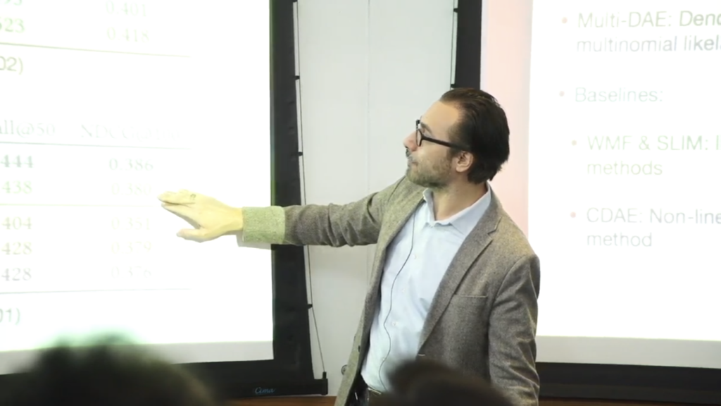
On Thursday, February 28th, NYU Tandon School of Engineering held a live streaming event featuring a talk given by Netflix’s Director of Machine Learning, Tony Jebara. The topic covered was “Machine Learning for Personalization”, which Jebara provided company use cases and solutions for content personalization.

Netflix Director of Machine Learning, Tony Jebara

Netflix, a streaming media-service, is well regarded within the machine learning field for developing impressive machine learning models that incorporate advanced feedback mechanisms to train and improve those models.

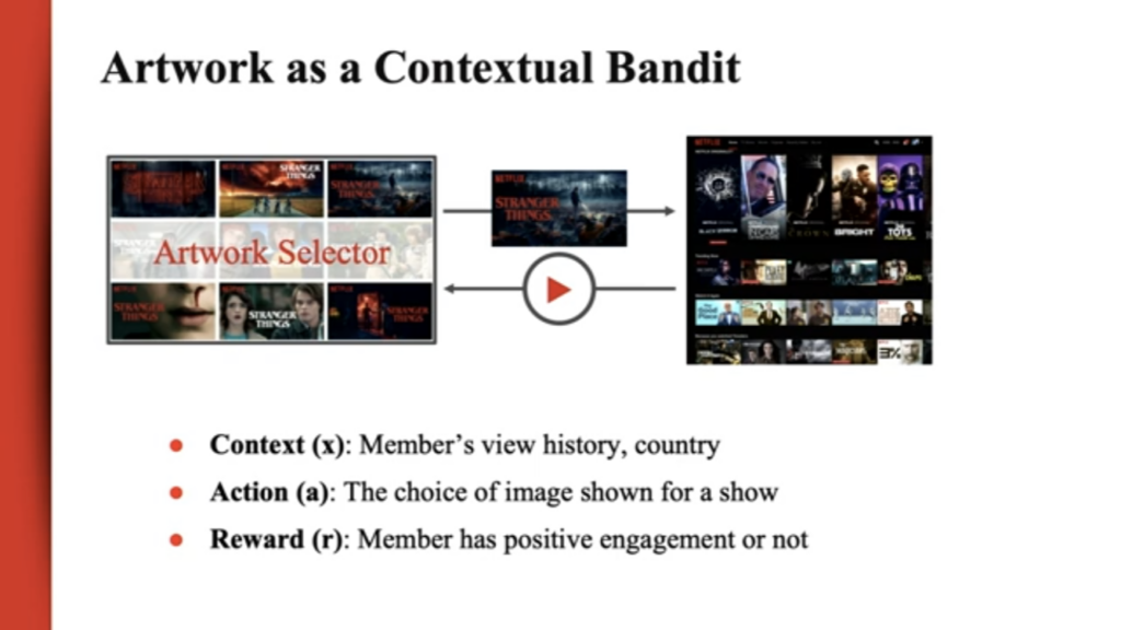
According to the Director of Machine Learning, Tony Jebara, every Netflix user’s experience is unique across a range of personalized content. A few examples of personalized content provided by Jebara were rankings, homepage generation, promotions, image selections, searches, advertisement displays, and push notifications.

Content Personalization

Content personalization is a technique leveraged by many companies, across many industries, for the business of either creating content, distributing it or both. Content encompasses everything from online articles to advertisements. In Digital Disconnect, McChesney describes that the popular digital method “personalizes content for individuals, and the content is selected based on what is considered most likely to assist the sale” (p.157).

Entrepreneur lauded Netflix and other media companies who are successfully leveraging machine learning to develop custom experiences but notes a dichotomy which plagues user’s and their preferences. The trade-off between conveniently custom experiences or inconveniently anonymous reintroductions. On one side, users face issues surrounding privacy or unpleasant information dictation.

Opposite to their praises as personalization gurus, Fast Company highlighted some of the negative criticisms Netflix has also received. When companies curate the content users consume, there’s a risk of receiving biased information whether it be political or racial. Berkowitz opens with, “How companies advertise to you says a lot about how they see you” when referring to the racial bias in the algorithms used by not only Netflix, in this case, but many of the other companies working to deploy advanced content personalization algorithms.

“Filter Bubbles”

Regarding the politically charged dictation of content, Castells remarks, “The networks themselves reflect and create distinctive cultures. Both they and the traffic they carry are largely outside national regulation. Our dependence on the new modes of informational flow gives to those in a position to control them enormous power to control us. The main political arena is now the media, and the media are not politically answerable” (p. 34).

McChesney adds how these practices also lead to an issue he considers the “personalization bubble” or what he specifically alludes to as the “filter bubble” (p.157). Users are trapped in an experience they believe to be unique or new but is perpetuated by the same content delivery—just done differently (p. 70).

McChesney references Eli Pariser’s The Filter Bubble: How the New Web is Changing What We Read and How We Think when stating, “Pariser’s Filter Bubble documented how the Internet is quickly becoming a personalized experience wherein people get different results on Google searches for identical queries, based on their history” (p.157).

When Netflix Intervenes

In his talk, Jebara claimed that “prediction is valuable but actual intervention is what we want to understand.” Their algorithms are two-fold—ensuring that experiences are uniquely specific without providing recommendations that are too specific, which may lead to either a negative user experience and a potential unsubscribe from the service.

We’ve all experienced moments of interacting with a digital platform that, over time and with enough data aggregation, begins to recommend content or display ads across devices and sites outside the ownership of the originating platform. If frightened enough, we may have even gone as far as to deleting our browser cookies, adjusting our privacy settings or even unsubscribing from the service.

Algorithm Feedback

Jebara mentioned that a multitude of mixed-method machine learning algorithms are implemented to hone everything from predictive analytics and image curation to user-enforced restrictions and feedback mechanisms.

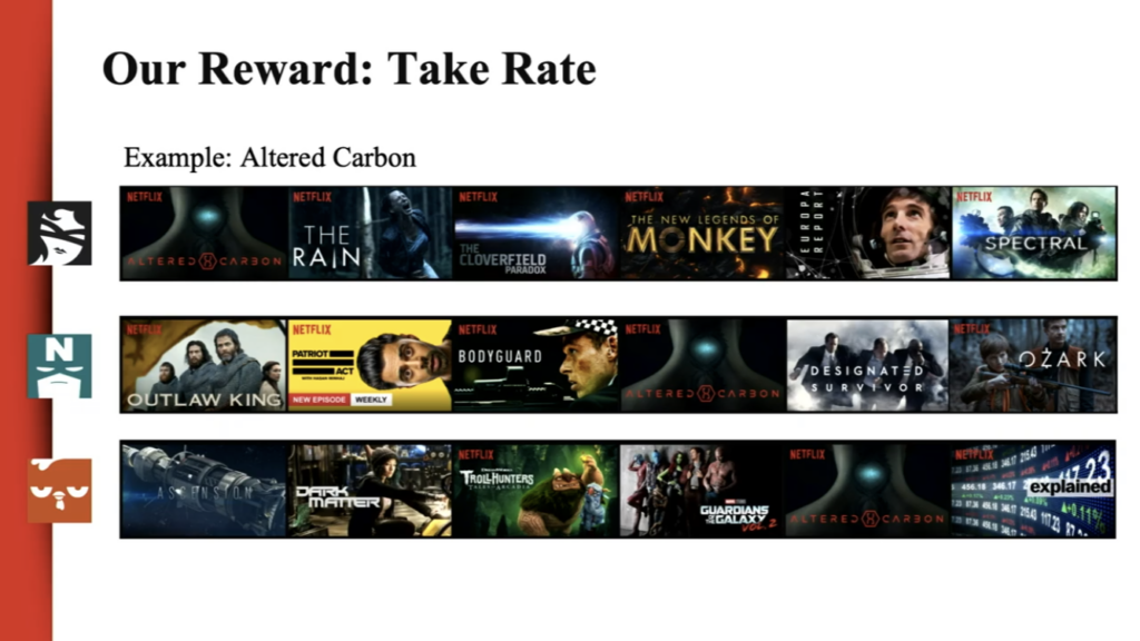
Jebara described their method take rate as a curatorial feedback strategy which tests different personalization experiences on several users to determine which of the content shown resulted in an actual viewing.

This strategy uniquely prefers the measurement of the number of viewers that strategy worked for over the number of viewers a specific piece of content was shown to. Jebara noted this method enables Netflix experts to learn from users by letting them show what content they prefer and in which ways they’re drawn to recommendations.

User Generated Feedback

This is a major shift from their previous user experience of providing users with the ability to ranking rank content using a star ranking system. Overtime and through observation, Netflix realized they couldn’t rely on that ranking system as a source of truth for which content users ranked highly versus which they’d prefer to watch. Jebara added users were not truthful in their telling of which content they preferred. Shifting away from user interaction to user observation has enabled a greater foundation for developing recommendation systems.

Conclusion

As content personalization algorithms advance, consumers will become a more passive actor in teaching content personalization algorithms. Every attempt at restricting interaction with such algorithms will lead only to yet another loophole identified by machine learning experts. How those companies manage those algorithms and exploit those loopholes are examples of the digital power dynamic which exists between the content generators and the content consumers.

References:

Berkowitz, Joe. “Is Netflix racially personalizing artwork for its titles?One writer’s experience with Netflix’s title art has us wondering whether the company is quietly using race in its algorithm for visually recommending films”. Fast Company (2018). https://www.fastcompany.com/90253578/is-netflix-racially-personalizing-artwork-for-its-titles

Castells, Manuel. The Information Age: Economy, Society, and Culture. Wiley-Blackwell (2010). https://lms.pratt.edu/pluginfile.php/876462/mod_resource/content/1/manuel_castells_the_rise_of_the_network_societybookfi-org.pdf

Chmielewski, Dawn C. “Netflix’s Use of Artwork Personalization Attracts Online Criticism”. Deadline (2018).  https://deadline.com/2018/10/netflixs-artwork-personalization-attracts-online-criticism-1202487598/

McChesney, Robert W. Digital Disconnect. The New Press (2013): 63-171.

Wirth, Karl. “Netflix Has Adopted Machine Learning to Personalize Its Marketing Game at Scale: Here’s how you can humanize marketing strategies. Entrepreneur (2018). https://www.entrepreneur.com/article/311931

Event Attendance: AI is the New UI

Interaction 19, held from 3-8 February in Seattle, is a week of design events for interaction designers from around the world. It assemble a diverse group of professionals and academics to explore the edges of interaction design and help to spark a transformation of the discipline for the needs of the 21st century. This year’s event features: Interaction 19 Conference, Education Summit, Local Leaders Retreat, Workshops, Student Design Charette and Interaction Awards Ceremony.

The three-day conference Interaction 19 is the main event. In the process of watching speeches of various topics, I found myself interested in the content about artificial intelligence. On 7 February, there are two groups of lectures about AI: “AI is the New UI” and “AI in the Wild”. The first topic attracts me very much. “AI is the New UI” includes five presentation: “Designing for AI”, “How to Design With, Not For, Artificial Intelligence”, “Democratization, Industrialization and Augmentation: Where Creativity and Design Craft is Going Next”, “Designing Transparent AI” and “How AI Will Change The Way We Work”.

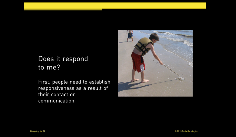
In “Designing for AI”, Emily Sappington talked about her opinions about imbuing artificial intelligent components in products. She shared her practices both in large companies and startups, indicating that creating minimum viable intelligence for AI product is the most important and fundamental strategy of product design. Meanwhile, designers should set appropriate user expectation for AI interaction process considering the user’s satisfaction. Because user’s interaction with product is a trust-building process in which quality and ability delivered in product that company promised directly influence the consequence of user testing. Take voice assistance as an example, “A user who can’t set a reminder with their voice , will not be likely to trust the same voice assistant to take down credit card information and order pizza.”

In “How to Design With, Not For, Artificial Intelligence”, Joe Meersman began with IBM Wason case study and some best practices. Then he proposed concrete framework of successful AI delivery, including ideal delivery team for each of the three categories of AI projects and relative delivery process.

Similarly, “Designing Transparent AI” from Arathi Sethumadhavan and Dr. Samuel J. Levulis also suggested that designers should set appropriate expectations about what the AI can and cannot do and strive to make various elements of system performance transparent to users. Then they provided some examples of the techniques that can be adopted to make AI algorithms and vulnerabilities more transparent to users.

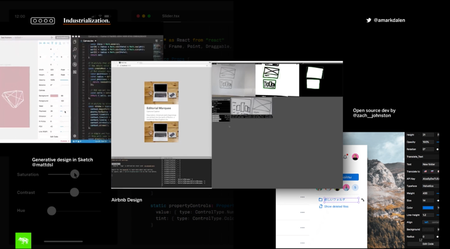
In “Democratization, Industrialization and Augmentation: Where Creativity and Design Craft is Going Next”, Andreas Markdalen proposed three things he believes that are critical to understand where design craft and discipline is going. The barriers for entering design field is diminish and people around the world are starting to participate and contribute. Design literacy is wildly increased and process commoditization is widely used with the emergence of new design tools and platforms, such as Autodraw, Adobe Sensei and Simple.io which are achieved by artificial intelligence and machine learning technology. Meanwhile, the popularity of digital transformation promotes the industrialization of digital design. Systemic design helps brand save time and effort in delivering value and product to market. Seamless workflow allows team to drive efficiency and automation. Open source tools like Airbnb design and generative design in Sketch are starting blend generative design with experience design. As a result, technology helps augment human skill and creativity to a large extent. As designers are starting to co-create alongside AI-driven systems and engines, a new era of systems and product design begins.

Kristian Samarian’s speech “How AI Will Change The Way We Work” also looks forward to the future. He indicated AI will likely cause a more significant shift for designers than previous design shift. Specifically, AI will bring us into an era of “teaching” technology. As more work is automated, our design domain will change to augmented human intelligence and human-machine collaboration.

“AI is the New UI” shows that AI is bringing a wide range of changes to the design field. Firstly,AI contributes to efficiency economy, improving the design efficiency. More and more automated design tools have emerged, replacing the repetitive and inefficient design work. As Markdalen mentioned in his speech, Airbnb Design can convert hand draft into prototype in a real time. There has also emerged automatically design tool like “Luban”from Alibaba. “Luban” makes use of deep learning and image generation technology to automatically design and generate advertising banners for Taobao, so that the design of advertising can also achieve personalized recommendation. On “Double 11” shopping festival of 2016, Luban made its debut. On “Double 11” 2017, Luban had been able to produce 40 million posters a day, an average of 8,000 posters per second, and each poster was designed according to the characteristics of commodity images. In other words, each one is unique.

More importantly, AI will interconnect all things, thus the design object will shift from single computer or mobile platform to intelligent devices, such as smart voice box, smart TV, smart cars, etc., forming a multi-scene fusion linkage. Meanwhile, the trend of combination between software and hardware means design objects are more diverse and design reference dimensions are more abundant. “AI is the new UI” indicates the trend of wild application of AI as the form as UI and UX, not just screens on devices. According to a report from Accenture in 2017, AI is rising as the new purveyor of UI and UX. The leading enterprise technology vendors have also regarded AI as the future of computer interfaces. More screenless computing is on the horizon with the innovation of AI in the field of interaction (McKendrick, 2017). Autonomous vehicles and voice-activated home assistants are just early examples of intelligent hardware, now more intelligent hardware is booming in business scenarios. Alipay’s face recognition payment is the representative of AI’s landing in new retail field. It is a new payment method based on artificial intelligence, biometrics, 3D sensing and big data risk management technology. Users can make payment by scaning their faces without using mobile phones, which effectively improves the user’s consumption experience and the efficiency of the payment. On September 1, 2017, Alipay landed the first face payment machine at the KFC restaurant in Hangzhou. By December 2018, there are 23 stores in 11 cities have tried. Not only in KFC, but also in retail scenes such as supermarkets and pharmacies, hundreds of cities across the country have begun to try face payment.

The rapid development of information technology brings great chance and threat to all walks of life. Every industry is exploring more possibilities and thinking about how to take advantage of AI. The design industry needs creativity and emotion, which should play a more important role in linking AI and humanity in the era of intelligence. Therefore, the relationship between design and AI is far more profound and complex than the work replacement relationship. As Sengers argued in “Practices for a machine culture: a case study of integrating cultural theory and artificial intelligence”: “In order to be able to address contemporary human experience, we need science and the humanities to be combined into hybrid forms which can address the machinic and the human simultaneously.”

– Mingqi Rui, Info 601, Professor Chris Alen Sula

Reference:

Interaction 19. (2019). Interaction 19 – 3-8 February 2019 • Seattle, WA. [online] Available at: https://interaction19.ixda.org/program/7_thursday/ [Accessed 15 Mar. 2019].

McKendrick, J. (2017). More artificial intelligence, fewer screens: the future of computing unfolds | ZDNet. [online] ZDNet. Available at: https://www.zdnet.com/article/artificial-intelligence-the-new-user-interface-and-experience/ [Accessed 15 Mar. 2019].

Phoebe Sengers, “Practices for a Machine Culture: A Case Study of Integrating Cultural Theory and Artificial Intelligence” Surfaces VIII: 1999, 6.

Event Attendance: Moran Yemini and the New Irony of Free Speech

INFO 601-02 – Assignment 3 – Event Attendance – Vella Voynova

How does the Internet impact freedom of speech? What does this mean for liberty? These questions occupy Moran Yemini, a Senior Fellow at the University of Haifa’s Center for Cyber Law and Policy and a Visiting Fellow at Yale Law School’s Information Society Project and Cornell Tech’s Digital Life Initiative. Yemini explored these questions at length at Cornell Tech’s seminar on March 7, 2019, “The New Irony of Free Speech.”

What is the irony of free speech?

The original irony of free speech that Yemini references was introduced in 1996 by Owen Fiss. Fiss argued that freedom of speech laws were originally intended to protect citizens from state interference, but gradually came to favor the wealthy and powerful at the expense of everyone else. While the laws granted everyone the same liberty to speak, only those with clout and authority could afford the expressive capacity to make their speech heard. The advent of the Internet and what Yemini calls the digital ecosystem democratized expressive capacity and gave citizens an online platform to reach bigger audiences across greater distances. Yemini’s “new irony” of free speech is that what we have gained in expressive capacity, we have lost in liberty to speak. Although the Internet carries our speech louder and farther, it makes us more vulnerable to interference. The use of the word “irony” perplexed some of the audience. Yemini explained that he finds irony not only in how the Internet has subverted expectations that it would solve the problem of free speech, but also in how much of the public believes that the problem has been solved.

Free speech and democracy

Audience questions also led Yemini to clarify that the problems and conditions he describes are found in liberal democracies and do not apply to authoritarian countries. While true that citizens in democracies enjoy more liberty through media, they should not take these conditions for granted. In a democracy, competition determines who controls media development, which makes the media a constant battleground (McChesney, 65). Competition is more intense when democracies face critical moments, such as negotiating the rules for Internet speech.

How does the digital ecosystem interfere with our liberty to speak?

During the majority of the seminar, Yemini discussed how the digital ecosystem interferes with our liberty to speak. Sources of interference are all around us: search engines that track histories and manipulate results, as well as broadband and cloud providers who create the framework for Internet speech. Additionally, media ownership concentration forces us to rely on digital platforms that conduct mass surveillance. This does away with our anonymity and enables media companies to manipulate us through data collection. Lawrence Lessig has already pointed out the value of privacy and anonymity. In order to protect these values on the Internet, we need to monitor those who design and profit from the digital ecosystem (Lessig, 104). The corporate and political actors who shape the Internet are not neutral in their motivations and have the means to interfere with our liberty to speak.

The technologically induced endowment effect

Yemini’s conclusion emphasized the importance of the technologically induced endowment effect: it is much harder to part with technology that we use than it is to live without that technology in the first place. While the increased individual freedom of the Internet may be gratifying and obvious, the interference allowed by the digital ecosystem is not always directly felt or perceived. We are in danger of becoming so dependent on the Internet’s expressive capacity that we may become willing to overlook the less apparent ways in which it curtails our liberty.

What happens next?

While Yemini outlined how the Internet is transforming freedom of speech and threatening our liberty, he did not propose clear solutions. Given his legal background, I expected to hear about how constitutional law could be used to approach the problem, or suggestions for policies that could safeguard our liberty to speak in a complex digital ecosystem. Jürgen Habermas argued for the necessity of a public sphere where citizens are free to express themselves without worrying about interference (McChesney, 66). After listening to Yemini, it is impossible not to be concerned that most of us perceive the Internet as a public sphere without giving sufficient thought to the ways in which its current structure interferes with our liberty to speak.

References:

Lessig Lawrence. (1999). “Open Code and Open Societies: Values of Internet Governance,” Chicago-Kent Law Review 74, 101-116.

McChesney, Robert. (2013). Digital Disconnect: How Capitalism is Turning the Internet Against Democracy. New Press.

Preserving our Digital Afterlives

This morning, as I was scrolling through Instagram, I came across an interesting post by Oroma Elewa, a Nigerian-born visual and performance artist, writer and director. Under the Instagram post, Elewa captioned “Please make this go viral. Don’t love and follow me secretly. Show me you care. Do not let me be erased. This is very painful.” Elewa was addressing a viral quote she had originated in 2014 on her personal Tumblr that has been repeatedly falsely misattributed to Frida Kahlo since 2015: “I am my own muse. The subject I know best. The subject I want to better.” If you Google that quote, you’ll find hundreds of images, articles, products, and social media posts attributing it to Frida Kahlo. In the comment section, people who followed Elewa through her journey as an artist on social media, supported her while others were skeptical. Frida Kahlo, an iconic artist and figure in popular culture and an inspiration to all women of many different backgrounds, didn’t say those words–but, who would believe that Elewa originated the quote?

As a young rising artist, Elewa was inspired by Frida Kahlo’s actual words: “I paint self-portraits because I am so often alone, because I am the person I know best.” Although this is an issue of the spread of misinformation and the blurred lines of ownership and authenticity in the online world, Elewa’s fear of erasure brought to mind Michele Valerie Cloonan’s concept of the paradox of preservation and the transient or ever-changing manner of one’s digital remains. Cloonan wrote that “it is impossible to keep things the same forever. To conserve, preserve, or restore is to alter” (235). Frida Kahlo is not alive to disprove that she ever said Elewa’s quote. With endless digital copies of her image being attached to the quote, how can we manage to support Elewa’s claim? How can Elewa make sure her work lives on without the fear of being erased, silenced or altered in the digital world? And most importantly, how can we protect and preserve our digital afterlives?

The Digital Afterlives Symposium was held at Bard Graduate Center in honor of Professor David Jaffee who was the head of New Media Research. Prof. Jaffee was instrumental in introducing and creating a new direction for the Digital Media Lab at BGC. After his death, not only was his legacy as a leading historian missed, but he also left behind a plethora of files and media pertaining to his personal and professional projects throughout his life. The topic of the symposium came about while his late daughter and a few of his colleagues started a project to archive and preserve Jaffee’s work. This endeavor has led to the exploration of finding innovative ways to protect, prolong and preserve our digital afterlives and the impact technology has on the sustainability of our digital projects as well as the privacy and accessibility of our personal information.

Technology has become an extension of our physical world. As we increasingly develop and interact with technologies, we end up with a constant re-experiencing of the past. At the symposium, Abby Smith Rumsey, an independent scholar, spoke about her research paper on how memory creates identity and how humans create artificial memory through the use of digital technology. Our transformation from an analog to a digital environment has made us reliant on digital technologies to preserve memory and be reminded of the past. And there is a moral weight of dealing with a person’s memory, especially if the person can be immortalized in the digital world. In her presentation called, “Death, Disrupted,” Tamara Kneese spoke on the proliferation of “dead users” in the online world, particularly in social media. Social media is so embedded into our lives that it has become a space for ritualized mourning, memorialization and perhaps immortalization as personal profiles transform into actual shrines after users’ deaths.

But, not everything lasts forever in the digital world. Rosenzweig pointed out that the “life expectancy of digital media [can] be as little as 10 years, [and even so] very few hardware platforms and software programs last that long” (742). Platforms will eventually disappear over time. MySpace, Orkut, Friendster and OpenDiary are all remnants of the old digital environment. Inevitably, we have to address the issue of digital decay. In her presentation at the symposium, Robin Davis, an Emerging Technologies and Online Learning Librarian at John Jay College of Criminal Justice, proved the fragility of the digital world through her case study on the lifespans of digital humanities scholarship projects that were created in 2005. She found that only half of the 60 DH projects she studied were accessible online 10 years later. In some cases, she found that other projects had a shelf life of 5 years due to issues with hosting and the lack of funding while a couple of web projects were even taken over by fraudulent companies. Davis reiterated that digital scholars need to build a preservation plan into their projects and consider the longevity of their choice to create content for the web.

So, ultimately, our digital remains will disappear, but can individuals maintain and manage their own digital data in the hopes of living on as information after death? Is it possible to save everything? Rosenzweig wrote about “the fragility and promiscuity of digital data,” which requires yet more rethinking–about whether we should be trying to save everything…” (739). The debate over whether it is worthy or not to preserve everything was also discussed at the symposium. Overall, all of the speakers agreed that we do not have the proper tools or policies in place to be able to. And also that it is important to preserve more ephemeral data now in order to understand its significance in the future.  

According to Cloonan, “preservation must be a way of seeing and thinking about the world, and it must be a set of actions…[it] also has broader social dimensions, and any discussion of preservation must be include consideration of its cultural aspects” (232). Like Cloonan, Rumsey said that the primary issues of digital technology preservation are not just technical but are in light of larger political, economic, and education issues of our world. Companies like Amazon, Google, and Facebook and libraries as well as government agencies need to put more effort into creating preservation programs. They also do not have the right capacity or policies of dealing with the ramifications of digital remains. If Verizon Media, the owner of Tumblr, were to step up and protect Elewa’s words from being misquoted as Kahlo’s, would it have stopped the proliferation of companies and individuals attributing the quote to Kahlo?

At the end of the discussion, Rumsey left us with a parting message–it is important for us to remember that there are people behind these machines or technologies. People program and create software and applications so that machines behave in a particular way, so it is only up to us to change how we use and think of digital technology. Technologies have no built in moral bias other than what we program them to be, but it is has become an expansion of who we are. The material and digital world are a connected space now. Therefore, we must take responsibility over our digitized selves.

References

Cloonan, Michele Valerie. “W(H)ITHER Preservation?” The Library Quarterly, vol. 71, no. 2, 2001, pp. 231-242. The University of Chicago Press, www.jstor.org/stable/4309597

Elewa, Oroma. “Elewa’s quote.” Instagram, 18 Mar. 2019,

https://www.instagram.com/p/BvG_v1YDnGT/.

Rosenzweig, Roy. “Scarcity or Abundance? Preserving the Past in a Digital Era.” The American Historical Review, vol. 108, no. 3, 2003, pp. 735-762. Oxford University Press, www.jstor.org/stable/10.1086/52956

Observation: Black & Light by Oscar Oiwa at Cadillac House

Info 601-02 Assignment 3: Observation by Michael Lewis

Due to my background in art and design, I chose to explore an art exhibition as my object of observation. A close friend of mine invited me to an opening of Oscar Oiwa’s Immersive Mural “BLACK & LIGHT” exhibition curated by Visionaire. In looking at this, I realized that this would be an excellent opportunity for me to conduct an observation of how people interact with each other and technology in a deliberate interactive environment.

Source : https://gothamtogo.com/oscar-oiwa-black-light-at-cadillac-house-gallery-in-greenwich-village/

Oscar Oiwa (53) is a Brazilian-American painter who is known for his Globalism movement in mural art. Throughout March 30, “BLACK & LIGHT” will be available for the public at Cadillac House, New York. The Japanese-Brazilian artist painted a black and white mural inside an inflatable dome with a surface area of 2,700 square feet. Oscar is well known for his signature surreal paintings and mythical characters like Light Rabbit and Shadow Cat. Events can, to some extent, be created or recreated (Buckland, 1991). In this case, Oscar tries to re-enact his art as a form of information for people in New York City to experience his idea and concept in a wonderful space of Cadillac House curated by Visionaire.

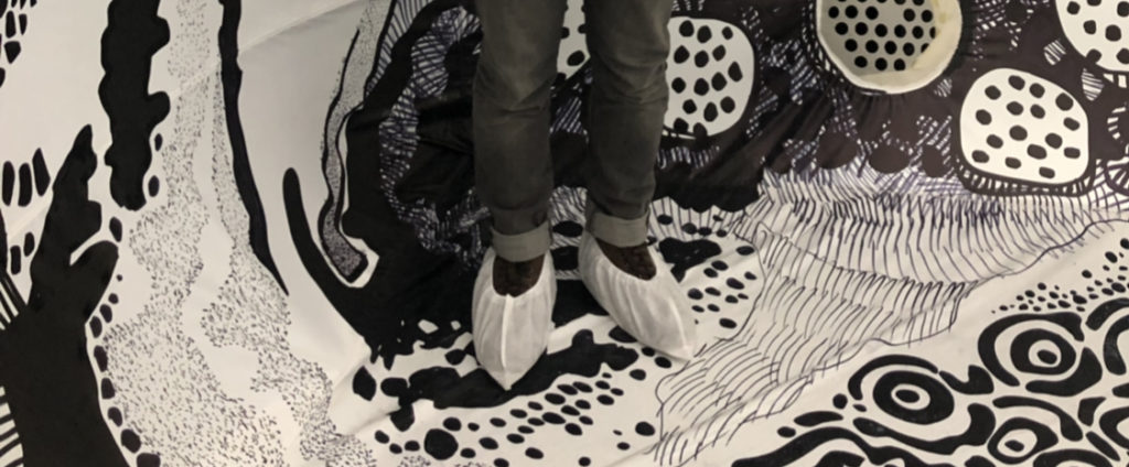
As I entered the Cadillac House building, a few hosts greeted me and asked me for the RSVP invitation. The event is very well curated and filled with people from the art and fashion industry. Guests are served with cocktails and hors d’oeuvre as they waited in the waiting room before they are allowed to enter the majestic-looking inflatable dome. As I was lining up to access the dome, I realized that all guests are required to use a disposable shoe cover provided by Visionaire. As a result, it prevented guests from ruining the paintings inside the dome. This procedure is a piece of evidence that the painting (information-as-thing) has to be preserved as much as it can due to its high value to the audience.

Disposable shoe cover for guests to enter the dome

After a 10 minutes wait, I and the several other guests entered the 2,700 square feet dome covered in an astonishing black and white surreal landscape painted by Oscar Oiwa. They limit 20 people to be inside the dome to prevent any damage to the painting. It is beyond words of how information is transmitted as a knowledge between guests, technology, and the artist himself. I realized that few of the guests are from outside of the country and they are accompanied by translators who are fluent with their languages and able to explain the concept behind this amazing art space. In looking at this, I realized that this is a form of an embodied information, a corporeal expression or manifestation of information previously in encoded form (Bates, 2006), transmitted by the translator to guests who are more comfortable in their own language.

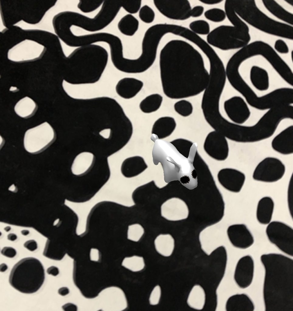
This event also provided an immersive experience where guests can interact with the painting through augmented reality. One of the staffs inside the dome approached me and introduced a feature that I can access through a gadget like a phone or a tablet. I was asked to access a site called jumpintothelight.com to experience the augmented reality designed by Oscar and Visionaire team. As I turn on my camera inside the dome, I can see Oscar’s famous Light Rabbit and Shadow Cat character running around across the painting inside the dome. It was such a breathtaking experience to witness a different form of embedded information, a piece of enduring information created or altered by the actions of animals and people in the world (Bates, 2006).

Augmented reality of Light Rabbit

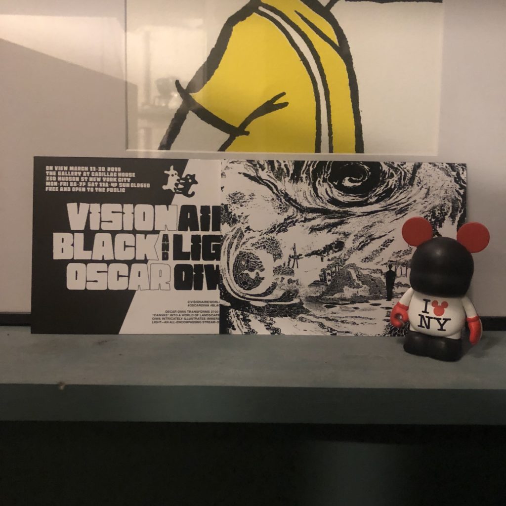
As each guest are only allowed to stay for some amount of time, I decided to exit the dome and join my peers outside to discuss our experience inside the space. As we have our own subjective opinion towards the display, a form of enacted information is being transmitted along to every individual in the discussion. After spending 2 hours in this fantastic space, I decided to leave and grab a postcard-look alike invitation designed by one of my closest friend who got invited to this event and make me as his companion. It is a 5″ x 7″ black and white postcard with a charming layout filled with Oscar Oiwa’s signature character Light Rabbit and Shadow Cat. We decided to keep the invitation as part of the evidence and memoir of our visit to the exhibition. This invitation act as communicatory or memorial information preserved in a durable medium which Bates called as a piece of recorded information. I am happy to say that I cherish every moment at the event and I do realize that this observation has given me so much information in different forms introduced by Buckland which are information-as-knowledge, information-as-process and the last but not least, information-as-thing as I brought the invitation back home as a souvenir from the event.

Black & Light invitation

References:

Bates, M. J. (2006). Fundamental Forms of Information. Journal of the American Society for Information Science and Technology, (57)8, 1036.

Buckland, M. K. (1991). Information as Thing. Journal of the American Society for Information Science, 42(5), 351-356.

Event Attendance: Designing the Connected City @ Cooper Hewitt, Smithsonian Design Museum

By: Michelle Kung
INFO 601-02 Assignment 3 Event Attendance

Cities like New York are notorious for congestion and pollution. It often takes the same amount of time to walk somewhere as it does to drive somewhere. But big tech companies are reimagining urban mobility with connected and autonomous vehicles (AVs). On the 25th of February, 2019, leaders in the field of autonomous vehicles or driverless cars came together at the Cooper Hewitt, Smithsonian Design Museum for a panel discussion. Moderated by Cynthia E Smith, the curator of Socially Responsible Design, the panel consisted of Sarah Williams, the director of Civic Data Design Lab at MIT, Ryan Powell, the head of user research and UX design at Waymo (Google’s self-driving car project), and Jack Robbins, the director of urban design at FXCollaborative. With diverse backgrounds, the three panellists debated topical issues engendered by AVs.

A World Unknown

One thing that the three panellists agreed on was that no one really knows how technology will impact mobility in urban spaces. The field is still new and concepts have only been tested on limited scales. Jack Robbins called this ‘a new era of mobility’. Indeed, we have no idea how the way we move, not just within cities but across the country, is going to change. All we know, and all leaders in the field know, is that autonomous vehicles will be the biggest drivers of change.

Heaven or Hell Scenario

Jack Robbins illustrated two opposing scenarios: a heaven scenario and a hell scenario. In the heaven scenario, after autonomous vehicles have replaced standard vehicles. There will be fewer vehicles on the road, fewer vehicle miles travelled and more spaces freed up in cities for other things. Without the need for parking (i.e. temporary storage of private vehicles) within the city, there is a tremendous opportunity for the creation of more green spaces and open spaces which will increase the liveability of any congested and densely populated city. On the other hand, in the hell scenario, there will be more vehicles and more vehicle miles travelled. Autonomous vehicles will be on the road driving around with or without passengers, which would be terrible for inhabitants of cities as well as the health of the planet. 

Will companies deliver on their promises?

Companies developing autonomous vehicles are of course promising everything detailed in the heaven scenario. But Jack Robbins cautioned event goers against trusting these companies too much.  After all, the way they make their money is incompatible with the promises they are making. For example, Google sells advertising but is promising increased road safety, mobility equity, easy parking, transit support, and less traffic. But how? By gathering an increasing variety of information on humans and on built environments.

Human Behaviour is Information as Thing

Waymo, Google’s driverless car company, purports to take a human centred approach to create a ride hailing service. Their primary goal is physical safety. In order to achieve this, Waymo collects an incredible amount of data on people and human behaviour in order to program the world’s most experienced drivers. According to Ryan Powell, 94% of road accidents are caused by human errors and Waymo’s aim is to eliminate this altogether. Waymo has managed to collect the data of behaviour patterns of adults, children, and cyclists in order to teach their fleet of driverless cars how to react safely in each scenario.

On the surface, treating human behaviour as information as thing is not at all revolutionary. Psychology, anthropology, and a whole host of other social sciences have studied the behaviour of humans for decades. But the monetisation and capitalisation of this information on such a large scale is new. Speakers in this talk were more interested in talking about the information regarding the space and infrastructure of a city than information about the people living in them, which is slightly alarming.

Public Space as Private information

A huge topic of debate in this design talk was the importance of the public nature of public space. Speakers Sarah Williams and Jack Robbins both challenged Ryan Powell on Waymo’s current practices of keeping information about the public space private.

As Waymo gathers more and more information on public spaces, their data set becomes more valuable. Sarah Williams advocated for city governments to leverage their power to ban companies like Waymo from operating in their cities to negotiate data rights. Both Sarah Williams and Jack Robbins argued for the importance of public governing bodies to step up and play a more active role in this sphere rather than passively hoping for technology companies to do the right thing by citizens. Autonomous vehicles pose real dangers in deepening and widening the digital divide, privatising public data, and decreasing equitability in cities. It is up to cities to set boundaries, guidelines, and regulations so that data collection and ownership of cities contribute to the public good and can benefit the many rather than the few.

Conclusion and Reflection

This design talk was fascinating and helped me conceptualise the new forms of information this emergent technology creates. The panel discussion really encouraged me to think more deeply about the data rights of citizens and city governments. It is already inconceivable, the amount of data big software companies have on our digital behaviour. It is entirely unimaginable, for the average user, what information companies developing autonomous vehicles will have on our behaviour in physical environments once AVs become more mainstream.

In the meantime, it is clear that city governments need to catch up to big tech players in order to ensure that public spaces are protected, new infrastructure built is adaptable to unforeseeable changes, that cities become more liveable in the long term for all its inhabitants, not just a select few.

References

Buckland, Michael K. “Information as Thing.” Journal of the American Society for Information Science42, no. 5 (1991): 351-60. doi:10.1002/(sici)1097-4571(199106)42:53.0.co;2-3.

Observation: Museum of Modern Art

Introduction:

The Museum of Modern Art (MoMA) is located in Manhattan, NYC. MoMA exhibits modern and contemporary art, including architecture, painting, sculpture and new art forms integrated with technology. MoMA is a world-famous museum, attracting a large number of visitors every day, which makes the process of information dissemination and acquisition particularly important. People acquire information in different ways, including taking photos, listening to commentaries, reading instructions and etc. Museums disseminate information through electronic display boards, text instructions, and broadcasting devices.

I went to the MoMA in the afternoon on March 19. In the lobby of the museum, it was not that crowded. Most people walked in twos and threes. Some of them were reading the introductions next to the sculptures, some of them were taking photos, and others were talking about the sculptures (figure 1). When I walked towards the stairs, I saw the sign on the wall which guided the visitors to the exhibition hall they wanted to visit.

Figure 1

Figure 2

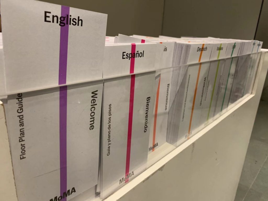
After I climbed to the second floor, I saw an information desk. The lady who was sitting behind the desk gave me a map which showed the floor plans of the museum. On the desk, I noticed several different colors on the covers of the brochures (figure 2) and one color corresponded to one particular language that the brochure was written in. The brochures were a really cool design that let people from all over the world feel the warmth and respect in this museum. As I continued walking, I noticed that the free audio commentaries were a great design as well. The visitors can borrow free audio devices from the desk and use them to play the commentaries while walking in the gallery. The commentaries are translated into nine languages so that the majority of the visitors can find their preferred one (figure 3). It is so convenient for visitors that they do not need a commentator to explain the exhibits. However, mobile exhibitions only have the English version of the commentaries. The translation process now is much easier than the old times, so the museum can improve it by using artificial intelligence to translate the majority of the commentaries into different languages and refine the translations through professional editors. It will save a lot of manpower, material, and financial resources and give the visitors a better experience.

Figure 3

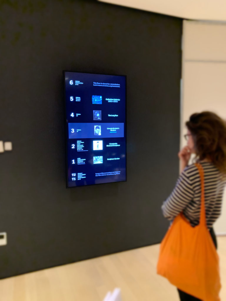
Then I followed the map and went to the third floor. When I arrived at the third floor, I saw an electronic screen on the wall (figure 4). Some of the visitors was looking at the screen and tried to find the collection that they wanted to see. On the third floor, it was exhibiting the furniture and decorations of the house. Visitors were watching the introduction videos which were projected on the wall. I have visited the latest exhibitions and events page from the MoMA website in advance and found Lincoln Kirstein’s Modern exhibition is on display. I went to the entrance of the exhibition hall and a lady asked me if I had the membership card because this collection was only open to members. I took out the card and she scanned the two-dimensional code on the back of the card and let me in. Compared to the traditional ways of verifying visitor information, this indeed is a new and efficient way to admit the visitors to the special exhibitions.

Figure 4

Figure 5

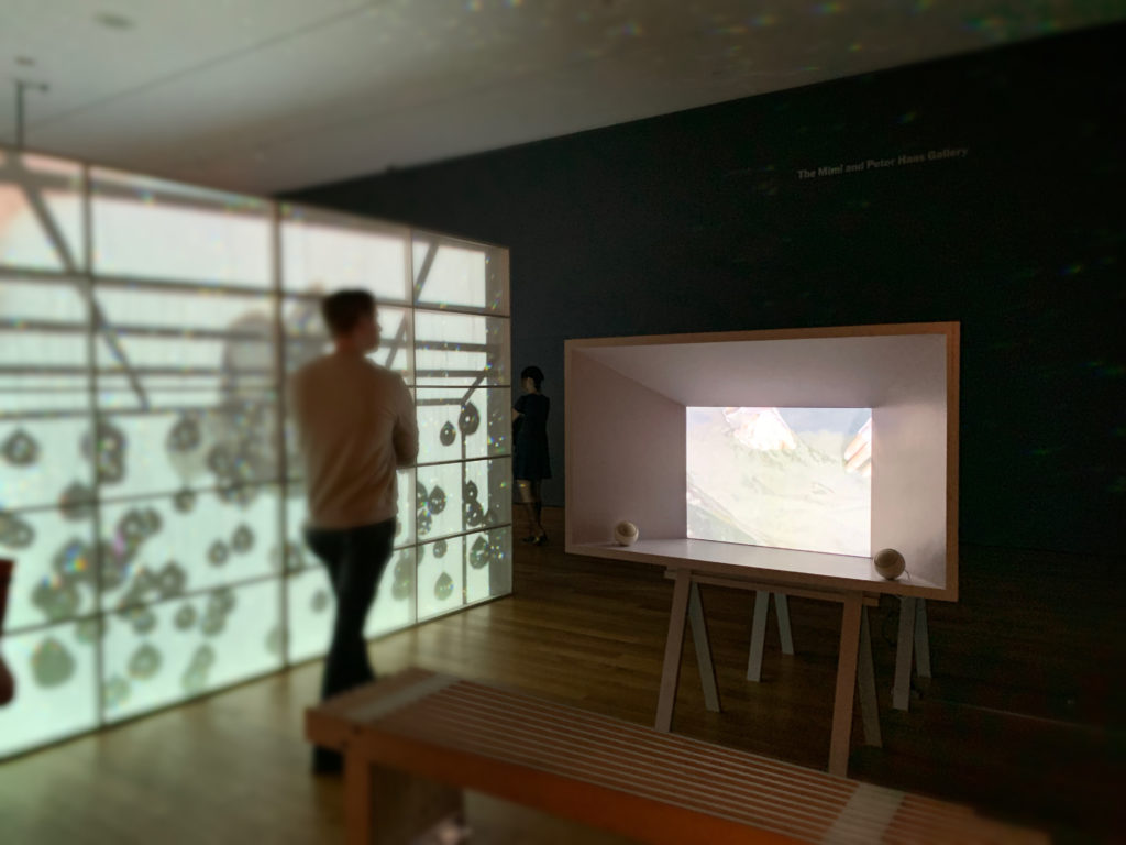
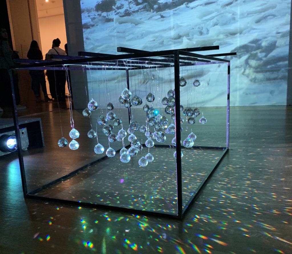
On the fourth floor, the art pieces were combined with technology and created a strange but special and novel feeling (figure 5). The dynamic space guided the visitors to look around and listen to the sound. The dark room, the bizarre lights and shadows accompanied by the background music let people experience the wonder and beauty of art (figure 6). I like these art items because when technology gets involved, everything becomes different and new. In Georgia Guthrie’s article “Art+Technology = New Art Forms, Not Just New Art”, she answered people’s question– “Why should we even try to use technology in art?” with this: “Because using technology in art has the potential to create entirely new art forms, and therefore new experiences for us that can be thrilling, illuminating, and just plain fun”. Technology is not only changing the pace of our lives but also shifting our appreciation of beauty in life. Technology gives us infinite possibilities to explore the beauty of the world. I am looking forward to seeing more intelligent art forms and art pieces in the future because our technology is developing rapidly day after day.

Figure 6

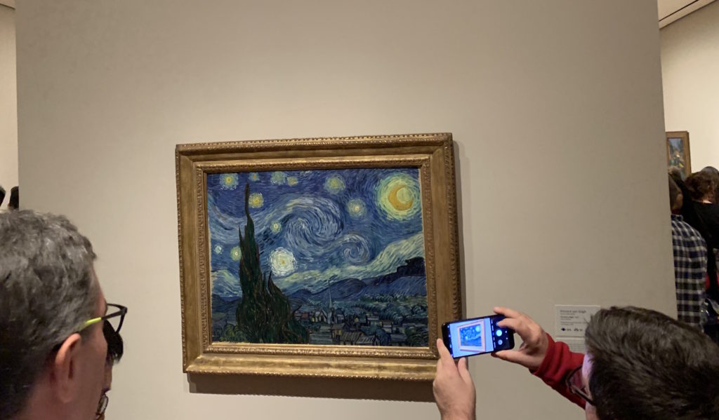
Finally, I got to the fifth floor where it was very crowded. The worldwide famous painting The Starry Night by Vincent van Gogh was exhibited on this floor. People come to see this world-famous painting excitedly, whether or not they have an artistic background. People recorded the special moment by taking photos of the painting (figure 7). Some people did not turn off the flash, so the security guy reminded the visitors again and again. It is better to have a sign on the wall in an obvious place to remind the visitors so that the security guy does not need to remind the visitors all the time.

Figure 7

Conclusion:

I enjoyed this observation and found out how people interacted with the information in a museum. In the article Fundamental Forms of Information, Marcia J. Bates says: “Anything that human beings interact with or observe can be a source of information”. The museum is a very important place for people to experience and absorb information. Bates writes that recorded information is communicatory or memorial information preserved in a durable medium(Bates 4). The documents and photos in the museum are recorded information. People read the documents and watch the photos on display and feel the history of the exhibits that satisfies their needs for aesthetic and the desire for knowledge. The museum is a medium to communicate cultures, a force to promote social change and development, and one of our most important wealths in the world.

References:

Guthrie, Georgia. “Art + Technology = New Art Forms, Not Just New Art | Make:” Make, Maker Faire, 31 Jul. 2018,https://makezine.com/2013/11/15/art-technology-new-art-forms-not-just-new-art/.

Bates, Marcia J. “Fundamental Forms of Information.” Journal of the American Society for Information Science and Technology, vol. 57, no. 8, 2006, pp. 1033–1045., doi:10.1002/asi.20369.

Xi Chen INFO 601-02 Assignment 3 Observation