Located at Lower Manhattan, The Oculus is the new transportation hub connecting The NJ PATH train to 11 NY subway lines; a must-see tourist attraction with marvelous architecture design; and an enjoyable shopping center with over 50 stores. As a multi-functional building serving users with diverse purposes, the information environment could be overwhelming. In March 18th, I experienced The Oculus as a NJ-NY commuter, to see whether the necessary information is clearly delivered to me, and observe how other users interact with information under their specific goal.
Layout of The Transit Hall
The Transit Hall is a 3 stories, 350 ft by 115 ft column-free elliptical space, with #1 train and PATH Station at the west end, E train station and the passway to Fulton Center at the east end, as well as two entrances and viewing platforms at street level.
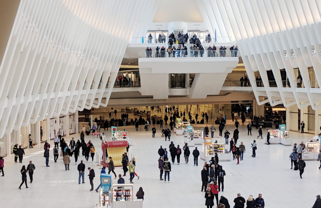
Upon exiting PATH station from underground, you could see ticket machines and printed information boards on both sides along the walls, and the #1 train entrances on the Oculus level. Walking up the stairs in front of you to the Oculus level, you would see several small kiosks, a sitting area, and the huge stairs leading you to the lower Mezzanine Level, for the exit to Fulton Center (A/C/4/5/J/Z/W/R lines) at the other end of the Transit Hall. The spatial structure was very obvious and easy to understand. I think the architect created an intuitive information environment, guiding different user groups in unnoticeably-designed separated circulation routes. Commuters walked straight down the hall for transition. Shoppers tend to stay closer to the curving edges where the stores are located. Most tourists entering from street would exit immediately after taking photos at the platforms.
Ticket Purchasing
There were 5 kinds of ticket machines outside The PATH station, 2 for both MetroCard and SmartLink (card and cash/card only), and 3 for SmartLink only (blank card/2 trips/10 trips with card), which make it a bit complex for first time users. During my observation I saw several people failed at their first attempt, because of the language barrier or trying to use cash on a card-only machine, or wandered around the area trying to figure out which machine to use. There was no information booth nearby so they eventually had to ask other passengers for help.
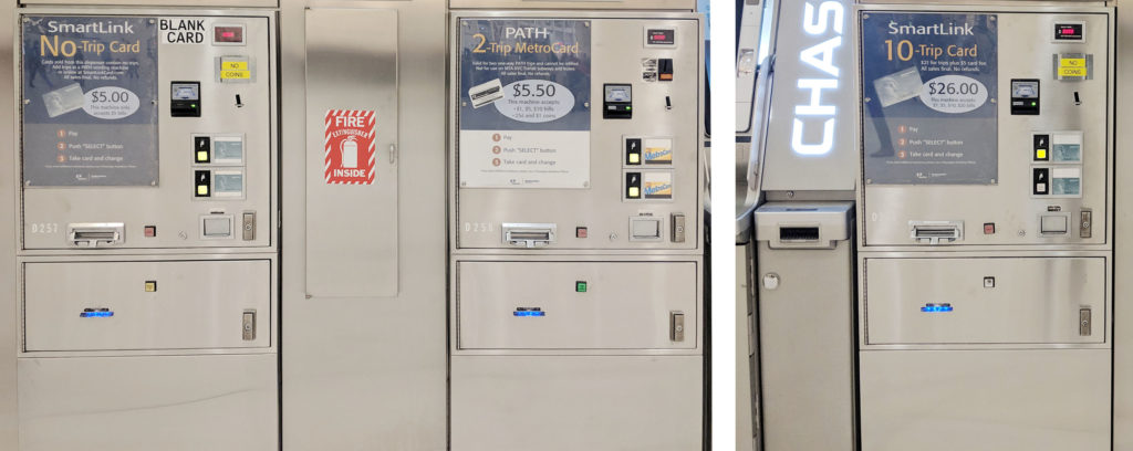
The MetroCard/SmartLink ticket machines provided 8 different language interfaces, which was intended to help foreign visitors to purchase ticket by their own. However, for me the overall English-Chinese translation was poor and some of the vital information, for example “trips” and “Unlimited Passes”, was not translated at all, which means passengers with no English knowledge can not complete the process without additional help. Furthermore, although PATH accept both MetroCard and SmartLink, the information was not displayed until you entering the ticket gate with you tickets purchased.
Suggestions:
- Reduce the types of ticket machine to avoid confusion and failure
- improve the translation to better serve foreign users
- Notified the users that both MetroCard and SmartLink are accepted by PATH on the information boards and ticket machines
Maps
3 types of map were available in the Transit Hall. PATH/Subway System Maps, both printed and electronic, could be found inside and outside the PATH/Subway station. Floor Plans for vertical transportation and transit direction were placed at every entrance/vertical circulation core, on the wall or as mobile stations. A Directory of Stores outside the PATH station occupied a whole wall.
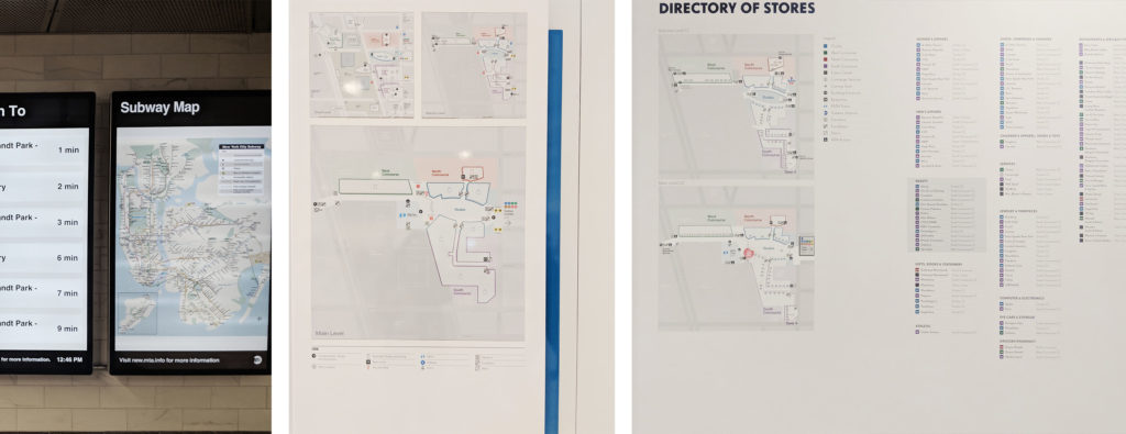
Stores and transit information were illustrated separately, all the maps were positioned at “decision points”, and “perpendicular to the view’s line of movement and sight”, which made it convenient for different users group to acquire information (Calori & Vanden-Eynden, 2016, p103). However, maps at the less crowded places provided incorrect “You Are Here” information. And none of the maps showed whether the subway entrance have access to both directions or a single direction. In addition to that, printed 2D maps might be difficult for some users to interpret and create a “mental map of the site”(Calori & Vanden-Eynden, 2016, p6). Printed and electronic Subway System Maps in the station were placed next to each other, providing duplicated information. The electronic Maps were in low resolution and can not be enlarge, so many information were unreadable.
Suggestions:
- Ensure information on the map is correct
- Add detail information regarding the subway line direction
- Provide 3D and interactive maps for users to explore the direction
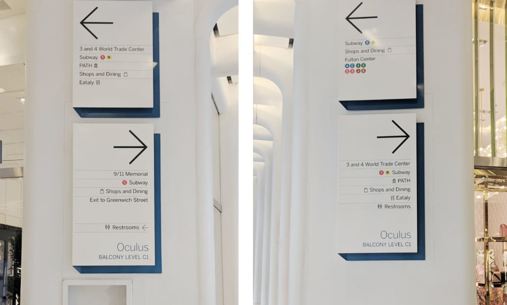
Signage System for Wayfinding
Similar to the Floor Plans, identification and directional signs could be found at every decision points, on the wall or under the ceiling, and were organized in hierarchy to allow users quickly scan through. Several directional signs with same content were placed along the route, so users could confirm their decision and verify the arrival at the destination.
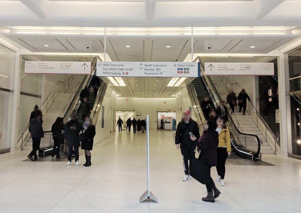
However, during the observation I saw visitors asking staffs for direction after they read through the signs and I believe there were a few reasons. First, some signs offered “contradictory” information which in fact was accurate. For example, at one decision point, the upper sign on the wall displayed the 1 train entrance was to the left while the sign right underneath it showed that the entrance was to the right. There were indeed entrances at both direction, but anyone who was not familiar with the area would definitely feel lost after reading the signs alone. And this kind of “competing” information can be seen all over the place. Second, signs provided incomplete information. The train entrance for single direction was not indicated on the signs and will lead users to the wrong way. In addition to the permanent signs, mobile sign stations were placed at multiple location, which may cause anxiety. I saw about 10 signs upon exiting the PATH station, leaving me a very negative impression.
Suggestions:
- state only the nearest entrance at one decision point
- Add detail information regarding the subway line direction
- Reorganize the information to reduce the total amount of signs at one decision point
Staff
There was only one concierge desk located at Oculus level, which may not be sufficient considering the daily traffic. And the location was neither illustrated on the maps nor listed on the signs. You could find staffs at every decision point and gate. Although I believe that is due to the security concerns, they would offer help when being asked. However, at crowded spaces they might not be visibly in their dark uniform.
Suggestion:
- Add more information booth, and provide the location information on maps and signs
- Change the uniform color to make staffs more visible when needed
Reflection
The experience illustrates how information works as thing (eg. ticket machines, signs, maps), process (eg. reading instructions, signs and maps) and knowledge (eg. successful completing the task) (Buckland, 1991). However, due to its quantity and complexity, it would be useful to introduce the fourth state – interactive information (eg. interactive map, multi-language interface) into the information system, allowing users to freely explore and acquire the information they need (Marchionini, 2008). These four stages are interconnected, any tiny mistakes occur in one state will cause error in the next one.
The insights and lessons I learned from its information-communication designs can be applied in my future work as users follow the same process to navigate in physical and virtual world. “The virtual worlds of software are worlds of cognition: ideas and concepts presented without physical substance” (Norman, 2004, p80). A clear and communicable information system design is especially essential in virtual world, since the users cannot get clues from anything other than your design, and as they are not physically restricted in a space, they can easily switch to other available options.
INFO 601-02 Assignment 3: Observation by Xin Su
Reference:
Calori, C & Vanden-Eynden, D (2015). Signage and Wayfinding Design. Hoboken, NJ: John Wiley & Sons, Inc.
Norman, D.A. (2004). Emotional Design: Why We Love (Or Hate) Everyday Things. New York, NY : Basic Books.
Buckland, M. K. (1991). Information as Thing. Journal of the American Society for Information Science, 42(5), 351-360.
Marchionini, G. (2008). Library & Information Science Research, 30(2008), 165–174.
For more information about The Oculus