Month: November 2018
Event Attendance: NYC Media Lab 2018
I attended quite a few information events in new york, some of them were very informative lectures and some of them were experimental workshops. However, the 2018 NYC Media Lab Conference was the one that made me feel blessed to be in New York. 2018 NYCML Conference was an annual two-day event organized by New York media lab. It was consisted of talk panels and debates on hottest topics from information field, and hundreds of demos across the country-wide industry and different university programs.
One of the most memorable talks for me was given by Thomas Reardon, a member of the W3C and the founder of CTRL Lab. This talk was regarding their latest neural interface technology. Just as people were still impressed by the glamorous technology from sci-fi movies, neural interface technology took the limit to the next level. In user interface technologies from movies, motion is necessary to perform an action through an interface projected by a pair of glasses, but neural interface technology (currently in the form of a wristband) is able to capture the users’ “intentions” with teeny tiny neurons. No visible movements is required. This is a demonstrated video from the presentation.
NYCML’18: Thomas Reardon Keynote
(Demo: 14:29 – 15:43)
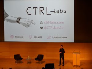
This presentation is revolutionary to me because it completely reformed my ideas about information design. Being specialized in user experience design, I focused my eye so much on the the actual products and graphic designs that sometimes I was limited. This innovative technology greatly broke the walls between neurology, biology, engineering and computer sciences. It not only demonstrated to me that information field is an interdisciplinary field, as we discussed in class, this innovation showed me the necessity of having the multi-disciplinary lens as a information professional. The definition of interface design can really be expanded when we start with a fresh mind.
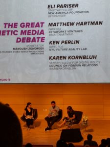
The second best part of the conference is the great debate about synthetic media between Eli Pariser, Ken Perlin and Matthew Hartman, Karen Kornbluh. Synthetic media refers to computer generated or modified media. The extreme version of this is deepfakes (Borthwick). Eli pointed out ethical issues related to fake news with filtered and incomplete information. On the other hand, the other party based their stands on creative arts. They made an example of the instagram famous virtual character Lil Miquela who had over 1.5 million followers. This debate stood out to me because of how much I could relate to it. I am one of the millions of the generation grew up with technology and social media. I was so used to the fact that the digital experience took a great percentage of my life, sometimes I ignored it. I experienced the Lil Miquela fade where people argued for her existence/authenticity. Then after truth revealed by her managing team, Lil’s followers accepted her being synthetic, and argued for Lil’s authentic personality behind the synthetic character. In Lil’s confession post, she wrote, “I’m not sure I can comfortably identify as a woman of color. ‘Brown’ was a choice made by a corporation. ‘Woman’ was an option on a computer screen…I’m different. I want to use what makes me different to create a better world. I want to do things that huan maybe can’t…” What once seemed so obviously “fake” and was considered a “lie” now feels more sincere and authentic than a real person in existence. This conversation highlighted the blurry border between digital culture and real life culture today and made me rethink the “fakeness” and “realness” in information. As we discussed in class, there are many invisible but influential information worker. I think constructing an information channel and building up a information platform should also be considered as part of the information process with an amount of creativity. As a ux designer, I used to conceive my job as to purely present the information to users, but this debate helped me realize the process and act of constructing a easy and unbiased channel or platform for information itself is already a “creation” in a sense. Nevertheless, it is also possible for the authenticity of the original information to be enhanced in the delivering process. Thus, as information professionals we have to make sure we adhere to the ethics.
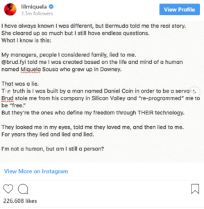
Lil Miquela Confession Post
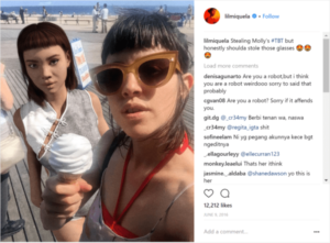
Image of Lil Miquela
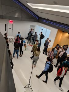
I also saw many students work during the demo exhibit. It varied from extremely technical ones tackling the internet speed problems to very artistic creations using emotional intelligence. I felt excited to be part of the community and could not wait to make a contribution to the information field. Honestly, before the conference I was held back by the fact that I didn’t have any kind of experience in the information field, but this conference helped me restore my confidence and I believe that my communication and business backgrounds would bring me unique perspectives in ux design.
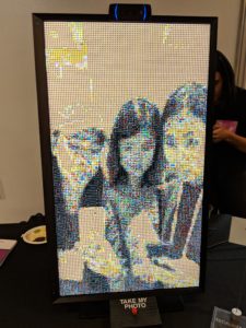
Student Demo: Screen/Picture is consisted of thousands of emojis
Work Cited:
Borthwick, John. “Synthetic Media – Render – from – Betaworks.” Render – from Betaworks, Render – from Betaworks, 29 July 2018, render.betaworks.com/synthetic-media-d0adcc53800a
Chinese Language in the Era of Information

“Chinese characters are innocent,” said MIT-educated Chinese scholar Zhou Houkun in 1915 and quoted by the curators at the Museum of Chinese in America (MOCA) as a radical introduction to an exhibition titled Radical Machines: Chinese in the Information Age. Set in the special exhibitions gallery, the exhibition is curated by Dr. Tom Mullaney from Stanford University. Exhibition materials range from archival documents, books, video clips, photographs, and the most eye-catching, rarely-seen vintage Chinese typewriters. Most of the items belong to Mullaney’s personal collection, which is “the largest Chinese and Pan-Asian typewriter and information and technology collection in the world” (mocanyc.org). This collection was formed along with the development of Mullaney’s years of scholarship at the intersection of East Asian history, history of science and technology, and transnational/international affairs.
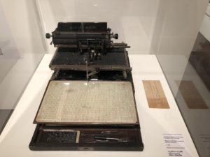
The radicalness, nurtured within the complex machines themselves, also sits in the nature of the Chinese language, together with many other languages from the East, being non alphabetical and thus having faced and still facing constraints in having a smooth merge with modern information technologies particularly on the end of inputting. This curatorial project as well as Mullaney’s research thus aim to be a unique introduction to this less known piece of history and a provocation to the Western dominance structured around information technologies.
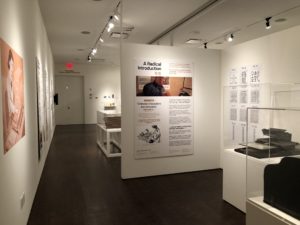
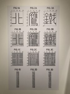
The exhibition was divided into multiple sections, drawing curious visitors first into an brief overview of the Chinese language, characters and phonetics, and the early history of printing press — Movable Type. Departing from there, since the base of written Chinese involves largely pictograph, morphing the characters into something more systematic emerged as one approach to “alphabetize” Chinese (see photo). On the other hand, the section titled Chinese Telegraphy introduces a second approach of assigning a combination of Latin letters to each of the commonly used characters. Traced back to 1870s, this method seems to be the starting point when the Chinese language was equated to English in order to adhere to the development of information technology and people’s communication needs.

Evolution of technology and shifting mode of communication have been increasingly intertwined. To answer the question of how communication defines social existence and shapes human development, exploring the history of communication technologies, from speech and language, writing, to printing press, gives us a developmental model to discuss Internet, as the agreed fourth one (McChesney, 69). The exhibition pretty much follows this itinerary when it takes visitors to explore the following two sections: Beyond QWERTY, The Typist in China.
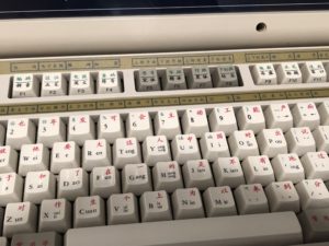
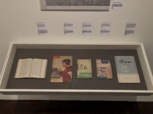
Beyond QWERTY exhibits several systems developed in history for inputting Chinese language, from the common word usage system, to later developed Wubi system, namely entering stroke-by-stroke. The section illustrates how information technology involves a large degree of customization due to the varying linguistic composition of languages. Therefore, learning how to type on a QWERTY keyboard becomes a less intuitive task for Chinese speakers. The Typist in China introduces the cultural history of learning to type using different methods, stroke-by-stroke Wubi or the phonetic method Pinyin. Echoing pieces of Western history, learning how to type, from textbooks and illustrations, became an appreciated skill for various professions. This is also very reminiscent for me as growing up in China, we also spent a good amount of time learning how to type and recently there’s also a discussion around that since Pinyin is easier to learn and few people can now use the Wubi method to type.
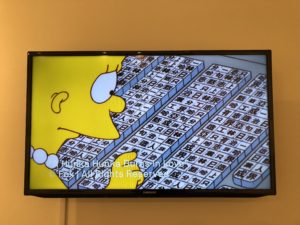
Personally a highlight of this exhibition turned out to be a section in the back of the gallery, named Western Perceptions. Absolutely less discussed, this section, including historical Western views of Chinese information technology presented in the realm of media and entertainment, attends to the issue from a cultural perspective. One will find video clips of Lisa Simpson and James Bond perplexed by a Chinese keyboard, Nancy in the cartoon puzzled by a Chinese typewriter found in the city dump. These manifestations carry a strong racist overtone, mocking the Chinese language being non-systematic, irrational, and thus not modern enough to keep up with modern technology.
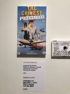
Obviously there’s issues around class and accessibility, but most often we perceive technology to be culturally neutral, or that technology even being a way to culturally collectivize human beings. Yet, Radical Machines tells us that technologies could also be racialized and the prejudice reflects what has been projected onto its users. Though framed under the umbrella ideas of language, information, and technology, the curators also sought to integrate “difficult heritage” — “pasts that are meaningful in the present but that are also contested and awkward for public reconciliation with a positive self-affirming contemporary identity” (MacDonald, 6) — into this exhibition. MacDonald in her research discusses that the task of tackling difficult heritage is indeed hard for museum and heritage institutions, in that on the one hand, museums, as public educational institutions with a sound voice, must take on the responsibility in addressing difficulty heritage, and gladly according to research observation, an increasing number of institutions are willing to do so (MacDonald, 16). On the other hand, how to address difficult heritage in a provoking yet equally inviting way always needs extensive discussion. MOCA has been an active participant in exhibiting difficult heritage: narratives in this particular section of Radical Machines resonate with those in the permanent exhibition next door, “Within a Single Step: Stories in the Making of America.”
Continuing with the socio-cultural perspective, the curator took this aspect to mark an end of this exhibition — “China is the world’s largest IT market? Isn’t it the time we knew it’s history?” Linking the past to present, Radical Machines: Chinese in the Information Age successfully raises the dialogue on information, language, and technology with a unique lens. To learn more on this topic, Dr. Tom Mullaney’s blog, though not updated in a while, has a handful of interesting articles.
Bibliography
MacDonald S. (2015). Is “difficult heritage” still difficult?. Museum International, 67, 6-22.
McChesney, R. W. (2013). How can the political economy of communication help us understand the Internet? In Digital disconnect: How capitalism is turning the Internet against democracy. New York: The New Press.
Museum of Chinese in America. (2018). Radical machines: Chinese in the information age. Retrieved from http://www.mocanyc.org/exhibitions/radical_machines
Protected: The Office: an Observation at Compass
A Multi-Sensory Visit to the American Museum of Natural History
At the beginning of October, I used my New York Public Library card to pay a visit to the American Museum of Natural History (AMNH). The enormous complex was packed on that sunny Saturday afternoon, but I was still able to deeply engage with the exhibits.
AMNH was the 12th most-visited museum in the world in 2017, having almost 5,000,000 people come through its doors throughout the year (TEA/AECOM, p. 19). The institution holds 34,120,652 specimens and artifacts in its collections, and recently added over 44,000 more (American Museum of Natural History Annual Report, p. 4).
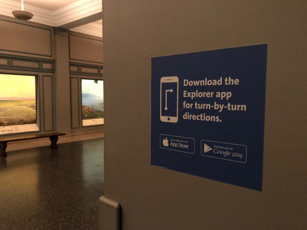
The public spaces of the buildings that make up the institution are segmented into 4 floors and a lower level. Upon entering, visitors are given a physical map outlining the best paths to take depending on the order in which they’d like to see the exhibits. AMNH also offers a mobile app that gives “turn-by-turn directions”, provides descriptions of exhibits, and allows for the use of augmented reality and other digital experiences that can open up more levels of engagement throughout (Figure 1).
A very notable way in which AMNH creates a logical navigation of the space is through a mixture of information visualization and mapping. Figure 2 and Figure 3 show some charts for The Hall of Vertebrate Origins, in which a cladogram is used to physically arrange exhibits throughout the Hall in order of evolutionary relationship.
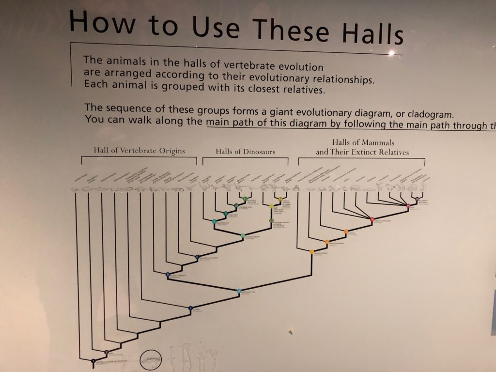
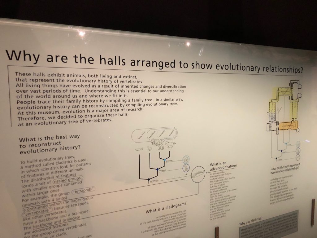
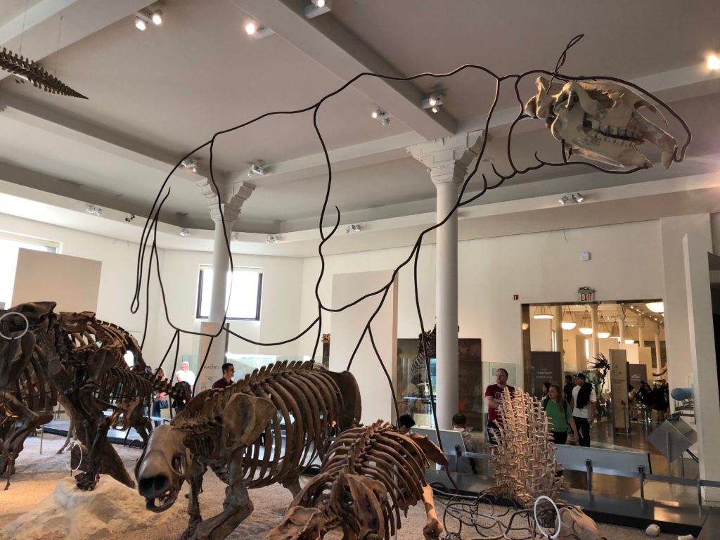
This technique melds the information on display with the physical space in order to help visitors navigate. Other visual techniques are also used, like the display in Figure 4 that makes up for missing parts of a fossil in order to show what the complete specimen might look like.
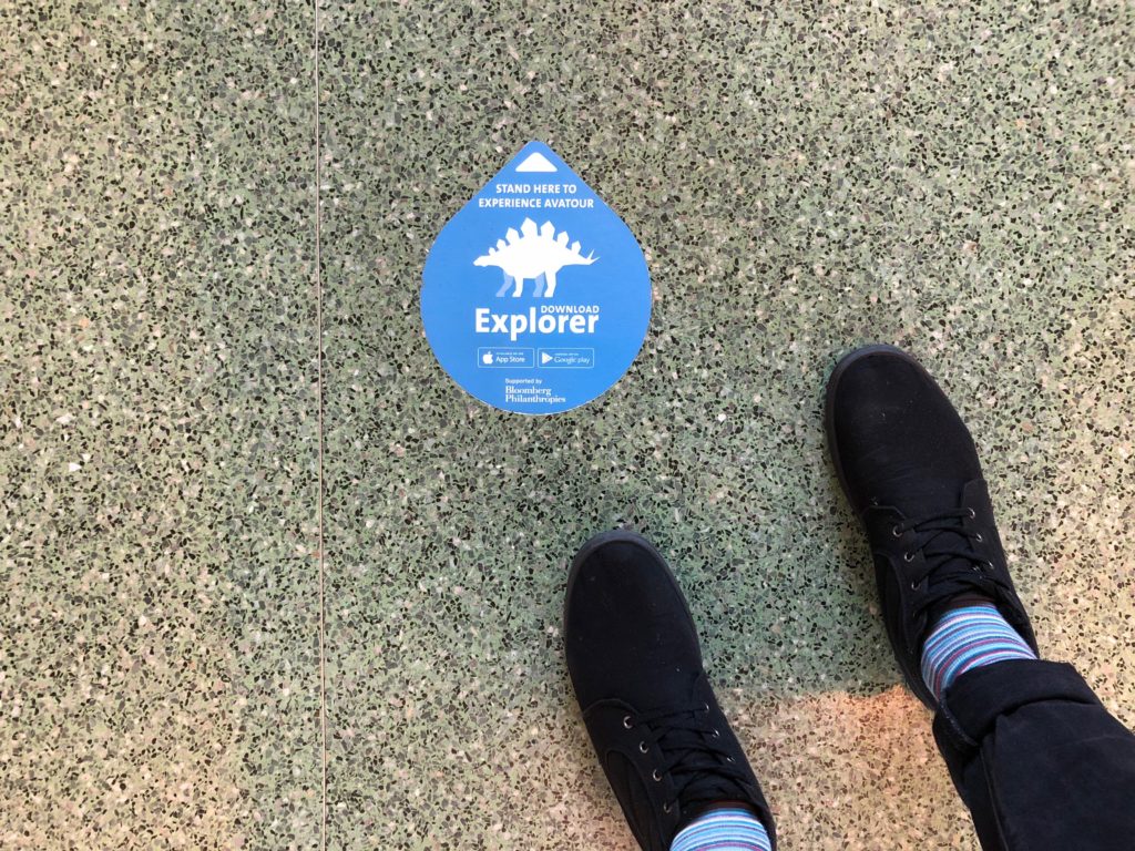
As mentioned, the museum also has the ability to use augmented reality, permitting interaction with the exhibit itself and enabling the experience to not just rely on a visitor’s ability to read as they browse collections (Robinson, 2015, p. 4). Signifiers are placed on the floor throughout to signal when this function is available (Figure 5).
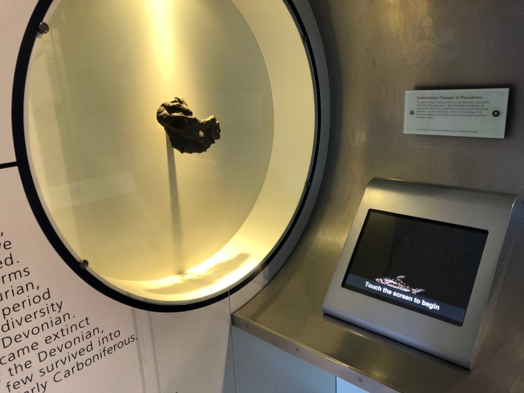
AMNH also uses tactile methods for visitors to engage on a more active level by embedding multi-sensory interactions into the exhibits themselves. Figure 6 shows a touchscreen that teaches more about “Evolutionary Changes in Placoderms” by providing the option to interact with a device rather than just merely showing a description on a sign.
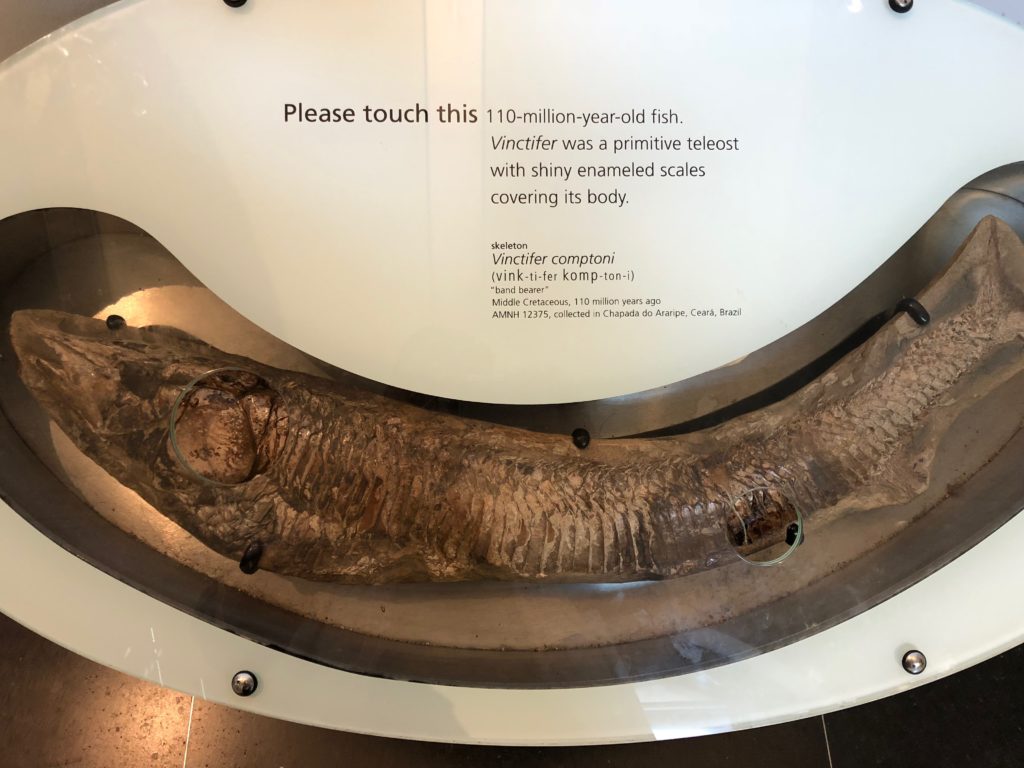
In Figure 7, a sign says “Please touch this”, a very obvious signifier telling visitors that they can literally touch the bony scales of a Vinctifer, a fish that swam in the ocean 110 million years ago.
The world’s largest meteorite on display, The Cape York Meteorite (Figure 8), lets visitors experience “touching an object that is nearly as old as the Sun” (American Museum of Natural History– Ahnighito).
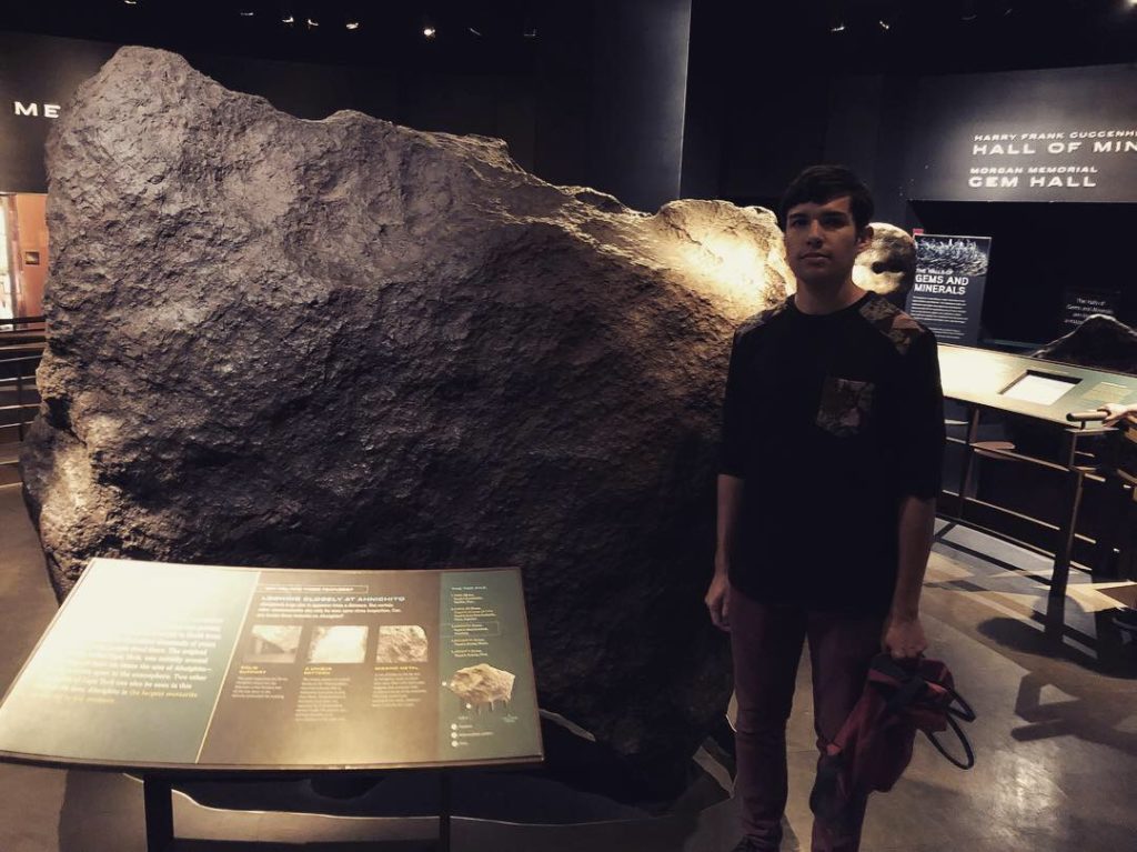
Using the sense of touch fits into Robinson’s idea of using multi-sensory options when interacting with a display in order to make exhibits more participatory (Robinson, 2015, p. 5).
Established in 1869, the American Museum of Natural History is a scientific juggernaut, a leader in exploration and research, and is constantly adapting to the new ways in which people can experience and enjoy museums.
References
- TEA/AECOM 2017 Theme Index and Museum Index: The Global Attractions Attendance Report. (2018). Retrieved from https://www.aecom.com/content/wp-content/uploads/2018/05/2017-Theme-Museum-Index.pdf
- American Museum of Natural History Annual Report 2017. (2017). Retrieved from https://www.scribd.com/document/382887896/AMNH-Annual-Report-2017#fullscreen&from_embed
- Robinson, L. (2014). Multi-sensory, Pervasive, Immersive: towards a new generation of documents. Retrieved from Centre for Information Science – City University London: http://openaccess.city.ac.uk/6864/1/LR%20-%20Immersive%201.pdf
- American Museum of Natural History – Ahnighito. Retrieved from https://www.amnh.org/exhibitions/permanent-exhibitions/earth-and-planetary-sciences-halls/arthur-ross-hall-of-meteorites/meteorites/ahnighito
The Unflinching Archivist: Integrating Museum and Archival Practices using the Work of David Wojnarowicz
On October 4, 2018, NYU Fales Special Collections archivist Nicholas Martin hosted a tour and talk for library, art, and museum professionals and other information specialists about the ongoing exhibition at the NYU Mamdouha S. Bobst Gallery. The exhibition highlighted the papers and work of artist, writer, AIDS activist, and photographer David Wojnarowicz (pronounced Voe-nah-ROE-vich). Wojnarowicz’s work incorporated multiple media that explored life in New York in the 1970s and 1980s from an outsider’s perspective, as well as confronted politics, morality, and his own diagnosis.

The Exhibition in Question
The exhibition at NYU, officially known as The Unflinching Eye: The Symbols of David Wojnarowicz, ran at the Bobst Gallery from July 12th to October 21st, 2018. It was staged in conjunction History Keeps Me Awake At Night, another show of the artist’s work that ran at the Whitney Museum of American Art from July 13th to September 30th. The NYU show featured photos, journals, and other objects separated into three major sections that showcased the creative breadth and symbolic depth of Wojnarowicz’s work as well as the way his personal relationships are reflected in his photography and his journals. The exhibition was coordinated by Nicholas Martin, with curatorial assistance provided by Hugh Ryan, Marvin Taylor, and Marcelo Yáñez.
Making Curatorial Decisions
During his tour, Martin spoke about the challenges of curating an artist’s work, both from the standpoint of honoring the artist’s legacy and from a logistical perspective. He explained that when staging a show, one of the most important questions an archivist asks is always, “What was the artist’s intent?” When the artist is no longer living (Wojnarowicz passed away in 1992), the archivist must make informed decisions about what to include and how to include it. Unfinished work can pose a problem – was this work even important to the artist? How do we know? One example of this is Wojnarowicz’s “Magic Box,” in which he collected a myriad of items, ranging from a Buddha sculpture to tweezers and nail clippers. It was never clear what the artist meant to do with these objects or how much he cared about them at all. Martin and his colleagues chose to disassemble the box for the exhibition, displaying it with its contents without making any assumptions about its purpose.
Logistical Obstacles
The “Magic Box” also contributed to the logistical concerns of the show, Wojnarowicz wasn’t thinking about long-term storage of his “Magic Box” items, but many of the objects within were made of materials that are harmful to each other and that present a challenge for archivists: should they store and show them altogether to preserve how they were found or separate them to preserve their physical integrity? Martin’s solution for the exhibition was to unpack the box and display everything together. In the archives, everything is also kept together and patrons are warned about handling procedures if they request to see the box.
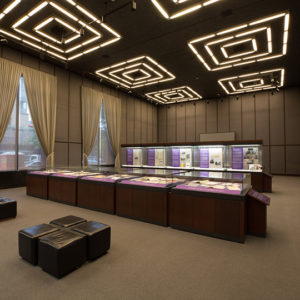
Other conservation risks for Wojnarowicz’s work that Martin described included humidity and light levels, which can prove particularly dangerous for the artist’s printed photographs. The constraints of the NYU Gallery meant that Martin had to work with facilities management, installers, and contract curators to try to correct for the structural issues (ex. high light levels from large windows) as best he could. Overall, the exhibition took about 100 hours of preparatory conservation work.
Reflection
I found Martin’s talk engaging and educational. Not only did I learn about David Wojnarowicz’s work, but I was finally able to understand all the moving parts of putting on an exhibition that lies at the intersection of art, archives, and museum practices. To be sure, there were challenges unique to this show, like the fact that it was a companion to the Whitney show and sometimes had to use facsimiles of items that were leant to the museum instead of the real thing. In general, however, Martin’s talk focused on issues universal to archival exhibitions and provided helpful insight into how to solve them. His discussion touched upon concerns that can be found in many foundational exhibition texts, like Organizing Exhibitions: A Handbook for Museums, Libraries and Archives by Freda Matassa.
In the future, I plan to explore archival practices from both sides of the equation, patron and curator. I hope to attend more exhibitions of this kind and, when talks aren’t available, I will try to analyze them myself to figure out what problems the curator may have faced in staging it. As a student, I hope to take classes in archival management and possibly even museum practices as well as apply for internships in this field to explore my interest in it and see if it’s something I want to pursue for my career.
References:
Communications, N. W. (n.d.). NYU Presents Exhibition of David Wojnarowicz Papers, Coinciding with Whitney Museum of American Art Retrospective. Retrieved November 5, 2018, from http://www.nyu.edu/content/nyu/en/about/news-publications/news/2018/july/nyu-presents-exhibition-of-david-wojnarowicz-papers–coinciding-
David Wojnarowicz. (n.d.). Retrieved November 5, 2018, from https://www.visualaids.org/artists/detail/david-wojnarowicz
David Wojnarowicz: History Keeps Me Awake at Night. (n.d.). Retrieved November 5, 2018, from https://whitney.org/Exhibitions/DavidWojnarowicz
Exhibition | The Unflinching Eye: The Symbols of David Wojnarowicz – News and Events. (n.d.). Retrieved November 5, 2018, from https://wp.nyu.edu/library-news/exhibition-the-unflinching-eye-the-symbols-of-david-wojnarowicz/
Matassa, F. (2014). Organizing Exhibitions : A Handbook for Museums, Libraries and Archives. London: Facet Publishing. Retrieved from https://login.ezproxy.pratt.edu/login?url=http://search.ebscohost.com/login.aspx?direct=true&db=nlebk&AN=969818&site=eds-live
Wharton, G., Engel, D., and Taylor, M. C. (2016). The Artist Archives Project: David Wojnarowicz. Studies in Conversation, 61, 241–247. https://doi.org/10.1080/00393630.2016.1181350
Event: National Design Award 2018 Winner’s Salon- Humen Experience/Built Environment
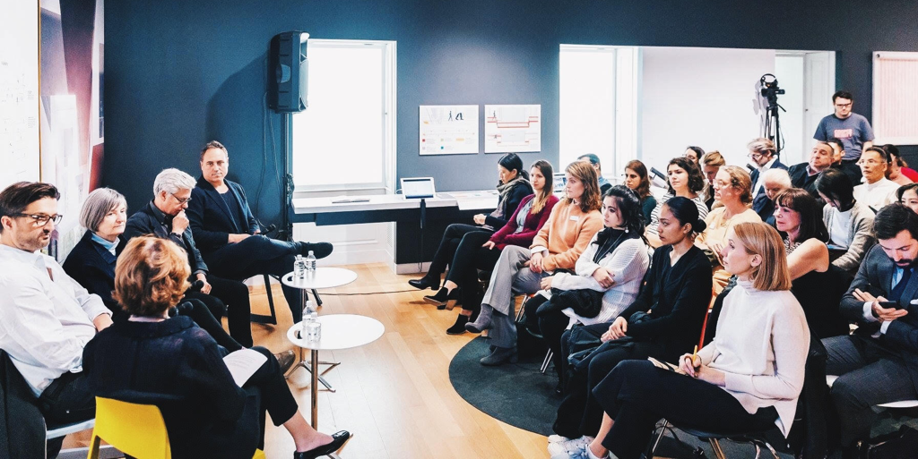
The Cooper Hewitt, Smithsonian Design Museum is my all time favorite, not just because of the well-curated collections or exhibitions, but the great museum experience design impresses me as well. When I searched online for events, the Cooper Hewitt Museum popped up in my head and that’s how I found this salon event as part of the National Design Award Week 2018. The 2018 National Design Award aims to honor excellent and innovative American design, and also seeks to raise awareness of the impact of design in the education sector (“National Design Award”, 2018). National Design Awards 2018 included a bunch of activities, such as workshops led by Award-winning designers, exhibitions, panel talks, and salon events. Because of my landscape architecture design background and my interest in designing for human beings, I chose to attend the “Human Experience/Built Environment” salon.
BRIEF INTRO OF HUMAN EXPERIENCE/BUILT ENVIRONMENT SALON
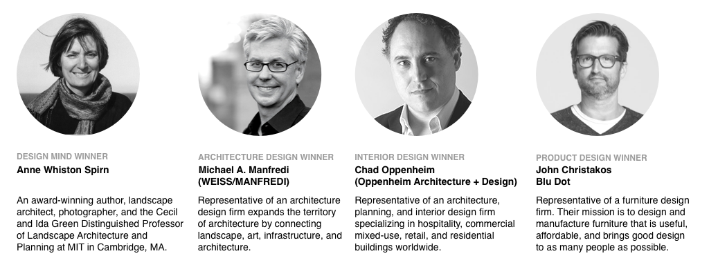
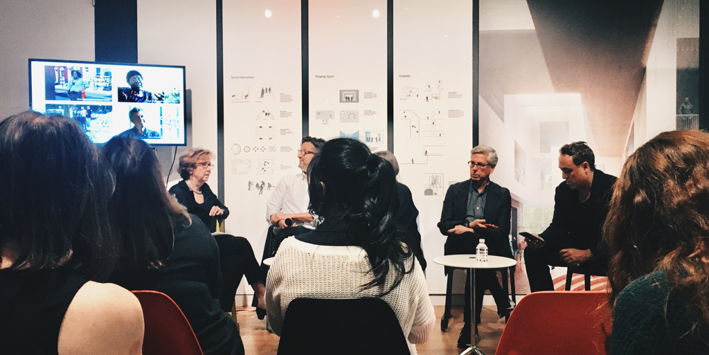
This event invited four National Design Award winners to share their creative /collaborative process for designing human experiences, challenges while designing, and the relationships between the built environment and designers (“2018 National Design Awards | Winners’ Salon & Master Classes”, 2018). Four award-winning teams/individuals are from different backgrounds. It’s a combination of a creative author, a furniture designer, an architect and an interior designer.
CREATIVE PROCESS
The salon started with inviting winners to share the creative process of their design works. Anne Whiston Spirn shared her process from an author perspective as the starting point. She is a person who would always start with an observation through her own eyes or the frame in the camera. She believes observation could reveal many things that you might ignore in your day-to-day life, for example, a buried river in the city or any other invisible forces that support human’s life. By doing so, observation can actually uncover the truth and yell us more about how life is lived. She will also talk to locals while observing in order to get the overall picture as a whole context. Michael Manfredi, the architect who represents WEISS/MANFREDI, added that his way of doing environmental design by talking to the local communities before even starts to sketch anything. When starting a new project, he would always keep “humanity” in mind, and reminds himself to be a person that knows nothing but eager to learn from and interact with communities. Chad Oppenheim from Oppenheim Architecture + Design tends to initiate the process from a childlike perspective. He goes to the site, wanders around and explores the environment like a boy back in the time when there was no Xbox and Gameboy. This approach helps him to discover the relationship between nature and humans, so he can really design for human experiences. Lastly, unlike other designers in this talk, as a furniture designer, John Christakos, the product designer of Blu Dot, oftentimes discusses with his partners about what piece of furniture they should design in the very beginning. Then they will sketch as a team to iterate the design work until the design goes to prototyping. That’s the reason why they never mark any of the design pieces as an individual work.
CHALLENGES AND COLLABORATION PROCESS
Manfredi mentioned how climate change impacts his consideration of spatial design as an architect. In the past, architects or urban planners didn’t really have to consider how to deal with the life-threatening storms, except in a waterfront neighborhood. But now, it has become a baseline requirement when designing spaces. He also shared how he collaborated with local dog owner communities in order to design a great dog park. His team facilitated a conversation of the local dog community, so each dog owner group could voice their opinion, and exchange their thoughts at the same time. After the conversation, the team sketched the park based on the discussion, then presented to the groups in order to receive valuable feedback. When the park was built and finally open to the public, the dog community was really satisfied with the outcome.
REFLECTION
1. Collaborating with communities is the key to designing good human experiences.
In my opinion, the spatial design discipline might be the pioneer of “user experience design.” For instance, when I studied landscape architecture design in college, to go on a field trip for observation already became a “must-have” process when designing a space. The purpose of going on a field trip is to understand the relationship between space/environment and the people. During the trip, designers are required to get to know about the local community as much as possible. Designers can either talk to local people directly, live with them for a few days, or just participate in local events. These methods will enable designers to discover the problems affecting an area, then explore the opportunity for solutions. Thus, it’s pretty common for architects/landscape architects to interact with communities and this “interaction” has even become part of the key process of spatial design.
Outside of the spatial design field, I feel designers tend not to have many interactions with communities (no matter if it’s a geographical community like a neighborhood, or a group of people that share something in common like small dog lovers). For example, when I worked as a UX designer, I did interact with “users” or “target audiences”, but the scale was smaller and it was more l goal-driven (wanted to know their devices usage patterns ), or task-driven (tested usability before releasing a new feature) approach.
So when Sasha Costanza-Chock wants designers to rethink the design processes in her article” Design Justice: Towards an Intersectional Feminist Framework for Design Theory and Practice”, that recalled my memory as a landscape architecture design student instantly. In her article, she encourages designers to address the challenges of communities by applying collaborative, creative methods as part of the design process, and to be a “people first” designer (Costanza-Chock 2).
When one of the winners, Whiston Spirn, works on her projects in West Philadelphia, she collaborates with locals by treating locals as experts based on their lived experiences. Her team focuses on building a sustainable, community-led living environment by inviting locals to share their knowledge and teaching them about landscape literacy. In her design process, designers are more like facilitators than experts. The other winner Manfredi, invites people who will be impacted directly in the future to join the design discussion. He wants to create an environment in which designed is based on the prioritized impacts for the community. These methods actually match the framework mentioned by Costanza-Chock in the Design Justice article. No wonder the final design outcomes were engaging and resident friendly, and even won the prizes.
2.Lack of diversity in design industry
When I first saw the winners in front of the audience, I was a bit disappointed. Three of the four winners are male, and there were no people of color except white people, nor people with disabilities. I thought the topic is about designing human experiences in America, a place that is full of diverse cultures, languages, and people, which should lead the topic to accommodate various needs and situations that are more inclusive. This fact reminds me of Jennifer Vinopal’s article about diversity in library staffing (“The Quest for Diversity in Library Staffing” 2016). She brought up the issue about “lacking in diversity based on race and ethnicity, age, disability, educational background, gender identity, sexual orientation, and other demographic differences” (“The Quest for Diversity in Library Staffing” 2016). Vinopal’s finding could actually apply to almost all work fields, including design disciplines. Her intention to raise the awareness of lack of diversity in the workplace aims to combat “the oppression that is caused by privilege, bias, and the attendant power differentials at no matter individual or systematic levels” (“The Quest for Diversity in Library Staffing” 2016).
Incorporating every possible role to every work field seems a bit impossible for now, and I am not sure if this is a good approach to solve the problem. When we discussed difficult heritage a few weeks ago, I defended Maya Lin’s design of Vietnam Veterans Memorial by stating “designers don’t necessarily have to be part of the group they design for”, because she was being accused as an unqualified designer due to her role as an “outsider” (meaning that there is no Vietnam veterans in her family). In this case, because the objective is controversial, the interpretation of the memorial is always different for each individual, and it’s hard to find a Vietnam veteran who has the skillset, and also who is not suffering from Post-traumatic stress disorder to design this monument. Therefore I don’t think this approach works here. However, there should be a better way to address the lack of diversity issue in every work field. Costanza-Chock already initiated the solution by applying a doable design framework to improve not only the design process but also the final outcome of the design. Whiston Spirn does co-work with the communities for over decades and the result is amazingly impactful in a good way. There would definitely be more good solutions to accommodate this issue.
This event raises my awareness of two topics: design justice and work field diversity. Some of the practitioners in design disciplines already integrate similar methods into their work process to make the design more welcoming and accomondable in most situations. We should make this notion more wide spread through to different disciplines to make this change happen.
RELATED SOURCES:
- “2018 National Design Award – About The Awards.” Cooper Hewitt, Smithsonian Design Museum, 31 Oct. 2018, https://www.cooperhewitt.org/national-design-awards/
- “2018 National Design Award Winners.” Cooper Hewitt, Smithsonian Design Museum, 31 Oct. 2018, https://www.cooperhewitt.org/national-design-awards/2018-national-design-awards-winners/
- COSTANZA-CHOCK, Sasha.“Design Justice: Towards an Intersectional Feminist Framework for Design Theory and Practice.” Design Research Society 2018 Catalyst, 25th-28th, June, 2018
- Vinopal, Jennifer.”The Quest for Diversity in Library Staffing.” In The Library With The Lead Pipe, 2016, http://www.inthelibrarywiththeleadpipe.org/2016/quest-for-diversity/