Network Map: Top 1000 Frequent Occurring Surnames Between Races

July 18, 2018 / 0 comments

Introduction I was able to interpret data provided by studying information from the 2010 Census. The data presents a normalized list of the top 1000 shared surnames between six, general and world race groups as defined by the US census. By creating a network visualization the intention is to determine the strengths between races and…

Read more →

NCAA FOOTBALL – Matchmaking Network

July 17, 2018 / 0 comments

NCAA FOOTBALL – Matchmaking Network   This research over network data started really fuzzy. It was hard to find data and information about a topic that was relevant to me, and at the same time easy to understand. The data selected was a study of the NCAA Football league, where I connected all the teams…

Read more →

Marvel Characters by Adam Kubert

July 17, 2018 / 0 comments

Introduction Using the Marvel Database API, I pulled data on all the different Marvel characters featured in issues by artist Adam Kubert to create a visualization in Gephi. Inspiration Looking at the example of connections amongst jazz musicians, I wanted to use the Marvel Database to create a similar chart of creatives. Each book, much like…

Read more →

San Francisco in Cinema: A network of SF film locations

July 17, 2018 / 0 comments

I selected data on film locations in San Francisco to inform my data visualization in Gephi. I’m not a movie buff but I do know San Francisco well and was interested in seeing what locations were memorialized in film. For reference, we explored the visualizations from Gephi directly and other sites. The two that stood…

Read more →

Ego Network of British Suffragette Emmeline Pankhurst

July 17, 2018 / 0 comments

Introduction My Gephi visualization is based on relational data on the British suffrage movement and, in particular, focuses on the network of suffragette Emmeline Pankhurst (née Goulden, 1858-1928). Born to activist parents, Pankhurst used political agitation and militancy to advance the vote to all women in the UK. Her home (an interesting parallel to contemporary,…

Read more →

PEOPLE REPORTING ANCESTRY – US Native American Indian

July 17, 2018 / 0 comments

Written by Jamie Raymond Information Visualization Summer Course at Pratt Institute This data set analyzes ancestry of all American Indian Areas/Alaska Native Areas/Hawaiian Home Lands within the United States in 2016 census found on United States census Fact Finder website, https://factfinder.census.gov/ using the following filter options: The Data was optimized for Gephi by cleaning in…

Read more →

Dogs in New York City

July 17, 2018 / 0 comments

View the dashboard on Tableau I’m New Yorker who always gets excited when I see a dog on the street, but I can’t have one myself. When I found New York City’s dataset on issued dog licenses I thought it would be fun to take a look at where all the dogs in the city…

Read more →

Game of Thrones – Co-occurrence Network of Characters

July 16, 2018 / 0 comments

Game of Thrones Network The topic of this information visualization network lab is the co-occurrence network of characters in A Song of Ice and Fire, or the five books in Game of Thrones that fall under that series. This book and HBO series has become a world-wide phenomenon over the past decade. I was interested…

Read more →

The 62 Dolphin’s Network Visualization

July 15, 2018 / 0 comments

Introduction “Networks are not the same thing as “networking,” or actively using a network to make connections to further one’s personal goals. A network is simply a set of rela­tions between objects which could be people, organizations, nations, items found in a Google search, brain cells, or electrical transformers. Transformers do not “network.”In this book we…

Read more →

Summary of NYC Projected Population over 2010–2040

July 11, 2018 / 0 comments

Introduction In keeping with getting to know more about my surroundings, I decided to investigate any significance in the population of NYC. In particular, in particular, this study became a way to discover patterns in the population summary by plotting it over time. NYC OpenData gave way to more particular information that is a summary…

Read more →

Water Quality, Cost & Consumption in NYC

July 10, 2018 / 0 comments

Water quality, cost & consumption in NYC,   After looking for meaningful data regarding the city of New York, I found a lot of research based on the water consumption, usage, price, and complaints regarding the city. My first approach contrasting this useful information and see what I learned from them. The inspiration behind this research…

Read more →

World Literacy Rates 2015

July 10, 2018 / 0 comments

The topic of this information visualization statistical lab was world literacy. Having taught grammar and reading comprehension in Spain for years, I know that these skills are essential for children to develop when they are young. I was curious to discover the literacy rates across different countries throughout the world, as literacy typically correlates with…

Read more →

Brooklyn: Where the Restaurants Are

July 10, 2018 / 0 comments

Introduction Changing demographics due to the rising populations in Brooklyn have had an impact on businesses, in particular, restaurants. The type and number of restaurants in an area can be a good indicator of lifestyle and income of its residents.  After recently moving back to Brooklyn, I have noticed an increase and change of cuisine…

Read more →

Census Data: California Counties

July 10, 2018 / 0 comments

Introduction I was introduced to programs OpenRefine and Tableau for the first time this month. OpenRefine allows data to be cleaned up, organized and normalized with features like selecting all related cells or transposing data to be reformatted. Tableau allowed me to take clean data and create visualizations for it through various graphs and charts….

Read more →

UNdata – National Feature Films Produced

July 10, 2018 / 0 comments

Written by Jamie Raymond Information Visualization Summer Course at Pratt Institute In exploration of the public data sets of UNdata, users from around the globe can search by “pooling” the major UN databases, which are browsable by category or keyword search. UNESCO Institute for Statistics, Data for the Sustainable Development, revealed a data set demonstrating…

Read more →

Gender and Nationality at the Museum of Modern Art

July 10, 2018 / 0 comments

The Museum of Modern Art (MoMA) is one of the largest collectors of Modern and Contemporary Art in the world. They have over 200,000 artworks in their collection. The Museum has been collecting since the height of post-Impressionism in the 1920’s, through Modernism in the 1960’s, and into the Contemporary present. As an open source…

Read more →

Visualizing the 2018 April Approved-build projects

July 9, 2018 / 0 comments

“The higher the quality of the data, the greater the potential for revelation.” — Stephen Few Introduction (Figure 1.1) Throughout the last week, I explored two software. One is OpenRefine, another is Tableau Public. According to Stephen Few, the Figure 1.1, I think OpenRefine will do the job of making the “Exploration Sense-Making – Communication”,…

Read more →

Quest for the Strongest Pokemon!

July 9, 2018 / 0 comments

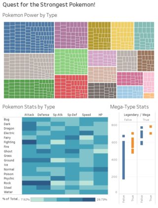
Pokemon is a Japanese media franchise that features monster-characters known as “Pokemon” (pocket monsters) who battle each other for sport. The franchise includes cartoons, movies, card games, and an array of video games for multiple platforms, most famously Nintendo’s Gameboy. In these Gameboy games, players take on the role of “Pokemon Trainer” and adventure through…

Read more →

Brazilian Political History.

July 5, 2018 / 0 comments

By thinking about data in a timeline format, the first insight that stuck with me was history itself. We spent a lot of years studying history and the events that changed our society throughout the years, and by analyzing it from a linear perspective, we can have a better understanding of events and movements that…

Read more →

Mapping: Visualizing the World Around Us

July 3, 2018 / 0 comments

Introduction Viewing a map can feel like an invitation to share a path and an experience. As information visuals, they are rich in storytelling. Maps can be inspiring, insightful or manipulative. They can capture not only practical knowledge but can provide historical, social, economic or political information. All maps are an effort to visualize the world…

Read more →