Gender and Nationality at the Museum of Modern Art
July 10, 2018 - All
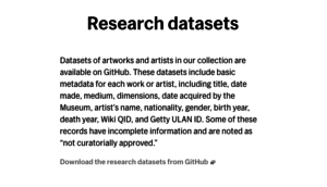
The Museum of Modern Art (MoMA) is one of the largest collectors of Modern and Contemporary Art in the world. They have over 200,000 artworks in their collection. The Museum has been collecting since the height of post-Impressionism in the 1920’s, through Modernism in the 1960’s, and into the Contemporary present. As an open source initiative, the museum has made public several datasets, which are available on Github and data.world. These research datasets allow the public to view the museum’s holdings and information about the institution through a different set of lenses and provide a level of granularity not necessarily possible when visiting the museum. In exploring their available data, I was particularly interested in what could be gleaned in terms of gender, nationality, and acquisition patterns. In my visualization, I used two datasets—one a comprehensive list of MoMA artists and the other a portion of the index of artworks, specifically the data regarding the museum’s painting and sculpture collection—to highlight statistics on gender and nationality. The questions I address in my visualization are multivalent, but include: what is the gender difference by percentage of MOMA Artists? What does the geographic distribution of artist’s nationality look like if mapped? What might be discerned about the collecting habits of the museum when visualized by accession date and nationality?
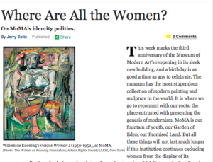
The inspiration for these questions and my visualization came from exploring the datasets of the museum, which included interesting variables such as gender, biographical information (e.g. birth date, death date), nationality, department, and accession date. Additionally, an article in New York Magazine by Jerry Saltz helped form my direction of inquiry. In the article, Saltz questions the lack of women in MoMA’s Permanent Collection from 1879-1969 and problematizes issues of gender throughout the museum and past exhibitions. With this article in mind, I wanted to use information visualization to bring attention to issues of gender and nationality in the collection and contribute to the discourse that inquires into the status quo of museums—both in their specialized and encyclopedic forms.

Materials and Procedures
Both datasets I used were large (+130,000 records in the collection and +15,000 artists). They both needed to be refined and “cleaned” in Excel and OpenRefine. I started with my smaller dataset and removed unneeded columns. I left certain columns that I knew I would eventually delete (e.g. Artist’s Name, Artist’s Biographic information), but knew would be helpful during workflow. Next, I removed unknown and incomplete records, formatted nationalities for consistency, added a corresponding country field so Tableau would recognize it as a geo-location, and continuously faceted down to make sure everything was consistent before bringing my data into Tableau. For my second dataset, I isolated the Painting and Sculpture Collection (approx. 4,000 records) from the Artwork index. I then performed many of the same functions previously mentioned, including formatting dates, adding a decade field, and removing unwanted characters such as parentheses. Indeed, I spent 80% of my time (approximately 10+ hours) working with and cleaning the data and 20% working in Tableau. In Tableau, I created my workbook, pulled in my cleaned data, grouped years into decades and nationalities into geographic regions, and created several visualizations. Once satisfied with the results, I created, cleaned up, and refined my dashboard.
Findings
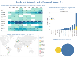
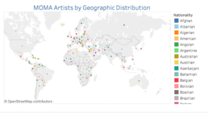
My Tableau Dashboard is comprised of four visualizations, all which give additional information such as record quantity and percentage when hovered over. As is clear in the highlighted graph, MoMA collected American artists heavily in the 1960’s, but almost no artworks by artists from Africa, Asia, the Caribbean, and Oceania in the early days of the museum. My stacked graph visualizes the quantity of artists by gender and nationality, and clearly highlights that American males comprise a large portion of the artist list. Below this, the simple, yet powerful visualization of artist’s gender by percentage clearly shows the disparity of females overall. My findings indicate that females make up approximately 18% of all artists; however, as suggested in the New York Magazine article, the percentage of female artists actually exhibited is likely much lower (acquisition does not guarantee exhibition). My final visualization maps all artists by geographic location. Hovering over the dots provides information on nationality and number of records.
Reflection and Future Directions
Before finding the MoMA dataset, I cleaned several datasets that were inevitably too unwieldy, dirty (i.e. unstructured) to use, or that otherwise needed more time to properly clean to be meaningfully visualized. Going through the growing pains of learning the basics of OpenRefine, however, help me to understand better the program and what it can do for visualization and content creation. I have worked on practice datasets in OpenRefine workshops in the past, but this project was certainly more extensive and beneficial in understanding how it works in tandem with visualization tools. This was my first time using Tableau, and I think it has a great deal of potential to help bring attention to critical topics such as gender disparity. It would also be interesting to delve into issues of race as they manifest in acquisition decisions (including prices paid), strategies of display, and public response. Extending this project would also be an equality fruitful venture.
The post Gender and Nationality at the Museum of Modern Art appeared first on Information Visualization.