The 62 Dolphin’s Network Visualization
July 15, 2018 - All
Introduction
“Networks are not the same thing as “networking,” or actively using a network to make connections to further one’s personal goals. A network is simply a set of relations between objects which could be people, organizations, nations, items found in a Google search, brain cells, or electrical transformers. Transformers do not “network.”In this book we are concerned with social networks, and what passes through this networks-friendship, love, money, power, ideas, and even disease.”
—-Kadushin
To visualize a network is not only visualizing data but also visualizing the relationships between objects. How to make the visuals clear and communicative? Can we make the visual interactive?
3 Inspirations
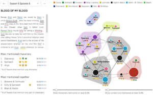
1, Game of Thrones discussions for every episode, visualized

According to this, It is really visual-direct that the designer made the big space between each part. I think it makes the network structure very clear.
2, Apple vs. Google company structure, as seen through patents
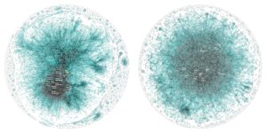
This one is a great example of using network visualization to analyze the structure of an object. According to this, Wes Bernegger, data explorer at Periscopic, came up with the conclusion, ” The most notable difference we see is the presence of the group of highly connected, experienced ‘super inventors’ at the core of Apple compared to the more evenly dispersed innovation structure in Google,” he continues. “This seems to indicate a top-down, more centrally controlled system in Apple vs. potentially more independence and empowerment in Google.”
3, Shakespeare tragedies as network graphs
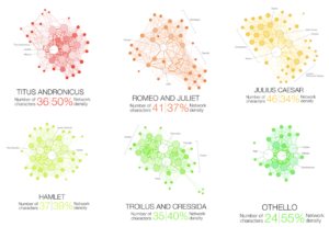
I think this shows a good example of using colors. Limited color brings the image a clean and professional impassions.
Materials
I downloaded network resource from CASOS Public Datasets: http://www.casos.cs.cmu.edu/tools/datasets/external/index.php#dolphins
This resource is the network of "An undirected social network of frequent associations between 62 dolphins in a community living off Doubtful Sound, New Zealand, as compiled by Lusseau et al. (2003)." D. Lusseau, K. Schneider, O. J. Boisseau, P. Haase, E. Slooten, and S. M. Dawson, The bottlenose dolphin community of Doubtful Sound features a large proportion of long-lasting associations, Behavioral Ecology and Sociobiology 54, 396-405 (2003). Retrieved from: http://www-personal.umich.edu/~mejn/netdata/.
From this resource, I want to visualize the relationship between the 62 Dolphins that living in the Doubtful Sound bay.
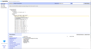
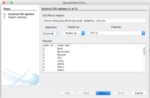
First, in order to clean up the data, I imported the original data to OpenRefine.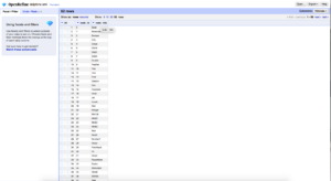
The node list is made by the name list the 62 Dolphins. After cleaned up the data, I imported the data to Gephi. I merged the edge list to Gephi by using the same process.
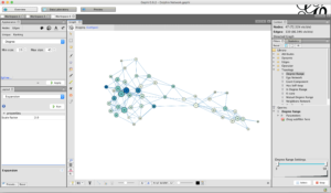
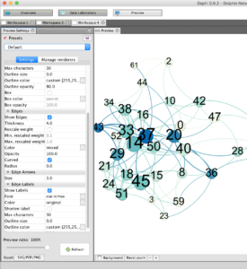
Gephi first generated the graphic like this below:
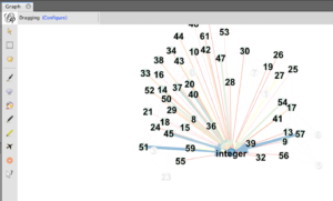
In order to make the graphic more concentrate on the relationships between the 62 Dolphins, I deleted the “Integer” element first.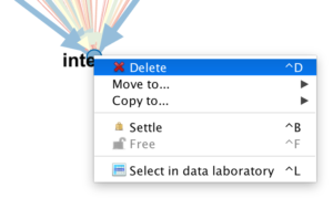
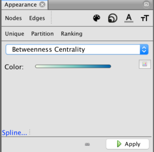
After this, I started to design the visual part. I changed the color palette and label size by using the Nodes and Edges edit panel. Here is one thing I noticed, when clicking the Nodes and Edges panel, the icon of each panel won’t change, there was no visual clue shows either the current panel is under the Nodes or Edges. The designer has to remember which editing panel that he/she chose, or it might bring some confusion.
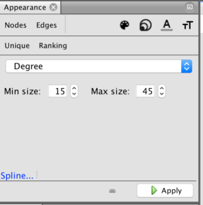
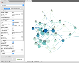
In order to make the graphic more visual-directly, I applied a Degree Range filter which is under the Filter-Topology panel. And about the pattern, I chose Yifan Hu layout to run the graphics first.
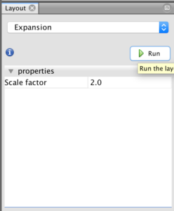
After this, to make the graphics breath a little bit more, I chose the expansion layout to run again.
Because Dolphin is a creature that has a really long history, I changed the original font to Palatino. Palatino is a font that contains long history and humanist feeling, the elegant impression represents Dolphin, not only the font, blue and teal color represent the Doubtful Sound Bay as well.
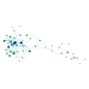
Results
Future Direction
During the process, I wonder if this Network can be interactive and shareable? From Professor Sula, I got the positive answer. I added a plug-in called Sigma JS, Using this plug-in, I exported a folder which included the CSS code and JS code of the network graphic. which allows me to embed in any website. The Sigma JS plug-in definitely brings more possibilities to the graphic.
Gephi is a strong tool to visualize network databases. However, it needs more basic knowledge of database organization than other software. Compare to Tableau Public, It might not be that friendly to designers.
Gephi can be a great tool for a marketing team. It works really well on highlighting the main relationships between each element. The interactive and shareable plug-in gives the software more possibilities.
The post The 62 Dolphin’s Network Visualization appeared first on Information Visualization.