World Literacy Rates 2015
July 10, 2018 - All
The topic of this information visualization statistical lab was world literacy. Having taught grammar and reading comprehension in Spain for years, I know that these skills are essential for children to develop when they are young. I was curious to discover the literacy rates across different countries throughout the world, as literacy typically correlates with a country’s economy, as well as its political and religious structures. Furthermore, as women generally receive less education and tutelage compared to their male counterparts, I wanted to know in which countries women truly excelled, and how this may correlate with the cultural climates of said areas. Creating visualizations that were not too overwhelming for the viewer that delivered the key information of this study was also important. Finding a dataset that gave a distinction of literacy rates between males and females was also essential.
Inspiring Visualizations
I was inspired by various information visualization dashboards that related to literacy, my research topic of interest.
The first interesting dashboard that I found concerned Indian Literacy. I was impressed with the Literacy by Gender graph that highlighted different country’s literacy scores by gender, providing more information when you were over a specific section. I also appreciated how the top and bottom five literacy score countries were graphed for comparison at the bottom of the page. However, I was confused by the color plot at the top left of the page, which also translated onto the map of India divided by region. It seemed that on the country map, the regions in green had over 75% literacy, however that was never directly explained, nor was the literacy plot at the top.
Another example I found was about Literacy Rates in the World. This dashboard was very influential for my dashboard design. The interactive bookshelf, using the spines of books as an appealing bar graph was genius. The interactive nature of this information visualization allowed you to click on all, male or female, to get different percentages of literacy for different regions of the world. Something I would have added to this info vis would have been a small chart comparing literacy counts for both genders at the same time, so the viewer could analyze the two quantities at once.
Finally, the Literacy Rates dashboard had interesting statistical differences in the literacy percent scores of men and women. Although, I was slightly disappointed that the creator did not make it clear as to the origin of the scores. Was it worldwide data or data from a particular country? Also, it was a little too minimal to be an adequate dashboard in my opinion. I would have liked to have been given additional information.
Materials and Procedures
To make my World Literacy Rates statistical lab I used the Tableau Public software and a public dataset that I found on the United Nations open data website. At first, I worked with creating a world map sheet that highlighted the percentage of literacy rates for all genders in different countries of the world. First world countries, such as the United States, Canada and the United Kingdom, were not included in the overall dataset. The dataset presented a number of complications, such as the addition of developing regions, or Millennium Development Goals regions, a classification standard developed by the UN that was added to the observation area column along with individual countries. I decided to remove MDG regions listings, as the countries in those regions were already accounted for in the dataset. Complicating things further, the UN dataset had the sexes lumped into all genders, male and female for each country. This made it impossible to show the literacy distinction for each country by sex in Tableau. For this reason, I decided to exclude the all genders category.

Results
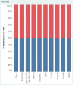
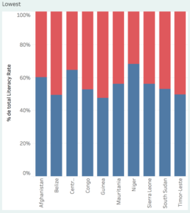
In World Literacy Rates dashboard, I ended up using four sheets I created from the UN literacy dataset: two maps of the world showing the literacy rates for 2015 for males and females respectively, a bar graph showing the ten lowest ranking literacy rate countries for 2015 and another bar graph showing the then highest for 2015, and an example line chart of literacy in Zimbabwe over time. I wanted to represent this information in an understandable and not overwhelming way. For this reason, I focused on the most recent documented year from the literacy dataset. Furthermore, excluding the ‘all genders’ category made it possible to show the gender difference in literacy rate rankings.
Future Directions
It was too difficult to figure out how to demonstrate the difference in gender literacy rates on a single map of the world with this time limitation. In the future, I would like to investigate further whether this is a possibility with Tableau. Making a story of all of this information would also allow me to show the changes in literacy rates over time. I could also include a section with the MDG regions, expected trajectories of future literacy and some additional text describing the information that is being represented.
The post World Literacy Rates 2015 appeared first on Information Visualization.