Mapping the social structure of dolphins using Gephi

April 14, 2018 / 0 comments

Introduction My original idea to test the network graphing tool, Gephi, was to create a family map using the notoriously complicated cast of the ABC show, Once Upon a Time. However, that dream was quickly crushed when I failed to find a fan-made data set of the cast members, and now I am considering making…

Read more →

Gephi: Letter Exchanges Across Europe

April 13, 2018 / 0 comments

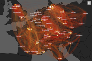
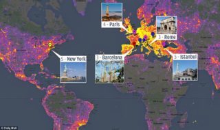
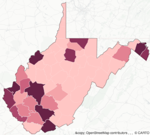
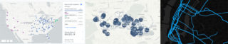
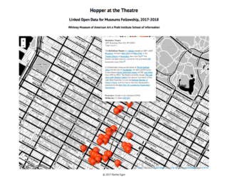
Introduction: Big data sets of social networks can be analyzed and viewed in different perspectives through visualization programs such as Gephi. Being an open-source tool, it is accessible and free for public use. Its functions include “exploring, analyzing, spatializing, filtering, clustering, manipulating and exporting”[1] data sets. Its “flexible architecture” can detect patterns and help users gather…

Read more →

Design Story: Intreprid Sea, Air & Space Museum Website

April 12, 2018 / 0 comments

Design Story for the Intrepid Sea, Air & Space Museum   Group: Arushi, Julie, Alexa, Krissy. The Challenge: Our group had the opportunity to reimagine a new website for the Intrepid Sea, Air & Space Museum Complex. The goal was to research users and analyze content to create a prototype we feel best serves the…

Read more →

Design Story: Chimera Calendar App

April 12, 2018 / 0 comments

By Kristen Droesch & Lily Martin, Spring 2017 For our Advanced UX Design course, we were charged with developing and prototyping a new calendar system. We kicked off our project by selecting the user group we were most interested in designing for, eventually settling on arts and media freelancers. To boil down the essential needs…

Read more →

A Redesign Proposal for the Voorheesville Public Library Website

April 12, 2018 / 0 comments

In order to propose a redesign for the Voorheesville Public Library’s website, we conducted a user-centered review, test, and analysis of the information architecture and interactive design of the site. It appeared to be clogged with duplicated content in an overly complex structure, and was not adapted for mobile. Our goals were to conduct research…

Read more →

Our Streets, Our Stories: A Case Study

April 12, 2018 / 0 comments

The Concept Our Streets, Our Stories is an ongoing oral history project run by the Brooklyn Public Library. The program aims to collect the personal stories of community residents throughout Brooklyn neighborhoods through recorded interviews. As an Our Streets, Our Stories volunteer responsible for conducting interviews, I initially set out to design a web-based solution…

Read more →

iSo Tones: A Case Study

April 12, 2018 / 0 comments

iSo Tones is a mobile music app for students, instructors, and music enthusiasts. It isolates and plays back the different layers of a track. The app also allows users to record themselves singing, or playing, whatever a particular layer and send that recording to friends and instructors for feedback. Initial Research: User Groups After conducting…

Read more →

Design Story: FUBU (For Users, By Users)

April 12, 2018 / 0 comments

About the Project This project was done in Pratt Institute’s Information Architecture and Interaction Design taught by Craig MacDonald. For this project, my group and I were given the task of redesigning the information architecture for Sesame Workshop (www.sesameworkshop.org) that would make the site’s interface much more user friendly, increasing its usability through improvements of…

Read more →

Design Story: The Intrepid Museum

April 12, 2018 / 0 comments

About the Project We were tasked with completely redesigning the Intrepid Museum’s website. After some research, we found the current site to be severely lacking in its ability to be aesthetically pleasing while providing users with easy access to information. Current Intrepid Home Page My Role One of the main roles I took on in…

Read more →

Queens Historical Society: A Case Study

April 12, 2018 / 0 comments

For over fifty years, the Queens Historical Society (QHS) has been actively celebrating and preserving the heritage and history of Queens, New York through educational programs, exhibitions, and its public repository of archival collections and sources.  The QHS website is a key vehicle for communicating their mission to the widest audience possible, yet their message…

Read more →

Design Story: Queens Historical Society

April 12, 2018 / 0 comments

Queens Historical Society   About the Project At the beginning of the semester we were broken up into groups and asked to tackle redesigning the Queens Historical Society website. In my group, each of us identify key issues within the website, these key issues helped us design a more friendly website using the following procedure….

Read more →

Design Story: QHS Redesign Project

April 12, 2018 / 0 comments

QUEENS HISTORICAL SOCIETY SITE REDESIGN ABOUT THE PROJECT MAJR Queens was contracted to complete a user-centered redesign of the Queens Historical Society (QHS) website emphasizing an improved user experience and responsive, multi-platform design.  The  4-month project generated several deliverables which supported efforts to understand users, structure content and design the final  prototypes. –Jo Polanco, UX…

Read more →

Visualizing Homelessness in New York City

April 12, 2018 / 0 comments

  This semester, I’ve taken an interest in the lives of homeless individuals. I begun learning about their experiences through my Advanced Design Research course, chatting with homeless individuals in New York City and volunteering at shelters. Until a few weeks ago, I relied mostly on ethnographic research such as observations, interviews and diary studies….

Read more →

A Simple Cost-Benefit Analysis of Refugee Movements

April 12, 2018 / 0 comments

Visualizations here: https://evanvolow.carto.com/builder/e68ddab2-14f4-440b-8546-09206070ee29/embed For our Carto lab, I vacillated a bit as to what topic I wanted to explore–chalk it up to not undertaking a geospatial project in a while. I came down to two particular datasets. WHO has data on the number of cases of multi-drug resistant tuberculosis by country, which I wanted to…

Read more →

Bike Rack Distribution In New York City

April 12, 2018 / 0 comments

For this Carto Lab, I wanted to see how bike friendly New York City is by looking at the distribution of bike rack in the relationship with bike lanes. New York was on the top 20 list of the world’s bi-annual bicycle-friendly city index created by a Copenhagen-based consulting firm Copenhagenize. The accessibility of bike…

Read more →

Farmers Market Directory: Where are the Organic Markets?

April 12, 2018 / 0 comments

Introduction: Using the data from the Farmers Market Directory from data.gov I was able to visualize a part of the data that I had not found possible in my previous work. I wanted to focus on mapping specific types of farmers markets that are sought after in this trending world of eating and using fresh…

Read more →

Mapping 2016 New York State Hate Crimes

April 12, 2018 / 0 comments

introduction I began this lab with the idea of mapping hate crimes with a heat map as I thought this type of map would best express the intensity of these crimes that I was trying to stress. Initially, my thought was to work with data that would represent just New York City (the five boroughs)…

Read more →

Mapping West Virginia’s Opioid Crisis

April 12, 2018 / 0 comments

  Over the course of the last two decades, people with opioid addiction and deaths by drug overdoses have increased five-fold, with 115 Americans dying from this cause per day as of 2016 (CDC, 2017). According to the CDC, West Virginia had the highest rate of deaths by drug overdose in 2016, nearly 13% higher…

Read more →

Visualizing NYC Lower Manhattan Retailers with Carto

April 12, 2018 / 0 comments

Lower Manhattan is one of New York City’s most affluent and crowded districts. It is not only a financial district where Wall Street locates and highly-educated people stay, but also a must-see tourist destination. Therefore, as a business district, Lower Manhattan is highly competitive, and also full of opportunities. To better understand  the retailer market…

Read more →

Remapping Hopper at the Theatre

April 12, 2018 / 0 comments

Introduction This report explores categorical and geospatial data collected through the Linked Open Data (LOD) for Museums Fellowship offered by the Pratt Institute School of Information and the Whitney Museum of American Art and visualized using CARTO, a proprietary Software as a Service (SaaS) cloud based platform for GIS and web mapping. The goal of…

Read more →