Bike Rack Distribution In New York City
April 12, 2018 - All
For this Carto Lab, I wanted to see how bike friendly New York City is by looking at the distribution of bike rack in the relationship with bike lanes. New York was on the top 20 list of the world’s bi-annual bicycle-friendly city index created by a Copenhagen-based consulting firm Copenhagenize. The accessibility of bike racks is one of the parameters that influence the ranking. Because Carto is mapping software, I decided to see the distribution of bicycle racks and bike lanes of New York City. I created the visualization with the aim of answering the following questions:
- Are bicycle racks evenly distributed around the bike lane?
- Which community in Manhattan is considered the most “bicycle friendly” regarding the number of bike racks available?
The target audience for this visualization is all bicyclists of New York City, and I want it to become an interactive guide that informs them about bike racks location and different types of rack near them.
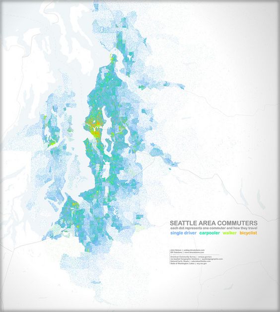
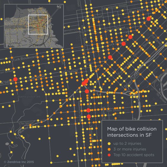
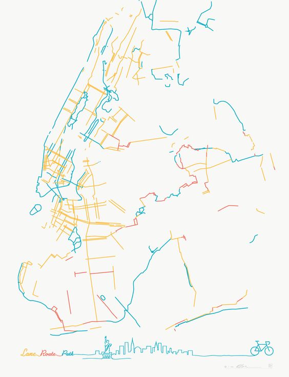
My inspiration came from my searches on Pinterest. The first visualization shows how people commute in Seattle. The visualization was published by IDV solutions, which they show the density of people by dots and used different colors to represent the various methods of transportation. I like the idea of dot gathering that shows density. This is how I come up with the idea of showing all the racks on the map to see how they are distributed across the city. The second inspiration is created by Zendrive that shows bike collision in San Francisco, and it used many different colors to indicate the frequency of accident happened at many different intersections. My third inspiration is a map of bike lanes in New York. The creator did not include the base map, which allows the bike lane to outline the shape of the city. It is very informative and artistically pleasing. It is my favorite inspiration out of all three.

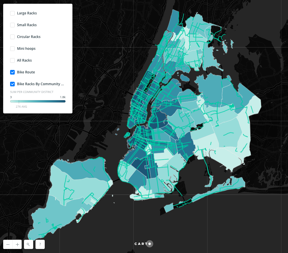
I created the visualization with Carto. I used the shapefile “Bicycle Parking” that I found from NYC Open Data. I uploaded the entire shapefile into Carto and exported a CSV file that contains all the geographic data as well as numbers of different types of rack. Because of the design of the dataset, I wasn’t able to use rack types directly to see where certain types of rack are located across the five boroughs of New York. Then I used Open Refine to separate and clean the data into four different CVS files that only contain one type of bike rack in each file. After I divided the dataset into large, small, circular racks and mini hoops, I deleted all rows that have a value of 0 in the numbers of rack column by using the “text facet” feature in Open Refine. This allows me to show only certain types of bike racks in one view by importing them into Carto as different layers.
I think the result is very close to what I had in mind when I started. Here, I can walk you through how I made some of the design decisions for each layer.
For the base map layer, I chose the “Dark matter (lite)”version that eliminates the background noise to a minimum. I decided to use a bright green to make the bike route to stand out as much as possible. The color of the bike lanes and the dots need to be contracting enough to see both clearly but also requires harmony in color to when viewed at the same time.
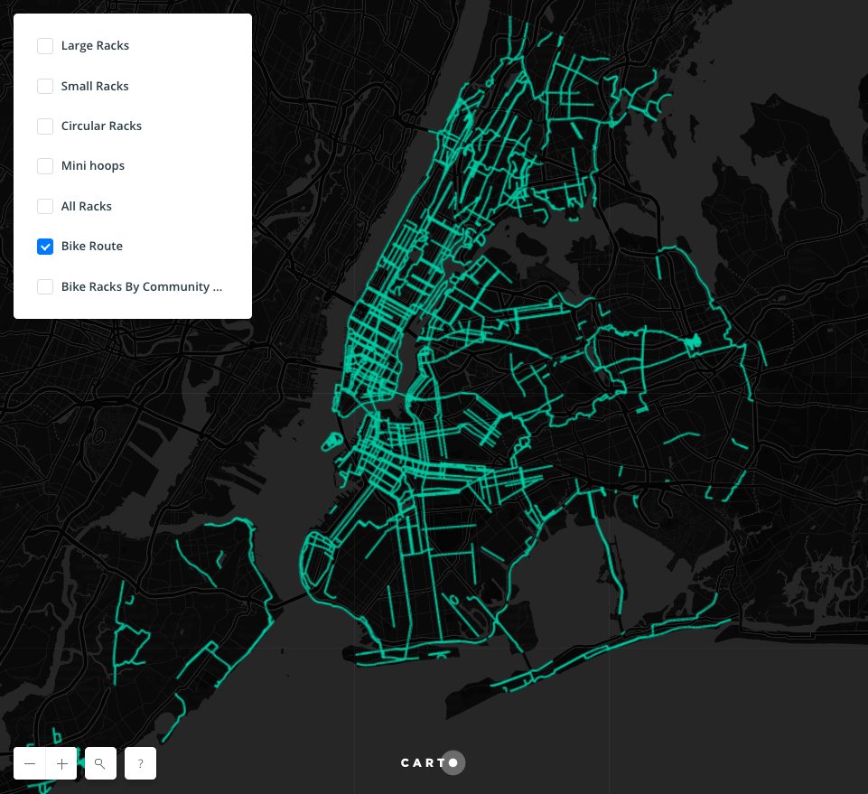
To be able to see the distribution and density of all rack located in the city, regardless of what type of rack, I need to have a layer shows each location as one dot. In the data file, as long as the “total_rack” column has a value more than 0, that one record will shows on the map as one dot. The purpose of this layer is to see the overall distribution, which is also going to be viewed in a more zoomed out perspective. I gave each dot a small size, so they are not overlapping too much in areas that have a high density of rack locations. I chose a light blue because it contrasts well with the dark map background. I decided to include all other information, such as location and numbers of rack in the pop-up window, so if users want to know details about a specific location, it only requires one click on the dot.
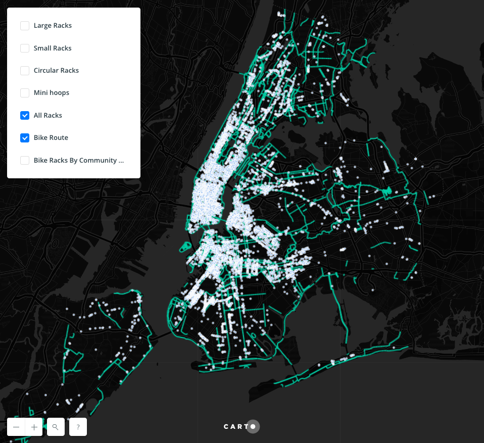
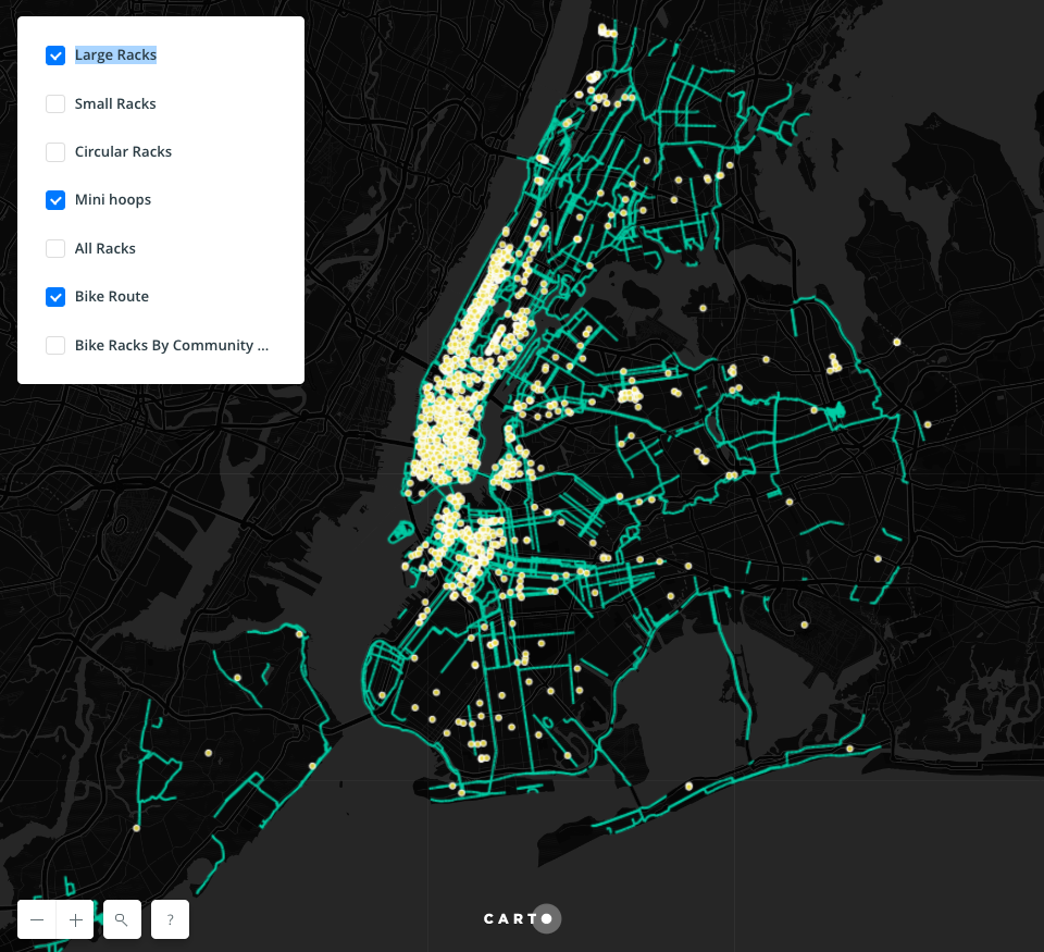
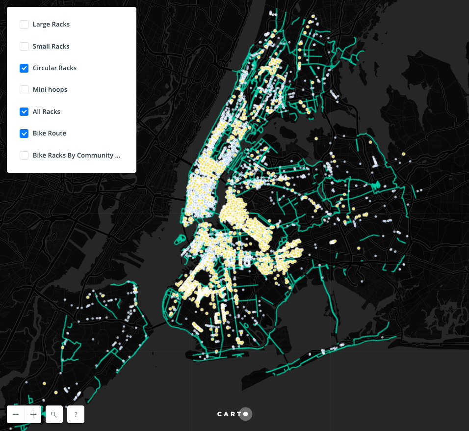
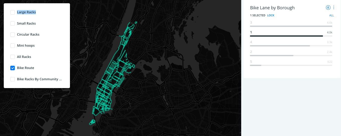
At first, I doubted if it’s really necessary to show the different type of racks on the map because if I were biking around an area, I would only care if there were any rack I can park my bike. However, I think for many bicyclists, they would benefit from knowing which rack locations might have a higher chance, in other words, more spaces to park their bicycles. Then I decided to create four different layers that show different types of rack. For these four layers, I formatted them the same way, meaning each layer has the same design. I chose a bright tinted yellow to differentiate the selected types from all the other racks, these dots have a slightly bigger size so that they could cover the underneath layer that shows the smaller blue dots of all racks, which minimize the confusion when viewing different layers at the same time. I also added pop up window on click for those dots to show their location and number of racks. The user can choose many types of rack and see what locations have those types of racks. The dots are the same color for easy identification. I also added a widget that users can use to see bike lanes in different boroughs.
For future directions, I would add borough as a filter, so that viewers can choose which type of rack in what borough they would like to see. Another direction is to allow users to search nearby racks by type, so they can use this visualization as their bike rack guide when they are touring around the city, no matter where they are.
References:
Cait Etherington. Can NYC Copenhagenize? The Bicycle-Friendly City Index. August, 2016. Retrieved from: https://www.cityrealty.com/nyc/market-insight/features/trending-in-ny/can-nyc-copenhagenize-the-bicycle-friendly-city-index/5341
People Dots: Seattle Area Commuting. IDV solutions. Janurary, 2013. Retrieved from: http://uxblog.idvsolutions.com/2013/01/people-dots-seattle-area-commuting.html
Here is the link to my interactive Carto Map:
https://wdai2.carto.com/builder/3ab2ebd9-6484-4fe9-a5f5-131730416401/embed
The post Bike Rack Distribution In New York City appeared first on Information Visualization.