Remapping Hopper at the Theatre
April 12, 2018 - All
Introduction
This report explores categorical and geospatial data collected through the Linked Open Data (LOD) for Museums Fellowship offered by the Pratt Institute School of Information and the Whitney Museum of American Art and visualized using CARTO, a proprietary Software as a Service (SaaS) cloud based platform for GIS and web mapping. The goal of the resulting geovisualization is to explore some of the CARTO Builder basic features by investigating the cultural and theatrical landscape of Edward Hopper’s New York.
Background
Leveraging the unparalleled collection of Hopper’s art and archival materials held by the Whitney Museum of American Art, Hopper at the Theatre contextualizes the artist’s personal and professional geographies towards the end of the interwar period circa 1925 to 1937. The project targets primary source data for semantic enrichment from event ticket stubs in the newly established Sanborn Hopper Archive.
Inspiration
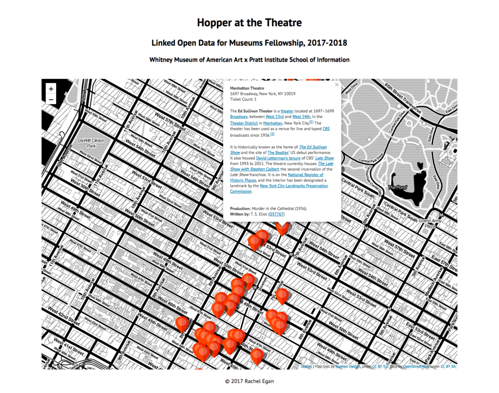
Primary inspiration came from the original Hopper at the Theatre interactive geovisualization (Figure 1) built by the author using HTML, CSS, JavaScript, and Python. Launch the project or view the code on GitHub.

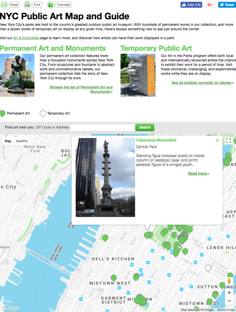
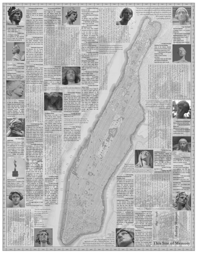
NYC Public Art Map and Guide (Figure 2) informed the decision to use different colors to visualize the permanence or destruction of a building, while Andrea Geyer’s artist map Audrey Munson: This Site of Memory (2006) was a source of creativity for commemorating New York City cultural landmarks, albeit in analog form (Figure 3).
Methodology
Data Collection and Transformation
A detailed overview of the original data extraction and transformation process can be found here. To summarize, primary source metadata from ticket stubs of events attended by Edward Hopper was generously provided by the Whitney Museum of American Art Archives. After exporting the ticket dataset from ArchivesSpace and minimally normalizing it using OpenRefine, manual and automated data enrichment and integration was performed using the following sources:
- Carnegie Hall Archives Linked Data
- Cinema Treasures
- Google Maps Geocoding API
- Internet Broadway Database
- Internet Movie Database
- MediaWiki API
- Wikidata Query API
The final dataset was structured to support future Resource Description Framework (RDF) modeling serialized as JSON-LD and visualization with open-source JavaScript libraries like Leaflet and Stamen Maps. While the nested structure of the final dataset was appropriate for building the original geovisualization from scratch, there were technical difficulties navigating down through multiple JSON subproperties like individual ticket data or complex geocoding when using CARTO Builder. To optimize the dataset schema for CARTO, I wrote simple Python script (see: https://github.com/reganartinfo/hopper/blob/master/carto.py) to flatten the Google geocoding data, keeping only the latitude and longitude of the theaters and appending them to the top level of the JSON array.
Visualization Creation
After flattening the ticket dataset, I imported it to CARTO Builder to use as the primary map layer. CARTO Builder is an extremely intuitive web-based interface that allows users to create beautiful maps in minutes. It automatically transformed the dataset into a point map, which I further customized by enabling the pop-up feature to display columns such as venue name and address from the ticket dataset. Given that the Wikipedia abstracts for the venues had already been parsed to HTML during the original extraction and transformation process, embedded hyperlinks remained functional when included in the pop-ups.
“Filter by column” analysis was applied to identify with venues’ current lifecycle (e.g. closed, demolished, open) and added as a widget for users to interact with. The color palette for the filters was selected using Eye Dropper, an open-source extension for Chrome, to pick colors from a digital image of New York Movie (1939) by Edward Hopper.
Results
Future Directions
With more time and resources, the author envisions flattening more portions of the original ticket dataset to be optimized for CARTO Builder. In doing so, temporal data from the performances could be displayed as an animated time-series widget that retraces the artist’s journey through New York City. Flattening the nested event category (e.g. play, drama, musical) and into rectangular data would also allow for an additional “Filter by column” analysis to further illustrate Hopper’s theatrical preferences based on frequency.
Many of the features incorporated into this CARTO geovisualization have also inspired future versions of the original Hopper at the Theatre interactive map. For instance, the “Filter by column” analysis and use of different colors to visualize the permanence or destruction of a building could be implemented using JavaScript and Leaflet to create markers with custom icons. CARTO’s automated affordance for vertical scrolling in pop-ups is an elegant UX solution to the overloaded text of the Wikipedia abstracts in the Leaflet version.
References
Geyer, A. (2006). Audrey Munson: This site of memory [Artist’s map]. Retrieved from http://www.andreageyer.info/projects/audrey_munson/munson_notebooks/audrey/mapNEU5.pdf
Hopper, E. (n.d.). New York movie [Digital image]. Retrieved from https://www.moma.org/collection/works/79616
NYC Parks. (n.d.). NYC public art map and guide. Retrieved from https://www.nycgovparks.org/art-map
The post Remapping Hopper at the Theatre appeared first on Information Visualization.