Gephi: Letter Exchanges Across Europe
April 13, 2018 - All
Introduction:
Big data sets of social networks can be analyzed and viewed in different perspectives through visualization programs such as Gephi. Being an open-source tool, it is accessible and free for public use. Its functions include “exploring, analyzing, spatializing, filtering, clustering, manipulating and exporting”[1] data sets. Its “flexible architecture” can detect patterns and help users gather insights on network science.
Network science deals with the behavior, interaction and relationships between elements. These elements are represented as Nodes and Edges in Social Network Analysis. Nodes represent the elements being analyzed, while edges represent the relationships between them.
The most common metrics used in network analysis are the four centrality features. They consist of Degree Centrality, Closeness Centrality, Betweenness Centrality, and Eigenvector Centrality. Overall, they measure the nodes in relation to connections and positioning. This gives users leverage to interpret their data as opposed to viewing it from a spreadsheet, as it provides different shapes and viewpoints for analysis.
Three Examples:
It interested me to create a map of networks that had directed relationships (edges).
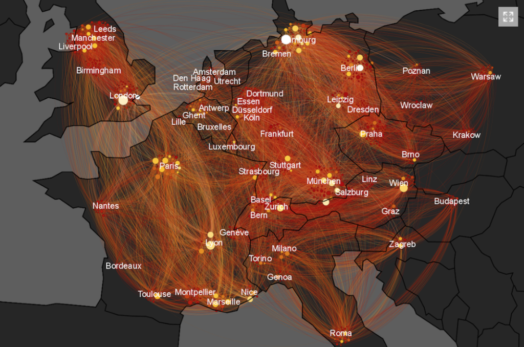
My first inspiration was from Martin Grand Jean[2], a Digital Humanities professional, who created a compelling visualization against a European map of exchanged letters.

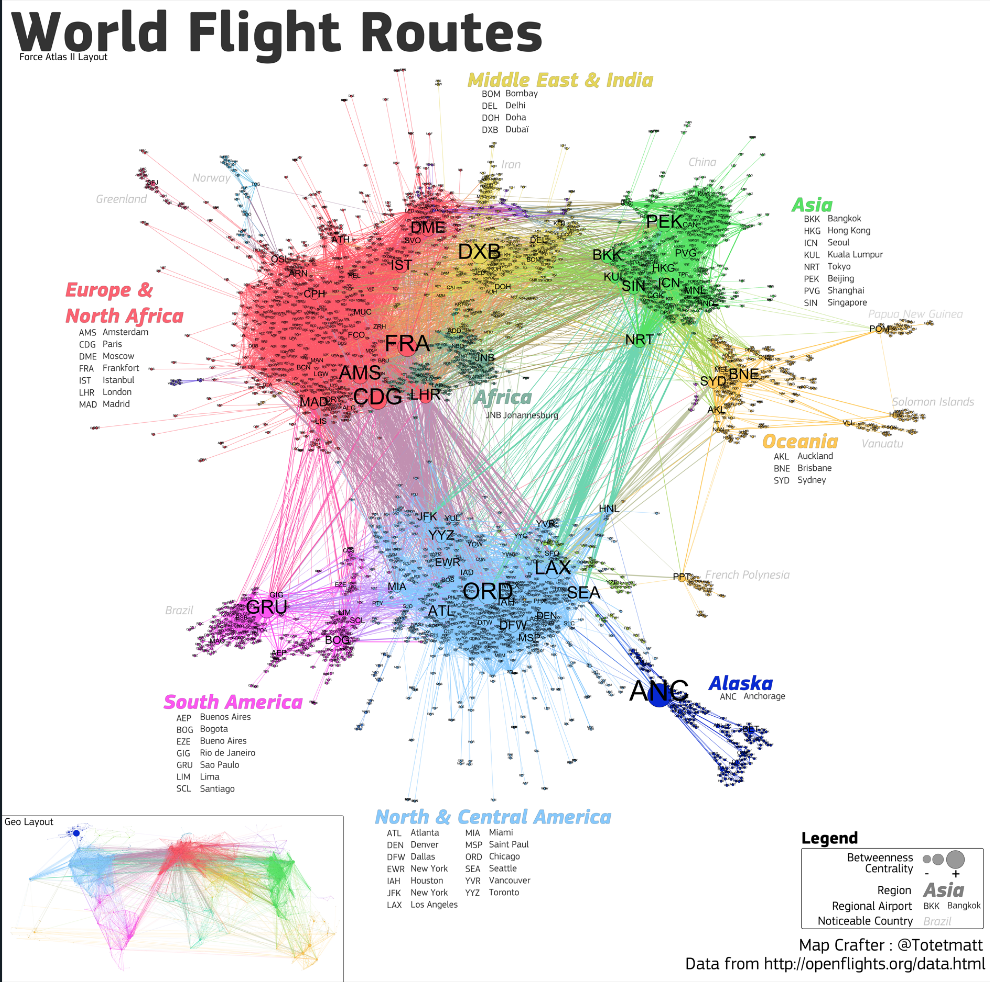
My second inspiration was a world flight map created by Matthieu Totet.[3] This visualization illustrated the different flight routes using betweenness centrality and color modularity.
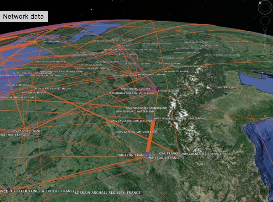
My third inspiration was a screenshot I saw of Gephi being used with Google Geocoding API. ASU had a tutorial taught by Julia Damerow and Erick Peirson.[4] Although I did not view this tutorial, this made me realize I wanted to involve do a project that involved maps.
Methodology:
Martin Grand Jean’s “Mapping Letters Over Europe” was reverse engineered, then slightly tweaked for this project.
Jean’s website included data sets for edges and nodes or this project, and explanations for different ways to analyze the data through Gephi’s layouts.
Each of Jean’s method of viewing data was to be done in different file versions, as the data sets changed and shifted according to layout and statistics.
I chose to first analyze the Betweenness Centrality among the nodes, before laying them out geographically as Jean did in his example. Performing this function identified the intermediaries between two parties of sent and received letters.
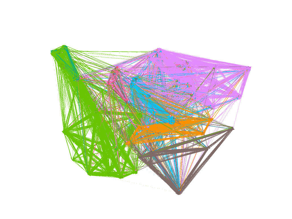
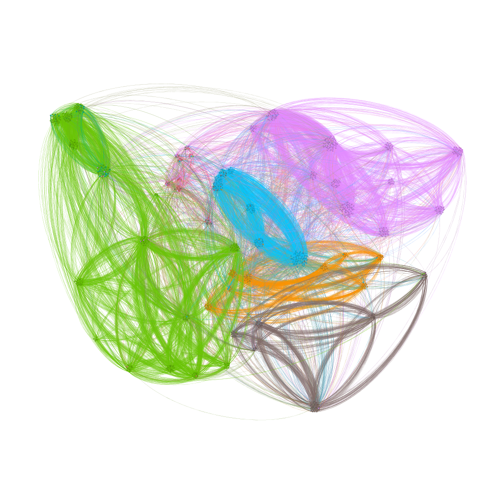
To tweak it, I then ran the Modularity statistic function and partitioned the nodes through color to best identify the communities within the letter exchanges.
I had a choice whether or not to superimpose it to a map background. A map was available for downloading, but superimposing data against a file required using another program called Inkscape.
Process:
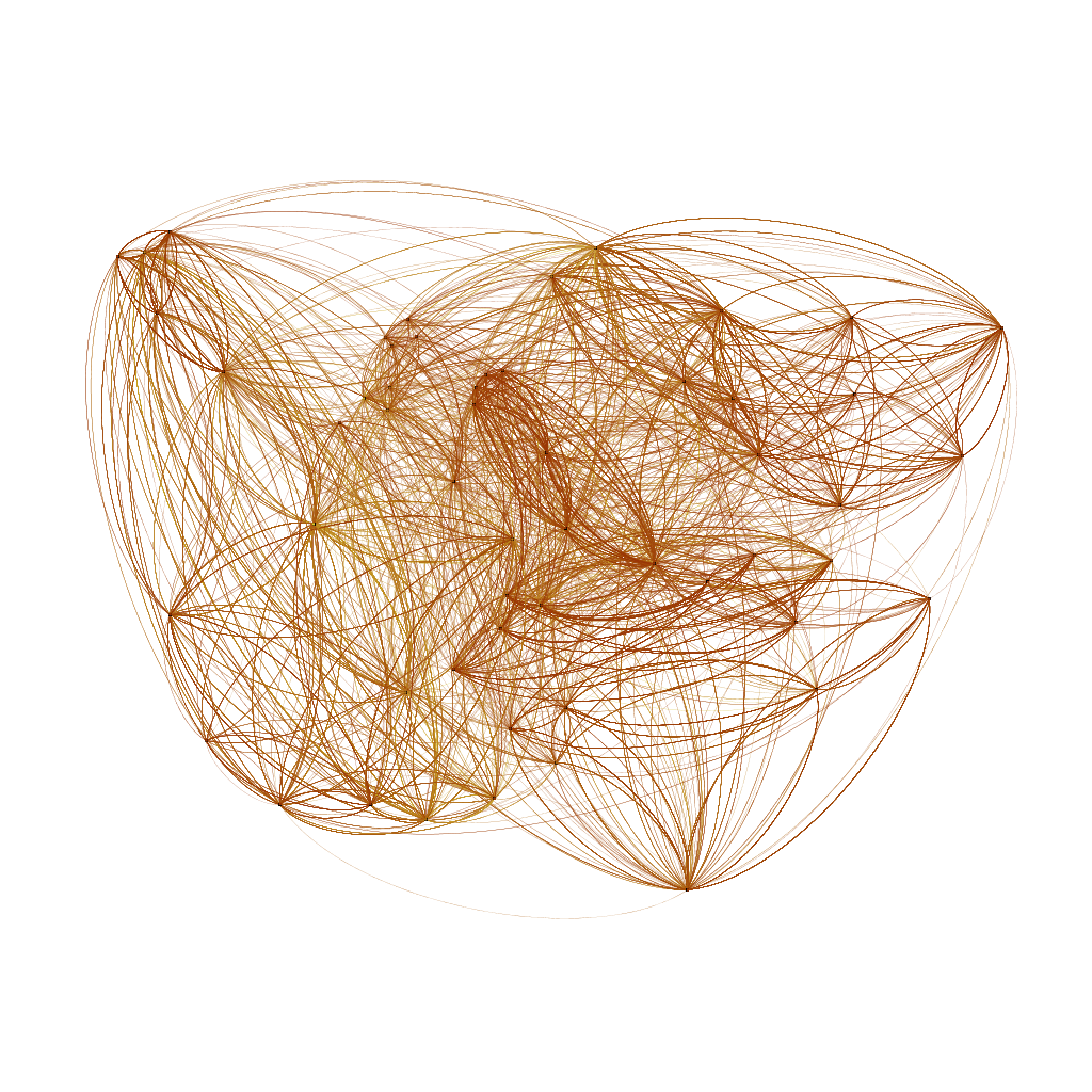
Prior to beginning this project, GeoLayout, Noverlap and Multimode Networks Transformation plugins were downloaded into Gephi.
The nodes and edges table were then imported separately into the Data Laboratory tab, taking into account each of the different column settings. For example, the “Latitude” and “Longitude” columns were to be imported as “Double” instead of “String” or “Integer.”
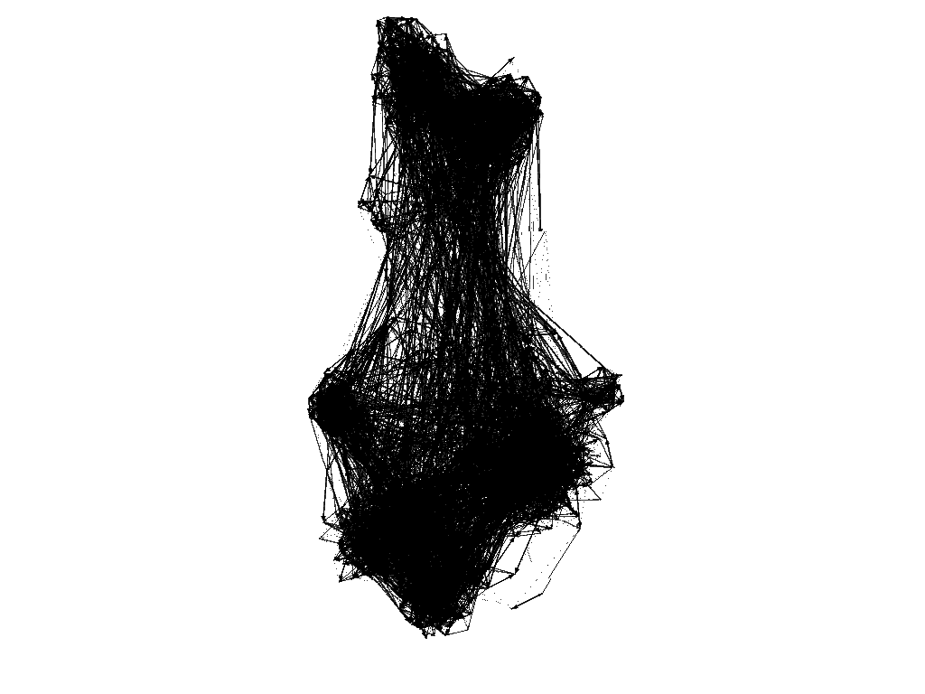
Once all data was properly imported, the Overview tab was clicked to see how the data was initially incorporated. Because the visualization was not coherent, proper size and spacing were implementing before further analysis.
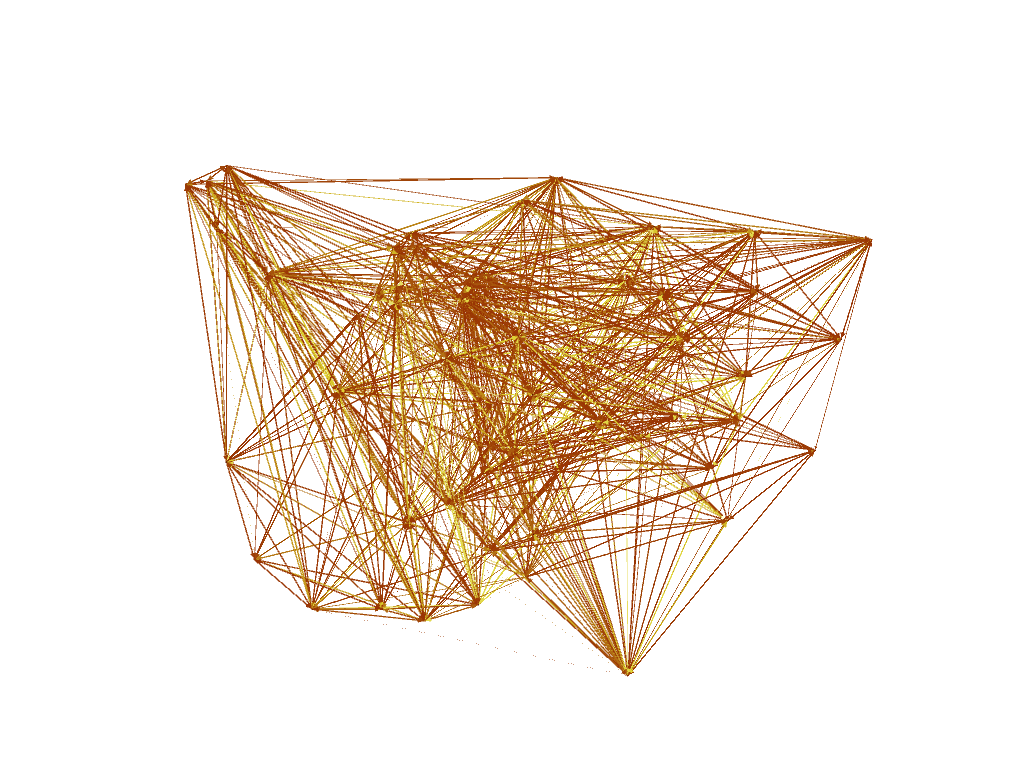
The nodes were then given appropriate degree sizes proportional to their Ranking, with a size range between 10-100. They were then adjusted using the spline to determine a more accurate result. In this case, I did not tamper with the spline, as the nodes did not significantly change when adjusting the shape.
The spacing followed a two-step process. The Fruchterman Reingold layout was set to initially unravel the nodes. The area value was set to 20,000 from its default 10,000 setting, with its gravity and speed both set to 10.
Next, the Force Atlas 2 layout was set to further space out the nodes around the dense areas. Its Scaling setting was set to 50 (from 2), and the Prevent Overlap option was selected.
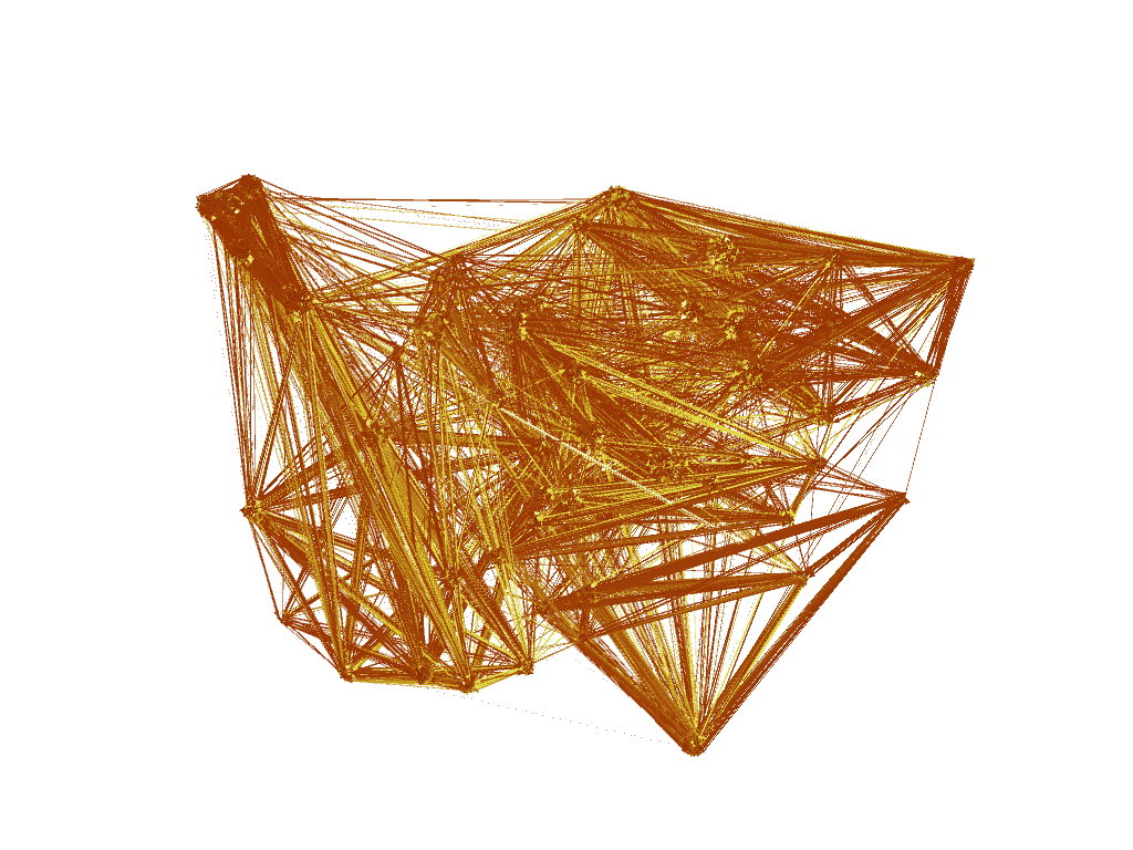
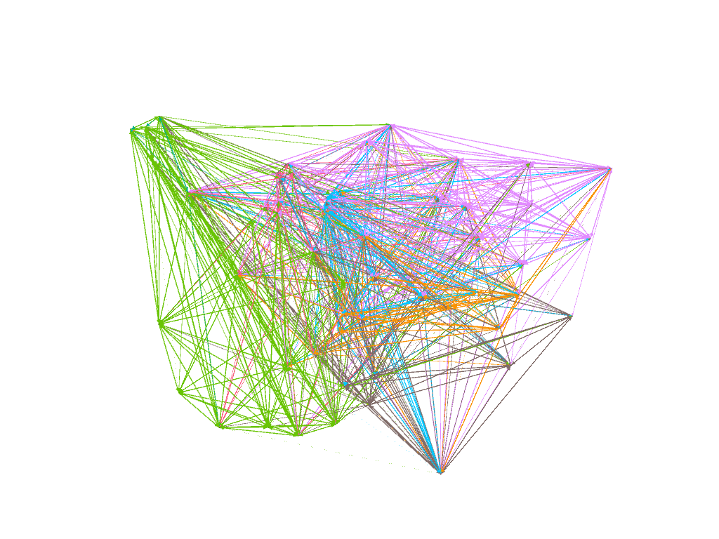
Betweenness Centrality:
In this project, the Betweenness Centrality was analyzed. This calculates the “number of nodes that stand in between each other.”[5]
To perform this, the “Network Diameter” was run on the Statistics window. The color of the nodes was then tweaked by its Betweenness Centrality.
This was visually represented in the color of the nodes. The lighter the color, the higher the B. Centrality. Comparing the color to the degree (size) of the nodes, it was interesting to see that they were not directly proportional to each other. Just because a node was bigger size did not mean it possessed a high betweenness centrality.
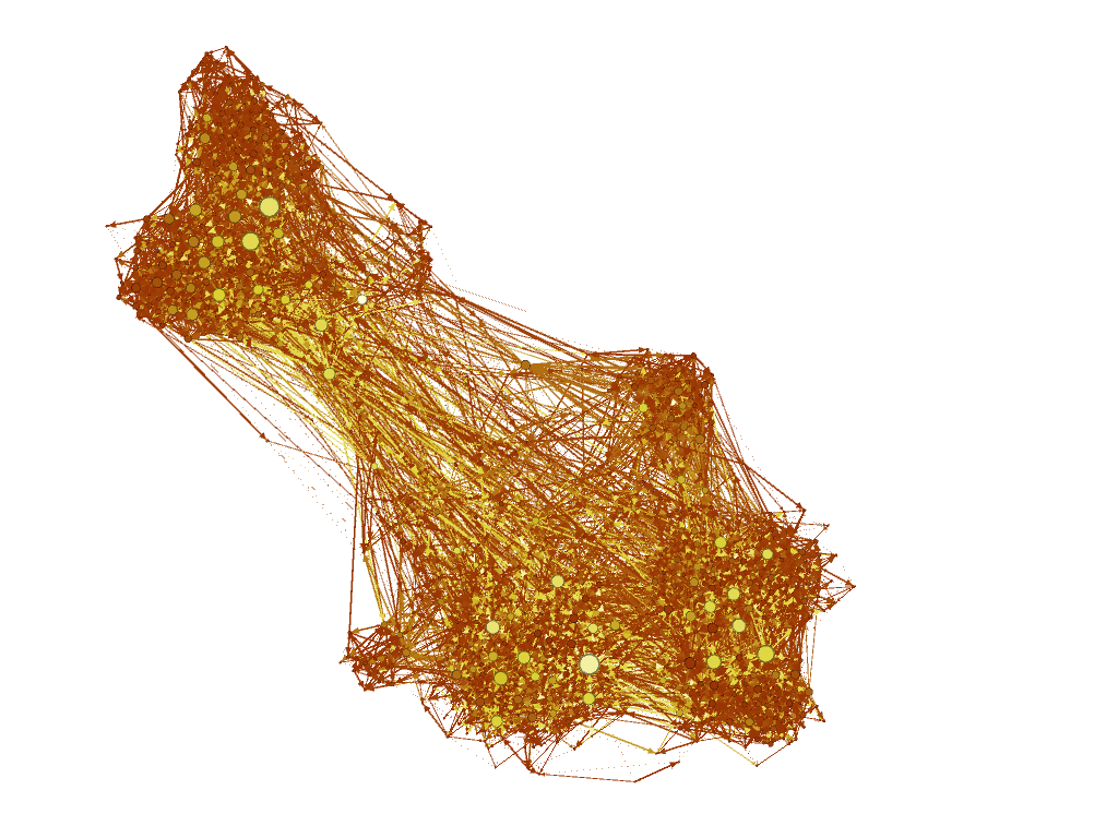
The Geographical Layout was then imposed on the network, with its latitude, longitude, scale and projection (Mercator) determined. This clustered nodes that belonged to their corresponding geographic locations.
There were many nodes that overlapped each other, and needed some space from each other. The Noverlap layout provided them with a margin that was set to 5.0. The final map was then Previewed and appearances were tweaked.
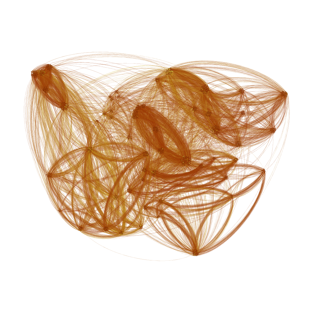
Modularity:
To illustrate the different communities, a statistical Modularity setting was run, and then applied to the nodes in the Color (Partition) settings. A resolution of 0.5 was chosen in order to detect and identify smaller communities. The Geographical Layout was then chosen to represent the data.
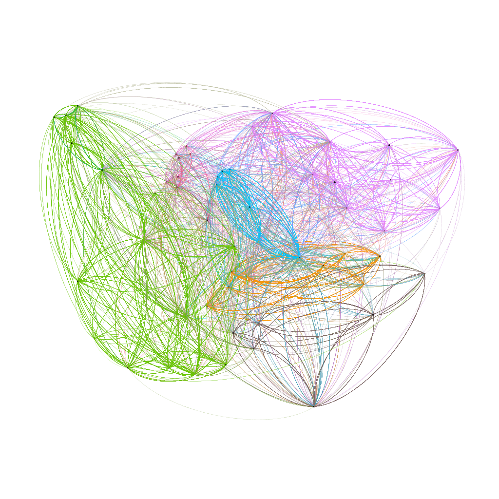
The final step was to display the data in the Noverlap layout scheme, exactly how it was done previously.
Results:
I was very happy with the results. Reverse engineering the visualization, even if Jean’s website had guidelines, was initially a challenge. I had to repeat this several times before being okay with what I saw. Having no prior exposure to Gephi, I had yet to build my conceptual model of the program through intuitively navigating. Once it was familiar, it was a very enjoyable process. I experienced viewing big data from different angles, shapes, colors and movements. It made me really understand how visualization tools can tell interesting and insightful stories, as opposed to simply viewing data on a spreadsheet.
References:
[1] About. https://gephi.org/about/

[2] Gephi – Introduction To Network Analysis and Visualization. http://www.martingrandjean.ch/gephi-introduction/

[3] Totet, Matthieu. World Flight Routes, matthieu-totet.fr/world_flight_routes.png.

[4] Tethne: Geographic Networks in Gephi and Google Earth

[5]Betweenness Centrality. https://en.wikipedia.org/wiki/Betweenness_centrality
The post Gephi: Letter Exchanges Across Europe appeared first on Information Visualization.