Mapping 2016 New York State Hate Crimes
April 12, 2018 - All
introduction
I began this lab with the idea of mapping hate crimes with a heat map as I thought this type of map would best express the intensity of these crimes that I was trying to stress. Initially, my thought was to work with data that would represent just New York City (the five boroughs) but after searching for datasets to support my topic, I was unsuccessful in finding exactly what I needed for this project, the required 100+ records/rows, geospatial dimension, and 1+ quantitative or qualitative dimensions, for just New York City. In the end I was able to locate 2016 hate crime statistics for the entire state of New York by county and decided to work with this dataset.
inspiration

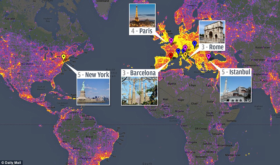
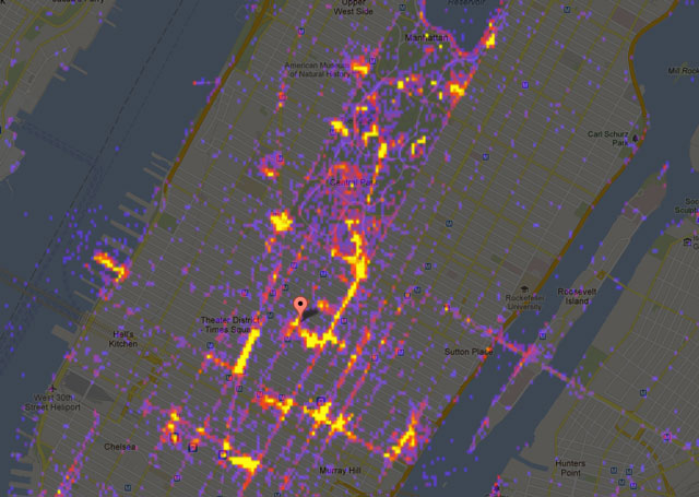
As noted above, my first inclinations were to use a heat map. My novice and I must admit, grandiose notions, were to express the number, type and precise location of hate crimes in NYC, similar to what was done by the Daily Mail map, see Figure 1. or the sightsNYC map by laughingsquid, which I still found appealing and powerful even without the added pop ups, see Figure 3.
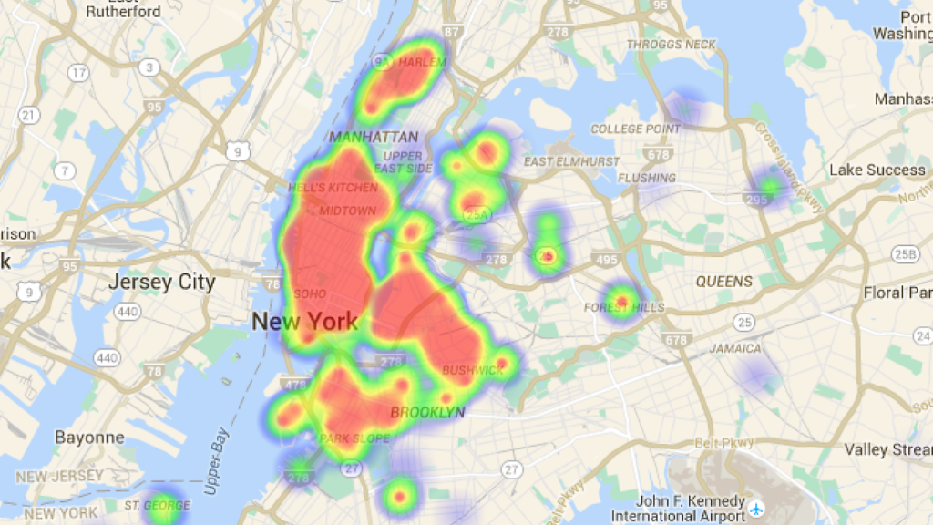
The use of a heat map with a darker background and a contrasting fiery, intensity of bright color to show incident occurrence, I thought, would be visually striking and further add in impressing upon the viewer that these are indeed shocking incidents. I was not against using a light background and felt that the use of familiar map and color scheme for the background could also be a powerful statement if used with the intensity of red and yellow to show crime occurrences, see the TimeOut map in Figure 2.
software and datasets
I completed this lab using Carto, an online mapping application. As I wanted to map hate crimes in New York, I performed numerous online searches to try and find datasets that would be appropriate for my topic and fulfill the requirements. My first search located information on hate crimes from New York Police Department website . Unfortunately, the information provided by the NYPD website did not provide enough records/rows to be used for this lab, there were less than 80. I then initiated a wider search and was able to locate a dataset that provided nice level of granularity that I felt would work for this exercise, i.e. what type of hate crime, from the New York State website. My only concern was that this data was broken down by county throughout the entire state of New York rather than my desired breakdown within NYC only. As with all labs, time is of the essence, and I accepted that this dataset, while not what I had envisioned initially, would suffice for this exercise. I then needed to find shapefiles that would work for my dataset. I had hoped to use shapefiles for NYC but now that my dataset was for the entire state, I needed to find something else. Fortunately Carto provided just the shapefiles needed within the application itself.
methods
This was my first attempt at mapping with Carto and I definitely had grandiose notions of what I wanted to accomplish, see above. Carto, is a very powerful, but not terribly accessible for the novice user, online mapping application. I will admit, the it is a bit intimidating and nowhere near as user friendly as something like Tableau. I definitely could have used many more hours of Carto tutorials to prepare for this class. Additionally, the tutorial information on the actual Carto website is not great though I did find the tutorials that Heather Hill created very helpful. The unfortunate result is that I spent far too much time trying to learn how to use Carto rather than actually using Carto to create the heat map of my dreams noted above. I was able to complete two layers on a very boring and flat map. My colors are nowhere near what I hoped to use (pink, blarg!). I struggled with the widgets and never reached a point where I created one that I felt would be useful for the viewer and ended up not keeping a single one. I did not even get close to a heat map which was incredibly disappointing. I did toy with the idea of adding labels to one layer of my map. Though I found that while it did give the viewer a quick understanding of the number of hate crimes reported in each county, it did not add additional value to the already apparent color variations so I removed them.
results
Unfortunately, I do not believe that my visualization from this lab has anywhere near the impact of my initial vision i.e. using a heat map to show “hot spots” of hate crime violence throughout NYC. I feel that the map is sparse and no where near as exciting and impactful as I had hoped would result from my first “real” map. I ran out of time and never actually
future directions
As to the future, I will definitely be revisiting Carto, though I honestly hope that they may be another application that is slightly more user friendly. I recall from the lab many of my colleagues noting that they could do the same thing in Tableau and it would be so much easier and I would agree. I would like to get to a point where I am at least comfortable navigating through all the menus rather than fumbling through them, unsure of what I am doing, though I do realize this is all part of the process. All and all, using Carto was a humbling experience and made me realize that I have my work cut out for me this summer as I embark on journey into GIS.
references
https://www.timeout.com/newyork/blog/see-a-heatmap-of-nycs-live-music-venues-022416
https://laughingsquid.com/sightsmap-interactive-heatmap-of-the-worlds-top-sightseeing-spots/
https://www1.nyc.gov/site/nypd/stats/reports-analysis/hate-crimes.page
https://data.ny.gov/Public-Safety/Hate-Crimes-by-County-and-Bias-Type-Beginning-2010/6xda-q7ev
https://www1.nyc.gov/site/planning/data-maps/open-data/districts-download-metadata.page
https://rmiller.carto.com/builder/67f87394-920c-4423-9084-1e414fbb19c1/embed
The post Mapping 2016 New York State Hate Crimes appeared first on Information Visualization.