Mapping West Virginia’s Opioid Crisis
April 12, 2018 - All

Over the course of the last two decades, people with opioid addiction and deaths by drug overdoses have increased five-fold, with 115 Americans dying from this cause per day as of 2016 (CDC, 2017). According to the CDC, West Virginia had the highest rate of deaths by drug overdose in 2016, nearly 13% higher than the second-highest state, Ohio (2018). People across the state have heartbreaking stories about this epidemic, such as one town not reporting the cause of death of anyone under the age of 40 in obituaries because it is unnecessary (Talbot, 2017). Efforts are being made to alleviate this issue, including grants from the federal Substance Abuse and Mental Health Services Administration, and millions of dollars being invested in peer recovery programs by the Department of Health and Human Services (Jarvis, 2018).
As part of my final projects this semester, I am considering a potential avenue to help alleviate this crisis: public services. After hearing about the librarians in Philadelphia administering Narcan to overdose victims, I wanted to see if services like libraries had an effect on the number of drug overdose deaths in an area or had the potential to make change based on their geographic locations.
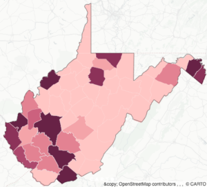
This lab is my first attempt to consider the geography of the opioid crisis in West Virginia, visualizing the number of drug overdose deaths by county each year between 1999 and 2015. Originally I had intended to overlay this data with library locations, but was unable to do so for this lab. The map depicted here reveals how the crisis has spread across the state over this time, as well as how individual counties see increasing numbers of deaths by drug overdose.
Example Visualizations
For this lab, I selected three visualizations to model my own after. I made my decisions based off of my plan to overlay the library locations on the map of county overdose data.

I chose this first example visualization because it is a choropleth map in shades of red. I liked the idea of making a choropleth map because it could represent the variation in the numbers of deaths through the pre-attentive attribute of color intensity (Few, 2009). The red was also attractive to me because it loosely corresponds to the idea of death because of it is the color blood. Finally, I thought the light white lines for borders were helpful for identifying state boundaries while not being visually intrusive. Although people may be able to roughly recognize the states without these borders, the counties in West Virginia are not as well known. Having these barriers on my visualization would help for reference while not contributing chartjunk in the image (Tufte, 2001).

The second visualization I chose for its animation. My data was longitudinal, meaning it had a temporal aspect and was repeatedly taken over time. Although I did not want to depict lines of journeys over time like this one, I did want to represent the changing death rates over time. This visualization also depicted the changes automatically without having to press any buttons or adjust a timeline. I had hoped to have that function in my map as well. Finally, I liked the relative simplicity of this basemap. I did not intend to use such a dark basemap, but I liked the lack of labels and the fact that it was relatively unobtrusive.

I chose my third example with my second map layer in mind. I liked having the red and blue together to represent different pieces of data, although I intended to reverse the colors (red choropleth of death rate data below blue markers for library locations). It would be relatively easy for colorblind people to differentiate these colors, and I thought that would increase its legibility. Ultimately, I did not use the second layer, but did create a reddish choropleth map.
Materials
Originally, I had intended on using two datasets to complete this visualization. I would have created one using the West Virginia Library Commission’s Library Locator and geodata from Google Maps, however this dataset was not completed in time for the lab. The second, and ultimately only, dataset was taken from the Underlying Cause of Death portion of the Centers for Disease Control’s WONDER database. This data mines mortality and population counts from all death certificates in each county in the United States. It reports demographic statistics as well as information on a single cause of death.
In order to georeference this data, I connected the death data from each county to county boundaries. The zipfile for the county boundaries, which were determined by the US Census, was downloaded from the WV GIS Technical Center. Another shapefile that depicted the border of the entire state was also downloaded from this source to outline the image.
![]()
The visualization was generated using Carto, a freemium, open-source mapping platform. Carto is browser-based and stored in a Carto server, so it can be opened and edited anywhere with an internet connection. Visualizations created in Carto can be published and linked directly to the Carto site or embedded in the HTML code of other websites.
Methods
This visualization was created in three overall steps, the first being data retrieval. As stated previously, I attempted to collect my own data on library locations, but eventually chose to only use the drug overdose data. I requested the CDC WONDER data about West Virginia grouped by county, year, and drug or alcohol-induced cause. The data included death, population, and crude rates, from 1999 to 2016, for all ages, genders, races, and origins.
![]() Once I downloaded this data, I cleaned it up using OpenRefine. I took out any totals that were included, as well as the crude rate and any other data that was not directly used in the visualization. Because I was interested in drug-induced deaths specifically, I also deleted all data from alcohol-induced deaths and deaths that were not alcohol- or drug-induced, since this was included with the drug and alcohol data. I decided to keep population as a field with the hope that I might be able to use analysis to find the percentages of deaths in each county every year instead of only the raw numbers of deaths. Additionally, I deleted “ County, WV “ from each entry in the “County” column to match the county boundary dataset and changed the years to a DD/MM/YYYY format.
Once I downloaded this data, I cleaned it up using OpenRefine. I took out any totals that were included, as well as the crude rate and any other data that was not directly used in the visualization. Because I was interested in drug-induced deaths specifically, I also deleted all data from alcohol-induced deaths and deaths that were not alcohol- or drug-induced, since this was included with the drug and alcohol data. I decided to keep population as a field with the hope that I might be able to use analysis to find the percentages of deaths in each county every year instead of only the raw numbers of deaths. Additionally, I deleted “ County, WV “ from each entry in the “County” column to match the county boundary dataset and changed the years to a DD/MM/YYYY format.
I also cleaned the county shapefile using OpenRefine. Because it originated from the US Census, it included demographic data that was unnecessary for this particular visualization. I deleted those fields to reduce the amount of clutter for the final dataset.
After the datasets were cleaned, I uploaded both to Carto. In a new map, I added the county boundaries dataset, then I selected the “Add Columns from Second Dataset” function from the “Analysis” tab. With this tool, I joined the death rate data to the county boundaries via the common county fields. This action assigned the death rates to each county, as well as the year data from the second dataset.
Once the datasets were joined into one, I used the “right_year” option under the “Data” tab to add a temporal element. Initially, I had wanted this to be an automatic animated timeline, which could show the rapid spread of drug overdose across West Virginia. However, Carto could only allow this function for point data, so I was unable to run the animation on my polygons. I could still have a year filter, so I kept this widget for manual manipulation.
The final step was styling the visualization. For the polygon fill, I chose a color scale from light pink to a dark, purplish red to represent the number of deaths in each county. I selected this hue because the reddish aspect would suggest some idea of death without being overly indelicate. The scale divided the data into 7 buckets by quantile to determine the color. I outlined the counties in white with a 0.1 width, with the intention to delineate the county lines for those unfamiliar with West Virginia counties without distracting the user. I also added a second dataset to create a West Virginia state border. When the year widget is in use, many of the counties that do not have any recorded drug deaths disappear. I added this border to make sure users understood where the state boundaries lie. In addition to these colorizations, I also made the year widget black to further imply death.
In terms of functions on the map, I added clickable pop-up windows in the dark style that include the county name and the number of deaths that year. I also turned off all the map options, such as the search bar and zoom controls, except for the legend, which describe the colors of the choropleth map. Finally, I selected the Positron (lite) basemap because of its unassuming style. It is mostly shades of gray without any labels. Although it includes state boundaries, roads, and geographic features, the images are muted enough so as to not distract the users from the more vibrant map of West Virginia. Tufte might argue that it creates chartjunk, but I felt it places the visualization geographically without being too obtrusive.
Results & Discussion
This visualization depicts the number of deaths by drug overdose by West Virginia county via a choropleth map. At the bottom of the visualization is a widget that allows users to filter the data by year or by a range of years. Users can also click each county to find out its name and the number of deaths during that year in that county.
Carto limited some of the analysis capabilities I had hoped to do with this visualization, however. For instance, I had hoped to animate the changes in the data over the course of the data’s time period. Carto only allows this feature for point markers, not polygons, so I was unable to follow this plan. I think it would have been especially effective to see the drastic change so smoothly, and I do not understand why Carto would not allow for this.
Another issue I had with Carto is that I could not use analysis to calculate percentages. Although as an regular Carto user, I was happy to find out more about the new analysis and data features, I was disappointed to discover that it could not do that simple calculation, at least not to my knowledge. I hope that in future upgrades, Carto will consider adding this type of analysis.
Future Directions
If I were to attempt this map again on Carto, I would try a few new features. First, I would want to actually add the second library location layer to get more depth with the idea of using public services to help alleviate the opioid crisis. I would also add percentages of drug overdose deaths to total deaths to my dataset since Carto is unable to calculate this itself. Percentages would more accurately depict the impact of deaths by drug overdose between counties with different population sizes. Additionally, I would consider adding a marker to depict cities of a certain size within West Virginia, particularly the state capital, Charleston. The opioid crisis appears to have originated there on this map, and having an indicator of city size might speak more to its geography
I also think I will be using a variation of this map and data as part of my final project for this course. Rather than using Carto, I plan to make visualizations in Tableau that include data on ages and places of death along with the data included here. I would also probably add percentages before carrying out this final project to appear more accurate.
References
Centers for Disease Control. (2017). Opioid overdose – Understanding the epidemic. Retrieved from https://www.cdc.gov/drugoverdose/epidemic/index.html
Centers for Disease Control (2018). Drug overdose mortality by state. Retrieved from https://www.cdc.gov/nchs/pressroom/sosmap/drug_poisoning_mortality/drug_poisoning.htm
Correal, A. (2018, February 28). Once it was overdue books. Now librarians fight overdoses. The New York Times. Retrieved from https://www.nytimes.com/2018/02/28/nyregion/librarians-opioid-heroin-overdoses.html
Few, S. (2009). Now you see it: Simple visualization techniques for quantitative analysis. Oakland, CA: Analytics Press.
Jarvis, J. (2018). W. Va. awarded grant to combat opioid addiction crisis. WV News. Retrieved from https://www.wvnews.com/news/wvnews/w-va-awarded-grant-to-combat-opioid-addiction-crisis/article_e35fb112-cb41-5e62-9062-e0046eb1ae92.html
Talbot, M. (2017, June 5 & 12). The addicts next door. The New Yorker. Retrieved from https://www.newyorker.com/magazine/2017/06/05/the-addicts-next-door
Tufte, E. (2001). The visual display of quantitative information (2nd ed.). Cheshire, CT: Graphics Press.
The post Mapping West Virginia’s Opioid Crisis appeared first on Information Visualization.