Visualizing NYC Lower Manhattan Retailers with Carto
April 12, 2018 - All
Lower Manhattan is one of New York City’s most affluent and crowded districts. It is not only a financial district where Wall Street locates and highly-educated people stay, but also a must-see tourist destination. Therefore, as a business district, Lower Manhattan is highly competitive, and also full of opportunities.
To better understand the retailer market in this neighborhood, I found a dataset of “NYC Lower Manhattan Retailers” from NYC Opendata, and used Carto to visualize how retailers in different categories located in the district. Since Lower Manhattan is also a transportation hub, especially the subway system. I added two datasets of “NYC Subway Lines” and “NYC Subway Stations” to see how the retail locations are related to the subway.
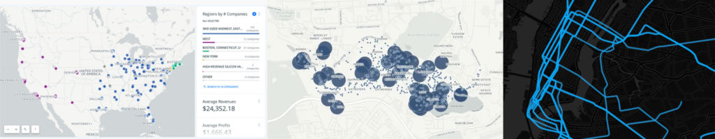
Before creating my own visualizations, I gathered some visualization examples for design inspirations. The first one is a typical Carto dashboard which includes a map and some widgets by the side to add more description and detail about the dataset. The second one is from a Carto analysis tutorial about creating travel/distance buffers. The third one is a visualization of NYC subway line, the color scheme (black background) contrast the subway line very well.

Categorizing and Labeling the Retailers
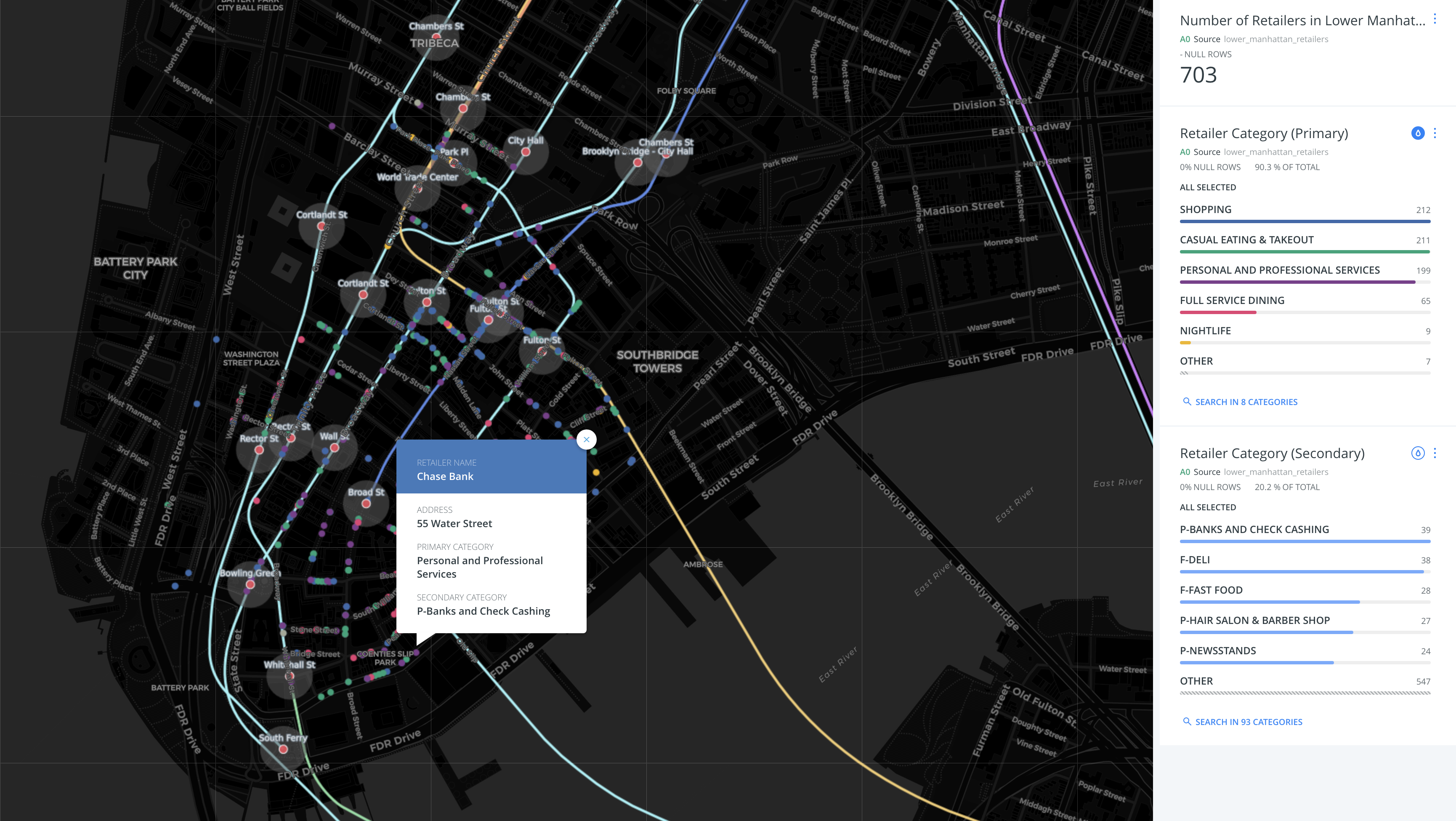
When starting the project, I first imported the dataset of Lower Manhattan Retailers. Then I labeled each retailer with their name, address, primary and secondary categories. Therefore, the audience of the map can click each retailer spots to view the detail information.
In order to better contrast retailer location, I rendered a flat and dark basemap so the audience can focus on the key information. I also added three widgets to display the total number of retailers in Lower Manhattan (703) and the bar charts of primary and secondary retailer categories.
From the bar chart, we can see “shopping” (212), “casual eating & takeout” (211) and “personal and professional services” (199) are the top three primary categories of the retailers. Within “personal and professional services”, “banks and check cashing” (39) , “hair salon & barber shop” (27) and “newsstand” (24) are the most common types of business. In terms of food, “Deli” (38) and “Fast Food” (28) are the most common types of retailers. It matches the needs of two major target customers in Lower Manhattan: worker and tourist.
Import Dataset of Subway Lines and Stations
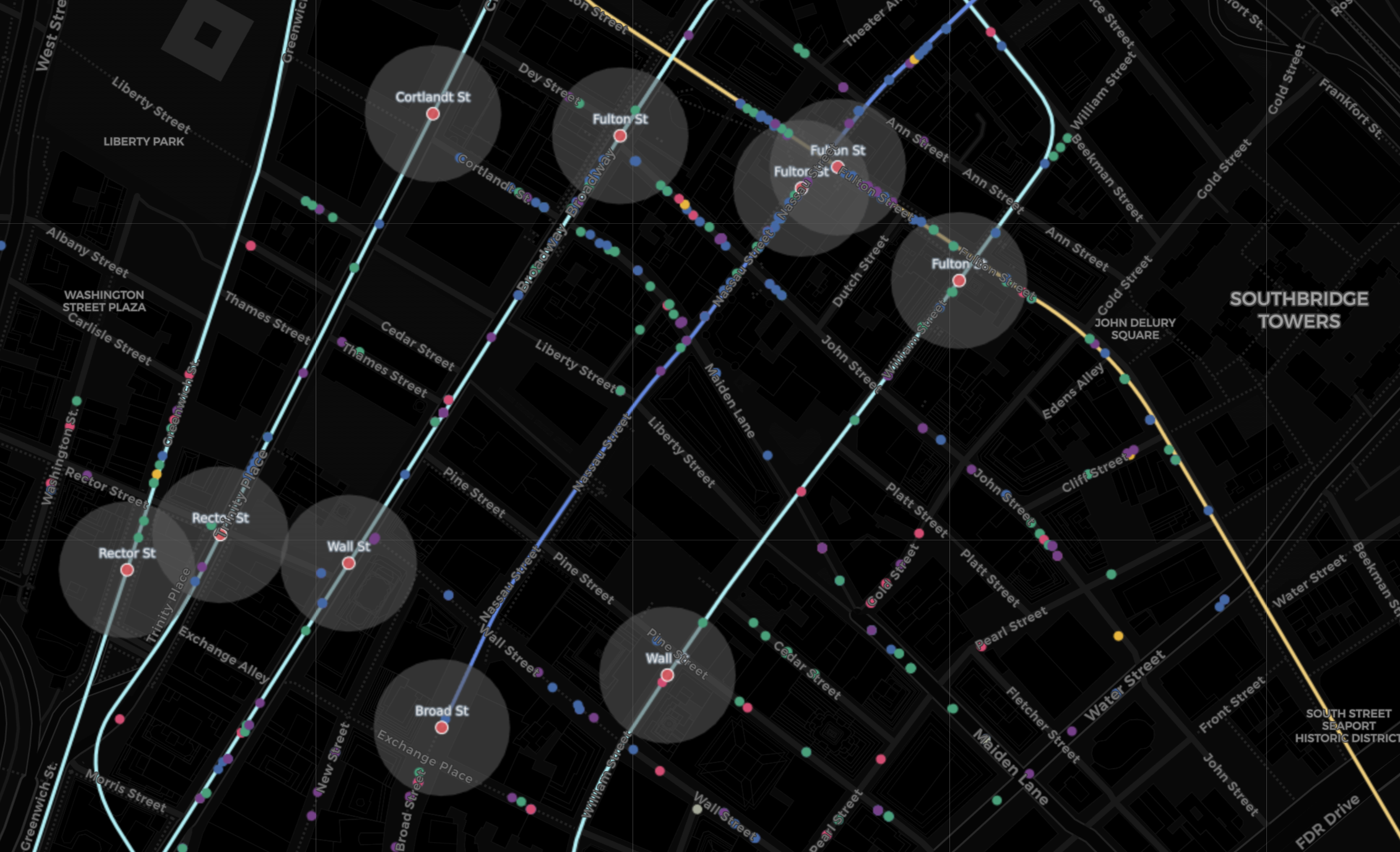
To understand how the retailer locations are related to the subway system, I further imported the dataset of NYC subway lines and station. Each subway station is labeled with the name on the map, and the subway line is labeled with a pop-up window. The subway lines are colored based on the lines, while some lines are categorized by the system as “others”, so they are displayed with the same color.
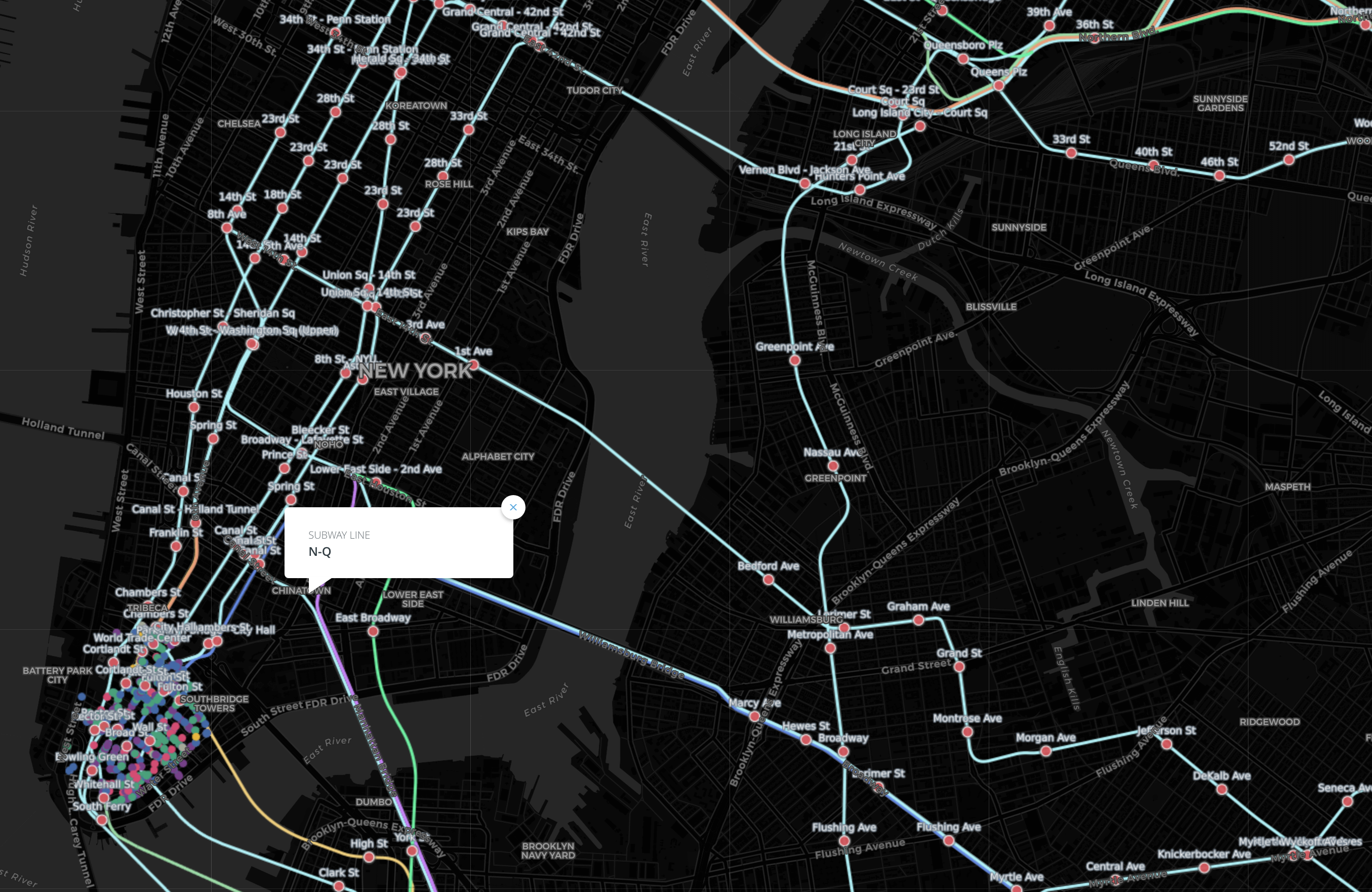
The result shows the retailer location is highly related to the subway lines and stations. Many retailers are overlapping the subway line, and there are more retailers near subway stations than those not, especially the shopping business.
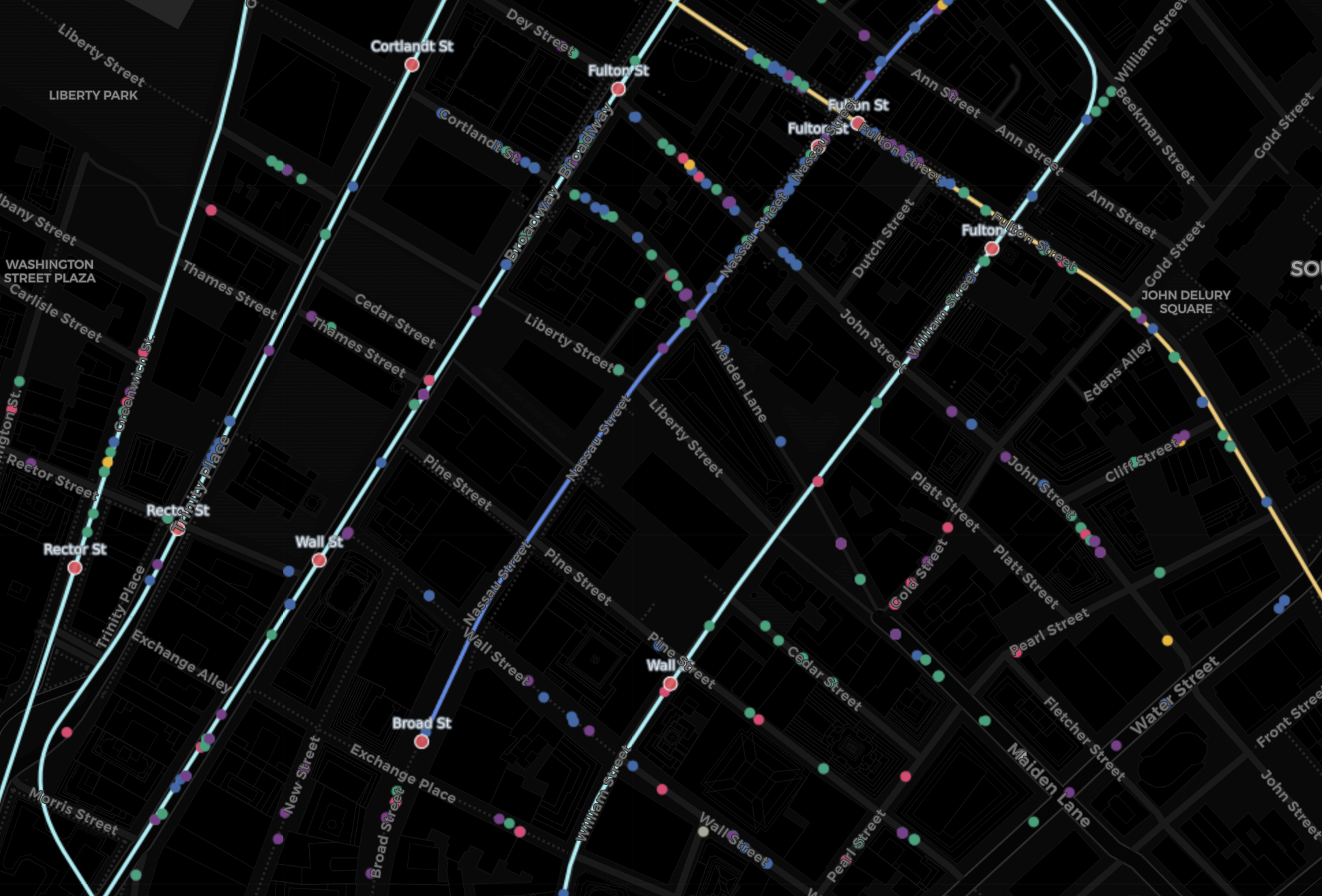
Create Travel Buffers (50m) around Subway Stations
Carto has many useful analysis tools which can add more insights to the dataset. “Create Travel or Distance Buffers” is one of the great tools which creates buffers of distance in meters, kilometers, or miles, so the audience can have a clearer understanding about how one location is related to others. For this project, I created buffers of 50 meters for each subway stations. I found “Fulton St” station has the most retailers around within 50m, followed by “Park PI”, “Rector St” and “Wall St”.
Future Directions
By going forward, I would like to conduct more analysis for the retailer category. In the map widget, Carto only shows the top 5 categories and categorizes the remaining data in “others”, which is not very accurate and satisfying. I want to see the ratio of all categories and look for what kind of business might be missing there.
I also look forward to adding more dataset to provide more context and comparison for the current data. Here are some datasets I’m very interested in including: First, the divide of sub-districts of Lower Manhattan (e.g. Lower Broadway, WTC/Tribeca South, Fulton, Financial District, etc.); Second, the median household income in each neighborhood; Third, the data of office building in Lower Manhattan.
Besides dataset, Carto itself is a powerful tool for mapping with many features that I haven’t explored, especially the analysis tool. It will be worthwhile to learn more about Carto and apply as many functions as possible that work for the dataset I use. For example, Carto has a very cool feature which can animate maps with time data. If I were able to find the dataset of the established time of the retailers, I can use Carto to create a map which animates how the retailers were built as time goes.
GIS visualization reveals and exams how geographic relations affect the world around us, which is the most straightforward way to display geographic data. When creating the visualization, it is important to consider how to help the audience relate the data with its context and compare in different ways. Choosing right color scheme and proper size of elements are also important to deliver the messages to the audience clearly. It is fine to explore different features of the software when creating the visualization, but having some goals in mind is a more efficient way to build a meaningful visualization.
View and play around with the visualization result here
References:
1. NYC Open Data-Lower Manhattan Retailers (2017, September 8). Retrieved from https://data.cityofnewyork.us/Business/Lower-Manhattan-Retailers/cw88-qpsr
2. NYC Open Data-Subway Stations. Retrieved from https://data.cityofnewyork.us/Transportation/Subway-Stations/arq3-7z49
3. NYC Open Data-Subway Lines. Retrieved from https://data.cityofnewyork.us/Transportation/Subway-Lines/3qz8-muuu
4. First Design Example: https://libraries.mit.edu/news/online-intro-carto-2/25850/
5. Second Design Example: https://www.youtube.com/watch?v=S_kNe24cO18
6. Third Design Example: https://carto.com/blog/mow-subway/
The post Visualizing NYC Lower Manhattan Retailers with Carto appeared first on Information Visualization.