(A Little) Messiness, (Some) Clutter, and (Ongoing) Revelations(s)

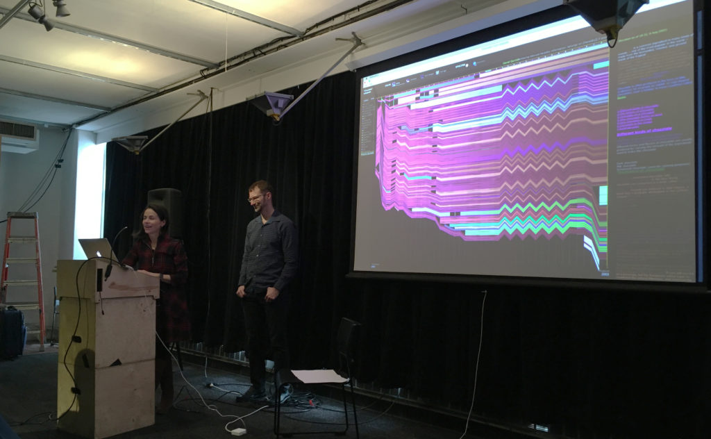
Viégas and Wattenberg, presenting in the clutter

As introduced by Miya Masaoka (Director of the Sound Art Program at Columbia’s School of the Arts and coordinator of the Artists Using Data series), Fernanda Viégas and Martin Wattenberg are “pioneers in data visualization and analytics” who have “shaped the field” and crafted tools and interactions that have been “used by millions of people.” (A similar description is on their collaborative site.)

Working to a more succinct description, their business cards would formally present them as members of Google’s PAIR (People+AI Research) initiative and Big Picture team. As simply defined by themselves at this presentation, they are scientists and artists — a dichotomy that would give many pause, but is no doubt a complementary pairing for many in the field.

While the work of such individuals inevitably links or crosses from one title to another, their presentation on March 8, “Messiness, Clutter, and Revelation,” focused on their work outside of Google, wherein they have explored new ways to use and investigate data, even as they set constraints within which to play with it. In that spirit of limiting parameters (and an eye to brevity), this review will contain itself to their work and philosophies as shared at this event, “an informal talk” in a mid-renovation space — a fitting format and environment for a presentation that ultimately moved toward the playful and iterative natures of both data exploration and artistic expression.

Viégas and Wattenberg essentially took turns presenting a small selection of work, individual and collaborative, all initially produced between 2003 and 2012, but timeless in their foundational role for the artists and others. Collectively, they defined an arc where the titular elements contributed to insights for the makers but also produced pieces of art — or at least design that moonlights as art.

This is evident, perhaps, in a project like History Flow (2003), explored initially as a ‘scientific probe’ in response to the then-new(ish) Wikipedia now residing at MoMA. This elegant visual investigation tracked the editing of Wikipedia entries, including the back and forth of dueling ideologies on matters adorable and political. In sharing examples of internet favorites such as ‘cat’ and hot-button issues like ‘abortion,’ the patterns of editing and relative passion in each is unmistakable. Yet, when asked if a visualization that compared the different kinds of impassioned debates had been attempted to establish a pattern, Wattenberg responded with a simple “No, but someone should do that.”

“Using data to know things” and questions of technological limitations or permutations were explored in The Art of Reproduction (2011); specifically an understanding of “How the internet is lying to you” through the varied representations of a single artwork that can be found online — from the decaying gold of Klimt (26 Danaes) to the deceptive black-and-white of Mapplethrope (8 Kens and Roberts). Which is the true reproduction work? Or aren’t they all?

This compilation of a single vision or a larger ‘truth’ from a messy table was also evident in Flickr Flow (2009),  a commission that sought to visualize the city of Boston, starting with the particularly ‘dirty’ data set of Flickr images tagged simply as “Boston Common.” The duo let those limitations and what they brought guide the form, stating: “Let’s work with that messiness; see what we can find.” The result is an elegant abstraction of ribbons that looks nothing like (but also, somehow, very much like) Boston year-round. In the process of its creation, it investigates what we as a society have preserved.

Other works explored how we search (Web Seer, 2009) , how “the alien mind” thinks (Thinking Machine, 2003) and how music might be visualized (The Shape of Song, 2002), with the last cited as ”an example of clutter yielding something useful.”

The presentation culminated with Wind Map (2012–). Also in MoMA, this piece was the most clear presentation of the pair’s iterative approach to data visualization, a case study that showed explorations from the abstract to the psychedelic, with the ‘final’ version resulting from the addition of a single line of code to an earlier iteration. Starting with the simple, seemingly ethereal (and almost Ono-esque) question “What does the wind look like?” and the desire to “make complex data easily accessible,” they created — they would have us believe unwittingly — a practical and emotional tool.

The resulting real-time visualization was picked up by meteorologists and combined with other data in weather maps, but also caused Louisiana residents in the path of Hurricane Isaac to reach out to the artists as they tracked the storm in real time. It was also picked up by school teachers and other scientists who used it to teach and to study their own passions. None of these were intentions; they were all unexpected results.
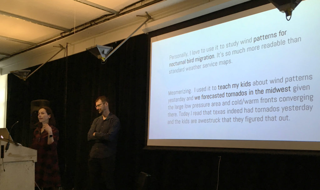
The unexpected results of Wind Map

Indeed, through almost all of the works presented, Viégas and Wattenberg seemed to speak to the utility of data, while often deferring to others in taking on that utility. They were readily willing to accept their work in a continuum where others (for example) could then take the code and build something new or explore another facet, as the two moved on to a new subject. They were driven not by “What can this do?” but by “What happens if we do this?” and seemed to view the usefulness of a project like Wind Map with the same wonder that they viewed the initial question of “What does the wind look like?”

Here any observer could be forgiven for a little ambivalence. The work done by Viégas and Wattenberg is — to those who enjoy visualizing data — smart and well crafted. The pieces in MoMA deserve that recognition. They do make one think — but mostly about what can be built upon their efforts.

For those looking to draw the line, this may fall too much on the ‘art’ side. The pair seem decidedly more interested in the baserate questions over the relational ones. (McGrath 160) Before making things, they certainly aren’t asking where the project will be “in ten, twenty, or even fifty years,” and the word “persona” had no place in the conversation. However, they do “value ephemerality and even magic” and seem to believe that “Not everything about a project must be rationalized or demystified.” As seen in those Wind Map explorations, they’re not afraid to “Make a useless [drippy, psychedelic] or disinterested version” of a project. (Sayers)

Looking to Miriam Posner, the pair’s work (again, as presented here) shies away from a critical engagement. They seem content to pose questions and make tools that others may then utilize — but the investigation stops at form and leaves impact to others.

To directly contrast Viégas and Wattenberg with some projects that Posner admires: How does a colorful visualization of Boston compare with Jacqueline Goldsby’s Mapping the Stacks that aims “to describe and arrange collections related to African American History in Chicago?” How does the composition of “8 Kens and Roberts” in the Art of Reproduction compare with David Kim’s ‘Data-izing’ the Images: Process and Prototypes, wherein Kim used the visualization to question the photographer’s categorization of his Native American subjects? Both speak to us about perceptions and ‘lies’ — one through form, the other through culture. (Posner)

Of course not all visualization (or art) must address the bigger issues — and even Posner knows this. Sometimes it just gets the conversation going, placing the data most clearly in front of those with the itch to investigate further. (And it’s another false dichotomy to decide we have to somehow judge one of these approaches over the other.) In the continuum of development, the world needs people who play in the messiness and clutter, those who ask questions, tinker around and leave something half-built on the workbench. Ultimately this research and discovery become tools of their own for those who want to build higher.

– Michael Kelly, Info 601, Professor Chris Alen Sula

References:
• McGrath, Joseph. (1994). “Methodology matters: doing research in the behavioral and social sciences.” Original paper.
• Posner, Miriam (2016). “What’s Next: The Radical, Unrealized Potential of Digital Humanities.” Keystone DH Conference, University of Pennsylvania, July 22, 2015. http://miriamposner.com/blog/whats-next-the-radical-unrealized-potential-of-digital-humanities.
• Sayers, Jentry (2018). “Before You Make a Thing: Some Tips for Approaching Technology and Society.” https://jentery.github.io/ts200v2/notes.html
The Feeling of Technology

What makes us feel?

From a biological perspective, it is proven that nerves located at integral parts of our bodies help us interpret external stimuli that come in contact with our body. The amygdala in our brain is a limbic structure that helps us process emotions and is a component that makes humans unique. The way our bodies have evolved have made us into analog creatures that react well to external stimuli in the natural world and this in turn has helped us become highly adaptable to earth’s different environments (Norman, 2008). From a technological standpoint, what happens when we begin to try to build machines to be more like us? What happens when we want our machines to then replicate our innate emotions or our psyche, to perform for us?

These were questions that I thought of when I was attending UXPA’s Emotionally Intelligent Design Workshop on February 16th. During this workshop, Pamela Pavliscak, a specialist that studies the relationship between our emotions and technology, asked us to partner up and design an app or piece of technology with human emotion in mind. We were required to use two themes as the basis of our invention. For myself and my partner, we had to create a dating app for people that are single. To help us create our invention, Pamela offered examples on how the tech industry has already began using forms of emotion, like our gestures and tone of voice, to implement design features that help build programs that react to us. Their reactions to our emotions will then prompt the machine to respond in a way that’s human, but not quite.

An example of this is SimSensei, a virtual human interviewer, which was created as a means to help health care professionals make more informed decisions on their patients based on their responses to the virtual interviewer. SimSensei is represented by a virtual human named Ellie, who is programmed to conduct interviews that help “…create interactional situations favorable to the automatic assessment of distress indicators, defined as verbal and nonverbal behaviors correlated with depression, anxiety, or post-traumatic stress disorder” (DeVault et al, 2014, p. 1061). Essentially, by creating a virtual helper like Ellie, people at risk of certain mental health disorders can feel they can open up to her, and in turn they can receive the right treatment. Patients are often misdiagnosed in the medical field so I think SimSensei has the right programming to flag warning signs of a particular disorder (keep in mind that it is mainly being used in diagnosing mental health issues).

In my honest opinion, it almost feels like Ellie has been programmed to trick patients into thinking they can trust it. During the course of an interview, the patient is being monitored, and every question Ellie asks is to create a response from the patient, either through speech or through facial changes. Here is a YouTube video that will help you see what sort of questions Ellie is programmed to ask to during her interviews and the type of facial tracking the machine uses.

Another great example offered to us is Toyota’s 2017 movie on a futuristic vision of how some cars may be developed (access it here ). The car featured in this short movie is a concept model, along with the AI named “You-ee” that is built into it. We see aspects of the car’s AI offer advice, act as “wing-man”, and my personal favorite – give positive reinforcement. During the workshop, only the clip from 5:45 to 6:34 was shown. Seen in its entirety, we get a glimpse into what an emotionally intelligent system can do for us. By giving something like “You-ee” human-like qualities (like its ability to make a joke out of Noah’s messy hair), it allows us to view the car as an extension of ourselves. More importantly, I think having a dependable AI is something that will allow individuals to flourish and establish better ties with their human counterparts.

Learning about the different types of emotion-based systems that are already on the market reminded me of Phoebe Senger’s remarks on AI being “..autonomous agents, or independent artificial beings” (Senger, 1999, p.10). We can, at this point, say that Ellie is a step away from being an autonomous agent. Although SimSensei is only currently being used to help doctors diagnose mental health patients, won’t this tool eventually be programmed to perform the the diagnosing by itself and then also administering treatment?

After reading Senger’s article, I now understand how the effects of implementing emotion into our programs can push our machines to the next level. Ellie is programmed with a voice and is made to be able to connect to humans so that we can better understand our own species. We will always be building towards the future, but we always want to keep our connections to one another close to us. After all, humans are empathetic and this quality will be incorporated into the things we create. “You-ee” a perfect example of how the relationship between human and AI can potentially be a harmonious union.

At the end of this workshop, all the groups presented their designs and prototypes. My partner and I decided to create a dating app that required all users to scan a full body image of themselves and display it on their page. Since I’ve never used a dating app before, I was never subjected to the cruel reality of them. According to my workshop partner, dating apps can make finding a partner relatively uncomfortable and weird. Therefore, by implementing a way to circumvent the feeling of discomfort and dishonesty, we believed having your entire self displayed is a great way of creating a more open dating world. But you may ask at this point: “Where’s the portion of your app’s design that makes your prototype emotionally intelligent?”.

And I will answer: “We’re not at that point yet”.

References:

  • DeVault, David et al. (2014). SimSensei Kiosk: A Virtual Human Interviewer for Healthcare Decision Support. 13th International Conference on Autonomous Agents and Multiagent Systems, AAMAS 2014. 2. 1061-1068.
  • Norman, Don A. (1998). The Invisible Computer: Why Good Products Can Fail, the Personal Computer is So Complex, and Information Appliances are the Solution. MIT Press. Chapter 7: Being Analog
  • Sengers, Phoebe. (1999). “Practices for a machine culture: a case study of integrating cultural theory and artificial intelligence.” Surfaces VIII.


Digital Afterlives Symposium

I have always been fascinated with what happens to our digital data after our lives end. There were so many questions I had on this topic and found many of them answered when I attended a symposium on Digital Afterlives at the Bard Graduate Center. There were four speakers who presented their papers on digital afterlives: Abby Smith Rumsey, Robin Davis, Tamara Kneese, and Margaret Schwartz. Each presenter explored the various ways that we preserve, resurrect, and prolong the lifespan of digital data. They also delved into the challenges and complexities of technologies and how we understand our mortality.

A Mere Shadow of the Past: How Memory Creates Identity

Abby Smith Rumsey is a historian and archivist and she presented on the way memory defines us in regards to digital data. She first explained that there are two types of memories: 1. Memory that is embedded in our DNA and how humans are able to survive based on recalling information. 2. Acquired memory that we utilize in our day to day life. Rumsey stated that this form of memory leads to predictions on what is going on around us and helps us function in the world.

Rumsey also stated that our imagination is memory in the future tense and that imagination forces us to think outside of our immediate surroundings and past behaviors. Rumsey then went on to discuss how books are the prosthetics of knowledge because they are extensions of our memories which we can return to over and over again. She also believes that the digital space can work in the same way.

She stated that the Web was initially created as a bulletin board, not a memory bank and that if we want to utilize it as a placeholder for memories, each of us needs to be trained in digital literacy to curate our lives. Each of us has to learn the tools needed to take action to preserve our digital memories so that it does not fade away. Rumsey believes that we cannot assume that our digital memories will live on without our active participation in making it so.

I found that Rumsey’s discussion on preserving memory relates to Joan Schwartz and Terry Cook’s article Archives, Records, and Power: The Making of Modern Memory. In this article, Schwartz and Cook state that without preservation “memory falters, knowledgement of accomplishments fades, pride in a shared past dissipates.”1 Whether an individual is uploading travel photos to a website or blogging about a family reunion, the need for preservation is paramount to in order to retain that digital information so that the memory of it is not forgotten.

The Final Death(s) of Digital Scholarship: An Ongoing Case Study of DH2005 Projects

Robin Davis is the Emerging Technologies and Online Learning Librarian at John Jay College of Criminal Justice. For her presentation, Davis focused on the digital afterlife of Digital Scholarship. Firstly, she discussed how the final death of digital data leads to it dissolving and then disappearing. Davis stated that digital data decays faster and digital scholarship requires ongoing active management to keep the website from breaking down.

Davis provided several examples of Digital Scholarship projects from 2005 and tracked their digital decay over a period of years. She demonstrated how each project showed examples of digital decay and an unexpected afterlife. One website had simply disappeared while another website was a fraudulent site where all of the text was copied and pasted from the original 2005 project website. This incident reminded me of the point that Roy Rosenzweig was discussing in his article Scarcity or Abundance? Preserving the Past in a Digital Era when it comes to digital information’s susceptibility to alteration and forgery. Rosenzweig writes “Digital information because it is so easily altered and copied, lacks physical markings of its origins, and, indeed, even the clear notion of an ‘original’”.2 The forgery of another website can lead to confusion for the user especially when trying to deduce an original document from a plausible counterfeit document.

Davis then went on to explain the various reasons why a website for a digital scholarship project can go down such as project team changes, hosting issues, lack of reliable funding, and not updating the Content Management System.

At the end of her presentation, Davis went on to discuss the importance of preservation and that it should start at the beginning of the digital scholarship project. She stated that there is nothing worse than doing all that work to just let a website crumble especially if future users want to utilize the information. She also provided preservation tips such as web recording the website or submitting the URL to the Internet Archive.

Death, Disrupted

Tamara Kneese is an Assistant Professor at the University of San Francisco and for her presentation, she focused on a deceased individual’s social media accounts and the rise of death startups. Kneese began the lecture by stating that social media accounts such as Facebook and Instagram can become treasured family heirlooms. These accounts can become a place where the relatives and friends of a deceased person can celebrate the life of that individual.

Kneese then discussed how Facebook has become a ritual graveyard and that the dead outnumber the living on the social media site. She went on to explain that in the early years of Facebook, the social media site would deactivate a deceased person’s account. After the school shooting at Virginia Tech in 2007, there was a proliferation of memorial pages on Facebook which allowed family members and friends to remember those that were lost. It also allowed journalists to find information on Virginia Tech students who lost their lives in the shooting. In response to this, Facebook created a memorialization feature for users to reconnect with the dead.

Kneese then went on to discuss the rapid rise of digital death apps in the 2000s such as Legacy Locker, DeathSwitch, and VitalLock. These apps were created so that people can plan what to do with passwords, social media accounts, and emails in the event of their death. She discussed how many of these apps quickly became defunct as there weren’t much interest by consumers in death apps.

At the end of her speech, Kneese went on to talk about how people should include their digital data when doing estate planning so that they can preserve and share their online accounts with family members. She discussed the importance of having final wishes when it comes to your passwords, emails, blogs, and websites so that family members can handle your digital remains properly.

The Haptics of Grief: A Taxonomy

Margaret Schwartz is a Professor at Fordham University and her presentation was on the taxonomy of grief and its relationship to the digital space. Schwartz began her lecture on the spectacle of suffering which she linked to deaths as the result of public executions, beatings, and hangings. She pointed to the open-casket viewing of Emmett Till’s mutilated body as a striking exhibition on sorrow.

Schwartz went on to discuss the history of preparing a dead body and stated that throughout the centuries women usually cared for the dead before burial. She explained the meticulous process of how women would wash and wrap the body in cloth. Schwartz then discussed the embalming process and how this changed the body’s physicality by providing a glamour to the corpse.

Schwartz concluded her presentation by sharing her viewpoint that our digital presence should emulate the preparation of a dead body. We should take care when accessing the digital space and treat it with respect. She believes that touch lingers in technological spaces and this is our mode of understanding. Schwartz also stated that the popular conception that the digital is non-physical is woefully inaccurate. She explained that the physicality of the digital is in the form of server farms, packets, and when we are utilizing a computer. Schwartz declared that everything that is online is tactile.

Conclusion

Each speaker brought various insights on the topic of digital afterlives that I found interesting and made me reflect on the steps I should take with my own digital data. I did notice that the key point that was continuously mentioned was the importance of preserving your digital data or memories. Several of the presenters stated that preservation of digital data should be done by everyone because that information may not only have tremendous significance to you but also to your family members and friends after you have departed from this world.

References:

  1. Schwartz, Joan M. and Terry Cook. “Archives, Records, and Power: The Making of Modern Memory.” Archival Science 2 (2002): 1-19.
  2. Rosenzweig, Roy. “Scarcity of Abundance? Preserving the Past in a Digital Era.” Oxford University Press (2003): 735-762

“Advancing Racial Equity in Your Library” Event Response

For the Event attendance, I am reviewing the webinar entitled, “Advancing Racial Equity in Your Library: Case Studies from the Field,” presented by the Race Forward Government Alliance on Race and Equity (GARE) on October 10, 2018.

The two speakers were Gordon Goodwin from the Government Alliance on Race and Equity, and Andrew Harbison from the Seattle Public Library. To help capture the intention of this talk, the goal of GARE was provided as, “to develop the capacity of libraries to make racial equity a priority within our libraries, cities, communities, and national associations.”

The topic of racial equity is a hot one being discussed in the information world, yet it is also a problem that has not been properly addressed still. With libraries being the sole free and accessible information and cultural center for most communities, racial equity needs to be made a priority. Children from poor and under-privileged areas are relying on technology and aid from public libraries more than ever to receive the same quality of education and opportunities as the more privileged communities.

If racial equity does not exist in libraries, it just adds to the problems the socially excluded face in society. Public libraries need to understand the magnitude of what social exclusion can do to a community. John Gehner points out that there are severe consequences to the, “negative perceptions affecting the way that professional librarians approach those who face social exclusion for many different reasons,” explaining what happens when libraries and their staff do not support equality.[1]

Realizing the importance of racial equity, specifically in public libraries, Goodwin and Harbison get right into it. Goodwin begins by laying out the goals they wanted this webinar to help achieve, which was first and foremost: to inform and to motivate the audience into action. I believe this is the purpose behind most, if not all, seminars and webinars dealing with social issues, specifically those about the information world. They are tools to educate and spread awareness for certain topics that are typically ignored, and motivation is the key to enacting change. Goodwin states right away that he wanted to, “Motivate listeners to take action, and how exactly to do that.”

The rest of the objectives for the talk were to understand the critical need for libraries to focus on race and improving equality for all communities, to learn about the ideas and tools that support racial equity, and how libraries are applying all of this to increase access and improve life for the patrons and staff of color.

Next the definition of racial equity is given as, “Closing the gaps so that race does not predict one’s success, while improving outcomes for all.” It is pointed out that race plays an important factor in determining how well someone does in life. Race helps to determine the barriers or blocks that people of color face in their life. Goodwin states that with improved racial equity, libraries can become places that help eliminate those barriers, and help to reduce race as decider for the success of an individual.

Putting race in front of equity targets the strategies for improving the quality of life and reduction of barriers that people of color face. Goodwin wants people to have an understanding that race does not separate humans beyond the superficial level of appearance, and that the practices and enforcement of laws within American society are still discriminatory, despite having removed the legality of segregation and racist discrimination. The cultural institutions we have still contribute to outcomes that disadvantage people of color, and that an awareness of this is an important first step in the right direction.

Briefly, Goodwin acknowledges the equal importance addressing the inequities faced based on gender, class, and disabilities. The intersectionality of these issues is key, as race plays a role even within the context of gender, class, and disabilities. He then continues onto the topic of how to begin achieving racial equity.

Thinking about issues of race and racism, Goodwin states a common tendency to focus on individuals, to immediately think about who is racist and how. It is better to focus on the institutional basis of racism, that changes within the structures of society are more important than individual cases or people. We need to be asking what roots of racism and prejudice exist within the foundations of our government and institutions, our groups of systems that determine how society functions. This will provide more equitable outcomes. Goodwin claims that, “achieving racial equity requires us to target strategies to focus improvements for those worse off,” and that there’s a need to, “Move beyond service provision to focus on changing policies, institutions and structures.”

Going into the history of libraries, and how during the creation of these institutions, people of color were not allowed any access. The roots of many laws and policies made at this time are still prevalent. Thinking about what laws and policies may still be negatively affecting certain communities inadvertently today can begin to address what changes need to be made. This means that there are rules that can unintentionally hurt certain people, such as the targeting of low-income groups that prevents people from participating fully.

Along this vein of thinking, there are also invisible or unknown prejudices ingrained into people by the institutionalized racism of our society that can be very harmful, as this prejudice leads to racist actions that can negatively impact people of color and the opportunities they receive. The example provided for this was a white librarian being more helpful to white patrons, waving their fees more often, and providing them with more renewals or leeway then they do for patrons of color. Collecting the data on the impact of practices and procedures on people of color is important in finding out what changes need to be made the most.

Implementing a racial equity initiative is the proposed solution for effectively changing things at the root of the problem, not just address individual blame or racism. Harbison begins polling the online audience on how many of them represent libraries that already have such an initiative. Case studies are gone through, providing evidence on what these initiatives have been able to successfully achieve and what impact on racial equity they have had. This wrapped up the webinar in an ideal way, as the first objective was to motivate action. Examples of how institutions executed that call for action and created a better society with better opportunities and a more equal treatment of people of color in places so relevant to the social exclusion and information access gap provide the best motivation for the audience, as they are able to see that this action works.

[1] John Gehner. Libraries, Low-Income People, and Social Exclusion, p. 39.


-Brianna Martin, Sula Info 601

Webinar can be accessed here: http://www.ala.org/pla/education/onlinelearning/webinars/ondemand/racialequity

Slides provided to accompany presentation found here:http://www.ala.org/pla/sites/ala.org.pla/files/content/onlinelearning/webinars/archive/Advancing-Racial-Equity-in-Public-Libraries_final.pdf

References:

John Gehner (2010): Libraries, Low-Income People, and Social Exclusion, Public Library Quarterly, 29:1, 39-47.


Newman Library Observation


The Baruch College Newman Library is a prestigious building located off of third avenue and 25th street, near the Flatiron and Gramercy Park district of Manhattan. Their website advertises the school as being, “in the heart of one of the world’s most dynamic financial and cultural centers.” The variety of patrons that come in to the library represent that extremely well.

The largest portion of students that attend the school are business and finance majors, so most of the books are textbooks cater towards this, though there are other types of books available as well. The Newman library is one of the busier CUNY school libraries, as not just the Baruch students- but alumni, staff, and other CUNY students utilize it as well. Its location is also very conveniently near where most of Baruch classes are held.

Working there for over a month now, I have been exposed to the majority of what the library and staff deal with on a daily basis. I’ve met the regulars, given the fines, mastered the Library of Congress Classification system, and worked both the rushes and slow periods.

Layout

Entering and navigating the Newman library can be a challenge in the beginning, though most students are very familiar with the floor plan after their first year. Walking into the building, you can either enter through card-access only turnstiles on the first floor or upstairs on the second and main floor. Here you have the circulation desk, reference department, reading room, laptop loan kiosk, computers, scanners, printers, periodicals, and reserve sections of the library. You can then use the elevator or stairs to access the third, fourth, and fifth floors. These are where the general stacks books are located. Call numbers are broken up by A-E on third, F-N on fourth, and P-Z on the fifth floor.

The laptop desk is located on the third floor, and this is where laptops and chargers are rented out to Baruch students. The sixth floor is the technology department and computer lab that is open to Baruch students only. This is also where the Bursar and financial aid offices are located. The only way to access the sixth floor is through the elevators located on the first floor. The first floor has the security office, student eating area with vending machines, and lockers. This makes giving directions a bit more difficult for staff, especially to newer patrons.

http://cdn.redalertpolitics.com/files/2015/09/6550614889_aa55971a7a_o.jpg

Technology Rentals

The Newman library circulation desk is the center for the majority of the rentals available for students. Here Baruch students may check out cameras, tripods, recorders, microphones, three types of headphones, five types of calculators, DVDs and players, hdmi cables, and presentation remotes. Each type of equipment has its own rules and check out procedures.

The calculator options are graphing, financial standard or professional, basic, and scientific. There are semester long, two week, three day, and daily loans offered. Students check these out on a first come, first serve basis, which is why priority is given to current Baruch students, though the library has quite an impressive stock. Students may also rent Mac and PC laptops, though this is not done at the circulation desk. The majority of interactions with patrons at the circulation desk are for technology loans.

Rentals and Reserves

Reserve textbooks and DVDs are found on the shelves behind the circulation desk and must be requested by the patron to check out. They are organized by the course code that placed the material on reserve and alphabetically by the professor’s name within the course section. Patrons must know at least the title of the reserve book they want, and ideally the course number as well. If no course code is found, staff must search the Baruch catalogue.

Most materials are given for either multiple weeks, daily, and three hour periods. Reserve materials are only loaned for three-hours at a time, and most students keep them inside the library because of this. Other books are given to students for four weeks and are allowed to be renewed a maximum of three times- unless requested by another student. Faculty and staff may reserve for more extended time periods and are not as strictly held to renewal limits. Professors may rent books and DVDs but not technology or room keys. All returns, excluding tech rentals, may be given to staff at the circulation desk or dropped in the book drop. The patron must physically hand in technology rentals to a staff member.

Interlibrary loans (ILL) and the CUNY Book Delivery service (CLICS) are available here as well. ILL books are sent from any local library and delivered and processed separately from all other books. They have their own check out/in program, separate from Aleph. Students may also request books from any CUNY library and have them sent here, as well as return the books at any CUNY library. This is the CLICS service. These books are treated the same as the Baruch stacks books, except placed in a different location when returned or requested daily. All CLICS and ILL books are located behind the circulation desk on the shelves beside the reserve materials.

Late Fees

There are strict late fees that automatically occur when patrons return items late, and the size of the fee depends of the item in question. Calculators are the lowest charge, being $5 a day. This is done to ensure that the library stock does not run out, students are much more likely to return items on time when the fines are so high. The library does have a cap on student fines, so that the bills are not posted to the bursar office until they reach $25 or over. This helps make sure the bursar office does not get bogged down with paperwork and that students are not forced to pay for lower fines or being late for the first few times. The more in demand items have larger fees, so laptops and cameras are much higher. The items that are shorter rental periods like reserve textbooks and room keys have hefty fines as well, these are more frequently check out and needed by most students.

Study, Presentation, Interview, and Carrel Rooms

There are a variety of rooms that students have access to. There is an online reservation system on the Newman library website where students sign up for time slots in advance. There are small group study rooms and large group study rooms as well as graduate only rooms available for reservation on the site. The sixth floor also has a section for room reservations, though these are not locked and students may use them as they please. These time slots fill up fast, though staff is allowed to book rooms for patrons if there is open availability, a rare commodity. Students who book rooms must come to the circulation desk to check in and rent the keys. The study rooms can be booked for a maximum of two hours or a minimum of thirty minutes.

Presentation rooms are for small groups of people who need a projector and these rooms are not reservable, but loaned out first come first serve. This is the same for interview rooms, but these are small one-person rooms where students can practice for interviews as well as use for remote/Skype interviews. These two rooms can only be used and loaned out for one hour, with one renewal if no one is put on a waiting list. The carrel rooms are larger rooms with cubby sections for quiet study. There are separate graduate and undergraduate carrel rooms, and each room has multiple keys for each cubby section. These keys are daily loans and students may have them until the circulation desk closes.

Patron Catering

As stated earlier, the Newman library is primarily a space for the students, an incredibly wide array of amenities are offered to the Baruch undergraduate and graduate students, as well as certain loans reserved for Alumni and other CUNY students. All the technology, book, and room reservation rental services are available to Baruch students, as they are the first priority patrons. The goal is to make sure that the students are given access to everything they need to succeed in class. Students can use the space for studying, practicing presentations, homework, student group meetings, and even preparing for job applications and interviews.

The library circulation desk is open from 9am until 10 on Monday through Friday, as well as 10am to 8pm on weekends, while the main library is open from 7am-midnight everyday. During finals season the library is open continuously from 7 am on December 10 through 11:59 pm on December 21. This 24-hour policy only applies to Baruch students between midnight and 7 am, other patrons must wait until 7am to enter. This is done to ensure that Baruch students have priority to all books and study rooms, as well as to more easily allow patrons to enter using their Baruch id cards to gain access to the building after normal hours are over.

Conclusion

Overall the Newman library has a plethora of resources available to students and is a great space for students and faculty to work. The library has become much more than a place to rent books, and the way they have integrated technology, spaces to work, and book renting together is both successful and innovative. The resources offered here are very generous and surprisingly well stocked. This library has become an integral place for most Baruch students, providing them with more than enough to get through graduation and even after, as the alumni continue to utilize the services here.


By: Brianna Martin

Digital Archives and Preservation at the Mark Morris Dance Center

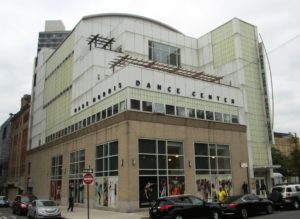
I visited with Stephanie Neel at the Mark Morris Dance Center on Friday November 9th. Neel is overseeing a group of archivists working on a large-scale project at the Center in Fort Greene, Brooklyn. Her team has been making diligent progress towards digitizing the Center’s library of VHS and pneumatic tapes. 

History of the Mark Morris Dance Center

The Mark Morris Dance Center, located one block west of the Brooklyn Academy of Music at the intersection of Lafayette and Flatbush in Fort Greene, Brooklyn, has been the home base of the Mark Morris Dance Group since 2001.  The Center was the first building to be dedicated solely to a dance group, and serves an additional function as an education space and outreach facility for the community.  The Mark Morris Dance Center offers many affordable and inclusive classes to the community and are not prejudicial with regard to experience or ability.

The Team

Neel is conducting this project in consultation with Greg Lisi and Savannah Campbell. Lisi and Campbell are video digitization specialists employed by the Dance Heritage Coalition. Lisi is also the moving image preservation specialist for the NYPL and has overseen all of their AV digitization efforts for the past ten years. Campbell is a graduate of the NYU Tisch School’s Moving Image Archiving and Preservation program. This team is rounded out be Regina Carra, Archive Project Metadata and Cataloging Coordinator, and Sarah Nguyen, a University of Washington MLIS student.

Funding

Neel and her team have been producing their work in accordance with a three-year Mellon grant, which is specificly tailored to the Mark Morris Dance Center. The grant is compliant with current digitization standards, and is aligned with OMEKA, a performing arts database standard. The main objective of this work is to organize and digitize their large holding of pneumatic tape, beta, VHS and high eight.

Archival Process

Neel and her team begin by cross-referencing the individual records with open source software. This method is similar to that which is employed by the NYPL and the Tate in London. 

The primary challenge of this work is in coordinating between Mark Morris and the various institutions throughout the world that commission dance pieces from the institute. Each of these institutions employ their own videographer, and therefore maintain proprietary usage rights of their footage. This footage then resides in a cold storage facility.  Mark Morris must then request an extraction of the digital files from cold storage.  The files are then checked for compliance with the Collective Access.  Collective Access is database software technology for use in cataloging.  

Further Challenges

The archival process at the Mark Morris Dance Center poses exciting challenges. These challenges are best illustrated by Michelle Caswell’s article “The Archive” is Not An Archives: Acknowledging the Intellectual Contributions of Archival Studies. In this article, Caswell identifies the importance of the record in archival practice. She writes: “The ‘record’ is the foundational concept in archival studies. Records, according to the prevailing definition in archival studies, are ‘persistent representations of activities, created by participants or observers of those activities or by their authorized proxies.'”1 Neel and her team of archivists and preservation specialists are sifting through a various forms of records in their process and must create separate hierarchies. 

Neel and her team are grappling with the archiving and cataloging of the so-called “uncatalogable.” They approach this problem by dividing the work into two aspects. One aspect is the choreography, which is authored soley by Mark Morris. The choreography is its own text. This text is then translated to other institutions that choose to perform the work with their own companies. The performances are a separate aspect of the process. They are made physical in the form of the recordings captured by each company’s individual videography department.

This process of sorting relates to Caswell’s definition of provenance. She writes: “Through provenance, archival studies insists on the importance of the context of the record, even over and above its content.”2 While content is important for Neel, the contextualization of the performance (when, where, which company) is the primary method of placing the records within the archive.

Outside Assistance

Neel has contracted with The MediaPreserve in Pittsburgh to complement the work being done in Brooklyn.  Shipping crates come and go from the Center’s archival office. The crates are filled with analog reels and cassettes, a couple of which I helped carry up to the lobby. According to the website of The MediaPreserve: “We have digitized for hundreds of institutions, universities, and museums transferring an array of formats including 1” Type C, 2” Quad, video cassettes, digital videos, film, and many more. Our work has covered numerous genres, including home movies, propaganda, documentaries, and works of art, as well as news, scientific, musical and educational programs.”

Practical Use of the Archive

The digital resources, once archived, are not simply kept in a closet. The tapes are a vital aspect to the company’s process, and are heavily referenced by new dancers and other global dance companies in order to recreate the specifics of Morris’s choreography. A database exists for the dancers where they are able to access time-stamped footage of past performances and other forms of raw choreography that serve as the building blocks for new performances.

Secondary Goals

Neel’s team is also responsible for the large collection of costumes and ephemera belonging to the Mark Morris Dance Group. These costumes  span the forty-year history of the Group. Additional items in need or archiving include historical prints, photographs, and programs. Most of these items are securely stored are of a less urgent manner for the team.  The analog technology of the video tapes is more fragile and requires urgent attention. Neel has decided to tend to the costumes toward the back end of the grant. 

Conclusion

Stephanie Neel and her team are dealing with an interesting challenge in archiving the digital materials at the Mark Morris Dance Center. They must parse through the records and create hierarchies of place and performance in order to assign order to their holdings. Their digitization and preservation methods are sophisticated and the team is composed of accomplished specialists in the field. The archive is unique in that these records will then become widely used as practical tools for instruction.

Sources:

  1. Michelle Caswell, “The Archive” is Not An Archives: Acknowledging the Intellectual Contributions of Archival Studies.
  2. Caswell, “The Archive.”

Symposium Review: “The Uncomfortable Archive”


I attended a New York Archives Week Symposium at the Center for Jewish History on West 16th Street on Friday October 16th entitled “The Uncomfortable Archive.” The symposium, co-sponsored by the CJH and the MetLife Foundation, was open to the general public and aimed at bringing together archivists, librarians, museum professionals, scholars, and researchers around the subject of difficult and “dangerous” information in the digital age. Of particular interest to me was the early afternoon program entitled “Uncomfortable Powers: Archiving Dangerous Knowledge,” which promised talks ranging from cloistered Soviet-era archives, presidential records, and Wikileaks.  

Omission and Obfuscation in the Private Soviet Archive

Katherine Tsan presented the first talk, “Omission and Obfuscation in the Private Soviet Archive.”  It was structured around her research into the coded messaging that survived this highly-censored historical epoch.  Tsan outlined the difficulty facing the contemporary archivists responsible for interpreting these incomplete records, which were obfuscated in order to circumvent the draconian provisions of Soviet-era oversight. Archives were state-controlled this way until 1991, meaning abbreviations, incomplete names, and code words were the norm in information files.

Tsan discussed the dual concerns when focusing on Soviet-era projects.  She highlighted the ethical conundrum involved in archiving writings and information that were purposefully celf-sensored. Tsan also discussed the dilemma posed by Putin’s current-day deep-freeze of national archives, which show strong evidence of private citizens blotting out images and cultural memory. Tsan questioned if historical preservation should probe beyond these intentions or approach them from an ostensibly globalist, progressivist slant? Putin’s unwillingness to fund archival activities is in line with Soviet effacement, indicated by the complete lack of KGB archives and the concealment of Russian presidential archives.

Tsan’s talk echoed concepts of power and the archive that we read in Schwartz and Cook’s article Archives, Records, and Power: The Making of Modern Memory. They write: “The point is for archivists to (re)search thoroughly for the missing voices, for the complexity of the human or organizational functional activities under study during appraisal, description, or outreach activities, so that archives can acquire and reflect multiple voices, and not, by default, only the voices of the powerful.”1 The near-totalitarian aspects of Soviet rule should be examined in the archival renegotiation of history. However, the key challenge here is how archivists can locate missing voices in a historical period in which they were silenced and redacted? 

Tsan’s talk also recalled Drabinski’s article Queering the Catalog: Queer Theory and the Politics of Correction. Drabinski notes that Queer theory also found roots in a postmodernism that challenged the idea that truth could be final.”2 Is there a possibility for a more thoroughly accurate and truthful picture of Soviet Russia given the degree of suppression and censorship prevalent in that era? Or is the fact that so much of Soviet history was censored the truest depiction of its archival history? Would further excavation create a muddled history? These are intriguing questions posed by Tsan’s presentation. 

Watergate, Covfefe, and presidential records

Katherine M. Wisser followed with her presentation, “Watergate, Covfefe, and presidential records.”  Wisser, an Associate Professor and Co-Director of the Archives/History Dual Degree Program at Simmons College in Boston, conducted an entertaining talk which contemplated the implications of presidential records. Presidents Nixon and Trump were Wisser’s primary examples as she grappled with the debate over whether or not presidential records constitute the private personal property of those individuals in office.

The Presidential Records Act of 1978 served as Wisser’s primary  point of orientation. She chronicled the various ways in which the executive branch has handled this Congressional decision, which mandates the preservation of Presidential and Vice Presidential records and states public ownership of said records. Various Executive Orders have been issued since the Act’s inception that have variously limited and broadened the scope of the PRA.

Wisser was quick to point out the Trump administration’s valuing of  secrecy over transparency. She highlighted this by discussing Trump’s proclivity for tearing papers to shreds, which has resulted in government officials taping said documents together to avoid egregious violations of the PRA.

SID Today and SID Tomorrow: Releasing an Archive of Leaked Government Documents

The final talk was given by Tayla Cooper, Digital Archivist at The Intercept.  The Intercept is home to the Snowden Archive, which archives the internal newsletter of the NSA’s Signal Intelligence Directive (SID).

According to The Intercept’s website: “SIDtoday is the internal newsletter for the NSA’s most important division, the Signals Intelligence Directorate. After editorial review, The Intercept is releasing nine years’ worth of newsletters in batches, starting with 2003. The agency’s spies explain a surprising amount about what they were doing, how they were doing it, and why.”3 In August 2018 alone, The Intercept published 328 separate documents from a source inside the NSA . These documents covered a range of topics, and summarized “how corporate the agency had become and rallied other frustrated spies to his cause; about the NSA’s environmentally-driven spying; and about some of the virtual private networks the agency cracked into, and why. Other highlights from this release, which covers the first half of 2006, touch on Iranian influence in Iraq, the attitudes of NSA staff toward the countries where they are stationed, and much more.”4

Cooper discussed the labor involved in redacting elements from these documents when sent to the NSA for review. Cooper also talked about  how organizations like The Intercept work to counteract what she described as “surveillant anxiety,” in which no amount of data is ever seen as offering a complete picture of governmental activity. She concluded by stating that this anxiety is something that can not be quelled, a dispiriting endnote that also served as a rallying cry.


Sources:

  1. Joan M. Schwartz and Terry Cook, “Archives, Records, and Power: The Making of Modern Memory,” 4.
  2. Emily Drabinski, “Queering the Catalog: Queer Theory and the Politics of Correction,” The Library Quarterly: Information, Community, Policy 83, no. 2 (2013): 94-111. doi:10.1086/669547.
  3. https://theintercept.com/staff/talyacooper/
  4. https://theintercept.com/snowden-sidtoday/

A visit to Capital One’s Design Team


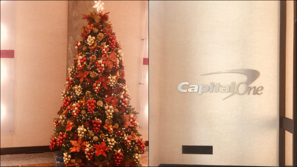
Entrance (Capital One)

My teacher, Sandra Davilla, connected me to Chris Castaneda who is the Principal UX Product Designer at Capital One. Capital One Financial Corporation is an American bank holding company which specializes in credit cards, auto loans, banking and saving products. It is headquartered at McLean, Virginia. Chris invited me to spend a few hours at their New York office on 19th street. I spent around five hours there on the 28th of November. The New York office space is dedicated to business, design and technical teams in commercial banking.

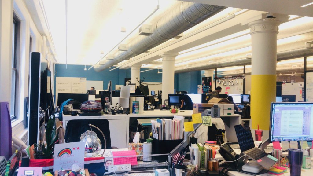
Design Team Workspace (Capital One)

I met Chris in the lobby and he offered me to join an ongoing design meeting. This meeting was about the upcoming sprint for Capital One’s mobile application. It was conducted by the design lead, Laura. The objective was to discuss completed user stories and to analyse new authentication, logging, and user onboarding features. There were eight team members in total from design, and mobile development teams. All the designs for the sprint were displayed on a screen in the meeting room. They thoroughly discussed a feature about authenticating a transaction on the mobile. Eventually, they decided to move the feature to the upcoming sprints. New stories were created for payment challenges and API issues. It was good to see people from diverse backgrounds, reaching a consensus after an intense discussion. The meeting room was arranged nicely. One wall of the room was dedicated to six goals of the current sprint and how the team was achieving those goals. I found it intriguing that there was a health indicator for the team, code, design and the user. I was glad to see the team’s health ‘good’ at that time. There was a calendar that had sticky notes for all upcoming meetings and, more importantly, there were donuts and candies to lift up everyone’s spirit. I was especially inspired by the productive discussion the whole team had and the way they were working together to improve the user experience. The meeting lasted for an hour.

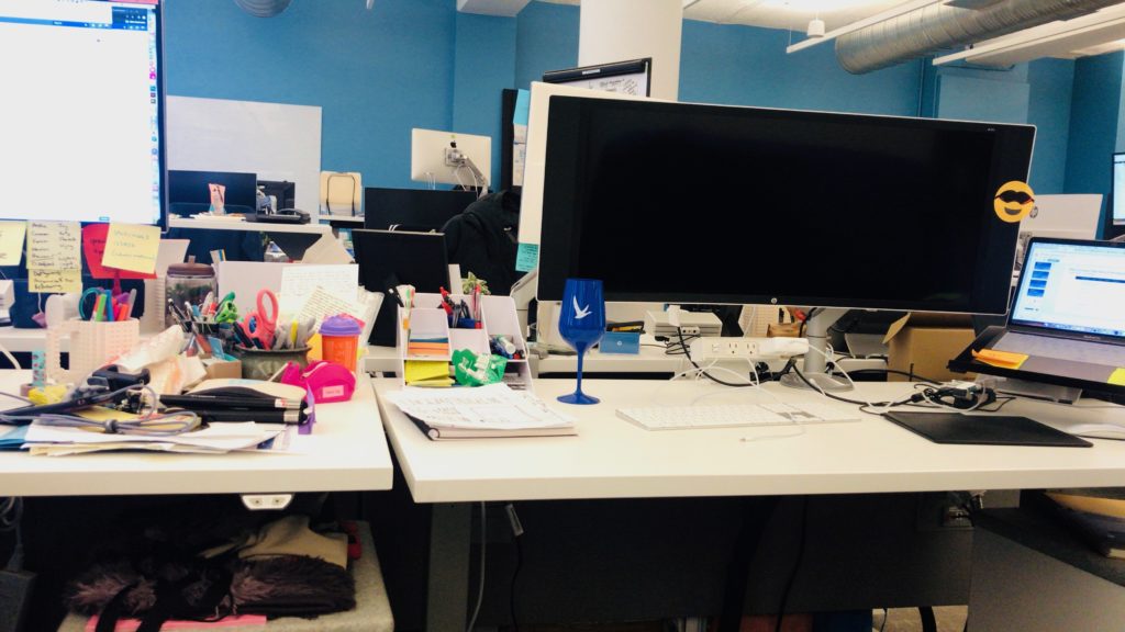
Chris’s Work Station (Capital One)

After that, I followed Chris to his workstation. We had a fun discussion about research methodologies and the design process Capital One is following to improve their products. Chris is on the design team that works for commercial banking. He explained that in commercial banking, clients are large company owners and the design team does not have direct access to them. To overcome this issue, Capital One has internal research partners. They help the company in recruiting proxy clients. Proxy clients are people who have a similar profile to the actual clients of Capital One. The similarity can be based on the kind of business the proxy client owns. Once a proxy client is recruited, the design team can invite them for an interview. On the choice between quantitative and qualitative research, Chris replied that the company prefers to use qualitative research methods due to the nature of their clients. He explained that in commercial banking, the client base is narrow. Recruiting ten proxy clients or inviting important clients to the office can be more effective than quantitative research methods like a survey. According to Chris, the most significant challenge as a designer in commercial banking is to understand the intricacies of financial complications. I brought up the theoretical approaches mentioned in Yvonne Rogers’s paper “New Theoretical Approaches to Human-Computer Interactions.” I asked Chris if he knew any of these approaches and what his opinion was regarding the approaches designers and researchers are following these days. Chris replied that he understands these theories but he thinks the world of user experience and human-computer interaction is advancing rapidly. He further added that businesses are realising the importance of user satisfaction and are ready to invest in it, which gives designers a great opportunity to research and expand their horizons. While we were having this conversation, he got a reminder of a meeting. Before heading towards the meeting, he introduced me to Samantha Li, Design Manager at Capital One.

Cafe (Capital One)

Samantha offered me a tour of the office space. We started with the design team’s space. She showed me the office of John, head of the design department. She told me that he is hard to find in his office because he prefers sitting among the designers so that everyone has direct access to him.  The best thing about his office was a board where the goals for the design team were posted. During this tour, I got the chance to meet a lot of people but one notable conversation I had was with Alisha. She is a lead designer at the incubator, Captial One Labs. She is part of a team of six including four developers and one researcher. The team focuses on innovative ideas which are not a part of their products. She did not describe the type of experiments they do but she was very excited about her work. She said that she likes her job because it lets her go beyond limits. In my opinion, the incubator was a great idea. I think companies can have such incubators to help employees explore and work on their innovative ideas. Another notable thing was Coders Program. It was a summer program where kids from different areas in NYC come to Capital One and learn to code from their tech team.

Kitchen Area (Capital One)

After the tour, we chatted in the lounge area. Samantha has been working in the industry as a designer for ten years now. I told her about the discussion we had in the class about inclusive designs and gave her an overview of the paper “Design Justice: towards an
intersectional feminist framework for design theory and practice” by Costanza-chock Sashaa. She said that she understands the concept of design justice and has been an advocate for it. She said she deeply cares about inclusive design and that she was very proud of herself because, during a design release, she made sure that mockups and images for the products were inclusive. She explained that some of the mockups had hands, she transformed those male Caucasian hands into brown hands with nail polish. She acknowledges the fact that mockups or design sprints will only be shared among the team but she believes that by adding these tiny details we can at least try to include everyone in the process. In her opinion, there is still a long way to go in terms of dealing with biases in design.

Judy Wajcman said in her paper, “Feminist theories of technology,” that drawing women into [technology] is crucial about how the world we live in is shaped and for whom. According to her, we live in a technological culture, a society that is constituted by science and technology, and so, the politics of technology is integral to the renegotiation of gender power relations.

Samantha has been working in the tech industry for ten years now and I got interested in her experience as a woman in the male-dominated industry. I asked her about how we can draw more women into tech, and what her experience has been. She was excited about the topic, and gave me an elaborate answer. Seeing women at higher executive levels in Capital One makes her very happy and she is enjoying working as a design manager. She told me that Capital One has a good male to female ratio but it is still not where it should be. According to her, initiatives like introducing high school girls to coding can bring a positive change. She further appreciated the collaboration at the company, where different teams meet once a month to share their problems. She invited me to design meetups that she arranges every other month for designers.

The office was amazing and the tour was a great learning experience for me. It was decorated for Christmas and was looking really beautiful. There was a positive vibe in the entire office. Everyone I met, seemed very happy with their job. 


Useful Links:

Capital One Labs -> https://www.capitalonelabs.com/
User stories ->https://searchsoftwarequality.techtarget.com/definition/user-story
Agile sotware development process ->https://agilemanifesto.org/
Sprints -> https://searchsoftwarequality.techtarget.com/definition/Scrum-sprint


Cited Work

“Feminist theories of technology”, Judy Wajcman
“Design Justice: towards an intersectional feminist framework for design theory and practice” by Costanza-chock Sashaa.
“New Theoretical Approaches to Human-Computer Interactions.” Yvonne Rogers


Digital life: New Museum archive system ARIES

Private Tour to Frick Art Reference Collection.

In their roles of preserving tangible and intangible heritage, museums have documented a corpus of knowledge that is fundamental for societies. However, this orientation, which has paid more attention to artifacts, is one of the reasons why museums are perceived as distant institutions that are more concerned with the past, and that are more at the service of the intellectual elite of the museums (MacDonald and Alsford, 2010). Consequently, museums, beyond being places to collect, preserve, study, and exhibit, are redefining themselves and making efforts to respond to a fast paced information society by incorporating more interactive museum management information technologies.

Frick Art Reference collection is a leading organization for digitizing their collection it is dedicated their resources to collect, preserve, study, exhibit, and shared through online. Frick Art Reference Library’s mission is to provide public access to materials and programs related to the study of fine and decorative arts created in the Western tradition from the fourth to the twentieth century.

Entering Frick Art Reference Library(FARL)

In order to visit the Frick Art Reference Library, you need to be 18 and older and you need to be registered or pre-registered through online. for security issue Coats, umbrellas, camera, and laptop cases, and bags larger than 9″ x 12″ x 3″ must be checked.

Stephen J. Bury

Stephen J. Bury is a scholar, art historian and the Andrew W. Mellon Chief Librarian of the Frick Art Reference Library in New York City. Meeting Stephen J. Bury was a strange experience to me, especially right after I read his essay about his plans about digitalizing Frick Collection: Embedding a culture of innovation at the Frick art reference library in Technology and digital initiatives: innovative approaches for museums / edited by Juilee Decker.  He introduced ARIES and equipment they use for documenting works.

ARIES: ARt Image Exploration Space

Louisa Wood Ruby, the Head of Research at The Frick Art Reference Library gave us to talk about the open source program they developed. As an emerging museum and digital culture professionals, I hope to create a culture of openness and accessibility in museums, so that visitors can reduce their fear of institutions and have a better understanding of the contents of collections and exhibitions. ARIES is the perfect example for  Libraries in incorporating technologies.

ARIES is an open source developed by members of the Digital Art History Lab (DAHL) collaborated with New York University’s Tandon School of Engineering and the Universidade Federal Fluminense, Brazill. This program is originally created to help to visually compare the artwork it saves tremendous time for art historian and curator.

ARIES follows Sir Tim Berners-Lee’s theory of “information management” system and it became the conceptual and architectural structure for the Web. Berners-Lee eventually released the code for his system — for free — It became a milestone in easing the way for ordinary people to access documents and interact over the Internet. (Digital life in 2025: Experts predict the internet will become ‘like electricity’-less visible, yet more deeply embedded in people’s lives for good and ill by Prof. Janna Anderson, Lee Rainie)https://lms.pratt.edu/pluginfile.php/831785/mod_resource/content/0/PIP_Report_Future_of_the_Internet_Predictions_031114.pdf

ARIES is free program for all and it is designed not just for the art historian and researcher, it is designed for everyone who is interest in the collection in Frick Art Reference Library(FARL)

Art historians have traditionally used physical light boxes to prepare exhibits or curate collections. which is exhausting and time-consuming ARIES is created to address problems. It is an image Exploration Space, an interactive image manipulation system that enables the exploration and organization of fine digital art. The system allows images to be compared in multiple ways, offering dynamic overlays analogous to a physical light box, and supporting advanced image comparisons and feature-matching functions, available through computational image processing.


ARIES is still under the development and they recently added tracking program for dispersal of an artist’s work. Tacking work would be really useful for curating exhibitions.


The Art Gallery of Ontario: Visitor engagement in the museum with the application.(HCI)

INFO-601 Foundations of Information Dr.Sula
Juri Rhyu
Observation

Observation—Complete an approximately three-hour observation of an information environment, chosen in consultation with the professor. Your article should describe what happened during your observation and should connect those details to larger issues in the field, citing/using readings where they are relevant.

Observation: The Art Gallery of Ontario: Visitor engagement in the museum with the application.

The About the Art Gallery of Ontario (AGO)

Visiting The Art Gallery of Ontario (AGO) was one of my travel list in Canada.
The Art Gallery of Ontario (AGO) is an art museum located at 317 Dundas Street, West Toronto, Ontario. Toronto is the largest city in Canada, and the AGO is one of the largest art museums in North America. The museum has nearly 95,000 of various artworks from contemporary art to European masterpiece. They support emerging indigenous Canadian artists and collaborative exhibitions with other museums and galleries around the world. The AGO is also known for their architecture. It was designed by famous Canadian architect Frank Gehry. The AGO is the first place where he experienced art in his childhood. I always admire Frank Gehry’s works because of his design philosophy. He wanted to build a museum that connects a city and its people to great art and art experience. His design intention is exactly appropriate for AGO’s mission: “We bring people together with art to see, experience and understand the world in new ways”1.

Before visiting the AGO, I checked their website to get information about the museum. The website is well designed; the first page has all the necessary information including gallery hours, current events, how to get to the museum, getting admission tickets, education events or classes and museum news which are all I wanted to know. The AGO presents wide-ranging exhibitions and educational programs. The museum is funded by the Ontario Ministry of Tourism, Culture, and Sports and additionally supported by the City of Toronto. The AGO always invites interesting and worldwide known exhibitions as well as developing own educational programs for visitors and publications. Recently, the museum has been crowdfunding to purchase “Infinity Mirrored Room” by artist Yayoi Kusama.2 They encourage visitors to donate for the artworks. More than 3,000 people have chipped in a contribution to permanently acquire Kusama’s brand new installation, even though they haven’t seen it until now. The artwork itself costs $2 million, with $1 million of the price tag paid for by the Art Gallery of Ontario Foundation. With one more week to go, the month-long crowdfunding campaign to raise the remainder sits at nearly $413,000, as of midday Friday. The AGO says it’s hoping more people donate on next week’s “Giving

1 About the AGO. (n.d.). Retrieved from https://ago.ca/about/about-the-ago
2 Here’s a sneak peek at the new Yayoi Kusama infinity room the AGO wants your help to buy | CBC News. (2018, November 23). Retrieved from https://www.cbc.ca/news/canada/toronto/kusama-infinity-room-first-look-1.4917109

Tuesday,” a day devoted to donations following “Black Friday” shopping. Funding is not enough to buy Kusama’s work yet, but it shows how much people care about the museum and participating in the development of the museum.

Special Exhibition

Anthropocene: The Human Epoch
Anthropocene: dramatically illustrates how we, individually and collectively, are leaving a human signature on our world.3 This show is organized by the Art Gallery of Ontario (AGO) and the Canadian Photography Institute(CPI) of the National Gallery of Canada(NGC), in partnership with Fondazione MAST.

Anthropocene is the culmination of an ambitious, four-year-long collaboration by the artist and filmmakers Edward Burtynsky, Jennifer Baichwal, and Nicholas de Penciaer. Their goal is capturing the massive scope of human effects on land, sky, and water.

Technology and Art(HCI)

The field of human-Computer interaction(HCI) is expanded alongside the extensive technological developments such as the internet wireless technologies, smartphones. These had created many opportunities for augmenting extending and supporting user experience, interactions, and communication.(New Theoretical approaches for Human-Computer Interaction by Yvonne Roger University of Sussex)

AGO developed an application with the artist to provide a unique experience to the visitor.

The artists created Augmented Reality (AR) Installations which can be activated by simply downloading application AVARA. The museum places the symbol on the floor and wall labels to help visitor identify each AR activation. There are six activations in total, four-videos, and two 3D AR installations which present experiences of confiscated ivory tusks, a northern white rhinoceros and a Douglas fir tree at or near the actual scale.

Conclusion

This museum visit did remind me of the several articles about digitalizing the institution, collecting data and museum heritage. The Art Gallery of Ontario (AGO) is seeking ways to directly interact with the visitors and to create an impressive museum experience rather than delivering pieces of information. This show is well curated with care and utilized the gallery space as much as possible. I visited this museum during the weekday, and the museum had a number of people and school groups, but it was not too crowded. Since this show encourages you to be on the phone, the show prepared the charging station right below the infographic about pollution and what is co. A museum educator was at the station to explain the works and environment and to answer questions from museum visitors.

As a museum educator, getting feedback is as important as curating shows. They set up a pathway at the end of the exhibition to make people experience interactive activities with touch screens which helps museums collect data. They invite people to upload photos of the show with hashtag#. Once you upload a photo with hashtag#, it is also automatically uploaded on the museum website (https://ago.ca/exhibitions/anthropocene). In my opinion, they should not post personal pictures until they get permission. Even though people tag the museum and the show, they would not expect that their pictures could be uploaded on the museum website.

In addition, I hardly believe that digital museums can replace traditional ones because a museum is where not only provides information and archives historical heritage but also where allows people to have a physical experience with art. The Museum building itself is

3 Anthropocene. (n.d.). Retrieved from https://ago.ca/exhibitions/anthropocene

also an art piece, and viewing digital contents does not give people the same experience as physically being in the space.