As introduced by Miya Masaoka (Director of the Sound Art Program at Columbia’s School of the Arts and coordinator of the Artists Using Data series), Fernanda Viégas and Martin Wattenberg are “pioneers in data visualization and analytics” who have “shaped the field” and crafted tools and interactions that have been “used by millions of people.” (A similar description is on their collaborative site.)
Working to a more succinct description, their business cards would formally present them as members of Google’s PAIR (People+AI Research) initiative and Big Picture team. As simply defined by themselves at this presentation, they are scientists and artists — a dichotomy that would give many pause, but is no doubt a complementary pairing for many in the field.
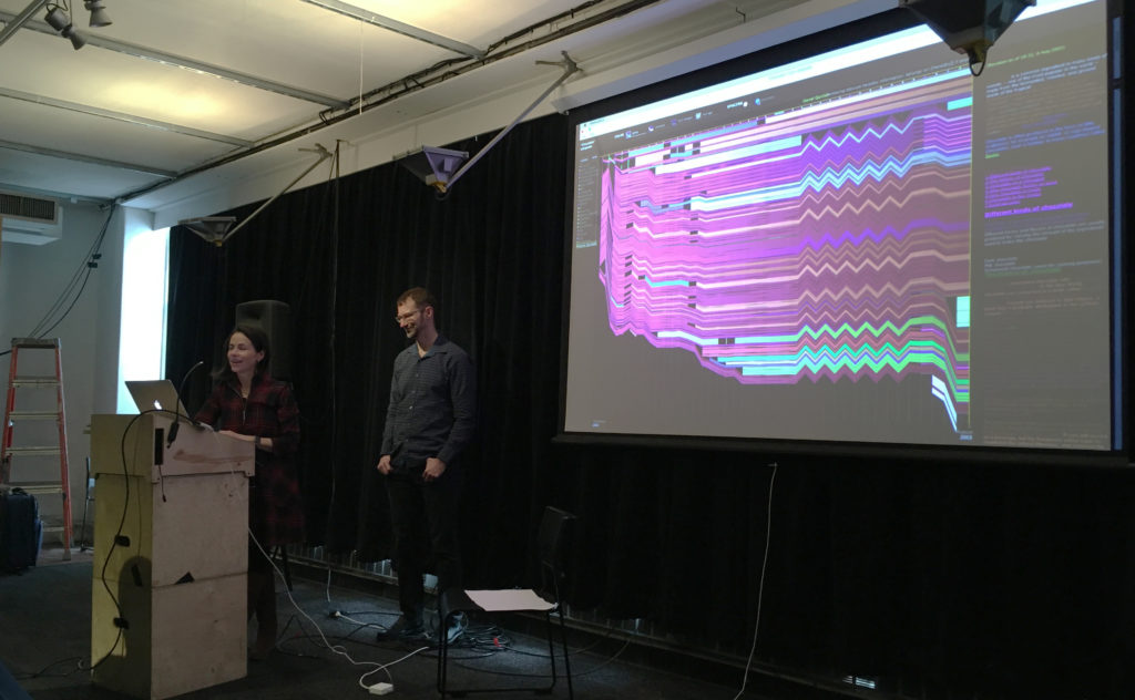
While the work of such individuals inevitably links or crosses from one title to another, their presentation on March 8, “Messiness, Clutter, and Revelation,” focused on their work outside of Google, wherein they have explored new ways to use and investigate data, even as they set constraints within which to play with it. In that spirit of limiting parameters (and an eye to brevity), this review will contain itself to their work and philosophies as shared at this event, “an informal talk” in a mid-renovation space — a fitting format and environment for a presentation that ultimately moved toward the playful and iterative natures of both data exploration and artistic expression.
Viégas and Wattenberg essentially took turns presenting a small selection of work, individual and collaborative, all initially produced between 2003 and 2012, but timeless in their foundational role for the artists and others. Collectively, they defined an arc where the titular elements contributed to insights for the makers but also produced pieces of art — or at least design that moonlights as art.
This is evident, perhaps, in a project like History Flow (2003), explored initially as a ‘scientific probe’ in response to the then-new(ish) Wikipedia now residing at MoMA. This elegant visual investigation tracked the editing of Wikipedia entries, including the back and forth of dueling ideologies on matters adorable and political. In sharing examples of internet favorites such as ‘cat’ and hot-button issues like ‘abortion,’ the patterns of editing and relative passion in each is unmistakable. Yet, when asked if a visualization that compared the different kinds of impassioned debates had been attempted to establish a pattern, Wattenberg responded with a simple “No, but someone should do that.”
“Using data to know things” and questions of technological limitations or permutations were explored in The Art of Reproduction (2011); specifically an understanding of “How the internet is lying to you” through the varied representations of a single artwork that can be found online — from the decaying gold of Klimt (26 Danaes) to the deceptive black-and-white of Mapplethrope (8 Kens and Roberts). Which is the true reproduction work? Or aren’t they all?
This compilation of a single vision or a larger ‘truth’ from a messy table was also evident in Flickr Flow (2009), a commission that sought to visualize the city of Boston, starting with the particularly ‘dirty’ data set of Flickr images tagged simply as “Boston Common.” The duo let those limitations and what they brought guide the form, stating: “Let’s work with that messiness; see what we can find.” The result is an elegant abstraction of ribbons that looks nothing like (but also, somehow, very much like) Boston year-round. In the process of its creation, it investigates what we as a society have preserved.
Other works explored how we search (Web Seer, 2009) , how “the alien mind” thinks (Thinking Machine, 2003) and how music might be visualized (The Shape of Song, 2002), with the last cited as ”an example of clutter yielding something useful.”
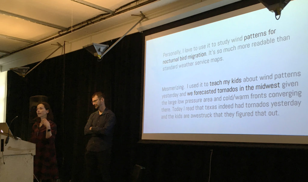
The presentation culminated with Wind Map (2012–). Also in MoMA, this piece was the most clear presentation of the pair’s iterative approach to data visualization, a case study that showed explorations from the abstract to the psychedelic, with the ‘final’ version resulting from the addition of a single line of code to an earlier iteration. Starting with the simple, seemingly ethereal (and almost Ono-esque) question “What does the wind look like?” and the desire to “make complex data easily accessible,” they created — they would have us believe unwittingly — a practical and emotional tool.
The resulting real-time visualization was picked up by meteorologists and combined with other data in weather maps, but also caused Louisiana residents in the path of Hurricane Isaac to reach out to the artists as they tracked the storm in real time. It was also picked up by school teachers and other scientists who used it to teach and to study their own passions. None of these were intentions; they were all unexpected results.
Indeed, through almost all of the works presented, Viégas and Wattenberg seemed to speak to the utility of data, while often deferring to others in taking on that utility. They were readily willing to accept their work in a continuum where others (for example) could then take the code and build something new or explore another facet, as the two moved on to a new subject. They were driven not by “What can this do?” but by “What happens if we do this?” and seemed to view the usefulness of a project like Wind Map with the same wonder that they viewed the initial question of “What does the wind look like?”
Here any observer could be forgiven for a little ambivalence. The work done by Viégas and Wattenberg is — to those who enjoy visualizing data — smart and well crafted. The pieces in MoMA deserve that recognition. They do make one think — but mostly about what can be built upon their efforts.
For those looking to draw the line, this may fall too much on the ‘art’ side. The pair seem decidedly more interested in the baserate questions over the relational ones. (McGrath 160) Before making things, they certainly aren’t asking where the project will be “in ten, twenty, or even fifty years,” and the word “persona” had no place in the conversation. However, they do “value ephemerality and even magic” and seem to believe that “Not everything about a project must be rationalized or demystified.” As seen in those Wind Map explorations, they’re not afraid to “Make a useless [drippy, psychedelic] or disinterested version” of a project. (Sayers)
Looking to Miriam Posner, the pair’s work (again, as presented here) shies away from a critical engagement. They seem content to pose questions and make tools that others may then utilize — but the investigation stops at form and leaves impact to others.
To directly contrast Viégas and Wattenberg with some projects that Posner admires: How does a colorful visualization of Boston compare with Jacqueline Goldsby’s Mapping the Stacks that aims “to describe and arrange collections related to African American History in Chicago?” How does the composition of “8 Kens and Roberts” in the Art of Reproduction compare with David Kim’s ‘Data-izing’ the Images: Process and Prototypes, wherein Kim used the visualization to question the photographer’s categorization of his Native American subjects? Both speak to us about perceptions and ‘lies’ — one through form, the other through culture. (Posner)
Of course not all visualization (or art) must address the bigger issues — and even Posner knows this. Sometimes it just gets the conversation going, placing the data most clearly in front of those with the itch to investigate further. (And it’s another false dichotomy to decide we have to somehow judge one of these approaches over the other.) In the continuum of development, the world needs people who play in the messiness and clutter, those who ask questions, tinker around and leave something half-built on the workbench. Ultimately this research and discovery become tools of their own for those who want to build higher.
– Michael Kelly, Info 601, Professor Chris Alen Sula
References:
• McGrath, Joseph. (1994). “Methodology matters: doing research in the behavioral and social sciences.” Original paper.
• Posner, Miriam (2016). “What’s Next: The Radical, Unrealized Potential of Digital Humanities.” Keystone DH Conference, University of Pennsylvania, July 22, 2015. http://miriamposner.com/blog/whats-next-the-radical-unrealized-potential-of-digital-humanities.
• Sayers, Jentry (2018). “Before You Make a Thing: Some Tips for Approaching Technology and Society.” https://jentery.github.io/ts200v2/notes.html