Category: Field Report
Observation: Museum of Modern Art
Introduction:
The Museum of Modern Art (MoMA) is located in Manhattan, NYC. MoMA exhibits modern and contemporary art, including architecture, painting, sculpture and new art forms integrated with technology. MoMA is a world-famous museum, attracting a large number of visitors every day, which makes the process of information dissemination and acquisition particularly important. People acquire information in different ways, including taking photos, listening to commentaries, reading instructions and etc. Museums disseminate information through electronic display boards, text instructions, and broadcasting devices.
I went to the MoMA in the afternoon on March 19. In the lobby of the museum, it was not that crowded. Most people walked in twos and threes. Some of them were reading the introductions next to the sculptures, some of them were taking photos, and others were talking about the sculptures (figure 1). When I walked towards the stairs, I saw the sign on the wall which guided the visitors to the exhibition hall they wanted to visit.
Figure 1
Figure 2
After I climbed to the second floor, I saw an information desk. The lady who was sitting behind the desk gave me a map which showed the floor plans of the museum. On the desk, I noticed several different colors on the covers of the brochures (figure 2) and one color corresponded to one particular language that the brochure was written in. The brochures were a really cool design that let people from all over the world feel the warmth and respect in this museum. As I continued walking, I noticed that the free audio commentaries were a great design as well. The visitors can borrow free audio devices from the desk and use them to play the commentaries while walking in the gallery. The commentaries are translated into nine languages so that the majority of the visitors can find their preferred one (figure 3). It is so convenient for visitors that they do not need a commentator to explain the exhibits. However, mobile exhibitions only have the English version of the commentaries. The translation process now is much easier than the old times, so the museum can improve it by using artificial intelligence to translate the majority of the commentaries into different languages and refine the translations through professional editors. It will save a lot of manpower, material, and financial resources and give the visitors a better experience.
Figure 3
Then I followed the map and went to the third floor. When I arrived at the third floor, I saw an electronic screen on the wall (figure 4). Some of the visitors was looking at the screen and tried to find the collection that they wanted to see. On the third floor, it was exhibiting the furniture and decorations of the house. Visitors were watching the introduction videos which were projected on the wall. I have visited the latest exhibitions and events page from the MoMA website in advance and found Lincoln Kirstein’s Modern exhibition is on display. I went to the entrance of the exhibition hall and a lady asked me if I had the membership card because this collection was only open to members. I took out the card and she scanned the two-dimensional code on the back of the card and let me in. Compared to the traditional ways of verifying visitor information, this indeed is a new and efficient way to admit the visitors to the special exhibitions.
Figure 4
Figure 5
On the fourth floor, the art pieces were combined with technology and created a strange but special and novel feeling (figure 5). The dynamic space guided the visitors to look around and listen to the sound. The dark room, the bizarre lights and shadows accompanied by the background music let people experience the wonder and beauty of art (figure 6). I like these art items because when technology gets involved, everything becomes different and new. In Georgia Guthrie’s article “Art+Technology = New Art Forms, Not Just New Art”, she answered people’s question– “Why should we even try to use technology in art?” with this: “Because using technology in art has the potential to create entirely new art forms, and therefore new experiences for us that can be thrilling, illuminating, and just plain fun”. Technology is not only changing the pace of our lives but also shifting our appreciation of beauty in life. Technology gives us infinite possibilities to explore the beauty of the world. I am looking forward to seeing more intelligent art forms and art pieces in the future because our technology is developing rapidly day after day.
Figure 6
Finally, I got to the fifth floor where it was very crowded. The worldwide famous painting The Starry Night by Vincent van Gogh was exhibited on this floor. People come to see this world-famous painting excitedly, whether or not they have an artistic background. People recorded the special moment by taking photos of the painting (figure 7). Some people did not turn off the flash, so the security guy reminded the visitors again and again. It is better to have a sign on the wall in an obvious place to remind the visitors so that the security guy does not need to remind the visitors all the time.
Figure 7
Conclusion:
I enjoyed this observation and found out how people interacted with the information in a museum. In the article Fundamental Forms of Information, Marcia J. Bates says: “Anything that human beings interact with or observe can be a source of information”. The museum is a very important place for people to experience and absorb information. Bates writes that recorded information is communicatory or memorial information preserved in a durable medium(Bates 4). The documents and photos in the museum are recorded information. People read the documents and watch the photos on display and feel the history of the exhibits that satisfies their needs for aesthetic and the desire for knowledge. The museum is a medium to communicate cultures, a force to promote social change and development, and one of our most important wealths in the world.
References:
Guthrie, Georgia. “Art + Technology = New Art Forms, Not Just New Art | Make:” Make, Maker Faire, 31 Jul. 2018,https://makezine.com/2013/11/15/art-technology-new-art-forms-not-just-new-art/.
Bates, Marcia J. “Fundamental Forms of Information.” Journal of the American Society for Information Science and Technology, vol. 57, no. 8, 2006, pp. 1033–1045., doi:10.1002/asi.20369.
Xi Chen INFO 601-02 Assignment 3 Observation
Protected: Observation: BPL Marcy Branch
Observation: Ridgewood Community Library
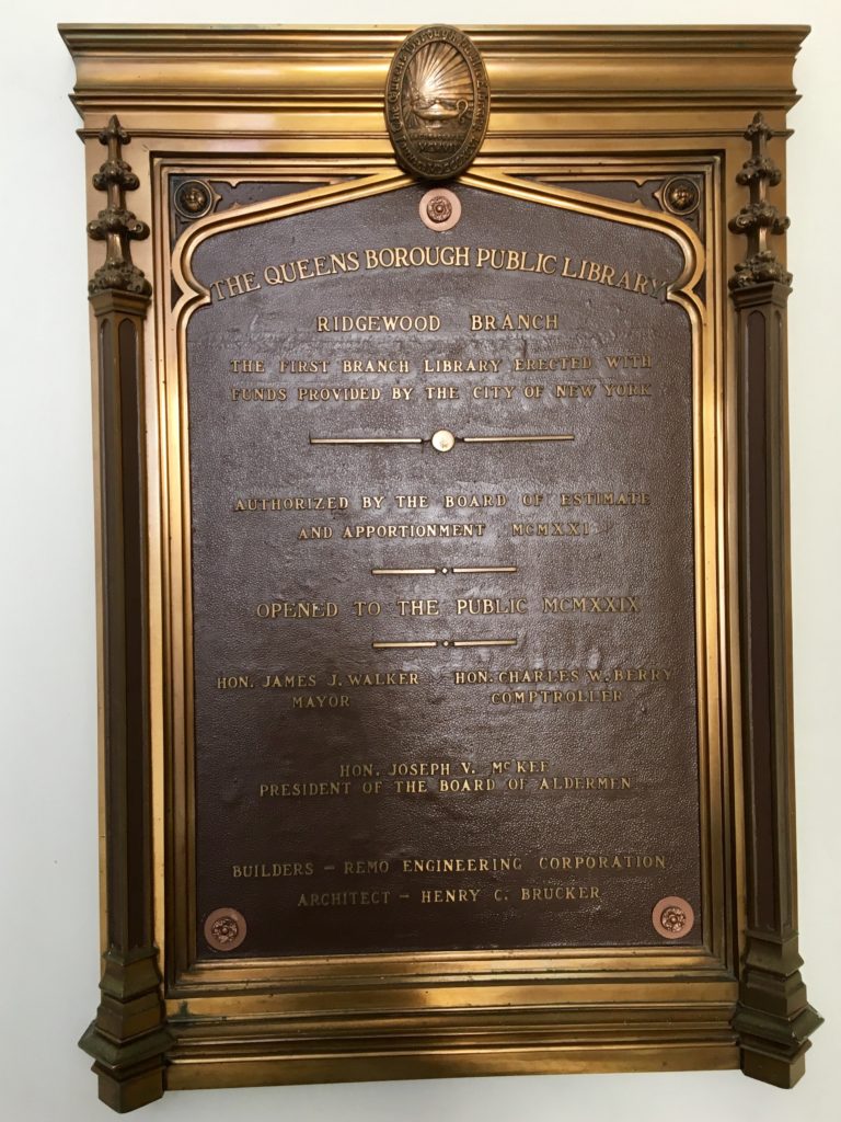
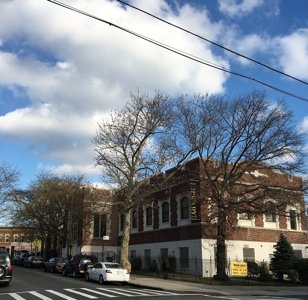 This week, I visited the Ridgewood Community Library, a branch of the Queens Library. Even though this is my neighborhood library, I had never spent time there except to pick up books I’d had transferred. The library is a fairly small branch housed in a beautiful brick building built in 1929. It was the first branch of the Queens Library to be constructed with funds from the city rather than from Andrew Carnegie. Renovated most recently in 2011, the library is fully accessible, with elevator access to every level. It is clean and well lit, with lots of natural light on the main level.
After entering the building at street level, I went downstairs to see the large meeting room for events, as well as a dedicated children’s room, which houses all of the children’s material. This room has its own circulation and reference desks, computers, and bathrooms.
The indoor book drop is located on this level just outside of the children’s room. The outdoor book drop is located down a ramp next to the main entrance, which allows for 24-hour book return. Both book drops use a computerized system with a retractable metal flap that opens when materials are placed on a conveyor belt. This system usually works smoothly, but I have had issues such as the machine being out of order or not sensing books that I placed on the belt.
I next went up one level from the entrance to the large main floor of the library, which houses the teen and adult sections. At the circulation desk at the center of this room, as well as the one in the children’s room, checking out books is fully automated, with a touchscreen monitor and a pad that senses library cards and books. This system is fairly straightforward to use, although in my experience, it’s not always clear how to complete the checkout process, and I’ve seen other people having difficulties as well. I think that instructions for checking out could be relayed more clearly on-screen.
The reference desk on this floor is positioned by the back wall toward the middle of the room. At the reference desk, patrons can sign up for the 20 teen and adult computers located in a balcony area, which offer free internet access, Microsoft Word, and limited free printing. A desk near these computers provides technical support. There is only one single-occupant bathroom for the entire floor, although I do appreciate its being labeled with the inclusive term “all-gender.”
This branch has different hours every day of the week, and is closed on Sundays. Ideally, it would have more consistent and longer hours to better serve patrons. I visited on a Tuesday, when it’s only open from 1 p.m. to 6 p.m. I asked the librarian at the reference desk if this issue was budget-related, but he explained that Tuesday has always been a short day due to staff training in the morning. The reference librarian did mention austerity measures currently in place that affect how many new materials the branch can acquire. The library’s programming, fortunately, is robust and seems to reflect the diverse population it serves. On its website, I saw a wide array of free programming, including kids’ Jeopardy, English as a Second Language (ESOL) lessons, a class on dealing with stray and feral cats in the neighborhood, a Financing Your Education session, and Flamenco dancing.
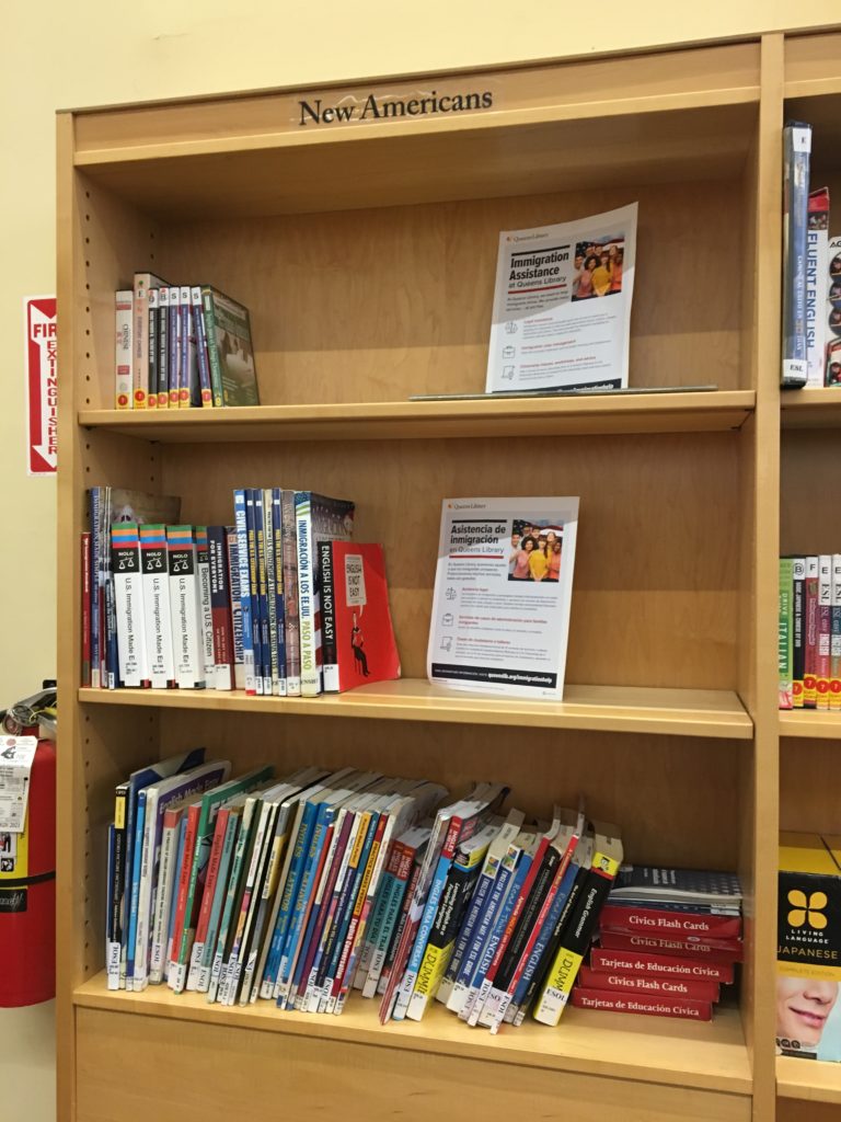
This branch is also impressive for its collections in languages that reflect Ridgewood’s immigrant population. In the adult section, there are designated shelves for languages including Albanian, Polish, Serbian, and Spanish. There is also a “New Americans” section geared toward immigrants, with videos, books, information pamphlets, and ESL materials. The literature near the circulation desk advertising library and community resources is printed in many languages. Having lived in Ridgewood for more than five years, I can attest to the large Eastern European and Spanish-speaking populations.
When I arrived at 1:30 p.m., the library was very quiet. Once school let out though, the teen section filled up and became loud and boisterous. Conversations reached the point of yelling, and because there weren’t enough tables or chairs, some students sprawled out on the floor. Since the teen and adult sections share the main floor, this noise filled the entire area and made it difficult to focus or hear the reference librarian as he answered a question.
While I think it’s great that teens are using the library, a more separate teen area like the younger children have would be ideal, as it would allow the rest of the library to remain a (reasonably) quiet environment. The reference librarian on the main level said that it can be a challenging place to work just because it does get so busy and loud. To me, these issues speak to the ever-present tension between providing access to everyone and ensuring that all groups of patrons have a good experience at the public library, all while dealing with space and budget constraints.
It seems like the best option for addressing the high volume of patrons at the Ridgewood branch would be to expand the building or move to a new location. Alternately, perhaps an additional neighborhood branch would help to address some of these issues. Of course, this is dependent on funding from the state and city governments as well as private sources. This blog post from YALSA (Young Adult Library Services Association) gives recommendations for dealing with noise and disruptions from teens after school when expanding isn’t an option. Suggestions include rearranging shelving and furniture to create noise barriers, opening up meeting rooms for teen use after school, and scheduling programming and activities for teens during this time.
Overall, while the Ridgewood branch faces challenges, I do think it’s doing a great job of targeting materials, programming, and resources to the needs and interests of the community it serves.
Observation of the Cooper-Hewitt Smithsonian Design Museum
When considering the kind of information environment I wanted to observe, I wanted to observe an institution whose mission centered around engagement with and education about art objects. I chose to observe the Cooper-Hewitt Smithsonian Design Museum as it is known as a trailblazer in the field of interactive museum experiences. I believed I would have the opportunity to observe the intersection of people, technology, and art collections in one space.
I visited the Cooper-Hewitt during a weekday morning shortly after it opened for the day. The Cooper-Hewitt is a converted mansion on the Upper East Side, situated in the middle of Manhattan’s “Museum Mile.” It is known as the Mecca of museum interactives, with touch screen and immersive digital tools featured prominently in almost every gallery space.
After I entered the museum, myself and a few other visitors made our way to the ticketing counter. There, we were given a demonstration of the museum’s most notable digital tool, the digital “pen.” The visitor services associate held up a sample wall label explaining if we pressed the end of the pen to a cross symbol on the label, we could save artworks we enjoyed. The works saved by the pen became a part of our own curated collection which we could access via an online code after our visit. I think this is an interesting way for the Cooper Hewitt to encourage their visitors to engage with works in the collection and continue their exploration outside of the museum. As I stepped away from the counter, I observed another visitor approach the counter to ask an associate a question. The visitor pointed to his digital pen and asked “do you give out these out so I won’t take pictures in the gallery?” The associate assured the visitor that they could still take photographs with their cellphone, but encouraged them to try the pen. They explained the pen provides clear images without the glare of the display cases, which the visitor can access at any time. The visitor did not seem entirely convinced, but made their way up to the main exhibition.
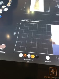
Interactive Tables: Interacting with the Web of Objects (Left) and Design Studio (Right)
As I made my way to the second floor and into the main exhibition, Saturated: the Allure and Science of Color, I noticed display cases all around the room with multiple objects inside. Near the displays and scattered around the room were table-sized touchscreen tablets. When I arrived, many visitors were hunched over the touchscreens with their pens in motion. Upon approaching the first table, I began reading the introductory text while other visitors continued to move their pens around the screen. The prompts on the table asked visitors “what will inspire you”, “what will you design,” and “be inspired.” Each screen table allowed four visitors at a time to design their own object and learn from a moving web of circles. Each orb in the web contained an object from the Cooper-Hewitt’s extensive permanent collection. From observing visitors at these tables, older patrons seemed to be apprehensive of the display oftentimes, avoiding or not approaching the screens. Younger visitors appeared very comfortable with interacting with this kind of technology and spent a majority of their visit designing their own virtual objects. Most visitors I observed did not interact with the moving web of images, instead opting for the more interactive features of the display. The touchscreen tables allowed visitors to engage with ideas from the galleries and actively design, but it seemed not many visitors were engaging with the wider collection in the way the museum was anticipating.
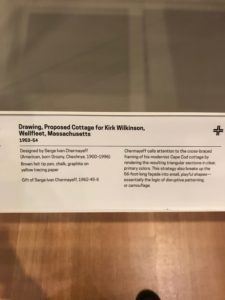
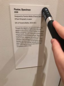
The Wall Label (Left) and the Pen (Right)
Observing visitors with the pen was more interesting. With the large tables, it appeared that many visitors approached the screens, because they were unfamiliar with its presence in a traditional museum gallery. Their curiosity with the technology seemed to be its main draw. Despite unfamiliarity, they had some inherent ease using the touchscreen technology, as I assume most visitors are already familiar with using a smartphone or iPad outside the museum. The digital pen was a little different as it is a piece of technology foreign to most people. and takes some effort to become comfortable with it. I observed many visitors struggling to save objects with their pens. A few visitors, frustrated with this process, let the pen dangle from the wrist-strap while they proceeded to take photos with their smartphones. It appeared patrons were either very engaged with the digital pen technology or ignored it all together. From my perspective, if a visitor was feeling apprehensive in this technologically dense environment, their interaction with the pen was the first thing to go.
In many ways, the Cooper-Hewitt functions as an information dense environment. The museum allows their patrons to engage with works on view, but also tap into their larger collection through the use of interactive technology. Given its density and foreign technologies, I found that many visitors’ “information seeking behaviors” were affected by what Elfreda Chatham defines as a sense of risk-taking. Visitors to the museum, in order to trust the information from the Cooper-Hewitt’s exhibitions, needed to trust the new technology as their connection to the information. I think the risk of not understanding how to use the pen or the touchscreen tables, made some visitors avoid the information all together.
Sources
Chatman, E. A. (1996), The impoverished life‐world of outsiders. J. Am. Soc. Inf. Sci., 47: 193-206. doi:10.1002/(SICI)1097-4571(199603)47:3<193::AID-ASI3>3.0.CO;2-T
Newman Library Observation
The Baruch College Newman Library is a prestigious building located off of third avenue and 25th street, near the Flatiron and Gramercy Park district of Manhattan. Their website advertises the school as being, “in the heart of one of the world’s most dynamic financial and cultural centers.” The variety of patrons that come in to the library represent that extremely well.
The largest portion of students that attend the school are business and finance majors, so most of the books are textbooks cater towards this, though there are other types of books available as well. The Newman library is one of the busier CUNY school libraries, as not just the Baruch students- but alumni, staff, and other CUNY students utilize it as well. Its location is also very conveniently near where most of Baruch classes are held.
Working there for over a month now, I have been exposed to the majority of what the library and staff deal with on a daily basis. I’ve met the regulars, given the fines, mastered the Library of Congress Classification system, and worked both the rushes and slow periods.
Layout
Entering and navigating the Newman library can be a challenge in the beginning, though most students are very familiar with the floor plan after their first year. Walking into the building, you can either enter through card-access only turnstiles on the first floor or upstairs on the second and main floor. Here you have the circulation desk, reference department, reading room, laptop loan kiosk, computers, scanners, printers, periodicals, and reserve sections of the library. You can then use the elevator or stairs to access the third, fourth, and fifth floors. These are where the general stacks books are located. Call numbers are broken up by A-E on third, F-N on fourth, and P-Z on the fifth floor.
The laptop desk is located on the third floor, and this is where laptops and chargers are rented out to Baruch students. The sixth floor is the technology department and computer lab that is open to Baruch students only. This is also where the Bursar and financial aid offices are located. The only way to access the sixth floor is through the elevators located on the first floor. The first floor has the security office, student eating area with vending machines, and lockers. This makes giving directions a bit more difficult for staff, especially to newer patrons.

Technology Rentals
The Newman library circulation desk is the center for the majority of the rentals available for students. Here Baruch students may check out cameras, tripods, recorders, microphones, three types of headphones, five types of calculators, DVDs and players, hdmi cables, and presentation remotes. Each type of equipment has its own rules and check out procedures.
The calculator options are graphing, financial standard or professional, basic, and scientific. There are semester long, two week, three day, and daily loans offered. Students check these out on a first come, first serve basis, which is why priority is given to current Baruch students, though the library has quite an impressive stock. Students may also rent Mac and PC laptops, though this is not done at the circulation desk. The majority of interactions with patrons at the circulation desk are for technology loans.
Rentals and Reserves
Reserve textbooks and DVDs are found on the shelves behind the circulation desk and must be requested by the patron to check out. They are organized by the course code that placed the material on reserve and alphabetically by the professor’s name within the course section. Patrons must know at least the title of the reserve book they want, and ideally the course number as well. If no course code is found, staff must search the Baruch catalogue.
Most materials are given for either multiple weeks, daily, and three hour periods. Reserve materials are only loaned for three-hours at a time, and most students keep them inside the library because of this. Other books are given to students for four weeks and are allowed to be renewed a maximum of three times- unless requested by another student. Faculty and staff may reserve for more extended time periods and are not as strictly held to renewal limits. Professors may rent books and DVDs but not technology or room keys. All returns, excluding tech rentals, may be given to staff at the circulation desk or dropped in the book drop. The patron must physically hand in technology rentals to a staff member.
Interlibrary loans (ILL) and the CUNY Book Delivery service (CLICS) are available here as well. ILL books are sent from any local library and delivered and processed separately from all other books. They have their own check out/in program, separate from Aleph. Students may also request books from any CUNY library and have them sent here, as well as return the books at any CUNY library. This is the CLICS service. These books are treated the same as the Baruch stacks books, except placed in a different location when returned or requested daily. All CLICS and ILL books are located behind the circulation desk on the shelves beside the reserve materials.
Late Fees
There are strict late fees that automatically occur when patrons return items late, and the size of the fee depends of the item in question. Calculators are the lowest charge, being $5 a day. This is done to ensure that the library stock does not run out, students are much more likely to return items on time when the fines are so high. The library does have a cap on student fines, so that the bills are not posted to the bursar office until they reach $25 or over. This helps make sure the bursar office does not get bogged down with paperwork and that students are not forced to pay for lower fines or being late for the first few times. The more in demand items have larger fees, so laptops and cameras are much higher. The items that are shorter rental periods like reserve textbooks and room keys have hefty fines as well, these are more frequently check out and needed by most students.
Study, Presentation, Interview, and Carrel Rooms
There are a variety of rooms that students have access to. There is an online reservation system on the Newman library website where students sign up for time slots in advance. There are small group study rooms and large group study rooms as well as graduate only rooms available for reservation on the site. The sixth floor also has a section for room reservations, though these are not locked and students may use them as they please. These time slots fill up fast, though staff is allowed to book rooms for patrons if there is open availability, a rare commodity. Students who book rooms must come to the circulation desk to check in and rent the keys. The study rooms can be booked for a maximum of two hours or a minimum of thirty minutes.
Presentation rooms are for small groups of people who need a projector and these rooms are not reservable, but loaned out first come first serve. This is the same for interview rooms, but these are small one-person rooms where students can practice for interviews as well as use for remote/Skype interviews. These two rooms can only be used and loaned out for one hour, with one renewal if no one is put on a waiting list. The carrel rooms are larger rooms with cubby sections for quiet study. There are separate graduate and undergraduate carrel rooms, and each room has multiple keys for each cubby section. These keys are daily loans and students may have them until the circulation desk closes.
Patron Catering
As stated earlier, the Newman library is primarily a space for the students, an incredibly wide array of amenities are offered to the Baruch undergraduate and graduate students, as well as certain loans reserved for Alumni and other CUNY students. All the technology, book, and room reservation rental services are available to Baruch students, as they are the first priority patrons. The goal is to make sure that the students are given access to everything they need to succeed in class. Students can use the space for studying, practicing presentations, homework, student group meetings, and even preparing for job applications and interviews.
The library circulation desk is open from 9am until 10 on Monday through Friday, as well as 10am to 8pm on weekends, while the main library is open from 7am-midnight everyday. During finals season the library is open continuously from 7 am on December 10 through 11:59 pm on December 21. This 24-hour policy only applies to Baruch students between midnight and 7 am, other patrons must wait until 7am to enter. This is done to ensure that Baruch students have priority to all books and study rooms, as well as to more easily allow patrons to enter using their Baruch id cards to gain access to the building after normal hours are over.
Conclusion
Overall the Newman library has a plethora of resources available to students and is a great space for students and faculty to work. The library has become much more than a place to rent books, and the way they have integrated technology, spaces to work, and book renting together is both successful and innovative. The resources offered here are very generous and surprisingly well stocked. This library has become an integral place for most Baruch students, providing them with more than enough to get through graduation and even after, as the alumni continue to utilize the services here.
By: Brianna Martin
Observation of the 58th Street Public Library
The 58th Street branch of the NYPL is one of their smaller locations. My observation took place midday on a weekday. Some patrons did appear to be stopping by during a lunch break, quickly picking up hold materials before leaving. However most patrons did linger in the library, many for the entirety of my observation.
Physical Library Space
When you walk into the library it is all one room. To your immediate left are a handful comfy chairs and behind that a small children’s area. This has two small tables with three or four chairs around them, and a very small open area. Then on the left are the stacks. To your immediate right is the reference desk. This library does not have self-checkout, so it is the only location to check out materials. (There is a book drop in the vestibule of the library so you can return books without entering the main space.) Beyond that, on your right are a dozen or so computers, which can be checked out for 45 minute intervals, and the DVD collection. Straight ahead of you there are some more comfy chairs, two long communal tables to work at with outlets built in and hold/reserve shelves which line the back wall.
One of the first things you notice about the space is that it is designed primarily for adult patrons. There are mostly places to sit and read/work individually. Some parents/caregivers have modified the space to suit their needs. An empty space in front of the reference desk, where the line forms when the demand is higher, is taken over by unofficial stroller parking. There isn’t enough space in the children’s section to store any belongings and have space to move around.
Use of the Space
Patrons at the time of the observation seem to be coming to the space to either work independently or pick up holds from the hold shelves. Only a handful of patrons even visited the stacks during their time in the library. Those working either at the computers or communal tables didn’t visibly have physical library materials with them. Over the course of the observation there were two older patrons who read periodicals that the library had on display. But only two patrons visibly had library books at their spaces. And only one of them spent time reading their book. Patrons primarily took advantage of the computer/Wi-Fi/digital resources that the library offers, as opposed to books or periodicals.
This library fulfills a very important role as a ‘third space,’ somewhere that is not home or work/school where people can congregate and just be. For example, there were many retirees, who came here to spend time outside of their homes. While not apparent from the layout, according to their website there is also a second floor, which houses a space that can be reserved for community events/needs as well as their tech classes.
Library Staff
During my observation I saw four different members of staff working the reference desk. Only one of them was a women. Considering the stereotype of the middle age white female librarian this felt noteworthy. Additionally two of the men were people of color. This felt important because as you look around the library, they have a diverse range of patrons. Having a body of staff that reflects your patron-base allows them to best serve their patrons, and be aware of any special needs or considerations their patrons might have.
Recommendations
This is not a high-tech library that is going to have a maker space or a lot of automated systems. However there are small areas where they could probably integrate more digital services. The addition of a self-checkout station would allow patrons who are just picking up materials, and not asking questions, to quickly get their business done.
There also felt like a need for a more designated child friendly space. Some patrons verbally complained about the strollers left in front of the reference desks. Many also made faces when navigating around them. While space is at a premium in a library of this size, the reading area next to the children’s area could probably be rearranged to have space for the strollers. Then those seats could be moved to another area of the library.
Another option would be to take advantage of the second floor space. Maybe when there aren’t events up there have the space open for children to use. That way there would be space for them to run around or read aloud without disturbing the people working downstairs. However I have not seen that space so I don’t know how difficult that would be or if there is a computer set up that would make that difficult.
Protected: Reflection of Observation of Museum of Moving Image
Digital Archives and Preservation at the Mark Morris Dance Center
I visited with Stephanie Neel at the Mark Morris Dance Center on Friday November 9th. Neel is overseeing a group of archivists working on a large-scale project at the Center in Fort Greene, Brooklyn. Her team has been making diligent progress towards digitizing the Center’s library of VHS and pneumatic tapes.
History of the Mark Morris Dance Center
The Mark Morris Dance Center, located one block west of the Brooklyn Academy of Music at the intersection of Lafayette and Flatbush in Fort Greene, Brooklyn, has been the home base of the Mark Morris Dance Group since 2001. The Center was the first building to be dedicated solely to a dance group, and serves an additional function as an education space and outreach facility for the community. The Mark Morris Dance Center offers many affordable and inclusive classes to the community and are not prejudicial with regard to experience or ability.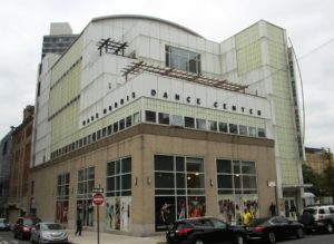
The Team
Neel is conducting this project in consultation with Greg Lisi and Savannah Campbell. Lisi and Campbell are video digitization specialists employed by the Dance Heritage Coalition. Lisi is also the moving image preservation specialist for the NYPL and has overseen all of their AV digitization efforts for the past ten years. Campbell is a graduate of the NYU Tisch School’s Moving Image Archiving and Preservation program. This team is rounded out be Regina Carra, Archive Project Metadata and Cataloging Coordinator, and Sarah Nguyen, a University of Washington MLIS student.
Funding
Neel and her team have been producing their work in accordance with a three-year Mellon grant, which is specificly tailored to the Mark Morris Dance Center. The grant is compliant with current digitization standards, and is aligned with OMEKA, a performing arts database standard. The main objective of this work is to organize and digitize their large holding of pneumatic tape, beta, VHS and high eight.
Archival Process
Neel and her team begin by cross-referencing the individual records with open source software. This method is similar to that which is employed by the NYPL and the Tate in London.
The primary challenge of this work is in coordinating between Mark Morris and the various institutions throughout the world that commission dance pieces from the institute. Each of these institutions employ their own videographer, and therefore maintain proprietary usage rights of their footage. This footage then resides in a cold storage facility. Mark Morris must then request an extraction of the digital files from cold storage. The files are then checked for compliance with the Collective Access. Collective Access is database software technology for use in cataloging.
Further Challenges
The archival process at the Mark Morris Dance Center poses exciting challenges. These challenges are best illustrated by Michelle Caswell’s article “The Archive” is Not An Archives: Acknowledging the Intellectual Contributions of Archival Studies. In this article, Caswell identifies the importance of the record in archival practice. She writes: “The ‘record’ is the foundational concept in archival studies. Records, according to the prevailing definition in archival studies, are ‘persistent representations of activities, created by participants or observers of those activities or by their authorized proxies.'”1 Neel and her team of archivists and preservation specialists are sifting through a various forms of records in their process and must create separate hierarchies.
Neel and her team are grappling with the archiving and cataloging of the so-called “uncatalogable.” They approach this problem by dividing the work into two aspects. One aspect is the choreography, which is authored soley by Mark Morris. The choreography is its own text. This text is then translated to other institutions that choose to perform the work with their own companies. The performances are a separate aspect of the process. They are made physical in the form of the recordings captured by each company’s individual videography department.
This process of sorting relates to Caswell’s definition of provenance. She writes: “Through provenance, archival studies insists on the importance of the context of the record, even over and above its content.”2 While content is important for Neel, the contextualization of the performance (when, where, which company) is the primary method of placing the records within the archive.
Outside Assistance
Neel has contracted with The MediaPreserve in Pittsburgh to complement the work being done in Brooklyn. Shipping crates come and go from the Center’s archival office. The crates are filled with analog reels and cassettes, a couple of which I helped carry up to the lobby. According to the website of The MediaPreserve: “We have digitized for hundreds of institutions, universities, and museums transferring an array of formats including 1” Type C, 2” Quad, video cassettes, digital videos, film, and many more. Our work has covered numerous genres, including home movies, propaganda, documentaries, and works of art, as well as news, scientific, musical and educational programs.”
Practical Use of the Archive
The digital resources, once archived, are not simply kept in a closet. The tapes are a vital aspect to the company’s process, and are heavily referenced by new dancers and other global dance companies in order to recreate the specifics of Morris’s choreography. A database exists for the dancers where they are able to access time-stamped footage of past performances and other forms of raw choreography that serve as the building blocks for new performances.
Secondary Goals
Neel’s team is also responsible for the large collection of costumes and ephemera belonging to the Mark Morris Dance Group. These costumes span the forty-year history of the Group. Additional items in need or archiving include historical prints, photographs, and programs. Most of these items are securely stored are of a less urgent manner for the team. The analog technology of the video tapes is more fragile and requires urgent attention. Neel has decided to tend to the costumes toward the back end of the grant.
Conclusion
Stephanie Neel and her team are dealing with an interesting challenge in archiving the digital materials at the Mark Morris Dance Center. They must parse through the records and create hierarchies of place and performance in order to assign order to their holdings. Their digitization and preservation methods are sophisticated and the team is composed of accomplished specialists in the field. The archive is unique in that these records will then become widely used as practical tools for instruction.
Sources:
- Michelle Caswell, “The Archive” is Not An Archives: Acknowledging the Intellectual Contributions of Archival Studies.
- Caswell, “The Archive.”
A visit to Capital One’s Design Team
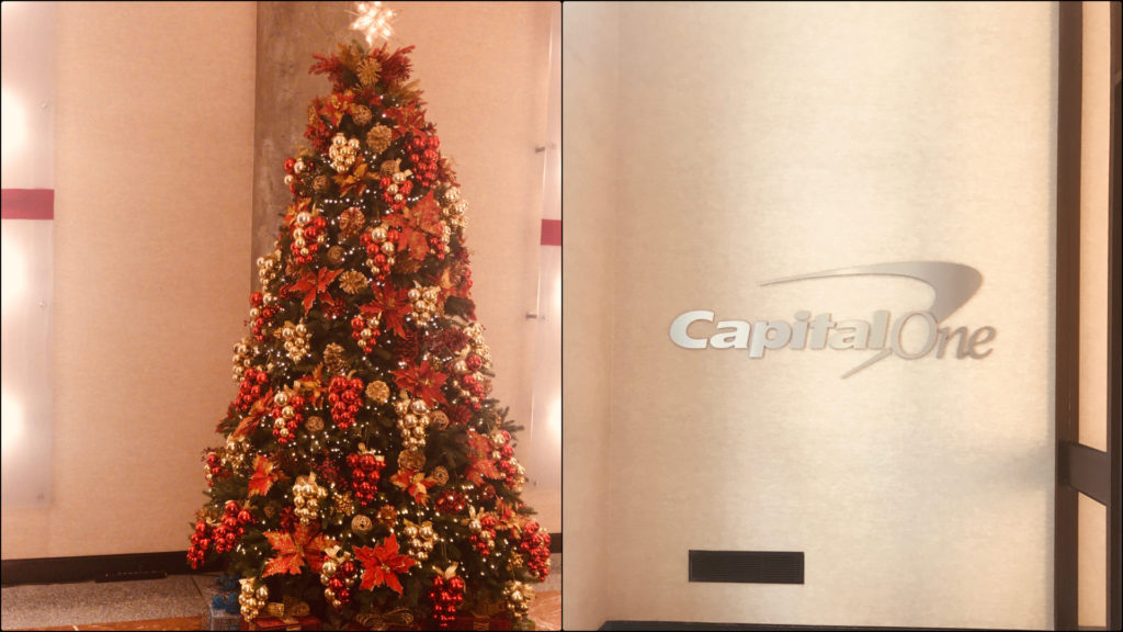
My teacher, Sandra Davilla, connected me to Chris Castaneda who is the Principal UX Product Designer at Capital One. Capital One Financial Corporation is an American bank holding company which specializes in credit cards, auto loans, banking and saving products. It is headquartered at McLean, Virginia. Chris invited me to spend a few hours at their New York office on 19th street. I spent around five hours there on the 28th of November. The New York office space is dedicated to business, design and technical teams in commercial banking.
I met Chris in the lobby and he offered me to join an ongoing design meeting. This meeting was about the upcoming sprint for Capital One’s mobile application. It was conducted by the design lead, Laura. The objective was to discuss completed user stories and to analyse new authentication, logging, and user onboarding features. There were eight team members in total from design, and mobile development teams. All the designs for the sprint were displayed on a screen in the meeting room. They thoroughly discussed a feature about authenticating a transaction on the mobile. Eventually, they decided to move the feature to the upcoming sprints. New stories were created for payment challenges and API issues. It was good to see people from diverse backgrounds, reaching a consensus after an intense discussion. The meeting room was arranged nicely. One wall of the room was dedicated to six goals of the current sprint and how the team was achieving those goals. I found it intriguing that there was a health indicator for the team, code, design and the user. I was glad to see the team’s health ‘good’ at that time. There was a calendar that had sticky notes for all upcoming meetings and, more importantly, there were donuts and candies to lift up everyone’s spirit. I was especially inspired by the productive discussion the whole team had and the way they were working together to improve the user experience. The meeting lasted for an hour.
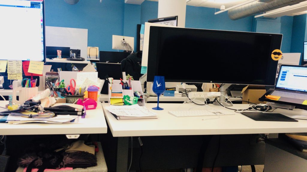
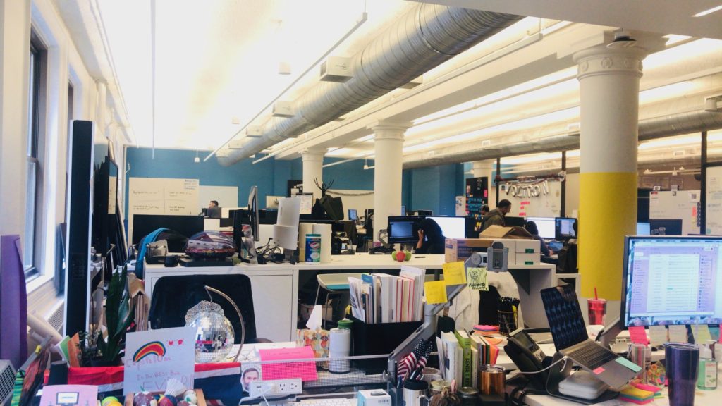
After that, I followed Chris to his workstation. We had a fun discussion about research methodologies and the design process Capital One is following to improve their products. Chris is on the design team that works for commercial banking. He explained that in commercial banking, clients are large company owners and the design team does not have direct access to them. To overcome this issue, Capital One has internal research partners. They help the company in recruiting proxy clients. Proxy clients are people who have a similar profile to the actual clients of Capital One. The similarity can be based on the kind of business the proxy client owns. Once a proxy client is recruited, the design team can invite them for an interview. On the choice between quantitative and qualitative research, Chris replied that the company prefers to use qualitative research methods due to the nature of their clients. He explained that in commercial banking, the client base is narrow. Recruiting ten proxy clients or inviting important clients to the office can be more effective than quantitative research methods like a survey. According to Chris, the most significant challenge as a designer in commercial banking is to understand the intricacies of financial complications. I brought up the theoretical approaches mentioned in Yvonne Rogers’s paper “New Theoretical Approaches to Human-Computer Interactions.” I asked Chris if he knew any of these approaches and what his opinion was regarding the approaches designers and researchers are following these days. Chris replied that he understands these theories but he thinks the world of user experience and human-computer interaction is advancing rapidly. He further added that businesses are realising the importance of user satisfaction and are ready to invest in it, which gives designers a great opportunity to research and expand their horizons. While we were having this conversation, he got a reminder of a meeting. Before heading towards the meeting, he introduced me to Samantha Li, Design Manager at Capital One.
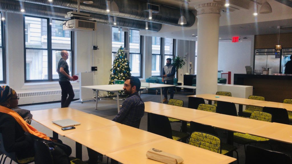
Samantha offered me a tour of the office space. We started with the design team’s space. She showed me the office of John, head of the design department. She told me that he is hard to find in his office because he prefers sitting among the designers so that everyone has direct access to him. The best thing about his office was a board where the goals for the design team were posted. During this tour, I got the chance to meet a lot of people but one notable conversation I had was with Alisha. She is a lead designer at the incubator, Captial One Labs. She is part of a team of six including four developers and one researcher. The team focuses on innovative ideas which are not a part of their products. She did not describe the type of experiments they do but she was very excited about her work. She said that she likes her job because it lets her go beyond limits. In my opinion, the incubator was a great idea. I think companies can have such incubators to help employees explore and work on their innovative ideas. Another notable thing was Coders Program. It was a summer program where kids from different areas in NYC come to Capital One and learn to code from their tech team.
After the tour, we chatted in the lounge area. Samantha has been working in the industry as a designer for ten years now. I told her about the discussion we had in the class about inclusive designs and gave her an overview of the paper “Design Justice: towards an
intersectional feminist framework for design theory and practice” by Costanza-chock Sashaa. She said that she understands the concept of design justice and has been an advocate for it. She said she deeply cares about inclusive design and that she was very proud of herself because, during a design release, she made sure that mockups and images for the products were inclusive. She explained that some of the mockups had hands, she transformed those male Caucasian hands into brown hands with nail polish. She acknowledges the fact that mockups or design sprints will only be shared among the team but she believes that by adding these tiny details we can at least try to include everyone in the process. In her opinion, there is still a long way to go in terms of dealing with biases in design.
Judy Wajcman said in her paper, “Feminist theories of technology,” that drawing women into [technology] is crucial about how the world we live in is shaped and for whom. According to her, we live in a technological culture, a society that is constituted by science and technology, and so, the politics of technology is integral to the renegotiation of gender power relations.
Samantha has been working in the tech industry for ten years now and I got interested in her experience as a woman in the male-dominated industry. I asked her about how we can draw more women into tech, and what her experience has been. She was excited about the topic, and gave me an elaborate answer. Seeing women at higher executive levels in Capital One makes her very happy and she is enjoying working as a design manager. She told me that Capital One has a good male to female ratio but it is still not where it should be. According to her, initiatives like introducing high school girls to coding can bring a positive change. She further appreciated the collaboration at the company, where different teams meet once a month to share their problems. She invited me to design meetups that she arranges every other month for designers.

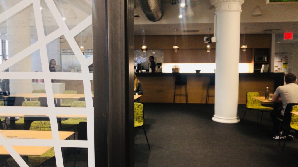
The office was amazing and the tour was a great learning experience for me. It was decorated for Christmas and was looking really beautiful. There was a positive vibe in the entire office. Everyone I met, seemed very happy with their job.
Useful Links:
Capital One Labs -> https://www.capitalonelabs.com/
User stories ->https://searchsoftwarequality.techtarget.com/definition/user-story
Agile sotware development process ->https://agilemanifesto.org/
Sprints -> https://searchsoftwarequality.techtarget.com/definition/Scrum-sprint
Cited Work
“Feminist theories of technology”, Judy Wajcman
“Design Justice: towards an intersectional feminist framework for design theory and practice” by Costanza-chock Sashaa.
“New Theoretical Approaches to Human-Computer Interactions.” Yvonne Rogers