Bluestockings: Organizing information to facilitate empowerment and challenge oppression

Question

What is the main mission of a “traditional” retail bookstore? Simple – to sell books. And how does a bookstore meet that mission? Display configurations and shelving tactics are used to get people to buy books, or any product for that matter. But what about a bookstore that’s mission isn’t just to sell books? What about a store that wants to offer more – to offer resources both to empower and create a safer space for its patrons?
How does an independent and radical bookstore like Bluestockings, present and organize its resources in order to meet their mission of inclusivity and challenge oppression?

Bluestockings

Bluestockings is a volunteer-powered and cooperative radical bookstore, cafe, and activist center in the Lower East Side of Manhattan, NY. Their mission is three-pointed :
1) distribute literature and resources about oppression, intersectionality, community organizing, and activism;
2) maintain a space for dialogue, education and reflection where all people are respected; and
3) build community connections, knowledge, and skills.

With this mission, Bluestockings strives to empower people to challenge oppression by embodying, “the principles of intersectional, trans-affirming, gender nonconforming, and sex-worker affirming feminisms and support liberatory social movements.” In this effort to create an , “equitable, cooperative, and free” society, Bluestockings offers over 6,000 books and zines on a wide range of topics.

Note: I will be mostly referring to Bluestockings  as a “center”, as I think it is an encompassing term that best reflects their mission.

History

Bluestockings was founded in 1999 by Kathryn Welsh as a bookstore and community space for women. It was named after The Blue Stockings Society, a women’s educational movement and literary discussion group from the 18th century in England. Like today, the bookstore was collectively operated and volunteer-run. However, due to financial distress, the collective disbanded in 2002. In 2003, Brooke Lehman purchased Bluestockings, the collective was reestablished, and the store reopened with an expanded focus on radical politics and activism.

The Plan

I planned a visit to Bluestockings to learn more about the way the center organizes information to facilitate empowerment and challenge oppression. For my structured observation I intended to review the following:

  • The resources available
    • This includes an exploration of titles and common topics
  • The setup, layout, and distribution of resources
    • This includes a survey of the headings used for describing/dividing sections and organizing the information available in the center
  • How patrons used and interacted with the space and its resources

Expectations

In relation to the three main components of my observation, I expected to see the following:

  • A variety of resources available covering a wide range of topics
  • Use of alternative headings and categories related to minority or marginalized groups and feminisms
    • moving beyond the expected Fiction, Mystery, Romance, etc.
  • Patrons using the space as a center for community and engagement
    • to meet, discuss, and plan ideas

What I Observed and Learned

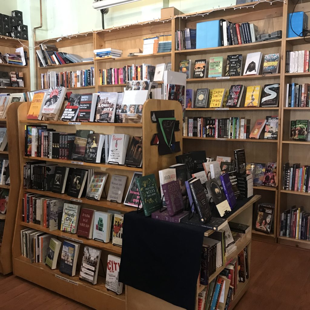
I went to Bluestockings on April 6, 2019. Upon entering, I was welcomed by a warm greeting and noticed people working, reading, and collaborating in the sitting area. Immediately to the left was a selection of zines, journals, and coloring books.  To the right, the checkout counter and cafe. A majority of the space was occupied by books on bookshelves and tables. The back wall displayed Bluestockings totes and t-shirts, alternative menstrual products, and “other oddly hard-to-find good things.”

Two tables of books stood near the middle of the store. The tables were stacked with a mix of books on a range of topics – feminism, incarceration, the environment, queer and gender studies, racial studies, radical education – with no heading to label them. In this way, these tables seemed to offer a non-hierarchical, uncategorized approach to organizing resources. This setup would seem to facilitate serendipitous discovery.

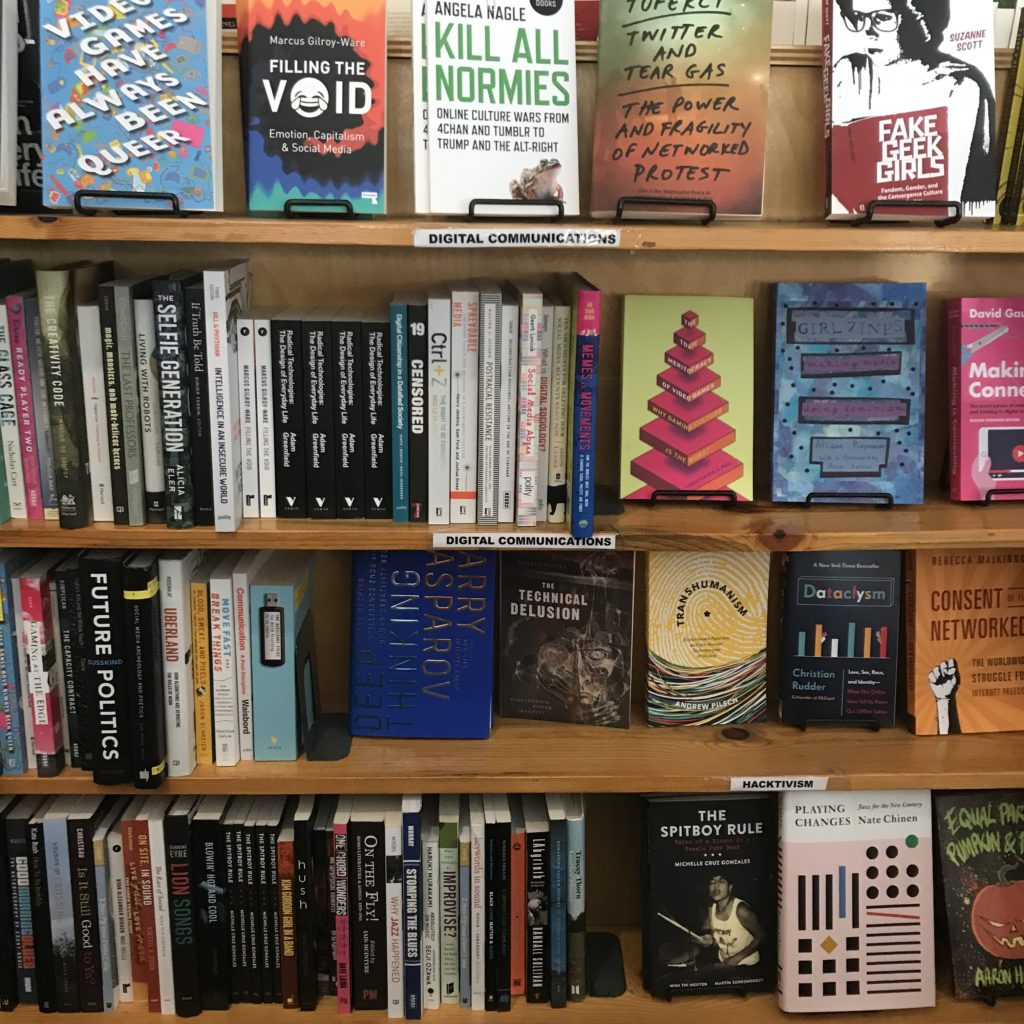
The rest of the titles offered were arranged by category with headings for different sections. 54 categories were surveyed:

Feminisms       Sexuality & Relationships           Radical History
Science & Technology Sex Work Radical Education
Violence & Trauma       Intersex           Hex the Patriarchy
Police & Prisons       Transgender            Activist Strategies
Race & Racism       Gender Studies           Feminist Fiction
  #Blacklivesmatter       Feminist Masculinity           Music
Black Studies       Queer           Art & Media
Indigenous Peoples Studies Queer Fiction           DIY Cookbooks
Libros para Niños       Asexuality             Spirituality
Latin American Studies       Critical Theory            Health Healing & Accessibility
(Im)migration & Diaspora      Digital Communications   Parenting & Pregnancy
Global Justice       Environment & Food Systems   Animal Rights
Post Colonial Fiction     Asia                 Comics & Graphic Novels
Class & Labor      Africa           Sci-Fi
Anarchism                       Middle East           General Fiction
Marxism & Autonomism        New York City         Featured Fiction
Political Theory       Urban Studies & Geography    Poetry
  Economics       Literary Nonfiction           Young Adult

A table labeled “Events” displayed 8 books with date tags on them. I talked with someone who worked at the center to learn more about the programs and events they offered. As it turns out, the center hosts an event nearly every day, if not multiple in one day. The date tags on the books signify the date of an upcoming event centered around that book. Some of these events highlight an author, editor, or contributor of the book. Other events aim to offer a safe space to discuss ideas, foster community, or simply read. In fact, on the day I visited there was a silent book club taking place. A calendar on the Bluestockings website shares all of the upcoming events.

Takeaways

In order to meet their mission, I expected that Bluestockings would organize their resources in a way that would facilitate inclusivity and challenge oppression. One way I imagined they could achieve this would be to employ a varied array of headings to organize their resources. With 54 different headings, Bluestockings did just that.

As mentioned earlier, the two ‘No Category’ tables appear to facilitate serendipitous discovery. With no categories to influence you, they also provide a relatively unbiased opportunity to discover titles. Of course in a store dedicated to selling radical content, you can expect to find books that fit that description, but the fact that there is a label-less table is worth noting.

Hosting events is a non-organizational method the center employs to reach their mission. Events like the silent book club create a welcoming environment to read at one’s one pace and be inspired by what others are reading. It rids the pressure associated with the commitment involved in a traditional book club, but still provides the sense of community. The dozens of posters, fliers, and notices for events taking place outside the center further exemplify Bluestockings’ effort to build a supportive environment and sense of community.

Representation matters. Words matter. The granularity in the more than 50 sections used to organize Bluestockings’ collection challenges the idea of neutrality in classification by recognizing the importance and power of language. In Emily Drabinski’s, “Queering the Catalog: Queer Theory and the Politics of Correction,” she talks about this power. She says, “in terms of organization and access, libraries are sites constructed by the disciplinary power of language.” Drabinski talks about libraries, but this would seem to hold true for bookstores, as they also use headings to organize information. Drabinski asserts, “subject headings, often cast by catalogers as a kind of pure, objective language, are not; where and when and by whom subject headings are used makes all the difference in terms of meaning.” While working to expand subject headings and more accurately organize material about social groups and identities is productive, Drabinski makes clear that emphasis on “correctness” is not. For, “even when subject headings are updated to reflect current usage…they do not account for all the other words users might use to describe themselves.”

With design layout being a major component to organization, I am reminded of Costanza-Chock’s recent work, “Design Justice: towards an intersectional feminist framework for design theory and practice.Costanza-Chock discusses the history and principles of design justice. According to Costanza-Chock, “design justice rethinks design processes, centers people who are normally marginalized by design, and uses collaborative, creative practices to address the deepest challenges our communities face.” She may have been talking about larger scale and more deeply rooted design decisions, but I would argue design justice would apply on a smaller scale. In this way, the layout and organization of books and information could be designed with the principles of design justice in mind.

Design and organization are evidently powerful tools and should be treated as such. From my observation, it seems Bluestockings has employed design justice principles to meet their mission. They have created a space and organized it in an effort to, “sustain, heel and empower,” to provide “liberation from exploitative and oppressive systems,” and to work towards, “sustainable, community-led” outcomes. Bluestockings is evidently a notable community institution that fosters community and provides a space for learning and empowerment.

They also just have a lot of good books. I bought two.

By Tina Chesterman
Info 601, Professor Chris Sula

References:
Costanza-Chock, S. (2018). Design Justice: towards an intersectional feminist framework for design theory and practice. Design Research Society 2018.

Drabinski, E. (2013). Queering the Catalog: Queer Theory and the Politics of Correction. The Library Quarterly: Information, Community, Policy, Vol. 83, No. 2

Activity Theory in Young Users of Digital Technology: an observation of the iGeneration

Introduction

A field study observing the digital interaction of young users was conducted on a second-generation, three-year-old boy of Afro-Indo Caribbean descent. The observation was conducted in the observer’s home.

The purpose of the study was to better understand the intuitive use of young children. How do they know to navigate and interact with features as they do? How do they learn these behaviors in unsupervised environments? How are their behaviors reinforced and applied across devices?

Many of these questions were a result of the above curiosities and a desire to better understand the cognitive processes at play as noted by Kuhlthau:

“A model representing the user’s sense-making process of information seeking ought to incorporate three realms of activity: physical, actual actions taken; affective, feelings experienced; and cognitive, thoughts concerning both process and content. A person moves from the initial state of information need to the goal state of resolution by a series of choices made through a complex interplay within these three realms (MacMullin & Taylor, 1984). The criteria for making these choices are influenced as much by environmental constraints, such as prior experience, knowledge, and interest, information available, requirements of the problem, and time allotted for resolution, as by the relevancy of the content of the information retrieved” (p. 362).

The structure of this field report was a combination of interview and observation. The purpose structure was due primarily to the subject’s age.

Disclosure

The subject of the observation is the observer’s nephew. Alluded to below, one of the many reasons why this observation was informally conducted was due to general curiosity. This initial curiosity began when noticing the subject’s use of mobile devices but, most recently, when he began sending nonsensical messages. The messages were initially thought to have been a prank by the subject’s mother but upon further inquiry, and frequent occurrences, the messages were a combination of drawn shapes or autocompleted phrases that were illogically constructed.

Screenshot of chat messages sent between the subject and the study's author.

Observations within the scope of this study included 1) how interaction changed or remained the same across an iPhone and iPad 2) interaction with specific features and implicit restrictions imposed on the user (e.g., inability to read or write).

“Motivation for doing the work”

According to “The Ethics of Fieldwork” by PERCS: The Program for Ethnographic Research and Community Studies – Elon University, listing motivations for conducting such studies better align the researcher with the outcome of the intended study and the benefits to the research field as a whole.

For many reasons, this study was not formally conducted. However, there are two reasons worth noting within the scope of this report. The first reason is due to the little experience the observer possessed in field studies containing child subjects. Leveraging practices from the readings within the study resulted in applying generalized techniques and procedures intended for adult subjects to a child subject.

Outlined later in greater detail, this posed many issues as one would expect the application of techniques and procedures reapplied in very different circumstances. However, motivation for pursuing this study prompted an attempt and a review of not only this study but also the review of unique requirements for child subjects. Hence, the second reason why the observation was not formally conducted: to better understand at what scale technology impacts early childhood development.

Possible Harms: skewed results due to the misuse of techniques and procedures.

Possible Benefits: generated interest to pursue, rectify, and advance this study.

Techniques

General tasks were assigned:

  1. Interact with a mobile feature
  2. Find and watch your favorite YouTube video
  3. Play an educational game
  4. Play a non-educational game
Subject playing the mobile app game "Grom Skate" on an iPhone.

As the subject worked through each task, some intervention and rewarding were required. Having known the subject, the tasks created were short in length–sufficient enough for possible naps or breaks–and the entire observation spanned across several hours. Snacks were rewarded for good behavior and for completing a task without interruption.

After completing the above tasks, the subject was closely observed to document any behavior which didn’t occur while completing those tasks.

Questions and notes from the observation

  • Activity Theory: in-practice
    • How would his actions change if the technology changed as Nardi claims, “Activity theory holds that the constituents of activity are not fixed but can dynamically change as conditions change” (p.38)?
  • Attention span: what does his actions say about the effect of technology on youth users’ ability to focus?
    • Never completes viewing of videos and tends to navigate to either the search bar or another video within 30 seconds to 2 minutes of viewing.
    • Viewing videos of greater interest last longer than 2 minutes but are never fully completed.
    • When a task was issued, the subject wanted to continue on longer for all tasks but the educational game. For the educational game, the user became frustrated unless there was sufficient guided intervention.
    • Voyeurism and the gaming culture: the subject’s attention was only kept when watching YouTube videos of others playing videos games or playing with toys.
  • Distributed Cognition (Nardi, p. 38): pattern recognition?
    • Participant cannot read nor sufficiently write. However, he is able to search YouTube videos he’s previously watched but is unable to search newly watched videos. To return to new videos, he taps the arrow icon to return to the video.
    • How he searches is by typing in the first few letters he remembers from the videos he’s views frequently. For retained previous search results, he reviews the list and selects which is most recognizable. He watches and then returns to the search bar if the video isn’t what he wanted. If the video is what he was looking for, he scrolls to the recommended videos to find new content and selects those items or searches content from the same channel of the video he’s currently viewing.
  • Signifiers and affordances
    • Participant understood the significance of the hamburger menu, toggles, touchscreen interface features such as swiping, device volume control and locking mechanisms, and other navigational signifiers such as the back/forward and up/down arrows.
  • Interaction
    • iPhone and iPad
      • YouTube and either a mobile app/feature.
    • No major differences in interaction other than the subject’s level of comfort and which device he preferred to use when.
      • The iPhone was generally used when sitting up.
      • The iPad was generally used when laid back.
  • Intervention
    • The study would be better conducted in a more controlled environment/location, without the mother nearby and by an individual with a balanced relationship.
    • Observer’s relationship with the subject was unbalanced. This required swapping between the mother as an instructor to guide him through exercises.
      • With the mother, the subject was at ease and felt less intimidated by the instructions and how they needed to be carried out.
      • The subject preferred guided instructions as opposed to unguided instructions. While guided instructions were more successful with the observer, they weren’t as successful as with the mother.
      • The subject enjoyed general instructions with sufficient freedom to navigate and course-correct by intuition than delegated navigational instructions.

Conclusion

The above study would do well with well-controlled environment, an unrelated observer with sufficient trust, and a well-vetted plan of tasks.

Additionally, prior to an observation containing child subjects, it would be helpful to know positive and negative triggers, learn what they like and what they dislike, review popular content for that age group and test the level of interest on the subjects, provide ideal rewards for completed tasks, and create a balance reward system.

Overall, this observation did provide an opportunity to analyze the subject’s behavior more closely and to develop a thoughtful hypothesis. Nardi explains that “activity theory recognizes that changing conditions can realign the constituents of an activity” (p. 38).

My original assumption that technology results in specific behaviors in young users has shifted to a hypothesis which accounts for the bidirectional relationship between any user and technology: technology reinforces or redistributes behaviors in young users which may predict their usage of other technologies and platforms, and related social behaviors.

References:

Kuhlthau, Carol C. “Inside the Search Process: Information Seeking from the User’s Perspective”, “Journal of the American Society for Information Science 42(5): 361–371. https://ils.unc.edu/courses/2014_fall/inls151_003/Readings/Kuhlthau_Inside_Search_Process_1991.pdf

McGrath Joseph E. “Methodology matters: doing research in the behavioral and social sciences”. https://lms.pratt.edu/pluginfile.php/876402/mod_resource/content/0/mcgrath-methodology%20matters.pdf

Nardi, Bonnie A. “Studying Context: A Comparison of Activity Theory, Situated Action Models, and Distributed Cognition”. https://lms.pratt.edu/pluginfile.php/876415/mod_resource/content/1/nardi-ch4.pdf

PERCS: The Program for Ethnographic Research & Community Studies, “The ethics of fieldwork”. Elon University. http://www.elon.edu/docs/e-web/org/ percs/EthicsModuleforWeb.pdf

Wilson, T. D. (2000). “Human information behavior.” Informing Science 3(2): 49–56. https://www.ischool.utexas.edu/~i385e/readings/Wilson.pdf

Observing and Listening with Decolonize This Place

Decolonize This Place is a protest organization started in 2016 described as “centering around Indigenous struggle, Black liberation, free Palestine, global wage workers and de-gentrification”. The organization has been getting considerable press since they began protesting at art museums and considered (from an ironic source) one of the changemakers to the art world for 2019.1  

I attended and observed the third week of a continuing protest to remove Warren B. Kanders from the board of trustees at the Whitney Museum. Kanders is the majority owner and CEO of Safariland, a manufacturer of personal safety products, military defense, and law enforcement products including tear gas which had been used in the recent conflicts at the US-Mexico border. On this day of the protest, an open letter signed by over 120 artists, critics and academics was delivered to the Whitney and posted to the website, Verso, which was a notable increase in awareness since the protest started in December.Decolonize This Place plans at this point to continue their weekly protest until some sort of action or response is taken by the Whitney’s board.

When I arrived, the lobby of the museum was calm as the protesters were a bit late. The security guards were ready but relaxed and expecting the weekly assemblage, but I overheard their enthusiasm at the prospect that the protesters may not show. Once the organizers started to arrive, the larger group became apparent; they were asked to hold banners and gather in a circle to get started. The banners displayed the names of countries where tear gas has been utilized in recent conflicts including Standing Rock, Baltimore, and Egypt, for example, and also noted white supremacy and art washing. The final organized group looked like it was approximately 60 to 70 people. It appeared at this point that the protest would address wider issues than simply the Whitney board.

There was an MC for the group who started the dialogue and introduced the issues at hand – removing Warren Kanders from the board and the use of tear gas as a weapon of war. To get things started the he asked if there was anyone in the crowd that had signed the open letter and if so, would they stand up and say a few words. No one responded presumably because no-one was in the crowd, or, I could only assume that if some of the crowd was connected to any person within the museum, they may have been hesitant to speak up. Students from NYU picked up the mic at this point, addressing colonization in higher education. The students called out their own school and others including Columbia and Pratt. It was at this moment that I really couldn’t associate their cause to the main issue, but they did get the momentum started which led other speakers to address art washing, gentrification and the control of corporate money in all institutions.  

The next question presented to the group was if anyone had experience with tear gas. This created an interesting shift in the energy of the crowd. First, a woman spoke up and explained she was in the military and had experience with tear gas in training drills. Next a man contributed his story about living in the West Bank and experiencing tear gas during a demonstration. His address to the group was about the use of tear gas as a weapon of war and a weapon to oppress. He went on to say that he respected what Decolonize was doing and wanted us to realize that the more we get used to oppressive behavior the more it desensitizes us. He stressed that the protesters work is important in keeping people aware of what tear gas is used for and that we should not be complacent. These comments brought the issue back around and this is where the protest started to get a bit heated.  

Decolonize This Place image courtesy of Instagram

It’s worthy to note that simultaneous to the protest was free Friday admission to the museum. Most of the general visitors did stop and look and some were interested (I believe the man who had lived in the West Bank joined in before his visit) and some were dismissive. I overheard some in the crowd think it was just about the current administration but didn’t seem to be interested generally. One unfortunate man was on his phone presumably poking fun at the protest, possibly he was in awe – maybe he had never seen such a thing in action – but he got called out for his privilege, which turned borderline aggressive but the protesters kept control. 

The phone incident caused the momentum to increase further which brought the issues around to the ultra-rich supporting the arts and being the decision makers, which led to the topic of gentrification of the neighborhood and the funds it took to bring the Whitney to the meat packing district. This was an interesting point which I hadn’t considered because I remember the neighborhood representing a very different part of New York City and certainly not having high end vendors gracing the streets. I found this pertinent to the larger discussion in how the art world in general has contributed to gentrification under the guise of “revitalizing” the community.3 It is this gentrification and questionable funding that contribute to continuing colonization. 

“Gentrification is the New Colonialism,” by Mi Casa No Es Su Casa, Image courtesy of Pinterest through ArtSpace

Observing protest, thinking about real change and watching the emotions it can bring up can be conflicting.  Even though I support the cause, I still couldn’t help thinking about the privilege one has in this country to protest no matter what their cause or economic status. There is also the question of where funding would come from to make arts accessible and protected. I was able to speak informally with one of the organizers for Decolonize This Place, Ben, and ask him this question. His response was that arts institutions should have community involvement and should be publicly funded – similar to the principals discussed in Costanza-Chock’s Design Justice theory. Although I recognized his point, I still needed to mention that with the current structure of fundraising and where arts funding comes from in this country, we may have a long road to before we see this type of structure. Ben agreed but acknowledged that if there are open lines of communication when appointing board members to these institutions, there would be a “better way to vet the candidates and draw a red line on how funding is obtained”. If this were implemented there would be slow change, with the ultimate goal to avoid “toxic philanthropy”. Again, I couldn’t help but be divided on this point as the pragmatist in me sees money as force that is not easy to influence. That was until I spoke to one protester who, in her address to the group, asked us to consider the net worth of our subject, Warren Kanders. A man who’s worth $700 million through manufacturing defense products gets to decide on where the Whitney is built, what the Whitney will exhibit, and how the Whitney will pull in revenue all while not considering the community that resided there before and what served and built that community. It was then I realized that this is why we protest. While Kanders is not a decision maker in the administrations that carry out policies that utilize Safariland products, there is a value placed on these products by the larger society. Perhaps we need to question what and who we place our value on and consider when those values oppress communities with less power. Protest may not produce change immediately and our causes may be broad, but we need to get the conversations started, see how we feel about it in later generations and watch how that can evolve. 

Resources

  1. https://observer.com/2019/04/arts-power-50-list/
  2. http://www.artnews.com/2019/04/05/warren-kanders-verso-books-open-letter/
  3. https://hyperallergic.com/350186/learning-from-decolonize-this-place/

COSTANZA-CHOCK Sasha,  Design Justice: towards an intersectional feminist framework for design theory and practice 

Observation at the Whitney Museum of American Art – Programmed: Rules, Codes and Choreographies in Art, 1965-2018

(Photo credits: Christopher Ku, Instgram: cawriskoo)

On March 29th 2019, I visited this exhibit and was transfixed by the main installation, which is a floor to ceiling panel of television sets. It is important to note that when I visited the exhibit, the museum was also showcasing its final weekend of their Andy Warhol exhibit. There was also an organized protest that was taking place at 7pm during the museum’s pay-as-you-wish period. The museum was jam packed with ticket buyers, members, and security staff. Although it was a high capacity evening, my access to the museum’s Programmed exhibit was smooth and calm.

The content in this exhibit celebrates art through programmable codes (or instructions) and how these codes can be used to manipulate the artists’ medium (computerized program or image sequence). All of the pieces in this exhibit were created through various types of computer programs, which were used to establish the structure and color of the piece. They are grouped in one of two sections: “Rule, Instruction, Algorithm”, which focuses on the rule-based conceptual art practices prior to digital art technologies and “Signal, Sequence, Resolution”, which focuses on the coding and manipulation of the moving image. Walking through the exhibit it was hard for me to differentiate between these two groups since nearly every piece has some sort of tech-based manipulation applied to it.

This exhibit is very open and full of content.  Navigating the exhibit can be overwhelming because there was music playing from the main attraction, Nam June Paik’s Fin de Siecle II (pictured above) and other installations around it. Adding to the noise from the installations are the human noises produced by the visitors and employees. I also noticed many people gravitated towards the multimedia content more so than a piece that did not openly appear to have a tech component to it.

Photo credits: Whitney Museum of American Art

Tilted Plane (pictured above) is a great example of one installation receiving more “people time” than other pieces. I think a big part of why this installation attracted more visitors than others is because of how “instagrammable” it looked. Jim Campbell created this piece in 2011 to project a two-dimensional image into a three-dimensional space. To do this, he placed modified LED lights at specific locations on a circuit board to mimic pixels in a low-resolution display. The viewer would enter at the spot Whitney staff has sectioned off as the entrance, which allows you to see the initial sight of birds taking off and landing. But as the viewer moved along, the image becomes distorted, and random, creating the illusion that you are no longer looking at a specific thing, but something abstract.

Being immersed in Tilted Plane not only gave me a serious case of dizziness (a warning sign was placed outside the installation about this) but also immediately reminded me of Bates (2003) and her discussion on natural and represented information. According to Bates, these forms of information allow for organization of knowledge and representation of this knowledge through other means. When applied to how the pieces in this exhibit was created, I can’t help but think about the process in which each artist came up with their initial concept (encoded information), their process of creating such pieces (embodied information), and the completion or exhibiting of their piece (exosomatic information).

Another piece from the exhibit that I found interesting is The Interactions of Coloreds by Mendi + Keith Obadike.  It is important to note that this installation was not as popular as Tilted Plane, but exhibited some important themes that should be looked at. This interactive piece invited the viewers to look at the conceptual website created by the artists to see how skin color has effected online commerce and ad-targeting. However, as the gallery attendant for the exhibition explained to me when I had trouble figuring out how to use the installation, the website built by the artists is not updated in real-time and tends to lag. Their website can be accessed here

Their “product” is a system that can help companies judge their customers or employees based on their hexadecimal color (the HTML equivalent of color). To add an interactive component to their website, they include a link that brings their viewers to a Google Doc questionnaire, which is to be filled out to compile the hex code for the viewer. Compiling this information is no different from Big Data firms collecting information from their users to better direct ads towards them to sell a product or sway them towards voting for a specific party or person. On the darker side of things, sometimes even limiting our access to important resources is a flaw in the types of systems offered to us in the real world. Costanza-Choke (2018) argues about these design injustices, where dominant groups oppress those who are often underrepresented because of their lack of access to resources that will help voice their concerns.

This installation reminds me of Sephora’s Color iQ, a “beauty service” tool that scans the surface of your skin to match makeup users to a host of foundations appropriate for their skin tone and color.  Each Sephora customer that has used this service is then matched up with a 4-digit and letter combination code that is linked to specific shades in the brands they carry. From a consumer point of view, this tool is useful since it gives me a curated look at products from brands that are guaranteed to work for me. But looking at it from an information science student’s point of view, I wonder how that information has been used since then.

Overall, Programmed is an exciting exhibition looking at alternate forms of art through digital manipulation. While pieces that had great aesthetic appeal harnessed more attention from visitors, other pieces had more alluring underlying themes that provoked viewers to look at them more closely.

Tiffany Chan, Info 601 – 01

References:

·           Bates, Marcia J. (2006). “Fundamental forms of information.” Journal of the American Society for Information and Technology 57(8): 1033–1045.

·           Costanza-Chock, Sasha. (2018). “Design Justice: Towards an Intersectional Feminist Framework for Design Theory and Practice.” Proceedings of the Design Research Society 2018.

The Cooper Hewitt Experience

When purchasing admission tickets to The Cooper Hewitt Museum, I was asked “would you like the Pen?” To which I was a little confused having not visited the museum before. The ticketing agent was kind to demonstrate the use and functionality of the Pen and left me with a greeting “happy exploring!”

The concept for the interactive Pen originated from Local Projects working with Diller Scofidio + Renfro and was designed to enhance the Cooper Hewitt experience by allowing visitors to “collect” objects from around their galleries. All visitors receive a Pen with their admission ticket containing a dedicated web address corresponding to their visit where they can access all the objects they have collected from their visit. Visitors may press the flat end of their pen to a ‘+’ icon on the museum labels to collect objects and explore them in more detail at interactive tables situated around the museum. The Pen combines two technologies where its interface with interactive tables employ conductive materials common to touchscreen styli and its interface with museum labels employ near-field communication technology. The interactive tables, designed by Ideum, allows visitors to explore and manipulate the objects they have collected, discover related objects, retrieve contextual information, learn more about the designers, design processes and materials, watch and share videos and even sketch their own designs.

According to Jake Barton, principal and founder of Local Projects, “[f]inding the right balance between digital and physical was really an iterative process developed over time together. Here is the Pen, it’s going to make visitors active, it’s going to reinvent the museum experience and turn audiences into participants, but it won’t do it at the expense of the traditional galleries, which will remain artefact-based and without digital technology” (Wright, 2017, p. 123).

In thinking of employing the digital in museums, it is important to consider what the right balance of the physical and the digital would be for the institution. Where can digital technologies be employed, and where it should not be? What level of comfort do different aspects of the museum have in delivering a digital experience? And, most importantly, what is the nature of such digital experiences?

With regards to the Cooper Hewitt, the Pen has become synonymous to their museum experience as it is interwoven into most aspects of the institution. The ticketing agents spontaneously encouraged visitors to use the Pen, even personally showing young children and elderly visitors how the Pen is used. The Pen encourages discovery, has a low barrier to entry, part of the ecosystem of the museum and is an important tool to accessing information in the museum (Bove, Crow, & Husney, 2014, p. 17). The Pen also seeks to ensure a ‘look up’ experience where visitors can be compelled enough to engage with the exhibits without need to use their mobile devices to take photos with. During my visit, I observed only a handful of visitors were taking photos, though not often, and promptly putting their phones away to continue with their use of the Pen. Having become a ubiquitous part of a visit to the Cooper Hewitt, the Pen is unlike the mobile apps / guides of other museums that visitors might be unlikely to adopt and cannot achieve large-scale transformation to a digital experience. 

The interactive tables offered visitors an opportunity to “play designer” where they could view their collected objects, were prompted “what will you design” and “what will inspire you” where they could then draw, manipulate and explore the museum’s collection to their liking. There was ease to the use of the interactive table however it seemed intimidating too. I observed visitors hesitant to use it at first but were encourage by museum staff to simply discover the functionalities of the interactive table. 

As I returned my Pen to leave the museum, I was reminded once again that I could revisit all the objects I have collected on the Cooper Hewitt website. Having accessed the website with my designated code, I found some objects to lack the images and metadata I had seen on the interactive table. This was a little disappointing as I was hoping to show my family overseas what I had seen in the museum. According to Chan, new loan forms and donor agreements were negotiated and by the time objects began to arrive for installation at the museum in 2014, all but a handful of lenders had agreed to have a metadata and image record of their object’s presence in the museum (2015). As such, these constraints do limit the post-visit experience of using the Pen.

Considering some of Norman’s design principles (2013, p. 72), 

  1. Discoverability — The Pen’s flat side has the same ‘+’ symbol as those on the museum labels. As such, it is possible to determine its possible actions however not explicitly obvious, aided by guidance from museum staff. 
  2. Feedback — When saving an object with the Pen, it lights up and vibrates when the action is complete, proving immediate feedback when an action is executed. 
  3. Affordances — The Pen afford holding like any regular pen and is helped with a wristband to prevent visitors from dropping it.
  4. Constraints — The Pen is limited to 2 actions—saving objects and drawing on the interactive tables. Its design allows ease for this interpretation.

Recommendations / Reflections

Though I found the overall experience of using the Pen throughout the museum to be positive, the layout of the museum was confusing and did inhibit my discovery of exhibits. No doubt the Carnegie Mansion is a beautiful setting for the museum but the narrow doorways and lack of signages made it difficult to navigate. The only indication of what exhibitions were showing was located in the stairwell. The museum could consider adding a map to the interactive table to aid in navigation.

While using the Pen, I thought of accessibility issues as the use of the Pen requires sightedness and is not user-friendly to those who are not. The museum had many other accessibility services available like assistive listening devices, reduced rate tickets, passenger elevator and large-print labels. However, I found it a shame that the technology vital to the Cooper Hewitt experience was not accessible to all.

Overall, the Cooper Hewitt provided a successful example of how digital technology can be employed by museums to enhance visitor experience and their exhibitions where at every stage and aspect, the Pen is interwoven into how the museum is operated.

References

Bove, J., Crow, A., & Husney, J. (2014). The Pen Process. Design Journal. November 2014, 15-17. 

Chan, S. (2015). Strategies against architecture: Interactive media and transformative technology at Cooper Hewitt. Retrieved from https://mw2015.museumsandtheweb.com/paper/strategies-against-architecture-interactive-media-and-transformative-technology-at-cooper-hewitt/

Norman, D. A. (2013). The design of everyday things. New York, NY: Basic Books.

Wright, L. (2017). New frontiers in the visitor experience. In A. Hossaini & N. Blankenberg (Eds.), Manual of digital museum planning (109-130). Lanham, MD: Rowman & Littlefield.

INFO 601-02 (Assignment 3 / Observation) – Jamie Teo

Observation of National Geographic Encounter – Ocean Odyssey

By: Michelle Kung
INFO 601-02 Assignment 3 Event Attendance

What is it

National Geographic’s Ocean Odyssey is an exhibition about marine biology and conservation that promises visitors an interactive and immersive experience. Visitors get to see, hear, and feel what ocean life is like for different sea creatures. A member of staff guides small groups of visitors through the interactive spaces and encourages everyone to explore every part of each space. The Ocean Odyssey starts in the shallows of the Pacific Ocean and takes visitors all the way to the Californian coast.  

I visited the Ocean Odyssey in March, 2019 had found this experience to both be a lot of fun and highly educational. The new technology used gave the exhibition a lot of affordances that visitors were not familiar with. And the guide, acting as mediator, served as the signifier to ensure that visitors’ experiences were pleasurable and not frustrating.

Immersive environments created by audio visual elements

Effective use of audio and visual elements made interaction with information truly immersive and entirely effortless.

Visual

The Ocean Odyssey experience featured multiple audio-visual displays. But unlike conventional single screen-based information, these experiences were highly immersive. Users were invited to enter rooms in which every surface was a screen, including the ceiling and sometimes even the floor. Many rooms had curved walls that surrounded groups of visitors. Our guide encouraged us to “swim” into the rooms, adding to the immersive experience. Many users attempted to interact with different visual elements, by pointing at them, stepping on them, and following them. Sometimes, digital elements responded to users’ physical movements but sometimes there was no digital/ physical connection. On the whole, visitors seemed delighted when interaction was possible and not at all disappointed when it wasn’t. Perhaps users haven’t developed an expectation to be able to interact with any digital element yet.

One of the most spectacular exhibits was a 3D video of a life size humpback whale displayed in a room on a curved wall that surrounded visitors. Visitors were invited to wear 3D glasses to improve their experiences. The video showed how humpback whales feed on krill by opening its gigantic mouth. Users were so mesmerised and immersed in the video that a user screamed out loud in fear when the photorealistic whale swam towards the screen with its mouth wide open! Such rich visual information elicited emotional responses in users.

Audio
Buttressing the vibrant visuals were rich and realistic audio elements. Effective use of sound allowed users to be immersed in the underwater environment created by the Ocean Odyssey. In an exhibit showing what the ocean is like in the night time, sound was the main medium. Users sat in a small auditorium completely devoid of light, listening to the sounds of whales, dolphins, and other sea creatures. Users were passive receptors of audio information. 

Interactive videos enraptured users

The Ocean Odyssey also featured gesture controlled interactive video elements to teach users about the behaviour of sea lions and about bio luminescence.

Our guide explained what bio luminescence was as users moved their arms in front of a screen. The screen detected motion and displayed corresponding lights, representing bioluminescent bacteria. Users were encouraged to interact tactilely with all elements of the bioluminescent exhibit. This hands-on approach allowed users to learn about an otherwise abstract part of the ocean that they have probably never heard of or thought about.

In the sea lion exhibit, our guide demonstrated using the screens to learn about sea lions. Individual users stood in front of individual screens, waving their arms and watching the sea lion swim in corresponding movements.

Traditional displays sadly forgotten

Unlike a traditional museum environment where static images and text are the bulk of the information, in this experience, they were peripheral. Unless the guide purposefully drew users’ attentions to non-digital image and text, they were largely ignored.

Perhaps a better designed information environment would make a more seamless transition between information that is digital presented to users, and traditional forms of information like posters and displays. Compared to interactive and immersive digital elements, traditional static visual graphics were much less interesting to users.

Quizzes and games

At the end of the exhibit, our guide led users into a room with many different games and quizzes on ocean ecology and conservation and allowed us to interact with them independently.  Most of these activities were screen based, apart from colouring sheets which no users used.

Users interacted with different screens equipped with pressure, laser, and gesture sensors, making each game interesting and different. Adults and children alike were captivated.

Reflection

I think the Ocean Odyssey experience was a really well designed information environment which allowed users to experience information in a fun, experiential, and dynamic way. It proves that learning doesn’t have to just be cognitive and challenges traditional approaches to learning by allowing users to engage with information physically and emotionally. I think this kind of experience, when curated as well as the Ocean Odyssey, can have great impact on education and edutainment.

But I’m not sure whether or not the information environment was designed with affordances in mind. Users were guided by a trained guide throughout, and were given instructions on how exactly to interact with each aspect of the experience. Of course, interactive experiences that blends digital with the physical are still very new so there isn’t as yet an established semiotic system that can allow users to know exactly how to interact with exhibits without a guide. I can imagine, in future, when more experiences incorporate interactive digital elements in physical spaces, there will be a need for the design of a standardised semiotic system that is well understood by the user to act as navigation.

References

Norman, Don. The Design of Everyday Things. New York: Basic Books, 2013.

Observation: @ JFK Airport JetBlue Airline

My observation took place during the night time at the John F. Kennedy International Airport. I was taking a best friend to his flight that was leaving at 11:45 AM. During the time at the airport we were trying to check-in as fast as possible because traffic has made us run late. When checking-in there weren’t that many staff attending customers on the JetBlue Airline. We believe that the staff was low because of the given late-night time. I remember there was a time that JetBlue had a lot of staff but that was during the morning and afternoons. Since my friend was leaving so late at night to go to his destination, he was having trouble in getting on board as fast as possible. He was running very late and too many people were causing delays that he couldn’t wait for a staff. He then decided that he wanted to use the self-service check-in with JetBlue kiosk. My best friend thought that it would be a faster to be able to check in through self-service system and won’t be able to wait on line for a long time.

The kiosk self-service machines were close by the where you check in with the staff. They were at a good spot where users can easily access it. If I’m not correct I believe there were about ten machines or more and most of them weren’t being used. The kiosk machines had a big touch screen for the users to use and be able to see the features and content that the check-in service provide. The kiosk machine also had a slot where you put in your passport so that it can scan it for ­its check-in purposes. My best friend started using the device but he wasn’t exactly sure how it worked. He decided to get help online through google. He had made his search on how to use the check-in self-service and had gotten a lot of information on videos and article on getting help. At the moment of his search he was able find something that helped him understand how to use the device at JetBlue airlines. The information he gathered only took him about 15 minutes of his time to be an able check-in with the machine successfully.

The kiosk machine was pretty much straight forward for him to use, but he was mostly having trouble in how to scan the passport the right way. I believe that the machine wasn’t telling the him how to properly enter the passport in the right way because the screen basically shows a 3 second video on how to do it. I believe that tip that device gives you to scan your passport is helpful but there should be a little more information added to the screen to help the user scan its passport. For example, if the kiosk machine was to show a set of steps of instructions while viewing the small clip that shows you how to scan your identification it will get the user to properly be able to do what is asking to do. I remember that my best friend was getting a little frustrated because he tried about three times and since he was running late to his flight, he wanted thing to get done fast. 

There are so many digital devices out there that even airports have self-service check-in for flight. All these devices are connected by a network and they all give a scalable feature to its users for simplicity and helpful use. Just like the website of google that helped my friend get the help he needs for to this digital device, it had provided him with so much information about the kiosk. These many information helps with the leading of new development. As Gary Marchionini writes in his paper of Human-information interaction research and development,

“Digital technology has created a plethora of new kinds of information objects, including multimedia combinations that exhibit behavior, acquire history over time, and lead to new emergent properties. When these objects are Web-based, they acquire a scalability feature that leads to new kinds of emergence: interactions among millions of people and trillions of machines cycles create new kinds of information objects defined by instantaneous states of the network.” 

Observing and experiencing what my best friend went through to check-in with the kiosk device at the airport gave me knowledge. The specific understanding, I had gotten from my observation was that it thought me how the information that my friend gathered was helpful in the way that he was able to understand and use the newly self-service device from JetBlue. Just by searching up a question.

Reference

Gary, M. (2008). Human-information interaction research and development. Library & Information Science Research, vol.30, 165-174. doi: 10.1016

Observation of Future of Physical Retail

When considering the kind of information environment, I wanted to observe, I wanted to observe the evolution of physical retail experience. I chose this because retail environment is experiencing a lot of changes after the emergence of e-commerce. Ground breaking retailers are seeing an incentive in looking priceless and administration to make a vivid shopping knowledge intended to pull at heartstrings and catch client dedication, notwithstanding for a brief timeframe. Developing innovation makes it less demanding to mix the physical and advanced retail understanding to give better knowledge into client conduct and expectation — and make a really special vivid experience for their clients. Retailers can utilize this total picture to make an increasingly customized shopping knowledge, drive transformations, improve client administration, and set themselves apart from their opposition. 

 I decided to go to the Nike Flagship store in Midtown on a weekday afternoon as it provides knowledge in a situation that is as responsive as digital.  This Six-story space is called as the “House of Innovation 0000”, a very first effort of Nike to bring retail to life. 

 While walking on the fifth avenue, the whole black building with frosted patterned glass panels and a huge Nike logo grabs my attention. The architecture itself gives information of from where the entrance is. The red glass door opens up to a sci-fi art installation of computers having heat maps and holographic shoes stating the identity of the brand. The store consisted of young visitors. The first floor is treated as innovative museum of Nike. It consisted of information of design process on screens and showing prototypes of previous shoe designs and the latest designs for sneakers. It also encouraged people to download its app to get the full experience of store. There was a digitally heat mapped sports court installed inside where people could experience their shoes before purchasing it. The tiles on the Arena can be reworked to have new spaces and designs; as the choice develops, the store format can advance as well, making the House of Innovation 000 an adjustable store in each feeling of the word. I think this was a really interesting feature because only in retail you can understand the feel of the shoes and nothing better than playing the game of choice in it to understand the comfort of it.  

I was directed to the second floor where there was Women’s clothing section. Here there were barcodes besides every product. People need to scan that barcode to purchase the product or get the desired size in the changing rooms. This helped people to roam around the store without carrying the weight of the cart. The whole process of shopping was digitized which made retail fun. Similar facilities were provided in the Men’s clothing section on the third floor. 

On the fourth floor was the shoes section. It had a sneaker bar and various designs in shoes. A full customization wing of Sneaker Bar, conveying on Nike’s spearheading DIY soul and offering an abundance of bands, textures, decals and more with which to adorn a wide determination of consistently invigorated footwear. People could customize the shoes themselves. The younger generation and shoe fanatic people were really enjoying it.  Even in this section there was a barcode besides the shoes which should be scanned using the Nike app to get it of size and choice. This barcode scanning is a really a great feature because then I need not search for a representative and wait for the whole process of finding a shoe of choice.  

This leads me to the last floor of the building where there is a Nike Expert Studio. This feature of one-on one joint collaboration with expert stylist can be booked by Nike members in-store and on the Nike App. I think this section was very VIP section where people could interact with stylist and get customized clothes or clothes that suits their body type or style. Very few people were coming to this section. I personally think this section was not getting as much attention as previous ones. They have not given much information about it even while entering the store. 

Observing this whole space was really interesting. It appeared that some visitors were there to only experience the innovative retail space. They were curious about the interactive features and the technology used in the store. Despite the unfamiliarity of technology some people were inherent on using it as someone would think they were stealing from the store. The young generations were very engaged with the technology. But the older generation was sticking to the conventional style of retail. 

As Bates stated in Fundamental Forms of Information, we will simply consider subjective experience, including the experience of remembering, to be the first on a list of kinds of embodied information that result from neural encoded information. I really enjoyed observing people first taking the experience of the product and having hands on customization which then lead them to buy the product. I observed what Marchionni said changes in the human–information interaction entities relate to learning or other mental state changes in the human and usage changes in the information object. I could sense the different between interaction with technology of different generation which depends on both urge of learning and mental state. 

I trusted it is the ideal convergence of individuals, innovation, and style in one space. The space had the capacity to speak with its city through individuals and advanced administrations, welcoming a discussion that is synchronized to the client.  From my perspective the whole technological process is overwhelming if you are trying it for the first time. But if this is the future of physical retail, people will get used to it eventually. Overall it was a great initiative taken by Nike Team. 

References: 

https://news.nike.com/news/nike-nyc-house-of-innovation-000

Marcia J. Bates Fundamental Forms of Information, Journal of the American Society for the Information Science and Technology, 57(8):1033–1045, 2006. 

G. Marchionini / Library & Information Science Research 30 (2008) 165–174. 

Richa Kulkarni, INFO 601-02

NYC Subway and Human Interaction

New York City’s Subway is one of the oldest and most efficient public transit systems that the world has seen. It started operating in the year 1904 and runs 24 hours on every day of the year. The Subway transit is also the most used metro system of the world, by a countless and diverse population. 

The Subway lines run through Manhattan and branch out into the boroughs of Brooklyn, Queens, and Bronx. It is a network of extensive structures and many junctions, of which I have made observation of one – Times Square 42nd Street/Port Authority Bus Terminal(PABT). 

This Subway station complex is located under PABT and Times Square at the intersection of 42nd Street, 7th and 8th avenues, and Broadway. Every train has a distinct color and number or alphabet associated with it. The 42nd Street Times Square station offers access to multiple lines. 

42ndTrainStation-trains

All the lines are bi-directional, running towards uptown and downtown. There are local lines which stop at every station, and there are express lines that make stops at fewer stations. Most lines, except a few, run 24 hours with higher frequency on weekdays.

NAVIGATION AND TECHNOLOGY 

The Subway system has a very well designed way-finding system which poses hardly any challenge to its users. It uses consistent visual language, universally accepted icons, and smart placement to make navigation through the enormous space easy. All signages are on non-reflective black surfaces with white legible sans serif text. The signages mark uptown and downtown trains with their specific icon. Use of icons and text together reinforces information, the “S” with “Shuttle” for instance. While the train icons are invariably placed on the right of the text, icons for ramps and wheelchairs go consistently on the left. 

A user’s initial point of contact with the Subway system’s technology is at the entrance where he finds a Metrocard vending machine. The machine accepts cash, debit or credit cards and is effortless with touch screen and comprehensible instructions. The system is quick and economical with $1 for the Metrocard itself, and preset values that the user can choose from to put charge on the card. Moving further the commuter enters the station through turnstiles which use a card reading technology. 

Metrocard-vending-machines

Throughout the Subway premises Customer Assistance Intercoms and Emergency Intercoms are easily accessible. The smart positioning of speakers allow system announcements to be audible all over, without any hindrance from the commotion. The station has Subway maps at frequent spots and Neighbourhood maps and entrances/exits. 

Maps-at-Subway-entrance-exit

Moreover, a recent addition of interactive touchscreens has augmented navigation. These all-in-one customer information devices allow one to select a destination station, in response to which the screens display possible routes with time estimates. Aside from information on train schedules these screens also offer recommendations for points of interest at select locations, information about escalators and elevators, outages and train delays, or if planned work is coming up. However, commuters don’t seem to use this technology as often. 

Interactive-screen-at-Subway-platform

All platforms have digital screens displaying ETA for their respective trains. 

Screen-displaying-trains-ETA
S

There are multiple apps designed specifically to aid Subway navigation, for example MTA Subway Time.

The 42nd Street Station, as all Subway stations, has several entry/exit points spanning across surrounding blocks with supplemental northwest, southwest, northeast and southeast corners, marked “NW”, “SW”, “NE” and “SE” respectively. There are two underground passageways to PABT allowing easy transfer to interstate buses.

CONVENIENCE AND EXPERIENCE

ATMs, convenience stores and trashcans are easy to locate. The subway is safe, and well monitored by surveillance cameras and police. Several posters advertising tv shows, web series and brands among other things, offer a sense of familiarity and make the experience less daunting. Also serving the same purpose are the artworks on the walls. Musical performances are a regular affair at the station, which also becomes a platform for artists to showcase and sell art. This makes the Subways less monotonous and more entertaining. Yellow strips at the edge of the platforms mark a safe distance from the rail tracks. These strips are embossed to prevent slipping. A set of benches are placed at the platforms for senior citizens and physically challenged.

Advertising-posters
Musical-performances
Artworks

An attempt to incorporate inclusive design has been made through the use of braille, ramps and elevators, but it fails to be efficient. 

inefficient-inclusive-design

ON THE TRAIN 

Every train’s icon, number/alphabet and route is visible on it. Red bulbs light up on both sides of the automatic doors when they are open. Many advertising posters on the insides of the trains offer comfort and interaction. There are poles and railings for standing commuters to hold onto. Newer trains have digital display of the trains route with current and next station highlighted, but the old trains only have a poster of the trains’ routes. To complement this, system announcements alert the passengers of the upcoming and current stations. There is priority seating for disabled and senior passengers. Clear instructions for events of emergency are displayed with assistance intercoms and emergency brakes.  

Posters-in-train

OBSTACLES AND SUGGESTIONS

The Subway system is extremely well planned and functional, and given its technological structure manned stations are barely needed. Although, a considerable number of users are not tech-savvy. There is a lost and found unit, but without relevant assistance chances of items being turned in are slim. There could be a dedicated station for a personnel within the premises for further help. Nonetheless, NYC Subway system is an exemplary public space design with minimum room for errors.

References: