Alex Austin
Introduction
Teacher pay is a hot-button issue in a profession with high turnover and high burnout. What isn’t discussed enough is the disparity of pay from school district to school district. For young teachers and those entering the profession, it’s important to consider how one’s choice of geographic location will affect their financial future.
In this lab, I outline the creation of a dashboard that teachers or individuals considering entering the profession can use as a tool to examine how potential employers will compensate them across New York State. Average pay by school district is presented in a series of connected visualizations.

While most public schools have unions, the pay from one district to another varies greatly. That’s because salary negotiations happen on a district-by-district basis. The district teachers’ union negotiates directly with the district Board of Education. This results in some school districts offering an average teacher salary of $35,000 and others offering an average teacher salary of nearly $135,000.
Unionized professions carry with them a common expectation of equitable compensation, but the disparity between average teacher salaries in districts across the state shows that pay across the profession is anything but equitable.
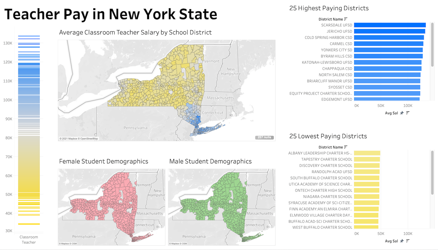
The Scarsdale Public School District is currently the highest paying district on average for teachers. The Scarsdale Teachers’ Salary Schedule – 2021-22 is an example of a salary guide that was negotiated between the district teacher’s union, Scarsdale Teachers Association, and the district’s Board of Education. The “Step” represented in the left column usually reflects the number of years a teacher has been teaching, but the beginning step number can be negotiated upon hiring. Each year, a teacher will move up one step from the year before, and their pay will increase accordingly. The level of a teacher’s education, represented in the other column headings, determines how much money a teacher will make at that step.

Process and Rationale for Designing the Visualizations
I began the process of visualizing teacher salary data by creating a simple scale from lowest to highest average pay. The New York State Department of Education offers yearly datasets detailing staff compensation, among other statistics. I imported the 2019-20 dataset into Tableau, selected the sheet labelled “AVG_SALARY,” and filtered for “Classroom Teacher,” so that the resulting graph would not include salaries for other school staff such as administrators.

The first two scales I created ran from green to magenta and green to orange. I chose green to represent money for the highest salaries, and magenta and orange worked as opposing representations for low paying districts. However, these warm colors were close enough to red, that they seemed like they might represent debt, which would be misleading on a scale representing only income.

I asked my classmate for advice on color options, and they suggested yellow and blue, which have fewer associated financial meanings. This was a good solution.
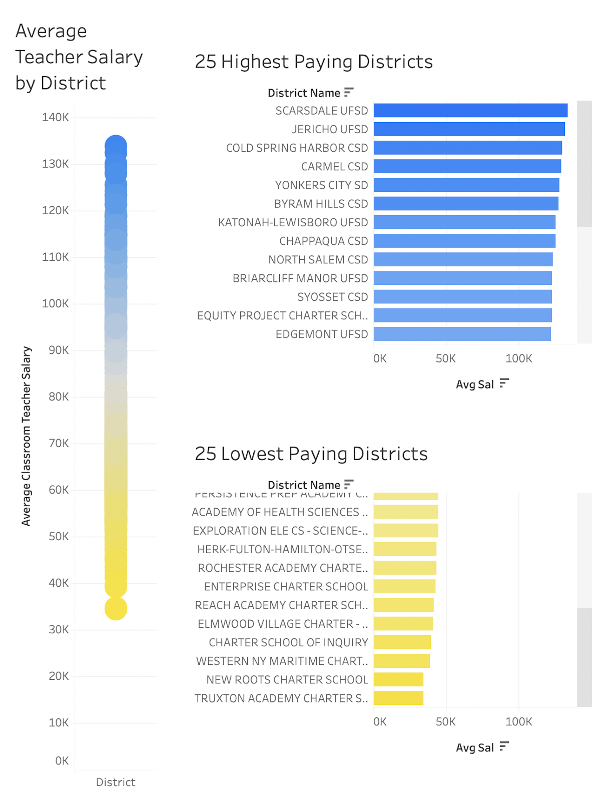
Next, I decided to highlight the top 25 and bottom 25 districts through the inclusion of two bar charts. The scale was useful, but it required hovering action in order to be read. Bar charts can be read without interaction, and the user can view multiple line items at once. I adjusted the color on these two bar charts to match the scale, and I set the x-axis to a fixed length of $140,000 so that the charts would display with the same scale.
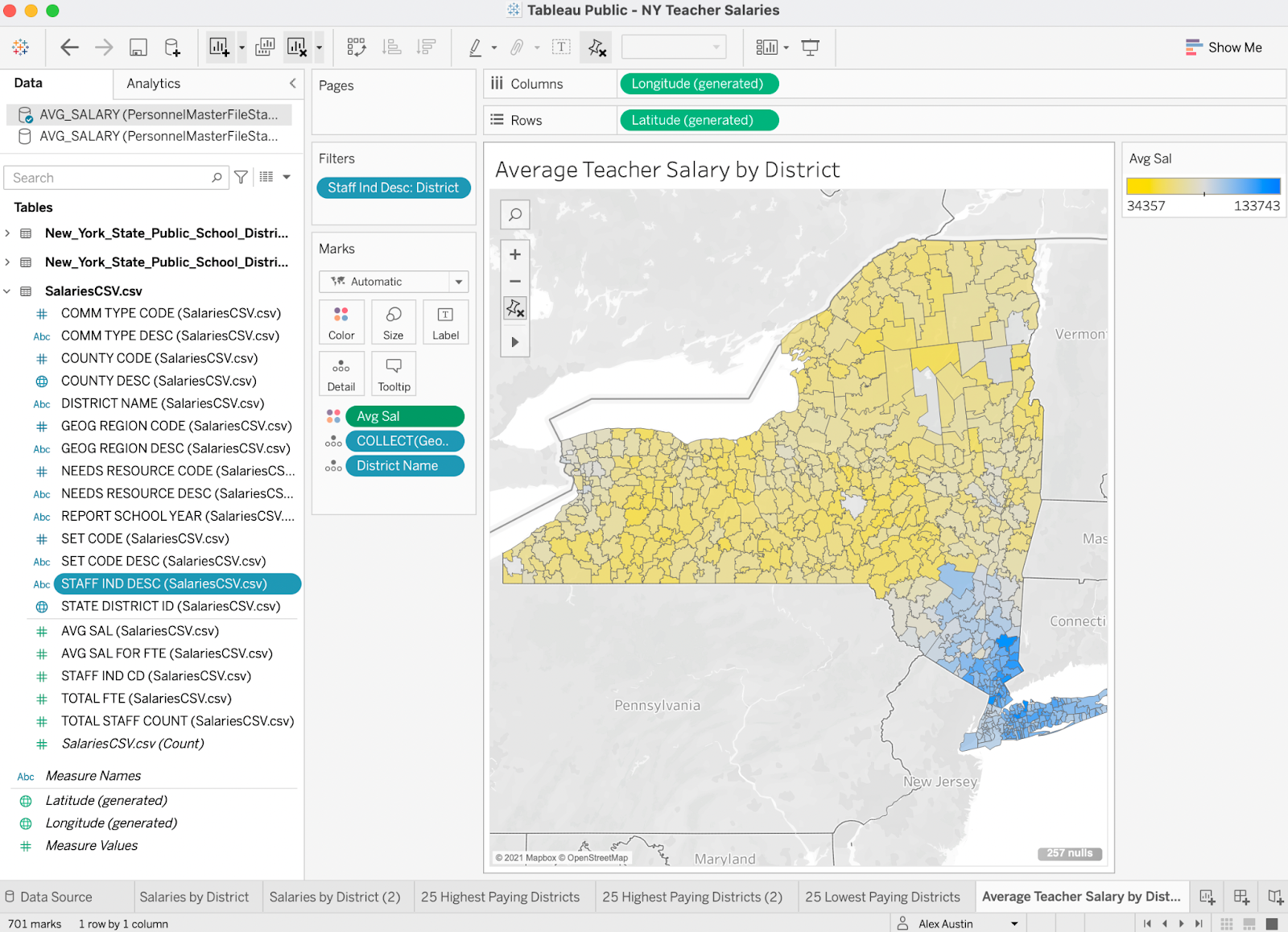
I presented my resulting dashboard for feedback from my class and also shared it with two teachers for feedback. All resoundingly agreed that this information would be much more meaningful with the inclusion of a map. I hadn’t created a map in Tableau before, nor had I connected two datasets to create one visualization, but I returned to the research phase and got to work.
I found a shapefile dataset for New York State School District Boundaries on ArcGIS Hub, and connected it to my other dataset by matching the 12-digit SED district identifier codes which were labelled differently in the column headings of each dataset. Soon, I had a map with color-filled districts that matched the values on the other charts I had made.
Technical Difficulties
After creating my map, I tried to save my project to Tableau Public, and I received an error message instructing me to “extract” data from one of my original datasets. The file would not save. I tinkered in the program, read the related help articles on the Tableau website, and visited forums when the first two solutions didn’t work. Extracting data was not an option on the version of Tableau that I had, so I had to close the program and rebuild my visualizations from scratch.
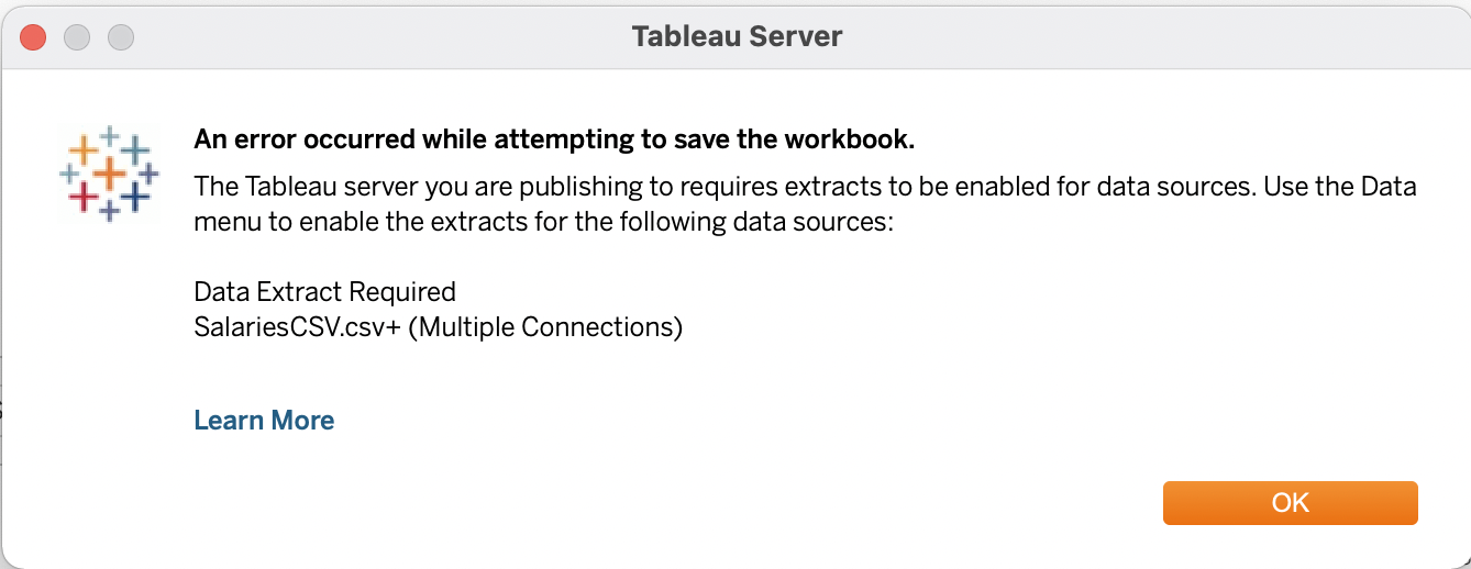
It was notably faster recreating the visualizations than it was creating them the first time around. However, when I tried to import more datasets to include demographic data in my dashboard, the “extracting” errors became more frequent and yielded more disruptive consequences.
What is not included in the salary guide is the additional money that teachers can make for supervising extracurricular activities and sports, which is another sum that can range from the hundreds to the thousands of dollars depending on the district.
Before aiming for tenure, a process which takes three or more years depending on the state, one should consider how the pay opportunities in their district compare to the pay opportunities in other locations. Districts can choose not to rehire untenured teachers without cause, so sacrificing tenure to move to another district mid-career can be risky. However, if a teacher recognizes that their pay is vastly lower than that of comparable counterparts in other districts, it may be wise to seek employment elsewhere.
Investigating Demographics
I had originally intended to include demographics data to provide a more well-rounded picture of the districts for potential teachers to inspect. The Office for Civil Rights in the U.S. Department of Education collects data on school districts and offers it publically through their Civil Rights Data Collection website. They provide information on demographics, budget and staff pay, subjects taught, and discipline and harassment/bullying statistics. For example, if you search for Tuxedo Union Free School District in Tuxedo, NY, and scroll down to the tab labelled “Discipline, Restraints/Seclusion, Harassment/Bullying,” you can see that while Black and Hispanic students make up only 20% of the student body, they are given 60% of the school suspensions. These statistics might send up a red flag for anyone wondering about the school climate.
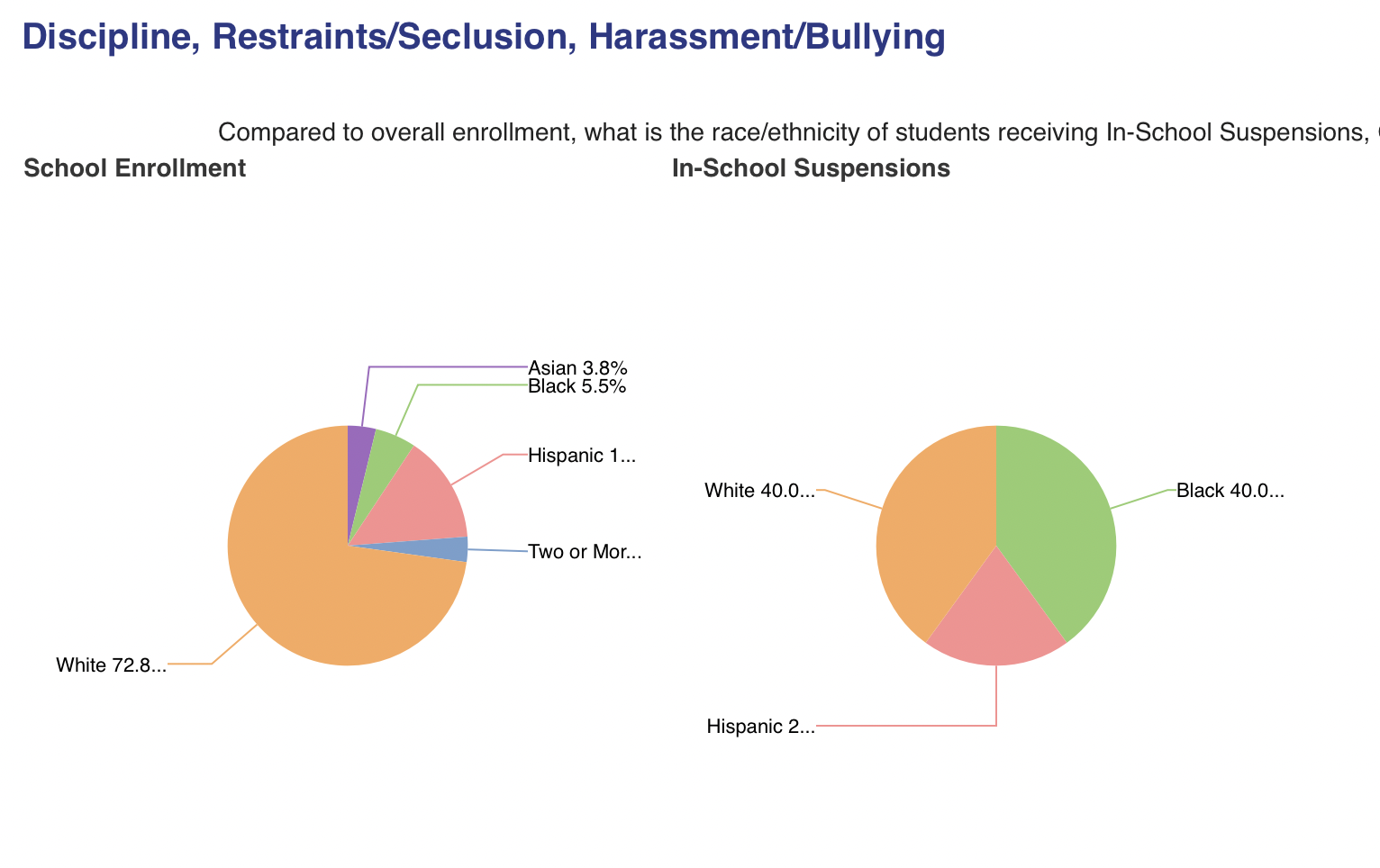
The CRDC website uses pie charts in small multiples, which provides the user with a clear and easy way to compare the percentages between charts.
I wasn’t exactly sure how I would incorporate demographic data into my dashboard, but I started by collecting datasets. On the CRDC website, I ran a search for all school districts in New York State, and used the “Choose Your Data” function menu to export Demographics – Enrollment Data. This created a dataset with demographic data for all districts in New York State.
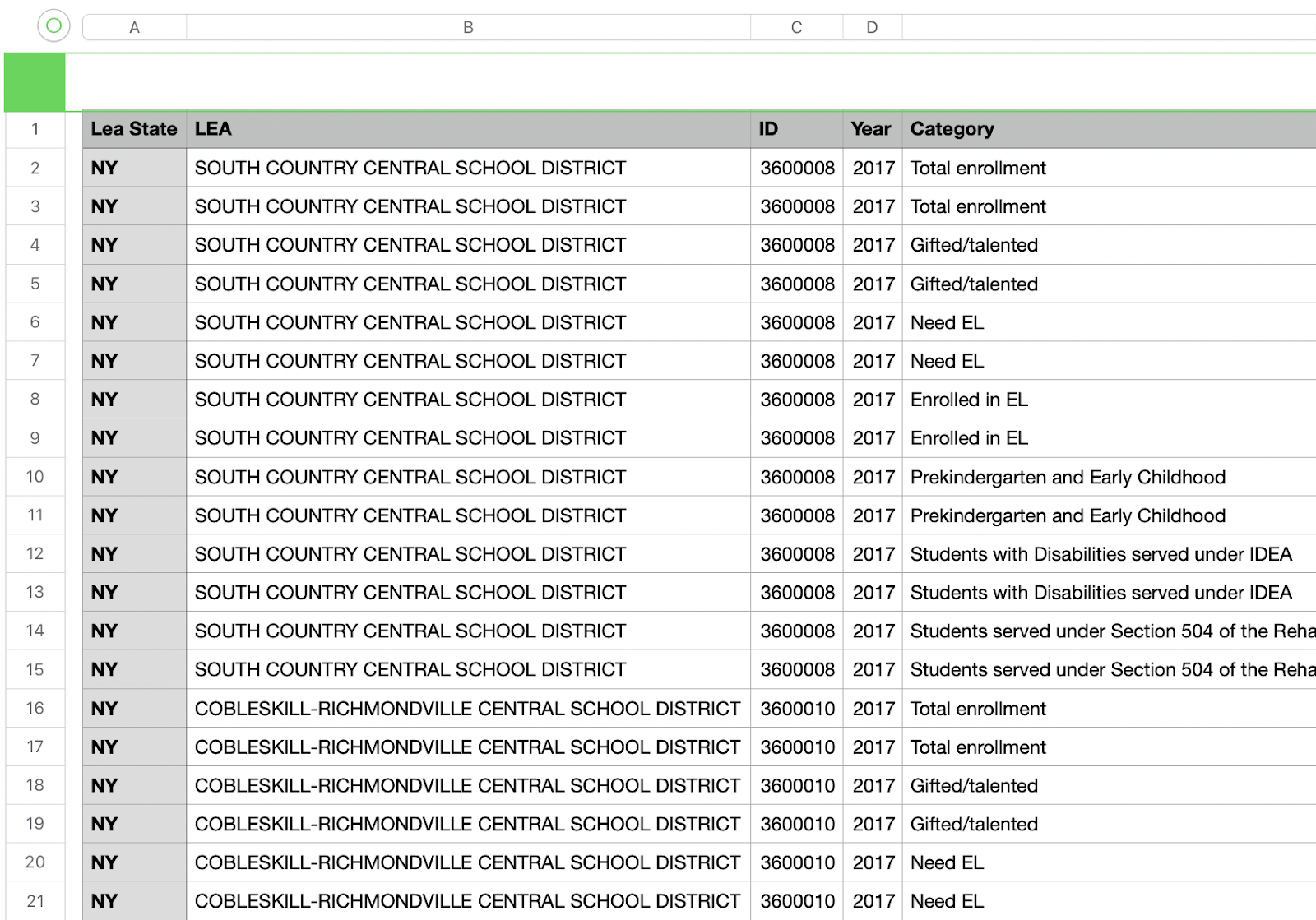
However, the district identifying numbers in this dataset did not match those in my other two datasets. These state district ID codes were 7-digit NY NCES LEA IDs, while the ones in my other datasets were 12-digit SEDs. I tried to find a dataset that linked the LEA IDs with the SEDs, but I couldn’t. However, I did find a dataset that linked the LEA proper names for districts with SEDs, so I could link the district names in this new dataset to the district names that appeared in my shapefile dataset (dataset: School Districts & BOCES_ Active School Districts listed within each BOCES with CEO Info). A ⌘F find command allowed me to confirm the matching data.
I connected the four datasets in Tableau, went to save my work, and received another “extract” error message. This would happen several more times throughout the process, as I would quit Tableau, reupload my data, save, connect the datasets, save, start creating visualizations with the new data, and save again. There seemed to be no rhyme or reason to this error message pattern. The program did start to lag more often when I was working on connecting the four datasets, so it may have been a glitch that had something to do with the size of the data I was working with.
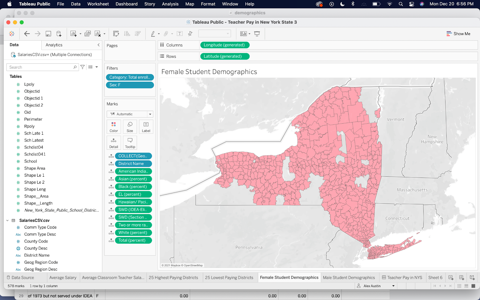
Finally, I was able to create demographic maps using the new data I had imported. However, there was missing data, and the statistics were separated by gender for each district. I didn’t like this arbitrary split, but I couldn’t find a way around it. In order for the information to display accurately, I had to create two maps separated by gender.
The two demographics maps, once added to the dashboard, did not flow with the other elements of the dashboard, both in terms of usability and topical relevance.
When hovering over one of the demographics maps, the salary data was difficult to read, because the user could only see the data highlighted across the visualizations as color and not as a specific number.

It was also difficult to read the numeric demographics data shown in the student demographics hover window. The district name was listed a third of the way down the list, making it difficult to identify. The statistics representing percentages were listed as decimal points instead of percentages, making them unintuitive to read.
Understanding the demographics data for one district would require the user to find and hover over the tiny district shape (which would only be a few pixels wide) on the Female Student Demographics map, write the numbers down, find and hover over the same tiny district shape on the Male Student Demographics map, record those numbers, and finally add them to the female numbers. This made for a terrible user experience.
But beyond a terrible user experience, the demographic data in the maps did not add much to the story of what it would be like to work in a district. Even though researching this data and adding these maps had taken hours of work, I knew I had to scrap them. Tableau apparently knew this as well, because when I tried to save them in a draft, it gave me another “extraction” error message. Without demographics, the focus of my dashboard shifted back to teacher pay.
Findings about Teacher Pay
The first and most surprising finding from making these visualizations was realizing just how wide the gap in average pay between the highest and lowest districts is. I had anticipated that the range of average pay might be something like $50,000-$80,000, but to realize that the range of average pay is $34,000-$134,000, one hundred thousand dollars between them is truly shocking. This means that about half of the classroom teachers at Truxton Academy Charter School make less than $34,000. The numbers are self-explanatory, but restating them in words hits differently.
The addition of the map was crucial in that it revealed the geographic pattern that governs teacher pay. Westchester, Rockland County, New York City, and Long Island all mostly reside in strong blue with high pay, while any district west of New Jersey and North of Connecticut quickly flip to yellow with low pay.
Nearly all of the low paying districts are charter schools. Charter schools usually do not have unionized teacher work forces. Without the power of collective bargaining behind them, teachers have less leverage over their salaries.
UX Feedback and Next Steps
One user suggested that since there is a high correlation between charter schools and low pay, I should include data on whether each district in the state is union or non-union. This was an excellent suggestion, and I spent a lot of time looking for information on which districts have unions and which don’t, but I didn’t have any luck. The next best thing may be to find a dataset that simply indicates whether a school is a charter school or not. I searched for this data as well, and to my surprise I couldn’t find a good dataset. But, I have a feeling that the latter is likely out there.
I also consulted a teacher who works in a NYC charter school and gets paid well. He noted that there is high teacher turnover in the school he works at. He was interested to see what the teacher retention rate is at the schools listed in the viz, as well as seeing a comparison of the cost of living with the salaries.
If I can find comparable datasets, I would like to create the same visualizations for New Jersey, Connecticut, Massachusetts, and potentially other states. If I were to map average teacher salaries across the whole U.S., it might make the most sense to present it in small multiples, with each state on a separate map. While it also would be interesting to see what the average teacher pay by state might be, on say a hex map, the viz that I have completed for this project has shown that the variation in pay by district from urban to rural areas is so large as to almost make the average pay of the whole state arbitrary.
I would like to research and add the information suggested by my users. The more information I add to the dashboard, the more complex the design challenges become. If I am to make these adjustments, I will need to work even harder on developing my viz design skills.