INTRODUCTION
The coronavirus has elevated data visualization, bringing charts and maps to the forefront of our news feeds and public decisionmaking. As governments scramble to collect and publish data, visualizations of cases and deaths are everywhere and terms like “flattening the curve” have become part of our vocabulary.
However, there has been relatively little visualization of governments’ responses, such as lockdowns and other restrictions, as the qualitative nature of the data makes comparison difficult. Oxford University has aimed to change this with the Oxford Covid-19 Government Response Tracker (OxCGRT), which I explored in this project. The dataset compiles data on government responses by country, including seventeen indicators and four composite indices. The data is collected by over 100 volunteers and is updated in real time, making it an impressive and important resource.
I focused on the stringency index, which represents governments’ containment and closure policies as a score from 0 (least stringent) to 100 (most stringent). The index includes countries’ policies around school closing, workplace closing, public events, private gatherings, public transport, stay at home requirements, travel restrictions, and public information campaigns. The data accounts for whether policies are country-wide or just in a certain region, with country-wide policies weighted more heavily in a country’s index score.
Data is provided by country-date, with each row representing a country on a particular date, with columns for the country’s policies.
I also included data on coronavirus cases compiled by Our World In Data, which aggregates data from the European CDC. This data reflects confirmed cases, which is likely significantly lower than the actual number of cases, depending on a country’s testing practices. This is a limitation of all coronavirus data analysis, although the available data is still meaningful.
My final product can be viewed here: https://public.tableau.com/profile/will.merrow#!/vizhome/lockdownsupdate/Story?publish=yes
PROCESS
My process involved reviewing existing visualizations, brainstorming, data analysis, and user experience research.
1. Review of Existing Work
Compared to other coronavirus data, there has been relatively little public visualization done with the OxCGRT data. The first that I looked at were from Oxford itself.
Oxford’s choropleth tool allows for exploration of the stringency data by country over time, although the color scale is somewhat hard to read and the aesthetics could be improved.
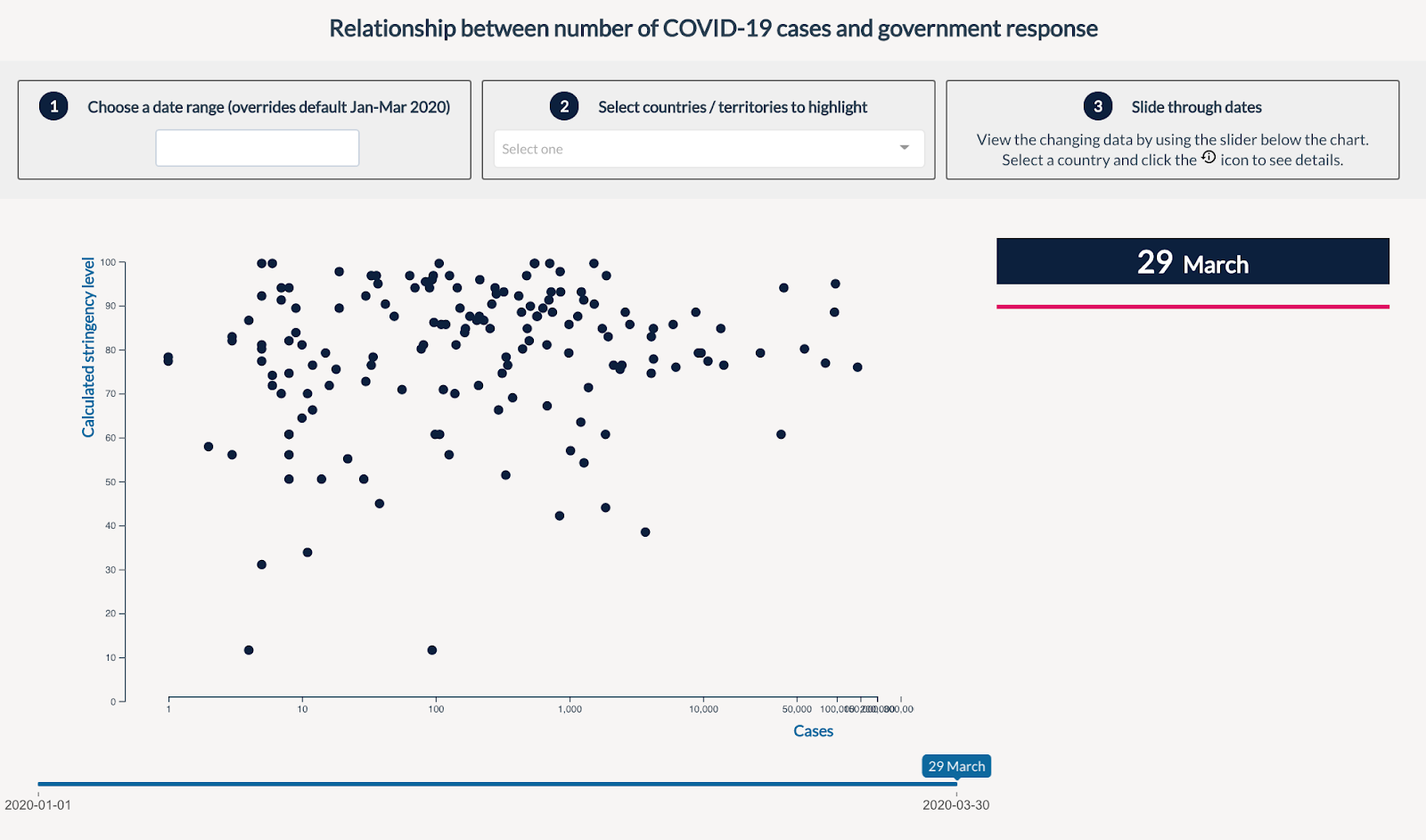
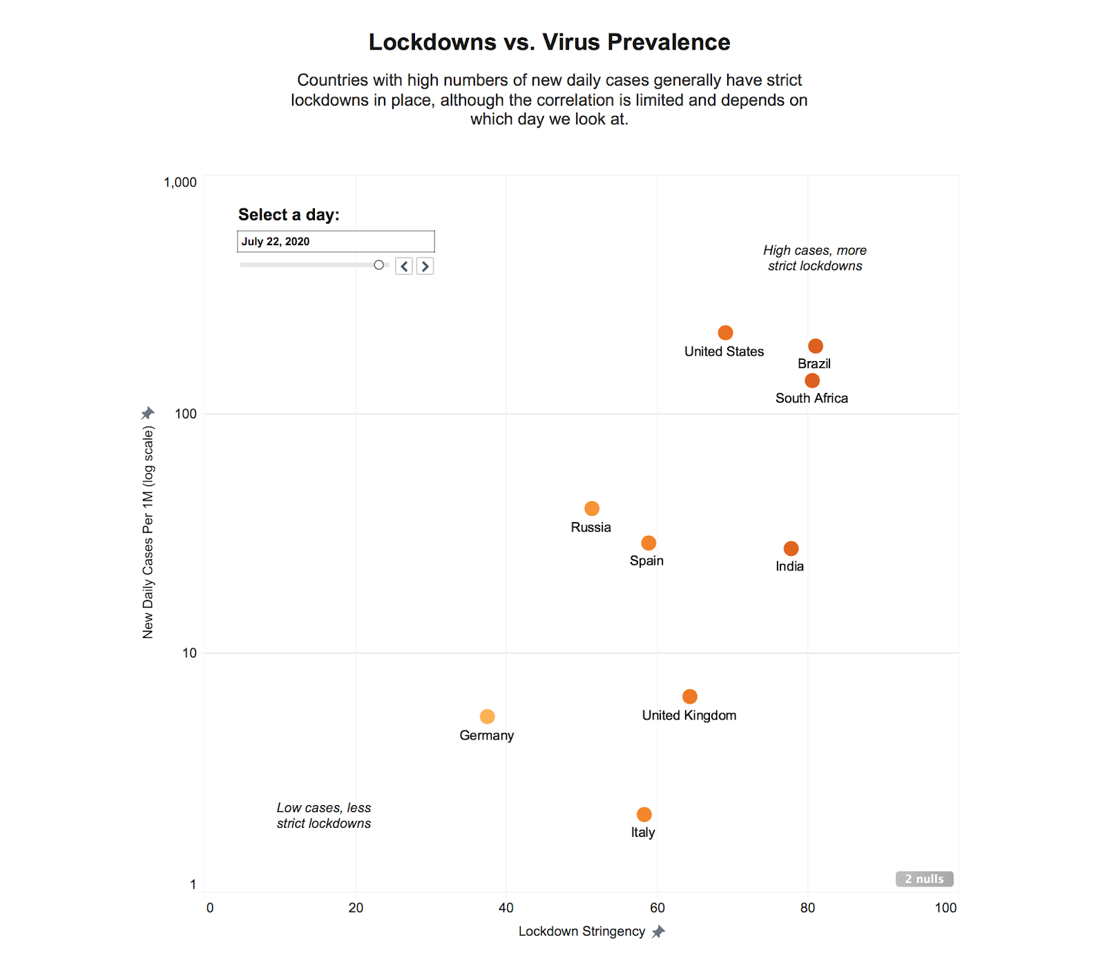
They also include a scatterplot tool with countries’ stringency scores versus the number of coronavirus cases. While the appearance and usability could be improved, I found the graphic compelling and modeled one of my charts after it.
Oxford also includes charts for individual countries showing both the overall government response and the number of deaths over time, using two y-axes, with a log scale for deaths.
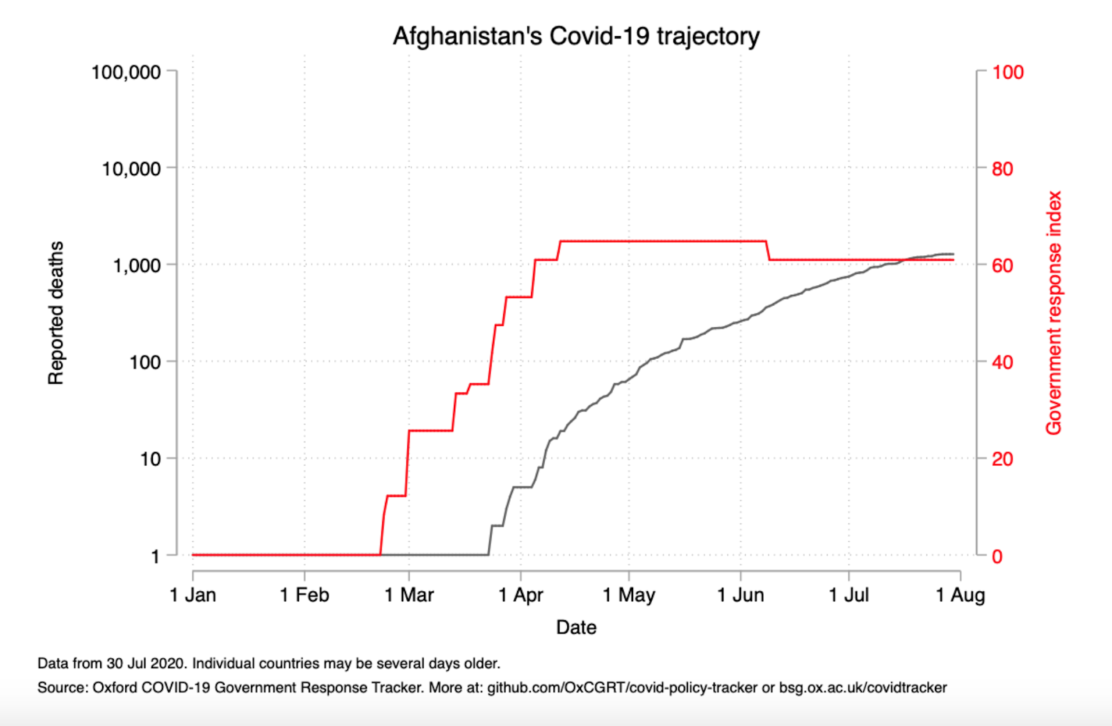
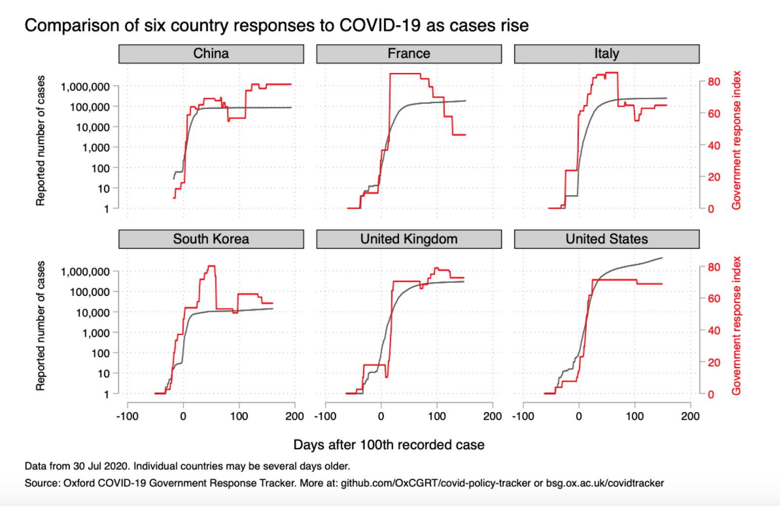
While dual axis charts and log scales can both be difficult to interpret, here the presentation is useful and important for understanding how the two might relate. This led me to think about how else I could approach showing both variables over time.
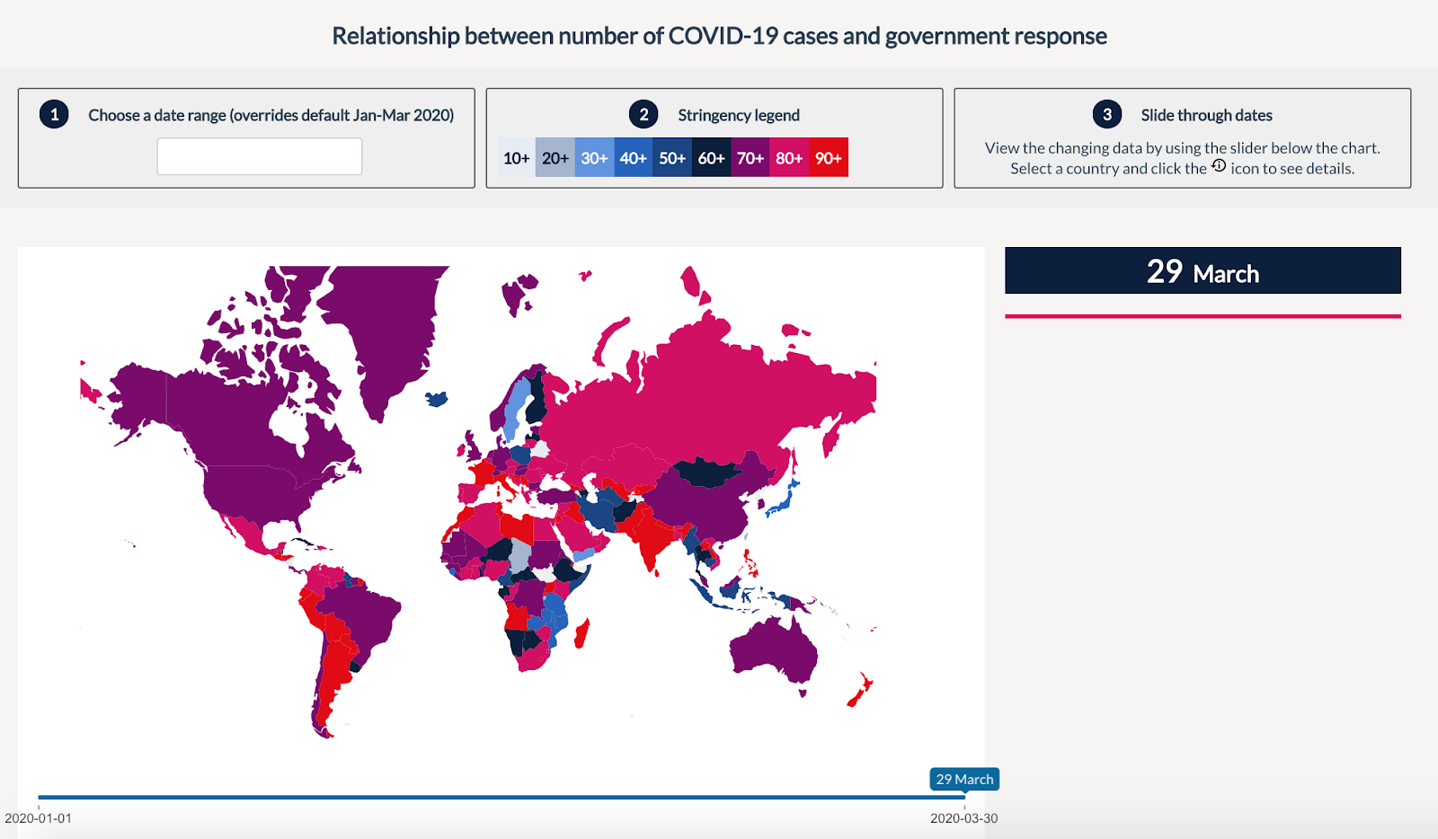
Our World in Data has also published visualizations of the Oxford data, mapping each individual indicator as well as the composite indices:
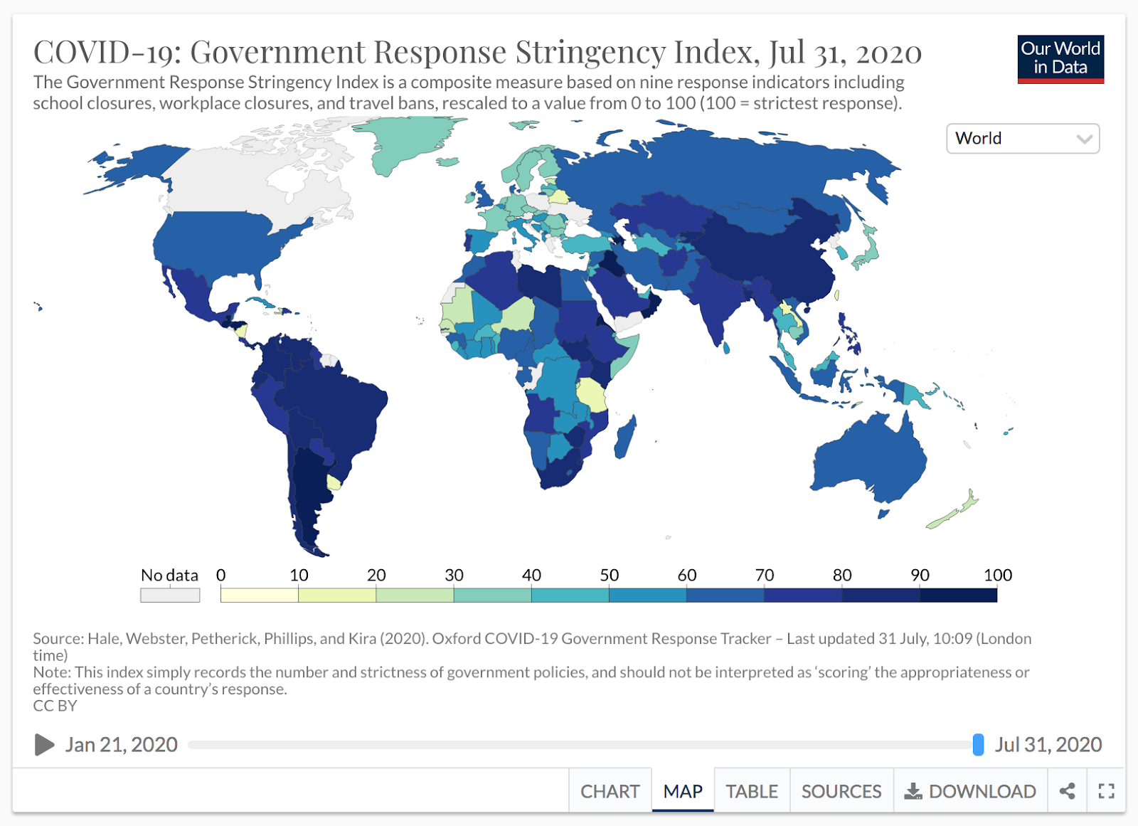
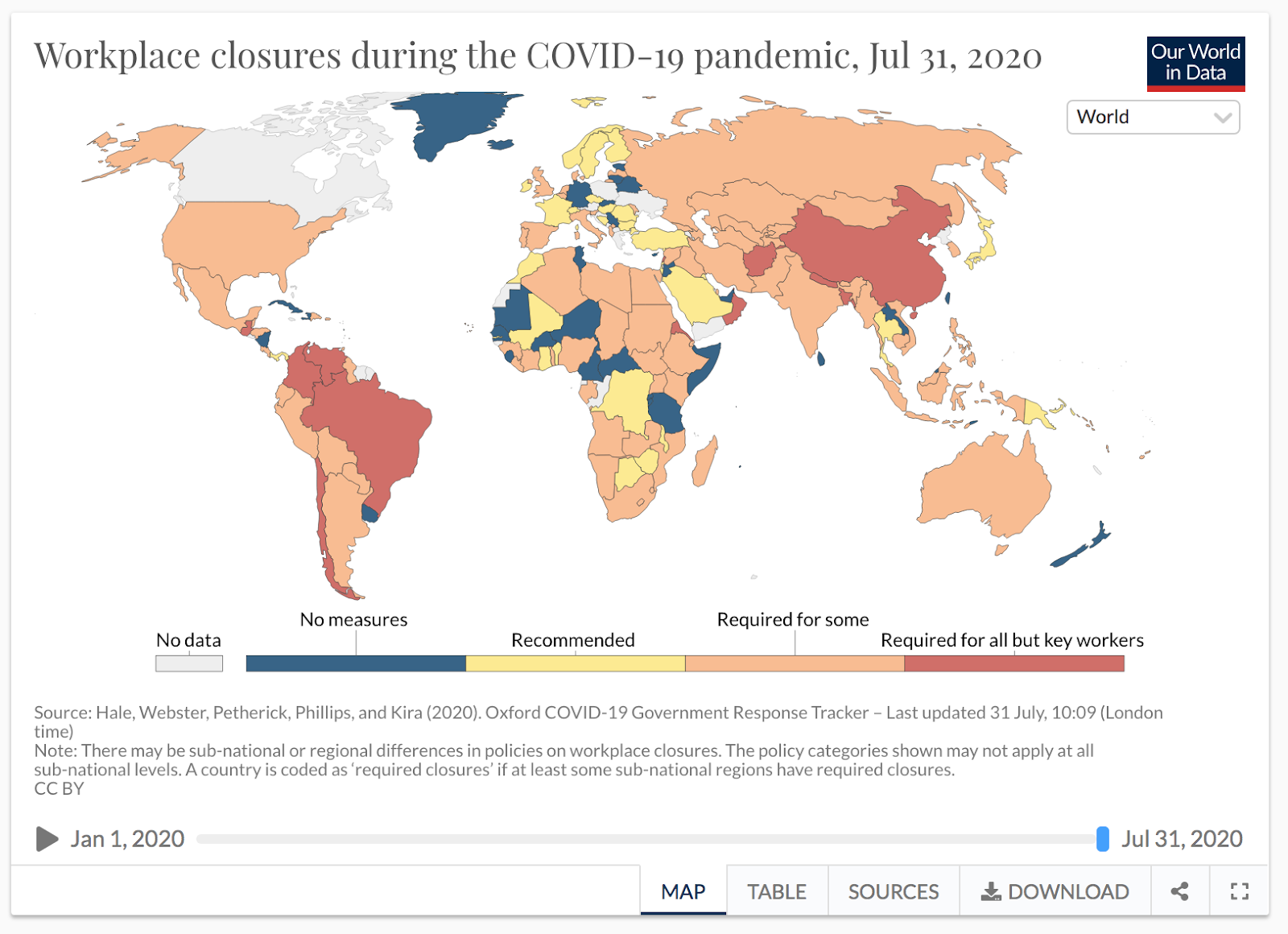
While these maps are interesting and easy to understand, they don’t guide the user to understanding the relationship between lockdowns and cases, which I decided would be my focus.
Finally, I referenced coronavirus graphics by the New York Times and the Washington Post, paying particular attention to how they chose to compare countries and dealt with the challenge of visualizing cases data which varies widely by country and exhibits exponential growth.
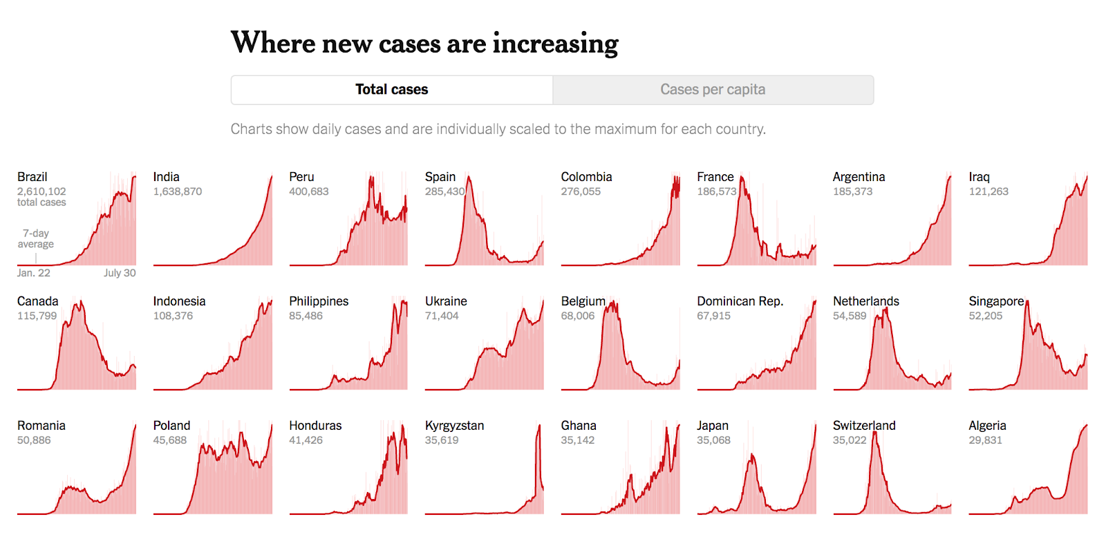
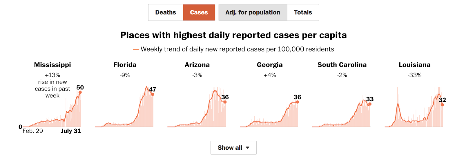
This visualization from the New York Times’ dashboard stuck in my mind as an example of a different way to show historical data in a compact format, and inspired some of my charts:
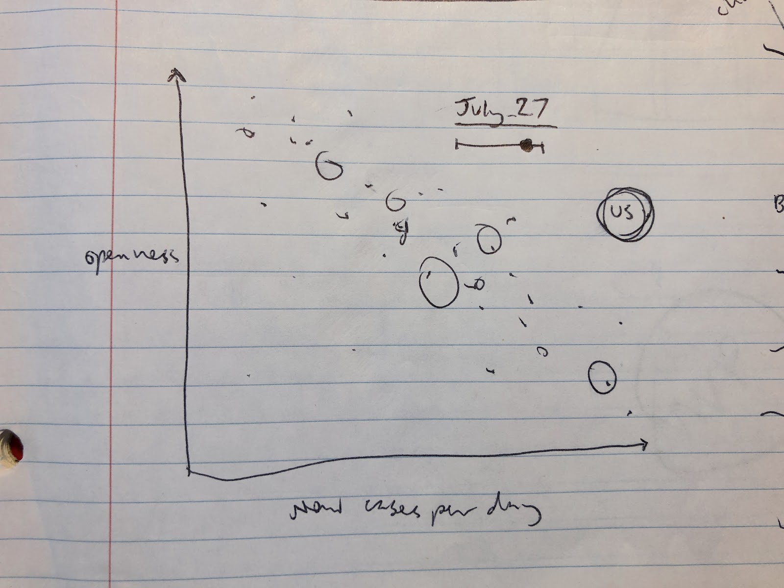
2. Brainstorming a Concept
After finding the data and reviewing existing examples, I decided I wanted to focus on the relationship between lockdowns and the spread of the virus, motivated by the wide range of government responses which we are seeing play out in real time.
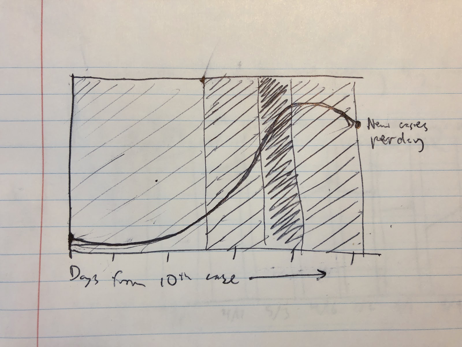
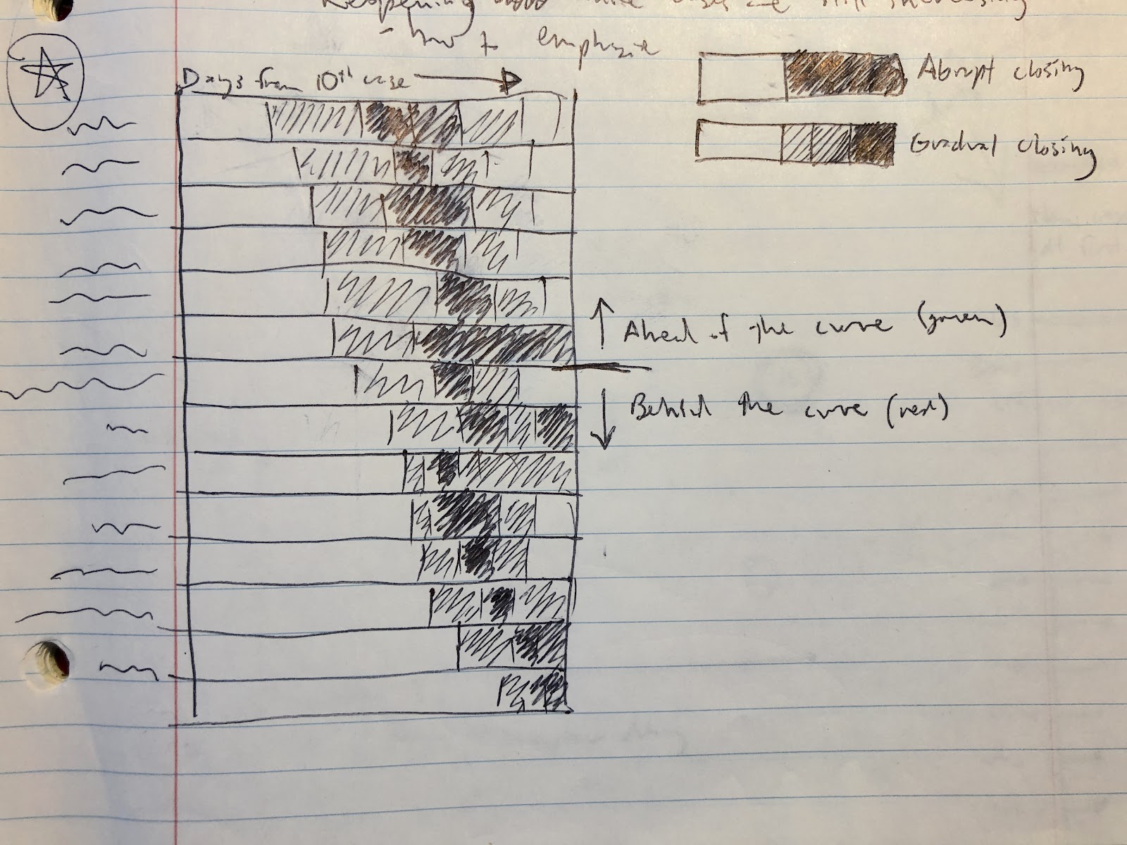
I began by drawing some rough ideas to help brainstorm visual approaches. This produced the ideas of using background fills in place of a dual axis, and using days since reopening on the x-axis rather than the actual date.
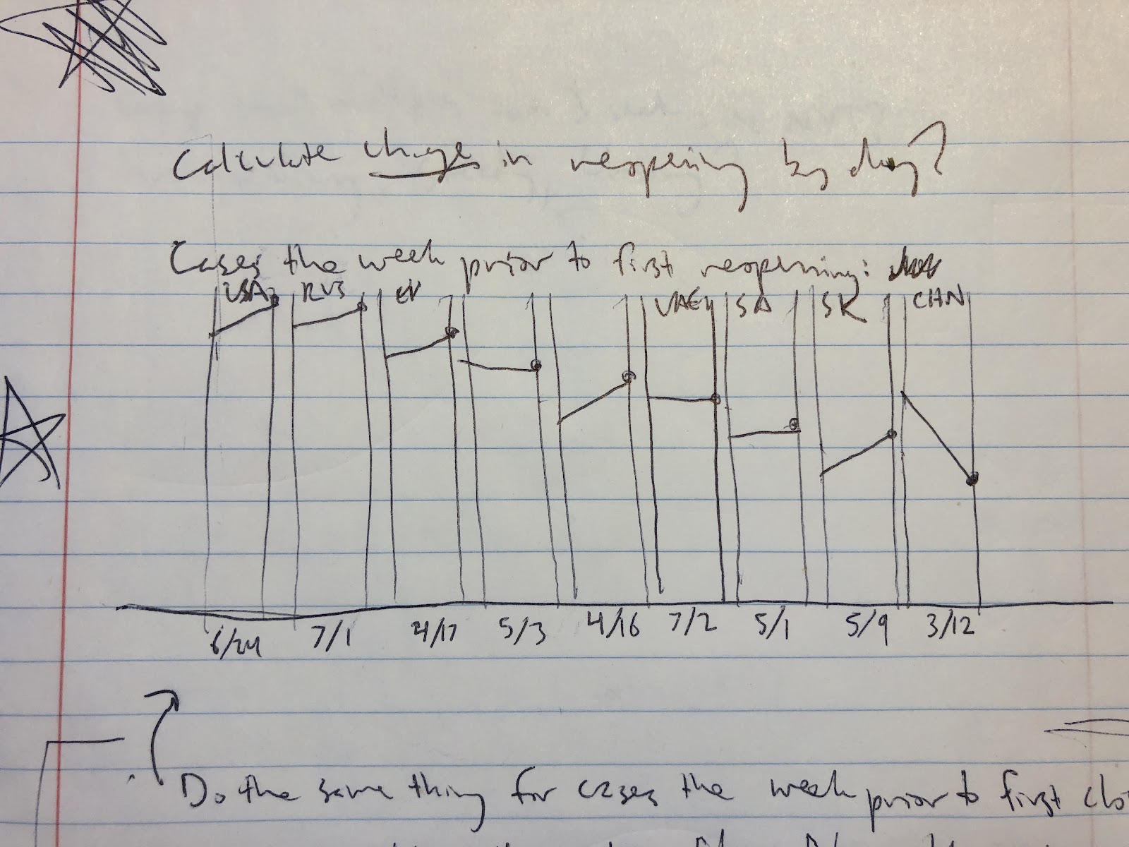
3. Data Preparation
While the data was provided in a clean and usable format, I knew I wanted to add additional variables and do some calculations for the analysis I had in mind. In this step, I worked in Excel and R given the large size of the dataset, and carried out the following operations:
- Limiting to countries of interest
- Reconciling date formats
- Joining with Our World in Data numbers for cases, deaths, and population
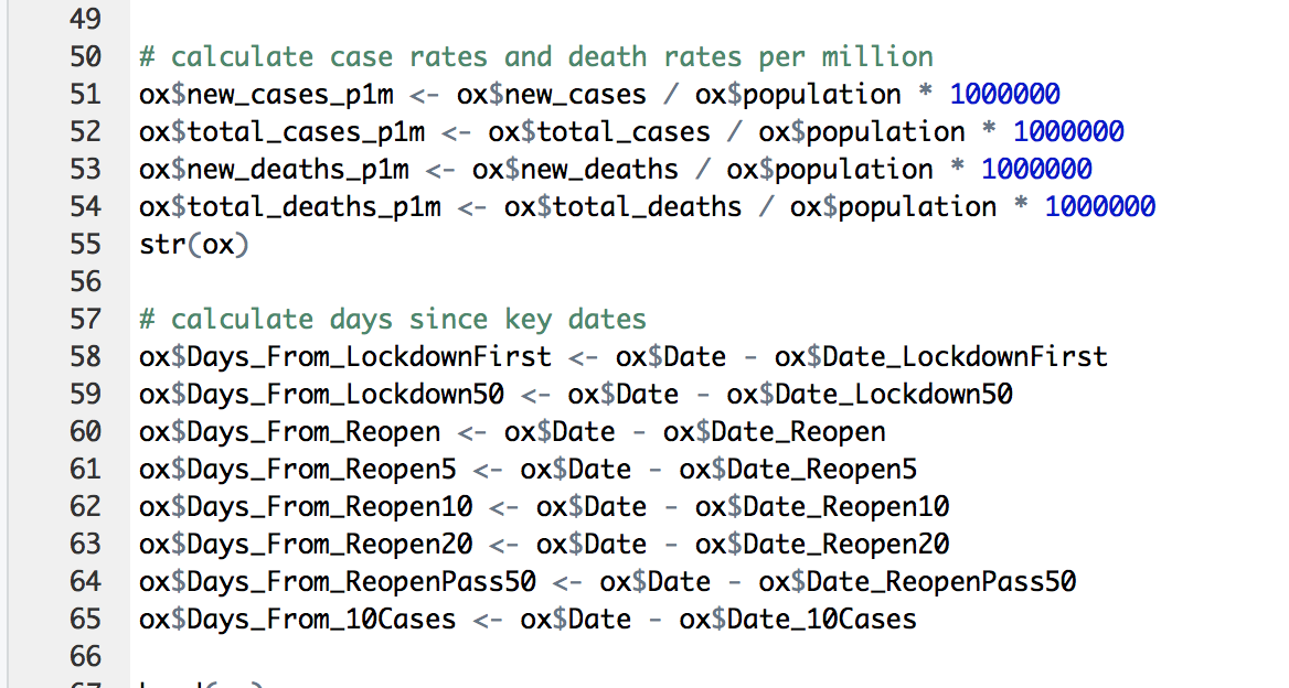
- Calculating cases and deaths per million people
- Adding key dates for each country (date of 10th case, date of reopening)
- Calculating days since key dates (days since 10th case, days since reopening)
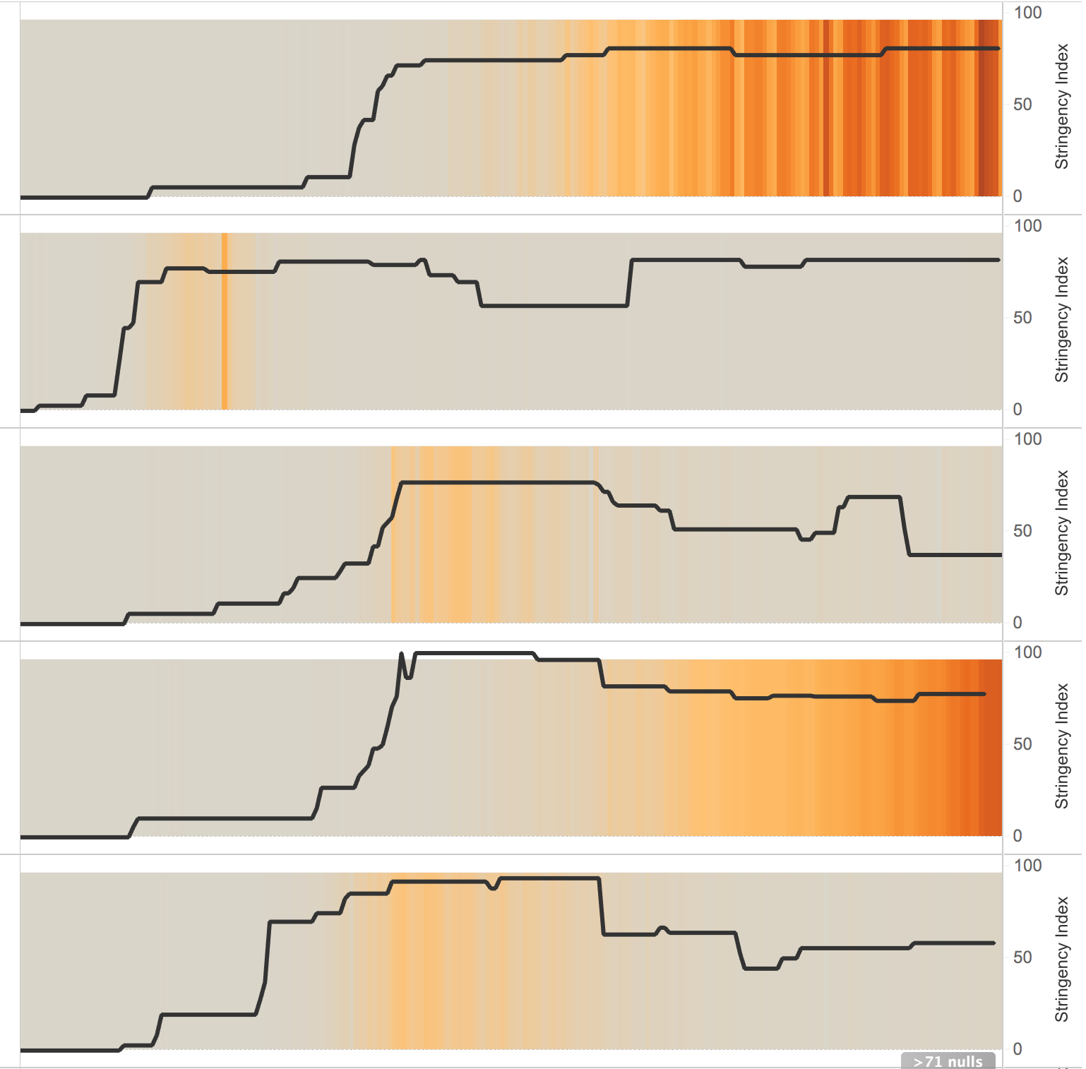
Determining what to use as the dates of reopening proved tricky because the stringency index is a continuous variable from 0 to 100. I initially used the date of the first decrease of stringency, and later changed to the date it first decreased by 5 points relative to the last peak.
I manually determined the dates for each country, although in the future this could be done with a function to be more scalable.

I used R to calculate the number of days from the key dates:
4. Production
I decided to create my final product in Tableau, which was the best choice in this case for creating a variety of visualizations quickly, with some interactivity and customized styles.
One early challenge was how to create a background fill of a variable color. After trying a few options, I began playing with a dual axis line chart, with one of the lines using a dummy variable for its height, colored according to stringency index. This was close, but didn’t fill the chart background like I was hoping:
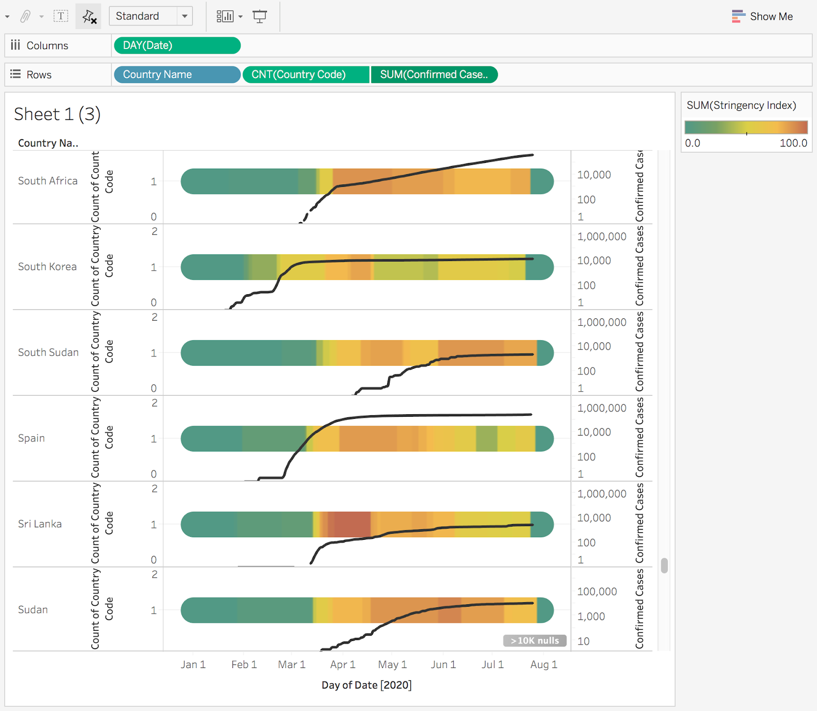
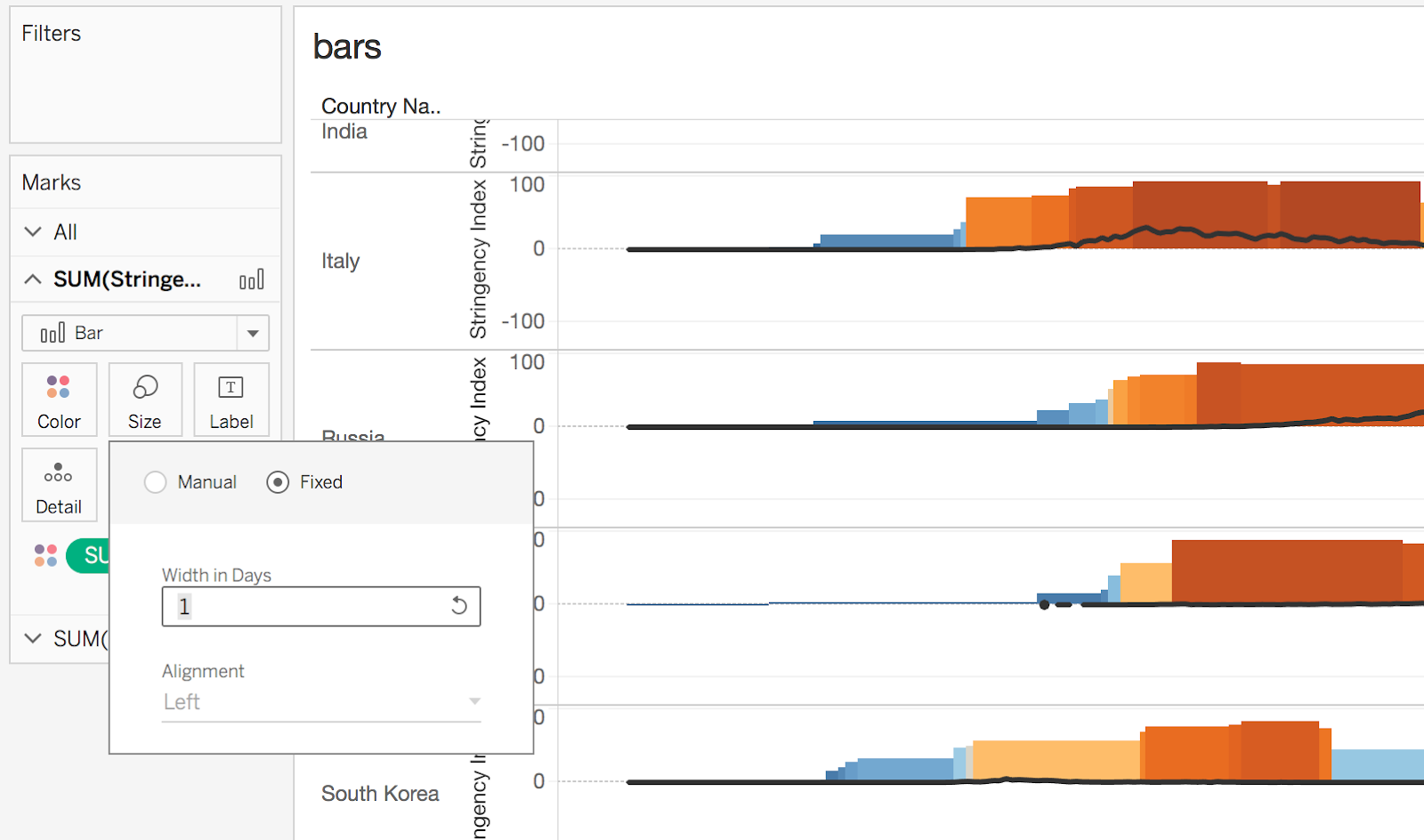
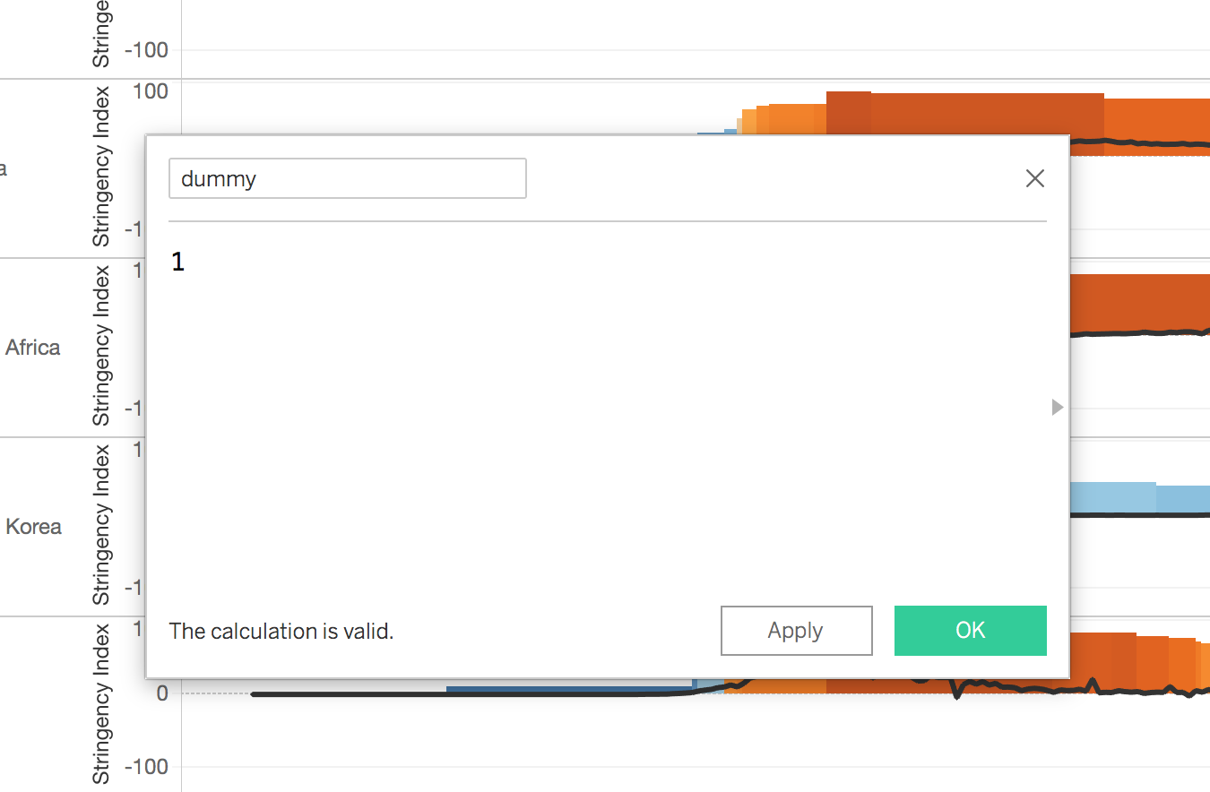
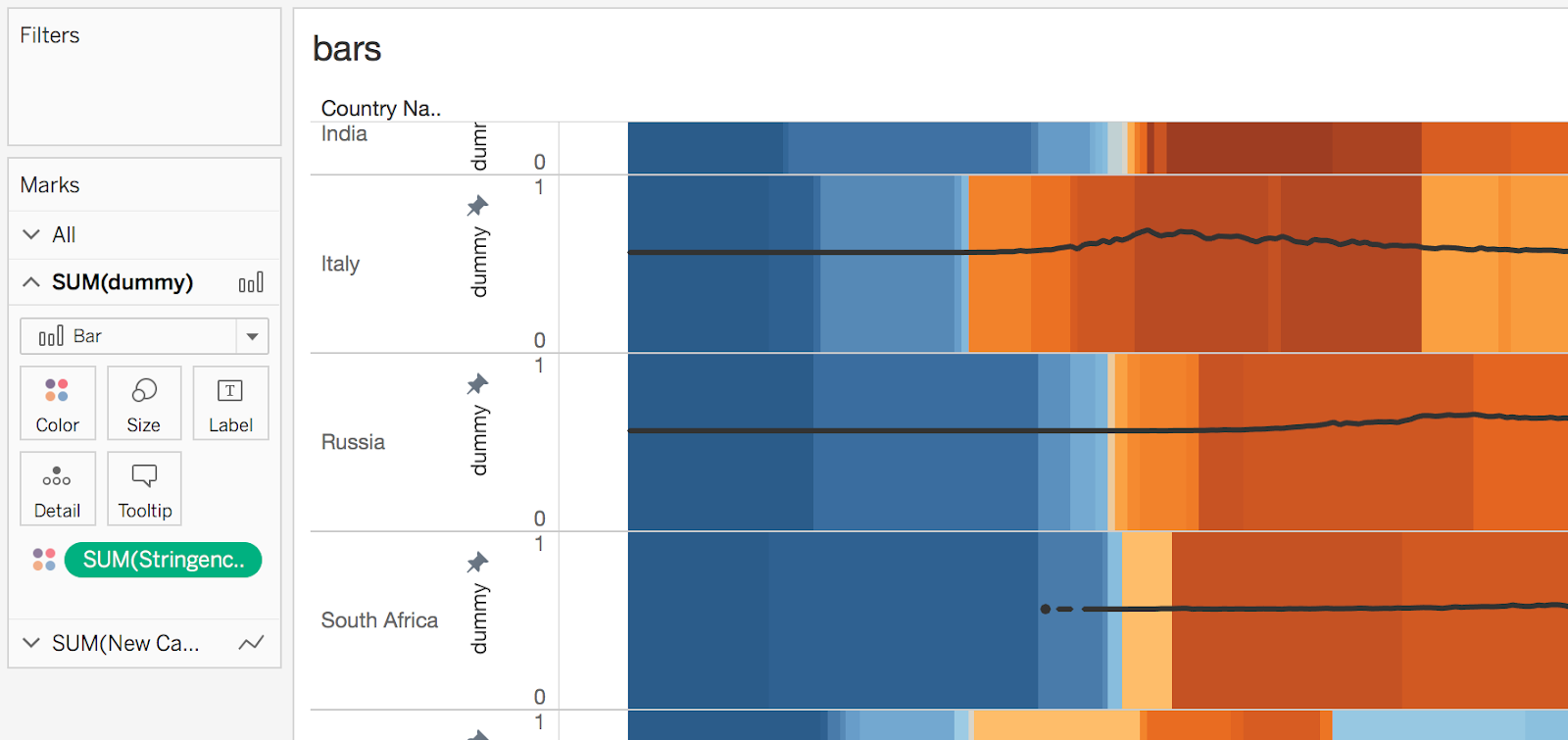
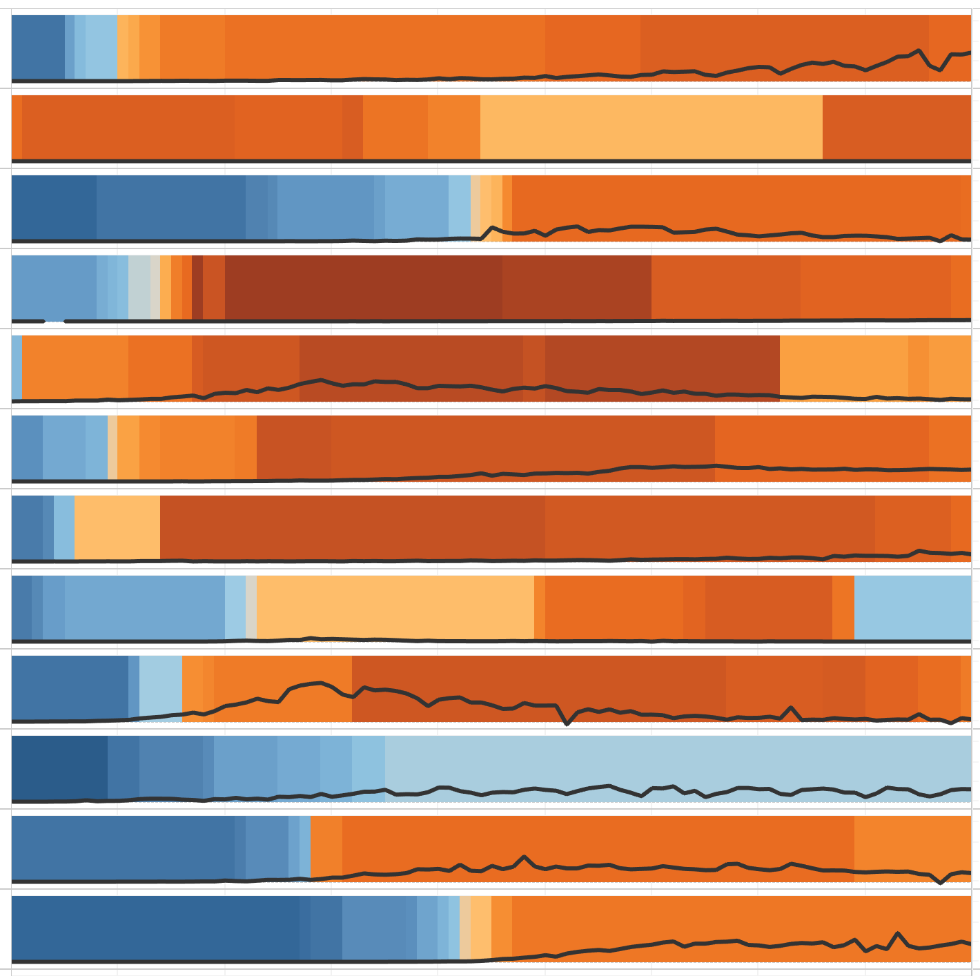
Filling the background proved to be possible with a bar chart, coloring by stringency and setting the bar width to 1 day so they didn’t overlap, then using a dummy variable to get bars of equal height and adjusting the axis min and max so the bars take up the full chart area:
One exploration was to switch which indicator was the line and which was the background – this was an interesting effect visually, although I ultimately decided it was less effective:
I created four finished drafts, each a Tableau dashboard designed to be viewed in sequence, to test with example users.
5. UX Research
I tested the drafts with two participants, with the goal of assessing user experience, specifically, understanding how they interpreted the visualizations, whether there were areas of confusion, and what they learned from the graphics.
I chose two participants who fit my target audience. Both were around 30 years old and residents of Washington, D.C., and most importantly had an interest in public policy and government responses to the coronavirus. One worked in government, while one worked for a nonprofit.
I conducted user tests by video chat, with the participant sharing their screen so that I could see how they interacted with the visualizations, while I took notes on a pad. I used the think aloud method, asking participants to verbalize their thoughts as they interpreted and interacted with the graphics.
Because the graphics are somewhat complex and unconventional, my main concern was determining whether the participants were able to understand them easily. Some of the most important findings were:
Understanding the bar/area plots
- Both participants understood the first graphic relatively quickly, aided by the explanatory text below the title
- Both participants used the title and subtitle text to understand the graphics, in addition to referencing the axis labels
- Both participants used the tooltips, both in understanding what the graphics represented and in interpreting the data
- For one participant, the meaning of the black areas representing cases was not clear at first glance
- Some of the graphics were hard to interpret at first because of the x-axis, although both participants eventually were able to understand all graphics on their own
- The third graphic was understandable, although the slight decreases in stringency were difficult to see
- Both participants had difficulty with the second chart at first glance because they did not immediately understand the x-axis, and learned by the third graphic that they needed to scroll down to see the x-axis
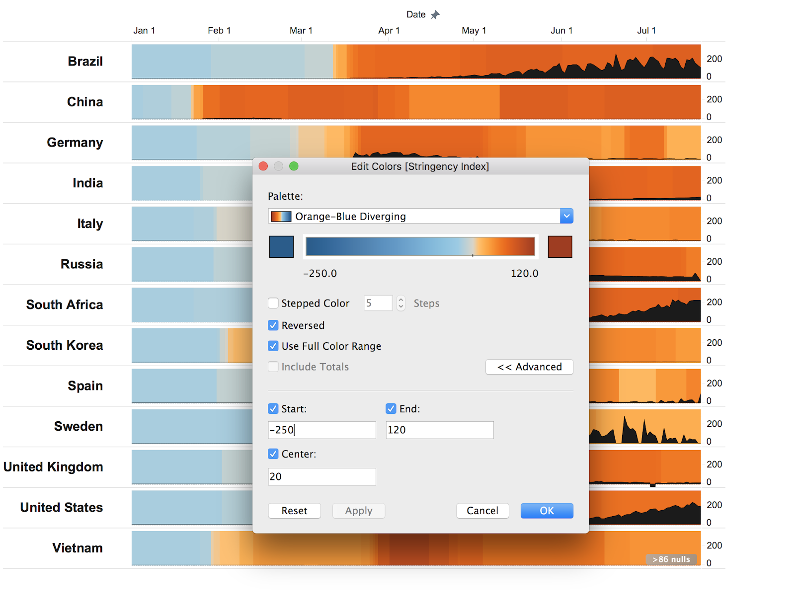
- One participant did not understand what the different shades of blue meant, mistakenly thinking that any shade of blue meant no lockdown was in place (when in reality the transition from blue to orange happened at 50, the midpoint of the stringency index)
Understanding the scatterplot
- Both participants liked and understood the scatterplot, although did not notice it used a log scale until prompted
- Both participants used the italicized help text on the scatterplot in determining how to read it
- Both participants initially did not see that they were able to change the date of the scatterplot
Likes and dislikes
- One participant wanted to be able to see cases on the second graphic, and also wanted to be able to see total cases in addition to cases per million
- One participant remarked how useful the sorting of the second graphic was
- One participant remarked on how useful the compact design of the second and third graphics was in order to see all countries at once
- Both participants enjoyed using the date slider on the scatterplot once it was pointed out to them, and one suggested that animation could help with interpreting the changes over time
What participants learned
- Both participants understood correctly that there is no overarching pattern of the impact of lockdowns or reopenings always leading to cases rising or falling, and that this was probably due to the reality of other variables being involved
- Both participants found some stories in the data that surprised them, such as the low number of cases per capita for China, India, and Vietnam
6. Refining
I made some changes after testing the draft with the users. Perhaps most importantly, I moved the date axis labels to the top of the charts, since this seemed important for both users. This is only possible in Tableau through a dual axis, adding the x-axis variable a second time to get an axis at the top, and hiding the bottom axis labels.
In addressing the comment about the color scale and the meaning of blue versus orange, I considered changing to a single hue color scale, although opted instead for an adjusted version of the blue-orange scale with the color center placed at 20 rather than 50. This was subjective, although looking at the data methodology I judged that 20 was a reasonable choice. Additionally, by starting the scale at a number below the minimum possible value, I was able to minimize the stark jump between blue and orange.
To address the comment on the third graphic about small decreases in stringency being difficult to see, I changed the date I was using as the date of reopening, opting for the date when stringency had decreased by a cumulative amount of 10 or more, even though this excluded some countries.
Finally, I made the scatterplot date slider more prominent and added animation.
DESIGN CHOICES
My goal with this project was to explore the timing of lockdowns and coronavirus cases, to help users understand what impact lockdowns or reopenings might have had. I wanted to allow some user exploration while keeping the focus on specific stories. This led me to create a few different visualizations with a narrative tying them together.
I began with the intention of visualizing all countries, but eventually decided to focus on a subset, both for practical reasons and because I felt this helped to focus the user on the main takeaways in the data, using a small number of countries as examples of the different patterns.
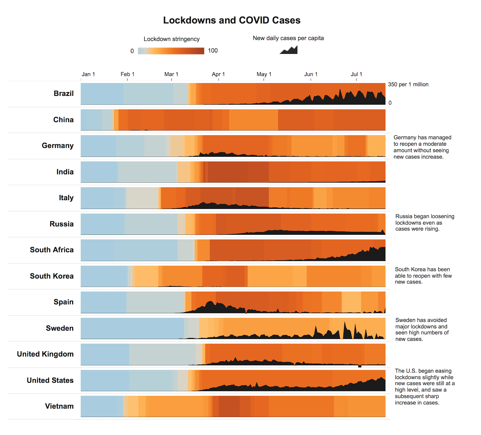
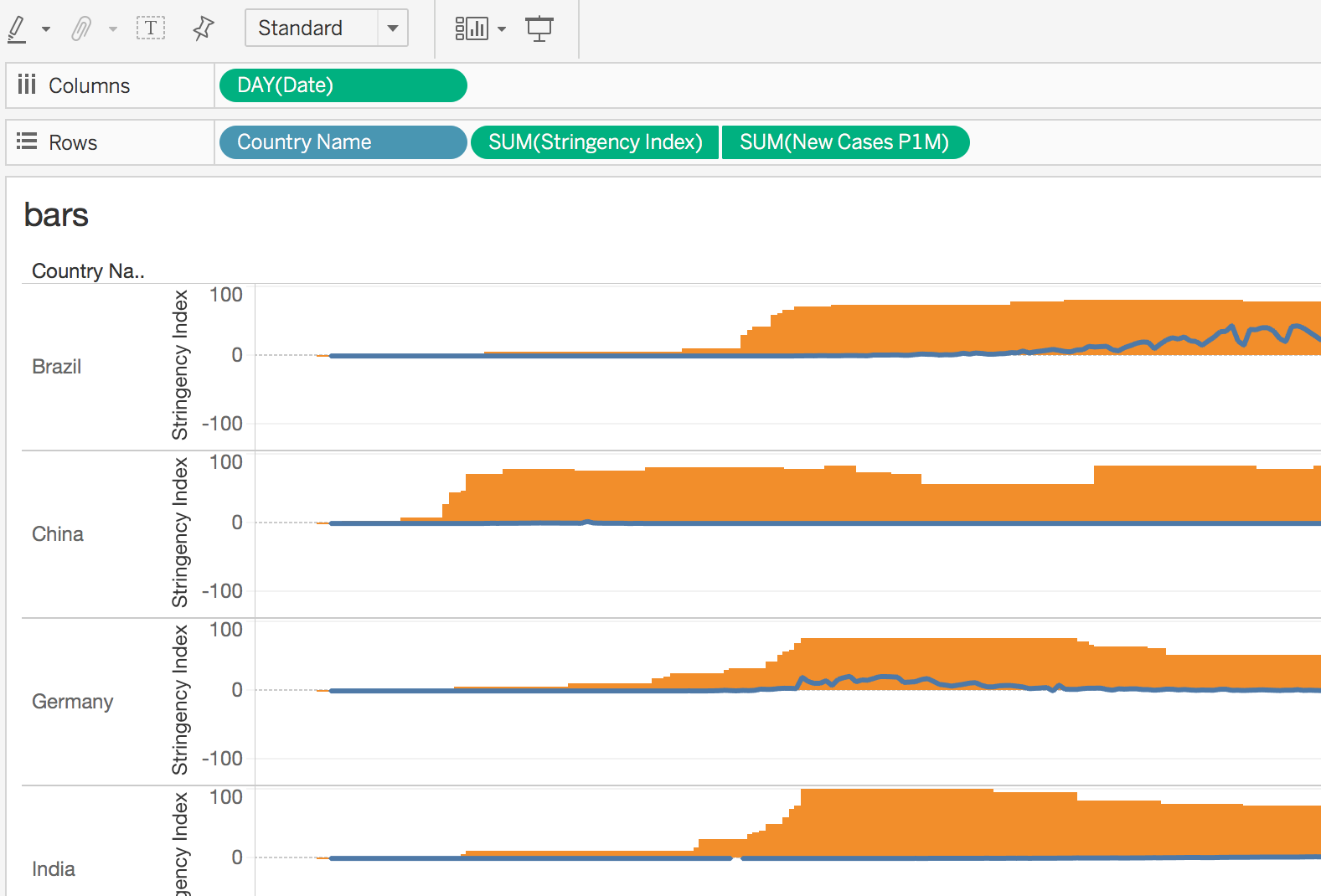
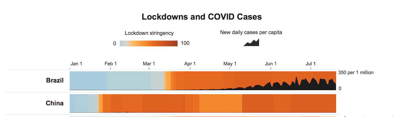
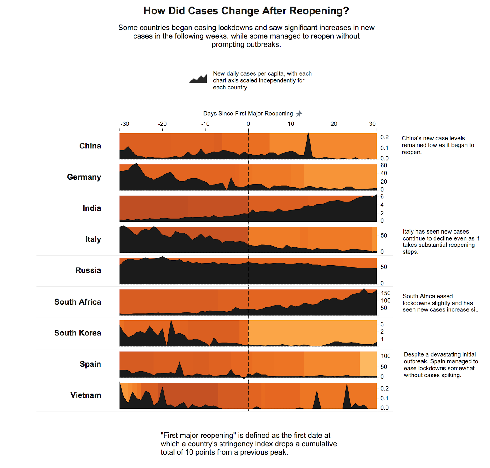
I wanted to visualize two variables over time without using dual axis line charts, because they can imply that the heights of the lines are related when in fact the units are different. This led me to overlay an area chart on a colored background:

I chose black for the area charts as a neutral color that would provide a strong contrast with the background, which needed to include both light and dark colors of varying hues.
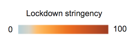
For the background color, I opted for a blue-orange scale, which is colorblind-safe and suggests increasing urgency without using a more negative color like red. Using multiple hues can suggest that the color midpoint is important, which is not the case here, so I stretched the scale in order to use more blue and gray values.
For the area charts, I wanted to avoid a log scale given the difficulty of interpretation. I used new daily cases rather than total cases to focus on the rate of change, and cases per capita to focus on the severity of outbreaks for each individual country.
I used an icon as the legend for the area charts to provide a quick visual reference, and added labels for only the first y-axis given the large number of charts and the availability of the tooltip.

I wrote the chart titles with the goal of helping the user quickly understand what they should be looking for in each particular chart.

For the scatterplot, I chose to use a log scale as Oxford University did in their own scatterplot. This is a risk, and wasn’t immediately clear to my test participants, although I felt it was the only way to allow comparisons on this type of chart given the huge differences in the numbers of cases.
FINDINGS
For me, there were several takeaways from exploring the visualizations:
Some countries locked down much more quickly than others
Countries like China, Italy, and Vietnam locked down before or soon after their 10th confirmed case. The U.S. waited to lock down until weeks after its 10th case, and interestingly, Germany and Sweden did as well.
Some countries have seen cases rise after reopening, while some have not
For example, the U.S. reopened slightly in mid-June and saw new cases rise afterward. However, the U.K. reopened to the same stringency level and with a similar level of new cases as the U.S., and saw cases decline.
Countries with low cases have been able to reopen somewhat, although they are still locked down to some degree
Germany, Italy, Spain, and South Korea have been able to reopen, although all have maintained some lockdowns, with a stringency index of around 40 to 60.
Countries with high numbers of new cases have been forced to remain locked down
The U.S., Brazil, and South Africa have maintained lockdowns for weeks with a stringency index of around 70 to 80, while seeing cases rise.
Sweden is an outlier in terms of lockdowns
Sweden is taking a different approach from other countries. It’s level of lockdown is far lower than the other countries included, and it waited a week since its 10th case to take any lockdown measures at all. Unfortunately, it is seeing very high numbers of new cases per capita.
China and Vietnam have very low numbers of new cases
Per capita, China and Vietnam are doing far better than other countries in containing the virus. Both locked down to some degree before their 10th confirmed case. Remarkably, Vietnam was able to go nearly two months with only moderate lockdowns while maintaining very low case numbers.
FUTURE DIRECTIONS
Future updates could include deaths as well as cases, or provide different views of cases on demand such as changing between new cases and total cases, or between consistent axes and individually scaled axes.
One large area I did not explore is the individual component indicators in the Oxford dataset (school closures, workplace closures, etc.) or the other indices beyond the stringency index. These could create many more interesting analyses.
Additional user testing would also be helpful. The complexity of the graphics could potentially be reduced to be more accessible to a wider audience, although the constant presence of similar graphics in the news makes me optimistic that this could appeal to a range of users.
Perhaps most importantly, future updates could include more updated data, which would provide further information about the relationship between lockdowns and the spread of the virus.