Lab report by Kyle Palermo for final InfoVis project.

View a larger copy of the visualization here:
Background
How do the subjects of headlines relate to the language used in those headlines, and what kind of story would this information tell us about the news cycle? This year the news feels especially understandably polarized around two cataclysmic events—the COVID-19 pandemic and the eruption of protests following the murder of George Floyd. Editorial shakeups have also brought some ongoing discussions about the appropriate boundaries of opinion in the newsroom to a head. In this context, it seemed like it might be interesting to look at the major nodes of news coverage and how language clusters around those nodes.
Process
Identifying a Data Set
My initial idea was to scrape article text from a major news outlet, and I quickly found that the New York Times offers a set of developer APIs covering a handful of predefined queries. These return metadata and not article text, which still seemed like a perfectly robust data set to work on. The Archive API seemed to offer the most comprehensive access to historical article metadata, returning an entire month’s worth of headlines for each call. Medium data science blogger Brienna Herold offered a helpful tutorial on accessing the Archive API using Python. I have only a general knowledge of Python but with help from my partner (a much more savvy Python user) I was able to get Herold’s scraper template running, pare it down to the narrow parameters that I wanted, and get it printing to one large CSV (Herold’s original prints one CSV per loop).

I included three parameters in my scraper: headline, data, and keyword, and the result was 458,547 unique headlines running from August 2015 through July 2020. Unfortunately, no keyword values were returned by my scraper, presumably because they are not actually offered accessible via the archive API (despite documentation to the contrary) or perhaps because of operator error. This was serendipitous because as I worked with my data (and talked to instructor Chris Sula) it became apparent that including a variety of news areas would create interesting clusters in my network. And with the final viz in hand, I am glad that I took this broader approach.
Preparing the Data
With a data set in hand, I explored a tutorial on working with text in Gephi by Clément Levallois. This tutorial introduced me to some of the details of creating network graphs with text data, including:
- how to identify n-grams—units of meaning that comprise “n” words such as “ice cream” or “do or die.”
- Filtering out stop words such as “the,” “and,” “or,” which help structure sentences but offer no semantic significance.
- Stemming, or counting words such as “save” and “saves” as single units.
This is a detailed tutorial that I highly recommend for understanding how to use text and language in data visualization, though Levallois offers a handy tool called Cowo which automates the processing of the data in preparation for Gephi or other network visualization programs. Cowo users can specify a max n-gram length, minimum word length, word delimiter, and other parameters. The program returns a .gml file which includes a set of nodes and edges and can be imported directly into Gephi (as well as some other files for use in other visualization programs).
Cowo runs its analysis quickly so I was able to explore a couple of different recipes by setting parameters and plugging the results into Gephi. I arrived at a 5,000 word map with n-grams up to 4 words and a minimum character count per word of four to remove stubs like “pri” that seemed to find their way into the node map.

Working in Gephi
Up to this point I strolled on the safe and well-worn paths of others who had done similar work. Working in Gephi feels a bit more like crawling through a dense jungle of difficult-to-understand parameters. Nodes and edges rendered effortlessly on screen yet getting those nodes (circles) and edges (connections) into a readable state would prove the most time consuming part of this journey. I consulted Gephi’s tutorial on layouts and Martin Grandjean’s introduction to network visualization and ran layout algorithms which they suggested would form nicely clustered networks. My nodes, on the other hand, seemed to form a rather amorphous soup. This problem continued even after running modularity—although Gephi was able to parse semantically meaningful clusters in my data these clusters were not strong enough to noticeably affect graph layout. The exact reasons behind this result remain somewhat mysterious to me but I suspect node connections were so ubiquitous as to create fairly even gravity among each of them. Filtering nodes by edge weight and degree offered some easing of readability but the overall shape remained fairly meaningless. Online forums suggested filtering for modularity and manually dragging different clusters away from each other but this felt like it defeated the purpose.


I was finally able to arrive at a solution by imposing a significant filter on nodes to remove those with a degree score below 784 and setting a minimum node size of 10 and max of 2,000—creating fewer nodes and more contrast between them, arranging them with a circle diameter of 1,110, and sorting them by modularity. This created a layout that was clustered by modularity score, largely readable, and showing variation in degree (via different node sizes) and hinting at edge weight by showing overlapping edges at 25% opacity.
At the suggestion of instructor Chris Sula, I also rendered each cluster as an individual network, which led to the same soupy problem on a smaller scale. I eventually found that if I filtered for each partition cluster and set the same 10-2,000 size contrast for nodes, I was able to compress the insignificant nodes to single point, leaving the more significant nodes readable and creating enough variation in node size to drive a more meaningful network layout using Force Atlas 2. Apparently, node size plays a significant role in driving network layout, which will be useful to remember in future network viz projects. I exported each layout to a separate PDF and combined them in the approximate multi-graph layout shown on my final visualization.
User Research
With a preliminary draft in hand, I sat down with my two “users,” Evan, a linguist at a major tech company, and Ron, a business development officer at an inertial device manufacturer and an avid and opinionated news reader. I led an informal interview session both users in which I asked them to engage with a digital copy of my visualization, think out loud about their experience, and share any questions or feedback. I documented their responses, which are summarized here:
User One: Evan
- Noted lack of explanation of how different color segments/clusters were formed and what they mean. While she was able to deduce that one cluster pertained to entertainment, for instance, she explained that this warranted further explanation to help users understand what they were looking at.
- Identified some idiosyncrasies in word clusters. Words that seemed to pertain to public transit and energy were grouped alongside words that seemed to deal with trans issues.
- Noted potential erroneous nodes, most obviously “dent” and “erica.” These words appear as low-order terms in Cowo’s parameter notes yet score highly in Gephi—perhaps because of an error in how it calculates degree (e.g., they are shown as overlapping with or proxies for words such as “America” or “Accident.”)
- Noted some suboptimal n-gram and stemming results, including the dual appearance of “evening briefing” and “briefing” as nodes when these terms should probably be included as one single semantic unit.
User Two: Ron
- Got hung up on what Cowo, Gephi, and edge weight were, which I perhaps belabored in the initial draft copy that accompanied my visualization.
- Suggested that I incorporate time as a variable in a future iteration, with my data spanning a large time range but glossing over how major mapped nodes pertain to actual events.
- Was surprised to see that “clinton” and “hillary” figured significantly less prominently than “trump” in terms of node size—both being beaten out by “citi” and “house.”
- Asked who “king” was.
- Explained that he was used to “corporate-type graphs,” that representing data this way seemed unfamiliar to him.
- Was unsure of what colors/clusters were driven by.
Addressing User Feedback
Both users, and in particular Evan, helped me realize that some of the content deficiencies in my data/visualization were not only visible to my nitpicky eye but also to other viewers. Addressing these problems with the source data and degree calculation would have put me back at square one, so it seemed the most appropriate response would be to preemptively answer these questions for other users.
Both also helped me realize that I had not sufficiently explained my source data or what drove the display, particularly the colors and clustering, leading to some confusion and distraction.
Despite these comments, both users found the viz readable and informative, and offered some visual appreciation as well. To move forward, I opted to overhaul the explanatory copy to better explain the clustering and warn users about some of the deficiencies in the data and resulting networks.
Results and Discussion
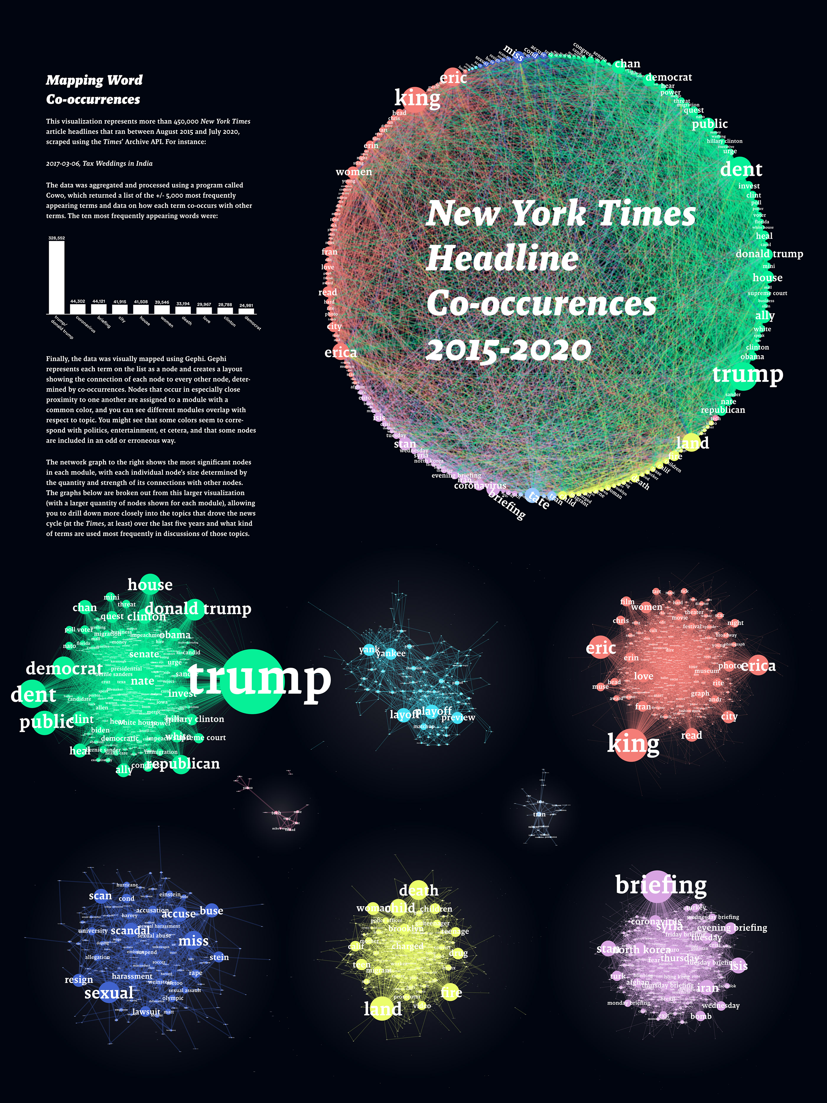
My final visualization consists of 9 network graphs created in Gephi. The first and largest graph displays nodes grouped by partition class and arranged around a circle, with each edge crossing the circle from its source node to its target node. This allows viewers to see the most significant nodes in my network and, because the circular layout function allows for arrangement of nodes by partition, it overrides the lack of visual clustering that plagued my initial layout, as discussed above.
Each color represented on the circle network chart corresponds to one of the eight breakout charts laid out below. These breakout charts allow users to drill down into particular clusters to see relationships between a larger set of related nodes.
I exported each graph with edges set to 25% opacity. Edges are too ubiquitous in these graphs to have individual meaning but layering them at a reduced opacity helps show areas of significant connection.
Each node and the edges for which it serves as a source share single color from an 8-color pallet I created using Colorpicker for data. I set my labels and body type in Malaga by Emigre, which has a quirky feel but still matches the editorial look I wanted for my data points.

I also included a block of copy explaining how the viz was created, two lines of sample data, and a bar chart showing counts for the ten most-used words, in order to anchor the rather heady visualization in some understandable metrics.
Despite the tendency of my nodes to group together indiscriminately, my data did result in semantically meaningful clusters which my users responded positively to, and I think tell an interesting story. Reading left to right, top to bottom, the six large clusters seem to correspond to politics, sports, entertainment, sexual impropriety, violence and disasters, and international affairs. The two smallest clusters (also left to right) seem to correspond to tech and (erroneously) trans and gender issues.
Reflection
While these clusters leave something to be desired as far as accuracy and invite a modification of process if/as I work on future text-based network visualizations, I think there is significant meaning here that is worth exploring—and I breathed a sigh of relief when each of my users reported finding the information interesting and digestible.
If I were to recreate this visualization (and broaden its scope), I would work on further processing the semantic data to arrive at a more meaningful list of words an clearer relationships between them. Relying on Gephi and Cowo to parse your data is great but it introduces a fair amount of mystery into the process, lessening your power to troubleshoot and understand what everything actually means. Improvements might include:
Culling a further list of hot words from the n most frequently used—for instance, extracting only nouns, and re-running the analysis to see which terms are most closely associated with each noun. This might give a clearer representation of how topic influences language and make the data less prone to erroneous term inclusion and ubiquitous connections. I might also manually introduce a column for word frequency to drive node size, rather than degree, which seems more fuzzy when dealing with a data set with so much connectivity.
Despite its imperfections, I am very pleased with how this project turned out and what I learned about python and scraping, semantic analysis, and how to get beyond the basics in Gephi.