Jessica Salinas
FA 21 | INFO 658
Info Visualization
December 19, 2021
Tracking CulturePass Reservation Trends
Introduction
For this assignment I shine a light on the newly-instituted NYC tri-library CulturePass program, a city-wide initiative that opened to the public in July of 2018. The mission of the program is to provide card holders from the NYPL, BPL, and QPL library systems with free entrance to specific museums, public gardens, and other cultural institutions around the New York City area. For program partner institutions, joining CulturePass stands to expand the scope of their reach to include new, untapped demographics. With these unique visits, partner institutions can plant seeds of recognition with younger crowds and likely gain new supporters along the way. This partnership model is great for promoting equity and inclusion and expanding access to many different kinds of people across the city. This involves very little risk or loss to a participating institution at one CulturePass reservation per year per card holder.
The goal of the visualization project is to present the CulturePass data for marketing and promotional purposes, highlighting the program’s most dazzling successes to encourage new institutional partnerships. Relevant information such as number of patron reservations, the popularity of individual partner institutions over time, and other strengths are among the data being showcased through the use of Tableau Public. Amidst these numbers there lie several stories; in them I find a success story.
Methods
I made a data request and received a simple CSV file that was heavily-redacted to protect patron privacy. This dataset was graciously granted to me by Pratt alum, Drew Stanley, who works in the Strategy Office at Brooklyn Public Library. The dataset I received included reservation information such as reservation ID, reservation date, attraction, borough, and the name of the library system used to book the reservation.
I gathered inspiration from BPL’s BklynSTAT on Tableau Public, and I also employed Tableau Public myself (CulturePass Project link). In my early stages of research, I took note of how BPL’s DAV team went about presenting the data. I customized my own visualizations with a very different spirit and motivation. My scenario is about marketing to a user persona who represents a small museum and is vaguely (or altogether un-) familiar with the CulturePass program.
User-Experience Research
I consulted early on with fellow MSLIS student, Drey Jonathan, who specializes in digital humanities but was initially unfamiliar with Culture Pass. They were tremendously helpful with think-alouds in the early phase of my planning, providing constructive feedback on early sketches and ideas as well as later iterations and evolutions of the more refined visualizations.
I also compiled a short UX survey that I asked my friends to look over. Both survey participants were familiar with the CulturePass program and have been interested in making reservations themselves as library patrons. I asked about legibility and if they could explain what the visualizations represented, and both participants indicated that they understood what the design was for and about. My sample sketches were hand-drawn and uploaded as a photograph – a choice I later regretted due to the photo’s very distracting lack of quality when viewed on a desktop, which garnered much feedback from one survey participant. In the future I would be sure to use an online sketch program instead. Some positive feedback included the use of color which was consistent across two proportional area charts.
Design
The narrative structure is a broad overview followed by more in-depth breakdowns of the most essential or otherwise impressive numbers. The aim is for a minimal and clear infographic style that could be emailed to prospective partners as a PDF attachment, legible on a desktop or mobile device and also potentially to be blown up into a poster or flyer format depending on user testing and feedback. Inviting, fun, pleasant, and exciting are all related to the feelings I hope to evoke. The overarching goal of this vis. is to, above all, leave an overall positive and uplifting impression on the reader as its purpose is to promote and market the CulturePass program, and I crafted the CulturePass trend visualizations with these considerations in mind from the start.
Color is a high priority. I opt for a color palette that is at least emotionally-neutral and ideally pleasant and reassuring. The colors I gravitated toward like various muted purples and shades of orange are bright and faintly cheerful, a nod to the wholesome, family-friendly nature of The Library (as a concept), and, in turn, the partnership program that is CulturePass. Since there is also an acknowledgement of the difficult times experienced in the city with regard to reservation trends, I am intentionally working toward avoiding the invocation of negative feelings in the reader with signifiers – colors or otherwise – that carry alarming or tragic associations as much as possible. Thus, I do not include one bit of red, a particularly visceral color. Should the point of this visualization have been to warn the public about various threats or to bring awareness to a dire situation, for instance, I would flip this design choice around and lean into red’s predilection for provocation.
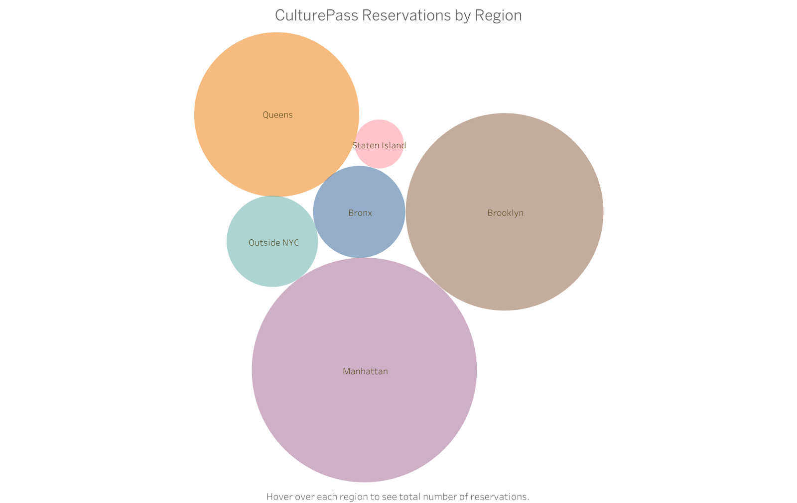
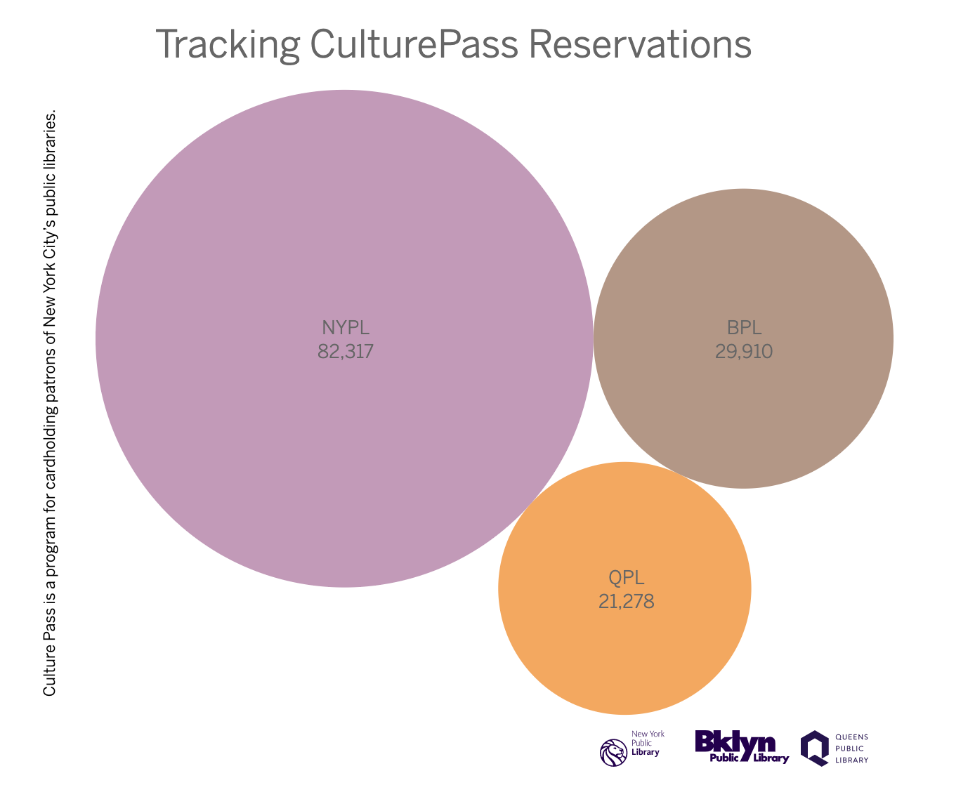
To begin, I broke down the total reservations by library system (Vis. 1.1). My design choices here are in service of a clear and broad overview. (What is it? The CulturePass program. Who is involved? These three library systems. Who leads the pack? New York Public Library system.) I created a few more in this proportional chart style (Vis. 1.2, Vis. 1.3). Of these early digital mockups, Vis. 1.3 might be great for a bit more exploration and interactivity, while many others could hold their own in a large poster format, in small printed pamphlets, and as static images viewed on desktop or mobile devices and more.
Upon reflection, I find the circles to be non-threatening with their lack of sharp edges and corners. Whether non-threatening and welcoming are antonyms I cannot quite say, but I did my best to set a warm and inviting tone. I also dabbled with lowering the opacity of the visualizations, particularly with the Top 10 Institutions (Vis. 1.4) where I also introduced a softer, lighter palette.
Vis. 1.1
Vis. 1.2
Vis. 1.3
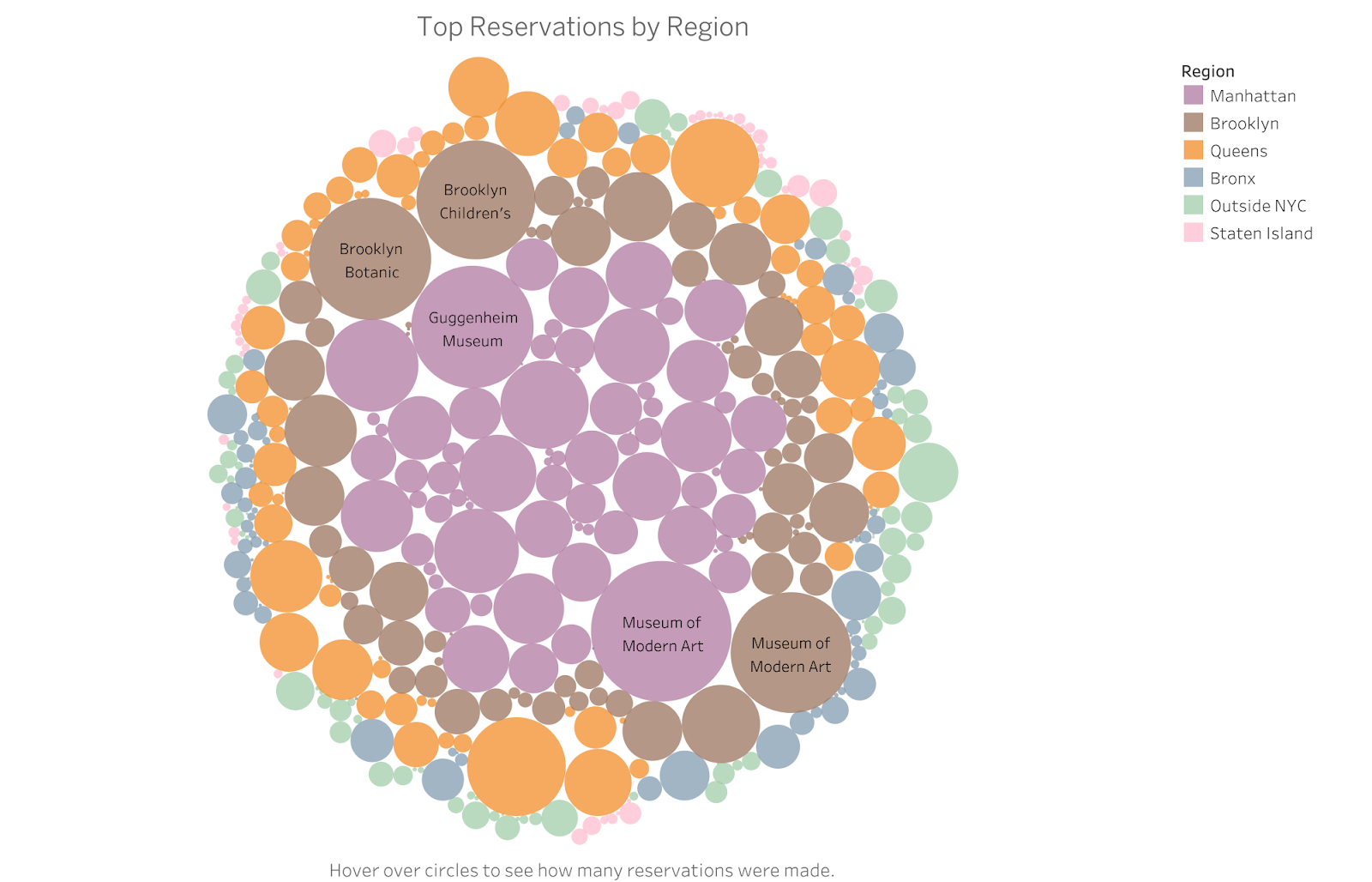
Vis. 1.4

Fundamentally I feel that communicating the gist and orienting the reader are of great importance. By starting with the big picture, I hope to encourage the user to familiarize themself with the essential information before diving deeper, especially so in my user case because CulturePass is not yet a household name by any means. However, I also realized that calling attention to NYPL’s lion share of the reservations may not be the wisest move as it is certainly not the most essential aspect of the narrative. Back to the drawing board I went.
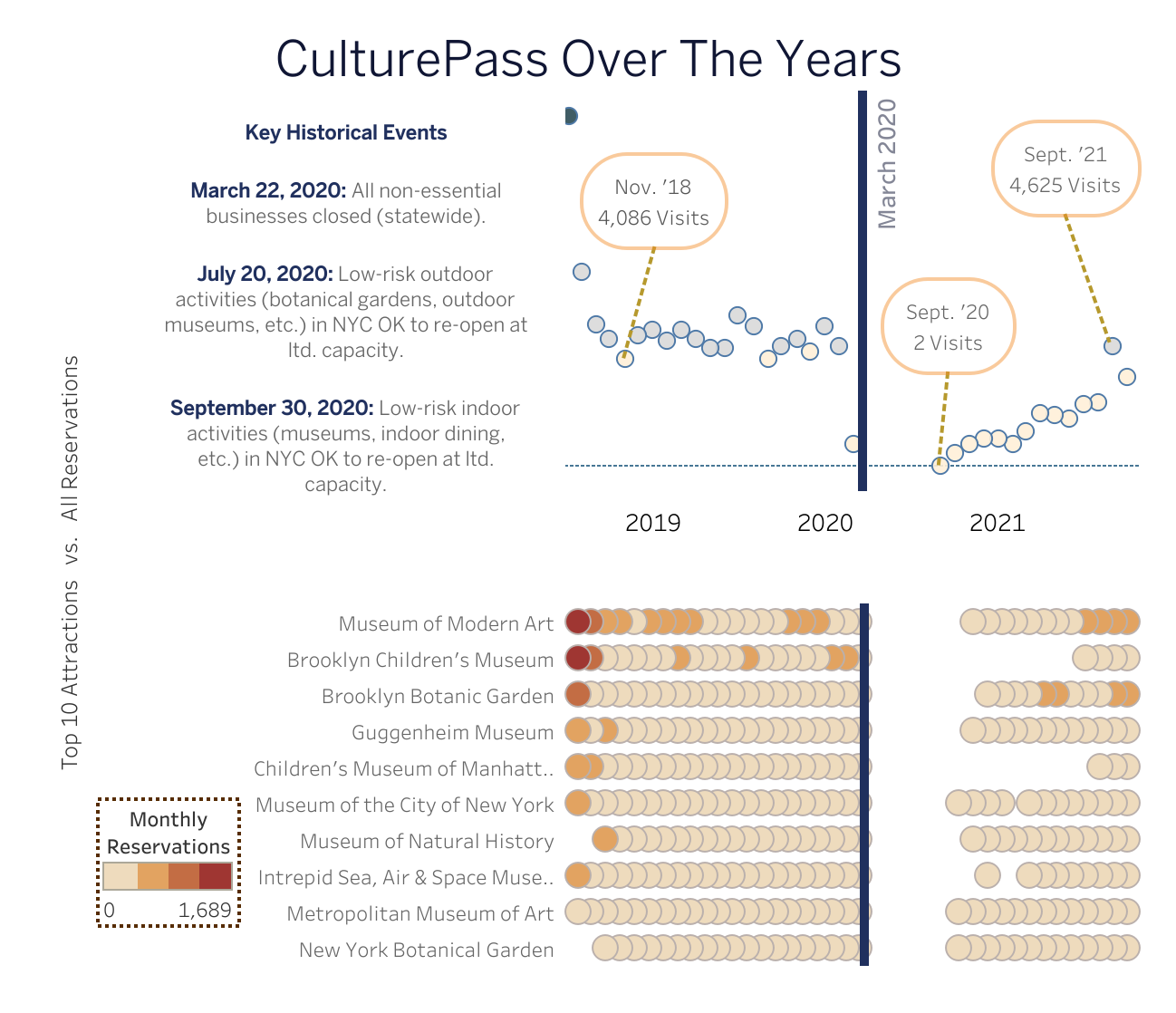
Another question user feedback led me to attempt to answer was regarding how the last several quarters have been impacted by the ongoing pandemic, most notably with the memorable first wave restrictions on non-essential businesses, and so forth. One might wonder how exactly CulturePass reservations have fluctuated amidst a significant city-wide lockdown that began in March of 2020 as well as how the re-opening affected CulturePass visits to these organizations. This is something that I felt it was important to address, and I certainly found it challenging.
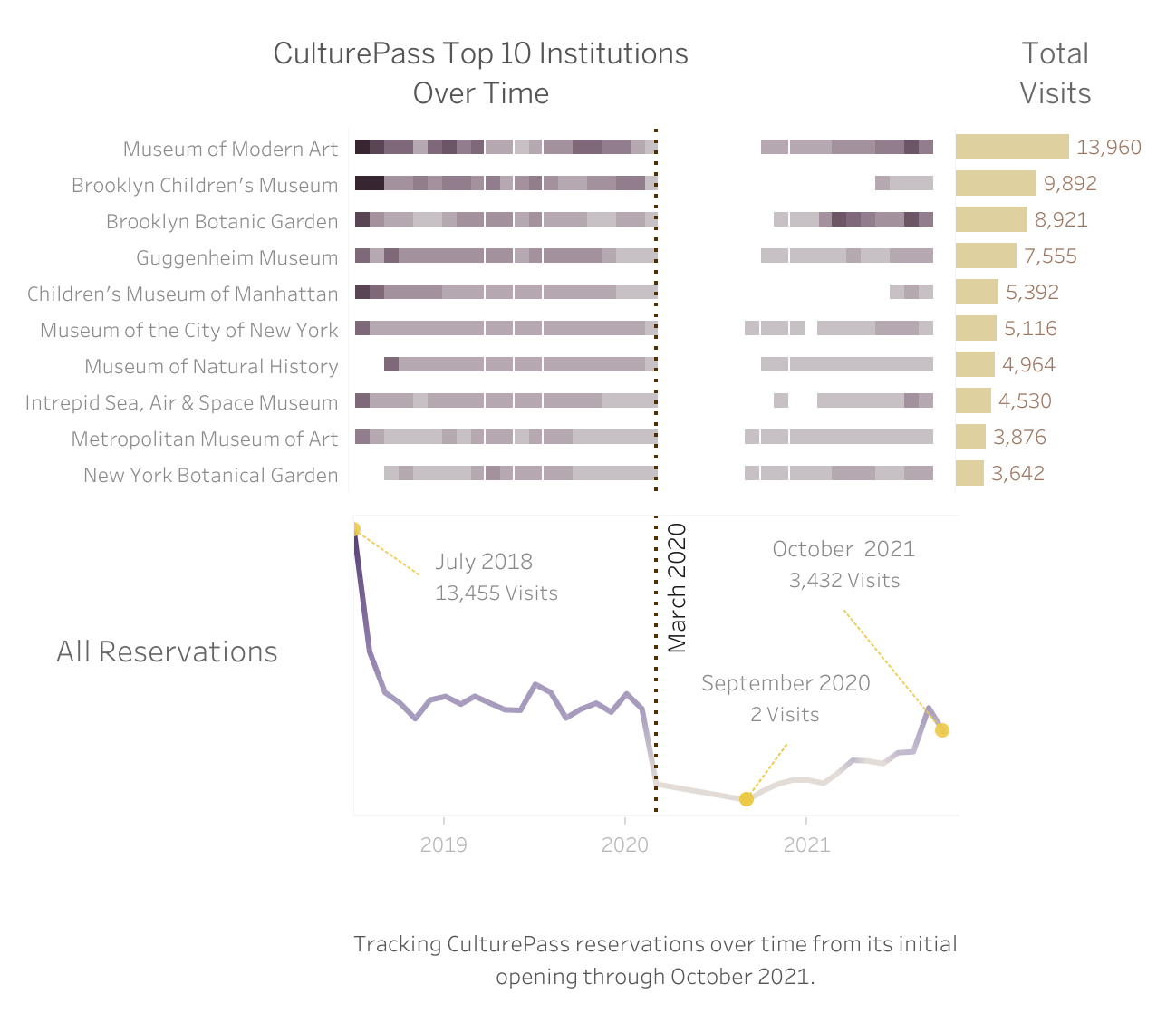
Initially I really struggled to match the overall tone of the first mockups when approaching visualizing the lockdown trends. A wide gap seemed to grow between the bubble-like – and child-like – visualizations (1.1-1.4) and the dour and tragic heat map with its drab, little squares. I continued to pursue perfecting this circular aesthetic direction of my first charts until finally something clicked – a beautiful synthesis of the design principles used in the early proportional circle charts (Vis. 1.1-1.4) could help me to overcome the aesthetic challenges of the more complex timeline visualization (Vis. 2.1).
I incorporated little circles into my timeline, significantly softening up my unseemly fraternal twins, Line Graph and her brother, Heat Map. I also used feedback from my oral presentation to inform many of the changes I made since that iteration of the project, such as reversing their order and adjusting the axis display to make the timeline as clear and legible as possible. I also used Professor Sula’s feedback about the historical context to really fine tune the text I added to the vis. and responded to feedback regarding the annotations on the line graph by changing the first annotated selection so as not to highlight the overall decline from the program’s initial peak and instead demonstrate the strengths I wished to showcase such as the strong recovery period following reopening in the fall of 2020.
Where color is concerned, I ended up using a range of muted browns for the Top 10 Attractions portion, outlined in a light brown color, and on the timeline above it, I used a bit of simple color theory to contrast blue with orange accents (Vis. 2.2). I toyed with my line graph, experimenting with shapes until once again settling on – you guessed it – circles. I believe they make a fantastic addition to this particular visualization, providing some visual relief amidst the rather fraught subject matter. There are still a few layout issues I could continue to agonize over, but I am generally very pleased with the direction this vis. went in. I can honestly say that I have never seen anything like it before.
Vis. 2.2
Findings
When the CulturePass program went into effect in July of 2018, the data shows a significant influx of patron reservations during the first program’s first month. The potential benefits to the New York metro area libraries are great as the three systems were inundated with new library card registrations in order for new library patrons to be able to participate, enticing new, previously unreached visitors through the library doors, as well. Another path that could be interesting to explore would be simulating the grant funding renewal process for CulturePass, in which case, the new card creations at NYPL, BPL, and QPL would be extremely relevant in terms of measuring the program’s success on the libraries’ end.
For this scope of this project, I am not particularly focused on new library card creations, but I do think it might be interesting to analyze and compare new card creation data from each library system to track improvements in new card registrations leading up to – and since – CulturePass’ inaugural summer in 2018. We can see on Brooklyn Public Library’s “BklynSTAT” Tableau page that there was indeed a very high number of new cards created with BPL in the summer of 2018 of nearly 16,000 library card registrations, coinciding with the early peak in overall CulturePass reservations (Screengrab 1).

Other findings include the discovery of a substantial recovery in the months following the period of lockdown and re-opening in 2020. There is still lots of room to explore and bring in additional datasets in order to have more to analyze.
Personal Reflection
The familiarity of this topic and my own interest in it helped me to overcome some of my initial reservations with the data vis. tools explored in this course. The iterative process of learning to use Tableau, although challenging, was satisfying in the end, and it has been gratifying to see my concepts come to life. My appreciation for the user-centered approach after conducting think alouds and a UX survey could not be greater. Typically my experience with UX has been vague and abstract. The principles we went over in previous weeks were being applied and the messy results were materializing in real time. The kind of insight gained from making mistakes along the way feels vast.