Data Through Design Exhibition

On 3/11/19, I attended the closing night of a very interesting exhibition called Data Through Design at the Brooklyn Navy Yard.  This annual alternative cartography exhibition is held during New York City’s Open Data Week, and is an endeavor of the Mayor’s Office of Data Analytics.  The objective of this exhibit is to enable curious makers such as technologist, artists, and designers to create novel methods of map-making, present new narrative perspectives, and develop a deeper understanding of life in the city using data as a medium. [DataThroughDesign, 2019]  The closing night of this exhibit consisted of tour of the artwork, a chat with the artists, and a panel discussion between the organizers and the artist on their work.

One of the things that intrigued me about this exhibit was how they challenged the way we interpret and process data and how it can be express or communicated through art. The theme is designed to challenge artists to consider how to tell the hidden stories and the connections that can be made through data.  The theme this year was “Not a Number”.  According to Wikipedia, in computers, Not a Number (NaN), is a numeric data type value representing an undefined or unpresentable value. [Wikipedia, 2019]

Organizers of Design Through Data, brought together a total of 16 artist working on 9 different projects, each team or artist were tasked with using NYC’s open data (https://opendata.cityofnewyork.us) to create their art under the Not a Number (NaN) theme.  They are essentially telling stories through art with the free public data published by New York City agencies and other partners.  Each artist utilized the public data and effectively expressed it visual and/or aural by  communicating and telling a story that fits the Not a Number theme.  

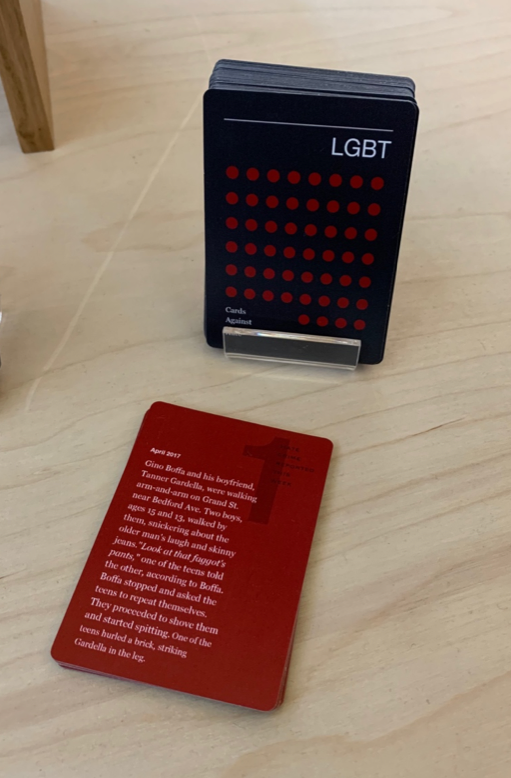
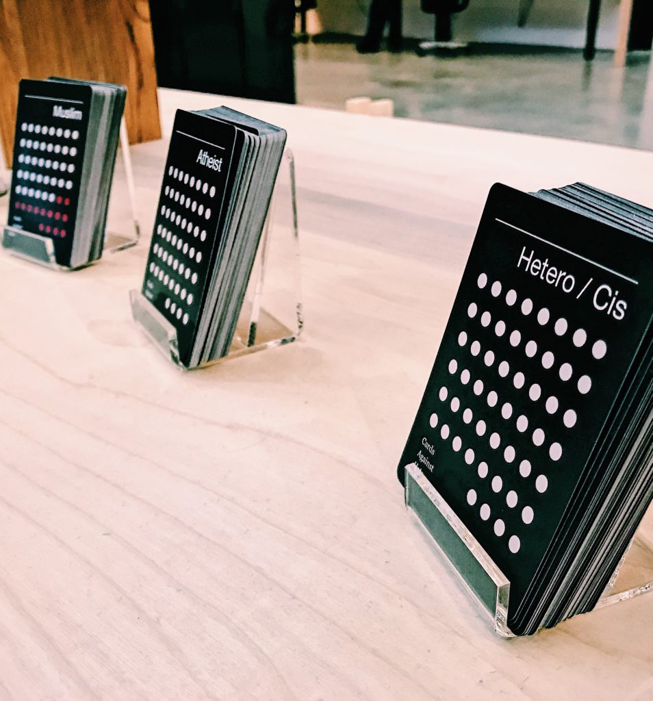
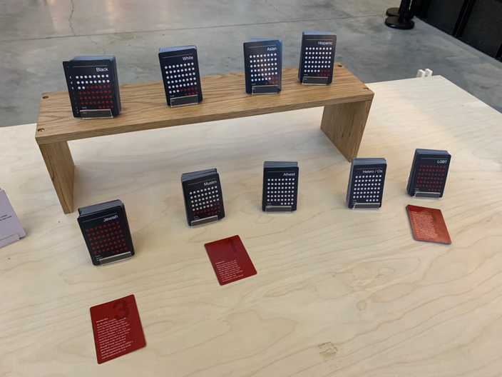
During the artist chat and panel discussion it was interesting to see and hear how they brought the data to life with their tangible and interactive art.  I found the data, content, and art of one project to be particularly interesting.  It was called Cards Against Hate, created by Stephannie Luu and Andrew Lin.  This project was a deck of cards (52 cards total) that focused on a specific demographic/group and hate crimes committed against them over the course of a year.  So there are approx. 52 weeks in a year, so each card detailed a hate crime that happened during that week.  
It’s a play on the popular and somewhat controversial party game, Cards Against Humanity, in which players complete fill-in-the blank statements using playing cards with words or phrases that are offensive or politically incorrect.  Of course this project isn’t meant to be played as a game or in a light hearted way, instead it is a heavy and in your face deck of cards that places you in the shoes of a specific group and hits you with the realities they face every day of their life.
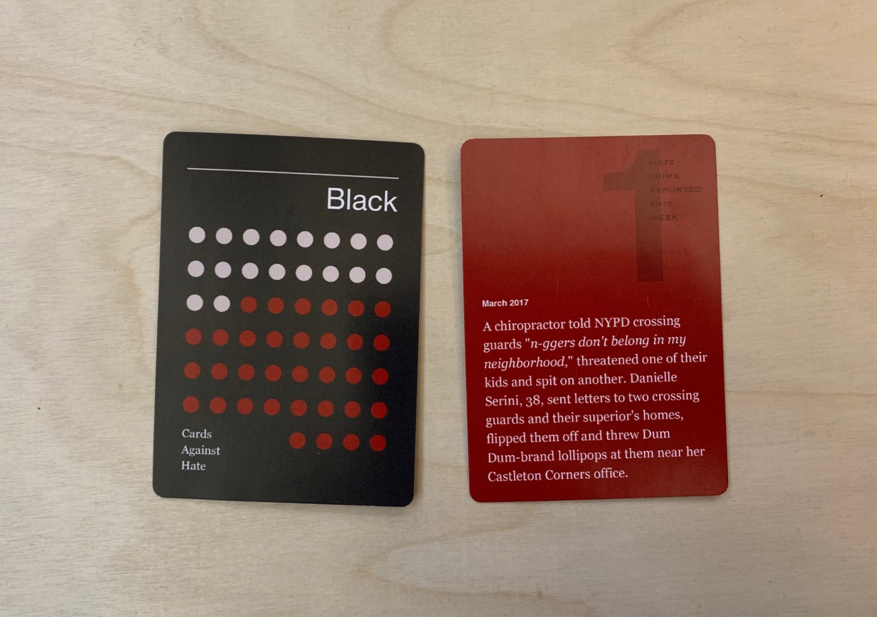
Sadly it wasn’t hard for the artist to find enough data to create not only one deck of cards but several decks for various demographics such as members of African Americans, Caucasian, Asian, Hispanic, Muslims, Jewish, and LGBT groups.  It was also interesting to hear how data is constantly being misused today, especially in this era of “fake news”.  During the Artist Chat, one of the Co-Creator of Cards Against Hate commented on this by saying “It wasn’t hard to find articles misusing this information [hate crime data].  Not all data is perfect, especially if not used in the right way.” 
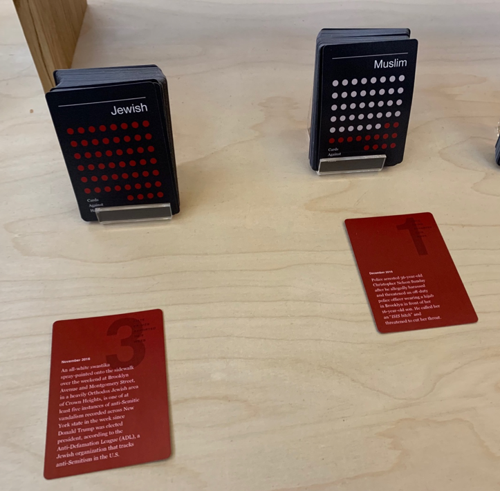
The creators mention one of the motivations while compiling and creating Humans Against Hate was centered around making data/statistics accessible and consumable. They said, “The emotions and human experience was important to us.  Representing it in this way makes it real and tangible as opposed to looking at numeric numbers and statistics in a database”

I thoroughly enjoed this exhibit as it brought to life statistical/numerical data to life. It also reinforced the principles and theories we’ve learned in class as this exhibit and the artist projects are great examples of Michael Buckland’s three meanings of Information: information-as-process, information-as-knowledge, and information-as-thing.  As mentioned by Buckland, An exploration of “information” runs into immediate difficulties since information has to do with becoming informed, with the reduction of ignorance and of uncertainty, it is ironic that the term “information” is itself ambiguous and used in different ways. [Buckland, 1991]  

Brief definitions of each are below:

  • Information-as-process is the act of informing or being informed
  • Information-as-knowledge is the knowledge communicated, perceived, or gained in information-as process.
  • Information-as-thing is the objects we use to provide information i.e. objects that are considered informative.

If we take the “Cards Against Hate” project by Stephannie Luu and Andrew Lin, you can easily see how it fits Bucklands definition of information.  For instance, the entire project itself is information-as-process as it is informing through art, the information collectively gathered via NYC open data (statistical information, various dates/details of hate crimes) is information as knowledge, and finally the deck of cards themselves represent information-as-thing. 

Moreover the NYC Open data repository is a collection of (free) information based on real data collected by various agency’s and supports Buckland’s definition on evidence. “Evidence” is an appropriate term because it denotes something related to understanding, something which, if found and correctly understood, could change one’s knowledge, one’s beliefs, concerning some matter. [Buckland, 1991].  This collection of “evidence” along with the 3 definitions of information provide context to the data for hate crimes committed against various demographic groups and make the deck and other artwork extremely effective.  Without this context it would be hard to understand or interpreting information being presented.

This was a great and informative exhibit!  I thoroughly enjoyed hearing the artist process and perspective during the chat/panel discussions, and what I learned from the art they made.  It opened my eyes on the impact of not only data but art as well. I’m looking forward to attending this exhibit in the future and excited to see what the coordinators and artist bring to life with their projects/art.

References

DataThroughDesign, About Data Through Design. Available online: http://2019.datathroughdesign.com/about[Accessed on March 15, 2019]

Wikipedia, NaN – Not a Number, available online: https://en.wikipedia.org/wiki/NaN[Accessed on March 15, 2019]

Buckland, Michael. “Information as Thing”,  June 1991. Journal of the American Society for Information Science 42:5: 351-360.

Airplane Entertainment System Observation

In this blog post, I will present my observation of the interaction between seven airplane passengers and the in-flight entertainment system of a Eurowings A340-300 aircraft. The observation was performed during a daytime flight from Dusseldorf to New York, on Sunday the 17th of March, 2019. In addition to the observation, I evaluated my own experience of interacting with the system.

Considering that online functions of phones and other devices are unavailable on most flights, the entertainment system becomes a passenger’s main source for information and entertainment. Like most modern in-flight entertainment systems, the Eurowings interface is touch screen based. The physical design shows no buttons or indications on how to turn the system on. Despite the lack of visual signifiers on how to wake the screen up, all passengers in my observation managed to start the system without any issues. Because of cultural conventions (Norman, 2013), people nowadays assume that screens without physical buttons will respond to touching, hence making this minimalist design work.

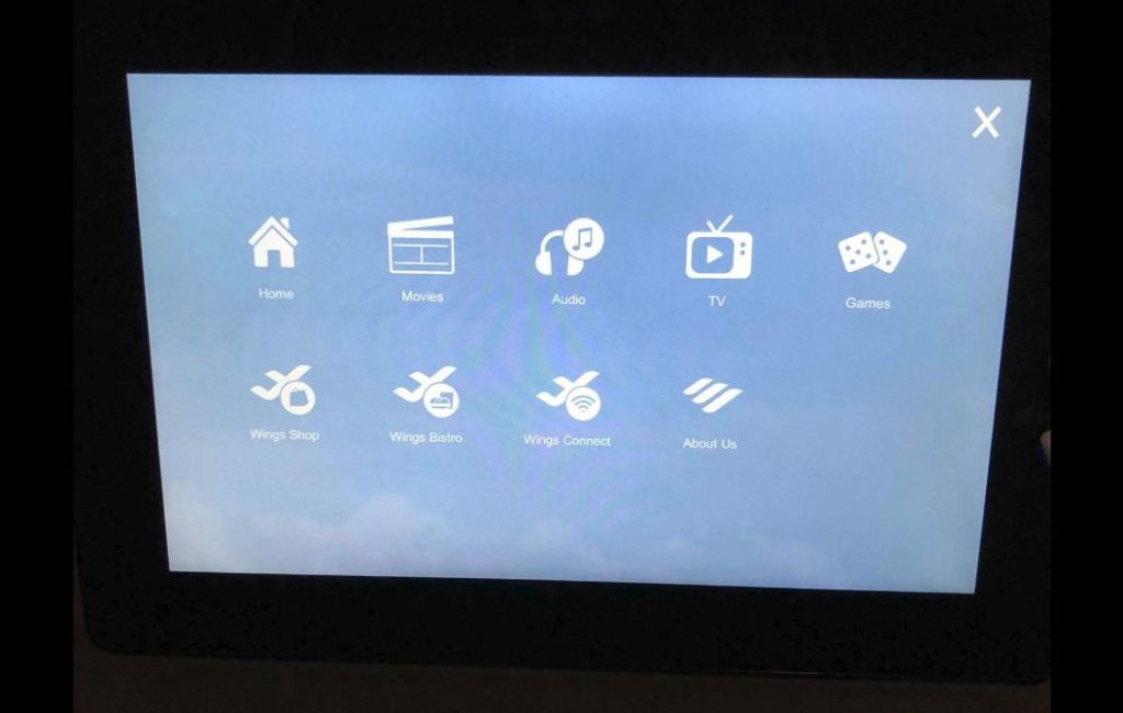
Most in-flight entertainment systems that I have come across as a passenger provide a rather user-friendly interface. Considering that most of these systems have similar standard content and functions, such as movies, food and beverage menu, and flight information, returning flyers will generally have a good idea of how to use the systems. The Eurowings entertainment system consists of a main menu with the following content; home, movies, audio, TV, games, shop, bistro, wi-fi, and “about us” (see picture below).

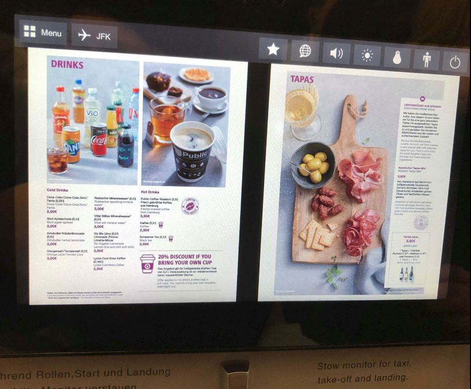
The positioning of the screen and the interface design appears to be inviting to users, as all passengers in my observation, including myself, started using it immediately following getting seated. Upon entering the system, four out of the seven passengers began to browse for movies, a function which was discovered without any apparent difficulties. Though once at cruising altitude, I observed how a passenger appeared to be struggling with ordering food. The menu was presented in a PDF format, instead of a built-in menu (see picture below).

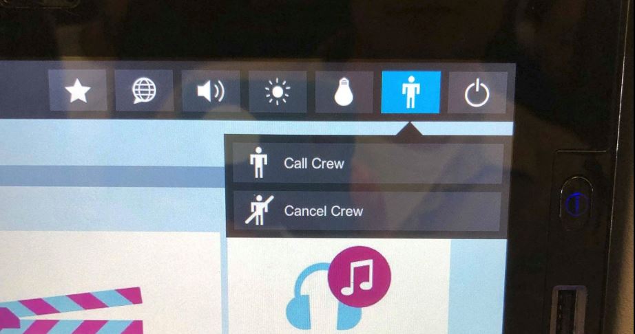
The small proportions of the screen made it difficult to read the menu, which led to the passenger picking up a physical copy of the Eurowings magazine, which luckily also contained the menu. I would suggest implementing a function to browse the food and beverage menu directly in the entertainment system to enhance the user experience. Once the passenger had decided what to order, she tapped the call-crew symbol on the screen (see picture below).

A slight moment later, a flight attendant and arrived to take the order. The call-crew button was also used on another occasion, where I observed how a passenger had a question for one of the flight attendants. These two events show how the entertainment system act as a link between a digital source of information and a human information source, i.e. an intersection of digital and physical. The fact that you can retrieve human information in addition to the recorded information within the interface implies encountering Goonatilake’s neural cultural and exosmotic flow lines (Bates, 2006).

Features on the screen further allow controlling the surrounding environment of passengers. By tapping the light bulb button on the screen, a passenger can switch the personal reading light on or off. Once again, showing how the digital interacts with the physical through the system. However, I noticed how some of the passengers got up from their seat and stretched to adjust the airflow from the ventilation above them. I would suggest making airflow adjustment a digital function placed within the interface, in order to further improve user and passenger experience.

Following the observation, I reflected on the importance of in-flight entertainment systems. In today’s society, people are used to having access to information at practically all times. I performed a minor, informal, in-flight experiment involving myself and a fellow passenger, where I decided we could not use the entertainment system for one hour. Being a daytime flight, none of us felt the need to sleep, neither did we have any books available. The prohibited use of the entertainment system resulted in reading all available papers provided in the back of the seat in front of us, and following that, a slight feeling of distress. This, somewhat disturbing observation, show how dissatisfaction can be generated when not having access to information. Conclusively, the in-flight system does not only function as a source for keeping passengers entertained and informed, but it also pleases our demand for constant information accessibility.

Another finding upon my observation was that all three information principals in Buckland’s article (1999) were encountered as passengers interacted with the entertainment system. Information as process was encountered as the flight attendant was called through the system, consequently providing information to the passenger. Information as knowledge was encountered e.g. when a passenger received insight from the flight information provided by the system. Information as thing was encountered as the screen presented informative visuals and audio through headphones to the passenger.

References:

Bates, M. J. (2006). Fundamental forms of information. Journal of the American Society for Information and Technology. 57(8), 1033-1045. Available at https://pages.gseis.ucla.edu/faculty/bates/articles/NatRep_info_11m_050514.html

Buckland, M. (1999). Information as Thing. Journal of the American Society for Information Science. June 1991, Vol. 42 Issue 5, p. 351-360.
Norman, D. (2013). The Design of Everyday Things. New York, New York: Basic Books.

#1Lib1Ref Event: Librarians Going on the Offensive

INFO 601-02 – Assignment 3 – Event Attendance – Maddy Newquist

On February 1, 2019, I attended an event at Fordham University’s Lincoln Center campus called “1 Librarian 1 Reference,” which was hosted by ASIS&T @ Pratt Institute and sponsored by Educators for Wikipedia at Fordham, Wikipedia Library, and Wikimedia Affiliates. The event’s tagline was: “Imagine a World Where Every Librarian Added One More Reference to Wikipedia.”

1 Librarian 1 Reference, or as it is referred to on their social media, #1Lib1Ref, is a global campaign organized by Wikipedia and its university workgroups to inspire librarians and other information professionals to contribute to Wikipedia articles—except that, instead of editing or writing articles, they would be providing citations for the content within the articles.

Why It’s Needed

Every Wikipedia user, from the casual interest reader to a researcher looking to flesh out a bibliography, has seen it. Instead of brackets containing a superscript number linking to a footnote, there is a bracket that looks like this: [citation needed]. The user has no way of knowing if the sentence(s) that precede this bracket are accurate, and the task of corroborating it is daunting—if the editor who added the fact couldn’t find it, when so many others had not hit obstacles in citing their own facts, how deep and challenging of a dive would it be to the user? The 1 Librarian 1 Reference campaign uses that lack of reliable sourcing as its base mission, hoping that both the immediate and long-term effect will be a benefit to Wikipedia users around the world.

The event began with a brief description of the goals of the event and the campaign at large, as in the paragraph above, as well as a wink and a nod to the fact that information professionals are the ones best suited to this task (more on that below). Attendees were then given a tutorial on general article editing and more thoroughly on the guidelines for adding citations. Afterwards, we were provided with a list of web-based databases that aggregate all the [citation needed] instances across Wikipedia, either by category, article, or even paragraph, and then were effectively set loose.

Our Responsibility to Transparency

Beyond the surface layers of providing an essential component to a reference encyclopedia, its users, and community, this event feels strongly, albeit subtly, relevant to the information field and the challenges it faces as digital resources become more available and library users increasingly value their independence and personal agency in finding the resources they need on their own.

Having librarians interact with Wikipedia is especially important because it continues to teach them about how the public/users search for information. The decades-long debate around information literacy is interesting to look at in conjunction with this campaign. If librarians and information professionals are meant to rethink the “’one-size-fits-all approach’ to information literacy” as Pawley suggests (446), why not treat Wikipedia as worthy of our time and effort in teaching users how to access information? Not only can we learn more about the ways in which users go looking for information, especially on a site that is, by design, user-controlled and user-organized, but we can lean into users becoming active agents in their search. Tewell points out that librarians are becoming increasingly invisible in the process—if we take opportunities such as this event to bolster information literacy from behind the scenes, we are helping the move away from the “traditional banking system” of education, so that students may teach themselves from equally trustworthy sources and be able to verify the path of information for themselves (27).

Share the Power

It also felt interesting to take a look at this event and its goals through the concept of the neutral librarian. As we’ve discussed in class, as well as seen in the Schwartz & Clark 2002 article “Archives, Records, and Power: The Making of Modern Memory,” librarians, and their institutional counterparts, cannot afford to be neutral—their interaction with historical documents and the people who interact with them makes it nigh impossible. Although Schwartz & Clark are referring to archives when they note that archivists have “enormous power over memory and identity,” their call for the power of archives to “no longer remain naturalized or denied, but opened to vital debate and transparent accountability” feels especially transferable in the context of the 1 Librarian 1 Reference campaign. Librarians are gatekeepers, in both its positive and negative connotation, of information, and by taking part in the verification and validation of a public access resource in one really strong and clear way to begin the process of transparency of information creation, not least by linking to accredited sources that the public cannot find on its own.

A Final Takeaway

The leaders of the event emphasized that we didn’t have to solve every citation problem that came up first in a database search—we were instead encouraged, if we wanted, to look for missing citations in the categories we had personal interest or backgrounds in. And while, yes, you could argue that this is more bias, I think it further helps bridge the gap between information professionals and the communities they serve, when we can experience the personal stakes that the users feel when searching for information.

References

Pawley, C. (2003). Information Literacy: A Contradictory Coupling. The Library Quarterly, 73(4), 422-452. doi:10.1086/603440

Schwartz, J. M., & Cook, T. (2002). Archives, records, and power: The making of modern memory. Archival Science, 2(1-2), 1-19. doi:10.1007/bf02435628

Tewell, E. (2015). A Decade of Critical Information Literacy: A Review of the Literature. Comminfolit, 9(1), 24. doi:10.15760/comminfolit.2015.9.1.174

Astro Gallery of Gems, Minerals, and Fossils

INFO 601-02 Assignment 3 : Observation By Umang Arora

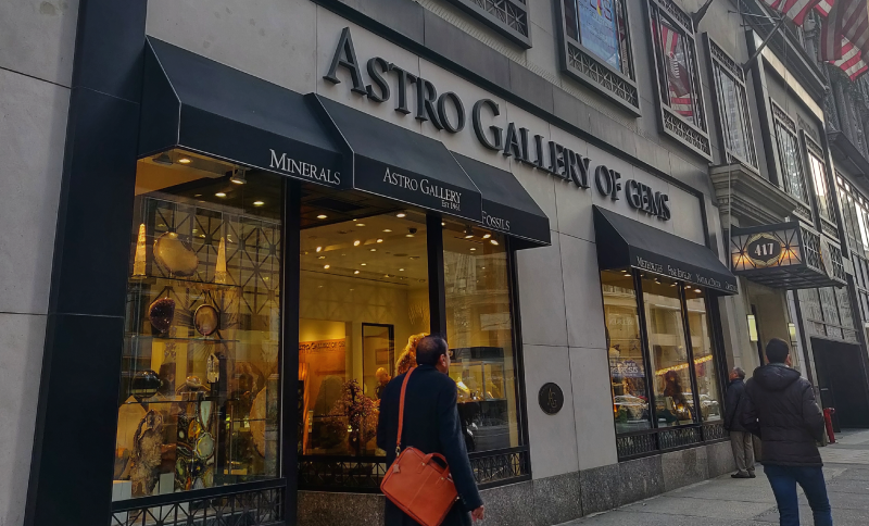
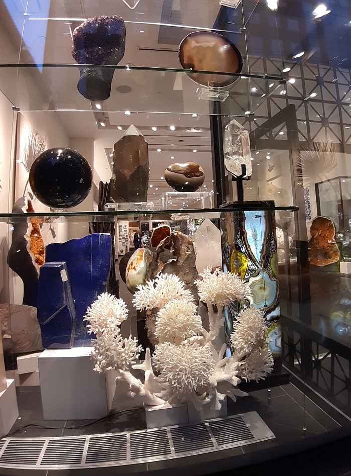
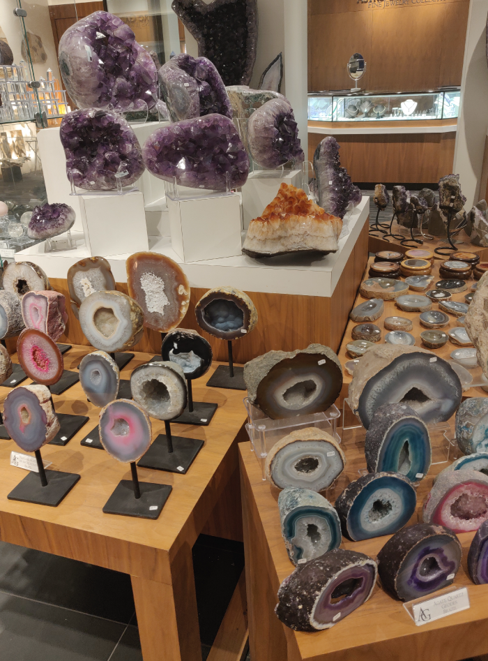
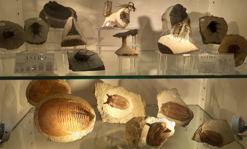
While exploring New York City streets during the week, I came across a store “Astro Gallery of Gems, Minerals and Fossils ” located in the heart of the city’s famous and favorite shopping district, Fifth Avenue. The store is quite huge and displays thousands of minerals, gems, fossils, and pieces of rare, unusual jewelry and pieces of home decoration.

Love For Rare Finds…The Start Of The Journey

Since it was founded in 1961, Astro Gallery has a long and rich history. Julio Tanjeloff was delighted with minerals and believed that there could be a market for high-end collectible specimens that could beautify the workplace and homes of customers.

He founded the company with this belief and vision and in 1963 opened doors for the public to the Astro Gallery of Gems, Minerals, and Fossils. Astro Gallery has been catering to big names in the art, fashion, design and performing industries through the years.

Dennis Tanjeloff, Julio’s grandson, took over the business in 1988 after Julio passed away due to a sudden heart attack. Since the age of four, when he first traveled the world with his grandfather in search of minerals, gems, fossils, and related objects, Dennis had been working closely with family business.

By 2004, by curating top collections and museums, running an online business and participating in mining investments, Dennis reinvented Astro Gallery.

Natural History And Fine Minerals For Purchase

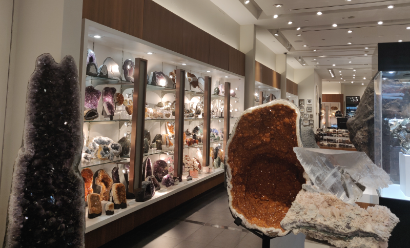
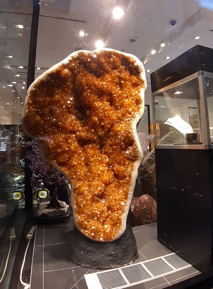
The window display has this large yellow mineral, which caught my eye immediately, and this beautiful white coral was on the other side. One is greeted by beautiful minerals, gems, and meteorites after entering the store, along with fossils that one would expect to see in a museum. The countries from which these items are sourced are listed alongside each item’s name (both online and on site). The extensive variety of natural history items on display provides something for everyone to enjoy, admire and afford from kids to adults.

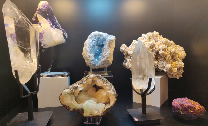
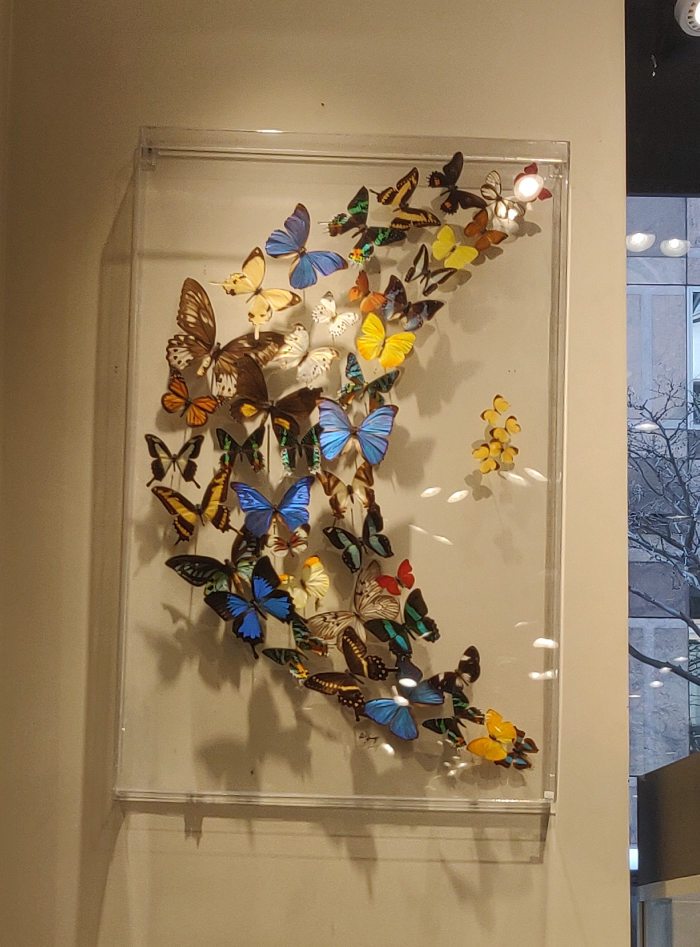
Together with the advanced collector, specimens on display will excite interested novices. The museum quality items are admired and loved by everybody who enters the store. From small stones to thousand-pound amethyst geodes, fossils, rare butterflies mounted in glass to decorate one’s wall as if on flight, along with amazing custom-made jewelry, every person of every age was amazed at the items on sale.

For yourself and others, you can find beautiful gifts. Stunning home decoration items and bath collections carved from stone, hearts, and animals made from beautiful crystals, desk stationery ready to take center stage in your workplace and lamps designed from stones to illuminate your homes are all affordable gifts available in the store. Also available for sale is custom jewelry designed from gems and stones.

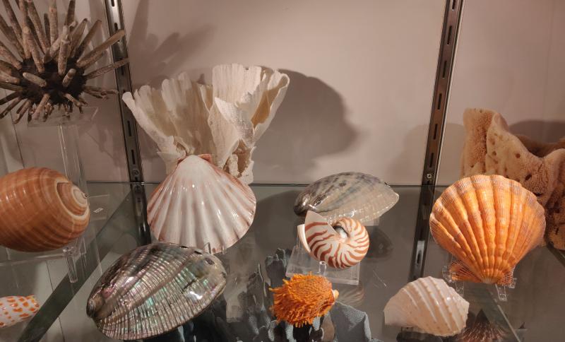
The Astro Gallery displays amazing obelisk cut from rare stones such as calcite and agate. An obelisk is a tall, four-sided, narrow tapering that ends in the shape of a pyramid. Rare bugs and critters mounted in framed glass and stone are also available for sale. For one’s house, quality museum fossils are available for purchase. There is a whole section dedicated to shells and corals after going further inside, which have unique and beautiful pieces to decorate your living room.

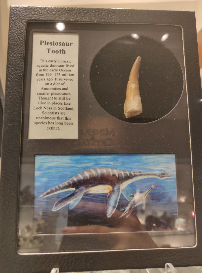
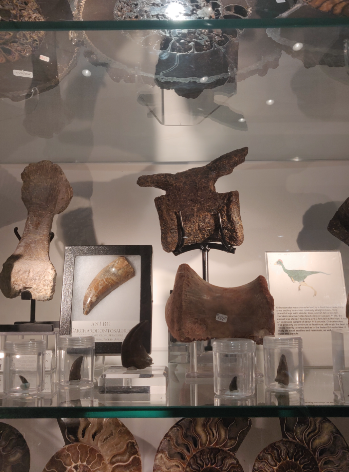
To catch the finest minerals, take a walk to the back of the store. Behind glass-enclosed cases are amazing view of colorful and rare minerals lit up on each glass top with spotlights. Discover minerals so big that one can crawl and rest among the crystals in every corner of the store. A whole section is assigned to shells and bones. The bones and teeth of various dinosaurs were on display on one side of the mounted frame with a brief description and picture on the other.

Many of the displayed pieces were marked with the sign ‘ No touch. ‘ This indicated that due to its high value and history, the artifacts (information-as-thing) must be preserved as much as possible.

When I arrived at the store in the evening, the amazing collection was being looked at and admired by a lot of people. Children were fascinated by butterflies, rare bugs and insects and asked various questions about the origin of these fossils, corals and insects and how they recovered them. Everyone present was amazed at the items on view and had a bunch of collection – related questions, it’s history and origin. I felt that every section of the store should have a brief description. Also, the names, origin and a little about each stone and crystal should be marked. At the same time, if certain studied gaps are left in the information provided, this will induce communication with the store staff and will actually create a cheerful atmosphere. This communication can also be an important source of deducing customer interest and behavior.

As Buckland mentioned in his paper Information as Thing (1991, p.354), objects are collected, stored, retrieved and examined as information, as a basis for becoming informed. I really enjoyed this observation and discovered how people interacted with the information in a store displaying natural history items one would expect to see in a museum. Writing about museums: “In the first stage, the objects themselves are the only repository of information.” (Orna and Pettit (1980, p.9)). It was fascinating to see that, like museums, Astro Gallery promotes and celebrates different groups and cultures by showcasing collective artifacts from around the world. The store has become a bridge where cultures can be communicated, knowledge desired and development promoted.

For anyone visiting New York City, the Astro Gallery of Gems, Minerals and Fossils is certainly a must – stop destination. Everyone of all ages will want to see the natural history on display in the store and maybe have the opportunity to take home a little piece of the historic wonder.

References:

https://astrogallery.com/

• Buckland, M.K. (1991). Information as Thing. Journal of the American Society for Information Science, 351-357.

Observation: The Oculus Transit Hall

Located at Lower Manhattan, The Oculus is the new transportation hub connecting The NJ PATH train to 11 NY subway lines; a must-see tourist attraction with marvelous architecture design; and an enjoyable shopping center with over 50 stores. As a multi-functional building serving users with diverse purposes, the information environment could be overwhelming. In March 18th, I experienced The Oculus as a NJ-NY commuter, to see whether the necessary information is clearly delivered to me, and observe how other users interact with information under their specific goal.

Layout of The Transit Hall

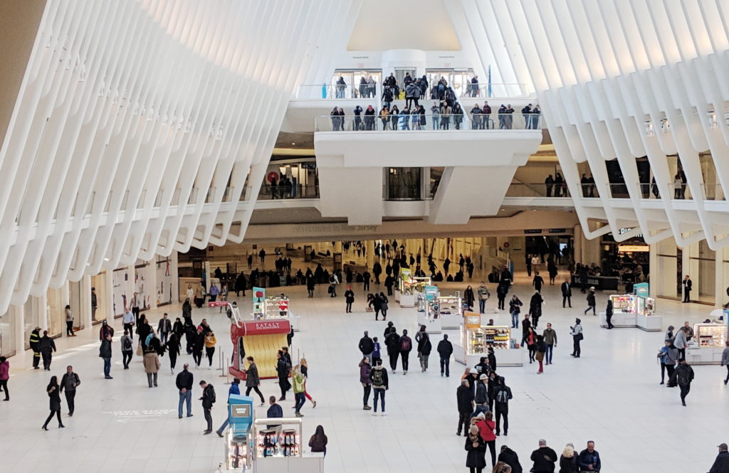
The Transit Hall is a 3 stories, 350 ft by 115 ft column-free elliptical space, with #1 train and PATH Station at the west end, E train station and the passway to Fulton Center at the east end, as well as two entrances and viewing platforms at street level.

The Oculus Transit Hall ©Xin Su

Upon exiting PATH station from underground, you could see ticket machines and printed information boards on both sides along the walls, and the #1 train entrances on the Oculus level. Walking up the stairs in front of you to the Oculus level, you would see several small kiosks, a sitting area, and the huge stairs leading you to the lower Mezzanine Level, for the exit to Fulton Center (A/C/4/5/J/Z/W/R lines) at the other end of the Transit Hall. The spatial structure was very obvious and easy to understand. I think the architect created an intuitive information environment, guiding different user groups in unnoticeably-designed separated circulation routes. Commuters walked straight down the hall for transition. Shoppers tend to stay closer to the curving edges where the stores are located. Most tourists entering from street would exit immediately after taking photos at the platforms.

Ticket Purchasing

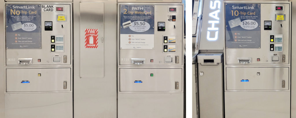
There were 5 kinds of ticket machines outside The PATH station, 2 for both MetroCard and SmartLink (card and cash/card only), and 3 for SmartLink only (blank card/2 trips/10 trips with card), which make it a bit complex for first time users. During my observation I saw several people failed at their first attempt, because of the language barrier or trying to use cash on a card-only machine, or wandered around the area trying to figure out which machine to use. There was no information booth nearby so they eventually had to ask other passengers for help.

SmartLink Ticket Machines (Left: Blank Card / Middle: 2 trips / Right: 10 trips with card ) ©Xin Su

The MetroCard/SmartLink ticket machines provided 8 different language interfaces, which was intended to help foreign visitors to purchase ticket by their own. However, for me the overall English-Chinese translation was poor and some of the vital information, for example “trips” and “Unlimited Passes”, was not translated at all, which means passengers with no English knowledge can not complete the process without additional help. Furthermore, although PATH accept both MetroCard and SmartLink, the information was not displayed until you entering the ticket gate with you tickets purchased.

Suggestions:

  • Reduce the types of ticket machine to avoid confusion and failure
  • improve the translation to better serve foreign users
  • Notified the users that both MetroCard and SmartLink are accepted by PATH on the information boards and ticket machines

Maps

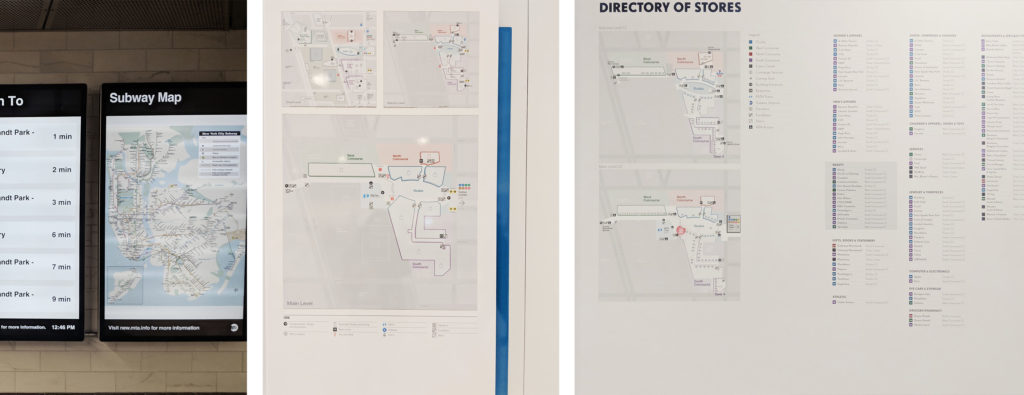
3 types of map were available in the Transit Hall. PATH/Subway System Maps, both printed and electronic, could be found inside and outside the PATH/Subway station. Floor Plans for vertical transportation and transit direction were placed at every entrance/vertical circulation core, on the wall or as mobile stations. A Directory of Stores outside the PATH station occupied a whole wall.

Maps (Left: Electronic Subway Map / Middle: Floor Plans / Right: Directory of Stores) ©Xin Su

Stores and transit information were illustrated separately, all the maps were positioned at “decision points”, and “perpendicular to the view’s line of movement and sight”, which made it convenient for different users group to acquire information (Calori & Vanden-Eynden, 2016, p103). However, maps at the less crowded places provided incorrect “You Are Here” information. And none of the maps showed whether the subway entrance have access to both directions or a single direction. In addition to that, printed 2D maps might be difficult for some users to interpret and create a “mental map of the site”(Calori & Vanden-Eynden, 2016, p6). Printed and electronic Subway System Maps in the station were placed next to each other,  providing duplicated information. The electronic Maps were in low resolution and can not be enlarge, so many information were unreadable.

Suggestions:

  • Ensure information on the map is correct
  • Add detail information regarding the subway line direction
  • Provide 3D and interactive maps for users to explore the direction

Signage System for Wayfinding

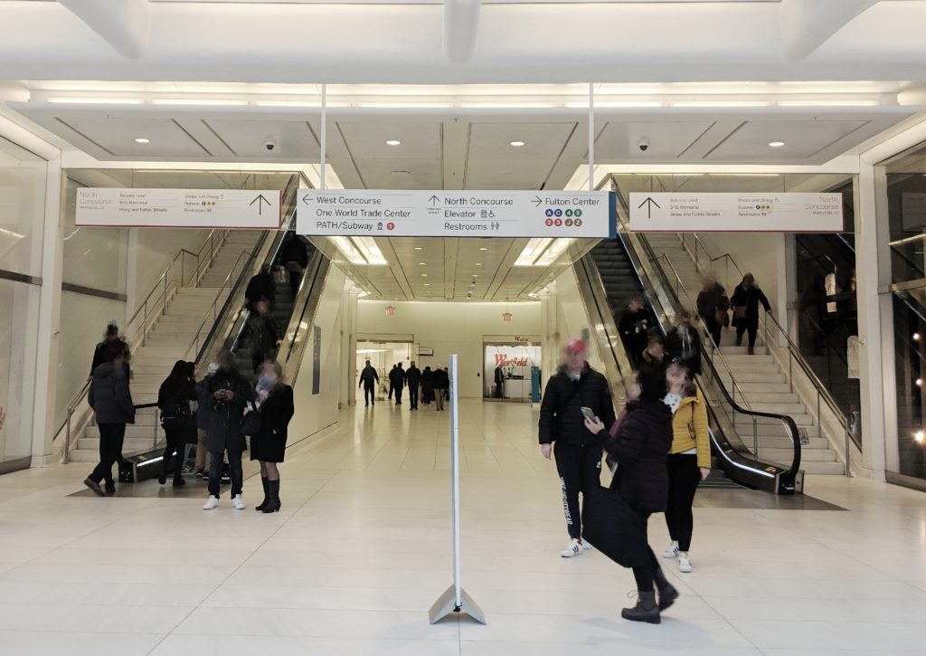
Similar to the Floor Plans, identification and directional signs could be found at every decision points, on the wall or under the ceiling, and were organized in hierarchy to allow users quickly scan through. Several directional signs with same content were placed along the route, so users could confirm their decision and verify the arrival at the destination.

Hanging signs and mobile sign station at a decision point ©Xin Su

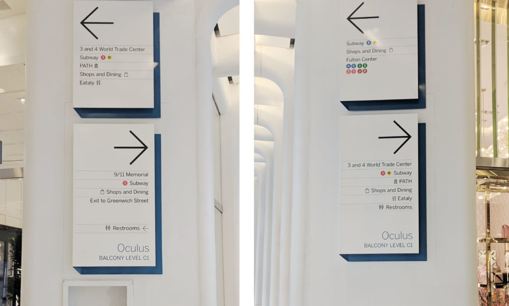
However, during the observation I saw visitors asking staffs for direction after they read through the signs and I believe there were a few reasons. First, some signs offered “contradictory” information which in fact was accurate. For example, at one decision point, the upper sign on the wall displayed the 1 train entrance was to the left while the sign right underneath it showed that the entrance was to the right. There were indeed entrances at both direction, but anyone who was not familiar with the area would definitely feel lost after reading the signs alone. And this kind of “competing” information can be seen all over the place. Second, signs provided incomplete information. The train entrance for single direction was not indicated on the signs and will lead users to the wrong way. In addition to the permanent signs, mobile sign stations were placed at multiple location, which may cause anxiety. I saw about 10 signs upon exiting the PATH station, leaving me a very negative impression.

Signs with “contradictory” information ©Xin Su

Suggestions:

  • state only the nearest entrance at one decision point
  • Add detail information regarding the subway line direction
  • Reorganize the information to reduce the total amount of signs at one decision point

Staff

There was only one concierge desk located at Oculus level, which may not be sufficient considering the daily traffic. And the location was neither illustrated on the maps nor listed on the signs. You could find staffs at every decision point and gate. Although I believe that is due to the security concerns, they would offer help when being asked. However, at crowded spaces they might not be visibly in their dark uniform.

Suggestion:

  • Add more information booth, and provide the location information on maps and signs
  • Change the uniform color to make staffs more visible when needed

Reflection

The experience illustrates how information works as thing (eg. ticket machines, signs, maps), process (eg. reading instructions, signs and maps) and knowledge (eg. successful completing the task) (Buckland, 1991). However, due to its quantity and complexity, it would be useful to introduce the fourth state – interactive information (eg. interactive map, multi-language interface) into the information system, allowing users to freely explore and acquire the information they need (Marchionini, 2008). These four stages are interconnected, any tiny mistakes occur in one state will cause error in the next one.

The insights and lessons I learned from its information-communication designs can be applied in my future work as users follow the same process to navigate in physical and virtual world. “The virtual worlds of software are worlds of cognition: ideas and concepts presented without physical substance” (Norman, 2004, p80). A clear and communicable information system design is especially essential in virtual world, since the users cannot get clues from anything other than your design, and as they are not physically restricted in a space, they can easily switch to other available options.

INFO 601-02 Assignment 3: Observation by Xin Su

Reference:

Calori, C & Vanden-Eynden, D (2015). Signage and Wayfinding Design. Hoboken, NJ: John Wiley & Sons, Inc.

Norman, D.A. (2004). Emotional Design: Why We Love (Or Hate) Everyday Things. New York, NY : Basic Books.

Buckland, M. K. (1991). Information as Thing. Journal of the American Society for Information Science, 42(5), 351-360.
Marchionini, G. (2008). Library & Information Science Research, 30(2008), 165–174.

For more information about The Oculus

Event Attendance: AI is the New UI

Interaction 19, held from 3-8 February in Seattle, is a week of design events for interaction designers from around the world. It assemble a diverse group of professionals and academics to explore the edges of interaction design and help to spark a transformation of the discipline for the needs of the 21st century. This year’s event features: Interaction 19 Conference, Education Summit, Local Leaders Retreat, Workshops, Student Design Charette and Interaction Awards Ceremony.

The three-day conference Interaction 19 is the main event. In the process of watching speeches of various topics, I found myself interested in the content about artificial intelligence. On 7 February, there are two groups of lectures about AI: “AI is the New UI” and “AI in the Wild”. The first topic attracts me very much. “AI is the New UI” includes five presentation: “Designing for AI”, “How to Design With, Not For, Artificial Intelligence”, “Democratization, Industrialization and Augmentation: Where Creativity and Design Craft is Going Next”, “Designing Transparent AI” and “How AI Will Change The Way We Work”.

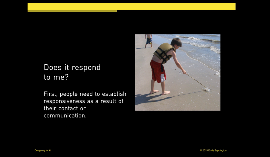
In “Designing for AI”, Emily Sappington talked about her opinions about imbuing artificial intelligent components in products. She shared her practices both in large companies and startups, indicating that creating minimum viable intelligence for AI product is the most important and fundamental strategy of product design. Meanwhile, designers should set appropriate user expectation for AI interaction process considering the user’s satisfaction. Because user’s interaction with product is a trust-building process in which quality and ability delivered in product that company promised directly influence the consequence of user testing. Take voice assistance as an example, “A user who can’t set a reminder with their voice , will not be likely to trust the same voice assistant to take down credit card information and order pizza.”

In “How to Design With, Not For, Artificial Intelligence”, Joe Meersman began with IBM Wason case study and some best practices. Then he proposed concrete framework of successful AI delivery, including ideal delivery team for each of the three categories of AI projects and relative delivery process.

Similarly, “Designing Transparent AI” from Arathi Sethumadhavan and Dr. Samuel J. Levulis also suggested that designers should set appropriate expectations about what the AI can and cannot do and strive to make various elements of system performance transparent to users. Then they provided some examples of the techniques that can be adopted to make AI algorithms and vulnerabilities more transparent to users.

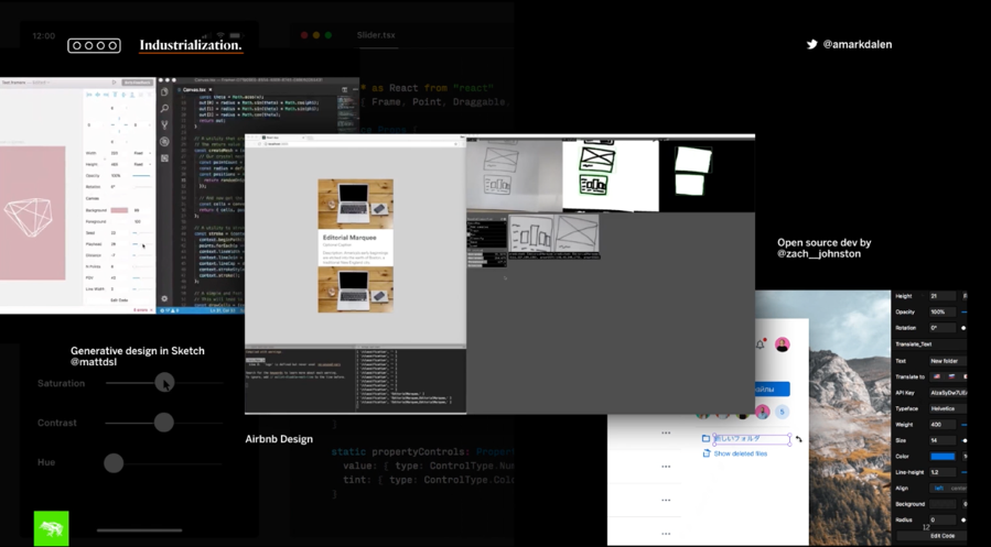
In “Democratization, Industrialization and Augmentation: Where Creativity and Design Craft is Going Next”, Andreas Markdalen proposed three things he believes that are critical to understand where design craft and discipline is going. The barriers for entering design field is diminish and people around the world are starting to participate and contribute. Design literacy is wildly increased and process commoditization is widely used with the emergence of new design tools and platforms, such as Autodraw, Adobe Sensei and Simple.io which are achieved by artificial intelligence and machine learning technology. Meanwhile, the popularity of digital transformation promotes the industrialization of digital design. Systemic design helps brand save time and effort in delivering value and product to market. Seamless workflow allows team to drive efficiency and automation. Open source tools like Airbnb design and generative design in Sketch are starting blend generative design with experience design. As a result, technology helps augment human skill and creativity to a large extent. As designers are starting to co-create alongside AI-driven systems and engines, a new era of systems and product design begins.

Kristian Samarian’s speech “How AI Will Change The Way We Work” also looks forward to the future. He indicated AI will likely cause a more significant shift for designers than previous design shift. Specifically, AI will bring us into an era of “teaching” technology. As more work is automated, our design domain will change to augmented human intelligence and human-machine collaboration.

“AI is the New UI” shows that AI is bringing a wide range of changes to the design field. Firstly,AI contributes to efficiency economy, improving the design efficiency. More and more automated design tools have emerged, replacing the repetitive and inefficient design work. As Markdalen mentioned in his speech, Airbnb Design can convert hand draft into prototype in a real time. There has also emerged automatically design tool like “Luban”from Alibaba. “Luban” makes use of deep learning and image generation technology to automatically design and generate advertising banners for Taobao, so that the design of advertising can also achieve personalized recommendation. On “Double 11” shopping festival of 2016, Luban made its debut. On “Double 11” 2017, Luban had been able to produce 40 million posters a day, an average of 8,000 posters per second, and each poster was designed according to the characteristics of commodity images. In other words, each one is unique.

More importantly, AI will interconnect all things, thus the design object will shift from single computer or mobile platform to intelligent devices, such as smart voice box, smart TV, smart cars, etc., forming a multi-scene fusion linkage. Meanwhile, the trend of combination between software and hardware means design objects are more diverse and design reference dimensions are more abundant. “AI is the new UI” indicates the trend of wild application of AI as the form as UI and UX, not just screens on devices. According to a report from Accenture in 2017, AI is rising as the new purveyor of UI and UX. The leading enterprise technology vendors have also regarded AI as the future of computer interfaces. More screenless computing is on the horizon with the innovation of AI in the field of interaction (McKendrick, 2017). Autonomous vehicles and voice-activated home assistants are just early examples of intelligent hardware, now more intelligent hardware is booming in business scenarios. Alipay’s face recognition payment is the representative of AI’s landing in new retail field. It is a new payment method based on artificial intelligence, biometrics, 3D sensing and big data risk management technology. Users can make payment by scaning their faces without using mobile phones, which effectively improves the user’s consumption experience and the efficiency of the payment. On September 1, 2017, Alipay landed the first face payment machine at the KFC restaurant in Hangzhou. By December 2018, there are 23 stores in 11 cities have tried. Not only in KFC, but also in retail scenes such as supermarkets and pharmacies, hundreds of cities across the country have begun to try face payment.

The rapid development of information technology brings great chance and threat to all walks of life. Every industry is exploring more possibilities and thinking about how to take advantage of AI. The design industry needs creativity and emotion, which should play a more important role in linking AI and humanity in the era of intelligence. Therefore, the relationship between design and AI is far more profound and complex than the work replacement relationship. As Sengers argued in “Practices for a machine culture: a case study of integrating cultural theory and artificial intelligence”: “In order to be able to address contemporary human experience, we need science and the humanities to be combined into hybrid forms which can address the machinic and the human simultaneously.”

– Mingqi Rui, Info 601, Professor Chris Alen Sula

Reference:

Interaction 19. (2019). Interaction 19 – 3-8 February 2019 • Seattle, WA. [online] Available at: https://interaction19.ixda.org/program/7_thursday/ [Accessed 15 Mar. 2019].

McKendrick, J. (2017). More artificial intelligence, fewer screens: the future of computing unfolds | ZDNet. [online] ZDNet. Available at: https://www.zdnet.com/article/artificial-intelligence-the-new-user-interface-and-experience/ [Accessed 15 Mar. 2019].

Phoebe Sengers, “Practices for a Machine Culture: A Case Study of Integrating Cultural Theory and Artificial Intelligence” Surfaces VIII: 1999, 6.

Event Attendance: Moran Yemini and the New Irony of Free Speech

INFO 601-02 – Assignment 3 – Event Attendance – Vella Voynova

How does the Internet impact freedom of speech? What does this mean for liberty? These questions occupy Moran Yemini, a Senior Fellow at the University of Haifa’s Center for Cyber Law and Policy and a Visiting Fellow at Yale Law School’s Information Society Project and Cornell Tech’s Digital Life Initiative. Yemini explored these questions at length at Cornell Tech’s seminar on March 7, 2019, “The New Irony of Free Speech.”

What is the irony of free speech?

The original irony of free speech that Yemini references was introduced in 1996 by Owen Fiss. Fiss argued that freedom of speech laws were originally intended to protect citizens from state interference, but gradually came to favor the wealthy and powerful at the expense of everyone else. While the laws granted everyone the same liberty to speak, only those with clout and authority could afford the expressive capacity to make their speech heard. The advent of the Internet and what Yemini calls the digital ecosystem democratized expressive capacity and gave citizens an online platform to reach bigger audiences across greater distances. Yemini’s “new irony” of free speech is that what we have gained in expressive capacity, we have lost in liberty to speak. Although the Internet carries our speech louder and farther, it makes us more vulnerable to interference. The use of the word “irony” perplexed some of the audience. Yemini explained that he finds irony not only in how the Internet has subverted expectations that it would solve the problem of free speech, but also in how much of the public believes that the problem has been solved.

Free speech and democracy

Audience questions also led Yemini to clarify that the problems and conditions he describes are found in liberal democracies and do not apply to authoritarian countries. While true that citizens in democracies enjoy more liberty through media, they should not take these conditions for granted. In a democracy, competition determines who controls media development, which makes the media a constant battleground (McChesney, 65). Competition is more intense when democracies face critical moments, such as negotiating the rules for Internet speech.

How does the digital ecosystem interfere with our liberty to speak?

During the majority of the seminar, Yemini discussed how the digital ecosystem interferes with our liberty to speak. Sources of interference are all around us: search engines that track histories and manipulate results, as well as broadband and cloud providers who create the framework for Internet speech. Additionally, media ownership concentration forces us to rely on digital platforms that conduct mass surveillance. This does away with our anonymity and enables media companies to manipulate us through data collection. Lawrence Lessig has already pointed out the value of privacy and anonymity. In order to protect these values on the Internet, we need to monitor those who design and profit from the digital ecosystem (Lessig, 104). The corporate and political actors who shape the Internet are not neutral in their motivations and have the means to interfere with our liberty to speak.

The technologically induced endowment effect

Yemini’s conclusion emphasized the importance of the technologically induced endowment effect: it is much harder to part with technology that we use than it is to live without that technology in the first place. While the increased individual freedom of the Internet may be gratifying and obvious, the interference allowed by the digital ecosystem is not always directly felt or perceived. We are in danger of becoming so dependent on the Internet’s expressive capacity that we may become willing to overlook the less apparent ways in which it curtails our liberty.

What happens next?

While Yemini outlined how the Internet is transforming freedom of speech and threatening our liberty, he did not propose clear solutions. Given his legal background, I expected to hear about how constitutional law could be used to approach the problem, or suggestions for policies that could safeguard our liberty to speak in a complex digital ecosystem. Jürgen Habermas argued for the necessity of a public sphere where citizens are free to express themselves without worrying about interference (McChesney, 66). After listening to Yemini, it is impossible not to be concerned that most of us perceive the Internet as a public sphere without giving sufficient thought to the ways in which its current structure interferes with our liberty to speak.

References:

Lessig Lawrence. (1999). “Open Code and Open Societies: Values of Internet Governance,” Chicago-Kent Law Review 74, 101-116.

McChesney, Robert. (2013). Digital Disconnect: How Capitalism is Turning the Internet Against Democracy. New Press.

Observation: Black & Light by Oscar Oiwa at Cadillac House

Info 601-02 Assignment 3: Observation by Michael Lewis

Due to my background in art and design, I chose to explore an art exhibition as my object of observation. A close friend of mine invited me to an opening of Oscar Oiwa’s Immersive Mural “BLACK & LIGHT” exhibition curated by Visionaire. In looking at this, I realized that this would be an excellent opportunity for me to conduct an observation of how people interact with each other and technology in a deliberate interactive environment.

Source : https://gothamtogo.com/oscar-oiwa-black-light-at-cadillac-house-gallery-in-greenwich-village/

Oscar Oiwa (53) is a Brazilian-American painter who is known for his Globalism movement in mural art. Throughout March 30, “BLACK & LIGHT” will be available for the public at Cadillac House, New York. The Japanese-Brazilian artist painted a black and white mural inside an inflatable dome with a surface area of 2,700 square feet. Oscar is well known for his signature surreal paintings and mythical characters like Light Rabbit and Shadow Cat. Events can, to some extent, be created or recreated (Buckland, 1991). In this case, Oscar tries to re-enact his art as a form of information for people in New York City to experience his idea and concept in a wonderful space of Cadillac House curated by Visionaire.

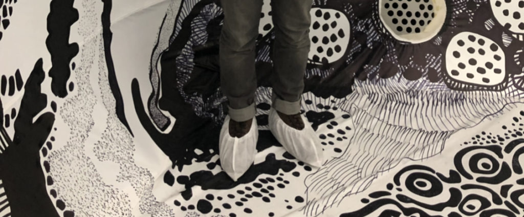
As I entered the Cadillac House building, a few hosts greeted me and asked me for the RSVP invitation. The event is very well curated and filled with people from the art and fashion industry. Guests are served with cocktails and hors d’oeuvre as they waited in the waiting room before they are allowed to enter the majestic-looking inflatable dome. As I was lining up to access the dome, I realized that all guests are required to use a disposable shoe cover provided by Visionaire. As a result, it prevented guests from ruining the paintings inside the dome. This procedure is a piece of evidence that the painting (information-as-thing) has to be preserved as much as it can due to its high value to the audience.

Disposable shoe cover for guests to enter the dome

After a 10 minutes wait, I and the several other guests entered the 2,700 square feet dome covered in an astonishing black and white surreal landscape painted by Oscar Oiwa. They limit 20 people to be inside the dome to prevent any damage to the painting. It is beyond words of how information is transmitted as a knowledge between guests, technology, and the artist himself. I realized that few of the guests are from outside of the country and they are accompanied by translators who are fluent with their languages and able to explain the concept behind this amazing art space. In looking at this, I realized that this is a form of an embodied information, a corporeal expression or manifestation of information previously in encoded form (Bates, 2006), transmitted by the translator to guests who are more comfortable in their own language.

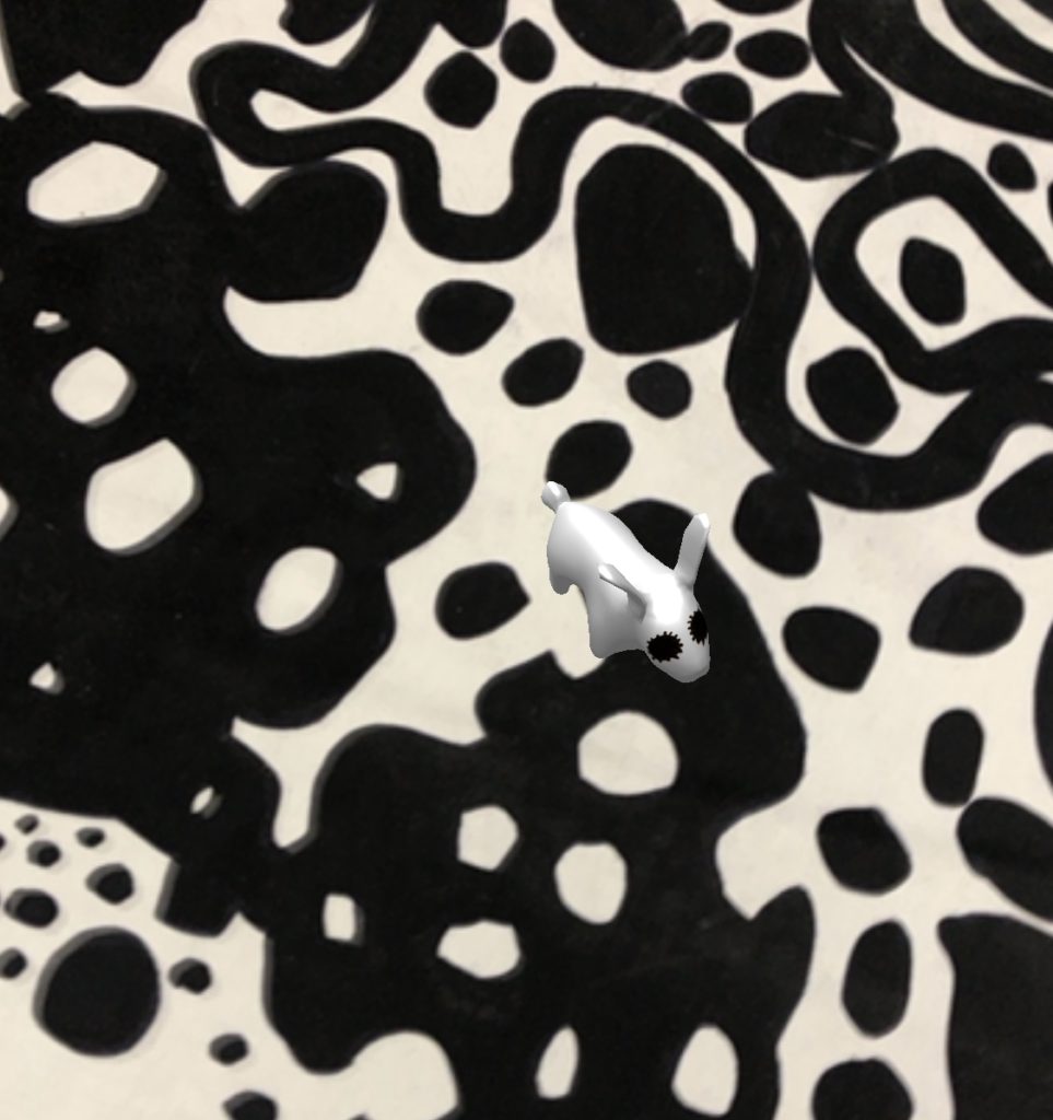
This event also provided an immersive experience where guests can interact with the painting through augmented reality. One of the staffs inside the dome approached me and introduced a feature that I can access through a gadget like a phone or a tablet. I was asked to access a site called jumpintothelight.com to experience the augmented reality designed by Oscar and Visionaire team. As I turn on my camera inside the dome, I can see Oscar’s famous Light Rabbit and Shadow Cat character running around across the painting inside the dome. It was such a breathtaking experience to witness a different form of embedded information, a piece of enduring information created or altered by the actions of animals and people in the world (Bates, 2006).

Augmented reality of Light Rabbit

As each guest are only allowed to stay for some amount of time, I decided to exit the dome and join my peers outside to discuss our experience inside the space. As we have our own subjective opinion towards the display, a form of enacted information is being transmitted along to every individual in the discussion. After spending 2 hours in this fantastic space, I decided to leave and grab a postcard-look alike invitation designed by one of my closest friend who got invited to this event and make me as his companion. It is a 5″ x 7″ black and white postcard with a charming layout filled with Oscar Oiwa’s signature character Light Rabbit and Shadow Cat. We decided to keep the invitation as part of the evidence and memoir of our visit to the exhibition. This invitation act as communicatory or memorial information preserved in a durable medium which Bates called as a piece of recorded information. I am happy to say that I cherish every moment at the event and I do realize that this observation has given me so much information in different forms introduced by Buckland which are information-as-knowledge, information-as-process and the last but not least, information-as-thing as I brought the invitation back home as a souvenir from the event.

Black & Light invitation

References:

Bates, M. J. (2006). Fundamental Forms of Information. Journal of the American Society for Information Science and Technology, (57)8, 1036.

Buckland, M. K. (1991). Information as Thing. Journal of the American Society for Information Science, 42(5), 351-356.

Event Attendance: Designing the Connected City @ Cooper Hewitt, Smithsonian Design Museum

By: Michelle Kung
INFO 601-02 Assignment 3 Event Attendance

Cities like New York are notorious for congestion and pollution. It often takes the same amount of time to walk somewhere as it does to drive somewhere. But big tech companies are reimagining urban mobility with connected and autonomous vehicles (AVs). On the 25th of February, 2019, leaders in the field of autonomous vehicles or driverless cars came together at the Cooper Hewitt, Smithsonian Design Museum for a panel discussion. Moderated by Cynthia E Smith, the curator of Socially Responsible Design, the panel consisted of Sarah Williams, the director of Civic Data Design Lab at MIT, Ryan Powell, the head of user research and UX design at Waymo (Google’s self-driving car project), and Jack Robbins, the director of urban design at FXCollaborative. With diverse backgrounds, the three panellists debated topical issues engendered by AVs.

A World Unknown

One thing that the three panellists agreed on was that no one really knows how technology will impact mobility in urban spaces. The field is still new and concepts have only been tested on limited scales. Jack Robbins called this ‘a new era of mobility’. Indeed, we have no idea how the way we move, not just within cities but across the country, is going to change. All we know, and all leaders in the field know, is that autonomous vehicles will be the biggest drivers of change.

Heaven or Hell Scenario

Jack Robbins illustrated two opposing scenarios: a heaven scenario and a hell scenario. In the heaven scenario, after autonomous vehicles have replaced standard vehicles. There will be fewer vehicles on the road, fewer vehicle miles travelled and more spaces freed up in cities for other things. Without the need for parking (i.e. temporary storage of private vehicles) within the city, there is a tremendous opportunity for the creation of more green spaces and open spaces which will increase the liveability of any congested and densely populated city. On the other hand, in the hell scenario, there will be more vehicles and more vehicle miles travelled. Autonomous vehicles will be on the road driving around with or without passengers, which would be terrible for inhabitants of cities as well as the health of the planet. 

Will companies deliver on their promises?

Companies developing autonomous vehicles are of course promising everything detailed in the heaven scenario. But Jack Robbins cautioned event goers against trusting these companies too much.  After all, the way they make their money is incompatible with the promises they are making. For example, Google sells advertising but is promising increased road safety, mobility equity, easy parking, transit support, and less traffic. But how? By gathering an increasing variety of information on humans and on built environments.

Human Behaviour is Information as Thing

Waymo, Google’s driverless car company, purports to take a human centred approach to create a ride hailing service. Their primary goal is physical safety. In order to achieve this, Waymo collects an incredible amount of data on people and human behaviour in order to program the world’s most experienced drivers. According to Ryan Powell, 94% of road accidents are caused by human errors and Waymo’s aim is to eliminate this altogether. Waymo has managed to collect the data of behaviour patterns of adults, children, and cyclists in order to teach their fleet of driverless cars how to react safely in each scenario.

On the surface, treating human behaviour as information as thing is not at all revolutionary. Psychology, anthropology, and a whole host of other social sciences have studied the behaviour of humans for decades. But the monetisation and capitalisation of this information on such a large scale is new. Speakers in this talk were more interested in talking about the information regarding the space and infrastructure of a city than information about the people living in them, which is slightly alarming.

Public Space as Private information

A huge topic of debate in this design talk was the importance of the public nature of public space. Speakers Sarah Williams and Jack Robbins both challenged Ryan Powell on Waymo’s current practices of keeping information about the public space private.

As Waymo gathers more and more information on public spaces, their data set becomes more valuable. Sarah Williams advocated for city governments to leverage their power to ban companies like Waymo from operating in their cities to negotiate data rights. Both Sarah Williams and Jack Robbins argued for the importance of public governing bodies to step up and play a more active role in this sphere rather than passively hoping for technology companies to do the right thing by citizens. Autonomous vehicles pose real dangers in deepening and widening the digital divide, privatising public data, and decreasing equitability in cities. It is up to cities to set boundaries, guidelines, and regulations so that data collection and ownership of cities contribute to the public good and can benefit the many rather than the few.

Conclusion and Reflection

This design talk was fascinating and helped me conceptualise the new forms of information this emergent technology creates. The panel discussion really encouraged me to think more deeply about the data rights of citizens and city governments. It is already inconceivable, the amount of data big software companies have on our digital behaviour. It is entirely unimaginable, for the average user, what information companies developing autonomous vehicles will have on our behaviour in physical environments once AVs become more mainstream.

In the meantime, it is clear that city governments need to catch up to big tech players in order to ensure that public spaces are protected, new infrastructure built is adaptable to unforeseeable changes, that cities become more liveable in the long term for all its inhabitants, not just a select few.

References

Buckland, Michael K. “Information as Thing.” Journal of the American Society for Information Science42, no. 5 (1991): 351-60. doi:10.1002/(sici)1097-4571(199106)42:53.0.co;2-3.

Data Through Design – Panel Discussion: Everything is a Proxy

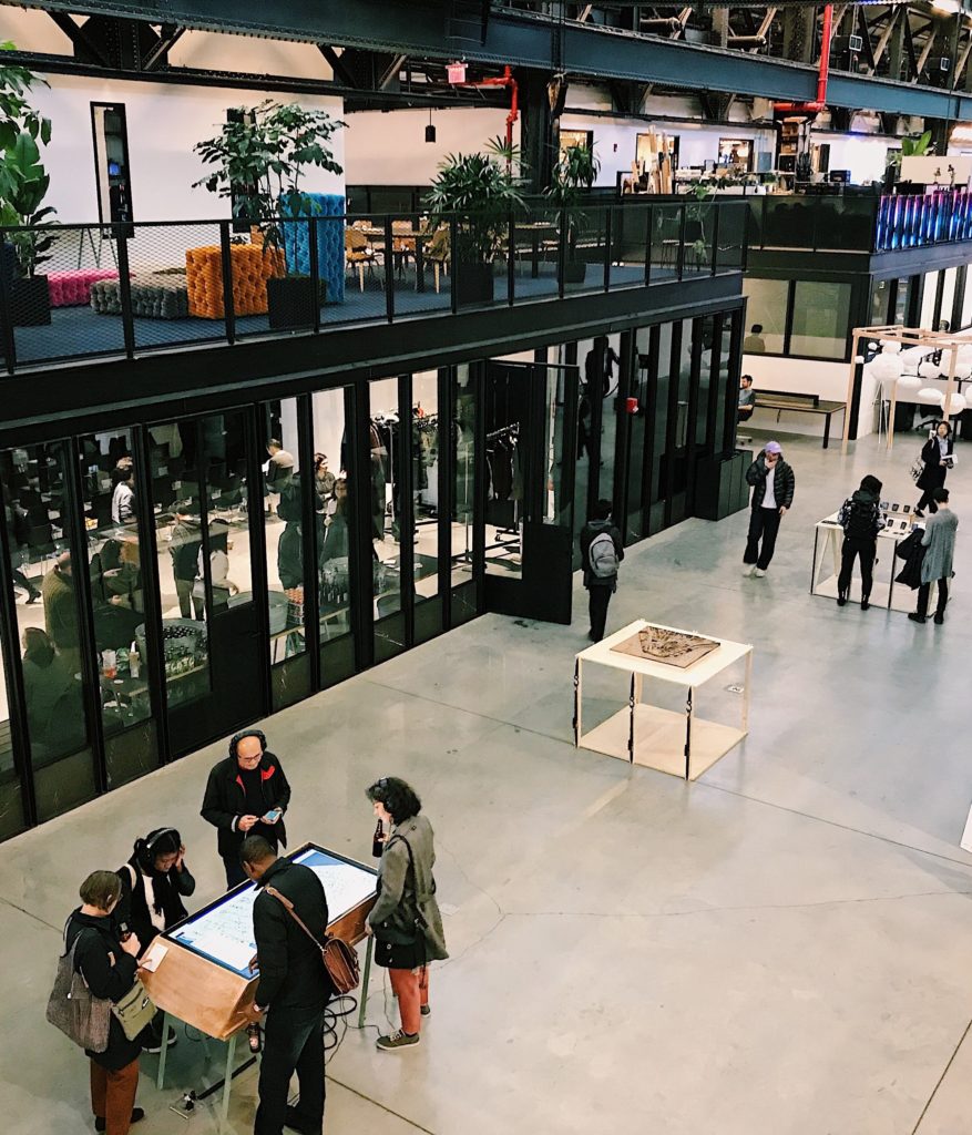
“Data Through Design – Panel Discussion: Everything is a Proxy” was a part of the Data x Design exhibition and NYC Open Data Week. It provided a platform for the audience to learn more about artists’ creative process. The event created a unique opportunity for live communication with exhibiting Data x Design artists about their design experience based on open data. The objective of this event was to encourage students to create new methods of map-making, develop a deeper understanding of life in the city and provide a wider knowledge of NYC’s open data. The event was held in the New Lab – Brooklyn Navy Yard. It was an open space where every visitor could test the functions of any interactive exhibits.

One of the sponsors of this event was Pratt Institute Spatial Analysis and Visualization Initiative. SAVI is a geographic information system-centered research and service that uses mapping, data, design, and visualization to understand and empower urban communities. They enable students to make data-driven maps and visualizations to solve real-world problems.

Let’s take a look at some of the projects:

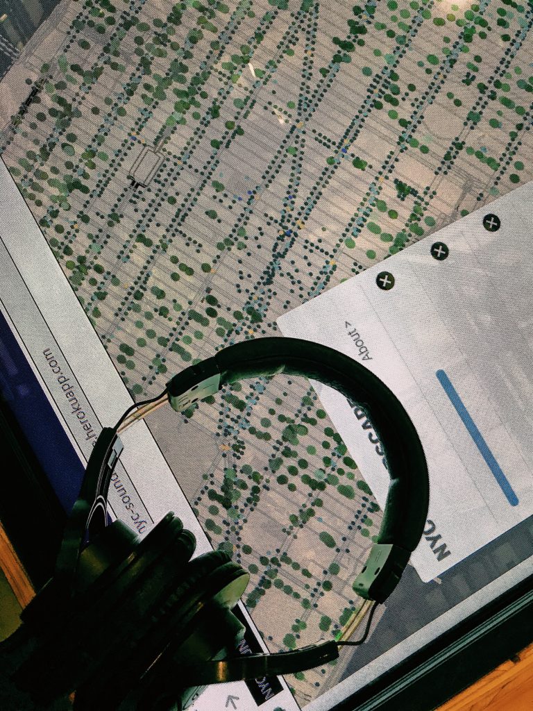
  • NYC Trees Soundscape

The authors of the project used a combination of six data sets to create an imitation of sounds on the streets of New York. Viewers can choose a route on an interactive map using a touchscreen and listen to the audio that simulates the environmental sounds in this location.

  • Cards Against Hate

Based on the annual “NYC Reported Hate Crimes” dataset, the project presented cards demonstrating the number of actual hate crime incidents with the real stories. The main goal of the project was to bring more attention to investigation of hate crimes and bias incidents in the US. Also, the authors hope to provide deeper insight into the nature of hate crimes among different social groups.

  • Exhausted New York

To design the installation, the artist researched the air quality index and compared it to the asthma rates among New Yorkers. Based on this information, she concluded that invisible problems of air pollution is one of the biggest in NYC. The aim of Exhausted New York visualization is to demonstrate how polluted the air that we breathe is.

Data-driven events are a great way to engage students in the creative process and encourage them to apply their digital skills. All projects were based on open data sets and the participants ’own experiences. All the artists used indigenous knowledge as a background for their projects. The artists analyzed the relevant issues for NYC and found a unique solutions. They offered fresh ideas to solve urban problems such as traffic jams, train delays and long lines. Open data sets help to present a­­ccurate and relevant information in physical space through digital visualization. With each project, data become more emotional. This process displays the application of the Data-Information-Knowledge-Wisdom model by Ma Lai (Meanings of information: The assumptions and research consequences of three foundational LIS theories). The authors of the projects turn the data into up-to-date city management, optimized delivery and service routes, and efficient strategic planning. 

The artists analyzed statistics and data correlations in their field of study to create the projects. Research that they conducted helped them investigate the specific issues of the city from different sides and create a unique solution as a result. Digital tools and open data allow artists to be able to say what they want to say. The process of interaction between the artist and data illustrates ideas from the “Human–information interaction research and development” article by Gary Marchionini.

In the process of working on their projects, the participants encountered some difficulties. Some of the datasets were incomplete and they had to read between the lines to fill in the gaps. In addition, artists had to take into account the historical, economic, and social contexts in which they used the data.

At the last part of the event, we discussed the issue of data education for high school students. Everyone who participated in the discussion agreed that in the next 20 years the curriculum will include data handling subjects to teach children to analyze and protect data.

To create their projects, participants worked on data, analytics, mapping, design, and visualization in collaboration with different departments of various universities and sponsoring organizations. Cooperation and team work helped create an enviroment where faculty and students could share ideas across disciplines to make government services more accessible, efficient and responsive to the public needs.

Before attending the “Data Through Design – Panel Discussion: Everything is a Proxy” event, I thought that open datasets were difficult to understand and they couldn’t be applied to solving modern urban problems. After participating in the discussion, my opinion about open data changed. I realize that it is a great sourse for innovative projects that could change our environment.

More information about the event is available on the website.: https://www.eventbrite.com/e/data-through-design-panel-discussion-everything-is-a-proxy-tickets-57713713270#

INFO 601-02 Assignment 3: Event attendance by Elena Korshakova