How Netflix Learns What You Like

On Thursday, February 28th, NYU Tandon School of Engineering held a live streaming event featuring a talk given by Netflix’s Director of Machine Learning, Tony Jebara. The topic covered was “Machine Learning for Personalization”, which Jebara provided company use cases and solutions for content personalization.
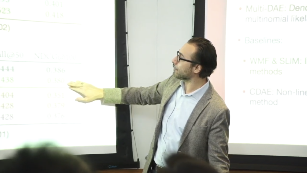
Netflix Director of Machine Learning, Tony Jebara

Netflix, a streaming media-service, is well regarded within the machine learning field for developing impressive machine learning models that incorporate advanced feedback mechanisms to train and improve those models.

According to the Director of Machine Learning, Tony Jebara, every Netflix user’s experience is unique across a range of personalized content. A few examples of personalized content provided by Jebara were rankings, homepage generation, promotions, image selections, searches, advertisement displays, and push notifications.

Content Personalization

Content personalization is a technique leveraged by many companies, across many industries, for the business of either creating content, distributing it or both. Content encompasses everything from online articles to advertisements. In Digital Disconnect, McChesney describes that the popular digital method “personalizes content for individuals, and the content is selected based on what is considered most likely to assist the sale” (p.157).

Entrepreneur lauded Netflix and other media companies who are successfully leveraging machine learning to develop custom experiences but notes a dichotomy which plagues user’s and their preferences. The trade-off between conveniently custom experiences or inconveniently anonymous reintroductions. On one side, users face issues surrounding privacy or unpleasant information dictation.

Opposite to their praises as personalization gurus, Fast Company highlighted some of the negative criticisms Netflix has also received. When companies curate the content users consume, there’s a risk of receiving biased information whether it be political or racial. Berkowitz opens with, “How companies advertise to you says a lot about how they see you” when referring to the racial bias in the algorithms used by not only Netflix, in this case, but many of the other companies working to deploy advanced content personalization algorithms.

“Filter Bubbles”

Regarding the politically charged dictation of content, Castells remarks, “The networks themselves reflect and create distinctive cultures. Both they and the traffic they carry are largely outside national regulation. Our dependence on the new modes of informational flow gives to those in a position to control them enormous power to control us. The main political arena is now the media, and the media are not politically answerable” (p. 34).

McChesney adds how these practices also lead to an issue he considers the “personalization bubble” or what he specifically alludes to as the “filter bubble” (p.157). Users are trapped in an experience they believe to be unique or new but is perpetuated by the same content delivery—just done differently (p. 70).

McChesney references Eli Pariser’s The Filter Bubble: How the New Web is Changing What We Read and How We Think when stating, “Pariser’s Filter Bubble documented how the Internet is quickly becoming a personalized experience wherein people get different results on Google searches for identical queries, based on their history” (p.157).

When Netflix Intervenes

In his talk, Jebara claimed that “prediction is valuable but actual intervention is what we want to understand.” Their algorithms are two-fold—ensuring that experiences are uniquely specific without providing recommendations that are too specific, which may lead to either a negative user experience and a potential unsubscribe from the service.
We’ve all experienced moments of interacting with a digital platform that, over time and with enough data aggregation, begins to recommend content or display ads across devices and sites outside the ownership of the originating platform. If frightened enough, we may have even gone as far as to deleting our browser cookies, adjusting our privacy settings or even unsubscribing from the service.

Algorithm Feedback

Jebara mentioned that a multitude of mixed-method machine learning algorithms are implemented to hone everything from predictive analytics and image curation to user-enforced restrictions and feedback mechanisms.

Jebara described their method take rate as a curatorial feedback strategy which tests different personalization experiences on several users to determine which of the content shown resulted in an actual viewing.
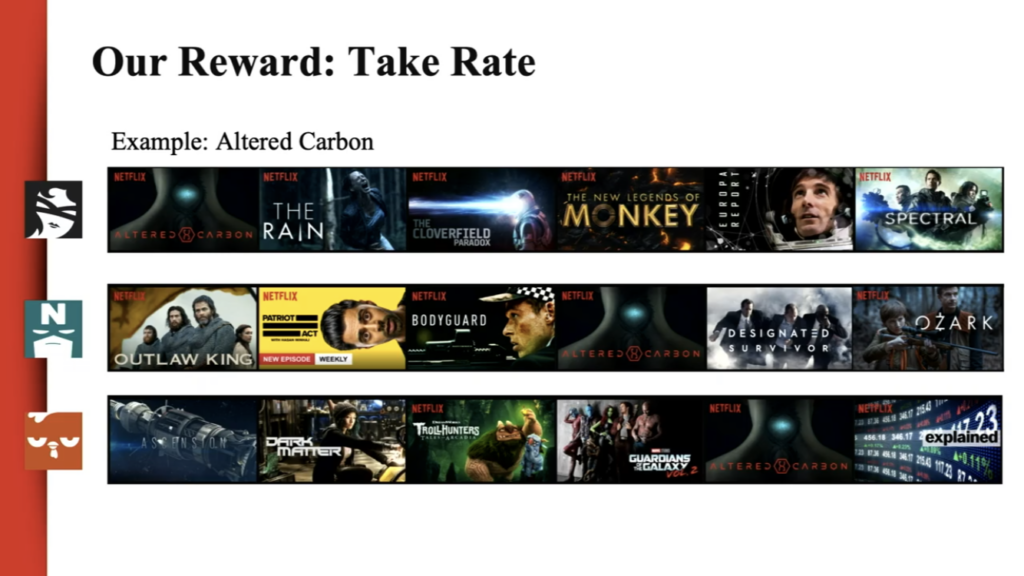
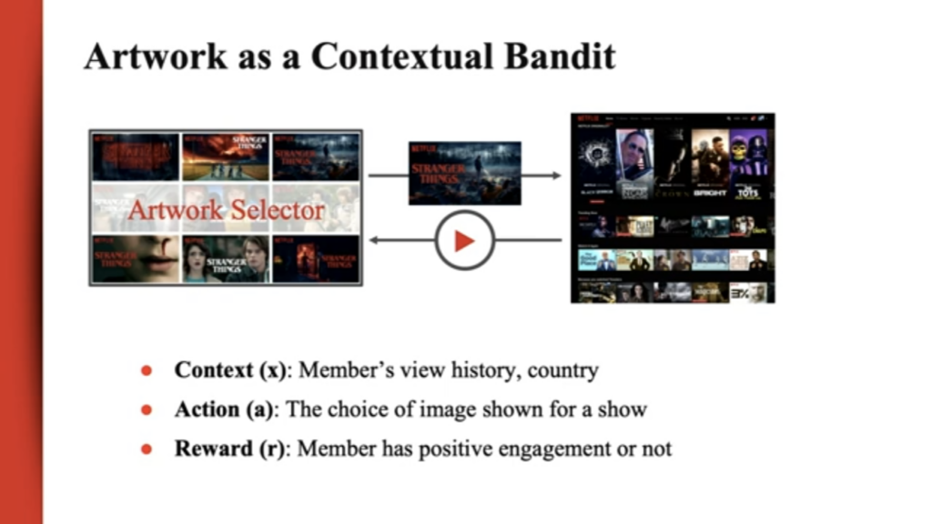
This strategy uniquely prefers the measurement of the number of viewers that strategy worked for over the number of viewers a specific piece of content was shown to. Jebara noted this method enables Netflix experts to learn from users by letting them show what content they prefer and in which ways they’re drawn to recommendations.

User Generated Feedback

This is a major shift from their previous user experience of providing users with the ability to ranking rank content using a star ranking system. Overtime and through observation, Netflix realized they couldn’t rely on that ranking system as a source of truth for which content users ranked highly versus which they’d prefer to watch. Jebara added users were not truthful in their telling of which content they preferred. Shifting away from user interaction to user observation has enabled a greater foundation for developing recommendation systems.

Conclusion

As content personalization algorithms advance, consumers will become a more passive actor in teaching content personalization algorithms. Every attempt at restricting interaction with such algorithms will lead only to yet another loophole identified by machine learning experts. How those companies manage those algorithms and exploit those loopholes are examples of the digital power dynamic which exists between the content generators and the content consumers.

References:

Berkowitz, Joe. “Is Netflix racially personalizing artwork for its titles?One writer’s experience with Netflix’s title art has us wondering whether the company is quietly using race in its algorithm for visually recommending films”. Fast Company (2018). https://www.fastcompany.com/90253578/is-netflix-racially-personalizing-artwork-for-its-titles

Castells, Manuel. The Information Age: Economy, Society, and Culture. Wiley-Blackwell (2010). https://lms.pratt.edu/pluginfile.php/876462/mod_resource/content/1/manuel_castells_the_rise_of_the_network_societybookfi-org.pdf

Chmielewski, Dawn C. “Netflix’s Use of Artwork Personalization Attracts Online Criticism”. Deadline (2018).  https://deadline.com/2018/10/netflixs-artwork-personalization-attracts-online-criticism-1202487598/

McChesney, Robert W. Digital Disconnect. The New Press (2013): 63-171.

Wirth, Karl. “Netflix Has Adopted Machine Learning to Personalize Its Marketing Game at Scale: Here’s how you can humanize marketing strategies. Entrepreneur (2018). https://www.entrepreneur.com/article/311931
Preserving our Digital Afterlives

This morning, as I was scrolling through Instagram, I came across an interesting post by Oroma Elewa, a Nigerian-born visual and performance artist, writer and director. Under the Instagram post, Elewa captioned “Please make this go viral. Don’t love and follow me secretly. Show me you care. Do not let me be erased. This is very painful.” Elewa was addressing a viral quote she had originated in 2014 on her personal Tumblr that has been repeatedly falsely misattributed to Frida Kahlo since 2015: “I am my own muse. The subject I know best. The subject I want to better.” If you Google that quote, you’ll find hundreds of images, articles, products, and social media posts attributing it to Frida Kahlo. In the comment section, people who followed Elewa through her journey as an artist on social media, supported her while others were skeptical. Frida Kahlo, an iconic artist and figure in popular culture and an inspiration to all women of many different backgrounds, didn’t say those words–but, who would believe that Elewa originated the quote?

As a young rising artist, Elewa was inspired by Frida Kahlo’s actual words: “I paint self-portraits because I am so often alone, because I am the person I know best.” Although this is an issue of the spread of misinformation and the blurred lines of ownership and authenticity in the online world, Elewa’s fear of erasure brought to mind Michele Valerie Cloonan’s concept of the paradox of preservation and the transient or ever-changing manner of one’s digital remains. Cloonan wrote that “it is impossible to keep things the same forever. To conserve, preserve, or restore is to alter” (235). Frida Kahlo is not alive to disprove that she ever said Elewa’s quote. With endless digital copies of her image being attached to the quote, how can we manage to support Elewa’s claim? How can Elewa make sure her work lives on without the fear of being erased, silenced or altered in the digital world? And most importantly, how can we protect and preserve our digital afterlives?

The Digital Afterlives Symposium was held at Bard Graduate Center in honor of Professor David Jaffee who was the head of New Media Research. Prof. Jaffee was instrumental in introducing and creating a new direction for the Digital Media Lab at BGC. After his death, not only was his legacy as a leading historian missed, but he also left behind a plethora of files and media pertaining to his personal and professional projects throughout his life. The topic of the symposium came about while his late daughter and a few of his colleagues started a project to archive and preserve Jaffee’s work. This endeavor has led to the exploration of finding innovative ways to protect, prolong and preserve our digital afterlives and the impact technology has on the sustainability of our digital projects as well as the privacy and accessibility of our personal information.

Technology has become an extension of our physical world. As we increasingly develop and interact with technologies, we end up with a constant re-experiencing of the past. At the symposium, Abby Smith Rumsey, an independent scholar, spoke about her research paper on how memory creates identity and how humans create artificial memory through the use of digital technology. Our transformation from an analog to a digital environment has made us reliant on digital technologies to preserve memory and be reminded of the past. And there is a moral weight of dealing with a person’s memory, especially if the person can be immortalized in the digital world. In her presentation called, “Death, Disrupted,” Tamara Kneese spoke on the proliferation of “dead users” in the online world, particularly in social media. Social media is so embedded into our lives that it has become a space for ritualized mourning, memorialization and perhaps immortalization as personal profiles transform into actual shrines after users’ deaths.

But, not everything lasts forever in the digital world. Rosenzweig pointed out that the “life expectancy of digital media [can] be as little as 10 years, [and even so] very few hardware platforms and software programs last that long” (742). Platforms will eventually disappear over time. MySpace, Orkut, Friendster and OpenDiary are all remnants of the old digital environment. Inevitably, we have to address the issue of digital decay. In her presentation at the symposium, Robin Davis, an Emerging Technologies and Online Learning Librarian at John Jay College of Criminal Justice, proved the fragility of the digital world through her case study on the lifespans of digital humanities scholarship projects that were created in 2005. She found that only half of the 60 DH projects she studied were accessible online 10 years later. In some cases, she found that other projects had a shelf life of 5 years due to issues with hosting and the lack of funding while a couple of web projects were even taken over by fraudulent companies. Davis reiterated that digital scholars need to build a preservation plan into their projects and consider the longevity of their choice to create content for the web.

So, ultimately, our digital remains will disappear, but can individuals maintain and manage their own digital data in the hopes of living on as information after death? Is it possible to save everything? Rosenzweig wrote about “the fragility and promiscuity of digital data,” which requires yet more rethinking–about whether we should be trying to save everything…” (739). The debate over whether it is worthy or not to preserve everything was also discussed at the symposium. Overall, all of the speakers agreed that we do not have the proper tools or policies in place to be able to. And also that it is important to preserve more ephemeral data now in order to understand its significance in the future.  

According to Cloonan, “preservation must be a way of seeing and thinking about the world, and it must be a set of actions…[it] also has broader social dimensions, and any discussion of preservation must be include consideration of its cultural aspects” (232). Like Cloonan, Rumsey said that the primary issues of digital technology preservation are not just technical but are in light of larger political, economic, and education issues of our world. Companies like Amazon, Google, and Facebook and libraries as well as government agencies need to put more effort into creating preservation programs. They also do not have the right capacity or policies of dealing with the ramifications of digital remains. If Verizon Media, the owner of Tumblr, were to step up and protect Elewa’s words from being misquoted as Kahlo’s, would it have stopped the proliferation of companies and individuals attributing the quote to Kahlo?

At the end of the discussion, Rumsey left us with a parting message–it is important for us to remember that there are people behind these machines or technologies. People program and create software and applications so that machines behave in a particular way, so it is only up to us to change how we use and think of digital technology. Technologies have no built in moral bias other than what we program them to be, but it is has become an expansion of who we are. The material and digital world are a connected space now. Therefore, we must take responsibility over our digitized selves.

References

Cloonan, Michele Valerie. “W(H)ITHER Preservation?” The Library Quarterly, vol. 71, no. 2, 2001, pp. 231-242. The University of Chicago Press, www.jstor.org/stable/4309597

Elewa, Oroma. “Elewa’s quote.” Instagram, 18 Mar. 2019,

https://www.instagram.com/p/BvG_v1YDnGT/.

Rosenzweig, Roy. “Scarcity or Abundance? Preserving the Past in a Digital Era.” The American Historical Review, vol. 108, no. 3, 2003, pp. 735-762. Oxford University Press, www.jstor.org/stable/10.1086/52956

Event Attendance: Designing the Connected City @ Cooper Hewitt, Smithsonian Design Museum

By: Michelle Kung
INFO 601-02 Assignment 3 Event Attendance

Cities like New York are notorious for congestion and pollution. It often takes the same amount of time to walk somewhere as it does to drive somewhere. But big tech companies are reimagining urban mobility with connected and autonomous vehicles (AVs). On the 25th of February, 2019, leaders in the field of autonomous vehicles or driverless cars came together at the Cooper Hewitt, Smithsonian Design Museum for a panel discussion. Moderated by Cynthia E Smith, the curator of Socially Responsible Design, the panel consisted of Sarah Williams, the director of Civic Data Design Lab at MIT, Ryan Powell, the head of user research and UX design at Waymo (Google’s self-driving car project), and Jack Robbins, the director of urban design at FXCollaborative. With diverse backgrounds, the three panellists debated topical issues engendered by AVs.

A World Unknown

One thing that the three panellists agreed on was that no one really knows how technology will impact mobility in urban spaces. The field is still new and concepts have only been tested on limited scales. Jack Robbins called this ‘a new era of mobility’. Indeed, we have no idea how the way we move, not just within cities but across the country, is going to change. All we know, and all leaders in the field know, is that autonomous vehicles will be the biggest drivers of change.

Heaven or Hell Scenario

Jack Robbins illustrated two opposing scenarios: a heaven scenario and a hell scenario. In the heaven scenario, after autonomous vehicles have replaced standard vehicles. There will be fewer vehicles on the road, fewer vehicle miles travelled and more spaces freed up in cities for other things. Without the need for parking (i.e. temporary storage of private vehicles) within the city, there is a tremendous opportunity for the creation of more green spaces and open spaces which will increase the liveability of any congested and densely populated city. On the other hand, in the hell scenario, there will be more vehicles and more vehicle miles travelled. Autonomous vehicles will be on the road driving around with or without passengers, which would be terrible for inhabitants of cities as well as the health of the planet. 

Will companies deliver on their promises?

Companies developing autonomous vehicles are of course promising everything detailed in the heaven scenario. But Jack Robbins cautioned event goers against trusting these companies too much.  After all, the way they make their money is incompatible with the promises they are making. For example, Google sells advertising but is promising increased road safety, mobility equity, easy parking, transit support, and less traffic. But how? By gathering an increasing variety of information on humans and on built environments.

Human Behaviour is Information as Thing

Waymo, Google’s driverless car company, purports to take a human centred approach to create a ride hailing service. Their primary goal is physical safety. In order to achieve this, Waymo collects an incredible amount of data on people and human behaviour in order to program the world’s most experienced drivers. According to Ryan Powell, 94% of road accidents are caused by human errors and Waymo’s aim is to eliminate this altogether. Waymo has managed to collect the data of behaviour patterns of adults, children, and cyclists in order to teach their fleet of driverless cars how to react safely in each scenario.

On the surface, treating human behaviour as information as thing is not at all revolutionary. Psychology, anthropology, and a whole host of other social sciences have studied the behaviour of humans for decades. But the monetisation and capitalisation of this information on such a large scale is new. Speakers in this talk were more interested in talking about the information regarding the space and infrastructure of a city than information about the people living in them, which is slightly alarming.

Public Space as Private information

A huge topic of debate in this design talk was the importance of the public nature of public space. Speakers Sarah Williams and Jack Robbins both challenged Ryan Powell on Waymo’s current practices of keeping information about the public space private.

As Waymo gathers more and more information on public spaces, their data set becomes more valuable. Sarah Williams advocated for city governments to leverage their power to ban companies like Waymo from operating in their cities to negotiate data rights. Both Sarah Williams and Jack Robbins argued for the importance of public governing bodies to step up and play a more active role in this sphere rather than passively hoping for technology companies to do the right thing by citizens. Autonomous vehicles pose real dangers in deepening and widening the digital divide, privatising public data, and decreasing equitability in cities. It is up to cities to set boundaries, guidelines, and regulations so that data collection and ownership of cities contribute to the public good and can benefit the many rather than the few.

Conclusion and Reflection

This design talk was fascinating and helped me conceptualise the new forms of information this emergent technology creates. The panel discussion really encouraged me to think more deeply about the data rights of citizens and city governments. It is already inconceivable, the amount of data big software companies have on our digital behaviour. It is entirely unimaginable, for the average user, what information companies developing autonomous vehicles will have on our behaviour in physical environments once AVs become more mainstream.

In the meantime, it is clear that city governments need to catch up to big tech players in order to ensure that public spaces are protected, new infrastructure built is adaptable to unforeseeable changes, that cities become more liveable in the long term for all its inhabitants, not just a select few.

References

Buckland, Michael K. “Information as Thing.” Journal of the American Society for Information Science42, no. 5 (1991): 351-60. doi:10.1002/(sici)1097-4571(199106)42:53.0.co;2-3.

Observation: Museum of Modern Art

Introduction:

The Museum of Modern Art (MoMA) is located in Manhattan, NYC. MoMA exhibits modern and contemporary art, including architecture, painting, sculpture and new art forms integrated with technology. MoMA is a world-famous museum, attracting a large number of visitors every day, which makes the process of information dissemination and acquisition particularly important. People acquire information in different ways, including taking photos, listening to commentaries, reading instructions and etc. Museums disseminate information through electronic display boards, text instructions, and broadcasting devices.

I went to the MoMA in the afternoon on March 19. In the lobby of the museum, it was not that crowded. Most people walked in twos and threes. Some of them were reading the introductions next to the sculptures, some of them were taking photos, and others were talking about the sculptures (figure 1). When I walked towards the stairs, I saw the sign on the wall which guided the visitors to the exhibition hall they wanted to visit.

Figure 1

Figure 2

After I climbed to the second floor, I saw an information desk. The lady who was sitting behind the desk gave me a map which showed the floor plans of the museum. On the desk, I noticed several different colors on the covers of the brochures (figure 2) and one color corresponded to one particular language that the brochure was written in. The brochures were a really cool design that let people from all over the world feel the warmth and respect in this museum. As I continued walking, I noticed that the free audio commentaries were a great design as well. The visitors can borrow free audio devices from the desk and use them to play the commentaries while walking in the gallery. The commentaries are translated into nine languages so that the majority of the visitors can find their preferred one (figure 3). It is so convenient for visitors that they do not need a commentator to explain the exhibits. However, mobile exhibitions only have the English version of the commentaries. The translation process now is much easier than the old times, so the museum can improve it by using artificial intelligence to translate the majority of the commentaries into different languages and refine the translations through professional editors. It will save a lot of manpower, material, and financial resources and give the visitors a better experience.

Figure 3

Then I followed the map and went to the third floor. When I arrived at the third floor, I saw an electronic screen on the wall (figure 4). Some of the visitors was looking at the screen and tried to find the collection that they wanted to see. On the third floor, it was exhibiting the furniture and decorations of the house. Visitors were watching the introduction videos which were projected on the wall. I have visited the latest exhibitions and events page from the MoMA website in advance and found Lincoln Kirstein’s Modern exhibition is on display. I went to the entrance of the exhibition hall and a lady asked me if I had the membership card because this collection was only open to members. I took out the card and she scanned the two-dimensional code on the back of the card and let me in. Compared to the traditional ways of verifying visitor information, this indeed is a new and efficient way to admit the visitors to the special exhibitions.

Figure 4

Figure 5

On the fourth floor, the art pieces were combined with technology and created a strange but special and novel feeling (figure 5). The dynamic space guided the visitors to look around and listen to the sound. The dark room, the bizarre lights and shadows accompanied by the background music let people experience the wonder and beauty of art (figure 6). I like these art items because when technology gets involved, everything becomes different and new. In Georgia Guthrie’s article “Art+Technology = New Art Forms, Not Just New Art”, she answered people’s question– “Why should we even try to use technology in art?” with this: “Because using technology in art has the potential to create entirely new art forms, and therefore new experiences for us that can be thrilling, illuminating, and just plain fun”. Technology is not only changing the pace of our lives but also shifting our appreciation of beauty in life. Technology gives us infinite possibilities to explore the beauty of the world. I am looking forward to seeing more intelligent art forms and art pieces in the future because our technology is developing rapidly day after day.

Figure 6

Finally, I got to the fifth floor where it was very crowded. The worldwide famous painting The Starry Night by Vincent van Gogh was exhibited on this floor. People come to see this world-famous painting excitedly, whether or not they have an artistic background. People recorded the special moment by taking photos of the painting (figure 7). Some people did not turn off the flash, so the security guy reminded the visitors again and again. It is better to have a sign on the wall in an obvious place to remind the visitors so that the security guy does not need to remind the visitors all the time.

Figure 7

Conclusion:

I enjoyed this observation and found out how people interacted with the information in a museum. In the article Fundamental Forms of Information, Marcia J. Bates says: “Anything that human beings interact with or observe can be a source of information”. The museum is a very important place for people to experience and absorb information. Bates writes that recorded information is communicatory or memorial information preserved in a durable medium(Bates 4). The documents and photos in the museum are recorded information. People read the documents and watch the photos on display and feel the history of the exhibits that satisfies their needs for aesthetic and the desire for knowledge. The museum is a medium to communicate cultures, a force to promote social change and development, and one of our most important wealths in the world.

References:

Guthrie, Georgia. “Art + Technology = New Art Forms, Not Just New Art | Make:” Make, Maker Faire, 31 Jul. 2018,https://makezine.com/2013/11/15/art-technology-new-art-forms-not-just-new-art/.

Bates, Marcia J. “Fundamental Forms of Information.” Journal of the American Society for Information Science and Technology, vol. 57, no. 8, 2006, pp. 1033–1045., doi:10.1002/asi.20369.

Xi Chen INFO 601-02 Assignment 3 Observation


Data Through Design – Panel Discussion: Everything is a Proxy

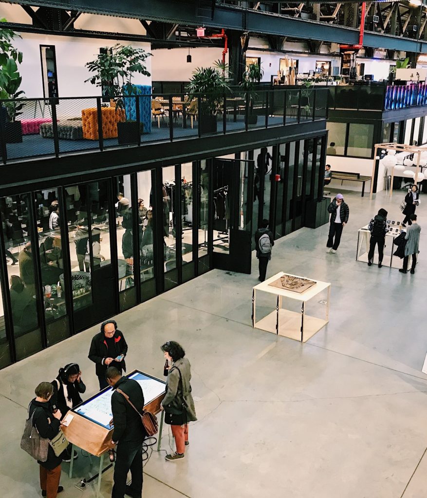
“Data Through Design – Panel Discussion: Everything is a Proxy” was a part of the Data x Design exhibition and NYC Open Data Week. It provided a platform for the audience to learn more about artists’ creative process. The event created a unique opportunity for live communication with exhibiting Data x Design artists about their design experience based on open data. The objective of this event was to encourage students to create new methods of map-making, develop a deeper understanding of life in the city and provide a wider knowledge of NYC’s open data. The event was held in the New Lab – Brooklyn Navy Yard. It was an open space where every visitor could test the functions of any interactive exhibits.

One of the sponsors of this event was Pratt Institute Spatial Analysis and Visualization Initiative. SAVI is a geographic information system-centered research and service that uses mapping, data, design, and visualization to understand and empower urban communities. They enable students to make data-driven maps and visualizations to solve real-world problems.

Let’s take a look at some of the projects:

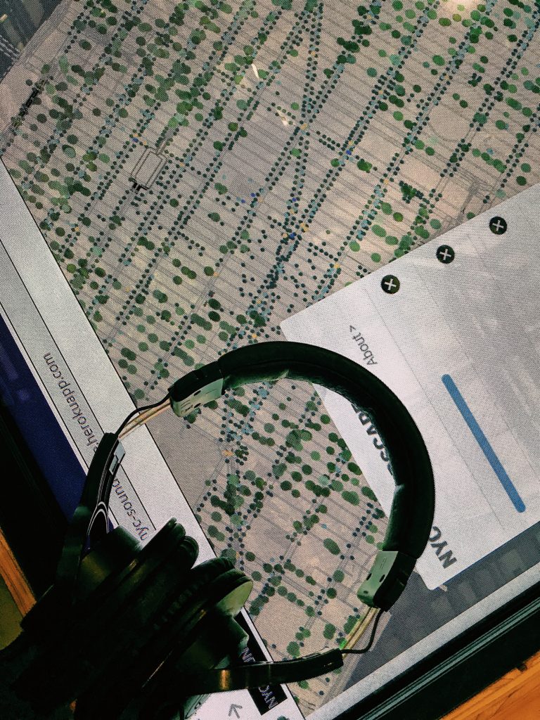
  • NYC Trees Soundscape

The authors of the project used a combination of six data sets to create an imitation of sounds on the streets of New York. Viewers can choose a route on an interactive map using a touchscreen and listen to the audio that simulates the environmental sounds in this location.

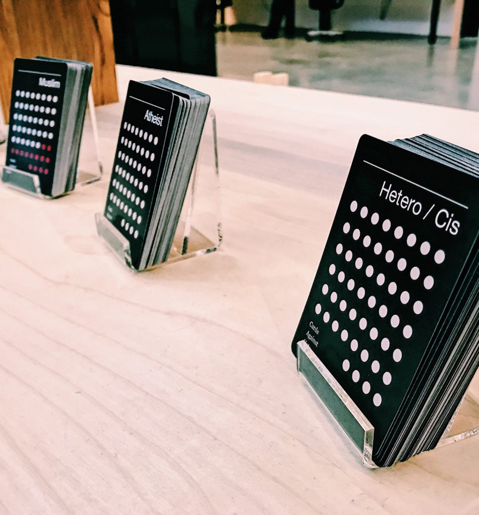
  • Cards Against Hate

Based on the annual “NYC Reported Hate Crimes” dataset, the project presented cards demonstrating the number of actual hate crime incidents with the real stories. The main goal of the project was to bring more attention to investigation of hate crimes and bias incidents in the US. Also, the authors hope to provide deeper insight into the nature of hate crimes among different social groups.

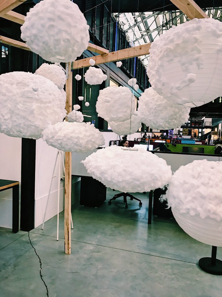
  • Exhausted New York

To design the installation, the artist researched the air quality index and compared it to the asthma rates among New Yorkers. Based on this information, she concluded that invisible problems of air pollution is one of the biggest in NYC. The aim of Exhausted New York visualization is to demonstrate how polluted the air that we breathe is.

Data-driven events are a great way to engage students in the creative process and encourage them to apply their digital skills. All projects were based on open data sets and the participants ’own experiences. All the artists used indigenous knowledge as a background for their projects. The artists analyzed the relevant issues for NYC and found a unique solutions. They offered fresh ideas to solve urban problems such as traffic jams, train delays and long lines. Open data sets help to present a­­ccurate and relevant information in physical space through digital visualization. With each project, data become more emotional. This process displays the application of the Data-Information-Knowledge-Wisdom model by Ma Lai (Meanings of information: The assumptions and research consequences of three foundational LIS theories). The authors of the projects turn the data into up-to-date city management, optimized delivery and service routes, and efficient strategic planning. 

The artists analyzed statistics and data correlations in their field of study to create the projects. Research that they conducted helped them investigate the specific issues of the city from different sides and create a unique solution as a result. Digital tools and open data allow artists to be able to say what they want to say. The process of interaction between the artist and data illustrates ideas from the “Human–information interaction research and development” article by Gary Marchionini.

In the process of working on their projects, the participants encountered some difficulties. Some of the datasets were incomplete and they had to read between the lines to fill in the gaps. In addition, artists had to take into account the historical, economic, and social contexts in which they used the data.

At the last part of the event, we discussed the issue of data education for high school students. Everyone who participated in the discussion agreed that in the next 20 years the curriculum will include data handling subjects to teach children to analyze and protect data.

To create their projects, participants worked on data, analytics, mapping, design, and visualization in collaboration with different departments of various universities and sponsoring organizations. Cooperation and team work helped create an enviroment where faculty and students could share ideas across disciplines to make government services more accessible, efficient and responsive to the public needs.

Before attending the “Data Through Design – Panel Discussion: Everything is a Proxy” event, I thought that open datasets were difficult to understand and they couldn’t be applied to solving modern urban problems. After participating in the discussion, my opinion about open data changed. I realize that it is a great sourse for innovative projects that could change our environment.

More information about the event is available on the website.: https://www.eventbrite.com/e/data-through-design-panel-discussion-everything-is-a-proxy-tickets-57713713270#

INFO 601-02 Assignment 3: Event attendance by Elena Korshakova

Representation and Power on Wikipedia

Jewish Museum Art+Feminism Wikipedia Edit-a-thon

Introduction

On March 3, 2019 I attended the Jewish Museum’s second Wikipedia Edit-a-thon co-presented with Art+Feminism. In celebration of Women’s History Month and the final day of the exhibition Martha Rosler: Irrespective, the event included a gallery walk-through with catalog designers Mika McGinty and Rebecca Sylvers, and assistant curator of the Jewish Museum, Shira Backer. The event was open to the public and aimed to offer an opportunity for people to learn how to edit and create Wikipedia articles in an effort to improve representation of cis and transgender women, feminism, and the arts on Wikipedia.

Martha Rosler: Irrespective

Martha Rosler: Irrespective was a survey of Martha Rosler’s work over her five decade-long career. Rosler’s work is dynamic and continually evolves and reacts to the social and political issues of today, yesterday, and tomorrow. Her work largely addresses matters related to war, gender roles, and urban gentrification, and throughout her commentaries runs a reflection on feminism that doesn’t shy away from the feminine. As a result, it would be hard to categorize Rosler’s work according to any one theme. People often describe Rosler’s work as “deeply political”, “feminist”, “intentional”, “outward”, and “intersectional”. Rosler fondly describes her own work as “hamfisted”.

The event kicked off with a walkthrough of the gallery led by Shira Backer, Mika McGinty and Rebecca Sylvers. The three designers gave unique insight into the processes of exhibit curation and art book formation – where they meet and where they diverge. They stressed that the book and the exhibition were not made to be one-to-one; they could emphasize different projects due to the constraints or capabilities of the two methods. In other words, the book was an opportunity to cover pieces not highlighted in the exhibition and vice-versa.

The exhibit tried to convey Rosler’s dynamism. There was a fully set dinner table with a voice-over of a woman discussing domesticity and the expectations of French women; a selection of five videos that examine the representation of women in pop culture and American imperialism; a large prosthetic leg swinging from the ceiling to a jaunty rendition of “God Bless America”.

It is interesting to consider the challenges in showcasing and preserving dynamic and ephemeral art like Rosler’s. Rosler continually changes and adds to her work, often including participatory elements to her pieces and installations. As a result, some questions the designers had to consider include: Is the first iteration the most important?; Is repetition valuable?; Does chronology take precedence? But no matter how hard someone tries to accurately preserve some creation, there is no absolute concept such as ‘permanence’. As Cloonan proposes, “the paradox of preservation is that it is impossible to keep things the same forever. To conserve, preserve, or restore is to alter” (Cloonan, 2001). For that matter, it seems to be Rosler’s intention to create ‘mortal’ work. Work that shifts, changes, and ultimately dies. It allows us to question preservation, even our own mortality.   

The curators were evidently aware of their role as history-makers and story-tellers. They cautiously discussed Rosler’s work on her behalf, careful to distinguish between their own interpretations and Rosler’s intentions. In addition, the curators revealed that they frequently worked directly with Rosler. It is important to note that they worked with a contemporary artist who was able to be active in her own storytelling. However, regardless of their efforts, the curators ultimately could only tell a single story of Rosler – their own version – and not Rosler’s whole story.

Wikipedia Edit-a-thon

After the exhibition there was a Wikipedia training course led by Carlos Acevedo, Digital Asset Manager of the Jewish Museum, followed by an open-editing session. The goals of the edit-a-thon were for beginners to learn how to edit on Wikipedia, to improve citations of women artists, and to expand biographies of women artists on Wikipedia (Acevedo, 2019). No prior editing experience was necessary in order to participate in the event. The museum also provided a number of laptops for guests to use. For an event that aimed to increase editing accessibility and improve women’s presence on Wikipedia, providing laptops and promoting a “welcoming spirit” was significant.

The Wikipedia edit-training considered the power and responsibilities that editors have. For example, it was emphasized that articles should be written from a neutral point of view. This is arguably impossible. However, the effort to avoid overly opinionated articles and original thought in edits is a fair endeavor considering the point of a system like Wikipedia is to collect and share existing knowledge as accurately as possible.

Event Stats
  • 25 people attended
  • 2 complete articles created
  • 36 articles edited
  • 145 total edits made

Representation & Closing the Gender-Gap on Wikipedia

Gender bias on Wikipedia is not limited to the underrepresentation of women and nonbinary people on the site, but is also reflected in the fact that a vast majority of editors are cis-male. For that matter, the edit-a-thon was not only an effort to improve coverage of women on Wikipedia, but also an effort to help close the gap in contributions made by women. According to Art+Feminism, a Wikimedia survey showed that less than 10% of Wikipedia’s editors identify as cis or trans women. Moreover, editors who identify as women are far more likely than men to have their edits reverted (Acevedo, 2019). Therefore, encouraging women to participate in editing projects and creating more opportunities to do so are important efforts that may help improve coverage of cis and trans women on Wikipedia.

In Archives, Records, and Power: The Making of Modern Memory, Schwartz and Cook describe the power of archives to shape and direct historical scholarship and our collective memory. They beg archivists to consider the power they have to essentially write history, to privilege and to marginalize. These concepts of power and privilege are not specific to archivists. This power is shared by all who document, curate, store, and share information. The curators of Martha Rosler: Irrespective were aware of this power and therefore worked to acknowledge it. Correspondingly, the Wikipedia training course clearly considered the power held by editors and the source itself.

Just as history has been written in favor of the patriarchy at the expense of women, future of representation of women and other marginalized members of society lies in reclaiming power over the documentary record and the institutions that share information. By recognizing the inherent power in archives, museums, Wikipedia, and other memory-institutions, and using that power to tell and support each other’s stories, cis and trans women can hopefully close the gap in gender representation. As an open access and open source, Wikipedia may be the place to start – the power is literally in our hands.

By Tina Chesterman

References:

Acevedo, C. (2019). Jewish Museum Wikipedia Edit-a-thon co-presented with Art + Feminism. [PowerPoint Slides]. Retrieved from: https://docs.google.com/presentation/d/1F6s9logWLiRTrX9l5Tt9E4GW2VTauLbhSRZBgRQj8QE/edit#slide=id.g51b9607e8b_0_122.

Cloonan M.V. (2001). W(H)ITHER Preservation? The  Library Quarterly, Vol 71, No. 2.

Schwartz, J.M. & Cook, T. (2002). Archives, Records, and Power: The Making of Modern Memory. Archival Science 2.


(A Little) Messiness, (Some) Clutter, and (Ongoing) Revelations(s)

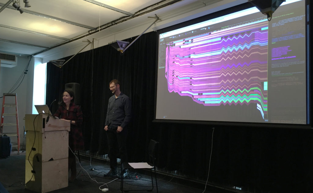
Viégas and Wattenberg, presenting in the clutter

As introduced by Miya Masaoka (Director of the Sound Art Program at Columbia’s School of the Arts and coordinator of the Artists Using Data series), Fernanda Viégas and Martin Wattenberg are “pioneers in data visualization and analytics” who have “shaped the field” and crafted tools and interactions that have been “used by millions of people.” (A similar description is on their collaborative site.)

Working to a more succinct description, their business cards would formally present them as members of Google’s PAIR (People+AI Research) initiative and Big Picture team. As simply defined by themselves at this presentation, they are scientists and artists — a dichotomy that would give many pause, but is no doubt a complementary pairing for many in the field.

While the work of such individuals inevitably links or crosses from one title to another, their presentation on March 8, “Messiness, Clutter, and Revelation,” focused on their work outside of Google, wherein they have explored new ways to use and investigate data, even as they set constraints within which to play with it. In that spirit of limiting parameters (and an eye to brevity), this review will contain itself to their work and philosophies as shared at this event, “an informal talk” in a mid-renovation space — a fitting format and environment for a presentation that ultimately moved toward the playful and iterative natures of both data exploration and artistic expression.

Viégas and Wattenberg essentially took turns presenting a small selection of work, individual and collaborative, all initially produced between 2003 and 2012, but timeless in their foundational role for the artists and others. Collectively, they defined an arc where the titular elements contributed to insights for the makers but also produced pieces of art — or at least design that moonlights as art.

This is evident, perhaps, in a project like History Flow (2003), explored initially as a ‘scientific probe’ in response to the then-new(ish) Wikipedia now residing at MoMA. This elegant visual investigation tracked the editing of Wikipedia entries, including the back and forth of dueling ideologies on matters adorable and political. In sharing examples of internet favorites such as ‘cat’ and hot-button issues like ‘abortion,’ the patterns of editing and relative passion in each is unmistakable. Yet, when asked if a visualization that compared the different kinds of impassioned debates had been attempted to establish a pattern, Wattenberg responded with a simple “No, but someone should do that.”

“Using data to know things” and questions of technological limitations or permutations were explored in The Art of Reproduction (2011); specifically an understanding of “How the internet is lying to you” through the varied representations of a single artwork that can be found online — from the decaying gold of Klimt (26 Danaes) to the deceptive black-and-white of Mapplethrope (8 Kens and Roberts). Which is the true reproduction work? Or aren’t they all?

This compilation of a single vision or a larger ‘truth’ from a messy table was also evident in Flickr Flow (2009),  a commission that sought to visualize the city of Boston, starting with the particularly ‘dirty’ data set of Flickr images tagged simply as “Boston Common.” The duo let those limitations and what they brought guide the form, stating: “Let’s work with that messiness; see what we can find.” The result is an elegant abstraction of ribbons that looks nothing like (but also, somehow, very much like) Boston year-round. In the process of its creation, it investigates what we as a society have preserved.

Other works explored how we search (Web Seer, 2009) , how “the alien mind” thinks (Thinking Machine, 2003) and how music might be visualized (The Shape of Song, 2002), with the last cited as ”an example of clutter yielding something useful.”

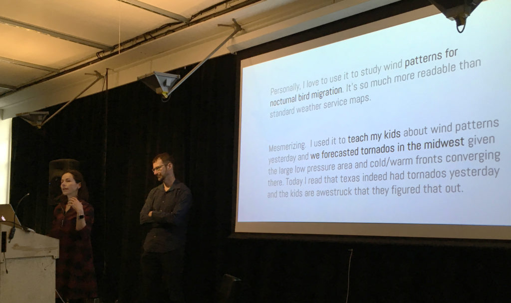
The presentation culminated with Wind Map (2012–). Also in MoMA, this piece was the most clear presentation of the pair’s iterative approach to data visualization, a case study that showed explorations from the abstract to the psychedelic, with the ‘final’ version resulting from the addition of a single line of code to an earlier iteration. Starting with the simple, seemingly ethereal (and almost Ono-esque) question “What does the wind look like?” and the desire to “make complex data easily accessible,” they created — they would have us believe unwittingly — a practical and emotional tool.

The resulting real-time visualization was picked up by meteorologists and combined with other data in weather maps, but also caused Louisiana residents in the path of Hurricane Isaac to reach out to the artists as they tracked the storm in real time. It was also picked up by school teachers and other scientists who used it to teach and to study their own passions. None of these were intentions; they were all unexpected results.

The unexpected results of Wind Map

Indeed, through almost all of the works presented, Viégas and Wattenberg seemed to speak to the utility of data, while often deferring to others in taking on that utility. They were readily willing to accept their work in a continuum where others (for example) could then take the code and build something new or explore another facet, as the two moved on to a new subject. They were driven not by “What can this do?” but by “What happens if we do this?” and seemed to view the usefulness of a project like Wind Map with the same wonder that they viewed the initial question of “What does the wind look like?”

Here any observer could be forgiven for a little ambivalence. The work done by Viégas and Wattenberg is — to those who enjoy visualizing data — smart and well crafted. The pieces in MoMA deserve that recognition. They do make one think — but mostly about what can be built upon their efforts.

For those looking to draw the line, this may fall too much on the ‘art’ side. The pair seem decidedly more interested in the baserate questions over the relational ones. (McGrath 160) Before making things, they certainly aren’t asking where the project will be “in ten, twenty, or even fifty years,” and the word “persona” had no place in the conversation. However, they do “value ephemerality and even magic” and seem to believe that “Not everything about a project must be rationalized or demystified.” As seen in those Wind Map explorations, they’re not afraid to “Make a useless [drippy, psychedelic] or disinterested version” of a project. (Sayers)

Looking to Miriam Posner, the pair’s work (again, as presented here) shies away from a critical engagement. They seem content to pose questions and make tools that others may then utilize — but the investigation stops at form and leaves impact to others.

To directly contrast Viégas and Wattenberg with some projects that Posner admires: How does a colorful visualization of Boston compare with Jacqueline Goldsby’s Mapping the Stacks that aims “to describe and arrange collections related to African American History in Chicago?” How does the composition of “8 Kens and Roberts” in the Art of Reproduction compare with David Kim’s ‘Data-izing’ the Images: Process and Prototypes, wherein Kim used the visualization to question the photographer’s categorization of his Native American subjects? Both speak to us about perceptions and ‘lies’ — one through form, the other through culture. (Posner)

Of course not all visualization (or art) must address the bigger issues — and even Posner knows this. Sometimes it just gets the conversation going, placing the data most clearly in front of those with the itch to investigate further. (And it’s another false dichotomy to decide we have to somehow judge one of these approaches over the other.) In the continuum of development, the world needs people who play in the messiness and clutter, those who ask questions, tinker around and leave something half-built on the workbench. Ultimately this research and discovery become tools of their own for those who want to build higher.

– Michael Kelly, Info 601, Professor Chris Alen Sula

References:
• McGrath, Joseph. (1994). “Methodology matters: doing research in the behavioral and social sciences.” Original paper.
• Posner, Miriam (2016). “What’s Next: The Radical, Unrealized Potential of Digital Humanities.” Keystone DH Conference, University of Pennsylvania, July 22, 2015. http://miriamposner.com/blog/whats-next-the-radical-unrealized-potential-of-digital-humanities.
• Sayers, Jentry (2018). “Before You Make a Thing: Some Tips for Approaching Technology and Society.” https://jentery.github.io/ts200v2/notes.html

The Feeling of Technology

What makes us feel?

From a biological perspective, it is proven that nerves located at integral parts of our bodies help us interpret external stimuli that come in contact with our body. The amygdala in our brain is a limbic structure that helps us process emotions and is a component that makes humans unique. The way our bodies have evolved have made us into analog creatures that react well to external stimuli in the natural world and this in turn has helped us become highly adaptable to earth’s different environments (Norman, 2008). From a technological standpoint, what happens when we begin to try to build machines to be more like us? What happens when we want our machines to then replicate our innate emotions or our psyche, to perform for us?

These were questions that I thought of when I was attending UXPA’s Emotionally Intelligent Design Workshop on February 16th. During this workshop, Pamela Pavliscak, a specialist that studies the relationship between our emotions and technology, asked us to partner up and design an app or piece of technology with human emotion in mind. We were required to use two themes as the basis of our invention. For myself and my partner, we had to create a dating app for people that are single. To help us create our invention, Pamela offered examples on how the tech industry has already began using forms of emotion, like our gestures and tone of voice, to implement design features that help build programs that react to us. Their reactions to our emotions will then prompt the machine to respond in a way that’s human, but not quite.

An example of this is SimSensei, a virtual human interviewer, which was created as a means to help health care professionals make more informed decisions on their patients based on their responses to the virtual interviewer. SimSensei is represented by a virtual human named Ellie, who is programmed to conduct interviews that help “…create interactional situations favorable to the automatic assessment of distress indicators, defined as verbal and nonverbal behaviors correlated with depression, anxiety, or post-traumatic stress disorder” (DeVault et al, 2014, p. 1061). Essentially, by creating a virtual helper like Ellie, people at risk of certain mental health disorders can feel they can open up to her, and in turn they can receive the right treatment. Patients are often misdiagnosed in the medical field so I think SimSensei has the right programming to flag warning signs of a particular disorder (keep in mind that it is mainly being used in diagnosing mental health issues).

In my honest opinion, it almost feels like Ellie has been programmed to trick patients into thinking they can trust it. During the course of an interview, the patient is being monitored, and every question Ellie asks is to create a response from the patient, either through speech or through facial changes. Here is a YouTube video that will help you see what sort of questions Ellie is programmed to ask to during her interviews and the type of facial tracking the machine uses.

Another great example offered to us is Toyota’s 2017 movie on a futuristic vision of how some cars may be developed (access it here ). The car featured in this short movie is a concept model, along with the AI named “You-ee” that is built into it. We see aspects of the car’s AI offer advice, act as “wing-man”, and my personal favorite – give positive reinforcement. During the workshop, only the clip from 5:45 to 6:34 was shown. Seen in its entirety, we get a glimpse into what an emotionally intelligent system can do for us. By giving something like “You-ee” human-like qualities (like its ability to make a joke out of Noah’s messy hair), it allows us to view the car as an extension of ourselves. More importantly, I think having a dependable AI is something that will allow individuals to flourish and establish better ties with their human counterparts.

Learning about the different types of emotion-based systems that are already on the market reminded me of Phoebe Senger’s remarks on AI being “..autonomous agents, or independent artificial beings” (Senger, 1999, p.10). We can, at this point, say that Ellie is a step away from being an autonomous agent. Although SimSensei is only currently being used to help doctors diagnose mental health patients, won’t this tool eventually be programmed to perform the the diagnosing by itself and then also administering treatment?

After reading Senger’s article, I now understand how the effects of implementing emotion into our programs can push our machines to the next level. Ellie is programmed with a voice and is made to be able to connect to humans so that we can better understand our own species. We will always be building towards the future, but we always want to keep our connections to one another close to us. After all, humans are empathetic and this quality will be incorporated into the things we create. “You-ee” a perfect example of how the relationship between human and AI can potentially be a harmonious union.

At the end of this workshop, all the groups presented their designs and prototypes. My partner and I decided to create a dating app that required all users to scan a full body image of themselves and display it on their page. Since I’ve never used a dating app before, I was never subjected to the cruel reality of them. According to my workshop partner, dating apps can make finding a partner relatively uncomfortable and weird. Therefore, by implementing a way to circumvent the feeling of discomfort and dishonesty, we believed having your entire self displayed is a great way of creating a more open dating world. But you may ask at this point: “Where’s the portion of your app’s design that makes your prototype emotionally intelligent?”.

And I will answer: “We’re not at that point yet”.

References:

  • DeVault, David et al. (2014). SimSensei Kiosk: A Virtual Human Interviewer for Healthcare Decision Support. 13th International Conference on Autonomous Agents and Multiagent Systems, AAMAS 2014. 2. 1061-1068.
  • Norman, Don A. (1998). The Invisible Computer: Why Good Products Can Fail, the Personal Computer is So Complex, and Information Appliances are the Solution. MIT Press. Chapter 7: Being Analog
  • Sengers, Phoebe. (1999). “Practices for a machine culture: a case study of integrating cultural theory and artificial intelligence.” Surfaces VIII.


Digital Afterlives Symposium

I have always been fascinated with what happens to our digital data after our lives end. There were so many questions I had on this topic and found many of them answered when I attended a symposium on Digital Afterlives at the Bard Graduate Center. There were four speakers who presented their papers on digital afterlives: Abby Smith Rumsey, Robin Davis, Tamara Kneese, and Margaret Schwartz. Each presenter explored the various ways that we preserve, resurrect, and prolong the lifespan of digital data. They also delved into the challenges and complexities of technologies and how we understand our mortality.

A Mere Shadow of the Past: How Memory Creates Identity

Abby Smith Rumsey is a historian and archivist and she presented on the way memory defines us in regards to digital data. She first explained that there are two types of memories: 1. Memory that is embedded in our DNA and how humans are able to survive based on recalling information. 2. Acquired memory that we utilize in our day to day life. Rumsey stated that this form of memory leads to predictions on what is going on around us and helps us function in the world.

Rumsey also stated that our imagination is memory in the future tense and that imagination forces us to think outside of our immediate surroundings and past behaviors. Rumsey then went on to discuss how books are the prosthetics of knowledge because they are extensions of our memories which we can return to over and over again. She also believes that the digital space can work in the same way.

She stated that the Web was initially created as a bulletin board, not a memory bank and that if we want to utilize it as a placeholder for memories, each of us needs to be trained in digital literacy to curate our lives. Each of us has to learn the tools needed to take action to preserve our digital memories so that it does not fade away. Rumsey believes that we cannot assume that our digital memories will live on without our active participation in making it so.

I found that Rumsey’s discussion on preserving memory relates to Joan Schwartz and Terry Cook’s article Archives, Records, and Power: The Making of Modern Memory. In this article, Schwartz and Cook state that without preservation “memory falters, knowledgement of accomplishments fades, pride in a shared past dissipates.”1 Whether an individual is uploading travel photos to a website or blogging about a family reunion, the need for preservation is paramount to in order to retain that digital information so that the memory of it is not forgotten.

The Final Death(s) of Digital Scholarship: An Ongoing Case Study of DH2005 Projects

Robin Davis is the Emerging Technologies and Online Learning Librarian at John Jay College of Criminal Justice. For her presentation, Davis focused on the digital afterlife of Digital Scholarship. Firstly, she discussed how the final death of digital data leads to it dissolving and then disappearing. Davis stated that digital data decays faster and digital scholarship requires ongoing active management to keep the website from breaking down.

Davis provided several examples of Digital Scholarship projects from 2005 and tracked their digital decay over a period of years. She demonstrated how each project showed examples of digital decay and an unexpected afterlife. One website had simply disappeared while another website was a fraudulent site where all of the text was copied and pasted from the original 2005 project website. This incident reminded me of the point that Roy Rosenzweig was discussing in his article Scarcity or Abundance? Preserving the Past in a Digital Era when it comes to digital information’s susceptibility to alteration and forgery. Rosenzweig writes “Digital information because it is so easily altered and copied, lacks physical markings of its origins, and, indeed, even the clear notion of an ‘original’”.2 The forgery of another website can lead to confusion for the user especially when trying to deduce an original document from a plausible counterfeit document.

Davis then went on to explain the various reasons why a website for a digital scholarship project can go down such as project team changes, hosting issues, lack of reliable funding, and not updating the Content Management System.

At the end of her presentation, Davis went on to discuss the importance of preservation and that it should start at the beginning of the digital scholarship project. She stated that there is nothing worse than doing all that work to just let a website crumble especially if future users want to utilize the information. She also provided preservation tips such as web recording the website or submitting the URL to the Internet Archive.

Death, Disrupted

Tamara Kneese is an Assistant Professor at the University of San Francisco and for her presentation, she focused on a deceased individual’s social media accounts and the rise of death startups. Kneese began the lecture by stating that social media accounts such as Facebook and Instagram can become treasured family heirlooms. These accounts can become a place where the relatives and friends of a deceased person can celebrate the life of that individual.

Kneese then discussed how Facebook has become a ritual graveyard and that the dead outnumber the living on the social media site. She went on to explain that in the early years of Facebook, the social media site would deactivate a deceased person’s account. After the school shooting at Virginia Tech in 2007, there was a proliferation of memorial pages on Facebook which allowed family members and friends to remember those that were lost. It also allowed journalists to find information on Virginia Tech students who lost their lives in the shooting. In response to this, Facebook created a memorialization feature for users to reconnect with the dead.

Kneese then went on to discuss the rapid rise of digital death apps in the 2000s such as Legacy Locker, DeathSwitch, and VitalLock. These apps were created so that people can plan what to do with passwords, social media accounts, and emails in the event of their death. She discussed how many of these apps quickly became defunct as there weren’t much interest by consumers in death apps.

At the end of her speech, Kneese went on to talk about how people should include their digital data when doing estate planning so that they can preserve and share their online accounts with family members. She discussed the importance of having final wishes when it comes to your passwords, emails, blogs, and websites so that family members can handle your digital remains properly.

The Haptics of Grief: A Taxonomy

Margaret Schwartz is a Professor at Fordham University and her presentation was on the taxonomy of grief and its relationship to the digital space. Schwartz began her lecture on the spectacle of suffering which she linked to deaths as the result of public executions, beatings, and hangings. She pointed to the open-casket viewing of Emmett Till’s mutilated body as a striking exhibition on sorrow.

Schwartz went on to discuss the history of preparing a dead body and stated that throughout the centuries women usually cared for the dead before burial. She explained the meticulous process of how women would wash and wrap the body in cloth. Schwartz then discussed the embalming process and how this changed the body’s physicality by providing a glamour to the corpse.

Schwartz concluded her presentation by sharing her viewpoint that our digital presence should emulate the preparation of a dead body. We should take care when accessing the digital space and treat it with respect. She believes that touch lingers in technological spaces and this is our mode of understanding. Schwartz also stated that the popular conception that the digital is non-physical is woefully inaccurate. She explained that the physicality of the digital is in the form of server farms, packets, and when we are utilizing a computer. Schwartz declared that everything that is online is tactile.

Conclusion

Each speaker brought various insights on the topic of digital afterlives that I found interesting and made me reflect on the steps I should take with my own digital data. I did notice that the key point that was continuously mentioned was the importance of preserving your digital data or memories. Several of the presenters stated that preservation of digital data should be done by everyone because that information may not only have tremendous significance to you but also to your family members and friends after you have departed from this world.

References:

  1. Schwartz, Joan M. and Terry Cook. “Archives, Records, and Power: The Making of Modern Memory.” Archival Science 2 (2002): 1-19.
  2. Rosenzweig, Roy. “Scarcity of Abundance? Preserving the Past in a Digital Era.” Oxford University Press (2003): 735-762