Event: Business re-imagined with Machine Learning and Artificial Intelligence

AI is real and it can be used to benefit the business and competitive advantage. There is a strong relation between the analytical capabilities and AI capabilities of the company. The business value that AI offers is solid. It will improve products and processes and make decisions better informed.  

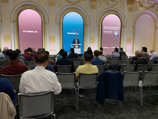
On April 9th 2019, Capital One and NYC Media Lab hosted an event on Machine Learning and Artificial Intelligence. The purpose of the event was to stimulate the deep discussions on the various aspects of future of machine learning and AI and real-world applications. This event looked into various aspects of machine learning such as the unprecedented impact on businesses and new considerations, challenges and opportunities that the technology will bring. The speaker of the event was Tom Davenport who is the professor of Information Technology and Management at Babson College, a fellow of the MIT initiative for the Digital Economy and a Senior Advisor to Deloitte Analytics.  

The seminar started with welcoming Tom Davenport on stage. Tom began with the seminar with stating the facts of AI in large American companies. He believes that 20-30% are AI aware and actively employing multiple technologies but very few put AI at first. Many firms are setting up AI management and infrastructure to automate jobs but AI have challenges of its own like implementation, integration, talent and data. But as he says the growth of AI is unavoidable. The questions initiated in this event were if we should have major ambitious AI projects or a number of small ambitious projects. 

AI technologies is a constellation of machine learning, neutral networks, natural language processing generation, rule engine, robotic process automation, digital workflows, custom integration and combination of these. But the most used technologies by companies are machine learning, deep learning, use of natural language processing and the robotic process. Tom mentioned that most AI projects fall into major three categories like robotics and intelligence automation for routine and data intensive administration tasks, AI based insights for insights from structured data and AI based engagement for interaction with customers or employees. AI not only helps in the automation of process but also benefit in enhancing the products, optimize the operations, make better decisions and many more.  

Tom gave few examples of companies having successful AI technologies. Vanguard, a financial portfolio management company, uses AI for One Big Application which is a “Personal Advisor Service”, it combines automated and human investment advice for portfolio rebalancing, tax loss harvesting and retirement income scenarios. Pfizer, a medicinal drug company, uses machine learning to classify prescribers of pain drugs and target discontinuing patients. Capital One uses machine learning to focus on credit decisioning and all aspects of customer interaction and operation. Google puts AI first to rank page and advertising algorithms. Google also has research labs to do research on AI and deep learning.  

Looking at these examples, Tom also explained that there are companies having both less ambitious and major ambitious projects which did not succeed. The most prominent example is of M.D. Anderson Cancer Center had a highly ambitious project to use AI to treat certain forms of cancer which treated no patient and the project was put on hold. But has a series of projects using CognitiveScale technology which is a success and it improve patient satisfaction, operational efficiency and financial returns. 

Although AI technologies are growing a fast pace but it will definitely have an impact on jobs and skills. But there will be primary challenges faced by companies like implementation, integration, cost of development and lack of skills. There will be jobs which will be to collaborate with smart machines. Tom believes that people can overcome this future employment issue if they strategize about how AI can transform and strategize your business model or process, start with less ambitious projects, emphasize on augmentation, take skills training, put an ethical framework in place and put someone or be in charge of AI. As Geoffrey C. Bowker, Karen Baker, Florence Millerand, and David Ribes stated in “Toward Information Infrastructure Studies: Ways of Knowing in a Networked Environment” that “it is the distribution of solutions that is of concern as the object of study and as a series of elements that support infrastructure in different ways at different moments”. To end with Tom says that we should be the solution by scaling up and skill out on AI than finding potential solutions about it. 

After attending this event it made me realize that I just don’t have to learn designing of the currently available technologies but also data and technology available in the future. As Gary Marchionini stated in “Human–information interaction research and development understanding” that “proflections form and evolve and discovering ways to manage them provide exciting new challenges to the information field’. As an information professional, through this event I understood that how I should adapt to Artificial Intelligence and create employment opportunities in IXD professions.  

Reference:

G. Marchionini / Library & Information Science Research 30 (2008)

Geoffrey C. Bowker, Karen Baker, Florence Millerand, and David Ribes  / Toward Information Infrastructure Studies: Ways of Knowing in a Networked Environment ,102

Richa Kulkarni, INFO 601-02
Event : The Video gaming Industry in NYC

The Center for Communication is a nonprofit actively engaged in bringing diversity to the media industry. It is offering students a chance to explore their career options, network and collaborate with influential professionals.

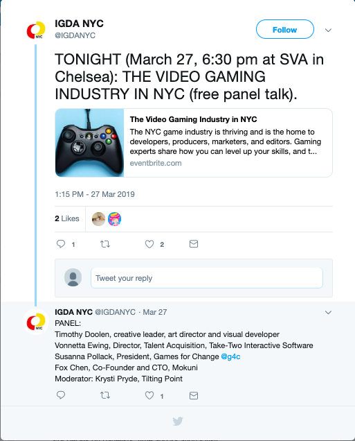
Center for Communication held the event “The Video Gaming Industry in NYC” at SVA Theatre on the 23rd street in New York on 27th March ’19. The Game Industry in NYC is burgeoning with expanding studios and start-ups. This development, coupled with New York’s unmatched exposure and networking opportunities, has just about shifted the gaming industry’s stronghold from the West Coast to the ‘Big Apple’. Smartphones, tablets and computers becoming so easily accessible for all has paved the way for the video gaming industry. As of 2018, this industry is generating as much as $135 billion.

Five gaming experts represented the thriving industry at the event. They talk about how one can add to or hone their skills in order to land a career in the world of games, and also what NYC has to offer for game fanatics and developers. 

  1. KRYSTI PRYDE Brand Marketing Manager, Tilting Point
  2. TIMOTHY DOOLEN Visual Developer, Graceful Decay
  3. VONNETTA EWING Director of Talent Aquisition, Take-Two Interactive Software Inc.
  4. SUSANNA POLLACK President, Games For Change
  5. FOX CHEN Co-founder and CTO, Mokuni Games

Video games have entertained users for many years, and over time the community of patrons has only grown. Gaming has come from special gadgetry and hardwares to handy smartphones and tablets. Essentially every person who holds a smartphone/tablet has at least one game on their device, and enthusiasts go further to download softwares, even buy gaming PCs and consoles. As the game industry makes this shift, the demand for developers multiplies. Committed professionals elevate the experience of gaming to meet new levels, and young ardent fans aspire to join the craft. 

The five speakers talk about their expertise and vocation before addressing the attendees’ questions pertaining to making a career in the field.  

It is true that when the industry was at a nascent stage, its development was identified particularly on the west coast of United States. However, with expansion the studios spread their wings to reach the east coast. Prominent studios such as Playcrafting, have established themselves in New York City. This has brought recognized experts, events & exhibitions, and opportunities to town. NYC’s growing community offers programs for people starting out or transitioning from other specialities, support and networking initiatives. 

One may wonder whether the opportunities to make a career in gaming industry of NYC come all the same for locals and non-locals. According to HR professional Vonnetta, nothing is more valuable to studios than a candidate’s aptitude and qualifications. Companies are seeking talent across the globe. 

What qualifications and skills are these employers really looking for? Clearly, knowledge of coding, engineering, algebra & geometry, computing, design thinking and graphics is expected. It largely depends on the position you are applying for. Beyond these the employers value soft skills, mainly clear articulation & communication, critical thinking, ability to collaborate, attention to detail, and of course creativity & efficiency. Having said that, a strong portfolio will do the groundwork. 

A fascinating fact about the current video gaming scene is that it is no more limited to game designers and developers. The industry is welcoming professionals of other disciplines as well as transferring candidates. The 5 experts emphasise on the possibility of transferring skills and knowledge. To name a few “sought-after” roles in gaming, other than design, data analysts & scientists, finance & accounting specialists, security infrastructure designers, marketing experts, developmental psychologists & behavioral scientists are good examples. A non-traditional role that was mentioned a considerable number of times is User Experience. More so, there is need for knowledge of music, and there is casting for voice talent too. There are opportunities for people from all walks of life. 

How to grab these opportunities is not a very difficult question if you are in NYC. Keep an eye out for the unending events, meets and conferences. Immerse in the community, network and get seen. Organizations constantly come up with competitions to attract new talent. Entry level talent can also get into the industry by taking up internships. Primarily, the key is to remain up-to-date with the industry news, stay engaged and connected with sources. 

As a student of Information Experience Design, I realised a new prospect for my professional career through this event. The video gaming community is more vast and driven than I imagined. It has developed to become a leading contributor of employment opportunities for professionals of IXD among others. Furthermore, the industry has devoted itself to not only producing sources of entertainment, but also to making social change. Organizations are committed to designing for improving cognition, mental health and well being. The event has taught me to acknowledge and appreciate the game industry.

https://www.centerforcommunication.org/calendar/2019/3/27/video-gaming

References:

Marchionnini (2008). Human information interaction. Library & Information Science Research 30

The Differing Roles Of the Ux Designer https://uxmag.com/articles/the-differing-roles-of-the-ux-designerhttps://uxmag.com/articles/the-differing-roles-of-the-ux-designer

Observation of National Geographic Encounter – Ocean Odyssey

By: Michelle Kung
INFO 601-02 Assignment 3 Event Attendance

What is it

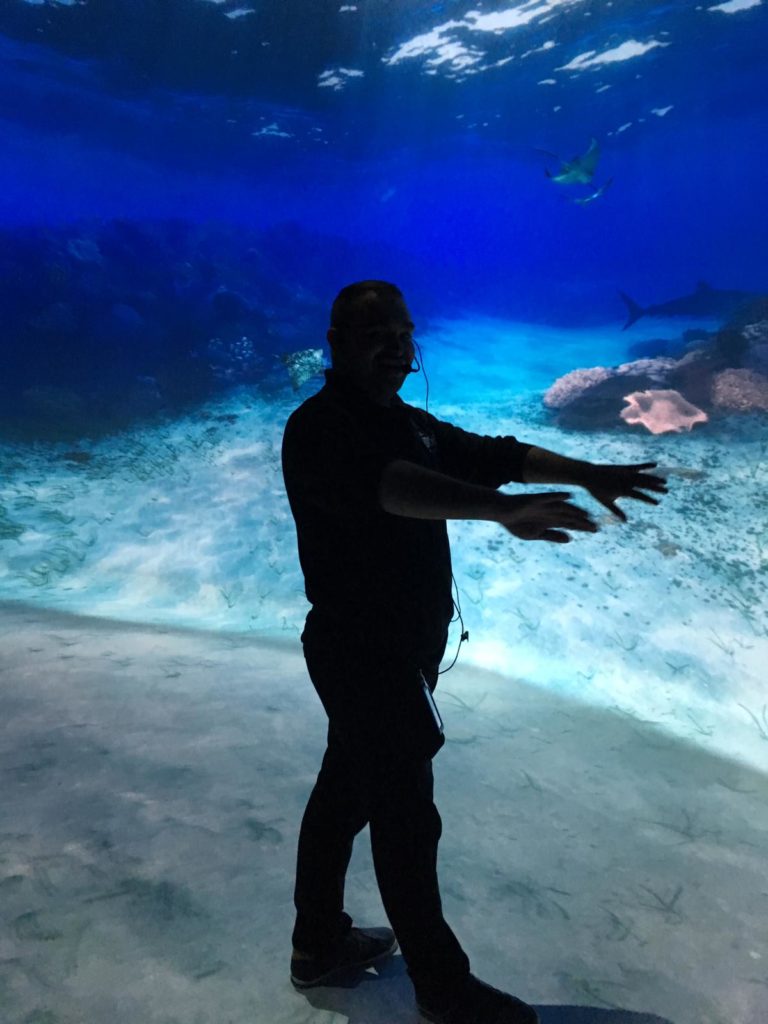
National Geographic’s Ocean Odyssey is an exhibition about marine biology and conservation that promises visitors an interactive and immersive experience. Visitors get to see, hear, and feel what ocean life is like for different sea creatures. A member of staff guides small groups of visitors through the interactive spaces and encourages everyone to explore every part of each space. The Ocean Odyssey starts in the shallows of the Pacific Ocean and takes visitors all the way to the Californian coast.  

I visited the Ocean Odyssey in March, 2019 had found this experience to both be a lot of fun and highly educational. The new technology used gave the exhibition a lot of affordances that visitors were not familiar with. And the guide, acting as mediator, served as the signifier to ensure that visitors’ experiences were pleasurable and not frustrating.

Immersive environments created by audio visual elements

Effective use of audio and visual elements made interaction with information truly immersive and entirely effortless.

Visual

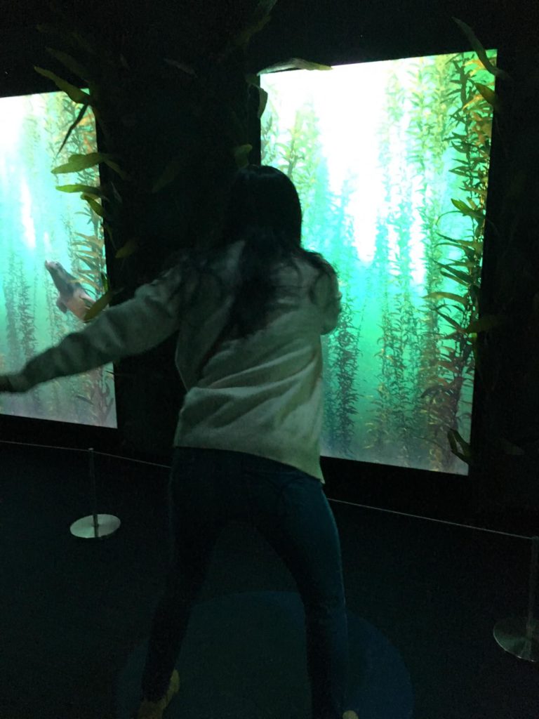
The Ocean Odyssey experience featured multiple audio-visual displays. But unlike conventional single screen-based information, these experiences were highly immersive. Users were invited to enter rooms in which every surface was a screen, including the ceiling and sometimes even the floor. Many rooms had curved walls that surrounded groups of visitors. Our guide encouraged us to “swim” into the rooms, adding to the immersive experience. Many users attempted to interact with different visual elements, by pointing at them, stepping on them, and following them. Sometimes, digital elements responded to users’ physical movements but sometimes there was no digital/ physical connection. On the whole, visitors seemed delighted when interaction was possible and not at all disappointed when it wasn’t. Perhaps users haven’t developed an expectation to be able to interact with any digital element yet.

One of the most spectacular exhibits was a 3D video of a life size humpback whale displayed in a room on a curved wall that surrounded visitors. Visitors were invited to wear 3D glasses to improve their experiences. The video showed how humpback whales feed on krill by opening its gigantic mouth. Users were so mesmerised and immersed in the video that a user screamed out loud in fear when the photorealistic whale swam towards the screen with its mouth wide open! Such rich visual information elicited emotional responses in users.

Audio
Buttressing the vibrant visuals were rich and realistic audio elements. Effective use of sound allowed users to be immersed in the underwater environment created by the Ocean Odyssey. In an exhibit showing what the ocean is like in the night time, sound was the main medium. Users sat in a small auditorium completely devoid of light, listening to the sounds of whales, dolphins, and other sea creatures. Users were passive receptors of audio information. 

Interactive videos enraptured users

The Ocean Odyssey also featured gesture controlled interactive video elements to teach users about the behaviour of sea lions and about bio luminescence.

Our guide explained what bio luminescence was as users moved their arms in front of a screen. The screen detected motion and displayed corresponding lights, representing bioluminescent bacteria. Users were encouraged to interact tactilely with all elements of the bioluminescent exhibit. This hands-on approach allowed users to learn about an otherwise abstract part of the ocean that they have probably never heard of or thought about.

In the sea lion exhibit, our guide demonstrated using the screens to learn about sea lions. Individual users stood in front of individual screens, waving their arms and watching the sea lion swim in corresponding movements.

Traditional displays sadly forgotten

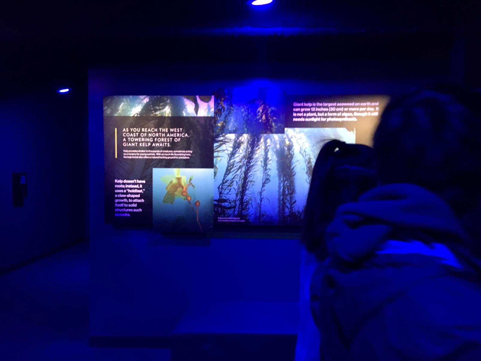
Unlike a traditional museum environment where static images and text are the bulk of the information, in this experience, they were peripheral. Unless the guide purposefully drew users’ attentions to non-digital image and text, they were largely ignored.

Perhaps a better designed information environment would make a more seamless transition between information that is digital presented to users, and traditional forms of information like posters and displays. Compared to interactive and immersive digital elements, traditional static visual graphics were much less interesting to users.

Quizzes and games

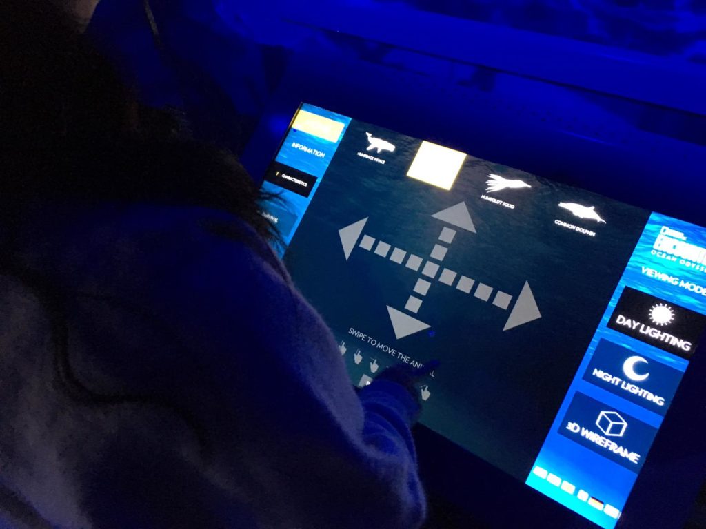
At the end of the exhibit, our guide led users into a room with many different games and quizzes on ocean ecology and conservation and allowed us to interact with them independently.  Most of these activities were screen based, apart from colouring sheets which no users used.

Users interacted with different screens equipped with pressure, laser, and gesture sensors, making each game interesting and different. Adults and children alike were captivated.

Reflection

I think the Ocean Odyssey experience was a really well designed information environment which allowed users to experience information in a fun, experiential, and dynamic way. It proves that learning doesn’t have to just be cognitive and challenges traditional approaches to learning by allowing users to engage with information physically and emotionally. I think this kind of experience, when curated as well as the Ocean Odyssey, can have great impact on education and edutainment.

But I’m not sure whether or not the information environment was designed with affordances in mind. Users were guided by a trained guide throughout, and were given instructions on how exactly to interact with each aspect of the experience. Of course, interactive experiences that blends digital with the physical are still very new so there isn’t as yet an established semiotic system that can allow users to know exactly how to interact with exhibits without a guide. I can imagine, in future, when more experiences incorporate interactive digital elements in physical spaces, there will be a need for the design of a standardised semiotic system that is well understood by the user to act as navigation.

References

Norman, Don. The Design of Everyday Things. New York: Basic Books, 2013.

Observation: @ JFK Airport JetBlue Airline

My observation took place during the night time at the John F. Kennedy International Airport. I was taking a best friend to his flight that was leaving at 11:45 AM. During the time at the airport we were trying to check-in as fast as possible because traffic has made us run late. When checking-in there weren’t that many staff attending customers on the JetBlue Airline. We believe that the staff was low because of the given late-night time. I remember there was a time that JetBlue had a lot of staff but that was during the morning and afternoons. Since my friend was leaving so late at night to go to his destination, he was having trouble in getting on board as fast as possible. He was running very late and too many people were causing delays that he couldn’t wait for a staff. He then decided that he wanted to use the self-service check-in with JetBlue kiosk. My best friend thought that it would be a faster to be able to check in through self-service system and won’t be able to wait on line for a long time.

The kiosk self-service machines were close by the where you check in with the staff. They were at a good spot where users can easily access it. If I’m not correct I believe there were about ten machines or more and most of them weren’t being used. The kiosk machines had a big touch screen for the users to use and be able to see the features and content that the check-in service provide. The kiosk machine also had a slot where you put in your passport so that it can scan it for ­its check-in purposes. My best friend started using the device but he wasn’t exactly sure how it worked. He decided to get help online through google. He had made his search on how to use the check-in self-service and had gotten a lot of information on videos and article on getting help. At the moment of his search he was able find something that helped him understand how to use the device at JetBlue airlines. The information he gathered only took him about 15 minutes of his time to be an able check-in with the machine successfully.

The kiosk machine was pretty much straight forward for him to use, but he was mostly having trouble in how to scan the passport the right way. I believe that the machine wasn’t telling the him how to properly enter the passport in the right way because the screen basically shows a 3 second video on how to do it. I believe that tip that device gives you to scan your passport is helpful but there should be a little more information added to the screen to help the user scan its passport. For example, if the kiosk machine was to show a set of steps of instructions while viewing the small clip that shows you how to scan your identification it will get the user to properly be able to do what is asking to do. I remember that my best friend was getting a little frustrated because he tried about three times and since he was running late to his flight, he wanted thing to get done fast. 

There are so many digital devices out there that even airports have self-service check-in for flight. All these devices are connected by a network and they all give a scalable feature to its users for simplicity and helpful use. Just like the website of google that helped my friend get the help he needs for to this digital device, it had provided him with so much information about the kiosk. These many information helps with the leading of new development. As Gary Marchionini writes in his paper of Human-information interaction research and development,

“Digital technology has created a plethora of new kinds of information objects, including multimedia combinations that exhibit behavior, acquire history over time, and lead to new emergent properties. When these objects are Web-based, they acquire a scalability feature that leads to new kinds of emergence: interactions among millions of people and trillions of machines cycles create new kinds of information objects defined by instantaneous states of the network.” 

Observing and experiencing what my best friend went through to check-in with the kiosk device at the airport gave me knowledge. The specific understanding, I had gotten from my observation was that it thought me how the information that my friend gathered was helpful in the way that he was able to understand and use the newly self-service device from JetBlue. Just by searching up a question.

Reference

Gary, M. (2008). Human-information interaction research and development. Library & Information Science Research, vol.30, 165-174. doi: 10.1016

Event: Precarity and hope for digitally-disadvantaged languages (and their scripts)

Description:

On March 28, I attended the digital life seminar at Cornell Tech on Roosevelt Island. The topic was Precarity and hope for digitally-disadvantaged languages (and their scripts).

What happened at the event:

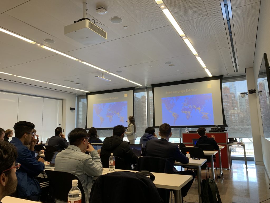
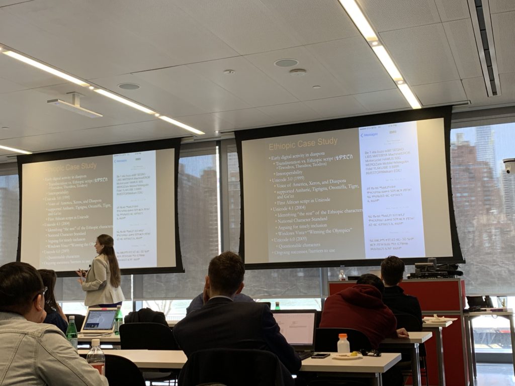
Isabelle Zaugg, the guest speaker, who was from the Institute for comparative literature and society, Columbia University, gave the audiences a brilliant speech on her topic: mass languages extinction(figure1) and her case study: what can be done to close the digital divide through an instrumental case study of Unicode inclusion and the development of supports for the Ethiopic script and its languages, including Ethiopia’s national language, Amharic.

Language extinction:

Figure 1

Mass languages extinction has been happening worldwide for a long time. In linguistics, language death occurs when a language loses its last native speaker. The extended meaning is when the language is no longer known, including second-language speakers(“language extinction”). The reasons why it happens are colonization, globalization, urbanization, oppression, and digital communication technologies(Zaugg). As we all know, knowledge can be stored in people’s mind and books or databases. However, we can retrieve important information from the books and databases more easily than from people’s mind. If we do not record the knowledge in people’s mind in time, the knowledge will all be gone eventually as the years passed. Language and scripts are the precious wealth our ancestors left us, and we must protect them from disappearing. Nowadays, people get plenty of insights from ancient books or archives to create literary works, artworks, music, even scientific inventions. Here is a very convincing example to show why we should care about the language and scripts extinction: Tu Youyou, the winner of Nobel Prize in Physiology or Medicine in 2015, is a Chinese pharmaceutical chemist and educator. She discovered artemisinin and dihydroartemisinin, used to treat malaria, a significant breakthrough in 20th-century tropical medicine, saving millions of lives around the world. The plant she found the chemical comes from, Artemisia annua L. (sweet wormwood), was used to treat fevers perhaps caused by malaria as early as the third or fourth century CE (Totelin, Laurence). Tu discovered the properties of artemisinin (qinghaosu in Chinese) after reading ancient Chinese texts from The Handbook of Prescriptions for Emergencies that dated back to 341 B.C. listing medicinal herb preparations. If the book did not survive during the thousand years, a much longer time would be needed to find the insights and exact Artemisia to treat malaria.

Case study: Ethiopic language and script

Figure 2

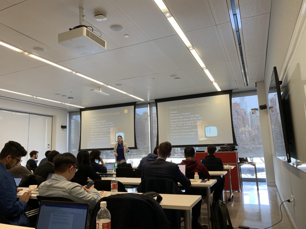
From Zaugg’s speech, I learned that language is a system of communication used by a particular community. A script is written characters. Languages and scripts do not always have a one-to-one relationship(Zaugg). Some scripts are gradually becoming obsolete. The invention of Unicode helps to record and save the scripts. Unicode(figure2) is a computing industry standard for the consistent encoding, representation, and handling of text expressed in most of the world’s writing system(“Unicode”).

Figure 3

In Zaugg’s case study(figure3), mixed methods have been used in the Ethiopic language and script research. The common language of Ethiopia is Amharic, with 345 letters. Its history can be traced back to the 4th century A.D. and it is one of the oldest words in the world today. Because the alphabet contains far more letters than the 26 letters in the Latin alphabet and is complex and difficult to distinguish, it is difficult to be compatible with modern science and technology communication networks. In 2004, with the participation of linguists and scientists from Ethiopia and the United States, and professors from the University of California, researchers reduced the total number of letters from 345 to 210, and then further reduce them into 28 basic alphabetic letters in Unicode. With this development, it has become possible to use Amharic to communicate in text on mobile phones, and Ethiopia’s communications have entered the 21st century rapidly.

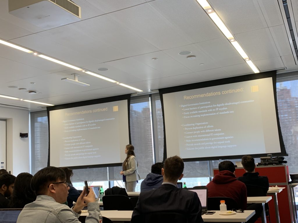
Figure 4

Zaugg oversees Unicode and ISO subcommittee working group, interviews with Ethiopic digital pioneers and linguists, and analyzes the non-traditional content of Ethiopic script and languages choices on Facebook, Wikipedia and .et country code top-level web domain. Some recommendations are put forward to save the Ethiopic language and script(figure4): Linguists should collaborate with IT professionals. Governments should optimize the Ethiopic keyboard standard and produce products that implement a free, open-source standard. International IT companies should support language diversity as part of corporate social responsibility(Zaugg).

Reflection:

Technology can mitigate language/script extinction and help to preserve culture heritages. Thanks to technology, scientists can save scripts by converting them to Unicode and spread it through the internet. However, technology is a double-edged sword. While it is helping to preserve languages and scripts, it can harm them in a way. When we were kids, we did not have so many digital devices as the kids have now, such as phones, pads, and laptops. We wrote our research paper on actual paper. We write a lot. Nowadays, most of the keyboards have the character/word suggestion function. A lot of young kids do not need to write by hands and they sometimes do not know how to write actual words because the keyboard suggests them the correct words all the time. In some cases, new immigrants in America cannot communicate with their grandparents smoothly in their native languages. Their grandparents come from the countries which English is not their mother tongue. The young generation cannot inherit the speaking and writing ability of their own languages from their parents or grandparents, therefore, native languages cannot be passed on. The young generation will lose their identity in a way and lose a sense of community and belongingness. In the article Digital Cultural Heritage: Concepts, Projects, and Emerging Constructions of Heritage, Marija Dalbello says: “The significance is related to cultural motion and public endorsement; significance processes are the basis for cultural inventions and collectivist traditions”(1). Only when the public realizes the severity of languages extinction and the significance of cultural heritage, can the technical professionals and the society take actions together to make progress on preventing the language extinction and the loss of cultural heritage.

References:

Zaugg,Isabelle. ‘Precarity and hope for digitally-disadvantaged languages (and their scripts)’. 2019. Lecture.

Wikipedia contributors. “Language death.” Wikipedia, The Free Encyclopedia. Wikipedia, The Free Encyclopedia, 24 Mar. 2019. Web. 31 Mar. 2019.

Totelin, Laurence. “Could Ancient Textbooks Be the Source of the next Medical Breakthrough?” The Conversation, 13 Sept. 2018, theconversation.com/could-ancient-textbooks-be-the-source-of-the-next-medical-breakthrough-48612.

Wikipedia contributors. “Unicode.” Wikipedia, The Free Encyclopedia. Wikipedia, The Free Encyclopedia, 31 Mar. 2019. Web. 31 Mar. 2019.

Dalbello, Marija. (2009). “Digital Cultural Heritage: Concepts,Projects, and Emerging Constructions of Heritage.” Proceedings of the Libraries in the Digital Age (LIDA)conference, 25-30 May, 2009.

Xi Chen INFO 601-02 Assignment 3 Event

Fellows Colloquium—Tracing Objects: Translation and Transmission

The Met Fellowship Program draws leading and emerging scholars and practitioners from fields such as museology, academia, archaeology, education and scientific research. Since the program’s inception in 1951, the fellows’ research has deeply examined The Met collection and have significantly added to ongoing discourse in their fields.

This spring, current fellows present their research and explore related scholarly topics in a series of nine colloquia. I attended one of these sessions with the topic “Tracing Objects: Translation and Transmission” on 15 March 2019. The colloquia featured fellows Krisztina Ilko, Tommaso Mozzati, Max Bryant, Brian Martens, Georgios Makris, Maria Harvey and Chassica Kirchhoff.


New Evidence on the Original Materials, Former Construction, and Late Collecting History of the Patio of Vélez Blanco

Tommaso Mozzati, Andrew W. Mellon Fellow, Department of European Sculpture and Decorative Arts

Patio from the Castle of Vélez Blanco, from The Metropolitan Museum of Art, Retrieved March 21, 2019, https://www.metmuseum.org/art/collection/search/199003. Image in Public Domain.

Mozzati’s research examines the marble patio originally part of the Castillo de Vélez-Blanco, now housed in the entrance of The Met’s Thomas J. Watson Library to showcase the museum’s Italian Renaissance statues. The Patio of Vélez Blanco was built at the beginning of the sixteenth century by Pedro Fajardo y Chacón and remains a matter of conjecture today. Mozzati’s archival investigation led him to an unpublished drawing from 1805 that shows the patio’s original composition, in situ in the Spanish fortress. Reflecting on this drawing, Mozzati highlighted questions of authenticity as with little to no archival records before, the changes made over time with the movement of the patio can only be supposed. The drawing differed significantly from the patio in The Met with various additions and shifts, emphasizing the compromised state of the original and the mutability of art to fit the whims of the owner. Mozzati thus brought up the idea of ‘trans-content’ with regards to the patio’s importance in the context of early modern Spanish architecture and its new meaning and significance now that it is situated in Fifth Avenue.

In addition to archival research, Mozzati examined the provenance of the marble used in the current iteration of the patio seeking to use scientific analysis to determine the structure of the courtyard before its sale in 1904 to French dealer J. Goldberg. I found Mozzati’s research particularly interesting in his multifaceted approach in studying the history and authenticity of the patio. Mozzati lamented that the patio is now a mere reminder of the original though still prized for its sculptural and architectural value in the context of the Spanish Renaissance. It is often taken for granted the role of museums to present authenticity and truth. There is much to learn in constantly questioning the information I am presented with even with respectable organizations and institutions.


Imported Art and Design in the Early Practice of the Adam Brothers

Max Bryant, Andrew W. Mellon Postdoctoral Curatorial Fellow, Department of European Sculpture and Decorative Arts

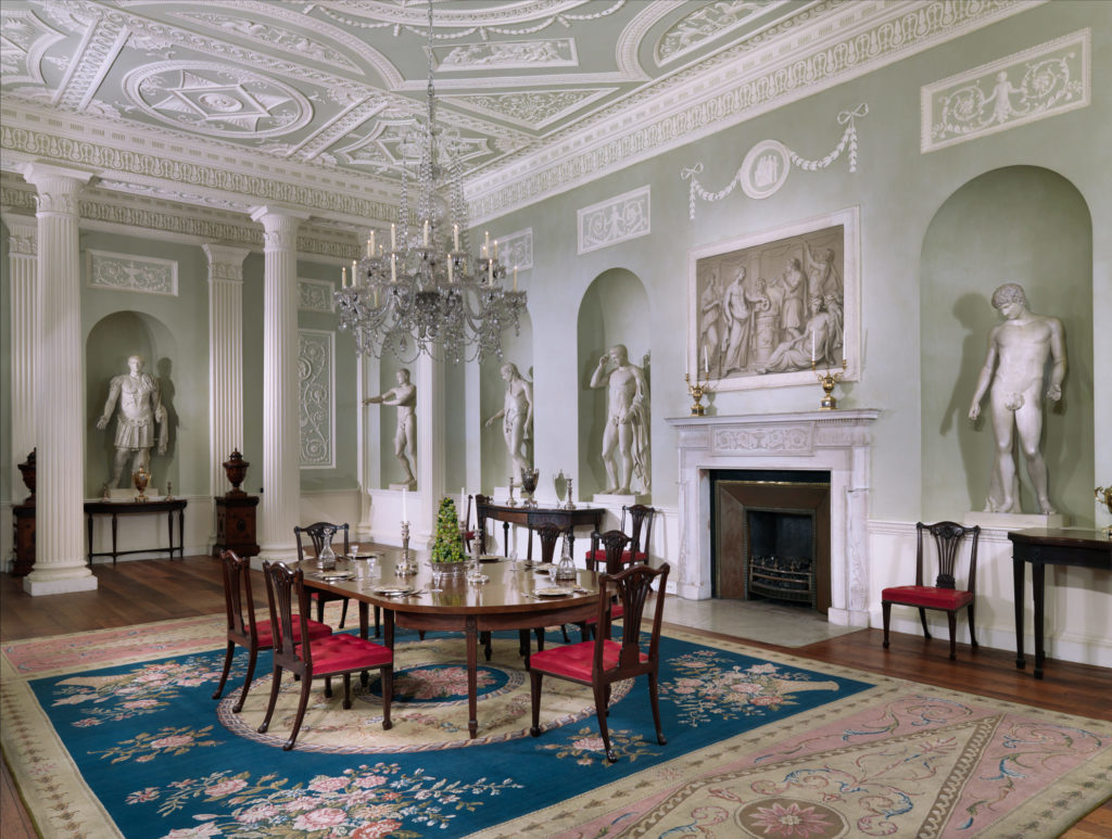
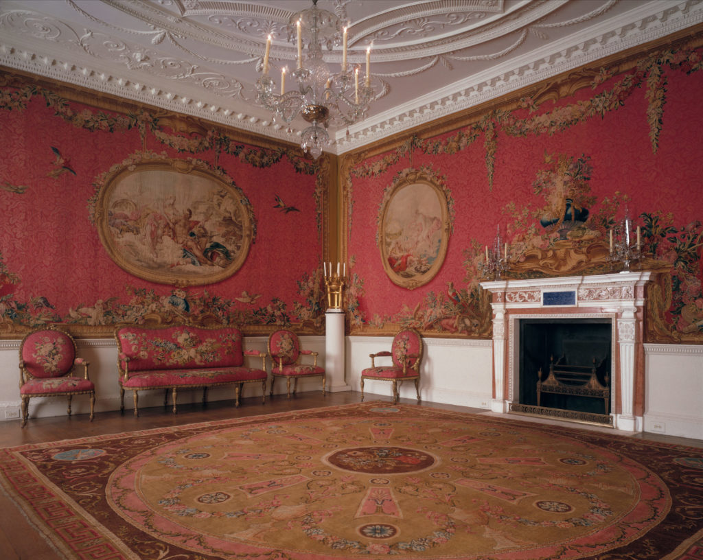
Dining room from Lansdowne House, from The Metropolitan Museum of Art, Retrieved March 21, 2019, https://www.metmuseum.org/toah/works-of-art/32.12/.
Tapestry Room from Croome Court, from The Metropolitan Museum of Art, Retrieved March 21, 2019, https://www.metmuseum.org/toah/works-of-art/58.75.1-22/.

The Adam brothers created exemplars of design, composite period displays that were an important stage in the development of modern museum culture. Bryant studied two of their displays from late-eighteenth century London: the tapestry room from Croome Court and the dining room from Lansdowne House, now being reconstructed in The Met’s new British galleries. Period rooms afford the museum visitor a chance to experience the furnishings, objects and decor within as related to each other in time, place and style in a way that isolating them cannot. Though many such rooms were originally designed as a proof of opulence, the objects within might not be curated well but fulfilled the aesthetic requirements.

Museums now question the contemporary resonance of such period rooms, if aesthetic quality or historic quality takes greater precedence. A moral element has now emerged that raises issues of populism, imported luxury and the attachment to the past.


To Conclude,

Many of the fellows had brought up issues of the transmission and translation of art between cultures in their presentation, befitting the overarching theme of the event. Their research took in depth studies of The Met’s collection in relation to various themes, locations and histories. As such, misinformation seems a underlining hindrance to their research with either little archival resources or when the translation of art could have had more verification.

Adorno states the authentic is a judgement of value and a manichean one that pits unobjective concepts against each other and leads to constant hairsplitting (Adorno, 1973). The criteria of authenticity is not necessarily objective where the museum seems an inauthentic device trying to frame ‘real’ or ‘authentic’ objects and ideas within contexts determined by them. Museums might argue that they are the last guardians of the past, in possession of relics for the benefit of scholars to study and people to view, where their reconstruction of historical sites can now be easily marveled all under one roof.

The event has opened my eyes to various museology and art history issues that I think also apply to information science where information verification and authenticity have become large issues in the community.


References

Adorno, T.W. (1973). The jargon of authenticity. Evanston: Northwestern University Press.

Bruner, E. M. (1956). Cultural Transmission and Cultural Change. Southwestern Journal of Anthropology. 12(2): 191-199. https://doi.org/10.1086/soutjanth.12.2.3629114

Hede, A. & Thyne, M. (2010). A journey to the authentic: Museum visitors and their negotiation of the inauthentic. Journal of Marketing Management. 26(7-8), 686-705. https://doi.org/10.1080/02672571003780106

Hooper-Greenhill, E. (2000). Museums and the interpretation of visual culture. London: Routledge.


INFO 601-02 (Assignment 3 / Event Attendance) – Jamie Teo

Event NYC Data School: Can open contracting hold smart cities accountable?

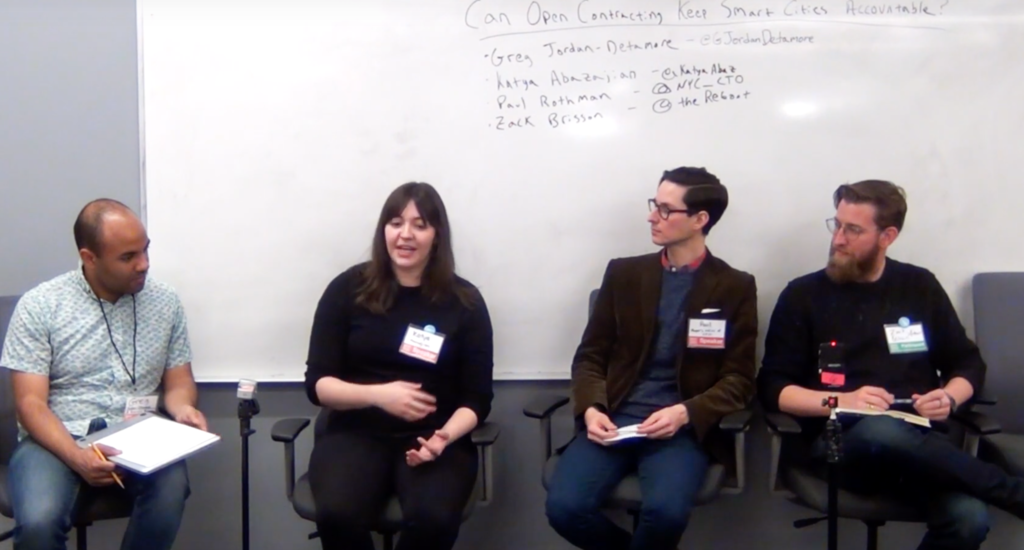
The panelists (from left): Greg Jordan-Detamore (Sunlight Foundation), Katya Abazajian, (Sunlight Foundation), Paul Rothman, (NYC Mayor’s Office), Zack Brisson (Reboot)

On a Saturday in March during NYC’s Open Data Week, NYC School of Data hosted their annual community conference to “demystify the policies and practices around civic data, technology, and service design.” With my BA in Geography, experience as an AmeriCorps VISTA, and current status as a Pratt IXD student, it’s not surprising I found myself drawn to a session entitled, “Can open contracting hold smart-cities accountable?”

On the 7th anniversary of NYC passing the Open Data Law, the hour-long discussion brought together 4 panelists: Zack Brisson, Principal at Reboot; Katya Abazajian, Open Cities Director at Sunlight Foundation;  Paul Rothman, Senior Product Manager at NYC Mayor’s Office of the Chief Technology Officer and Greg Jordan-Detamore at the Sunlight Foundation.

I’ll reflect on the event in hopes to continue the conversation on transparency and accountability in government tech, particularly smart-city technologies, amidst the rising tide of surveillance capitalism.

via Vecteezy

Who builds smart cities?

Upon opening the panel, Mr. Jordan-Detamore of Sunlight Foundation explained regulating, or even discussing the regulation of, smart-cities is difficult because the term is a broad buzzword with no real definition. For the purpose of the discussion, the panelists clarified their meaning of smart-cities as “urban centers being used to collect data and then things being done with that data for some purpose.” Admittedly still pretty broad, but somewhere to start!

The panel really focused on the relationship between those who make the actual technology, and the governments who purchase them. Smart city technologies are built by private technology corporations, or vendors, like Google, but once the city begins using them, it’s often unclear who owns the resulting data. The speakers explained the reason cities purchase technology from private corporations is pretty obvious: Governments often lack the organizational infrastructure and internal expertise to build on their own (remember Seattle’s failed independent bike-share). One panelist asked, “I mean, how great would it be if your city’s government was as efficient as Amazon?”

The government-vendor relationship

Early on, the panelists underscored the imbalanced relationship between the government and corporate entities who enter into smart city technology contracts. Governments looking to procure a product “never really have the upper hand,” explained Abazajian from the Sunlight Foundation, as they don’t have the same technological expertise. The Sunlight Foundation’s Jordan-Detamore stressed that governments, especially smaller municipalities without the infrastructure of, say a Boston, are especially vulnerable of being swindled by the shininess of Silicon Valley.

While watching an episode of VICE News Tonight a week after the panel, I saw the disastrous potential of manipulative contracting in the town of Jackson, Mississippi. The manufacturing conglomerate Siemens sold 65,000 water “smart meters” to the city for $90 million dollars in 2013. Fast forward to 2019: the water meters don’t actually work and started a billing crisis that has grown into the city’s $25 million debt. About the dynamic between the city and Siemens, Jackson Mayor Chokwe Lumumba told VICE News, “It’s akin to someone selling you the most expensive car that they have on the lot, and understanding at the time that they’re selling it to you that you can’t afford to buy it; you don’t understand how to operate it, but if they can get you to purchase it, they will.”

Via piktochart

Behind closed contracts

There’s a lot of cloudiness around the ethics of smart city technologies because their contracts are, more often than not, closed. Closed contracts that limit the details to the public are the norm, and tech companies want to keep it that way. Before this panel, I (slightly embarrassingly) had no idea there was even an option of opening them.

Abazajian explains, “vendors make the argument their proprietary technologies warrant a closed contract, but in reality, they don’t need to be.” There’s a broad range of contract data that’s not sensitive, not private, and not proprietary. Lack of transparency in contracts was unanimously cited as a major issue in protecting civil liberties by the panelists.

Would an open contract have saved Jackson, Mississippi? Via CC.

Advocating for open contracts

The panelists from the Sunlight Foundation explained their new open contract initiative, which helps city governments open the process of procuring smart city technologies. On a functional level, opening a contract means giving the public access to smart-city contract data in a standardized way, so advocates and other community members can see how public money is spent.

Sunlight Foundation operates under the notion that the public should be involved in the rollout of smart city technologies from the start because they are the major stakeholders. A vendor should not be able to come in and “trample the public’s right to information,” one panelist quickly quipped. “Open contracting creates feedback loops”, explains Brisson, which “helps infuse community input into the plan.”

While watching the segment on Jackson’s water bill crisis, I couldn’t stop wondering what would have happened if the contract was public to begin with. Public outcry could have halted the overly ambitious and exploitative plan that sunk the small town into massive debt.

References:

A $90 million “smart” system has totally screwed up these residents’ water bills – VICE News. (n.d.). Retrieved March 21, 2019, from https://news.vice.com/en_us/article/vbw8qy/a-dollar90-million-smart-system-has-totally-screwed-up-these-residents-water-bills

Naughton, J. (2019, January 20). “The goal is to automate us”: welcome to the age of surveillance capitalism. The Observer. Retrieved from https://www.theguardian.com/technology/2019/jan/20/shoshana-zuboff-age-of-surveillance-capitalism-google-facebook

There Is No Such Thing as a Smart City – The Atlantic. (n.d.). Retrieved March 21, 2019, from https://www.theatlantic.com/technology/archive/2018/02/stupid-cities/553052/

Why good policies go wrong: Seattle’s botched bikeshare model | Apolitical. (n.d.). Retrieved March 21, 2019, from https://apolitical.co/solution_article/good-policies-go-wrong-seattles-botched-bikeshare-model/

Event: Data Through Design

I attended an event at the NEWLAB called Data Through Design, which was split in three separate sections, an exhibit viewing, artists discussion, and panel discussion. This event was an independently organized exhibition for data and cartography where they introduced a few artists who have used data in their projects and a panel discussion based on proxies was discussed. I’ve participated in the entire event and gained a lot of knowledge from the events discussion based on what the artists and panelists said throughout the event. This event was a high interest to me because I wanted to gain much more understanding in data collection from online data websites and how it can be used for a design project. I have taken a data visualization course in programming on my undergraduate years and have knowledge in collecting data but I wanted to learn more. Back when I took my data visualization course, I was very amazed in how data sets can be used in a program to determine a solution and get information. Even though I have knowledge in data collection this event caught most of my attention because of its panelist discussion in everything is a proxy. The panel was a discussion about proxies in data models where they are used in the complexity of getting a specific data set that works best for your project or needs. Proxies is everything is their theme in the discussion and this is because proxies are the information of things around us that can be brought together in order to be used in special work for the society. In my understanding the event is teaching the audience to grasp knowledge on data and how data is useful to the people and their works.

At the event I saw an exhibition viewing. In the exhibition there were a couple of projects created by the artists who were in speaking at the event. There was piece of works called temporal views of a bike lane, collision course, cards against hate, and a few more. All of these exhibits have data collection in them that was used to be created. For example, one of the exhibits called cards against hate showed cards that had different information about none hate crime in the week based on religion, race, and other subjects. The artists who created these cards used a data collection to get the information they needed to showcase their work. The artists who created this piece of work spoke to the audience and said that the data sets they used helped them get what they wanted and they agreed that the data collection of information would change the society in many ways.

The event talked about how useful data is helpful to the people and the design projects that are being developed by artists. Data is a big informational source that never ends. You can use data for anything you want. But mostly people use it to find solutions, make life simple for its users, and create a better living for the society. The information within data is very big and you can find about anything on the topic you choose to explore on. I believe that the information within data is useful in many ways and will help the people or users interact with products that use data in a much effective way. There is still a lot more information to be added to data. It is a growing branch that has no limits. Data is big and is growing more and more every day.

Proxies or data collection is a good tool because it helps users connect with information in a faster and smarter way. As Jim Martin and Raik Zaghloul say,

Collection management is profoundly affected by rapid changes in the library profession. While this provides librarians with opportunities to connect users with information, it also demands the ongoing development of new skills (Martin & Zaghloul, p. 313).

Even though I have knowledge in data collection, I have learned a lot by going to this event. This event should go on more throughout the years as technology is developing every day. The event has given me the understanding of how data or proxies is a big solution to the society. I believe that the event changed the way I see data in the way that data not only has been used at libraries, programs, but also on design works like cards against hate. Many of the words spoken about data at the event gave me the expertise on how data collection is used in about almost everything that we can think of.

Reference

Jim, M. and Raik, Z. (2011). Planning for the acquisition of information recourses management core competencies. New Library World, 112(7/8), 313-320. Retrieved from URL https:// doi.org/10.1108/03074801111150440

Link to event: http://2019.datathroughdesign.com/

Observation of Future of Physical Retail

When considering the kind of information environment, I wanted to observe, I wanted to observe the evolution of physical retail experience. I chose this because retail environment is experiencing a lot of changes after the emergence of e-commerce. Ground breaking retailers are seeing an incentive in looking priceless and administration to make a vivid shopping knowledge intended to pull at heartstrings and catch client dedication, notwithstanding for a brief timeframe. Developing innovation makes it less demanding to mix the physical and advanced retail understanding to give better knowledge into client conduct and expectation — and make a really special vivid experience for their clients. Retailers can utilize this total picture to make an increasingly customized shopping knowledge, drive transformations, improve client administration, and set themselves apart from their opposition. 

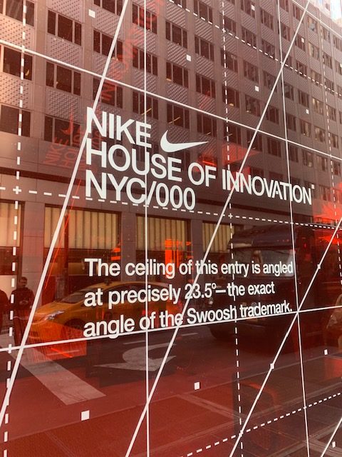
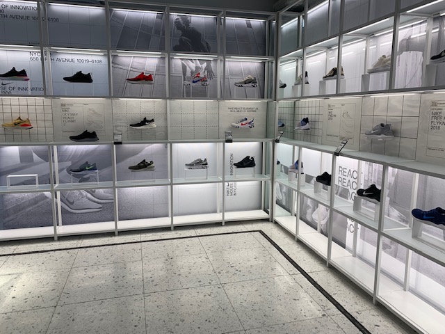
 I decided to go to the Nike Flagship store in Midtown on a weekday afternoon as it provides knowledge in a situation that is as responsive as digital.  This Six-story space is called as the “House of Innovation 0000”, a very first effort of Nike to bring retail to life. 

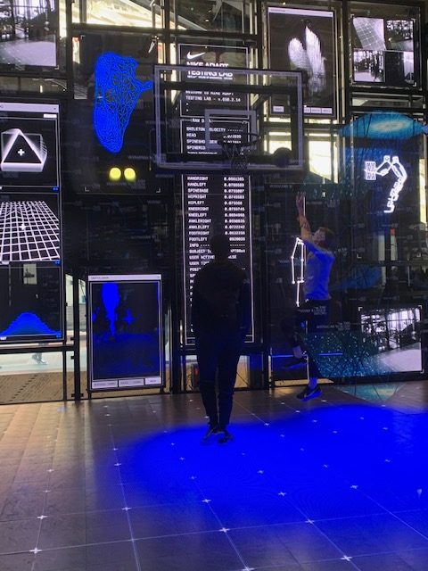
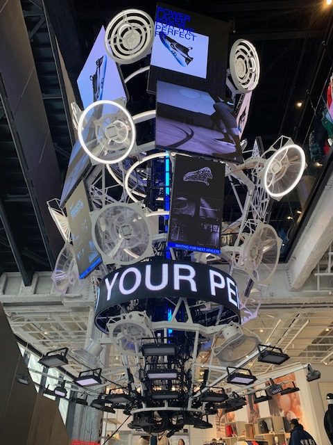
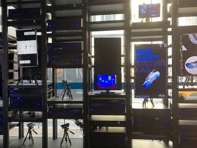
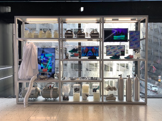
 While walking on the fifth avenue, the whole black building with frosted patterned glass panels and a huge Nike logo grabs my attention. The architecture itself gives information of from where the entrance is. The red glass door opens up to a sci-fi art installation of computers having heat maps and holographic shoes stating the identity of the brand. The store consisted of young visitors. The first floor is treated as innovative museum of Nike. It consisted of information of design process on screens and showing prototypes of previous shoe designs and the latest designs for sneakers. It also encouraged people to download its app to get the full experience of store. There was a digitally heat mapped sports court installed inside where people could experience their shoes before purchasing it. The tiles on the Arena can be reworked to have new spaces and designs; as the choice develops, the store format can advance as well, making the House of Innovation 000 an adjustable store in each feeling of the word. I think this was a really interesting feature because only in retail you can understand the feel of the shoes and nothing better than playing the game of choice in it to understand the comfort of it.  

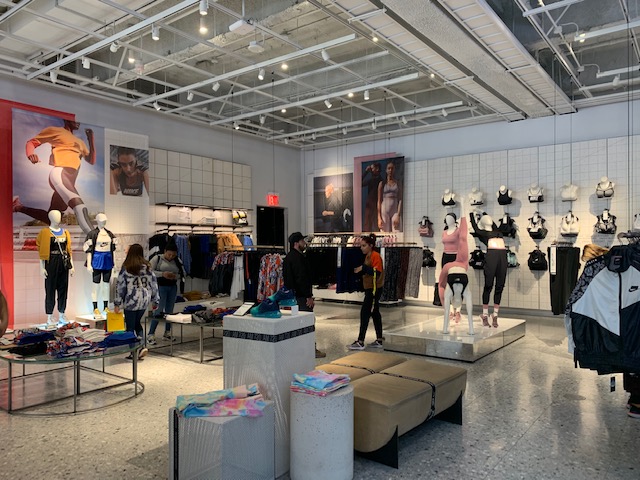
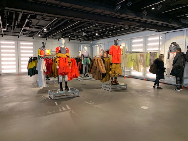
I was directed to the second floor where there was Women’s clothing section. Here there were barcodes besides every product. People need to scan that barcode to purchase the product or get the desired size in the changing rooms. This helped people to roam around the store without carrying the weight of the cart. The whole process of shopping was digitized which made retail fun. Similar facilities were provided in the Men’s clothing section on the third floor. 

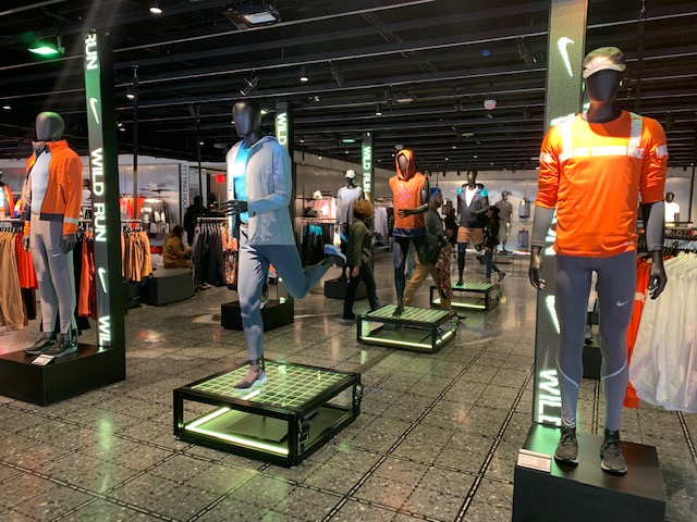
On the fourth floor was the shoes section. It had a sneaker bar and various designs in shoes. A full customization wing of Sneaker Bar, conveying on Nike’s spearheading DIY soul and offering an abundance of bands, textures, decals and more with which to adorn a wide determination of consistently invigorated footwear. People could customize the shoes themselves. The younger generation and shoe fanatic people were really enjoying it.  Even in this section there was a barcode besides the shoes which should be scanned using the Nike app to get it of size and choice. This barcode scanning is a really a great feature because then I need not search for a representative and wait for the whole process of finding a shoe of choice.  

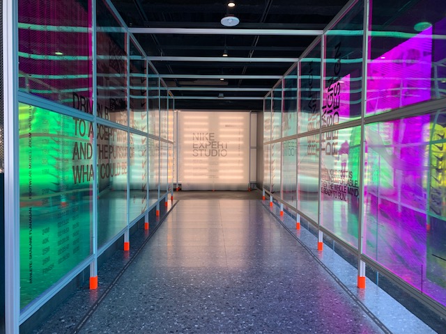
This leads me to the last floor of the building where there is a Nike Expert Studio. This feature of one-on one joint collaboration with expert stylist can be booked by Nike members in-store and on the Nike App. I think this section was very VIP section where people could interact with stylist and get customized clothes or clothes that suits their body type or style. Very few people were coming to this section. I personally think this section was not getting as much attention as previous ones. They have not given much information about it even while entering the store. 

Observing this whole space was really interesting. It appeared that some visitors were there to only experience the innovative retail space. They were curious about the interactive features and the technology used in the store. Despite the unfamiliarity of technology some people were inherent on using it as someone would think they were stealing from the store. The young generations were very engaged with the technology. But the older generation was sticking to the conventional style of retail. 

As Bates stated in Fundamental Forms of Information, we will simply consider subjective experience, including the experience of remembering, to be the first on a list of kinds of embodied information that result from neural encoded information. I really enjoyed observing people first taking the experience of the product and having hands on customization which then lead them to buy the product. I observed what Marchionni said changes in the human–information interaction entities relate to learning or other mental state changes in the human and usage changes in the information object. I could sense the different between interaction with technology of different generation which depends on both urge of learning and mental state. 

I trusted it is the ideal convergence of individuals, innovation, and style in one space. The space had the capacity to speak with its city through individuals and advanced administrations, welcoming a discussion that is synchronized to the client.  From my perspective the whole technological process is overwhelming if you are trying it for the first time. But if this is the future of physical retail, people will get used to it eventually. Overall it was a great initiative taken by Nike Team. 

References: 

https://news.nike.com/news/nike-nyc-house-of-innovation-000

Marcia J. Bates Fundamental Forms of Information, Journal of the American Society for the Information Science and Technology, 57(8):1033–1045, 2006. 

G. Marchionini / Library & Information Science Research 30 (2008) 165–174. 

Richa Kulkarni, INFO 601-02
NYC Subway and Human Interaction

New York City’s Subway is one of the oldest and most efficient public transit systems that the world has seen. It started operating in the year 1904 and runs 24 hours on every day of the year. The Subway transit is also the most used metro system of the world, by a countless and diverse population. 

The Subway lines run through Manhattan and branch out into the boroughs of Brooklyn, Queens, and Bronx. It is a network of extensive structures and many junctions, of which I have made observation of one – Times Square 42nd Street/Port Authority Bus Terminal(PABT). 

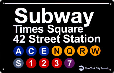
This Subway station complex is located under PABT and Times Square at the intersection of 42nd Street, 7th and 8th avenues, and Broadway. Every train has a distinct color and number or alphabet associated with it. The 42nd Street Times Square station offers access to multiple lines. 

42ndTrainStation-trains

All the lines are bi-directional, running towards uptown and downtown. There are local lines which stop at every station, and there are express lines that make stops at fewer stations. Most lines, except a few, run 24 hours with higher frequency on weekdays.

NAVIGATION AND TECHNOLOGY 

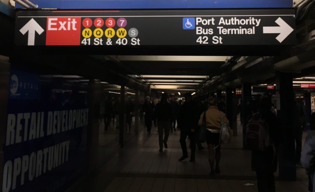
The Subway system has a very well designed way-finding system which poses hardly any challenge to its users. It uses consistent visual language, universally accepted icons, and smart placement to make navigation through the enormous space easy. All signages are on non-reflective black surfaces with white legible sans serif text. The signages mark uptown and downtown trains with their specific icon. Use of icons and text together reinforces information, the “S” with “Shuttle” for instance. While the train icons are invariably placed on the right of the text, icons for ramps and wheelchairs go consistently on the left. 

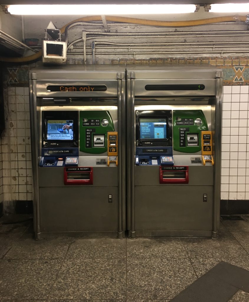
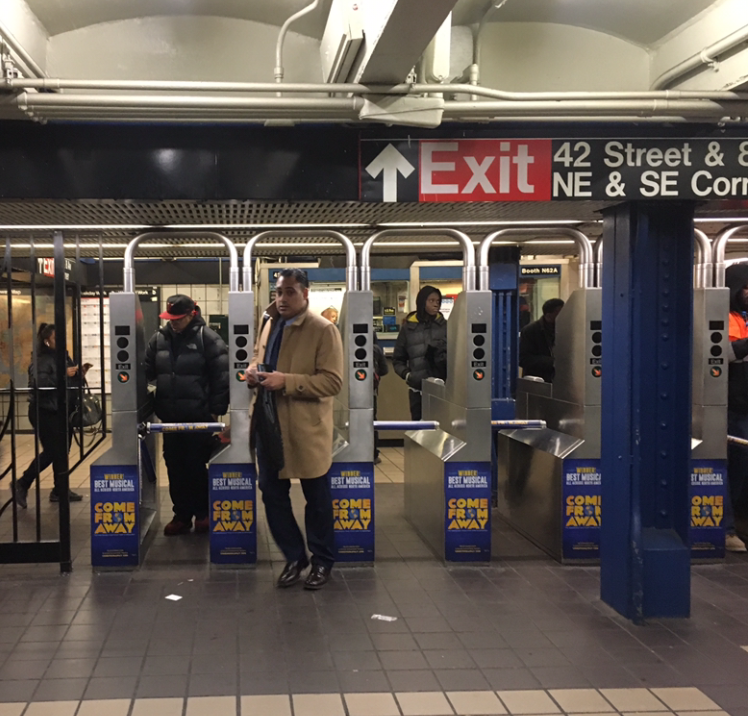
A user’s initial point of contact with the Subway system’s technology is at the entrance where he finds a Metrocard vending machine. The machine accepts cash, debit or credit cards and is effortless with touch screen and comprehensible instructions. The system is quick and economical with $1 for the Metrocard itself, and preset values that the user can choose from to put charge on the card. Moving further the commuter enters the station through turnstiles which use a card reading technology. 

Metrocard-vending-machines

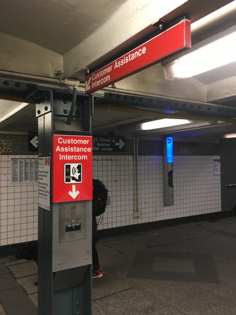
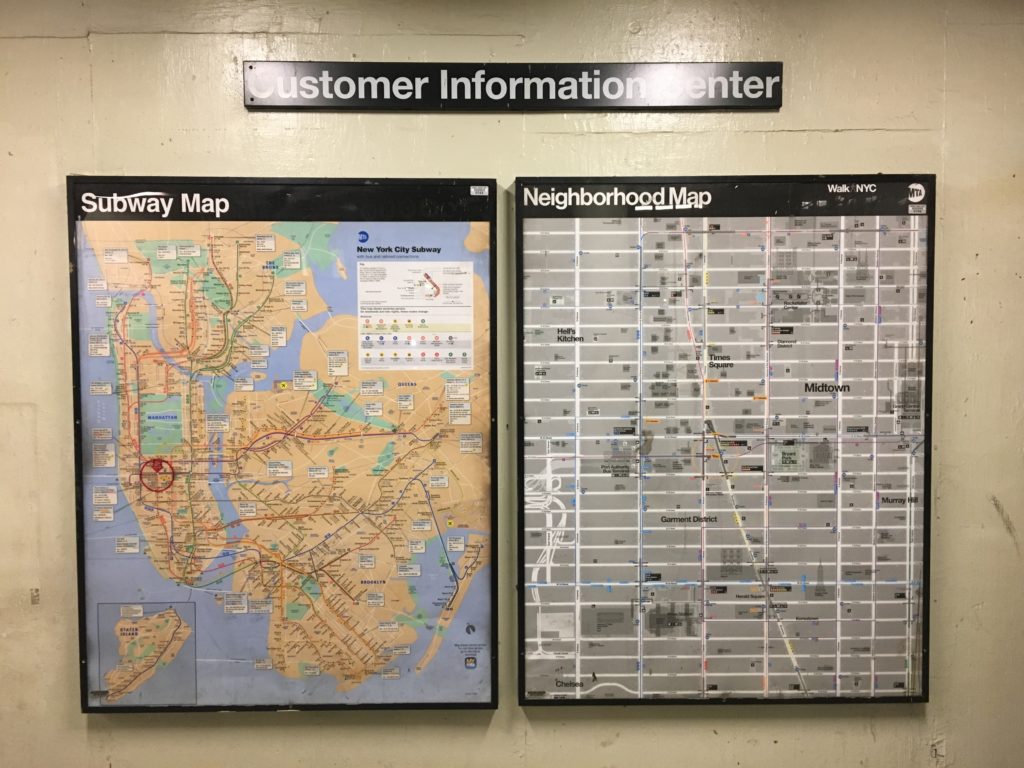
Throughout the Subway premises Customer Assistance Intercoms and Emergency Intercoms are easily accessible. The smart positioning of speakers allow system announcements to be audible all over, without any hindrance from the commotion. The station has Subway maps at frequent spots and Neighbourhood maps and entrances/exits. 

Maps-at-Subway-entrance-exit

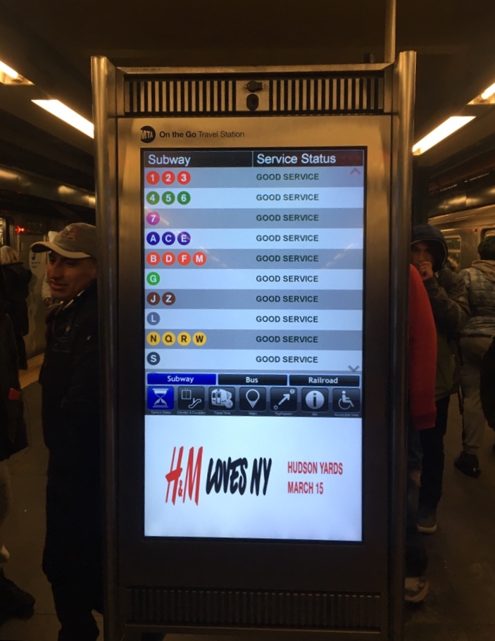
Moreover, a recent addition of interactive touchscreens has augmented navigation. These all-in-one customer information devices allow one to select a destination station, in response to which the screens display possible routes with time estimates. Aside from information on train schedules these screens also offer recommendations for points of interest at select locations, information about escalators and elevators, outages and train delays, or if planned work is coming up. However, commuters don’t seem to use this technology as often. 

Interactive-screen-at-Subway-platform

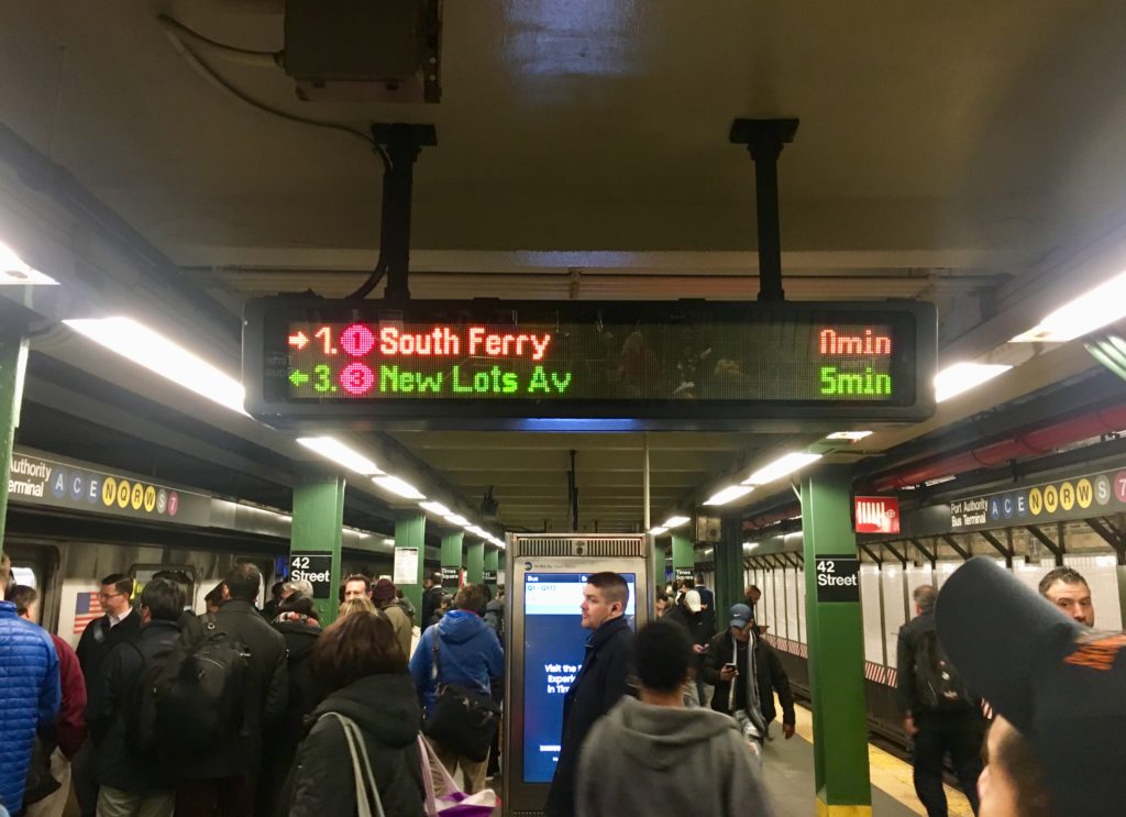
All platforms have digital screens displaying ETA for their respective trains. 

Screen-displaying-trains-ETA
S

There are multiple apps designed specifically to aid Subway navigation, for example MTA Subway Time.

The 42nd Street Station, as all Subway stations, has several entry/exit points spanning across surrounding blocks with supplemental northwest, southwest, northeast and southeast corners, marked “NW”, “SW”, “NE” and “SE” respectively. There are two underground passageways to PABT allowing easy transfer to interstate buses.

CONVENIENCE AND EXPERIENCE

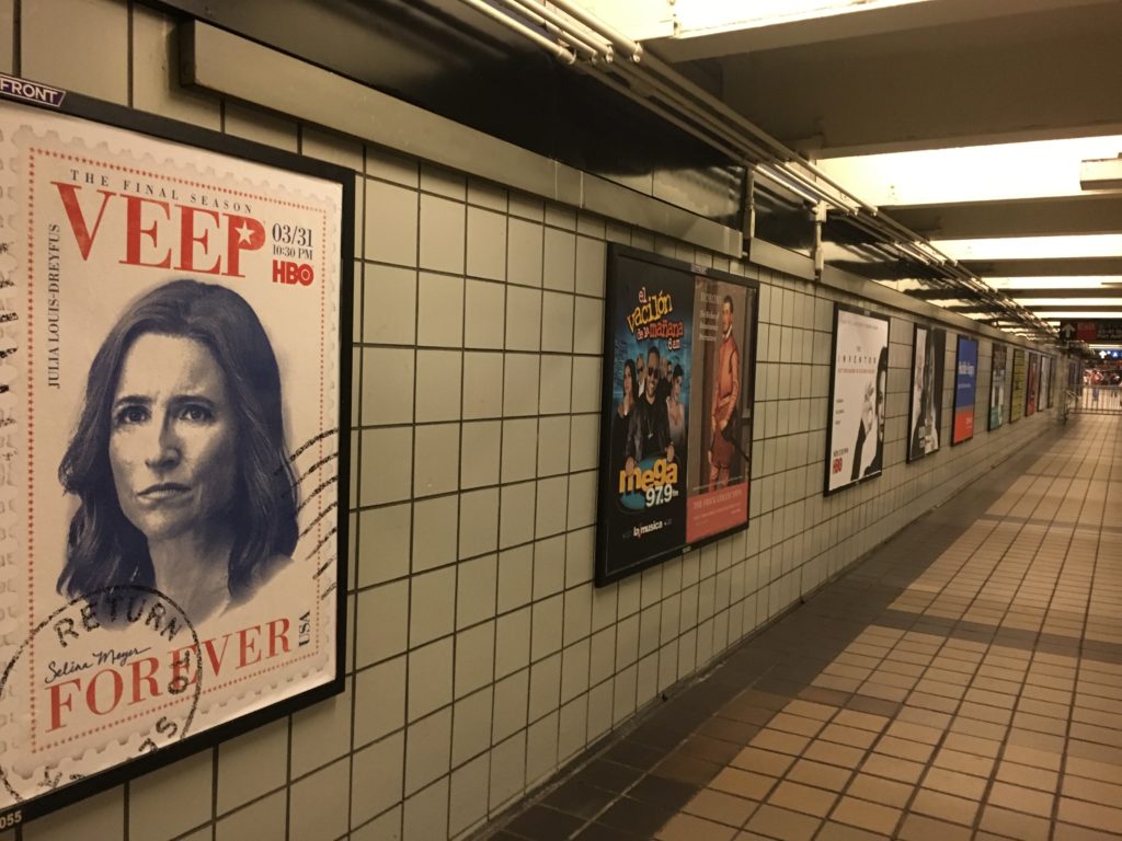
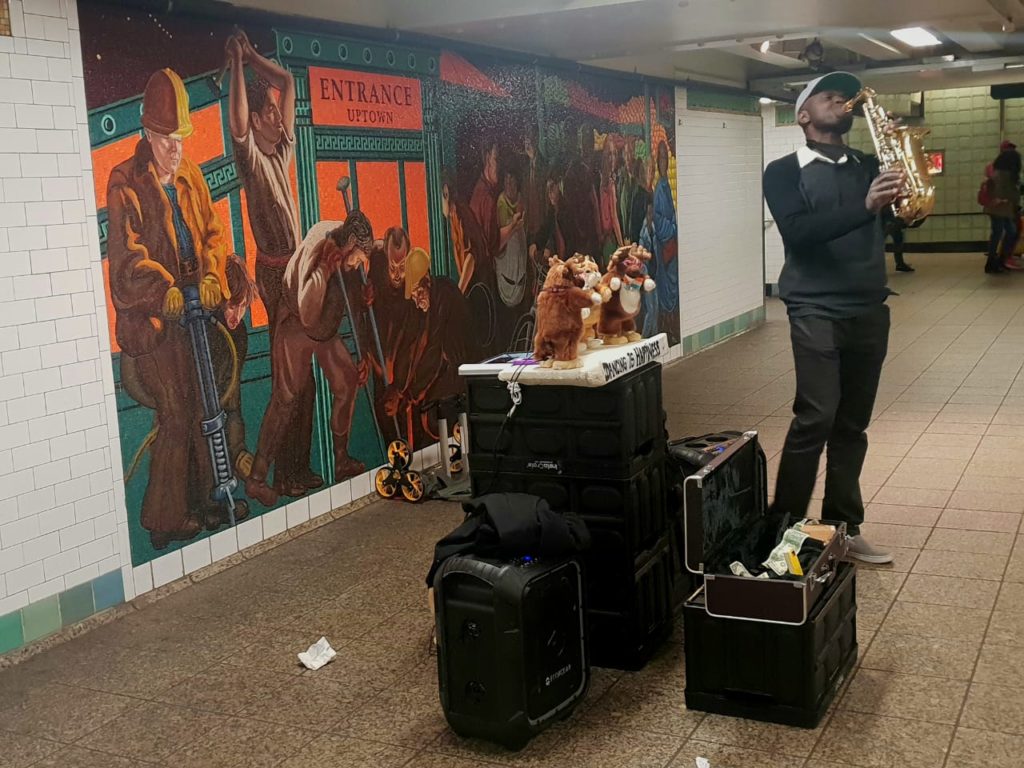
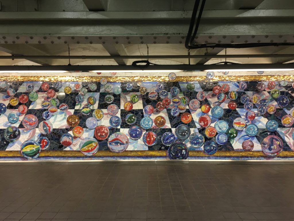
ATMs, convenience stores and trashcans are easy to locate. The subway is safe, and well monitored by surveillance cameras and police. Several posters advertising tv shows, web series and brands among other things, offer a sense of familiarity and make the experience less daunting. Also serving the same purpose are the artworks on the walls. Musical performances are a regular affair at the station, which also becomes a platform for artists to showcase and sell art. This makes the Subways less monotonous and more entertaining. Yellow strips at the edge of the platforms mark a safe distance from the rail tracks. These strips are embossed to prevent slipping. A set of benches are placed at the platforms for senior citizens and physically challenged.

Advertising-posters
Musical-performances
Artworks

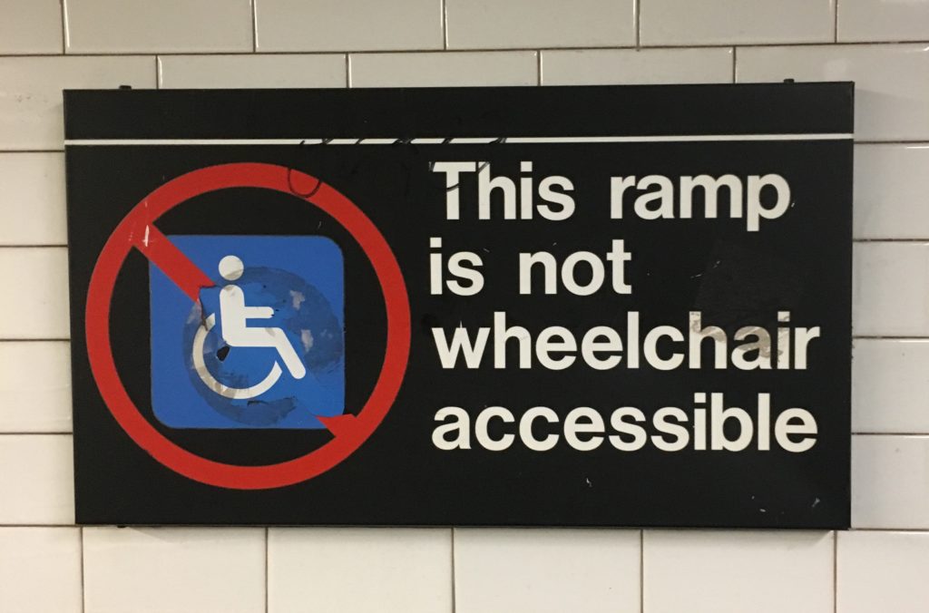
An attempt to incorporate inclusive design has been made through the use of braille, ramps and elevators, but it fails to be efficient. 

inefficient-inclusive-design

ON THE TRAIN 

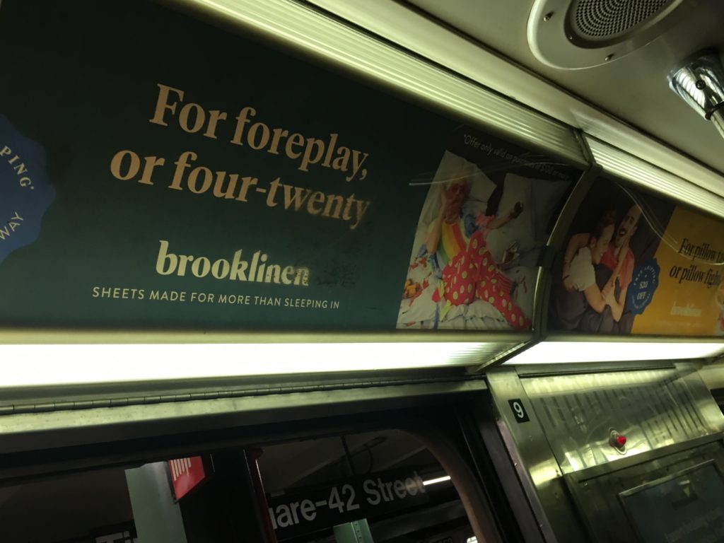
Every train’s icon, number/alphabet and route is visible on it. Red bulbs light up on both sides of the automatic doors when they are open. Many advertising posters on the insides of the trains offer comfort and interaction. There are poles and railings for standing commuters to hold onto. Newer trains have digital display of the trains route with current and next station highlighted, but the old trains only have a poster of the trains’ routes. To complement this, system announcements alert the passengers of the upcoming and current stations. There is priority seating for disabled and senior passengers. Clear instructions for events of emergency are displayed with assistance intercoms and emergency brakes.  

Posters-in-train

OBSTACLES AND SUGGESTIONS

The Subway system is extremely well planned and functional, and given its technological structure manned stations are barely needed. Although, a considerable number of users are not tech-savvy. There is a lost and found unit, but without relevant assistance chances of items being turned in are slim. There could be a dedicated station for a personnel within the premises for further help. Nonetheless, NYC Subway system is an exemplary public space design with minimum room for errors.

References: