Observation at The Met Fifth Avenue: How is the museum tour guide in including different kinds of visitors.

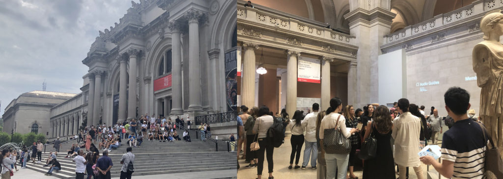
The Metropolitan Museum of Art is the largest art museum in US and the third most visited art museum in the world. The main building in Manhattan’s Upper East Side in one of the world’s largest art galleries. As was posted on January 4, 2019 that 1,659,647 visitors were attracted to The Met Fifth Avenue and The Met Cloisters from May 10, 2018 to October 8, 2018. Based on the data from Wikipedia and MET official website, with such large number of visitors from all over the world, I began to curious how the visit guide provided by the museum service did well in considering different kinds of visitors.

According to what I learnt from Design Justice, the tour guide designed by MET should aim to ensure a more equitable distribution of the benefits and in this case, the museum tour guide should also consider non-English speakers, people with disabled, etc.

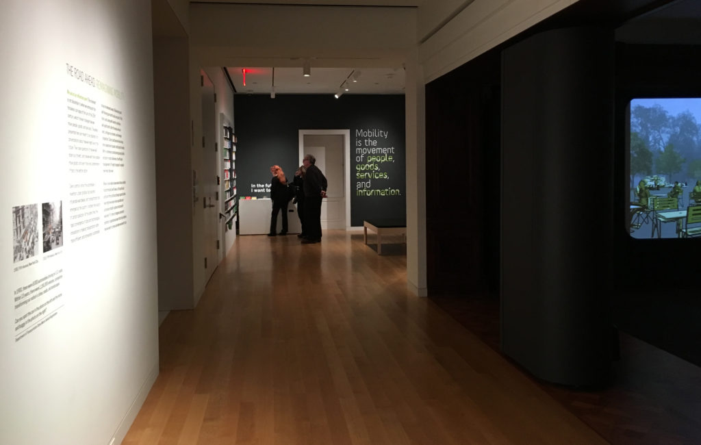
I went to The Met Fifth Avenue on 27th, Sep. to directly observe as a visitor and my goal was to see whether different kinds of visitors were guided friendly and effectively in visiting the museum. It was a cloudy afternoon with crowded visitors, and I waited for 10 minutes in line to get my ticket.

1 Manual Guide

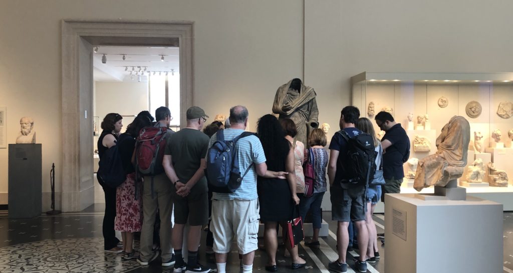
I saw several cicerones surrounded by a small number of visitors. I joined them for free. Some visitors followed by cicerones carried backpacks and not seemed like locals. The good thing for getting a manual guide is that you could directly ask questions and get answers, especially for history or art fanatics who are always filled with questions.

But this method is not that feasible for visitors who prefer to get through the museum quickly and are not fluently English speakers. Since you are guided by a certain route and listening to deep explanations of the exhibits really takes time. In this period, I found some of visitors would only follow a few minutes then left the group to visit by themselves.

2 Audio Guide Rent Onsite

These days the most commonly used tour guide in museum is audio guide. At the museum lobby visitors could easily find the words “Audio Guide”, and the return place was also obvious to find. During my observation period, I found no more than 50% visitors were using audio guide and I guess it was because the audio guide in MET was not free, or some were not first-time visitors or some just preferred to quickly visit the whole museum without deep explanations.

2.1 Whether considering non-English speakers.

Yes. The audio guide provided by MET contains 10 different languages, which is especially considerable for foreign visitors. When I visited the museum, I found a lot of Asian visitors renting audio guide and listening to the guide frequently. It’s much effective for them to get the explanations in their mother language.

2.2 Whether considering visitors with disabilities.

During my observation period, I did not find disabled visitors. But I found some information on the MET website that the museum offered assistive listening devices and real-time captioning for visitors with hearing loss.

2.3 Whether considering aged visitors.

I found an old woman who seemed uneasy to input numbers into the audio guide to get the explanations. And some visitors seemed tired to hold the guide near their ears to listen all the time and they needed to find a place to sit or change to another hand to hold the guide. I think the interaction method between visitors and audio guides is not that friendly especially for aged visitors. Manually inputting numbers could waste time. Besides, the guide is not that easy and convenient while the MET is large, and most visitors would stay more than 2 hours.

I guess it’s better to add automatic induction function to the audio guide and visitors don’t need to input numbers themselves but only to answer yes or no to listen the guide. In addition, always holding the guide near ear to listen is not convenient. Why not provide earphones to aged visitors together with audio guide? Or support the visitors using their own earphones.

2.4 Whether considering visitors who prefer quickly visiting the whole museum.

I did find a visitor hanging the audio guide around her neck, but she didn’t use it during the whole process. And some only listened a few seconds then gave it up. I guess the contents provided in audio guide were too long and they only wanted to get a concise version. They came to the museum to get something new but not preferred to get that deep understanding towards a single exhibit. In that case, perhaps better to provide different versions for visitors to choose from. For instance, a quick 1-minute explanation together with a detailed 5-minute version.

3 The MET App

There is an App called The MET which also provides travel guides and even augmented reality function. The good thing is you could use it offline, while the bad thing is that you have to download it beforehand. How many visitors would take trouble to download an App to help them visit the museum? I guess better to develop a Web App for visitors who just want to visit temporarily.

During my observation period, I only saw a young woman using her iPhone to get the audio guide. Generally speaking, not a large number of visitors choose to get a guide on App. I believed one of the problems was not enough contents on App, compared to the audio guide you rent onsite.

Conclusion

In 2015, the MET did a thorough research on how to improve the audio guide and during the research they did find 40% visitors were foreigners and the importance of reducing the complexity of using audio guide. However, just like what Norman said, “The world is not neat and tidy and things not always work as planned.” All the tour guides provided by MET are roughly satisfied but still have space to improve. Perhaps reconsidering different visitors’ needs could help better the overall experience.

Reference

1 Wikipedia: Metropolitan Museum of Art: https://en.wikipedia.org/wiki/Metropolitan_Museum_of_Art

2 Met Welcomes Nearly 7.4 Million Visitors in 2018:

https://www.metmuseum.org/press/news/2019/2018-calendar-year-attendance

3 Improving the Audio Guide: A Look at Our Visitors:

https://www.metmuseum.org/blogs/digital-underground/2015/improving-the-audio-guide-a-look-at-our-visitors

4 Norman, D. A. (1998). The Invisible Computer: Why Good Products Can Fail, the Personal Computer is So Complex, and Information Appliances are the Solution. MIT Press. Chapter 7: Being Analog http://www.jnd.org/dn.mss/being_analog.html.

5 Costanza-Chock, “Design Justice: Towards an Intersectional Feminist Framework for Design Theory and Practice”

Blog: Person, Place, and Thing

Heidi Klise

Cultural Heritage Preservation

Cultural heritage and heritage preservation are significant components of information studies. A beautiful line from the movie The Monuments Men does a good job of explaining why it is important to preserve heritage. George Clooney’s character Frank Stokes declared, “You can wipe out an entire generation, you can burn their homes to the ground and somehow they’ll still find their way back. But if you destroy their history, you destroy their achievements and it’s as if they never existed. That’s what Hitler wants and that’s exactly what we are fighting for.” (1) The protection of heritage has been tasked to the United Nations Educational, Scientific, and Cultural Organization (UNESCO). UNESCO divides heritage into two categories, tangible (physical items, monuments, geography, etc.) and intangible (oral stories, traditions, events, etc.). My research paper will delve into examples of heritage preservation by refugees in new communities. For this assignment I want to highlight non-refugee related examples of tangible heritage: the Hawaiian mountain Mauna Kea, the journal of a WWII prisoner of war, and Swiss archaeologist Paul Collart.

Person: Paul Collart 

This coming Wednesday at NYU there is a talk called, “Heritage in Peril: Digital Approaches to Preservation.” I will be unable to attend due to class but I wish I could as it is a topic of particular interest. The keynote talk will be presented by a professor from the University of Lausanne (Unil), which, according the the event invite, “is home to the Collart Collection, the world’s most comprehensive archaeological archive of the Temple of Baalshamin in Palmyra, Syria.” (2) The temple was destroyed in 2015 by ISIS. The collection is named in honor of Paul Collart, a Swiss architect and professor at Unil, who UNESCO entrusted with the inventory of the cultural property of Syria and Lebanon. (3) Collart also led the excavation of the Baal Shamin temple in the 1950s, which was classified as a UNESCO world heritage site in 1980. It’s a mark of the 50s that a Swiss man and not a Syrian was entrusted with the cultural property of two Middle Eastern countries. However, the photographs that he took during the excavation are even more important now that the real temple has been destroyed. In a video from Khan Academy, Dr. Salaam al-Kuntar and Dr. Steven Zucker discuss Palmyra. Dr. al-Kuntar says, “[A]nd then we start asking ourselves, what is the meaning of a world heritage site if that site cannot be protected?” (4) This brings up an interesting point about heritage sites, they are protected from development but what resources does UNESCO have when sites are at risk? And if militaries are entrusted to protect sites, that leads to a larger conversation that is somewhat addressed in The Monuments Men, is a life worth sacrificing for art or architecture?

The image of Collart is from archnet.org. (5)

Place: Mauna Kea

Mauna Kea is the peak of a dormant volcano on the Big Island of Hawaii. From base to top, it is the highest mountain in the world at 32,696 feet, of which 4,205 rise above sea level. (6) The summit is sacred to native Hawaiians and is believed to be a home to the gods. There has been a long-standing struggle between builders and locals since the first telescope was built by the University of Hawaii in 1970. (7) This past summer, protests stopped construction of the proposed Thirty-Meter Telescope (TMT), which would be the 14th built on the summit. 

Since mid-July, native Hawaiians, transplants, celebrities such as Jason Momoa, and others have set up camp and blocked the access road to the telescope area. Organized largely on social media, the “we are Mauna Kea” protests have even taken place in cities such as Las Vegas and New York City. I read an instagram post from actor, local, surfer, and business owner Kala Alexander that said something to the effect of, ‘we’re not anti-science or against learning more about the stars, what we’re against is the further desecration of our sacred Mauna Kea.’ What’s interesting is that the University of Hawaii has largely been at the forefront of observatory construction. Information about a lawsuit by the Office of Hawaiian Affairs explained, “the state and the University of Hawaiʻi have continuously neglected their legal duties to adequately manage the mountain. Instead, they have prioritized astronomical development at the expense of properly caring for Mauna Kea’s natural and cultural resources.” There have been rumors of another equally appeasing TMT location in the Canary Islands of Spain, but not much has been reported. 

(image from Kala Alexander’s instagram page)

What is also interesting, is that two of the other volcanoes and sacred locations on the Big Island, Kilauea and Mauna Loa, lie in Volcanoes National Park and are under protection due to their dedication as UNESCO world heritage sites. Why was Mauna Kea not included? Remember the ‘S’ in UNESCO stands for ‘scientific.’ Mauna Kea Observatory is listed in the category of astronomical heritage, “The smooth shape of the isolated mountain, along with its high altitude, produces astronomical image quality that is among the best of any location on Earth.” (8) So, who decides for what purpose something should be preserved? In this case it was the UN, but in other cases it could be information professionals and archivists. I am reminded of Shwartz and Cook’s article about archives and power, “records are also about power,” they wrote, “They are about imposing control and order on transactions, events, people, and societies[…]” (9) The discrepancy between the Hawaiian volcanoes’ protection is an example of the potential bias within preservation, and how the bias can be directed by the controlling body that funds preservation. The “We are Mauna Kea” movement 

Thing: Secret Journal

            During research for my undergraduate thesis about my grandpa’s WWII story, I found a unique and rare book: a collection of journal entries and sketches by a man who was in the same prison camp as my grandpa. I use the word rare because the only new copy on amazon.com is selling for $860 (there’s also a copy for sale on Etsy.com). In the archives of the Air Force Museum on Warner Robins Air Force Base in Georgia, I also found scans of the pages, and other drawings and handwriting, in a folder about my grandpa. 

            Prisoner of War: My Secret Journal, (10) was written by Squadron Leader B. Arct from 1944-45, during his time as a POW at Stalag Luft I in Barth, Germany. It is a compilation of artifacts including handwritten journal entries by Polish Air Force Officer Bohdan Arct, hand-drawn maps, a detailed list of the contents of Red Cross parcels, weekly rations from the German guards, and an illustrated chart of how those rations and parcels depleted towards the end of the war. There are also lines written by the other men in Arct’s bunk room that include poems, journal entries, songs, and notes much like those at the end of a school yearbook. The many instances of cartoons and different men’s handwriting alone make this book a precious source for preservation. Sure, this book exists but who knows how many copies were made, those that I’ve found are difficult to acquire, and as the 90-year old former POW’s pass on it becomes harder to find more information. For example, one man wrote his Canada address for Arct to find him later, it’s doubtful if the man or his family still live there. There’s also a note from a New Zealand soldier named Kai Ora, all of the time I’ve spent researching WWII over the years and I had forgotten that New Zealand was involved. 

The image seen here is from my Grandpa’s folder in the archives and is similar to the drawings in Arct’s book.

I feel the heavy sense of information overload from this one book alone. It is such a unique and precious resource, but I don’t know what to do with it. In the spirit of information sharing, I’ve wanted to create a website to upload research from my thesis and bits of my interview with my grandpa so that others searching for information about their ancestor might find a little more. However, the copyright for this book is strict and I don’t know how to contact the rights holders-Arct’s descendents. The following poem is from the book and was also written in a small notebook that my Grandpa made while at Stalag Luft I (covers from butter tins and pages from cigarette packages). I remember that he became choked up when he read it to me during our interview. 

High Flight by John Gillespie Magee Jr., 1922-1941

“Oh I have slipped the surly bonds of earth And danced the skies on laughter silvered wings, Sunward I’ve climbed and joined the tumbling mirth of sunsplit clouds and done a hundred things you have Not dreamed of—wheeled and soared and spun high in the sunlit silence. Up, up the long, delirious burning blue I’ve topped the windswept heights with ease Where never larks or even eagles flew, Hovering there I’ve chased the shouting winds Along the footless halls of air, And while with silent lifted mind I’ve trod the high untrespassed sanctity of space, Put out my hand and touched the face of God.”

1. Clooney, George (Producer & Director). (2014). The Monuments Men [Motion Picture]. United States: 20th Century Fox. 
2.  Heritage in Peril: Digital Approaches to Preservation. (n.d.). Retrieved October 20, 2019, from http://as.nyu.edu/ancientstudies/events/fall-2019/heritage-in-peril–digital-approaches-to-preservation.html
3.  Paul Collart. (n.d.). Retrieved October 20, 2019, from https://archnet.org/authorities/8232
4.  Palmyra: the modern destruction of an ancient city. (n.d.). Retrieved from https://www.khanacademy.org/humanities/ancient-art-civilizations/palmyra/v/palmyra-destruction
5.  Exhibition from the Archive of Paul Collart Includes Previously Unpublished Images of Palmyra | Aga Khan Documentation Center. (n.d.). Retrieved October 20, 2019, from https://libraries.mit.edu/akdc/2018/02/07/exhibition-from-the-archive-of-paul-collart-includes-previously-unpublished-images-of-palmyra/
6.  Society, National Geographic. (2013, April 8). Mauna Kea. Retrieved October 19, 2019, from http://www.nationalgeographic.org/media/mauna-kea/
7.  Mauna Kea. (n.d.) Office of Hawaiian Affairs. Retrieved October 19, 2019, from https://www.oha.org/maunakea/
8.  UNESCO Astronomy and World Heritage Webportal – Show entity. (n.d.). Retrieved October 19, 2019, from https://www3.astronomicalheritage.net/index.php/show-entity?identity=44&idsubentity=1
9.  Schwartz, Joan M. & Terry Cook. (2002). “Archives, records, and power: the making of modern memory,” Archival Science 2: 1–19.
10.  Arct, B. (1988). Secret Journal: Life In A World War II Prison Camp. Great Britain: Webb & Bower.


IBM Design Thinking Workshop Report

On Oct. 4, 2019, I attended a Design Thinking Workshop held by IBM CIO Design and Pratt Institute for Pratt students. The purpose of this workshop was to introduce the concepts of Design Thinking and conducting some applications on user experience(UX) design.

8 Facilitators from IBM CIO team in this event: Chelsea Calhoun (Content Designer), Dana Chang (Manager), Kelly McGowan (Visual Designer), Shannon Andrea (UX/UI Designer), Soo Yun Kim( Visual/UX Designer), Veronica Moyer (Visual Designer), Youn Lee (UX Designer).

Soo Yun Kim was the principal lecturer, and she started with an ice-breaking activity: attenders were asked to design an alarm clock in 3 minutes and displayed and introduced their works. In the second task, attenders were asked to design an alarm clock for waking people in the morning. This time, when people talked about their designs, they were more confident and spoke with more logic reasoning. This event led us to think about how to design and who we design for, which inspired more innovative outcomes.

 Discussed the definition of design with attenders, she declared that design was a discipline that required education, work, and practice to reach proficiency, demanded clarity of vision, blended science, and arts, entailed iteration with real users, and thrived with collaboration. After introducing the IBM company, she illustrated their CIO Mission, “We Make Work Better”: leading with design to drive simplicity and ease of use, engineering the systems that run the business, and innovating to transform the business. Design thinking was the key for them to achieve the mission. She elaborated that design thinking was a framework for approaching problems through collaborative activities. It required a focus on user outcomes, diverse and empowered teams, and restless reinvention. As they mentioned, these principles could guide them to see problems and solutions as an ongoing conversation. The interesting part of these principles was that they use an “infinite” symbol to represent a model Loop, a continuous cycle of observing, reflecting, and making. Repeating this process could help the design team to think about any design problem in multi-direction and through periods.

Design and develop process is always dynamic since the information in this world is transient, and people change their needs every second. Still, the design is key to people’s collective liberation, but most design processes today reproduce inequalities on the matrix of domination. Therefore, the idea of design thinking to collect diversity and repeat the Loop cycle with more participants with intersectionality involved could definitely empower the community, not merely on one single product.

The next part of the workshop was to let attenders practice design thinking through a task. We were offered with the problem to solve with design thinking, “Design a better way for students to find the right classes and professors”. Before we found a partner to start interviewing each other about our experience in choosing classes, we were offered several interview tips

  • Don’t suggest answers to your questions, 
  • Don’s be afraid of silence, 
  • Be aware of nonverbal cues, 
  • Stay on the same path of a question, 
  • Ask “WHY”. 

Those tips extracted from abundant field research experiences with ethics and techniques are very important. To get valuable results from research and interview, it’s essential to concern about the formation, conduct, and communication. Developing the proposal and conducting suitable behaviors are the foundations to build trust with and receive proper feedback from the interviewees.

For the interview, we ideated interview questions, paired up with another person, and interviewed each other in 15 mins. With the interviewing results we got, all attenders were separated into six groups. Each group got one IBM facilitator to help with building up the solution, and our group worked out the procedure with Kelly. First, we needed the empathy map to gather the ideas from the interview into four sections: say, think, does, and feels. During this process, the lecturer explained what made a good empathy map:

  • It is based on real research, 
  • It explores multiple user dimensions, 
  • It is verified with users or even co-created with them, 
  • It captures both the positive and the negative.

Based on those guidelines, we noted the top pain points on sticky notes and placed them on board. Then group the similar ones, we found some big ideas, the main concern, and pain points.  Next, we used the green and pink dot stickers to vote the most valuable and feasible one. To sort out the solution for that big idea, every group needed to discuss a scenario and storyboard it. Finally, each group should make a presentation to show the result. Our group focused on the pain point that new students hardly had access to class feedbacks from the fellow students, the big idea our group valued most, and made a storyboard of how a new student forum could help through Q&A, while other groups with their big ideas offered solutions like visualizing more professor information and providing the class syllabus and requirements more directly.

This workshop was short for students to finish all the steps and run out a solution, but it gave us an overall idea of how to use design thinking in the application. At the end of this 3-hour workshop, there was the question period. Dana Chang, the design manager reasserted the importance of design thinking not only in design but all through the industry. Also, she talked about the shift of the methods and techniques of research, design and develop, and the excellence of using qualitative research and quantitive research cooperating together with the addition of the new schism based on design thinking. Although those design methods are innovated through time, design thinking is always important. Other designers also shared their experiences in this design industry, and many of them had changed their positions once or twice. It seems that this industry is really dynamic and exuberant, and people are always willing to adjust to new challenges.

Through this workshop, I could understand design thinking in the context of fundamental principles of research, which collects the true needs of the target users. The research is a vital process to learn a certain topic you are working on, both in general and in detail. How to get the information now and in the long run is a problem that leads to the request of ethical jobs. Showing respect, asking for consents, and building trust should be assured if researchers want to protect an interview-friendly environment for both interviewees and interviewers.

Reference

  1. https://www.ibm.com/design/thinking/page/framework/loop.
  2. Costanza-Chock Sasha, “Design Justice: towards an intersectional feminist framework for design theory and practice”, 2017.
  3. PERCS, The Program for Ethnographic Research & Community Studies, “The Ethics of Fieldwork”.

Suhair Khan, Street Museum of Art, Little Robots Friends

Person: Suhair Khan

My person is Suhair Khan, project manager at Google Arts & Culture. A click on the link will immediately pull up the world’s array of art collections, stories, and cultural sites onto your screen. You can check out the local Guggenheim Museum to see what exhibitions are happening or hop over to Vienna to see your favorite painting of ‘The Kiss.’ If you’re feeling adventurous, you can use one of Google’s VR tools to stroll down the murky paths of the Catacombs of San Gennaro in Naples and discover a new collection of mosaics. The beauty of this platform is everything is up to the viewer to decide where they want to go, what they would like to see, and how long they want to be there for. And the best part? This viewing experience is free and meant to be enjoyed in the comfort of one’s home (or in my case, a tiny coffee shop in Greenwich Village).

So what is Google Art and Culture? Simply put, it is a platform launched in 2011 to “provide access to art and culture to everyone and everywhere” (Gajardo & Lau, 2017). Google Art and Culture has kept this mission true. So far, Suhair and her team of engineers have partnered with over 1200 non-profit cultural institutions, galleries, and artists across 70 countries to share, preserve, and present some of the most beautiful artworks and curated stories online.

Suhair is no stranger to multicultural experiences. She grew up in Milan, London, and South Asia and have led projects in the UK, Australia, Indonesia, and Korea. Her mission is to have art and culture accessible to people who can’t travel and “make sure distance and culture doesn’t get in the way of resources and sharing” (Appleby, 2018). This is what technology has allowed us to do: break down the barriers and show art no longer needs to be confined to a physical space but can be made accessible anywhere online. Suhair is reconstructing the way people engage with art by making the experience easier and less intimidating. Instead of traveling to a particular place, the artwork is brought to the viewer. This reminds me of the ‘armchair traveler’ when early photographers would send souvenir photo albums to loved ones back home so they can feel like they were visiting these faraway places without leaving their seat. Technology has allowed us to revitalize the role of a digital ‘armchair traveler’ by making the experiences even more realistic and interactive.

So how can we relate Suhair’s work to the information field? First, Google Art and Culture is showing us a way we can present digitized information meaningfully by “creating networks of connections with context” (Appleby, 2018). We can see this with museum curators’ taking the role of digital storytellers as they now need to consider writing stories for audiences outside of the typical museum-goer realm. Second, we can take note of Google Art and Culture’s broad ways of searching for information. Categorizing artworks by color, popular topics, place, time, historical movement, etc., can inspire us to think outside of our usual groupings and be more ambitious in the pathways we create. Third, a look into Google’s features such as shared birthdays or their famous art selfie app that matches viewer’s face with an artwork provides more intimate and personal ways of engagement that IXD professionals can consider. Finally, the biggest takeaway is the multidisciplinary approach to sharing information. By collaborating with institutions and including tools that compare artworks from various cultures, the information no longer exists as a single narrative in support of one view but is transformed into a collection of narratives in support of cultures around the world. Thereby, viewers are able to get a well-rounded understanding of society and adopt a different cultural perspective.

Place: The Street Museum of Art

I decided to take a more unusual and unconventional route by picking The Street Museum of Art (SMoA) as my place of interest. I would say this is unusual than the rest because SMoA isn’t actually a physical museum, but it is an international, public art project that takes their exhibitions onto the streets and uses the city’s urban environment as their canvas. So far, the exhibitions have been held in New York, London, and Montreal. A look on SMoA’s website reveals their projects have transformed city streets into gallery walls where “admission is always free and the hours are limitless” (“The Street Museum of Art”, n.d.).

In Plain Sight’ is an exhibition held in Williamsburg, Brooklyn and features the works of eleven artists “to encourage visitors to rediscovery this city through a street artist’s perspective…. And imagine the artists on their search for the ideal urban canvas” (“In Plain Sight,” n.d.). As mentioned, most of the artworks are hidden or have been cleverly positioned so the viewer would pay attention to sites that are usually ignored and thereby, ‘rediscover’ the urban city. This won’t apply to me as much as I have never been to Williamsburg before. With nothing but a digital Google map, I took the subway to Williamsburg on a sunny Friday afternoon to embark on my urban scavenger hunt.  

Screenshot of ‘In Plain Sight’ Google Map

While searching for these artworks, it made me think about some of the topics discussed in class, such as the concepts of permeability and permanence. What happens when these places don’t exist anymore, will the artworks still be archived? How will it be archived – through photographs snapped and shared? I was only able to find two out of eight artworks and gave up on the last three. It may have been partly my fault, as I chose to go with the exhibition from 2012. However, this exhibition made me also think about the art world- how does this experience differ from an exhibition at a museum or gallery setting? In my opinion, the biggest difference was that this urban museum experience became much more personalized. I wasn’t confined to a physical space, I didn’t feel intimidated, and I loved how customizable the guide was. I could listen to music, pause the exhibition and grab a bite to eat, or even complete it over a span of a few weeks. It was also nice to know that my exhibition journey is unique in the sense that there was no specific path given to see the artworks, while museum settings usually give viewers a direct path to follow.

This exhibition also varies greatly from the online ‘In Plain Sight’ on Google Art and Culture. Instead of having everything presented at once on a single platform, SMoA was completely opposite: I had to physically go out and search for all these places myself. Unlike the ‘armchair traveler’ experience that Google Art and Culture provides, SMoA builds upon the ‘in situ’ concept of experiencing the art at its original place. Even though most of the artworks are no longer on view, I would say art in situ becomes more of a valuable experience because I had to physically travel and search for the places. Not knowing what to expect, then being incredibly amazed to find the artwork became a much more memorable, emotional, and personal experience than it would have been seeing it as a digital exhibition.

Thing: Little Robot Friends

I chose the Little Robot Friends (LRF) for my thing. I was searching for fun gift ideas for my nephew when these little tiny adorable creatures caught my attention. Hours later, I found myself still watching their YouTube videos and I ended up almost buying a robot myself.

LRF are programmable, customizable robots that teach kids aged seven or higher how to code. For $49.99, you can purchase a DIY kit or already assembled kit, which also comes with its own coding software filled with open-source-code to program new robot behaviors.

“They can sense the amount of light in a room, they can hear with a small integrated microphone, they can detect your touch and they can also communicate with other Little Robot Friends using infrared light (like your TV remote). They have two RGB LED eyes and a 250mW speaker for expressing their current mood. The brain is an 8-bit 32K microcontroller that provides a lot of space for coding behaviours and storing memories.”

(“Little Robot Friends,” 2016)

This project is similar to Google Art and Culture and SMoA because of the flexibility of customization for its users. For instance, you are welcome to alter LRF’s personality. I would say LRF is able to create an even more engaging experience than the rest because of the emotional connect. They are robots that are personalized, tangible, meant to be held in one’s hand that can elicit empathy with the robots, and empathy with coding.

“Each interaction with your Little Robot Friend is stored as a memory, and changes how it will behave over time. We are working hard to make this a profound experience, one that can surprise you and make you smile as you watch your Friend grow up.”

(“Little Robot Friends,” 2016)

This makes me think of our previous discussions of provenance, and the idea of treating archives as objects. If we are able to adopt this view and see archives as tangible, living objects such as the little robot friends, then perhaps we will be more mindful and remember that our interaction with the objects will also affect its context and memory.

References:

Appleby, E. (Producer). (2018, May 03). Episode 33: The Art of Connectivity: Suhair Khan from Google Arts & Culture. [Audio podcast]. Retrieved from http://sotapodcast.com/episodes/33

Gajardo, T., & Lau, Y. (2017). The Woman Who is Bringing Museums & Cultural Sites from All Over the World to your fingertips. The Artling. Retrieved from https://theartling.com/en/artzine/interview-head-google-arts-culture-suhair-khan/

In Plain Sight. (n.d.). The Street Museum of Art. Retrieved from http://www.streetmuseumofart.org/in-plain-sight-1

Little Robot Friends. (2016). Aesthetic Studio. Retrieved from https://www.kickstarter.com/projects/aesthetec/little-robot-friends

The Street Museum of art. (n.d.). The Street Museum of Art. Retrieved from http://www.streetmuseumofart.org/about

A Person, Place, and a Thing

Mmuseumm

Photo: Hilary Wang 2019

My Place is New York City’s smallest museum, the Mmuseumm, housed in a decommissioned freight elevator shaft at 4 Cortlandt Alley. Free to the public.
 
The Mmuseumm is a “style of storytelling about the modern world. It is a contemporary natural history museum. It is a design museum about people. It is Object Journalism.” Founded by Alex Kalman, Benny and Joshua Safdie in 2012, the Mmuseumm frames itself as a contemporary Wunderkammern composed of artifacts, ephemeral objects, and evidence of human existence. Every shelf is a curated collection of objects accompanied with a red label noting provenance and a collection statement. 

These objects are like records “disembedded from their creation and extracted into systems that allowed them to be used,” in this case viewed within a museum setting (Caswell, 2016, p.5). As information professionals we create networks of relationship between documents within collections and fonds. We assess the value of documents and attempt to predict its usefulness for an imagined future user. One of the exhibitions, Objects of Collapse, in collaboration with Patricia Laya (2018), features items purchased in Venezuela. When isolated, the knock-off Oreo cookies (Oieo Cookies) seem like an endearing rip-off. However, when placed on a shelf amongst fourteen other knockoff products, the visual evokes a darker narrative about counterfeits, economics, and social-political environments. 

My fascination with the Mmuseumm model is their focus on curating “non-art objects,” questioning the value of artwork displayed in traditional institutions of authority. Is this form of radical cataloging? Mmuseumm turns the lens to banal objects that once placed amongst a collection become imbued with meaning and significance. The elevator shaft becomes a microcosm of the world as well as an actualized metaphor of an archive, instead of a database, users step into an elevator shaft and visually scrolls through the rows of documents.

Olia Lialina

Photo: Rhizome

My Person is Olia Lialina, a net artist, archivist, and co-author of Digital Folklore (2009) a book about various facets of amateur digital culture from meme’s to DIY electronics. 

I first came across Lialina through a video interview in Quartz about early amateur websites from the 90’s. Lialina uses the Internet as a medium while at the same time analyzing the relationship between users and the changing digital landscape. Having a background in fine arts, I’m drawn to Lialina’s practice that blends the line between art and digital archiving. Sometimes labeled as a “net-crusader,” she advocates for the importance of early Internet culture. This includes examples of personal web pages in the 90’s and DIY websites before the rise of subscription site creators like Squarespace and Wix. By preserving these “amateur” websites, Lialina creates context for how the relationship between the user and the World Wide Web has evolved. 

She co-created One Terabyte of Kilobyte Age, a Tumblr feed that posts screenshots of GeoCities websites every 20 minutes. The screenshots are sourced from one terabyte of GeoCitie sites archived by The Archive Team in 2009 when Yahoo announced it was no longer hosting the web service. This Tumblr feed is an image bank and resource for users to access the early internet through digital surrogates of GeoCities. It should be noted that Yahoo acquired Tumblr in 2013, bringing into question how long will Tumblr continue to be hosted?  

Digital Folklore is composed of essays exploring digital vernacular and the evolution of the “user.” Lialina and co-author Dragan Espenschied define Digital Folklore as:

“[E]ncompassing the customs, traditions and elements of visual, textual and audio culture that emerged from users’ engagement with personal computer applications during the last decade of the 20th and the first decade of the 21st century.”

(Lialina 2009)

We’ve discussed in our Information Foundation class, the powerful role archivists have in determining our social memory and assigning value to what is preserved and what is not. Yahoo’s decision to no longer host GeoCities, potentially driven by the lack of economic profit, reflects a devaluing of early Internet culture. Without archivists like the Archives Team, acknowledging the cultural value of this niche Internet world, we as a culture would have lost evidence of how the early World Wide Web was utilized. Through her work and application of these digital archives, Lialina demonstrates similar tenants of archival theory to create diverse and inclusive collections.

The Future Library

My Thing is The Future Library by Katie Paterson. 

Photo: Katie Paterson

This work of art that will span one hundred years began with planting one thousand trees in a forest outside of Oslo, Norway in 2014. The forest “will supply paper for a special anthology of books to be printed in 100 years time. Between now and then, one writer every year will contribute a text, with the writings held in trust, unread and unpublished, until the year 2114” (Paterson). Patterson is known for creating works of art that utilize time as a material, creating tangible expressions of geological and deep time. Check out the The Fossil Necklace for another example.  

An aspect of the information profession that intrigues me is the duality of information and time. Archivists try to determine methods of preserving documents for future users while simultaneously negotiating what documents a future user will want to access. This piece has created an archive of unknown contents where authors are writing manuscripts for an unknown audience. The manuscripts will be housed in the New Deichmanske Library, opening in 2020 in Bjorvika where “the authors’ names and titles of their works will be on display, but none of the manuscripts will be available for reading– until their publication in one century’s time” (Paterson). I keep thinking of Sue McKemmish’s quote, “records [are] always in a process of becoming” (Caswell 2016). 

I wonder what guidelines or ethical “value” systems the Future Library Trust follows to nominate authors and how the charge reflects our information role to select, retain, record, archive, and promote. How will this project be passed along to the next generation of caregivers maintaining the forest and the stewards of this evolving library?

References

Mmuseumm. (n.d.). Retrieved from http://www.mmuseumm.com/

Wyman, Annie, J. (2014, November 10). Cabinet of Wonder. The Paris Review. Retrieved from https://www.theparisreview.org/blog/2014/11/10/cabinet-of-wonder/

Lialina, Olia. (2015, November). Not Art&Tech: On the role of Media Theory at Universities of Applied Art, Technology and Art and Technology. Retrieved from http://contemporary-home-computing.org/art-and-tech/not/

Olia, Lialina. Espenschied, Dragan. (2009). Preface: Do you believe in Users? Retrieved from https://digitalfolklore.org/

Quartz. (2019, July 18). The early internet is breaking – here’s how the World Wide Web from the 90s on will be saved. Retrieved from https://www.youtube.com/watch?v=2LzyRcLJdlg

Future Library, 2014 – 2114 (n.d.). Retrieved from https://www.futurelibrary.no/#/ 

Paterson, Katie (n.d.). Retrieved from http://katiepaterson.org/portfolio/future-library/ 

By Hilary Wang

Observation: The Bronx Museum of the Art’s Useless Machines Exhibition

Recently, I went to the Bronx Museum’s “Useless: Machines for Dreaming, Thinking, and Seeing” exhibition. The exhibition was created to highlight the opposite purpose of machines. Rather than creating machines to produce labor or fulfill a practical duty, the exhibition featured artists all over the world who constructed or depicted useless machines “to praise inutility.” The exhibition was a direct “reaction to the materialistic values promoted by capitalist society.” The artists created a collection of machines to stir dreams, feelings, critical thinking, and ironies. I thought this exhibition was interesting because of its purpose to create something useless and meaningless out of machinery. In class, we talked a lot about machine learning, artificial intelligence and how we currently live in a machine culture. And according to Sengers, machines are embedded into every aspect of our lives:

“We are no longer…simply supplied by machines; we live in and through them. From our workplaces to our errands about town to our leisure time at home, human experience is to an unprecedented extent the experience of being interfaced with the machine, of imbibing its logic, of being surrounded by it and seeking it out…” (Sengers, 2000, p.5).

Fernando Sanchez Castillo, Method on the Discourse, 2011, video screen shot

I thought that the exhibits at the museum highlighted what Sengers explained as the “shortcomings in technology.” The collection was a mixture of video, digital photographs, interactive sculptures and robotic machines behaving in curious ways. One exhibit by an artist named Fernando Sanchez Castillo displayed a video (pictured above) of a military robot that was originally designed to disarm explosives creating a painting in a slow, sarcastic manner. It was interesting how the artist inverted the function of the military robot by turning it into an artistic device. Technology is what we create it to be and as we rely on technology and machines to carry out dangerous or important tasks for us, the magnitude of its presence is felt even more when machines fail to (or are reprogrammed) complete the tasks we program it to do or they become useless. Transforming a machine so crucial as a bomb deactivating robot into a mere painting device changed the value of it as it was stripped of its former programmed task. This showed how machines can be used and recreated for other things than what it is originally meant for.

Unlike the artists, computer scientists are trained to identify these shortcomings and make solutions to those problems (Sengers, 2000, p.5). However, they are also blinded-sided by their myopic focus on improving machinery and not on the cultural context the machine is being made in (Sengers 2000). Thus, there can be unintended consequences of designing or creating a machine without discussing the need for it, the context it is being made in, and how it can be used in other ways if placed in a different environment.

I went to this particular exhibition with the intention to observe how visitors interact with the pieces within the space/ environment of the museum. But when I got to the museum, I found that visitors were not allowed to touch any of the art displays even though some of it incorporated interactive features for people to try out. I wanted to see if people were more inclined to go to the interactive exhibits which included displays of machines, video and robotic devices rather than the “non-hardware”/non-machinic ones such as photographs or drawings. Unsurprisingly, I found that people were more drawn towards the machine and robot displays. This brought to mind Norman’s Being Analog chapter, in which he explained why humans are inherently analog beings while technology and machines are created to be digital (2008).

According to Norman, “the world is not neat and tidy.” The world is naturally analog but with the advancement of technology and machines, people are forced to fit the world into digital models. Computers are logical and strict. Humans are unreliable and dramatic beings who are susceptible to making errors even if they are forced to behave in a machine-like way. Norman has described a world where technology destroys the mercurial essence of humans, but does not take into an account a world where both technology and humans are seamlessly integrated. Technology is no longer a separate entity of our world. AI and robots are becoming more human-like while humans are using advanced technology to enhance physical bodies and improve their health. In addition, AR devices are being created to integrate the real and the digital.

Algis Griškevičius, Toned photograph

We are constantly interacting with machines and technology that someday maybe we will become as one–a concept that artist Algis Griškevičius depicted in his photographs at the museum. The photograph showed a nude man with numerous tools stuck and screwed into his body as if he was a living magnet or a hybrid. Within the scope of the exhibition’s theme of depicting useless machines, I found this photograph very telling of the future we may live in. The tools on the man’s body seemed useless, placed in a illogical or unhelpful way. It’s there because it can be; they are tools without purpose. Soon, perhaps we will live in a future world where technology is not only all around us, but just another extension of our bodies.

The exhibition’s concept of “praising inutility” reminded me of how technology cannot be studied separate from its cultural context in which it is made in. Even though the exhibition wanted to depict the uselessness of technology and machines, I realized by doing just that they created meaning out of the displays by making it art. Thus, the machines and collection of pieces were useful in an artistic setting of a museum but they, of course, will not be useful in a non-artistic setting.

References:

Sengers, Phoebe. “Practices for a machine culture: A case study of integrating cultural theory and artificial intelligence”. Surfaces, vol. 1,  2000, p. 2-58. www.pum.umontreal.ca/revues/surfaces

Norman, Don. “Being Analog”. The Invisible Computer, 2008. https://jnd.org/being_analog/

The Optimistic Road Ahead

One section of The Road Ahead, with Cityscope (2018) in foreground

From December 14, 2018 to March 31, 2019, The Road Ahead: Reimagining Mobility at the Cooper Hewitt, Smithsonian Design Museum presented forty design projects, ranging from interactive platforms to urban design. Noting that “We are at an Inflection point”, the introductory text on the wall proposed that “the works presented here are meant to be catalysts for conversations about how we might live in the future” The attempt to start these conversations was framed by six questions that ran across the top of the exhibits including, most intriguingly for me, “How might shared data improve urban design?”

Having briefly visited the exhibit previously, I went in with a couple of questions at the ready myself (some of which I will combine to frame the comments below). The general goals were to observe both the exhibit itself and specific projects as environment and methods for gathering and presenting data.

In an attempt to observe a larger and broader population, I went on a pay-what-you-wish evening (and the second-to-last day of the exhibit), arriving early to review all exhibits and then stepping back to observe more of how they were experienced.

How did the exhibition itself collect and display data? How did an exhibit about mobility move visitors?

The visitor’s introduction to the data collection aspect of the exhibit actually started on the ground floor, with a display that asked “How was your commute to the museum?” The question was to be answered — and those answers collectively visualized — through the use of foam balls (Green = “Good”; Red = “Not too good”). This was the only interactive exhibit-specific wall graphic, but it did engage and prepare the visitor for the interactive world of touch screens and post-its in the projects two floors above.

However, this clever prelude was then undercut in the exhibit itself by framed infographics that seemed out of context or less effective than the projects exhibited. Some were predictive (Three Futures of Urban Transportation); some diagrammatic (Contested Curbs). Some were explanatory (How We Move); some illustrative (Letting go of the wheel). Collectively, they could have helped navigate a visitor through the exhibit, but instead they felt like projects of their own, ones that did not always rise to the level of the work with which they shared the space. Instead of directing traffic, they added to it, a congestion made all the more troublesome by the exhibit’s confusing start.

Upon arrival, and after reading the introductory text, viewers were presumably expected to move toward the opening section of the exhibit, which invites one to listen to experts and offer one’s own thoughts before diving into the projects on display. Instead, I watched visitor after visitor turn right to investigate a sound installation designed specifically for Cooper Hewitt called Sounds of the Future City (2018), which enticed them with bells, whistles and video projections, before depositing many of them out the other side — into the middle of the exhibit. This was a particularly unfortunate detour for an exhibit that states, just twenty feet from this misdirection: “Mobility is the movement of people, goods, services, and information.”

How did individual projects utilize data to tell a story? In an exhibit that aims to start conversations — that explores ‘convergence of data and technological innovations’  — to what degree do these presentations speak to and engage the visitor?

Here we come to the heart of the observation. These questions naturally overlapped in various projects and so will be addressed collectively here. Within such a dense and at times overwhelming show, the comments below will focus only on some of the projects that were most data-focused, sorting those into three areas I noted, with overlaps existing across them.

Data as Tool

As an awareness of the role of data becomes more prevalent in society, its visualization becomes an object of wonder, with the intermediary steps of the process presenting their own sense of “Look what they can do!”

The short video City Data Analytics: Modes of Travel and Commuter Walking Times (Zaha Hadid Architects, Habidatum, 2017) from the Walkable London Exhibit showed a clear visualization of data relevant to pedestrian and other metropolitan traffic. It proved a point, established patterns, but did not offer a specific ‘solution.’

The same might be said of City Scanner (MIT Senseable City Lab, 2018), a congregation of six sensors that sits atop the cab of a municipal garbage truck, gathering six kinds of data that are then visualized to show patterns and occurrences. The “think of what we could do with this” mentality was evident in the last line of its description: “City Scanner could be used to help inform decisions about public health, security, and overall better services for citizens.” Could be.

What differentiated the Los Angeles Mobility Data Specification (LADOT/ITA, 2018), however, was that this video actually spoke to how this ‘neat tool’ of data, in the form of a common vocabulary and standard, shared in real time as a software platform, could be used to efficiently manage issues of changing street capacity and public safety. This was a tool in use.

Data as Assurance

If the exhibit had a project that seemed the most fascinating to the audience the evening I visited, it was The Moral Machine (2016), an online tool created by the Scalable Cooperation Group at the MIT Media Lab to gather data related to human decisions as to which lives should be saved by a driverless car in various scenarios; a decision that was often made by one of a pair of visitors that commentated on each others’ judgments and processes:
“This is so funny… They die….”
“That was you. That was everyone else.”
“I don’t want to kill a cat…”
“This one you shouldn’t have to think about. Just kill the dog!”
And the almost unsettling: “I love judging…”

‘Assurance’ may not seem quite the right word for an interface that presents one with moral decisions, but at the heart of the project is the assurance that we are speaking with, and gathering data from, people ‘just like you’ as we make decisions about these autonomous vehicles.

Some issues arise at the end, when the machine evaluates your decisions and states whether or not a characteristic such as gender “matters a lot” in your decisions, when it cannot truly know, based on the limited data set. (It is worth noting that the original online version does offer more disclaimers, as well as a follow-up questionnaire asking one to explain their reasoning.)

The complement to all this judging was the Sensor Visualization video (Waymo, Google Creative Labs, Framestore, 2018), a very effective presentation that explains and visualizes how Waymo’s self-driving cars ‘see’ objects, pedestrians, lights and other factors to make one’s riding experience stress- and accident-free. Safe, clean projections of paths and labels for speed and distance from the car assure the viewer that Waymo has the data and as such has everything under control. It offers an assurance that there is measurement going on behind the scenes.

Data as Play

While the Moral Machine can feel like a particularly challenging game of Would You Rather?, Cityscope (City Science Group, MIT Media Lab, 2018) was Lite-Brite with building blocks, inviting viewers to redistribute structures on a street grid to visualize two possibilities of traffic density (shared vs owned driverless cars) on city streets. It was fun to move the structures around and note the changes, but it must be noted that despite its promise, and obvious ability to draw interest, Cityscope appeared to fail in communicating its intended message. This was one of those cases where the label for the project was behind the viewer. So everyone wants to play with it, but few understand it. This was exacerbated by the unfortunate choice of red (owned) and green (shared), which already tilts one toward preferring the latter, with the red definitely feeling like an indicator of intensity. All of this could be summed up in an exchange I witnessed at the table:
“Do you think red means…?”
“It’s congestion. Or something….”

Part of the ‘vehicle inspiration wall’

In contrast, The Future of Automobility (2014, 2017) from IDEO brought Design Thinking into the exhibit as a means of presumed research. This project invited visitors to contribute their ideas via Post-Its to a ‘vehicle inspiration wall.’ A kind of ‘free work,’ it excited the spirit of play and brainstorming in many visitors, who drew pictures and layered Post-It upon Post-It (ignoring the walls precisely drawn grid) with ideas fanciful and serious (e.g. ziplines; BAN ALL CARS).

So while acting as a tool and providing assurance, our interaction with data (whether in collection or review) can also be fun, which is a great way to engage visitors who might not otherwise consider these issues.

A Contrast

Of course, whether functioning as a tool, an assurance or a game, all of these projects were Good.

That is to say: collectively, The Road Ahead was largely about the solutions — or rather the possible solutions. It presented the problems of the world as mountains to be climbed through data and design and asked “How might we…?” In the terminology of Dan Geer shared in Terms of Service, the show’s “Tomorrow Questions” (Keller & Neufeld 8) are what-ifs of potential; “What will I gain?” Not “What will I lose?”

But, what if one combined the Moral Machine and Waymo, identifying certain members of society — those who ‘matter less’ — as it makes decisions?

The introductory text to the exhibit states “no one really knows where these mobility transformations will take us…” This is true. Before making a thing, Jentry Sayers asks us to envision “two dramatically different scenarios: one where the results are ostensibly positive, and one where the results are ostensibly negative.” (Sayers) This exhibit is only the first half of that equation. And if Cathy O’Neil, in defining ‘Weapons of Math Destruction’ speaks to the “authority of the inscrutable” which attempts to obfuscate and force acceptance (O’Neil), an environment such as The Road Ahead works through design and interactivity to make it more visible, providing, perhaps, an authority of the genuine.

It’s difficult not to look at an exhibit such as this and see in all these streets and cars the drawings from Terms of Service of car trackers and insurance premiums, pedestrian sensors and the internet of things — the connecting of dots from or by even the most (seemingly) innocuous, or even beneficial of sources to troubling ends. (Keller & Neufeld 13, 15, 23)

Yet in a world where suspicions of those connections are easier and easier to raise, The Road Ahead suggested a smoother ride than much of what we have been reading recently; an optimism and a welcome contrast to the data harms and big data that we know are the underbelly or other side of much of this technology. It offered assurances, tools, and a little bit of the play that makes any future seem a little more creative, and a little more promising.

– Michael Kelly, Info 601, Professor Chris Alen Sula

References:
–  Keller, Michael & Josh Neufeld. (2015). “Terms of service: understanding our role in the world of big data.” Al Jazeera America. http://projects.aljazeera.com/2014/terms-of-service/#1.
– O’Neil, Cathy (2015). “Weapons of math destruction,” Personal Democracy Forum 2015. https://www.youtube.com/watch?v=gdCJYsKlX_Y.
– Sayers, Jentry (2018). “Before You Make a Thing: Some Tips for Approaching Technology and Society.” https://jentery.github.io/ts200v2/notes.html  

Field Report – Exploring the Morris Museum

For my observation, I decided to go to the Morris Museum in Morristown, New Jersey to observe their current exhibit titled “Pen to Paper: Investigating Famous, Historical Letters.” When I saw this current exhibit online, I figured this would be the perfect exhibit to talk about the preservation of these letters and what this exhibit tried to tell the world about the famous people who wrote them. With that goal in mind, I went to the Morris Museum to view the exhibit. However once I arrived I realized that the museum also had a “traveling exhibit” about music boxes from the Guinness collection, which I found far more interesting.

One of my favorite pieces from this collection was the Plerodiénique Sublime Harmonie Cylinder Music Box and Writing Desk (pictured below).

Another one of my favorite pieces was the Hall Clock with Compound Music Movement.

What interested me about this part of the exhibit is that they showed a lot of artifacts that had dual purposes, such as the music box that is also a desk and the clock that is also a music box. It was interesting to see that these items were created to have more than one function.

Another aspect that I enjoyed about this exhibit was that it encouraged the viewer to interact with the collection. There were display stands that had a hearing device and buttons that the viewer could press to hear what music from the presented time would sound like.

There was a wooden roller set out with pins. This was how songs used to be played during the time that these music boxes were created. It is was explained that each pin represented a note and each roller represented a song.

There was even a game that could be played at the end of the exhibit. For this game, you would put your hand on a speaker and try to feel the different vibrations that the different sounds made.

One of the reasons why I enjoyed this part of the museum so much was that it showed a time where technology was much different than it is now. These music boxes are major technological advancements when they were first created in the 1700’s-1800’s, even though in current society music boxes may not be considered a technology to a general viewer.

While touring the museum, I was surprised how small all the other exhibits were compared to the Guinness collection. I think this showed the emphasis that the museum wanted to place on this collection. I believe this is also the reason why I was much more fascinated with the Guinness collection over the other exhibits.  But even though the other collections were smaller, it seemed that the museum still made a conscious effort to show the comparison of older technology to newer technology.

In the picture below, you see that the museum showed how writing has changed throughout time in their Paper to Pen collection. When I was reading Jentery Sayers article on technology throughout time, I couldn’t help but think about the collections that I saw at the Morris Museum. Originally I thought about the music boxes and how they could be considered “technology instrumentalism”m which means that they were a neutral technology. But then I realized that the Pen to Paper collection could be an example of “technology determinism” which is technology used for social progress. As Sayer mentioned most of these pieces from these two collections would be considered “symbols of progress, modernity, efficiency, and mastery over nature” (Sayers).

In this picture it shows elements that could have been used to make different colors of ink that would be used to write or draw, it shows a few ink wells, different types of quills and calligraphy pens, a typewriter, laptop, and cellphone.  As the picture implies, these all became means of communicating. Just in this one picture, we can see the progress and change of technology throughout time.

What I found most interesting about this exhibit was its incorporation of current technology into the collection itself. It almost felt like the current technology used for this collection overshadowed the idea of the collection which was looking at old letters from famous people in history. I say this because in the room, just below one of the displays, there were two pairs of headphones and IPads that were showing a short film. Then on the wall, there was a television that told about the making of quill pens and how society portrays old quill pens wrong in movies since most of the time the hair of the feather is cut off to make it easier to hold. It just seemed like the focus was mostly on the current technology since the letters left a lot of white space on the wall, while the television area took up a lot more space and the museum had changed the color of the wall to draw attention to it (which you can see in the picture with the display of past/current technologies that is above). Also, the short film and the television were both a form of white noise in the room, which grabbed my attention and probably the attention of a general viewer, which took my attention away from the famous letters.

In the end, it was nice to see the different exhibits that the Morris Museum had on display. It was interesting to see their way of incorporating technology into their exhibits as a way to attract the audience to engage with their collections. Because of my experience with museums and my interest in continuing to work in a museum, it was interesting and educational to see how other museums use technology. 

References:
Sayers, Jentry. (2016). “Technology” in Keywords for American Cultural Studies,” ed. Bruce Burgett & Glenn Hendler. NYU Press. http://keywords.nyupress.org/american-cultural-studies/essay/technology.

Morris Museum. Morris Museum. morrismuseum.org/.

Observing Human Information-Seeking Behavior at Roosevelt Island.

On April 13th, Saturday, ‘The Cherry-Blossom Festival’ was held at the Four Freedom Park at Roosevelt Island. The festival was organised to celebrate Roosevelt Island’s blooming cherry blossom trees and was also featuring traditional and modern Japanese performances and Cultural Fair.
The festival was free, and registration for the event was voluntary and was only there for organizers to estimate the number of people attending .

It was encouraged to take public transportation for the event as there is limited parking space available at Roosevelt Island. The modes of transport in and out of the island available were – subway, tram, ferry, bus and car.

The first sign of trouble which was visible while arriving to the island was that the waiting time to take the tram was no less than 2 hours. But at least the Subway and the Bus traffic was moving smoothly. Even after arriving the Island via the Subway, people were greeted with an extremely crowded subway station. But at this point all everybody desired was to escape the subway station and rush towards the necklace of cherry blossom trees present at the island.

While at the island, people enjoyed the beautiful displays and performances. The problems began when people started heading back home. The island had drawn such a crowd that all the modes of transport were jammed. The line to the subway station grew so long that the end of it was not visible. The bridge, tram, Subway, NYC Ferry, and bus service all experienced crowding and delays. The crowding got even severe after 1:45, when the NYPD briefly asked MTA to bypass the Roosevelt Island stop so that paralyzed F trains could move again.

This was the point where there was a sudden switch in the behavioral pattern of the attendees. It went from ‘relaxed, enjoying the beauty of spring’ to ‘Need to find means to get off the island at once’.
The surge of urgency and frustration seemed contagious. The people started gathering information to select the best possible mode to get off the Island.

The characteristics that were witnessed in their behavior were closely related to the characteristics stated by Ellis in ‘ Wilson, “Human information behavior”’
which are:

Starting: the means employed by the user to begin seeking information, for example, asking some knowledgeable colleague.
Chaining: following footnotes and citations in known material or “forward” chaining from known items through citation indexes.
Browsing: “semi-directed or semi-structured searching;”
Differentiating: using known differences in information sources as a way of filtering the amount of information obtained.
Monitoring: keeping up-to-date or current awareness searching.
Extracting: selectively identifying relevant material in an information source.
Verifying: checking the accuracy of information.
Ending: which may be defined as “tying up loose ends” through a final search.

It started with people asking MTA staff or visible event organizers the best means (of transport) which might take the least possible time. When no substantial answer was given to them they started chaining which in this case might just be following directions given to them by fellow attendees of the festival, who might’ve been trying to leave since an hour earlier, thus, having more experience in that current scenario.

Then they started browsing the different options available for getting off the island. Differentiating them by an estimate of time it might take if they opt for each of the available options, or in what direction of the city it would take them. They kept monitoring the progress of the lines, whether they were moving, or the amount of people present in the lines for the Subway or the Bus.

People then extracted the data which seemed relevant to them, making decision, for example selecting to travel by bus, because the line seems the shortest and they would definitely get a seat when the bus arrives. But still kept verifying the time when the bus would arrive by messaging the number present with the details of the bus, which informed them of the estimate time of arrival and current distance of the bus from the stop.
But in the end they still kept a track of whether the subway line was moving faster, so they could switch the mode they selected according to their observations.

The search for any sort of information begins with the need to solve the problems being experienced by the users. During the festival, the attendees faced a problem and looked for methods in which they could solve the problem. Even though everyone unknowingly followed the simple basic method of narrowing down to their preferred mode of transport, the ultimate decisions taken and the reasoning behind those decisions were all distinct. The process incorporated a series of encounters with information within the space rather than a single incident from which a decision was made.

References:

  1. Wilson, “Human information behavior”. – Ellis, D. (1987). The derivation of a behavioural model for information retrieval system design. Information Studies. Sheffield, University of Sheffield.
    http://inform.nu/Articles/Vol3/v3n2p49-56.pdf
  2. Kuhlthau, Carol C.”Inside the search process: Information seeking from the user’s perspective” “Journal of the American Society for Information Science’ 
    https://ils.unc.edu/courses/2014_fall/inls151_003/Readings/Kuhlthau_Inside_Search_Process_1991.pdf
  3. https://www.fdrfourfreedomspark.org/public-programs-events/2019/4/13/roosevelt-island-cherry-blossom-festival