Over the course of the Spring Semester, our Digital Humanities class analyzed a variety of digital humanities projects from spatial analysis and mapping, to data visualizations, to text analysis methods. I have an art history background and really enjoy visualizations both for their aesthetic value and also for their ability to enhance large data. There are many ways to gather data whether from downloading a CSV or calling an API to scraping a website. This project was intended to highlight one of the more complicated methods for obtaining data: web scraping.
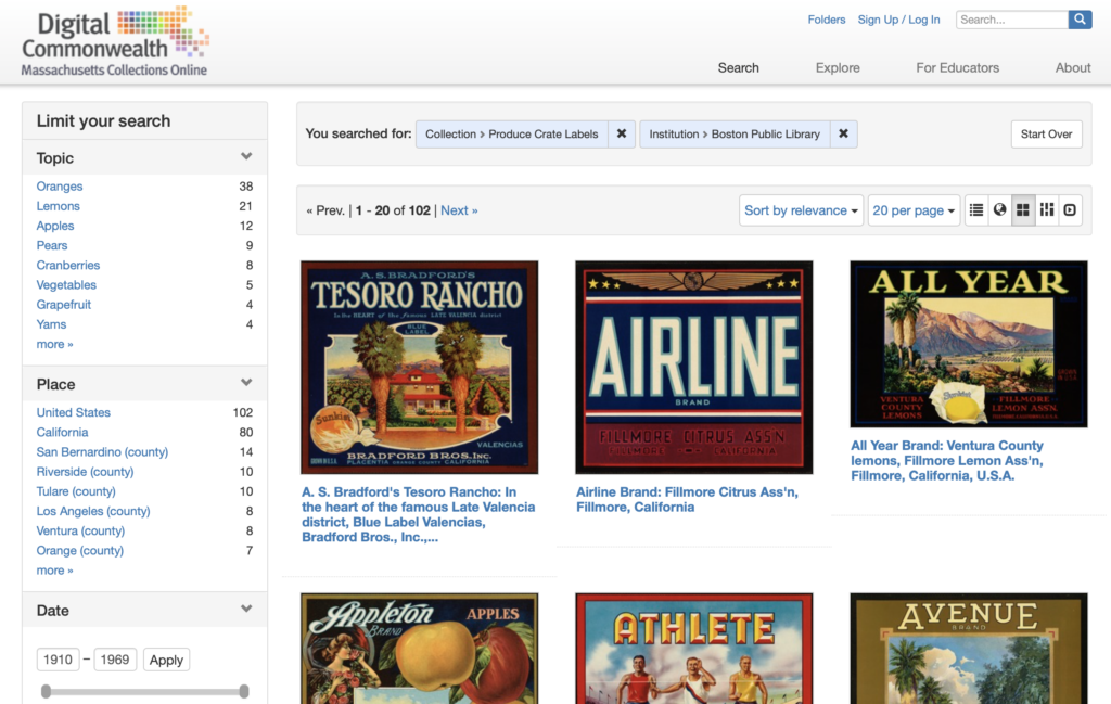
I chose a digital collection of produce crate labels from the 1930s-1960s. The Los Angeles Public Library offers an API on a collection of produce labels but the Boston Public Library hosts a digital collection on the “Digital Commonwealth” platform. The Digital Commonwealth is a consortium of libraries, museums, archives, and historical societies throughout Massachusetts. The website provides access to digitized media with historical interest. I wanted to highlight how much effort would go into pulling data that was not readily available, i.e. like an API, to look at data.
Research Question
Produce crate labels are a relic from the past with high aesthetic value in the modern era. Before World War II, produce was packaged in wooden crates with visually enticing paper labels on the end. During the war rationing and other factors led produce companies to search for more cost friendly containers. With cardboard containers there was no need for paper labels and by the late 1950s wooden crates were all but extinct. Still these visually stunning pieces of art remain as by products of the past and are admired for their kitschy nature.
The main research question began by looking at how to use computer-based methods to analyze produce crate label images from the 1930-1960s and to track any correlation between aesthetic choices and geography. I aimed to track the evolution of these visuals but as the project went on, the scope changed to look at the aesthetics of the labels themselves with special attention being placed on looking at brightness, color choices, and saturation.
Background Literature
The project grew out of a project by City College professor Kevin Ferguson, entitled “Visualizing Walt Disney Animation Studios.” In this project, Ferguson uses ImageJ (a free scientific image analysis software) to analyze in a distinctive manner fifty-five feather length films from Walt Disney Amination Studios. Using the z-projection function in ImageJ, he summed film frames from various movies to create a new composite image. In reviewing his project, these z-projection images morph into a completely new object allowing for a unique “understanding of a film corpus.”[1] Ferguson called his summations “digital surrealism,” because it creates “images by means of an automatic process which reveals otherwise unconscious information about film texts.”[2] He goes on to say that the new images are both aesthetically pleasing and raise new questions surrounding interpretation of the entire film. I decided I wanted to use Ferguson’s “digital surrealism” in order to see if new questions arose surrounding the aesthetics of the produce crate labels.
As the project evolved to analyze each crate for individual characteristics, I turned to “Robots Reading Vogue” for guidance on what computer programs to use. “Robots Reading Vogue” is a Digital Humanities project out of Yale University from Peter Leonard and Lindsay King, both librarians at Yale and interested in pursuing a digital humanities project. With their project, they analyzed the Vogue Archive (consisting of over 400,000 pages and 6 TB of data) accessed through ProQuest and Conde Nast in 2011. From the data set, not only did they analyze images as they relate to color and brightness but also looked at text analysis and algorithmically generated memos from editors. “Robots Reading Vogue” utilized ImagePlot in order to analyze Vogue covers with relation to brightness and saturation, lending me to think about looking at the crate labels in a similar fashion.
From these two projects, I developed a better understanding of computer-based programs I wanted to use as well as examples of methods and outcomes when dealing with image related data sets.
Methodology and Results
Initially I wanted to write a python script that would expand upon my Programming for Cultural Heritage class at Pratt. I wanted to write a script in Python to highlight how some digital collections make their data easily accessible while others require more effort. In this script I was analyzing for data to coincide with my original idea about looking at the data of each label. In my programming for cultural heritage class, I learned about BeautifulSoup, a Python library that allows for text to be parsed from websites (specifically HTML and XML sites). BeautifulSoup works by using the “find” or “find_all” methods to search for specific aspects of the website and take your defined text from those attributes. Having scraped websites for information I wanted to see if I could do it for images.
Luckily in my same class, Genevieve Milliken, was working on a project to scrape images from WPA photos from websites. She told me if you isolated the image URL in a JSON there’s a script you can use to download the images. I tried to write a JSON file for the code. I used the “inspect” option in Chrome by Google which highlights specific points within the HTML script. The BeautifulSoup text retrieved can then be assigned to specific attribute-value pairs in the python dictionary established at the beginning of the code. In the script, I decided to establish a dictionary to look for absolute URL, caption, and image URL for each image in the collection. The absolute URL allowed me to establish a base page in which to scrape all the data I wanted to find. These parameters were defined using the requests method and BeautifulSoup. Once the caption and image url were established, I used the append method so each “for” loop in Python would add on to the next, thus creating a list of all items. The dictionary I established at the beginning now serves as the base for the JSON file that was written in the bottom of the script. This is what I came up with:
Genevieve shared with me her download script and I tried to insert my code and it didn’t work. So I instead I used my computers terminal to print out the image URL and then I dragged and dropped each file into a folder on my desktop.
Genevieve then stepped back in to show me where my script went wrong and highlighted change to my original script in order to work.
Her script uses urllib.request, which is a Python package that is designed to pull images from websites. A function (or block of organized, reusable code that is used to perform a single, related action) was defined as download_image and uses urllib.request to retrieve images from the defined URL in the JSON file. However when I imported my JSON script, in Genevieve’s code it did not work. So my original code needed to be adapted.
First, we needed to adapt my original script. Genevieve added an initial for loop and range of all pages in the Digital Commonwealth more seamlessly. She then changed the all photo URL because I was searching under the wrong HTML class in order to grab the thumbnail URLs. With that she wrote a a second “for” loop that ran though all the image URLs in the right class.


When the new web-scraping script (check out Genevieve’s GitHub she created related to this project) was output as JSON file the download script worked and downloaded with the captions for the image file name, as per her script.
From this data, I used the ImageJ and ImagePlot, open source image processing programs, in order to analyze the collection of images. I downloaded ImageJ, a public domain scientific image analysis software program originally developed by the National Institute of Health and uses a variety of plugins in order to analyze visual images and plot data. One of those plugins is ImagePlot, developed by Lev Manovich’s Software Studies Initiative. ImagePlot is what ultimately allowed me to graph images based off certain parameters that it gathers from analyzing the data file. Both of these plugins come with large amounts of documentation, which helped me discover certain quirks of the program that would have impeded my project.
The first was that all the images have to be numerically numbered as per ImageJ requirement. Genevieve suggested I use the application NameChanger. This application batch changes naming and extensions of files. Once all were numbered in ascending order, I needed to make all image the same size in order to be uploaded into ImageJ. Sizing proved problematic when performed via photoshop. I ended up using a website called www.bulkresizephotos.com to do it quickly, however I feel like that might have compromised the integrity of the images. It also created a white padding around each image which I feel could have skewed the data gathered in ImageJ. I imported the newly resize collection of crates (organized by filename which is really alphabetically).
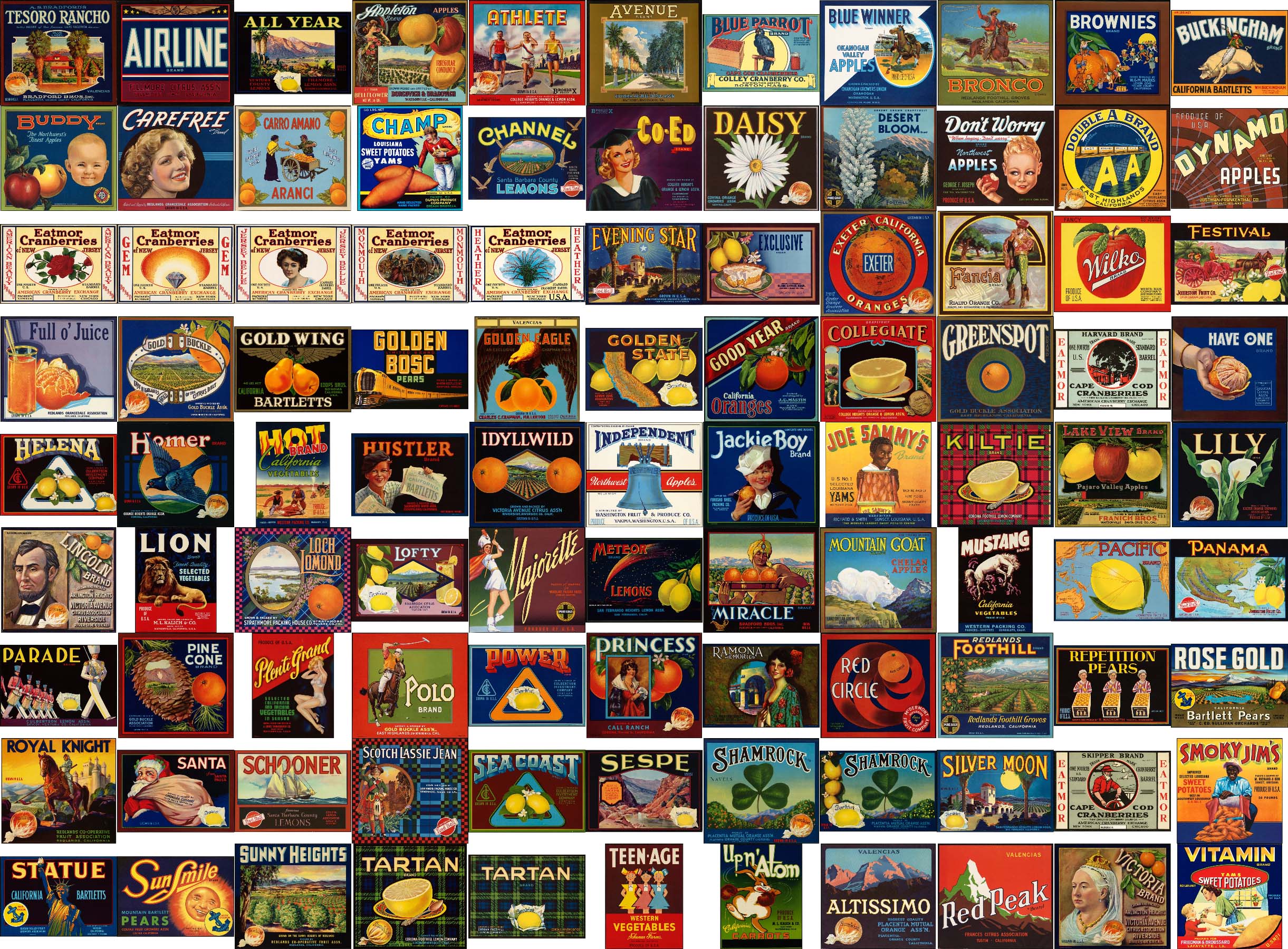
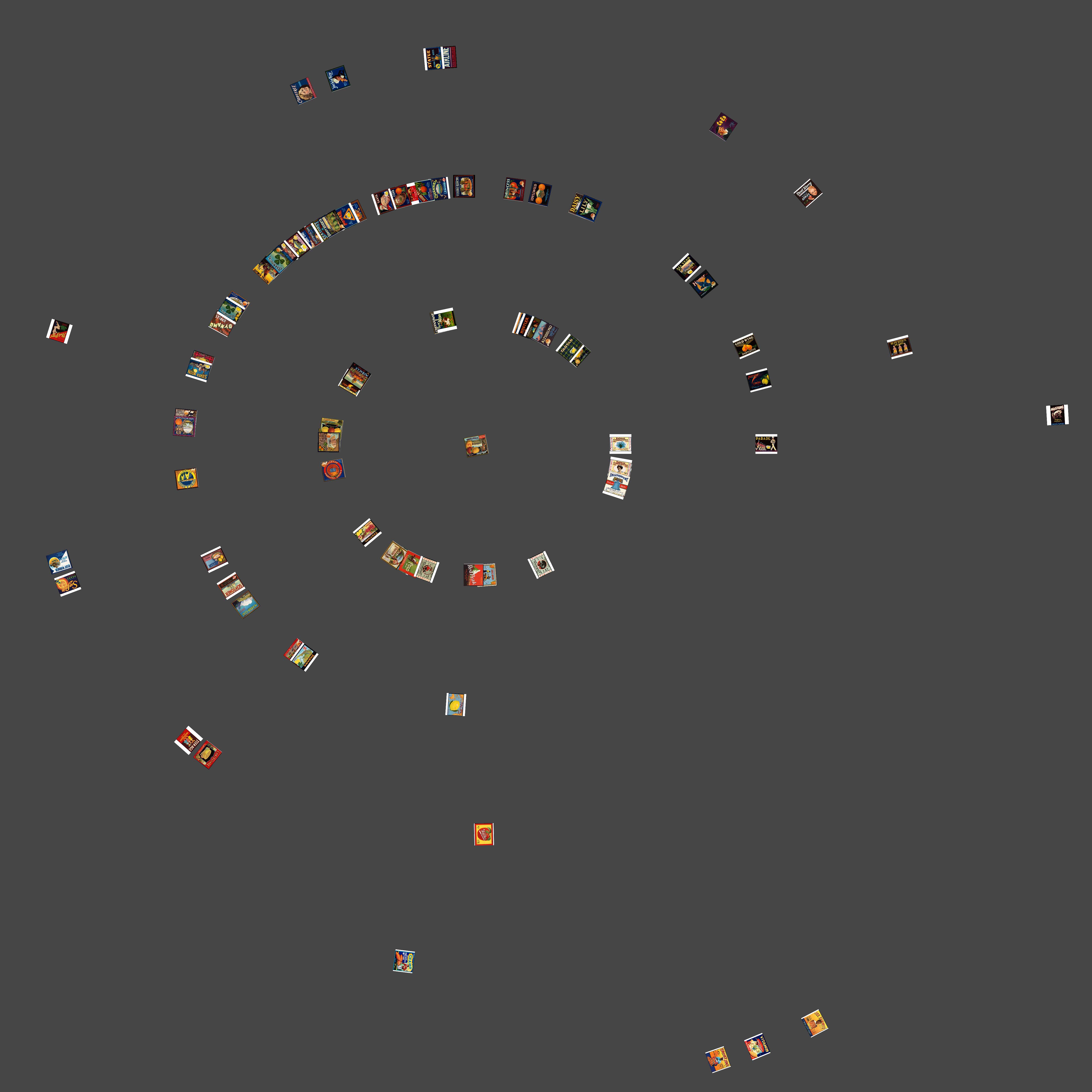
The first visualization I performed was an experiment working in ImageJ and not in ImagePlot. I imported the image sequence and then ran a stack (a way to display two or more images in a single window). The montage stack allows for all the crate labels to be seen at once. From this visualization, you can gain a basic understanding of the difference in colors used in each label (pictured at the beginning of the article). In looking at print media from the 1930s and 1940s, the time period of a majority of these images, lots of primary colors were used in solid blocks with minimal patterns. For the most part, each label corresponds aesthetically to what is being sold with images and colors relating to either the name of the brand or the produce and usually contain a majority of primary hues.
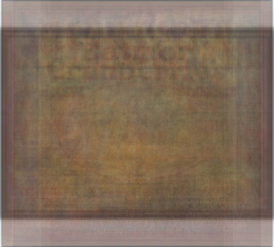
The next stack I used was the z-projections. Inspired by Kevin Ferguson’s project, I wanted to see how much difference in hue, saturation, and brightness there was between the labels. With z-projections you can only stack the images based on one property unlike in ImagePlot macro where these properties can be visualized in comparison other things. The z-projections showed what I expected – the outline of a rectangular crate – which was enhanced by the white padding of most of the images. ImageJ offers six z-projections that each use a different mathematical equation to analyze the RGB values of each pixel in a certain location of the image. The four (pictured below) show the most interesting representations of the entire collection.
Average Intensity 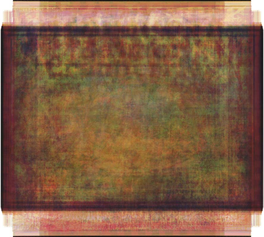
Median Intensity 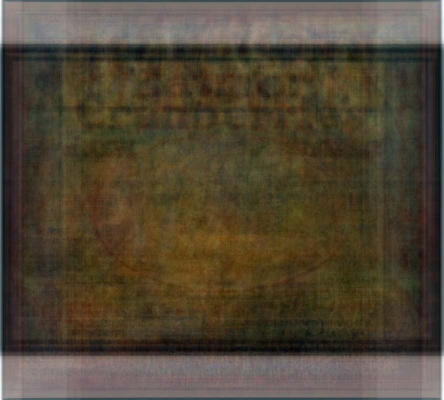
Sum Intensity
The Average and Median Intensities print the pixel color somewhere in between the maximum and minimum values. The Average visualization shows a less muted palette while the Median visualization shows a much brighter intensity, which makes sense since the average is the mean of all the colors while the median takes the middle value of the pixel. When looking at the montage of all images it is understandable that both the median and average have an orangish hint to them as most of the crates use that color. This could be due to the fact that a majority of the collection is orange produce companies or the fact that even if the produce was not orange in nature, the color was still used in the lettering or elsewhere.The Sum and Standard Deviation stacks were also interesting and predictable. The Sum totals all the image and lays them over each other. This new representative image of all labels was the darkest of all which is probably due to the use of black in most labels.
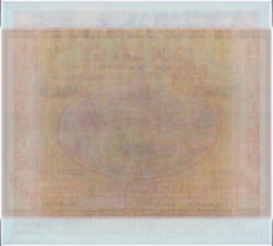
The Standard Deviation is a measure that is used to quantify the amount of variation or dispersion of a set of data value or in this case a specific coordinate. What is interesting about this visualization is that it produced the most singular representation of the labels, that of the color orange. It is the lightest of all the visualizations and is primarily composed of various shades of orange. There is a the faintest of lettering in the top middle (indicative of a label) and an oval shape in the center. This is the visualization that most directly harkens back to Kevin Ferguson’s idea of sums of movie stills creating a “new, single representative image.”[3] Here, the visualization of the Standard Deviation does just that, creates a new singular embodiment of the collection.
From this initial purview, I began to experiment with more of the plugins available in the expanded ImageJ package (all created by Lev Manovich). The ImageSlice proved to be my favorite because it produced an entirely new and exciting image. This macro allows for users to create splices of images (of varying sizes which was an added reprieve) and stack them together. The result produces an interesting analysis of overall design and color. I chose to pick the middle 10 pixels of each crate and visualized them both horizontally and vertically. With the horizontal view, parts of the text of each label comes through creating a chaotic but visually intriguing montage. The vertical view allows for a beautiful cross section of colors. However more orange tones are seen in the horizontal, while reds and yellows come through more in the vertical view.

24 bit Horizontal Slice 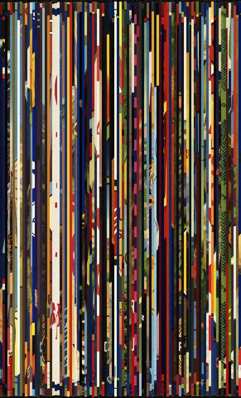
24 bit Vertical Slice
I ran ImageMeasure macro on the resized images in order to gather basic visual properties of every image. ImageMeasure saves the result in a tab-delimited text files entitled “measurements.txt.” The .txt file is then used to chart the plots of each image. The following visualizations show the medians of Brightness in relation to Hue and Saturation. The choice of median was due to get a more general view of the images rather than a calculated value with the Standard Deviation. I am unsure if changing the year or even the Standard Deviation would have produced a more linear chart. In both images, the labels that use the most colors are clustered together which was to be somewhat expected. It seems like there is some correlation between hue and saturation, but I feel that graphing them in comparison to Brightness (versus something like Time) is what produces non-linear graphs. Although through these graphs it is possible to see some correlation between Saturation and Hue when compared with Brightness, I am unsure what that is. I know that labels with more colors are clustered together and I see that labels with mostly white (not from the padding) are also on the fringe of the data set.
(x) Brightness vs Hue (y) 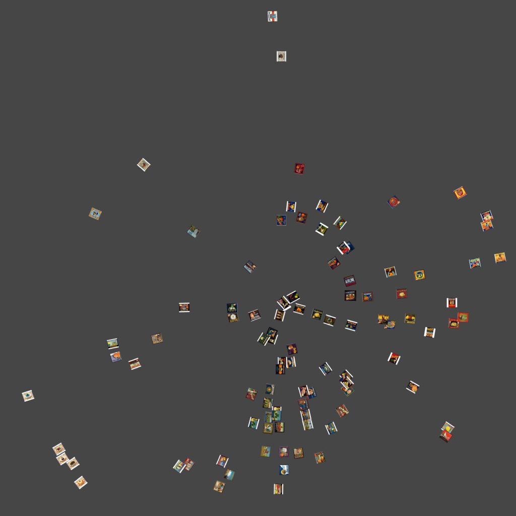
(x) Brightness vs Saturation (y)
I went back and added a “Time” column to the measurements.txt so that I could sort the images by year and other values. However this proved to deliver results in a circular fashion than in a tradition bar graph notation which made little sense given the linear nature of time. While the data is represented in an interesting manner it makes no sense and I have trouble drawing conclusions surrounding what the data is saying. I chalk this up to user error as I am still pretty unfamiliar with the software. When I would try and limit canvas size it would produce no images or stack images directly on top of one another. In this instance, I think the main error is in the delineation of the year as a single value. In the example file in ImageJ, comparing 725 Van Gogh paintings, the years were noted with attached decimals (which represent something not indicated) instead of single values and the result was a very linear display of brightness over time.
Overall the results were inconclusive of any real relationship between Brightness, Saturation, and Hue but I feel that was mostly due to my beginner status working with ImageJ and how I chose to define the charts.
Future Directions
I was really pleased with how this project turned out, especially given the exploratory and beginner level nature of the project creator. However, I feel this project is a long way from a truly finished form. Below is a list of issues and future directions I would like to see this project take.
- Fix errors in scaling/downloading: Going back and modifying Genevieve’s script to attempt to fix the .bin download error would guarantee that all images from specific data sets would download in uniform fashion. Also important is a better understanding of the image scaling errors I received within ImageMeasure.txt macro in ImageJ. Using a website that resized images provided ease in the long run but ultimately, I felt cost me some integrity with my data (which is the whole point of the project).
- Build a better/larger data set: While it’s true my collection was meant to highlight web-scraping scripts in python, I feel that a larger data set (more scraping of websites) would prove to paint a better picture of these labels. First step is researching more images on websites to scrape. Another would be to use the image download script in python with the available API from the Los Angeles Public Library. A larger dataset would really help understanding the breadth of this diverse and artistically unique collection. With this larger data set a more detailed description of the data would be useful and achieved by building a more detailed JSON dictionary. This could produce more interesting visualizations and analysis of the images i.e. to look at the amount of labels for orange companies versus those for vegetables.
- Explore d3.js: Just like “Robots Reading Vogue” I would like to present the data in a more animated fashion. ImagePlot outputs large, high quality images in print formats. They can be turned into animations during rending but the output is a large dump of .png files that need to be rendered with a video editing software. D3.js can handle both large amount of individual images with user designed axes that can be altered in real time. According to their website, “D3.js is a JavaScript library for manipulating documents based on data helping you bring data to life using HTML, SVG, and CSS.”[3] Using D3.js in conjunction with a larger data set would allow me to create a more aesthetically interesting visualization that will really do the unique visual nature of the data justice.
- Explore more data visualizations: In my project, I only looked at visualizations for Median values rather than Standard Deviation standards. Exploring different expressions of the data would yield different interpretations but I am unsure whether it would yield a more linear description of the data.
[1] Kevin Ferguson, 2017, “Digital Surrealism: Visualizing Walt Disney Animation Studios.” (Retrieved from http://digitalhumanities.org/dhq/vol/11/1/000276/000276.html[Accessed 27 April 2019]
[2] Ibid.
[3] Ibid.
[3]Data Driven Documents. About. Retrieved from https://d3js.org
References
Boston Public Library. “Produce Crate Labels.” Digital Commonwealth. Retrieved from https://www.digitalcommonwealth.org/collections/commonwealth:b2774332r[Accessed 20 April 2019]
Ferguson, Kevin. 2017). “Digital Surrealism: Visualizing Walt Disney Animation Studios.” (Retrieved from http://digitalhumanities.org/dhq/vol/11/1/000276/000276.html[Accessed 27 April 2019]
ImageJ. (2019). Documentation. Retrieved fromhttps://imagej.nih.gov/ij/docs/index.html[Accessed 5 may 2019]
ImagePlot. (2019). Documentation. Retrieved fromhttp://lab.softwarestudies.com/p/imageplot.html[Accessed 5 May 2019]
King, Lindsay M. (2016). “Data Mining beyond Text in the Vogue Archive.” Culture Analytics Beyond Text: Image, Music, Video, Interactivity and Performance. Institute for Pure and Applied Mathematics. Retrieved from http://www.ipam.ucla.edu/abstract/?tid=13061&pcode=CAWS1[Accessed 29 March 2019]
Manovich, Lev. (2011). “Style Space: How to Compare Image Sets and Follow Their Evolution.” Retrieved from http://manovich.net/index.php/projects/style-space [Accessed 6 May 2019]