
For my project, I crocheted the dataset. I intentionally wanted to avoid summarizing or filtering the data, but rather wanted to attempt to make a textile that represented the dataset exactly as we downloaded it. By approaching a representation of the dataset this way, I take a different approach to what data can tell us than traditional visualizations do. While a typical visualization like a bar chart or network graph might use data to push forward toward new insights and next steps related to the content of a given dataset, I wanted this piece to take viewers backwards by making material the actions that take place before data becomes ready to use. These actions, including data collection, processing, and storage, are too often undercompensated and uncredited in projects that make use of data.
Background
A textile is particularly well-positioned to comment on data representation and the labor behind it. Textiles themselves inherently encode binary information, forming patterns through a series of decisions about whether or not a thread is picked up (Harlizius-Klück, 2017). One of the longest-standing examples of textile-encoded information are Quipu – knotted cords used by indigenous Andean communities to transfer messages over long distances (Michelson, 2020). In fact, the earliest computers stored binary data in a miniature woven textile known as core rope memory (Patowary, 2020).
Despite this history, fiber art is often seen as a “craft” rather than an art or a feat of engineering, resulting in undercompensation of this type of labor. Core rope memory is also referred to as “Little Old Lady” or “LOL” memory, in reference to the elderly women that were hired by electronic manufacturers from local textile industries for their skill in weaving and their low labor cost. Similar tactics were used by Fairchild Semiconductor, an electronics manufacturer that opened its plant on Navajo land in 1965 and employed over 1,000 Navajo women as core rope memory weavers, with the racist rationale that indigenous women had “innate” weaving skill (Nakamura, 2014).
These very contributions are evidence that our modern computational infrastructure is founded on the gendered and racialized labor politics that continue to sustain it. Just like these early textile-based contributions to modern computers, data processing tasks such as data entry and “data cleaning” are seen as managerial roles rather than foundational to data science. A data textile can serve as a “knowledge object” that connects acts of data creation and processing to the appropriation of craft traditions – an appropriation that rests on the undercompensation and undercitation of certain contributors for the sake of capitalist profit.
The Textile
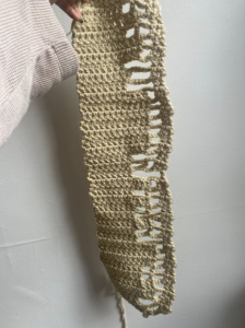
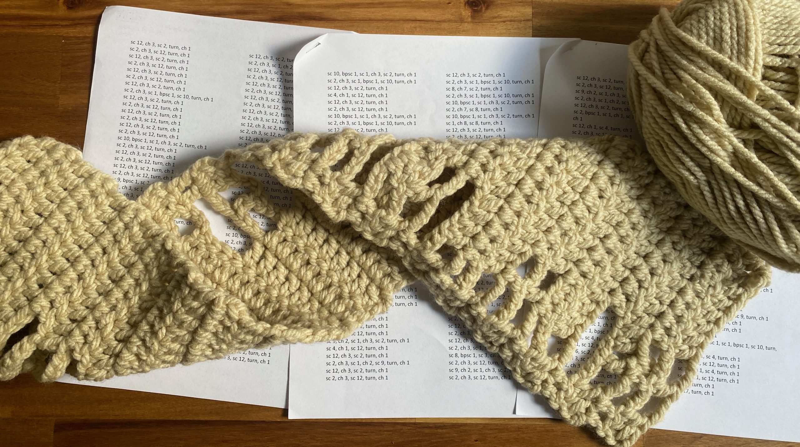
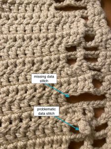
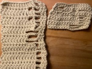
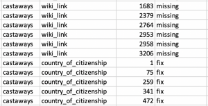
The textile I created contains one row for every row in the dataset. Within each row, each stitch represents one value (a cell if you’re picturing a spreadsheet). Missing values are represented as gaps, while values that our team identified as problematic (such as mispellings, anachronistic names, etc.) are represented as stitches that haven’t been connected to the preceding row and appear in need of mending.
It may seem that this is a direct and simplistic representation of the dataset. There are many excellent and arguably more exciting projects that have used fiber techniques like knitting or crochet to create material data visualizations, such as scarves that visualize climate change or this COVID wall hanging. Unlike these projects, this manifestation of the data doesn’t provide the type of “insight” we are used to seeing from a visualization. This is purposeful – by physically creating a one-to-one representation of the dataset, I wanted to emphasize the fact that no analysis or visualization can go beyond the space of the data – its gaps, its errors, its shape and size. A well-designed graphic may give the impression that the data is telling a story, but WE are always the ones telling the story. Anyone who works with data imposes their own perspective when they make decisions about how to manipulate, filter, or fill in the blanks of an imperfect and static dataset.
Even the simple process of creating this textile was not free from subjective decisions. There was no “right way” to materialize the dataset, and the process of making the textile made me aware of my own subjectivity in the process of working with data. It was up to me to choose what crochet stitch would represent missing or problematic data. And because I was making a physical product, I had to take into account my own time and labor. For example, a single crochet is the fastest and easiest stitch, but a triple crochet is the tallest stitch, which would best show the gaps in the data. I compromised with a double crochet.
So What?
A handmade textile representing a dataset immediately reflects the work of creating and processing data in a way that a traditional visualization might not. In their work Data Feminism, Katherine D’Ignazio and Lauren F. Klein outline 7 principles to guide data projects that seek to challenge and change power differentials. Principle #7 is “make labor visible” and deals with naming and crediting contributors to data products that may not have directly created anything visual – such as those responsible for data collection and processing. D’Ignazio and Klein argue that failing to credit these contributors, or to recognize these tasks as part of data science, deepens entrenched power imbalances along lines of gender, race, and class by deeming some parts of data work more citable than others (D’Ignazio & Klein, 2020). Failing to credit and describe these early steps in the data life cycle also obscures the decisions that shape what the data contains – and by extension, any biases or oversights that may have influenced this. The final textile – if I ever finish it – will be the culmination of 222 hours of work and $518.00 worth of yarn, and clock in at 166.5 feet long. The labor that is clear from the product can be used to provoke discussion of invisibilized labor in the data industry and the subjectivity of data collection and processing.
The textile also embodies the material consequences of data storage. The look and feel of a handmade textile might evoke the idea of un- or underpaid- labor in the domestic sphere while at the same time reminding us of the over- production and consumption of textiles in our current society, expendable to us but still the product of labor that is exploited along lines of class, race, and gender. Terms like “the cloud” make it seem like data has no physical form, when in reality storage and computation require both physical space and precious resources to maintain. The scale of the textile drives home the physical ramifications of data storage.
In these ways, this data textile is a portal to discussing several important concepts of critical data literacy: the subjectivity of data collection and analysis, the invisibilized and undercompensated labor that underpins the field of data science, and the materiality of data and computation. These are issues that should be at the forefront of any data project, but might not be linked to as readily by a visualization. The textile could function as a “teaching object” – either as an installation or by being integrated into data literacy instruction, or as an activity for participants to make their own datasets.
Technical Details
The visceralizations in this project are derived from two sheets of the dataset – the castaways sheet and the discs sheet (as described in Data). This textile materializes only the castaways sheet (for now), because the discs sheet is much larger.
I started with the indexes of cells that were missing or needed processing (as described in the Data Map & Key) for the castaways dataset. OpenRefine was used to facet and cluster the dataset to identify place where the data needed to be standardized, and R was used to identify the indexes where each missing value or pattern that needed fixing occurred. The result was a list of indexes noting where each piece of missing or problematic data occurred.
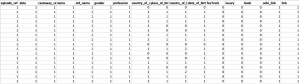
I used these indexes to create a dataframe of the same dimensions as the original castaways sheet, but instead of the data each cell contained either a 0 (missing), 1 (present), or 2 (needs fixing)
What I wanted to do was turn this representation of the data into a crochet pattern that was usable to me without too much extra interpretation. To do this, I first had to use R reverse every other row of the dataframe – because although the dataset is read like a book, left to right, to crochet the dataset I would need to work from left to right, then right to left, then left to right – alternating the direction I was working everytime I moved onto the next row.
From here, I replaced the numbers with the shorthand for the stitches I had decided to use to represent present, missing, or problematic data – a double crochet for present data (dc), a chain that skipped the same number of stitches for missing data (ch), and a little “bauble” stitch that I created to look like a double crochet that hasn’t been attached to the previous row (ch 3, slip st in first stitch from the hook, slip st, dc).
I then used the base R function rle() to generate run-length encodings of the three stitches – to create a pattern that told me how many of each stitch to do rather than repeating the shorthand that many times:
ch 17
dc 17, turn, ch 1
dc 8, bauble st1, dc 3, ch 3, dc 2, turn, ch 1
dc 2, ch 3, dc 1, ch 2, dc 9, turn, ch 1
dc 8, ch 1, dc 3, ch 3, dc 2, turn, ch 1
dc 2, ch 3, dc 1, ch 2, dc 9, turn, ch 1
dc 12, ch 3, dc 2, turn, ch 1
dc 2, ch 3, dc 12, turn, ch 1
dc 8, ch 7, dc 2, turn, ch 1
dc 2, ch 6, dc 9, turn, ch 1
dc 8, ch 7, dc 2, turn, ch 1
dc 2, ch 3, dc 12, turn, ch 1
dc 12, ch 3, dc 2, turn, ch 1
And so on.
The final pattern can be viewed and downloaded here.
– Lubov McKone
All code and data used to generate the textile pattern can be found in this Github repository