
A Data Map and Key
Working with data can lead us to presume that we are situated on firm ground and in possession of hard, solid facts. Phrases like “the data show” and concepts like “data driven” are part of a larger social narrative that invests data collection and processing with a kind of Newtonian certainty. The reality of data, however, is far from this idealized picture. Scholars like Drücker (Drücker, 2011) rightly point out that data do not occur in nature but are instead created and captured to suit various needs, interests, and ideologies. People who work with data (generating, capturing, cleaning, analyzing, and outputting it) routinely deal with an array of uncertainties and must make various compromises as they (re)shape data to meet the demands of various techniques for analysis. When first encountering a dataset, it is not uncommon to have multiple questions regarding its initial state. How large is it? How complete is it? How “clean” or “dirty” is it? How reliable were the data collection processes (human, mechanical, or digital) that brought it into being?
There are a variety of ways of answering these initial questions – assessing the shape of the data (the number of columns and rows) as well as whether or not there are missing pieces, scanning entries to see if there are mistakes or redundancies, and reading any data dictionaries or reports accompanying the data to understand how a dataset came to be. Even with these approaches, however, it can still be difficult to understand the extent of the data as well as how distributed “dirty” data are across an entire dataset.
Making an Image for a Map
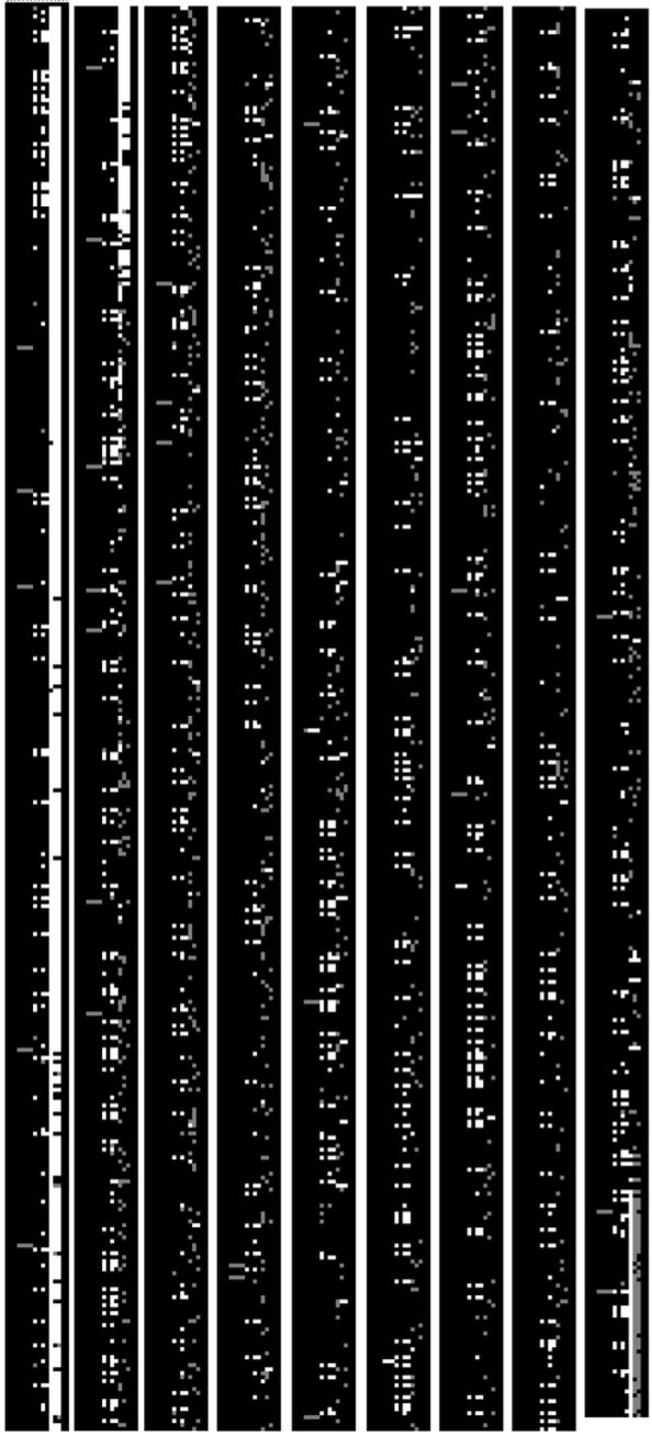
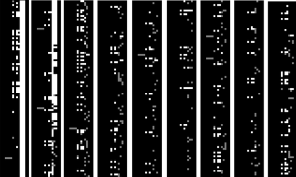
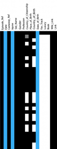
As part of the Making the Desert Island Discs Data project, we asked whether or not we could create a map of the data that would give us insights into its extent and “completeness”. Doing so would help us answer fundamental questions about this particular dataset before moving on to finer-grained analyses of specific elements contained in it. To make a map of the data, we decided to create a 1:1 image in which each pixel represented a cell in a spreadsheet. We limited ourselves to two specific sheets (data about the guests and data about the songs chosen) and focused on three options – data that were present and appeared reliable, data that were present and appeared to need correction or repair, and data that were missing. We assigned a color to each category (black for present, grey for needing repair, and white for missing). The team divided the spreadsheets by column and used OpenRefine to analyze each to determine into which of our three categories any particular data cell fell. The present, reliable data required no special handling so we chose only to annotate when a cell was missing or needed intervention. These were identified by the sheet on which they occurred, the column in which they were situated, the specific row at which they were located, and whether they were missing or needed to be “fixed”. This provided a set of x, y coordinates as well as the variety of data involved (missing or flawed), which could be situated on the Cartesian plane of an image. The result was a three-color image that mapped where the categories of data were across each sheet of the dataset. With this, we could see where gaps occurred and how extensive they were. We could also see where errors were interspersed throughout the data.
Physicalizing the Extent of the Data
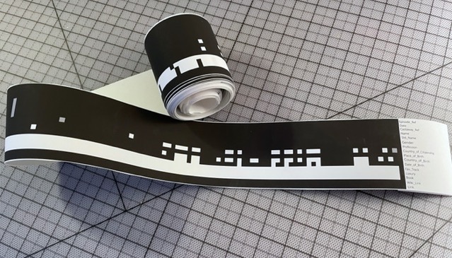
In addition, the image provided insight into the extent of the data. Using pixels to represent columns and rows allowed us to calculate a width and length in millimeters. The 15 columns and 3,218 rows of the guest data, for example, equated to 3.97 mm x 851.43 mm (0.16 in x 33.52 in). The slender dimension of the dataset’s width made it difficult to see any detail without zooming in on the image. To make the physical form of the dataset easier to see and handle, it was necessary to further process it by adjusting its dimensions and preparing it for large-format printing. Scaling the data by 15 yielded an object that was 5.95 cm x 12.77 m (2.34 in x 41.9 ft), which provided a good balance between visibility and portability. The printed, and assembled, pieces of the image allowed us to see what “long” data looks like when taken out of the purely digital realm and put into a form we can experience physically. It also allowed us to ask comparison questions regarding what a larger data set might look like in an equally scaled physical form. As a point of comparison, for example, we looked at the 2015 Tree Census from the NYC Open Data portal, which has 45 columns and 684,000 rows of information. When converted to pixels and then millimeters, the Tree Census measures 11.91 mm x 171.45 m (0.47 in x 562.5 ft), which is triple the width and more than twenty times the length of the guest dataset in our study. Were it to be scaled by the same factor as the guest data, it would measure ~17.9 cm x 2,571.75 m (7.03 in x 8,437.5 ft). Data sets derived from Big Data operations (e.g. social media) would be larger by orders of magnitude – imagine what one hour’s worth of Facebook or Twitter data would measure. Thinking of the extent of data in terms of physical width and length can help illustrate how massive the information being collected across the globe hourly is.
Making a Key for Clarity
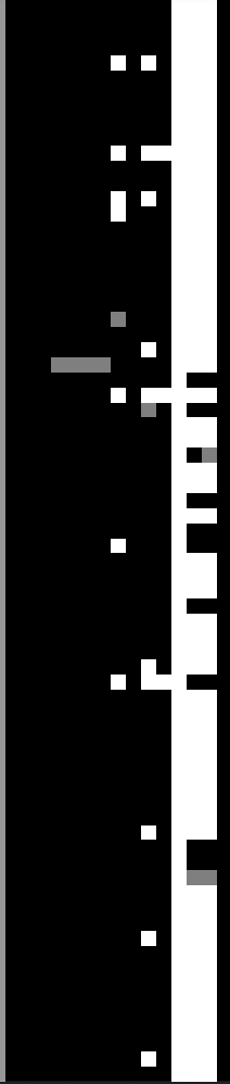
Once we had a map of our dataset, we then asked whether or not we might be able to use it as a key for the various projects we were working on with the data. Each team member chose a particular aspect of the data with which to work. This meant that the products of those investigations were not based on the entire dataset but on portions of it. This is a normal part of data analysis – examining the relationships between a limited number of variables – but it often remains hidden because the relationship of the selected dimensions to the entire dataset is obscured. A key derived from the data map allows us to show from which parts of the entire dataset each project draws its information. This, in turn, helps make clear the types of selection and reduction that occur when analyzing data as well as draws attention to what is left out by such processes.
Lessons Learned
While these techniques may not be practical for all datasets, especially those that are massive in scale, they are worth incorporating into smaller projects. Using a reduced three-category mapping schema can help visually assess where problematic data is. That said, non-visual approaches can be equally helpful. For example, working out the proportion of data identified as problematic in relation to the whole can be instructive (though it will not show where those data are). Providing visual or conceptual cues regarding where errors and omissions are as well as a reminder of the selections being made throughout analysis can be an important means of challenging prevailing social narratives regarding the certainty and supposed impartiality of data.
Being able to see, and handle, a physicalization of a dataset can provide researchers, students, and consumers of data with a better idea of just how much data is at stake. It is not necessary, however, to perform the work required to print and assemble a physicalized version of a dataset. Simply making the conversion from columns and rows to millimeters, centimeters, inches, or feet – and then comparing those measurements with similarly sized objects (e.g. the length of a city block, the distance between towns, etc.) – can be helpful for beginning to reckon with the extent of a given dataset. These methods, among others, can provide more clarity on the scale and condition of a dataset from the outset. Bringing these issues to the fore may be incredibly helpful for encouraging greater data literacy and for helping producers, analysts, and consumers of data be more aware of the contingencies of something so seemingly solid as “hard data”.
Technical Details
The 1:1 images representing the guest and song choice spreadsheets (called ‘castaways’ and ‘discs’ respectively) were created using the Python Image Library (PIL) under the fork called PILLOW. Despite the updated name, the library is still imported from PIL rather than PILLOW (Pillow Handbook, n.d.). Each spreadsheet was initially assessed for its number of columns and number of rows, which became the width and length of each image. The guest data spreadsheet was 15 columns by 3,218 rows and the song data spreadsheet was 14 columns by 26,260 rows. Each column in both spreadsheets was analyzed for missing data as well as data that needs repair.
Preparing the Data
On initial inspection, it was evident that there was a large number of missing values as well as special characters in the data that were not properly decoded. Carol Choi, Jessika Davis, Ava Kaplan, and Lubov McKone divided the datasets among themselves and carried out the time- and labor-intensive work of data exploration and analysis. They used OpenRefine as a tool and deployed its built-in functions to facet the columns they individually chose. Each then used a regular expression to find all instances of special characters in their chosen columns. Lubov McKone identified a workflow for doing this using the “Text Facet” and “Text Filter” functions of OpenRefine and then deploying the regular expression pattern [\p{S}].
The information derived from these filtering functions was then further analyzed using R. Lubov wrote a compact and elegant R statement for the team to use that could be altered to search for each type of undecoded special character found using OpenRefine and that would render the specific location information needed. For example, identifying in which rows the character combination of √© occur in the ‘name’ column of the castaways (guests) spreadsheet used the statement:
which(str_detect(castaways$name, ‘.√©. *’ ))
This returned a list of row indices, in which the damaged data were located. This information was then copied into a separate spreadsheet, which used a shared template with the column names ‘sheet’, ‘column_index’, ‘row_index’, and ‘action’. In each case, ‘sheet’ refers to the specific spreadsheet in which the data resides (e.g. castaways or discs), ‘column_index’ refers to the name of the column in which the data is located (e.g. name), ‘row_index’ locates the specific row in the column in question, and ‘action’ designates whether the data needs to be ‘fixed’ or is ‘missing’. In the case of improperly decoded special characters, the action assigned was ‘fix’. A similar set of operations was carried out to find missing values, which were assigned ‘missing’ in the ‘action’ column. Once completed, the spreadsheets compiled by the team were used to generate images of the dataset.
Preparing the Image
Each image was first created using the PIL Image class, set to RGB mode, with the columns of each as width and the number of rows as height. This initial step produced a black image that acted as the base for later alterations. By agreement, the team decided that missing data would be coded as ‘white’ and that damaged or ‘dirty’ data would be coded as ‘grey’. Once the information regarding missing and damaged data was retrieved from the spreadsheets provided by the team, each point was mapped onto the base image using the ‘.putpixel’ method of the Image class. This was possible because the analysis spreadsheets recorded the column name and row index for each, which provided the x,y coordinates needed to place each point in its proper location.
To isolate the x,y coordinates each spreadsheet was imported into Pandas and converted to a data frame. Next, a custom helper function using the ‘.loc’ method was employed to subset and filter each spreadsheet using a bi-conditional test (e.g. filter for ‘name’ and for ‘fix’). This returned a data frame containing only the rows in which those conditions held true. These data frames were then further subdivided to return only the row index values, which provided the y coordinate values for the ‘.putpixel’ method. This process could have been included in the stage in which the bi-conditional test was carried out but was left as a separate step to help maintain clarity regarding how the y values were derived. Designating the x coordinate for each column was trivial as that value does not change for the two-dimensional array of the image. This value was taken from the original column index of the guest or song spreadsheets respectively and is recorded for reference in a multi-line comment in the python script written for creating each image.
Creating, Scaling, and Printing the Image
Once the y coordinates were isolated for each column, a custom function was used to place appropriately colored pixels at the specified x,y coordinates in the base image. This mapped the grey ‘fix’ pixels and white ‘missing’ pixels to their respective locations and provided an overview of where data were missing and where ‘dirty’ data were interwoven into the whole dataset. A similar approach was used to create keys for each project. Once each team member identified which portions of the datasets would be used for their projects, the rows, columns, or even individual cells could be isolated and given a highlight color to make them easy to see. Using color on a black, white, and grey substrate helps focus attention on the specific areas in question.
Each image had an exaggerated width to height ratio (15 : 3,218 and 14 : 26,260), which made them hard to view without zooming in on them. Using a viewer to see more detail was a workable solution for a purely digital version of the dataset map but the underlying aim of our project was to physicalize the data in various ways. The physicalization plan for the data maps was to print them so that they could be viewed and handled. The slender proportions of the image, however, made it difficult to see details with any real clarity. As a result, it was necessary to scale the image so that when printed it would be easily visible yet not overly unwieldy to transport or interact with physically. Using a custom function to convert pixels into other measurements (e.g. millimeters, centimeters, inches, feet), a variety of scaling factors were explored to find a good balance for the printed version. In the end, a scaling factor of 15 yielded a workable solution for the shorter of the datasets (i.e. the castaways) and produced a physical object that was 5.95 cm wide by 12.77 m long ( 2.34 in x 41.9 ft). The longer song dataset would have yielded an item that was 5.56 cm wide by 105.57 m long (2.19 in x 346.35 ft), which was as visible as the guest dataset, but far too long to transport or use easily. As a result, it was decided that only the guest dataset would be put into physical form rather than both. Each, however, was prepared for large-format printing should it ever be necessary to print the song dataset.
Putting the maps into a form for large-scale printing required subsetting each image using a custom helper function built around the ‘.crop’ method of the Image class and importing the parts into Adobe Illustrator for layout and pre-print processing. The guest data map was broken into nine segments; the song data was separated into 40 parts. These divisions were chosen because they provided a good balance between segment length and number of pieces to be assembled in the next stage. Each segment was saved as an individual, numbered .png file ready for use in Illustrator but also available for use in other contexts (e.g. a website) should the need arise. Each map required its own file in Illustrator and both were assembled sequentially from left to right with scaling occurring during this stage. To adjust each section, the width and height were multiplied by 15. While it would be possible to do this with PIL, Illustrator is better optimized for carrying out these types of transformations. At the top of the left most segment in each file, the original column names were placed and aligned according to their orientation in the original datasets. Preserving the column names in this way was a means of representing some of the information contained in the original dataset while abstracting away the specific information found in each cell by reducing it to one of three potential colors. Each Illustrator file was prepared for printing on an HP DesignJet Z6200, which required making a line path for the text, rasterizing the entire file, and saving it as a PDF. Each of these actions was accomplishable through built-in actions in Illustrator. The large-scale image was printed on HP Heavyweight Coated Paper with a final printed dimension of 64.48 cm x 142 cm (25.4 in x 55.94 in). Each segment was cut out of the larger sheet and assembled sequentially by taping them together front and back. The assemblage was then rolled from the bottom so that the section with the column names was situated at the top.
-John Decker
The spreadsheets for recording the locations of missing and dirty data, the Python scripts for generating the data maps and keys, and the PDFs of the scaled, segmented maps are available in a GitHub repository.