Improve Passenger Experiences of Airlines Facing Future

May 11, 2018 / 0 comments

Introduction and Goals As a continuation of my previous topic visualization of global flight networks, I decided focus on improving the customer (user) experiences of airline companies in my final project, which is also the project goal. As I mentioned before, If you used to have the experience flight 19 hours of a long distant…

Read more →

Visualizations of the Global Flights Network

May 11, 2018 / 0 comments

Introduction With the rapid pace of innovation, airlines and airplane makers are working hard to keep up. People love travel, and if you travel to abroad, how to search a flight in a perfect price and desirable air service in the main problem. For Instance, if you used to have the experience flight 19 hours…

Read more →

The Networked Art Genome Project

May 9, 2018 / 0 comments

Introduction This report explores categorical and hierarchical data from The Art Genome Project (“TAGP”), Artsy’s ongoing study into the characteristics and connections between artists and artworks, using Gephi, an open-source network analysis and visualization software. The goal of the resulting network visualization is to graphically represent abstract information hierarchies, providing a shared point of reference…

Read more →

The Flu and Influenza Vaccines in the United States

May 7, 2018 / 0 comments

Introduction Recent reports have suggested that the 2017-2018 flu season may have been the one of the deadliest. This assertion, however, is misleading. This flu season may have had periods of severity that were higher than previous seasons, but it’s too soon to tell whether, overall, how severe it was. And we’re not out of the…

Read more →

Are New York City Shelters Meeting the Homeless Demand?

May 7, 2018 / 0 comments

Introduction For my final project, I decided to explore whether New York City homeless shelter capacity meets demand. This semester, for my Advanced Design Research course, I researched how unsheltered homeless individuals dealt with inclement weather. At the beginning of my research, I learned through the State of the Homeless 2017 report that homelessness in…

Read more →

United Nations 2030 Agenda for Sustainable Development

May 7, 2018 / 0 comments

INTRODUCTION In September of 2000 world leaders came together at the United Nations in New York City and adopted the United Nations (UN) Millennium Declaration committing their nations to a plan to reduce poverty through 8 targets or goals – with a deadline of 2015 – that have become known as the Millennium Development Goals….

Read more →

How Use of SNAP Benefits at Farmers Markets Benefits Your Health

May 6, 2018 / 0 comments

Introduction I chose to create three visualizations with a single data set, the Farmers Market Directory produced by the US Department of Agriculture (USDA). I focused on the data regarding the markets, the acceptance of Supplemental Nutrition Assistance Program (SNAP) and the products sold. The products that I decided to direct my attention to were…

Read more →

Some Orlando Crime Data 2015-2016

May 5, 2018 / 0 comments

Introduction  As per usual I had an idea for my final that was too big for me tackle with my current level of expertise, time limit, and nature of the time period. I initially wanted to relook at my Miami-Dade 311 data and look directly at issues that would pertain to hurricanes. A map of…

Read more →

Opioid Overdoses: An Epidemic Grows Up and Out of Control

May 4, 2018 / 0 comments

Opioid overdoses have steadily risen in the United States over the past 20 years. Different states are achieving different success rates in managing the epidemic. The relationship between professionally dispensed prescriptions and overdose deaths has been scrutinized, yet even as these prescriptions are curtailed, the death toll increases. While the correlation between the two metrics…

Read more →

Peshawar Visualizin’ (An extension of the “Peshawar Scrapin’” CIA documents project)

May 4, 2018 / 0 comments

  Introduction to the war The Soviet-Afghan War of 1979-1989 is a topic that is given short shrift in the history curricula of US grade schools, and therefore in the public consciousness at large. In a way, that’s not surprising–much as our historical education is constructed as a succession of wars, this one did not…

Read more →

Understand Citi Bike’s Usage Pattern With A Popular Month Of Data From 2017

May 3, 2018 / 0 comments

Introduction For this final project, I wanted to expand the topic scope on my Carto Lab that focused on mapping bicycle rack distribution in all five boroughs of New York City. The Carto lab was targeted to bike commuters who own a bike. For this final project, I wanted to inform bike commuters who use…

Read more →

BICW-NY YouTube channel analysis and suggestions

May 3, 2018 / 0 comments

    Introduction to the visualization Data visualization is the study of visual representations of data. Usually, from the results, people can dig out some novice information, summarize some engaging points and help their product to be polished based on these findings.   mission and goals This report focusing on analyzing the data from BICW-NY…

Read more →

Visualizing the World Tourism Data

May 1, 2018 / 0 comments

Introduction This project is to visualize the world tourism dataset from World Tourism Organization, including arrivals of non-resident tourists/visitors, departures and tourism expenditure in the country and in other countries. I intended to use maps and charts to provide visual comparison between countries. With the consideration of the project goals and application features, Tableau Public…

Read more →

Once Upon a Graph; Mapping the Once Upon a Time Family Tree

May 1, 2018 / 0 comments

Introduction The inspiration for creating this social network came with the final season of the show Once Upon a Time, an ABC drama featuring fairytale characters who are magically cursed into modern day America. Stitching several classic fairytales together, the show is well known for its characters’ complicated family tree. Spanning over several locations, both…

Read more →

Hawaii 2017 Visitor Map

May 1, 2018 / 0 comments

Introduction Hawaii is a tourist-based economy, relying heavily on visitor expenditure and investments. The Department of Business, Economic Development and Tourism began collecting visitor statistics through the Hawaiian Tourism Authority since 1990s. The data collected has expanded throughout the years. From what started as an overall visitor count has now stretched to varied areas such…

Read more →

Implementing Community Programs to Prevent Deaths by Drug Overdose in West Virginia

May 1, 2018 / 0 comments

The opioid epidemic is a devastating crisis that is ravaging rural areas of the United States. The state of West Virginia has been especially affected, having the highest rate of deaths caused by drug overdose in the United States in 2016 (CDC, 2018). Despite seeming insurmountable, some individuals and programs are working toward methods of…

Read more →

Visualization of US Domestic Flights

April 30, 2018 / 0 comments

Introduction This project was the extension report of the Gephi Lab which I had done previously for the US domestic flight. In this project, I had included the historical records of US domestic flights of 2009 to create the further visualizations. This project would be focusing on the traffic volume as well as the connections…

Read more →

NYC wifi hotspot locations visualization and analyzation

April 24, 2018 / 0 comments

Introduction: Using the data from the NYC Wi-Fi Hotspot Locations from NYC Open Data website. I was able to visualize a part of the data and focus on mapping specific types of wifi hotspot locations. The relationship between the wifi hotspot and metro line/entrance also been discovered. This is not only a map but a…

Read more →

Marvel Social Network in GEPHI

April 21, 2018 / 0 comments

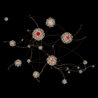
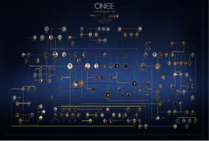
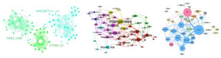
Figure 1. Final – Marvel Social Network introduction For the GEPHI lab I decided to work with a large dataset, the Marvel Social Network available from the GEPHI wiki (https://github.com/gephi/gephi/wiki/Datasets). I am fan of Marvel and thought working with this dataset would be interesting as I am familiar with the groups represented by this social…

Read more →

Visualizing the Content of Science Fiction with Gephi

April 21, 2018 / 0 comments

According to Goodreads, “Science fiction (abbreviated SF or sci-fi with varying punctuation and capitalization) is a broad genre of fiction that often involves speculations based on current or future science or technology.” It is a very popular genre of fiction which often includes some imaginative concepts and explores the potential consequences of scientific and other…

Read more →