How Use of SNAP Benefits at Farmers Markets Benefits Your Health
May 6, 2018 - All
Introduction
I chose to create three visualizations with a single data set, the Farmers Market Directory produced by the US Department of Agriculture (USDA). I focused on the data regarding the markets, the acceptance of Supplemental Nutrition Assistance Program (SNAP) and the products sold. The products that I decided to direct my attention to were those defined by the Center for Nutrition Policy and Promotion (CNPP) as essential food groups, which include grains, vegetables, fruits, milk products, and meats. With each product and SNAP data I aim to highlight access and in many cases the lack thereof, of food and farmers markets. I chose one state to create a more detailed visualizations with the data provided and I chose Connecticut. If you or someone you know is in need of SNAP I would hope this project helps in finding foods that are healthy while not breaking the bank, everyone deserves to eat healthy fresh foods.
Materials
- Farmers Markets Directory Data (USDA)
- Tableau Public
- Center for Nutrition Policy and Promotion (CNPP), MyPyramid
- SNAP eligibility information (USDA)
Methods & Inspiration
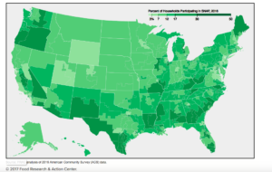
I found inspiration for the entire project from an image created by the Food Research and Action Center, representing aggregate data of SNAP use across the United States.

Fig. 1 Food Research and Action Center representing the % of households participating in SNAP in 2016
From this image you can see that the darker areas are showing where a higher percentage of households participate in SNAP. From this single image I can determine the higher percentage of SNAP users are in large metropolitan areas along the east, west and southern coasts.
To take the idea of representing the use of SNAP across the country I was also inspired by a map created by the USDA which shows the acceptance of SNAP by farmers markets per county, per state.
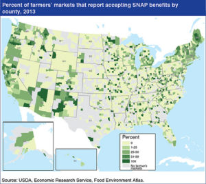
Fig. 2 USDA, % of Farmers Markets that accept SNAP in 2013
The version of this map that I created is a heat map showing the total number of farmers markets accepting SNAP per state. By using a map like this I was able to convert the data further, to visualize the real reason farmers markets are so important to communities across the country, their supply of fresh food.
Fresh foods are always better than canned foods anyday. Yet, when someone is desperate for food the easiest and cheapest thing may not be the healthiest choice. So why not make it easy, cheap, and healthy with farmers markets affordable by supporting SNAP use. The standard of healthy foods in this project inspired by the CNPP MyPyramid.
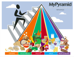
Fig. 3 USDA, Center for Nutrition Policy and Promotion, MyPyramid.
With this as an inspiration I created my visualization to reflect the pyramid creating a connection to the importance of each food group. With this poster the descriptions provide a breakdown of a healthy balanced diet can look like and what I have hoped to achieve is where that diet can be achieved.
Results & Description
With the data that was provided by the USDA I needed to clean it up before I could use it in Tableau. I got rid of unnecessary columns of data I would not be working with to create my visualizations. The USDA Farmers Market directory is voluntary, where farmers markets provide their information. As for the voluntary part, this creates a lot of gaps in the data. “Data omissions do not always cause direct harm, but where a limited data source is used to generate insights about a larger population or provide a service at scale, omissions can have negative impacts” (Broad, Smith & Wells,16). The gaps in this data are the areas left blank. A name of a market was recorded but the products sold were not. Once the clean up was done I was able to work with the data that was going to help me answer my questions regarding SNAP, products sold, and the essential food groups.
My first visualization helped answer the first question, how do the Farmers Markets in the United States help those on SNAP buy products that are labeled as Essential Food Groups? I chose to create this visualization with a Tableau storyboard.
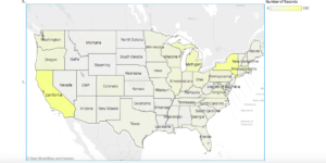
Fig. 4 Total number of markets that accept SNAP per state (slide 1 of 6)
Of the total number of markets per state I chose to create five more visualizations that demonstrate which markets provide foods on the CNPP pyramid and can be bought with SNAP. What is good to keep in mind is that not every market sells every product, which can be seen as patches of color across the country in figures 5 & 6.
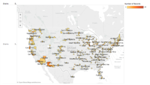
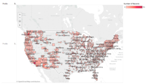
Fig 5 & 6. Here are the markets that sell grain (fig. 5, slide 2 of 6) and fruit (fig.6, slide 4 of 6) and accept SNAP
When scrolling over the map there are pop up windows that show you the detailed information regarding a particular area you are interested in.
My second visualization I took the data and looked at it on a smaller scale, one state in relation to the whole country. By choosing Connecticut I worked with a smaller data set and was able to see a single locations extent of SNAP use. What I have done is represent the total number of all markets in each county, broken down to show the total number of markets that do and do not accept SNAP and from there determine which city within each county that do and do not accept SNAP.
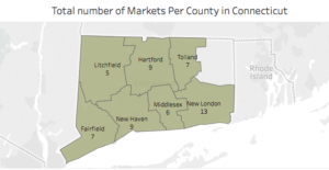
Fig. 7 Total number of markets per county within the state of Connecticut
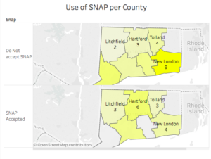
Fig. 8 The total number of markets per county that do and do not accept SNAP
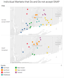
Fig. 9 Individual markets per county listed with the city where markets do and do not accept SNAP
The third visualization took the county visualization showing the markets that do accept SNAP and related it to the products sold. This is a very similar viz to the one representing the country’s total in relation to the products.
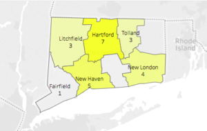
Fig 10. Number of farmers markets per county that accept SNAP (this is the map on the bottom of fig. 8)
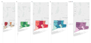
Fig 11. The products being sold in relation to the CNPP essential food groups pyramid. Grain, Vegetables, Fruit, Milk products (cheese), and Meat (Eggs, Meat, Poultry)
By using these visualizations in conjunction with each other you can see where there are a high number of farmers market accepting SNAP across the country and in comparison with a single state. When focusing on one state, it can be relatable to a viewer, sparking questions they never thought to ask before.
Design Rationale
I did not want the data to just be points or lines on a graph I wanted those who saw my visualizations to relate to what they were seeing. In each of my visualizations I chose to represent my data with a heat map. As a quantitative value being the number of markets the shades of color were going to show a difference in the number of markets state to state. “The reason for the apparent difference is that we perceive color not in absolute terms but as the difference between the color that we are focusing on and the color that surrounds it” (Few, 38). While deciding on my use of color in the design of the visualizations I wanted to create an understanding that the state map is a part of the whole, with its own specific data that can be seen on a smaller scale. I chose the color yellow to represent totals ,as the color was not of significance in the food groups pyramid. The choice of color was determined by the food pyramid itself to create a connection with what should be part of a healthy diet. I liked the colors as they did not, within each map, display a necessary good versus bad. It is noticeable when a color is lighter or darker or where there is no color at all in representing where, how many and what is being sold. When focusing on color I needed to make sure it was a continuous attribute throughout my visualizations. I looked back at the Color Tutorial “Using Color Effectively in Computer Graphics” by Lindsay W. MacDonald to reassure myself that I was not overwhelming the viewer with too much color. One of her quotes specifically stuck out to me she states that “color is one of the most effective visual attributes for coding information in displays and is capable, when used correctly, of achieving powerful and memorable effects” (MacDonald, 26). I hoped, which I later observed in my UX research, that the color choices I made have a memorable effect in understanding the connection between the visualizations and the CNPPs food pyramid. Included in the use of color I kept in mind that the max number of colors in a single visualization should be seven, which I did not exceed in maintaining consistency. In all of the choices I made of creating three different visualizations allows for a wider view of the country to be brought down to a very individualized point of view. Being from Connecticut and having access to Connecticut farmers market users, for my UX research, I as well as my test subjects were able to look at the country as a whole in comparison to what is available right at home.
User Experience
My process in finding and testing subjects for the user experience part of this lab was defined by the state I chose to do a further study. In conducting my user experience I chose to ask those of the community in use of or with the knowledge of farmers markets within the state of Connecticut. For variation in the research I chose individuals, male and female, of different age groups.
I conducted my research through observations and asking questions, for each visualization I made, prompting the use of the visualization to reach an answer. The older male participant when interacting with the map of the United States was focused on the use of color in relation to the quantified number of markets to provide him with the information he was looking for. He started clicking around while adjusting the zoom on the map. What was difficult and out of my control were figuring out the toggle options for moving the map around.
For the older female participant she had a very different interaction with the visualizations, she did not notice the extra information in the pop up windows when scrolling over the maps. I ultimately had to direct her to the pop ups as she was asking questions that were easily answered with the information provided. The older female participant, while using the country map, zoomed straight into where she lived, Connecticut, locating herself within the entire county. She did not know that the next visualizations were about to show her more of the details she was looking for. As we moved through the visualizations getting into further detail the older female participant started to ask the questions I had been thinking myself. Where are the communities, that she knows of in use or are in need of SNAP, that are not being serviced by farmers markets.
The younger participants both male and female, had similar interactions with the technology and in understanding the relationship between each visualization informing the next. They each understood that the pop up windows answered many of their questions that they were not always vocal about asking as they were figuring it out. As the younger participants understood the technology and how to interact with the information on the screen that it was not inherent in the older participants.
A huge difference between the participants was that the younger male participant was color blind. I was intrigued to see how he perceived the colors being used, as there were five colors in use. He was able to see shades of color and differentiate what they were based on his previous knowledge. By showing him the food pyramid in relation to the colors used in my visualizations he could pick out that the colors being used were orange, green, red, blue and purple, while seeing only shades of greens and blues. In determining that the color portion of the visualizations were not giving him all of the information he needed to understand the viz, he was grateful for the pop up windows that appear when scrolling over states or counties. I hoped with the added feature of pop up windows that anyone who came across this visualization could grasp the use of it and find the information they needed about farmers markets and the use of SNAP.
After the observations of use, I asked questions that were intended to direct the participant to a particular viz that would provide the best answer. Not every viz would give the same answer twice but could answer any of the questions I asked by finding the correct one to tell you what you needed to know. For the map of the United States I prompted three questions; Can you tell me which state has the largest number of farmers markets that accept SNAP?, Which state has the most farmers markets that accept SNAP and sell fruit?, and finally, When picking a state of their choice can they tell me the number of markets within a particular county that accepts SNAP while selling vegetables?.
When I introduced the maps of detailed information about Connecticut I asked more specific questions related to the state. I asked; Which county in CT has the lowest number of markets total?, Within a county, a choice they were able to make, how many markets accept SNAP and how many do not? And furthermore within a county, which city’s markets do accept SNAP?
Finally with the last visualization that breaks down the markets accepting SNAP in Connecticut by the products sold that are on the food pyramid, I asked one simple question; Where can someone buy all of the essential food groups in Connecticut successfully using SNAP? In conclusion there are two counties within the state of Connecticut where someone on SNAP can successfully buy grains, vegetables, fruits, milk products and meats.
Links to Visualizations
Visualization #1: The United States Food Groups https://public.tableau.com/shared/46MNQ6JYF?:display_count=yes
Visualization #2: Connecticut’s Totals https://public.tableau.com/shared/C3C2M53RM?:display_count=yes
Visualization #3: Connecticut’s Food Groups https://public.tableau.com/views/CTfarmersmarketsandsnapp/SNAPandFoodPyramid?:embed=y&:display_count=yes&publish=yes
Revision recommendations
There were only a few recommendations by the participants that they came from my observation of their confusion, which I prompted with a question of how would that make your experience better? First, the older male participant was a bit confused by the use of the term number of records, which is to mean the number of markets. Changing that would make it more clear. In the second visualization of Connecticut where the markets are represented by city within a county, there are alot of colored dots, with a key at the bottom of the dashboard page. I had noticed that the participants were not using the key as much, but instead resorted to hovering over a dot to orient themselves within the state by county. A recommendation that was given was to move the key up or next to the map for a faster understanding of the colors. Finally the last recommendation was for the third visualization of the state of Connecticut’s farmers markets and products sold, to include a key for each product map. The goal was to create a memorable experience with color by including the food pyramid with the maps of products. To allow for enough space for all the maps to line up next to each other I needed to manipulate the columns on the map that defined the product being shown. These comments on revisions are ones to definitely consider when editing the visualizations for future use.
Future Directions
In the future I would like to see that this map, the state observations in particular, be used for other states across the country. In doing so there can be a comparison between states, or within a single state, of where SNAP users can benefit from what is being sold at a local farmers markets. I would like to try and incorporate the data that showed time in the original dataset. With this particular information I would be able to show when markets are open selling what product at a particular time of year. As we know here in the North East, fresh foods are hard to come by at farmers markets in the winter, but in California their minimal seasonal change allows for markets to stay open all year round. To take using time further I would be interested in showing the height of the seasons when products are the most delicious.
With that being said I would really like to incorporate demographic data as an accompaniment to the maps in regards to the overall state or particular counties. By incorporating this data with the data that I created there can be a more informed conclusion as to where farmers markets are in relation to certain demographic areas and where SNAP is being accepted in relation to areas. I would like to say that the maps that I created can draw similar conclusions but that would solely be based off an observer’s perception of an area or situation. The numbers may not be able to tell us everything but it is information that can be used to make a change where change is needed.
Resources
Few, Stephen. Now You See It: Simple Visualization Techniques for Quantitative Analysis. Analytics Press; 2009.
Food Research and Action Center. (2017). [Interactive Map showing the percentage of households participating in SNAP in 2016]. SNAP Households by Congressional District. Retrieved from http://www.frac.org/maps/snap-cd/snap-congress.html
MacDonald, Lindsay W. (1999). “Using Color Effectively in Computer Graphics.” Computer Graphics and Applications. IEEE 19 (4): 20-35.
US Department of Agriculture: Agricultural marketing service. (2018). Local Food Directories: National Farmers Market Directory. [data set] https://www.ams.usda.gov/local-food-directories/farmersmarkets
US Department of Agriculture: Center for Nutrition Policy and Promotion. (2015). MyPyramid Graphics. [poster] https://www.cnpp.usda.gov/mypyramid-graphics
US Department of Agriculture: Food and Nutrition Services. (April 2018). Supplemental Nutrition Assistance Program (SNAP). https://www.fns.usda.gov/snap/eligibility
The post How Use of SNAP Benefits at Farmers Markets Benefits Your Health appeared first on Information Visualization.