Once Upon a Graph; Mapping the Once Upon a Time Family Tree
May 1, 2018 - All
Introduction
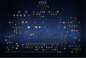
The inspiration for creating this social network came with the final season of the show Once Upon a Time, an ABC drama featuring fairytale characters who are magically cursed into modern day America. Stitching several classic fairytales together, the show is well known for its characters’ complicated family tree. Spanning over several locations, both real and fantasy, many of the characters receive both real world and enchanted world names and memories. Fans have attempted to map the main family in the show (see Figure 1) which includes Snow White, Prince Charming, and their daughter Emma Swan as arguably the core unit.

Figure 1 Genealogical chart of the characters from the show Once Upon a Time
The goal of this project was to create a visualization that would show the complicated family tree this show created in a way that viewers could use as a reference while trying to traverse the storyline. Most fan made trees were created around the fourth or fifth season, during the shows more popular time. As the show draws to a close with its seventh season, this visualization would serve as a reference for fans to look back and remember the complexity of the show.
Methodology
Initial UX
Before starting the visualization, an initial user testing was conducted using competitor analysis of three different visuals of the Once Upon a Timefamily three. The visualizations included a fan-made family tree, the Wikipedia character list, and the Wikia family tree. The user testing was conducted by three viewers of the show as a focus group. Viewers were selected by their knowledge of the show and familiarity with the characters’ connections and significance. The focus group setting was established out of time constraint and also knowledge of the participants’ ability to critically express their individual opinions while discussing in a group setting.
Questions used during this phase of user testing were asked for each of the three example visuals in turn and included:
- Why would you use a visual like this one?
- What are elements that you especially like or dislike about this visual?
- What seems like the most important piece of information this visual is trying to share?
- What makes this visual different from the others?
- Which visual was your favorite/least favorite and why?
Findings from the user testing ranged from navigation preferences and levels of text to preferred characters and family connections to focus on as well as clarifying unclear areas in the family tree. Results from this initial interview were taken into consideration when creating the nodes for the dataset as well as the types of relationships to include in the edges data.
Creating the Dataset
To best show the organization of the characters of Once Upon a Time, Gephi was chosen for the graphing process. The hope was to be able to show the different family units from the show and how they each connect to each other.
Since a dataset containing the characters from Once Upon a Time was not publicly available, it was necessary to create a dataset first. The list was made using two excel sheets. The first list was the node sheet and contained a list of character names as labels and a list of numbers from one to 68 as IDs.
The characters were selected by going through the list of characters in the Wikipedia Once Upon a Time Character List and then removing characters who were not closely related to the main family. Four other separate and well-known families were also included in the sample to show the scale of the main family and as a reference for users using the visual to reminisce about the show. Excluded from the list were unknown characters. Several characters have one known parent while the second is not mentioned in the show. Since they do not add to the character information on the graph, they were left out from the nodes list.
The second file for the edges was a bit more complicated to make. First a list of relationship categories was made to define connections within the graph. For the sake of simplifying the graph, all relationships would be undirected. Five categories were selected including: parent-child, marriage, sibling, step or adopted version of previous categories, and alternate version of self.
Through magic or alternate universes, several characters ended up with alternate versions of themselves for some part of the series. Four of the more prominent alternate versions were included in the visual since they were also necessary in the family tree. Adoption and step relations are not biological connections but are crucial parts to the storyline and therefore were also included. Marriage was also used as a connection to simplify eliminate the need to show connections of pairs who create a child together but are not in a romantic relationship, or a couple in a romantic relationship that does not result in offspring. This choice was to again simplify the visual from becoming too congested with connections.
Source and Target columns were made, and each character was gone through in order to make sure that all connections were made. A total of 110 edges were found. To make the list easier to create, names were copy and pasted into their corresponding slots from the nodes file to the edges file and then converted into IDs using the excel Vloop formula. Type and Weight columns were added after the Source and Target columns.
Both the node and edge files were saved separately as CSV files and uploaded to Gephi as their respective columns. The edges file required some extra rows to be deleted in a text editor before it was able to be added to the Gephi dataset. Upon inspection of the files, it was discovered that three of the edges listed as both Source to Target and the reverse. Gephi automatically condensed these doubled into two weight edges. This was easily corrected on the Gephi dataset table.
Creating the Initial Visual
To gain an initial understanding of how the nodes would connect and be organized, the layout was changed to Force Atlas with a repulsion rate of 2000. Force Atlas is supposed to be a useful layout for showing social connections and was used in the previous Gephi project mapping a dolphin social network (see Figure 2).
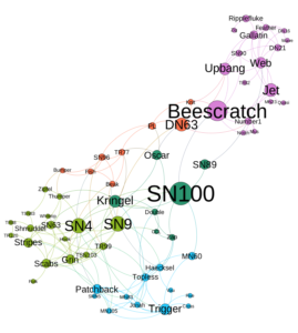
Figure 2 Social Network connecting a group of dolphins
Next, a modularity statistic was run so that nodes could be sized using betweenness as a ranking. Other ranking options were considered, such as modularity, but the betweenness centrality ranking best displayed the characters most central to the family tree, while modularity focused on connectiveness which was prevalent in some of the small outlying families which was not the focus of the graph.
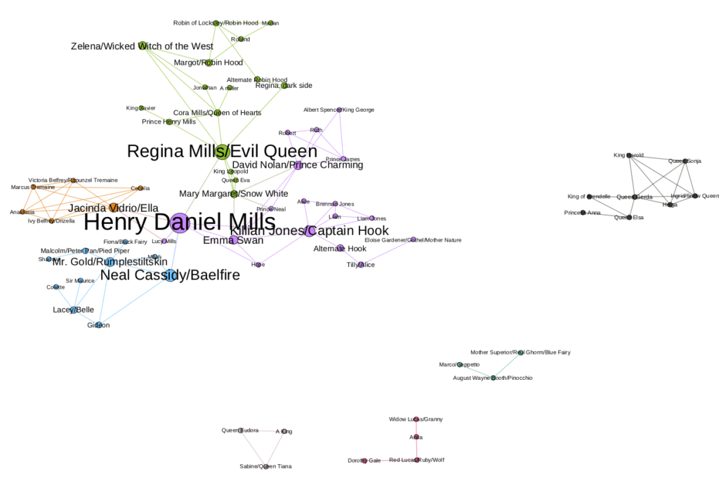
Figure 3 First draft of social network visual
After adjusting the size by ranking, nodes were partitioned by modularity class and distinguished by color. This was done to visually separate the different families and help again with navigating connections while taking into account family overlap. Labels were turned on by node size to make sure that all nodes were properly connected. One edge was discovered to be missing and was easily added straight into Gephi’s dataset. After adjusting a few of the nodes by hand so that none of the labels were covered, the initial version of the visual (see Figure 3) was ready for feedback from users. A second version with curved edges was also included for comparison, but users unanimously agreed that the straight edge visual was preferred.
Follow-up UX
After the creation of the first prototype for the project, a second focus group was conducted with the same group as the initial user testing. This group was shown the first prototype of the visual which showed nodes utilizing size to illustrate betweenness and color to denote groups with closer familiar ties.
This second round of testing included a thorough walk-through of the visual and detailed description of each part, as users were encouraged and continued to ask questions and provide feed back on choices made in the design. While at first unsure how to process the visual, some elements came forward as helpful during the talk through while others remained visually confusing to users. Comments made during the walk-through were noted and taken into consideration in the redesign phase.
Findings
Users were more interested in the main family and had mixed feedback on the necessity of the other smaller families that showed scale. It was pointed out that if the visual was to show characters outside of the connected family, then it might be expected to show all of the characters.
Users found relationships difficult to interpret since edges were colored by the nodes near them and not by the type of edge or relationship had by the two characters they connected. They also pointed out that parent-child connections were visually more V shaped in connection while traditionally they were used to T shaped connections to show two parents to child connections.
While they were initially unclear about the sizing and coloring of the visualization, after their purpose was defined, users stated approval for the color use to show familiar connectiveness and stated that the larger, more connected characters served as a helpful starting point in their navigation of the visual.
Since the initial focus group was conducted via Skype, users were sent the three competitive visuals and asked to access them however was most convenient. As a result, visuals were tested on both laptop and mobile screens. A finding from this aspect of the test, was that some visuals were better suited for mobile while others might not appear at all on the mobile version. General feedback from accessing visuals on mobile devices was that visuals should be clear, brief, and most importantly, zoomable.
Revisions and Design
Several different layout options were considered before the final choice was made (see Figure 4). While the original version showed a triangle of the three most connected nodes in the middle, the final version centers around the single most connected node, with the next most connected centered in smaller nodes connected around the center one. This design was a response to user feedback that the larger nodes were helpful in giving a visual starting point for users to navigate through the visual by giving a clear center to branch out from. It also addresses the comment that the initial layout contained “so many lines” by spacing the nodes out more and creating defined clusters.
This new layout was accomplished by randomizing the layout and setting it again at Force Atlas with a repulsion rate of 2000. Next, Label Adjust and Noverlap was alternately run repeatedly until nodes were all spaced enough to not cover each other’s labels.
The next alteration involved adjusting the visual appearance of the nodes. Color choice was made with red-green color deficiency in mind. Attention was also made to keep colors from being too dark that they would hide labels within them and too light that they would be lost in the background of the visual. To accomplish this, the design site, Palleton, was used to find complimentary colors that fit within these constraints and were added to the visualization. After the node colors were selected, the next step was to make sure that nodes were big enough to show their colors. The smallest nodes in the ranking needed to be sized up to 10 to increase visibility and make sure that the colors were easy for users to distinguish.
Edge labels were debated, as the different form of connections are crucial to the story (see Figure 4). However, activating the edge labels created too much clutter and overlapping of labels, and the idea was dismissed for the sake of readability.
Finally, the wide grab tool was used to move the outlying families closer to the central family to minimize unused space and to start the visual at a closer view for users.
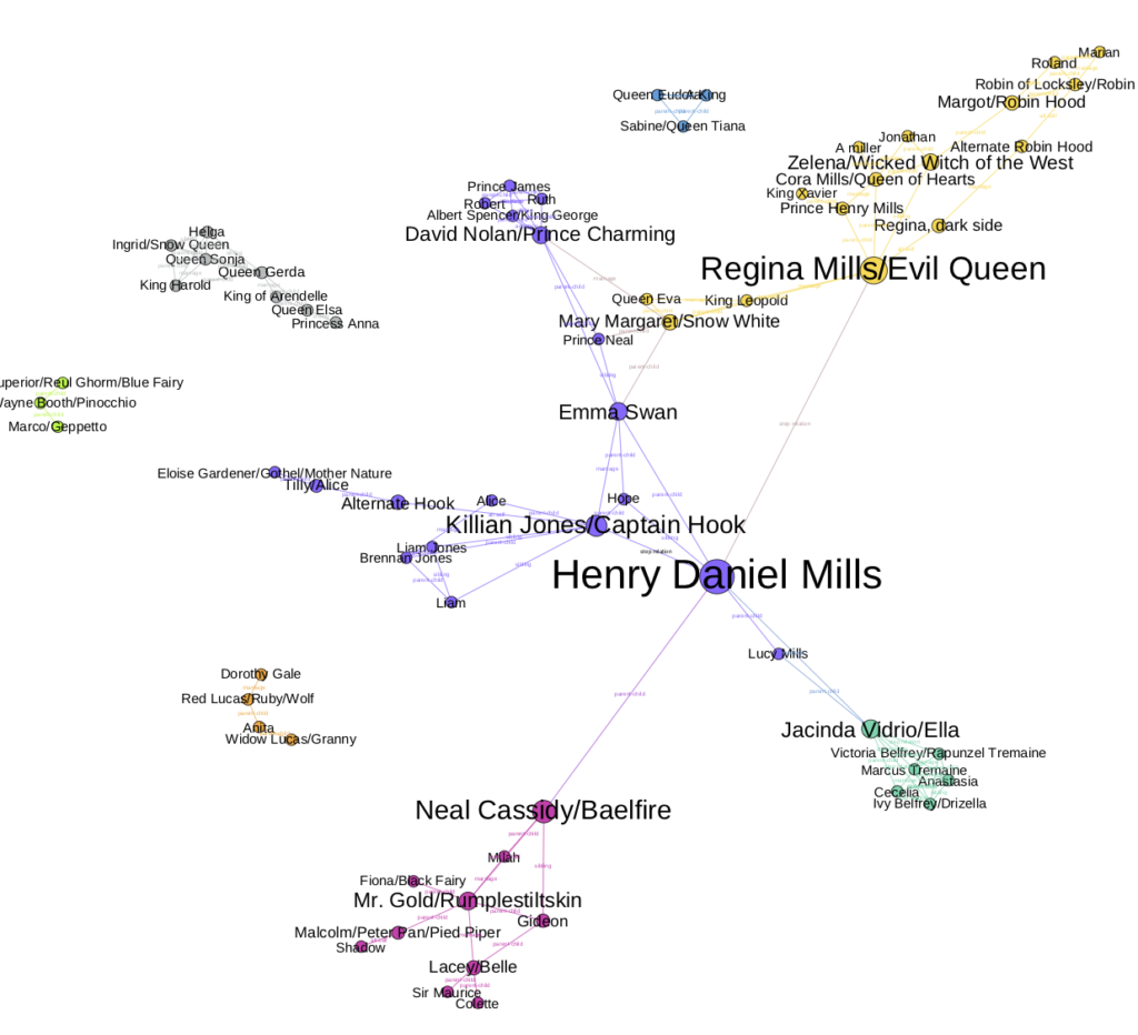
Figure 4 Social network after first revisions
Conclusion
If there was more time, it could be informative and add to navigation if four additional graphs were made which center around each of the largest nodes in the graph including Henry Mills, Regina, Ella, and Neal. This would allow the user to get an overview of the family connections with the option of looking closer into branches of the family.
It would also be visually helpful to partition the edges by their different attributes. This would allow edges to be colored by type of connection so that users could visually see that two characters are share a parent-child connection versus a sibling connection. Gephi does not appear to intuitively offer this option at present.
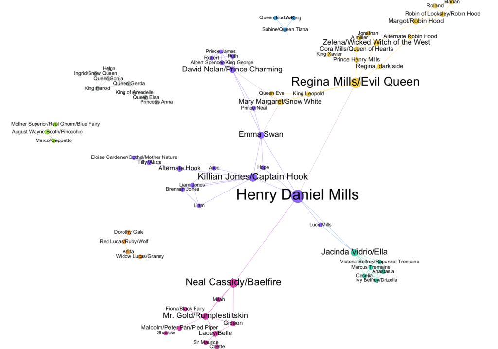
Figure 5 Final version of the Once Upon a Time Social Network visual
Overall, the graph focuses on the connections within the Once Upon a Time family versus other visuals in the past which focus in displaying the genealogical aspect of the family tree.
References
Wikipedia list: https://en.wikipedia.org/wiki/List_of_Once_Upon_a_Time_characters
Wikia Family tree: http://onceuponatime.wikia.com/wiki/Once_Upon_a_Time_Wiki
Fan-made family tree: http://www.bad-mushroom.com/once-upon-a-time-connections/#jp-carousel-324
The post Once Upon a Graph; Mapping the Once Upon a Time Family Tree appeared first on Information Visualization.