
Are New York City Shelters Meeting the Homeless Demand?
May 7, 2018 - All
Introduction
For my final project, I decided to explore whether New York City homeless shelter capacity meets demand. This semester, for my Advanced Design Research course, I researched how unsheltered homeless individuals dealt with inclement weather. At the beginning of my research, I learned through the State of the Homeless 2017 report that homelessness in New York City increased 79 percent in the past decade to more than 62,000 homeless individuals in January 2017. Within this population, more than 30 percent of individuals are children below the age of 18.
Project Summary
Learning about such a drastic increase in homelessness led me to wonder whether shelter capacity adequately matches demand or whether there’s an imbalance between the capacity of people shelters can take in and the demand for beds in shelters.
For my final project, I aimed to create a set of visualizations that displayed the homeless shelter system and explored the current shelter capacity and overall shelter demand in the City. I chose to create the visualizations in Tableau Public stories because I wanted to feature a combination of maps and graphs to tell a story. I wanted users to interact with and explore the visualizations by hovering and clicking on them as well as obtain context behind the visualizations in a storytelling manner. I created these visualizations for individuals interested in policy and social work.
Process
Obtaining, Cleaning and Transforming the Data
To create the visualizations, I utilized the following four datasets:
This dataset contains daily reporting of the number of homeless individuals in shelters by group since 2013. The dataset provided by the Department of Homeless Services was fairly clean and only needed to have a few duplicate rows removed.
SIRS Data on Student Homelessness
The data on student homelessness contains reporting on the number of students in public and charter schools who experienced homelessness at any point in time during the 2016 – 2017 school year. I chose to normalize the data by manually adding the number of students in each district and dividing the homeless student population over the corresponding districts’ student population. When adding total district students, I utilized Niche’s student count. Apart from adding total students, I also manually added district number to link the data with the school district boundary file.
This shapefile provides geospatial boundaries for New York City’s 32 school districts.
The Department of Housing and Urban Development’s dataset provides reporting on shelter and housing project capacity (number of beds) by relevant group.
To be able to plot the shelter points from the Bed Inventory data, I geocoded the addresses and transformed these into latitude and longitude pairs utilizing Google’s OpenRefine and Geocode API. I then transposed the shelter data, loaded the csv into QGIS, and transformed the data into a shapefile. Turning the csv into a shapefile allowed me to then connect the Bed Inventory with the school district shapefile in Tableau.
Tableau
To build the Tableau story, I first created individual maps and graphs and then grouped relevant visualizations into several dashboards. I then organized those dashboards into stories. Within Tableau, I joined and linked the bed inventory, school district, and data on student homelessness to facilitate my analysis and then added the unlinked daily report. More on about the final design process can be found in the “Design” section below.
User Experience Research
Recruitment and Session Structures
To receive user feedback on the visualizations, I performed two rounds of user testing: one mid-way through the visualization development with two participants and a second one towards the end of the project. I recruited participants that either worked in policy or social development or were interested in the subject matters.
The goal of the first session was to receive “big picture” advice about the visualizations and how to take the research one step forward, while during the second session, I mainly aimed to polish the visualizations themselves and ensure good flow within the story. Although during both sessions I asked participants to speak out loud as they explored the visualizations, I asked more questions about general understanding and opinions during the first session. During the second session, I let the participant walk me through his thoughts as he explored the visualization without my guidance.
UX Research Findings
Problem #1: Department-specific jargon and superfluous information confused users
Two users had trouble understanding language specific to the Departments of Homelessness and Housing and Urban Development, such as “Rapid Re-Housing” and “HH Beds with Children”. Users also found information that popped up when hovering over the map to be unnecessary.
Solution #1: Simplify language and superfluous information
In order to simplify the visualization, I removed the latitude and longitude from the hovering tool tip, changed variable names to be more understandable, and added more compelling titles.
Problem #2: Users found the story layout and map sizes too large for reading all at once
Two users stated that some graphs where too big and that they did not want to scroll when looking at the visualizations. One user mentioned that the map’s default zoom was too zoomed out, which caused data visibility issues.
Solution #2: Fit all visualizations within one page and avoid scrolling
Although Tableau Story has a default width that falls within the page, it doesn’t have a set height. Thus, I set the minimum height of the dashboard to 360px and included text below the images still visible without scrolling, to ensure the users would see the entire visualization on one page.
Problem #3: Comparing shelter capacity through maps was cumbersome
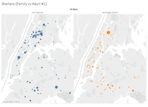
Initially, I tried to display shelter capacity utilizing maps, mapping the shelter point data with the number of beds set to size. Users found it confusing because both maps looked similar and were not able to correctly assess whether or not shelter capacity matched demand.
Solution #3: Visualize shelter capacity and demand through bar graphs
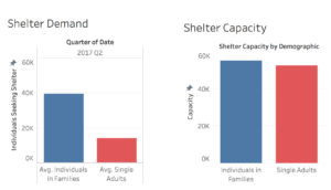
I changed the capacity and demand visualization into bar graph form to allow users to better and more exactly compare the two, leveraging users’ preattentive processing through the bar lengths.
Problem #4: Map of Homeless Students was confusing without prior mentioning of the underlying variables
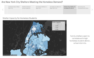
One user mentioned that he did not understand the “Shelter Capacity for Homeless Students” map because there were too many variables. He said that because he had not previously gotten a chance to understand those variables individually, he did not understand them all together in one complex map.
Solution #4: Break down homeless student data into three different visualizations
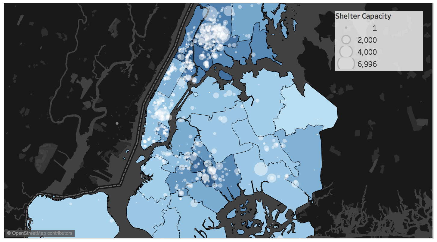
In order to make the “Shelter Capacity for Homeless Students” map more understandable, I added a story tab that introduces the problem of homeless students. This map shows the number of homeless students through bar graphs broken up by school district number as well as the same bottom layer of the Homeless Student map.
Design
Choosing Tableau Stories
For this project, I aimed to utilize the visualizations for storytelling to educate audiences on homelessness in New York City. Because I wanted to ensure that I could guide the user through the visualizations in a specified order—first introducing her to the current homeless problem and trends; highlighting overall demand versus capacity; then delving into homeless students section; and final concluding back with homeless trends—Tableau story was the best medium of communication.
Colors
Throughout the visualization, I utilized color as an element of visual representation, maintaining consistent coloring throughout the story to move users from tab to tab seamlessly. I chose blue tones to signify families—light blues for students and children and a dark blue for individuals in families. Adults throughout the visualization are in red and total homeless in gray. Overall, I tried to limit each story tab to 2 colors in order to avoid distracting the user.
Types of Visualizations
The main kinds of visualizations utilized in the story were time series line charts, bar graphs, and maps. I delivered most of the information via line charts and bar graphs, focusing on length and position, which are perceived with high precession through users’ preattentive processing. I took advantage of these visual perception cues to aid users in registering the difference between variables such as shelter capacity and demand. Bar charts were mainly used for comparing overall numbers and line graphs for indicating trends.
I utilized time series visualizations to reveal overall homeless trends and rates of change for various homeless groups. Because the data was collected daily, I decided to keep it scaled daily to see the truest trend in shelter demand.
Within the visualization, I also utilized maps sparingly to compare homeless student density by school district (demand) to the number of shelters in the districts (capacity). Because I was not able to intersect the polygon layers with the points, I cannot with certainty say that shelters are currently meeting homeless student demand in each individual school district. Instead, the “Shelter Capacity for Homeless Student” map allowed me to see where shelters currently congregate on the map and compare these to the individual student districts and assess whether or not they correspond to each other.
Visualization Findings

Overall, by creating these visualizations, I learned that shelter capacity seems to match shelter demand fairly well in New York City at the top line level. I was not able to dig deeper to truly understand the nuances of the data and demographics because the public data on homelessness is limited. Nonetheless, this top line analysis shows that ignoring preferred placement, homeless individuals currently looking for shelter should be able to find shelter.
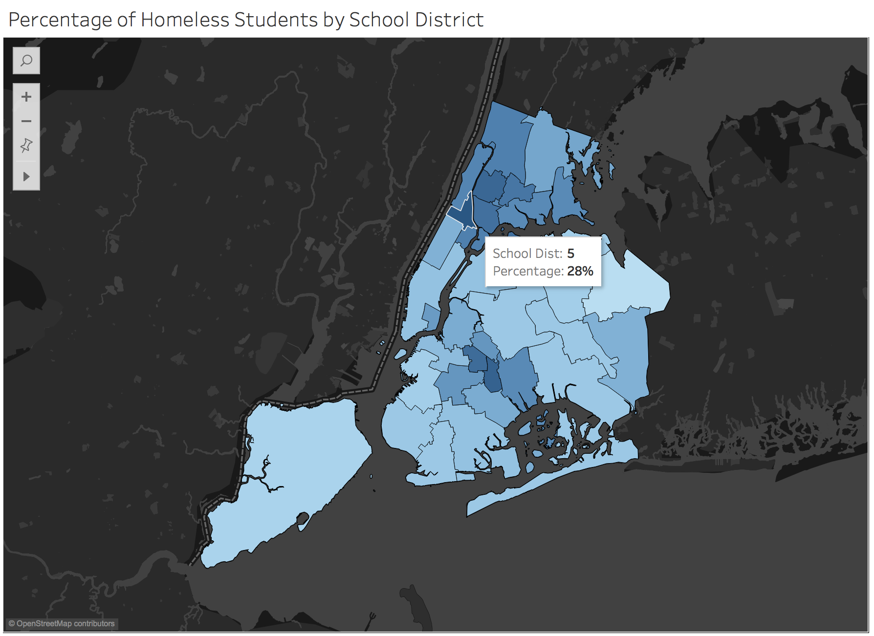
Throughout my analysis, I also learned about the scary student homelessness trend. After seeing the percentage of homeless students in school districts as high as 28%, I thought that my data was wrong. I did a quick Google search and found a New York Times article that placed the homeless public school population in New York City at about 10%. I then calculated total students identified as homeless over total students in all New York City districts within my spreadsheet and that equaled about 11%. The data I utilized counted students in charter and public school while their data only public schools. These both seemed to match up correctly.
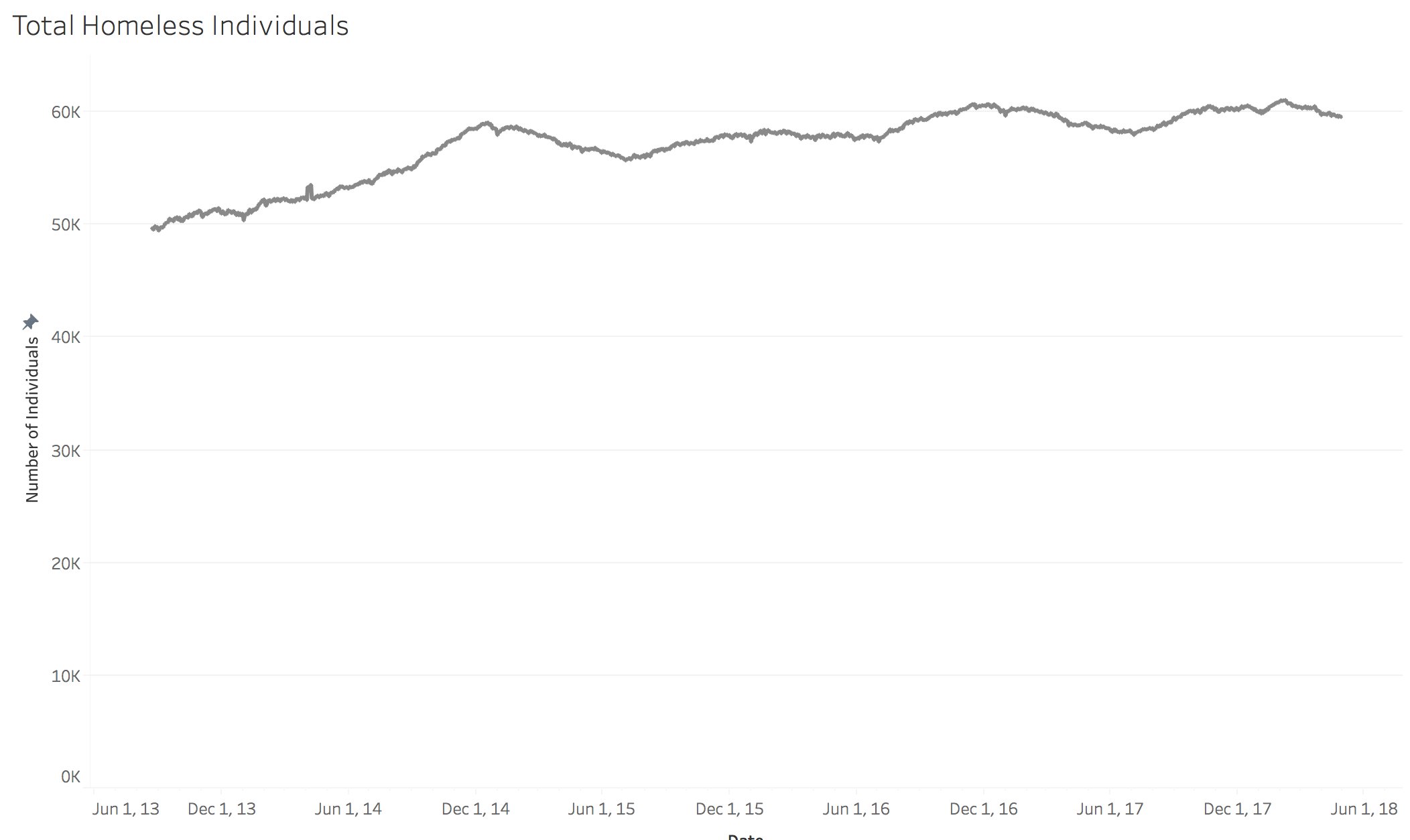
Apart from the homeless student trend, the overall homeless trend in New York City is alarming. Homeless individuals looking for shelters have increased about 20% in the past four years. Even though it’s important that the homeless have a place to stay, it might not be best for the City to continue to open temporary solutions and might be best for the City to move funds into more permanent housing options.
Further Work
In order to continue to refine this visualization and improve their insights about homelessness, I would like to understand the following information:
- Relative shelter capacity by New York City district
- Relative shelter capacity by New York City school district
- Overall yearly trends – the raw bed inventory counts were collected in the summer, so I think that shelter demand might change a fair amount during the fall and winter months.
Obstacles
Some obstacles I ran into while creating the visualization were mainly due to data and software limitations. Data on homelessness is hard to come by due to privacy violations and because some private shelters don’t collect this information. Reliable data on homelessness with spatial components is even harder to come by. For example, there’s an active stream of 311 data with latitude and longitude coordinates, but it’s not completely reliable. Moreover, HOME-STAT, the Mayor’s initiative to collect data on homeless individuals publishes basic dashboards, but doesn’t make the data available.
Additionally, Tableau Public makes it fairly difficult to merge spatial files with latitude and longitude text files without involving outside software assistance. Being able to merge the shelter points with the New York school district shapefile was a challenge, in which I probably spent four to five hours and had to involve QGIS, where I transformed the csv into a shapefile. Geocoding the Inventory Count addresses (about 1,000 rows) on OpenRefine took a long time as well.
Conclusion
Overall, attempting to understand the difference in shelter capacity and shelter demand was fairly complicated due to limited robust data—data that contains location, time and demographic information. Nonetheless, I was still able to utilize the data I had to analyze the homeless environment in New York City. Specifically, it was incredibly eye opening to learn that about 11% of public and charter school students in New York were homeless at one point in time during the 2016 – 2017 school year.
References

Visualization link: https://public.tableau.com/views/HomelessShelters_0/AreNewYorkCitySheltersMeetingtheHomelessDemand?:embed=y&:display_count=yes&publish=yes
Data

http://www.nysteachs.org/info-topic/statistics.html#data

https://data.cityofnewyork.us/Social-Services/DHS-Daily-Report/k46n-sa2m

https://www.niche.com/k12/search/largest-school-districts/s/new-york/

https://www1.nyc.gov/site/planning/data-maps/open-data/districts-download-metadata.page

https://www.hudexchange.info/programs/hdx/guides/pit-hic/#2017-pit-and-hic-reporting
The post Are New York City Shelters Meeting the Homeless Demand? appeared first on Information Visualization.