
Introduction
Living in NYC may seem like a dream to most people. It is by far one of the most developed cities in the world. Employment opportunities seem endless here if you are willing to look, and there is so much to do that you are constantly able to stay entertained.
Within the 5 boroughs of NYC everything is so convenient that it is easy to take it for granted. There are bodegas open late hours on every corner, and subway stations that allow you to instantly transport yourself into another neighborhood or borough with such ease.
In terms of entertainment, close your eyes and pick something you would like to do. Yep, you can probably do that in NYC or at least very close to it. The museums are world-famous where we have people traveling all over the world to see them and view our priceless art collections. The Broadway musicals are a must-see, with actors so talented that they make you feel as if you are part of the story.
In other forms of entertainment, if you prefer to mingle at a bar or go dancing at a fancy nightclub, you have your pick from those every single day of the week. This is probably where NYC gained its well-known description as “the city that never sleeps”.
NYC is a place special in its ethnic communities whether it is the Chinese communities that have formed in Chinatown to Dominican communities that have formed in Washington Heights, to Korean communities that have formed in Fresh Meadows. It is safe to say that moving here can make you feel at home without being at home. This is something that isn’t always possible outside of living in NYC.
Since we have some of the largest populations of ethnic communities, many have blessed New York City with their tasty cuisine. You can get any type of food you can ever imagine here. Whether you want a gorgeous piece of Wagyu beef to yummy pierogies, everything can be found whenever you are in the mood for them. The food options here in NYC stretch so far and wide that Open Data has crunched the numbers and found that it would take a person 22.7 years to eat at a different spot each day without going to the same place twice. How insane is that?!
With all that being said, NYC is an amazing place to live but the rental process in NYC can be incredibly overwhelming for first-timers. It requires hours scanning apartment listings while considering various factors. Expensive fees, credit score checks and lengthy lease agreements are one of those various factors that can lead one to want to rip their hair out. Besides that matter, the timeline for finding a rental apartment in NYC is normally a short period of time, anywhere from one month to a couple of weeks. This may seem daunting especially if you are used to making big decisions months or even years in advance.
Finding a rental apartment in New York City means weighing endless tradeoffs. Is living close to a subway station more important than being able to stretch your legs at a park? Or is it having a laundry unit in your apartment building? Those planning on moving to NYC can often find themselves making tough decisions in their search for an apartment.
Our goal is to improve the experience of renting an apartment in NYC by creating a guide that involves factors such as average rent in different neighborhoods, safety, location of rental properties and their distance with subway stations, supermarkets, parks, etc. We want this reference to help people make decisions faster so that they can move into an apartment that is right for them with minimal stress.
Our final report would answer the following:
- How are rentals distributed among the five boroughs of New York?
- What’s the price distribution and what’s the range of fair prices available?
- Which are the most popular locations to rent an apartment?
Being able to answer these questions would mean that we have achieved our goals in creating this set of visualizations.
Inspiration
During our initial research, we came across different kinds of visualizations, few of which we really liked. In order to ideate on the final visualization, we created two kinds of inspiration boards. One where the data is closely related to the topics we were researching on and the other with the kind of visualization technique, layout, presentation style and aesthetic appeal we were aiming to achieve.
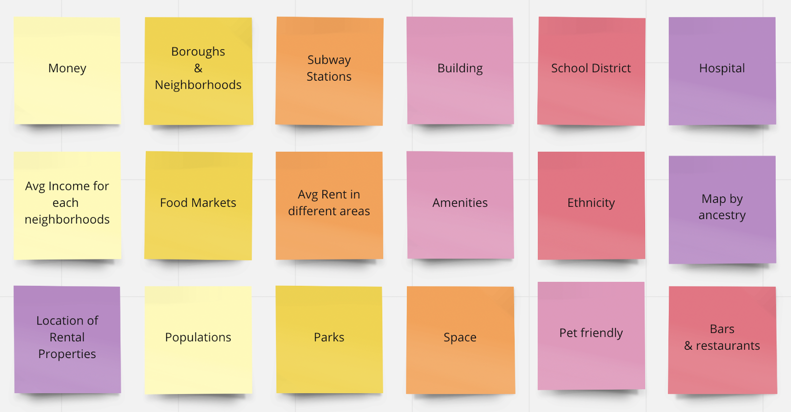
To understand the kind of data that would help us achieve our goal, we looked into various different aspects and parameters one would consider. This inspiration was drawn from the generative research we did as a part of the study to understand the complexities of the challenges one goes through while renting an apartment or looking for a place to live in the city.
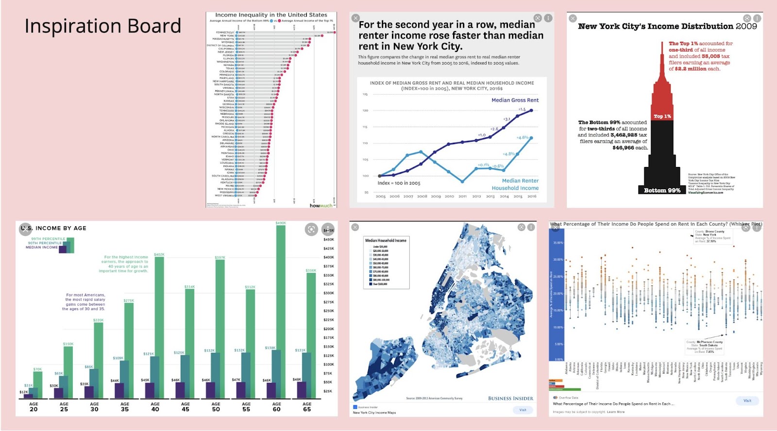
One of the main factors that we initially wanted to work on was the income status and the average rent in different parts of the city. That led us to the visualizations presented in the first Inspiration board. We found some data visualizations that were related to our field of study. The intriguing part about this process was to get to know how different these visualizations looked and various different ways to present similar kinds of data.
These visualizations were taken from the following sources:
- Ethnic neighborhoods in NYC by world region
- Income inequality in America varies dramatically by state
- New York City Median Renter Income Continued Its Upward Trend
- New york city income distribution 2009
- U.S. Income by Age
- Median household income
- What Percentage of Their Income Do People Spend on Rent in Each County?
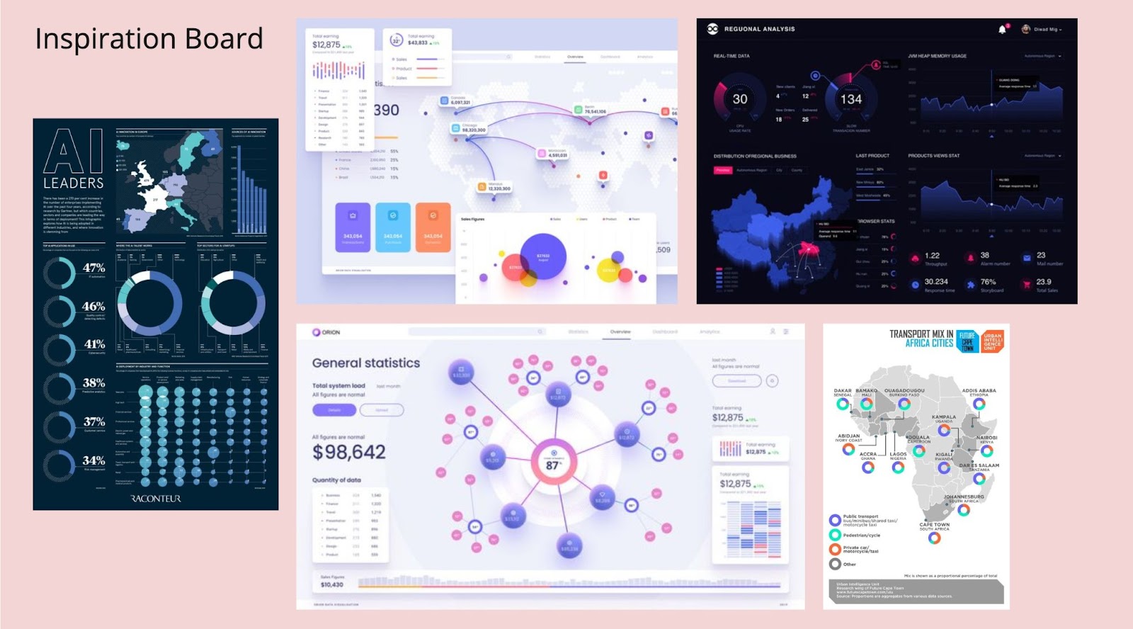
The second Inspiration Board gives an overview of the kind of visualizations we were aiming to achieve on the basis of visuals, aesthetics, representation and visualization format. We also found the color palettes used in these boards to be very interesting and pleasing. The overall dashboards in these visualizations convey the kind of interactivity we were planning to achieve. They have also used different kinds of visualization techniques to create an impact on the audience.
Although these were our inspirations in the starting of this project, we realized that we would be using different tools in this project to create all the visualizations. Initially we were planning to use Figma or Adobe Creative Suite to create one dashboard to bring all of our visualizations together just like it’s shown in the second inspiration board. Unfortunately, in order to keep the interactivity of the visualizations intact, we decided to keep them separately.
The visualizations in the second inspiration board were taken from the following sources:
- Template of data visualization on the world map
- Data visualization
- Orion Data Visualization
- A collection of infographics produced for Future Cape Town during my time there.
- AI Leaders
Rationale
We conducted preliminary research using Google Forms to poll out what were the major considerations that people would evaluate while apartment hunting. We collected eye-opening survey responses from 40 participants. 72.5% of the surveyors identify themselves as female, 25% as male, and 2.5% non-binary identity. Based on the survey results, we selected the datasets accordingly for our visualizations. We created bar, lollipop and line graphs for NYC median rent prices and NYC crime statistics. We created Carto maps for ancestry, subway station, crime rate, retail food stores, and parks- so that they may be interactive.
Here were our results from the survey we conducted:
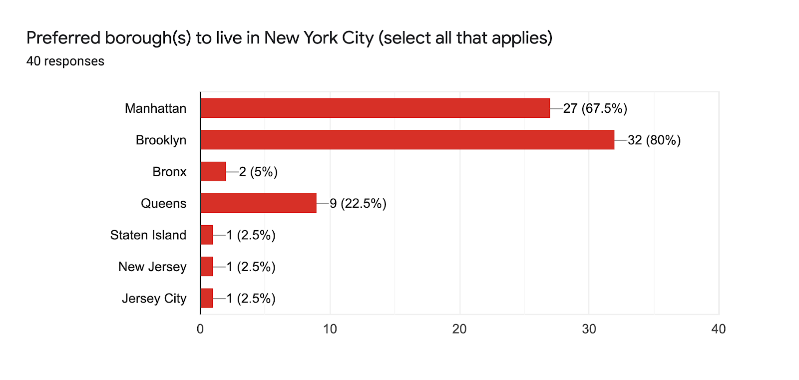
Brooklyn outperformed Manhattan as a preferred borough in our surveyed responses. New Jersey City as well as New Jersey did not fall under our five boroughs but we wanted to give our survey users the ability to choose an area outside of NYC that was close by to NYC.

Our word cloud design is based on the given answers from the above question. East Village and Chelsea are the most popular neighborhoods in Manhattan. The desired neighborhoods in Brooklyn are Williamsburg, Greenpoint, Bed-Stuy, Prospect Park, and Cobble Hills. The full responses are listed below:
Brooklyn- Williamsburg, Greenpoint, Brooklyn Heights, Cobble Hills, Bed-stuy, Ridgewood, Crown Height, Dumbo, Park Slope, Bushwick, Downtown Brooklyn, Clinton Hill, Prospect Park, Fort Greene
Manhattan- LES, Chelsea, West Village, East Village, Upper West Side, Upper East Side, Midtown, Gramercy, Soho, Flatiron, Harlem, Central Park, Riverside Park, Battery City
Queens- Long Island City, Astoria
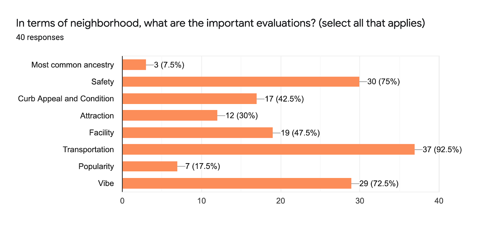
As you can see in the above image, transportation is among the top neighborhood evaluation factors. People want to live close to subway stations and so they consider that when looking for an apartment. Safety comes second with 30 counts. People want to ensure that the neighborhood they are living in does not have a lot of crime. Vibe takes up third place. People want to live in a neighborhood where spirits are high. Surprisingly, the people we surveyed didn’t really care about the most common ancestry as one of the factors they would really want. This revealed to us that the users who took the survey were English speakers and were comfortable living anywhere in NYC because communication was not an issue to them. The results of the user survey on this factor did not match with what others have communicated in person. Jessica’s parents, for example, found it crucial to live in a predominately Polish neighborhood because they did not know any English upon arrival to NYC.
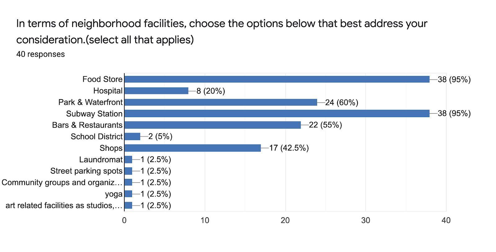
For our surveyors regarding neighborhood facilities, the spread of food stores and subway stations were equally important. A lot of people don’t tend to have cars when they live in bustling areas and so making sure that things are within walking distance was important for them. Parks & waterfront comes second with 24 counts. Having a park nearby is a nice factor for some people because they want to be able to enjoy the greenery past the concrete jungle.
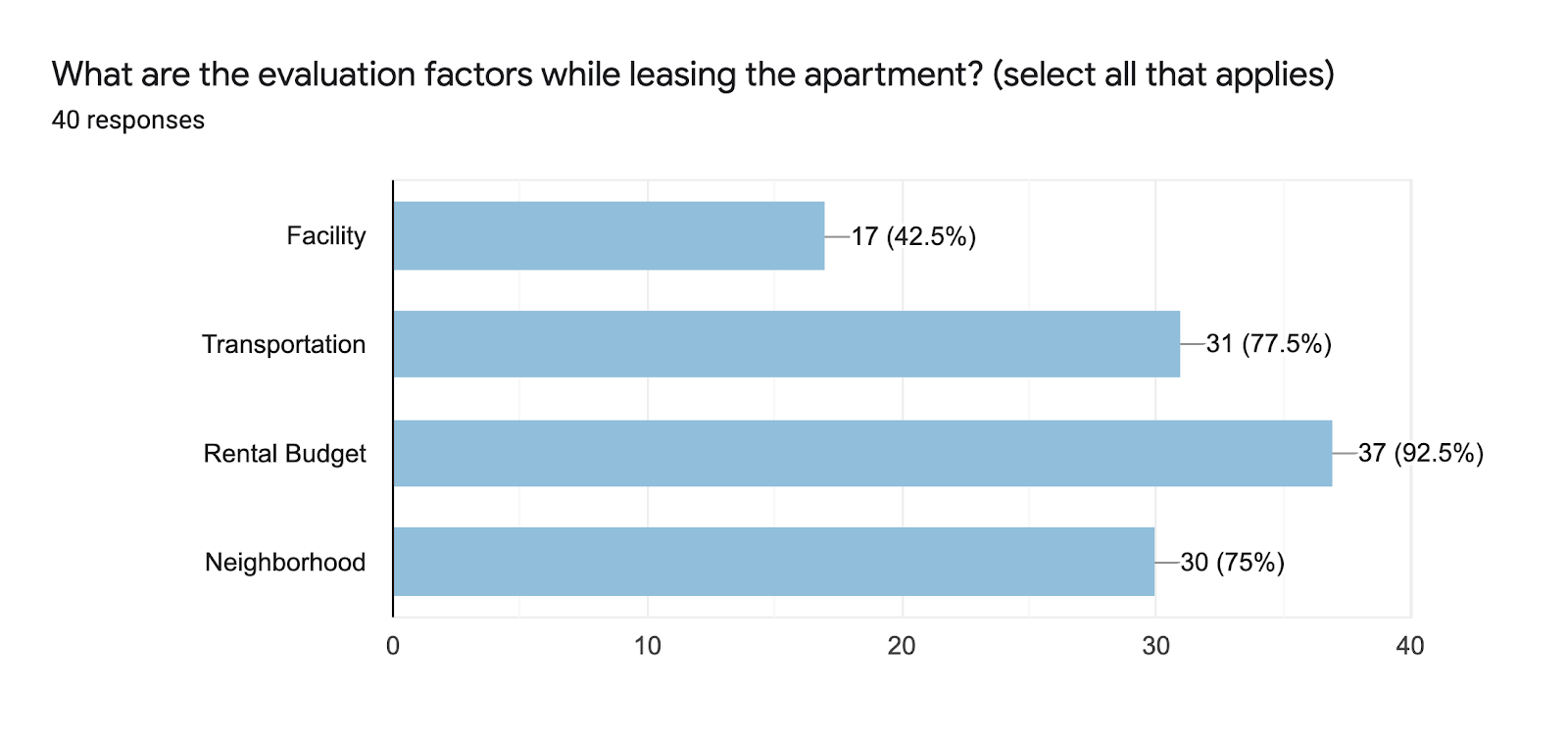
The rental budget was the most important factor for those surveyed. This makes sense, as usually an individual’s major expense is paying for housing. People want to make sure they stick to that budget so they can live within their means.
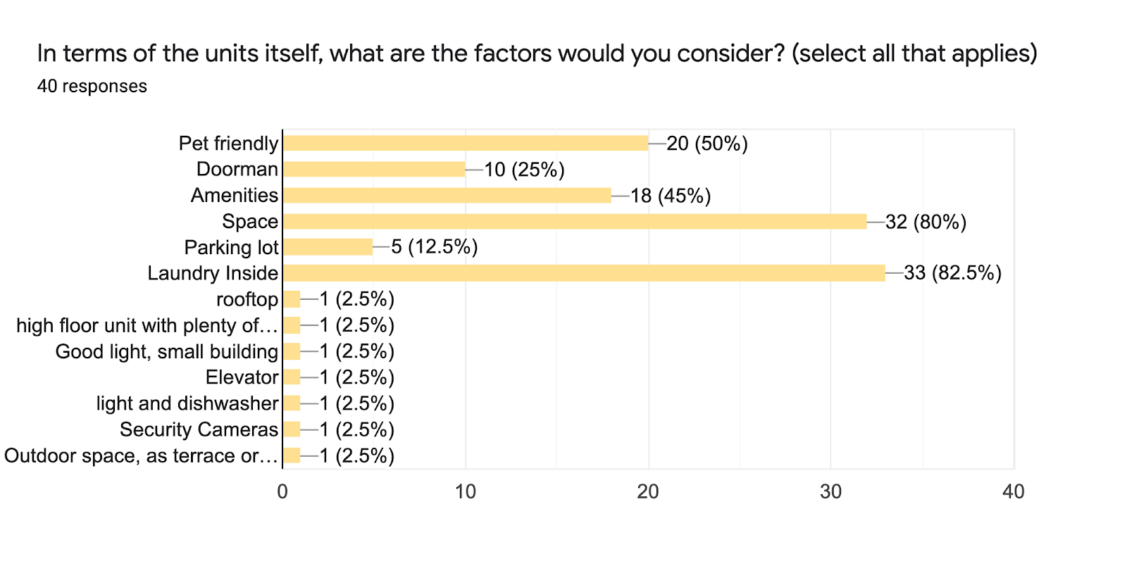
More and more apartments are advertising themselves as having a number of amenities and so we wanted to find out what people really wanted out of those main amenities. Laundry inside the apartment or apartment building was super important to people. Having to lug your laundry outside of the building to a nearby laundromat can be considered a big pain. Following the laundry factor, people want to have a lot of space in the apartment they are renting. Usually there are trade offs here because newer apartments that are large in nice areas can come at a very high price. There are apartments that are older and in less popular areas that are more affordable.
Process/ Methodology
In order to understand the user of this resource guide, we started gathering all the information related to renting an apartment in New York city. Our initial research started with us brainstorming on the factors that one would think about while looking for a place to rent in the city. We used Miro as a collaboration tool during this process. Those factors include but are not limited to the following:
Simultaneously, we were also working on the user journey to understand the process that a user would go through in renting an apartment in New York City. This user journey was created on Figma. This user journey highlights the four stages a user would go through. We also played with the dialogue boxes to showcase the emotions one would have while going through this user journey and to present a realist image of the user.
The user journey map is shown below:

The next step was to find the relevant datasets and decide on the tools to create the final visualizations in. As a group we decided that the kind of representation that we wanted can be created through Carto and Tableau.
Carto is a Software as a Service cloud computing platform that provides GIS, web mapping, and spatial data science tools.
Tableau is a visual analytics platform that helps transform the data to create advanced visualizations.
In order to access the advanced features of Carto, we got the student developer pack from GitHub. We gathered datasets from different sites such as NYC Open Data, New York City website, StreetEasy Reads, etc.
The datasets we used for our visualizations are found below:
- Neighborhood Tabulation Areas (NTAs)
- Borough Boundaries
- 2020 Census Tracts (Clipped to Shoreline)
- Most common ancestry by neighborhood
- Breakdown of NYC rent prices
- NYC Parks
- NYC Subway Stations
- NYPD Complaint Statistics
- NYC Crime Statistics
- NY Retail Food Stores
Color Palette: For this project, we’ve used a diverging color palette from ColorBrewer. Diverging color scales normally have a bright middle value and we wanted to have a color that could easily separate each value from another.
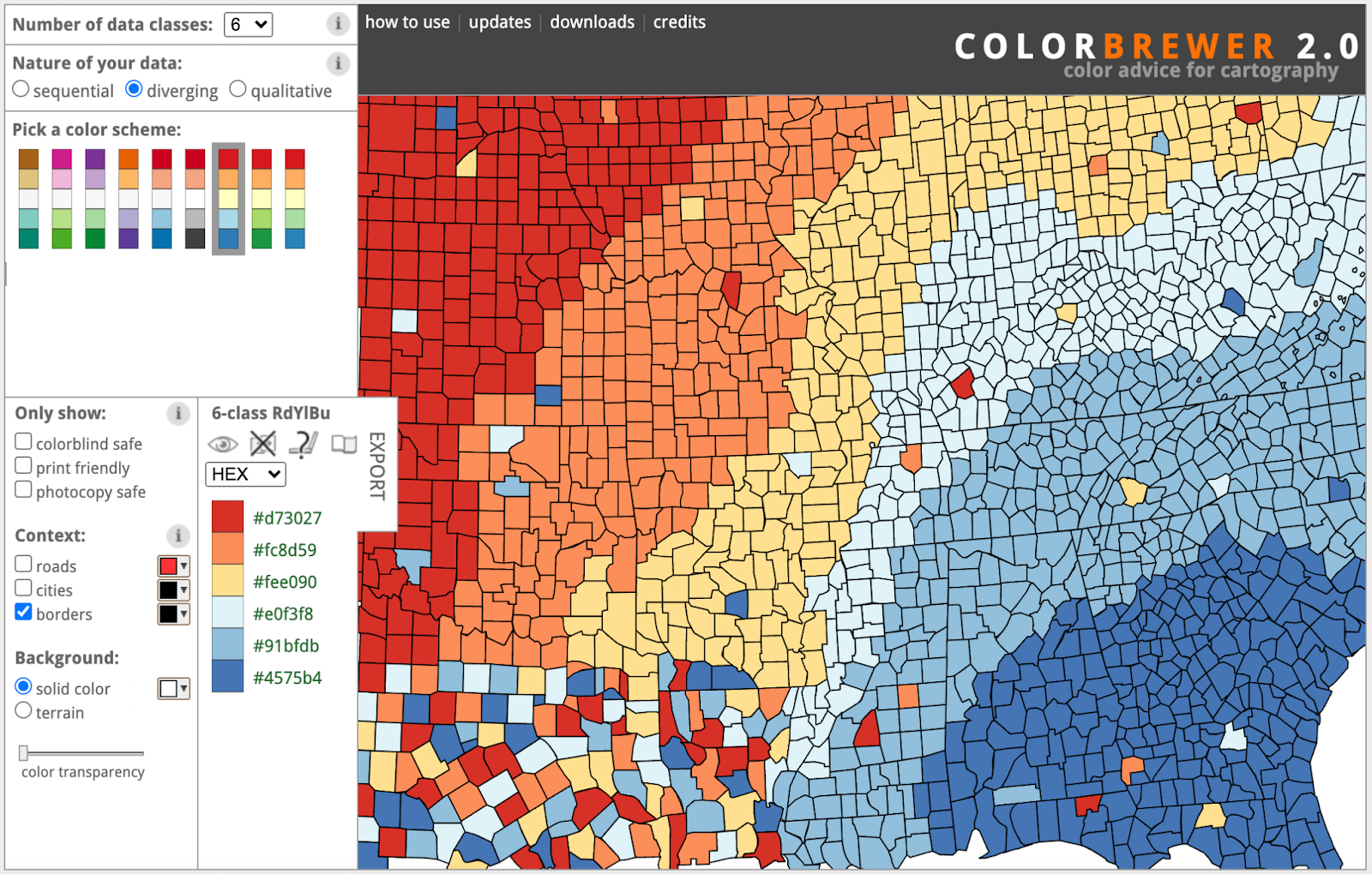
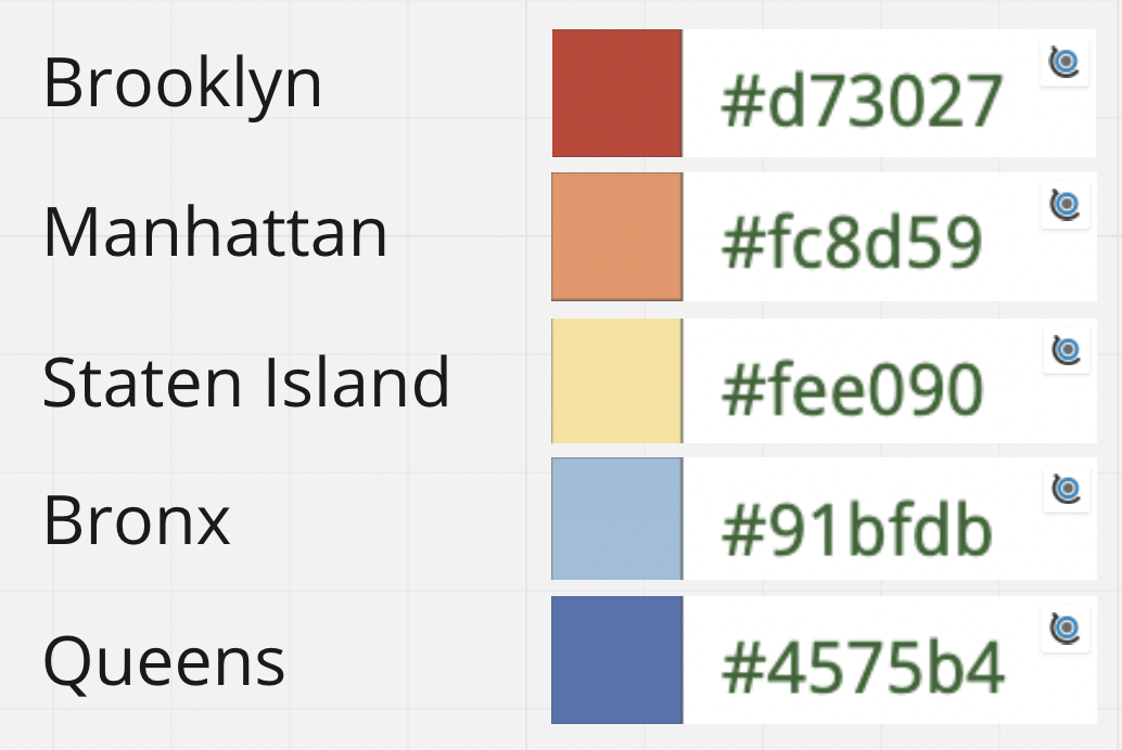
For the purpose of consistency, we assigned colors to each borough which was used throughout different visualizations to maintain consistency and not confuse the user.
Our methodology for each of the visualizations is provided below:
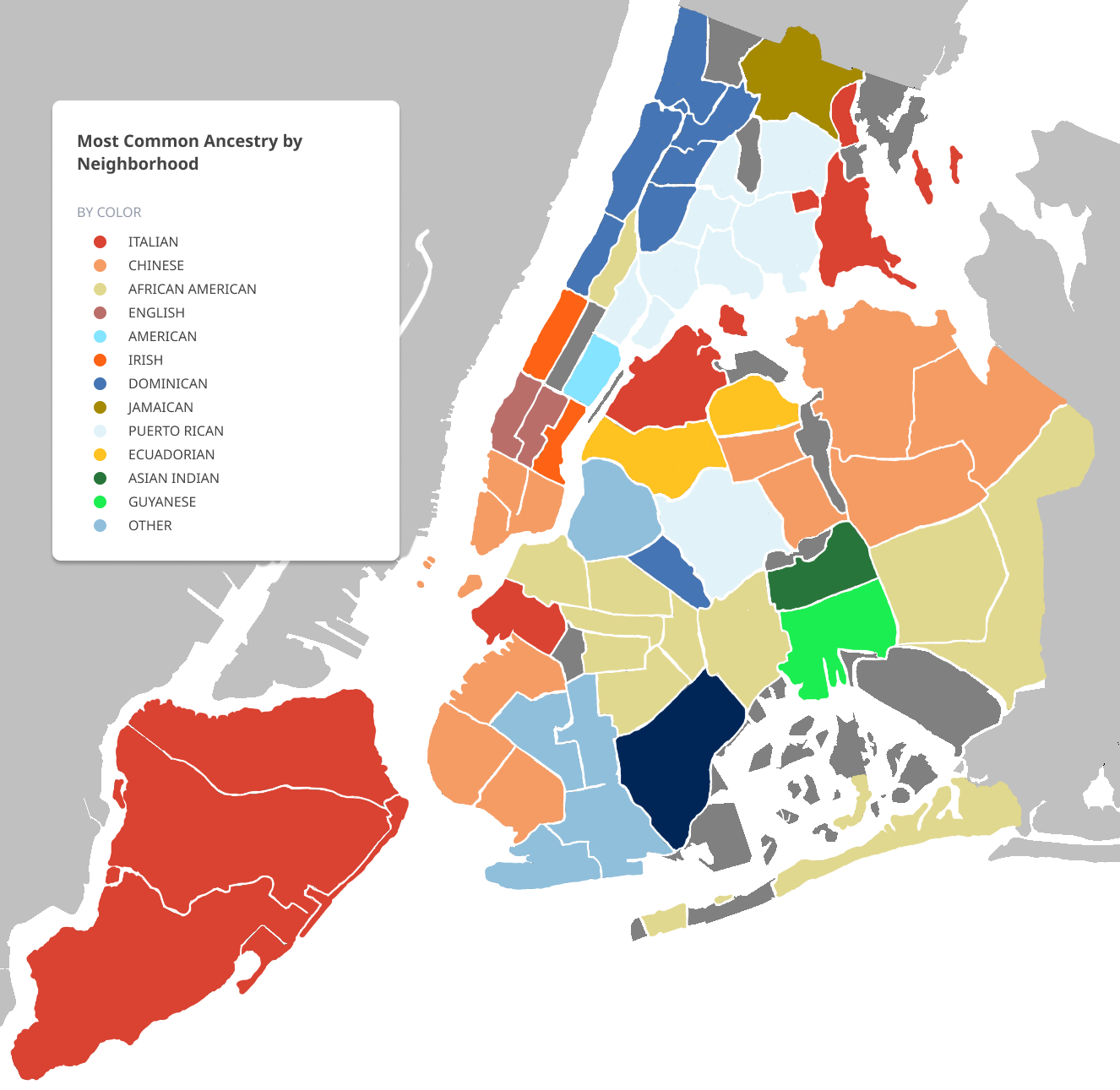
Most common ancestry by neighborhood Map
We were able to get inspiration from an ancestry map we found on a Business Insider article. The map that Business Insider created used data from the American Community Survey. We originally tried to manipulate the different areas on Carto to correspond with the most common ancestries but it was proven to be difficult and not possible at that moment. We still wanted to visualize the different ancestries present and so we had to adjust our plans and think outside of the box to create our ancestry map. The map we created was drawn on top of a grayscale map of different neighborhoods of NYC visible from Google. The app we used to draw on top of the grayscale map is called Procreate. Procreate is a great digital painting app made for the iPad. Each area that had that most common ancestry was colored by hand. The color palette we had decided beforehand was used plus additional variations of the colors in the color palette to ensure everything was cohesive.
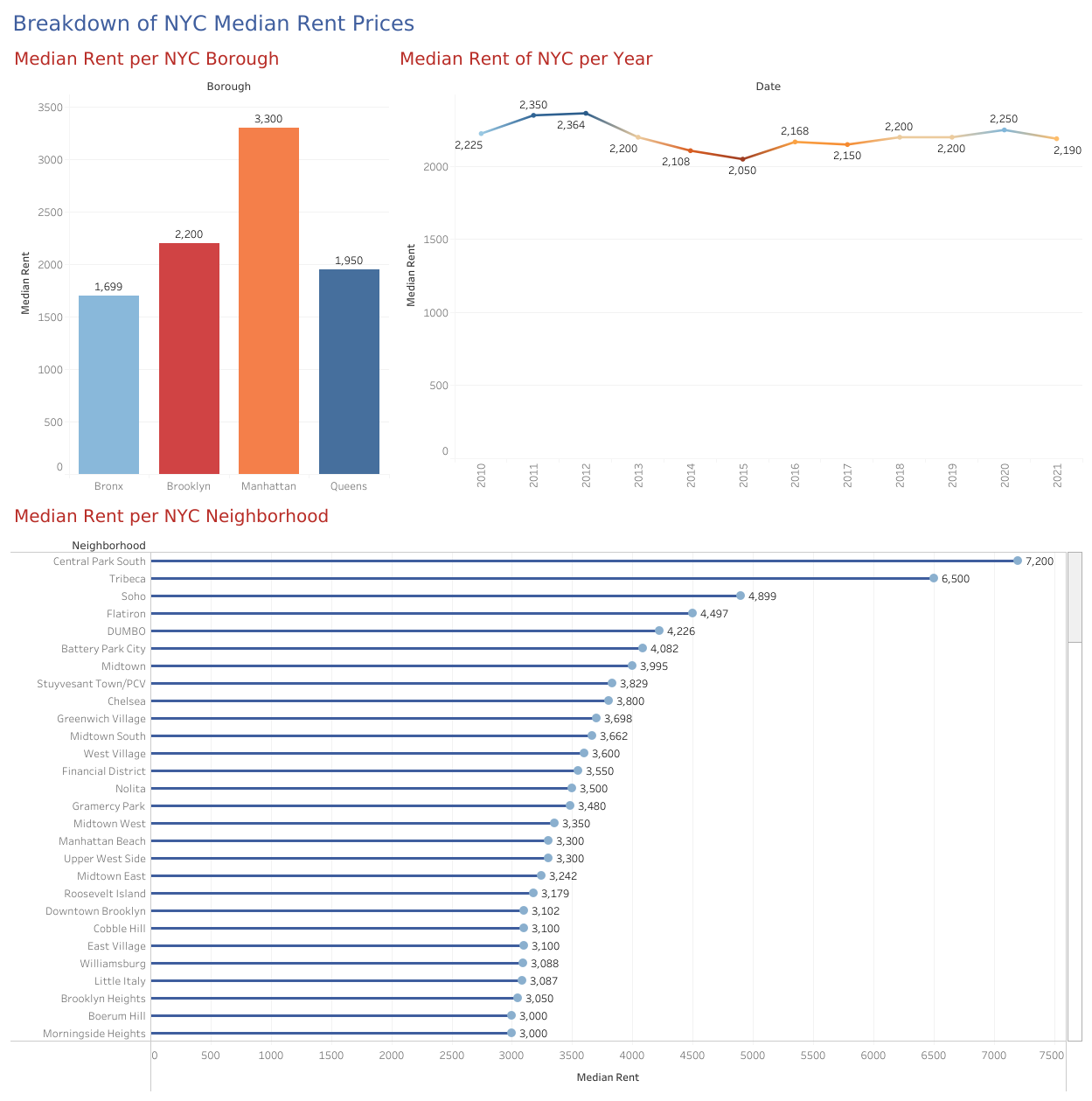
Median rent per NYC Borough, Neighborhood, and year dashboard
The dataset that we found for median rent of NYC was found on StreetEasy. We had to refine this data a bit in OpenRefine before we were able to input it into Tableau. In Tableau we were able to give both a breakdown of the median NYC rent per borough and median rent per individual neighborhood. We wanted to give further information on how NYC median rent has changed overall since 2010 and it seems like there weren’t any unusual findings here. The color palette we used for the Tableau dashboard was consistent with the one that we agreed on before. We made sure to keep the colors assigned to each borough to ensure our charts and maps both correspond to the same thing.
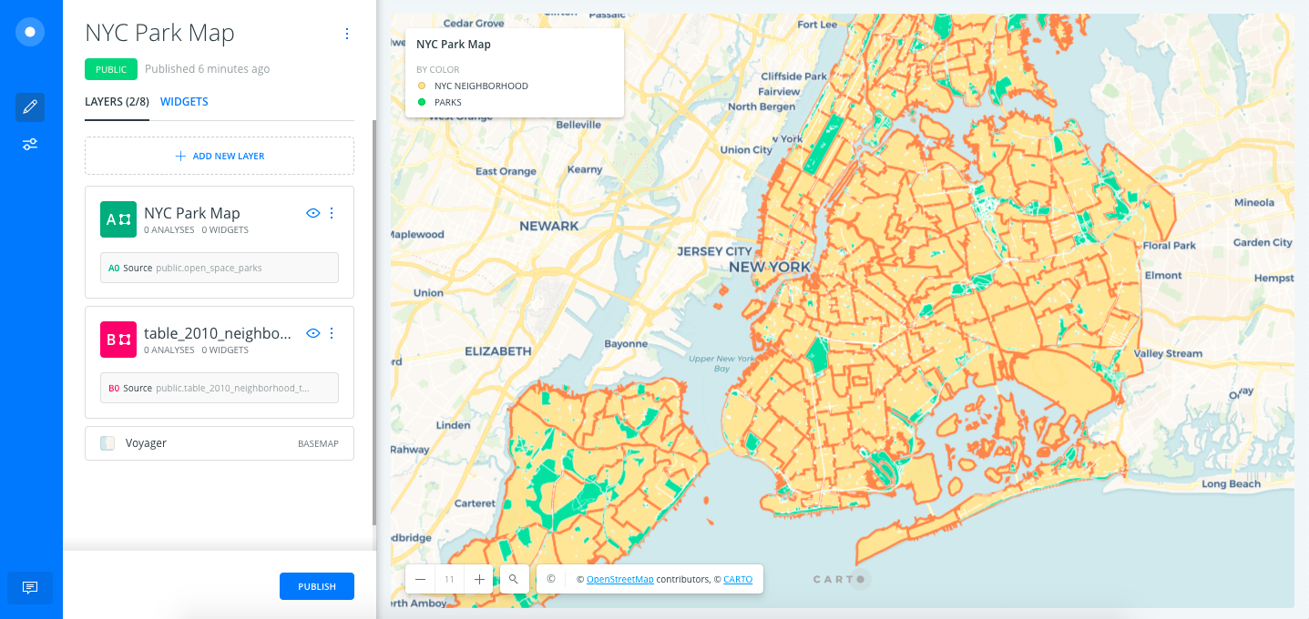
NYC Park Map
Our NYC park map was created using a dataset from Open Data. The dataset was a lovely GeoJSON file we were able to upload directly into Carto, from there we were able to assign colors for land and for the parks. Originally, we were torn by having to stick to the color palette we have previously agreed upon and so the map was colored yellow for land, and red for parks.
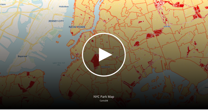
After our presentation, it was evident that we would need to stray away from our color palette a bit and change the parks to a green color. This made a lot more sense for everyone because everyone associates parks with the green color.
NYC Subway Station Map
Two datasets were used to create this map on Carto. The first dataset provided NYC Neighborhoods and borough borders to divide the subway stations according to the area to help people understand and filter it by their requirements. The second dataset was taken from NYC Open Data which highlighted all the subway stations in the city. Both of the datasets were in GeoJSON format which were easily hooked up to Carto.
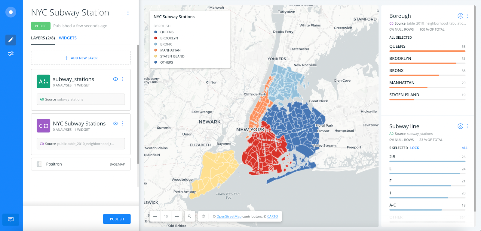
This image shows the two layers used in the map. Like mentioned above, the colors used for each borough remains consistent in all the visualizations.
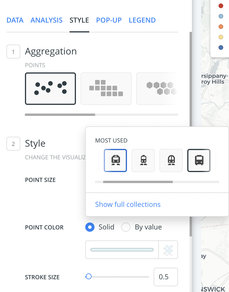
While editing the style of the layer with subway stations, train icons were used to represent subway stations instead of points, squares or hexbins. Using the train icon gave the map a more appropriate feel.
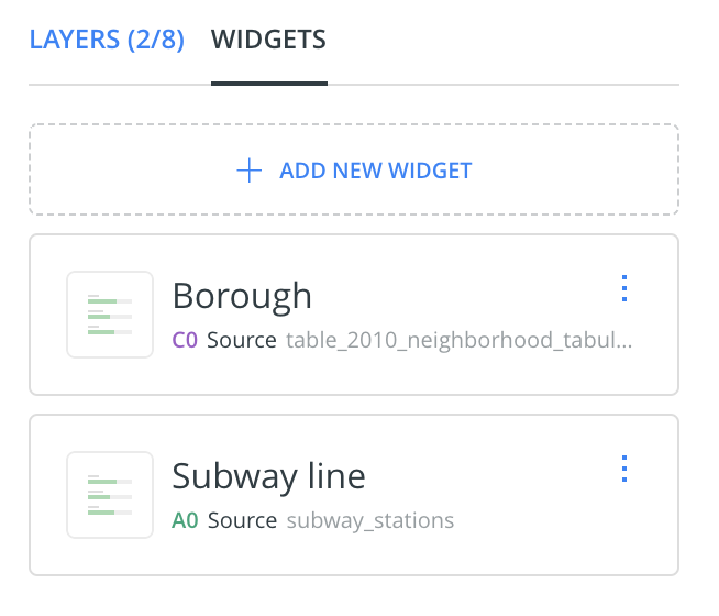
Two widgets were used in creating the final layout of the map. These provide the users to filter the subway stations by boroughs and subway lines.
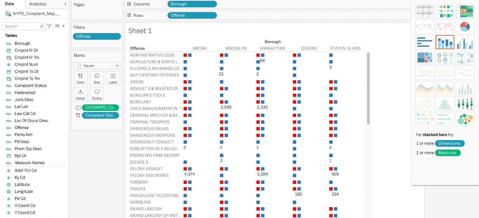
NYPD Complaint Status
Safety is another factor that most people consider while selecting an area, neighborhood or borough to live in. This visualization was created on Tableau and represents the NYPD complaint status of various kinds of offenses in 2021 in the different boroughs. This visualization is completely a part of our research process to understand the crime statistics in the city. This helps people understand the number of complaints filed and how many got resolved.
The dataset used in this table was in csv format.
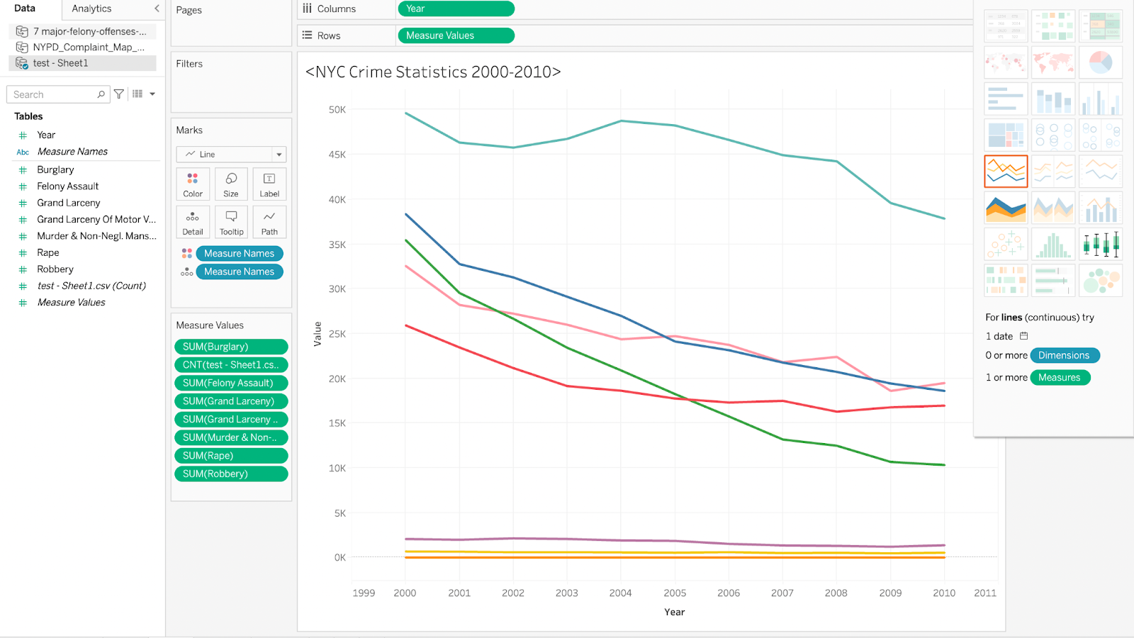
NYC Seven Major Felony Offenses 2000-2010
Just like the above mentioned visualization on NYPD Complaint status, This visualization was created as a part of the study and the research done to create other visualizations. This line graph was created using NYPD’s citywide data on seven major felony offenses. This visualization represents how the number of different offenses have declined during the years 2000 to 2010.
NYPD Complaint Map
Two datasets were used to create this map. The first dataset provided NYC Neighborhoods and borough borders and the second dataset is the same as used in the tableau table showcasing NYPD Complaint status. The difference between this map and the table is the interactivity and filters this map provides. This map gives users an option to select the boroughs with crime complaints, the offenses that took place and what is the status of each complaint.
Initially this was created using a different color palette, but because the colors used to represent each borough were sequential, it created a level of confusion where the users might think that the darker color represents more complaints. To avoid this, we selected a color palette that removes the possibilities of wrong interpretation of our visualizations.
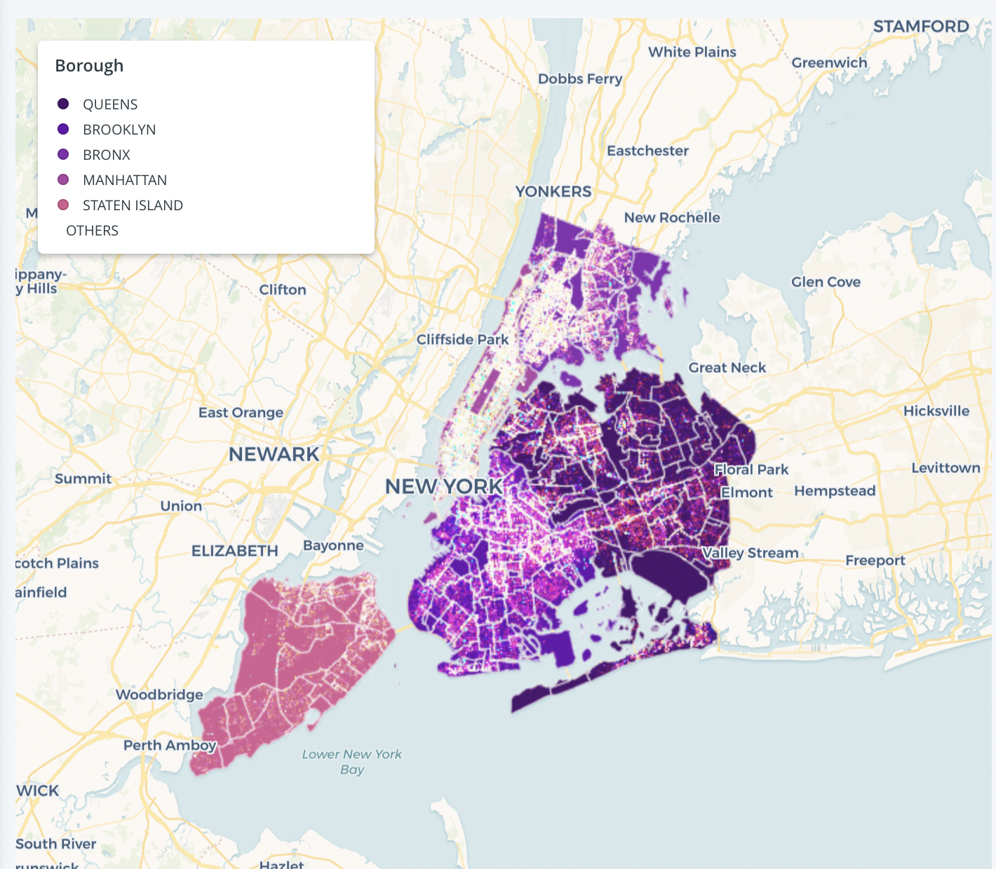
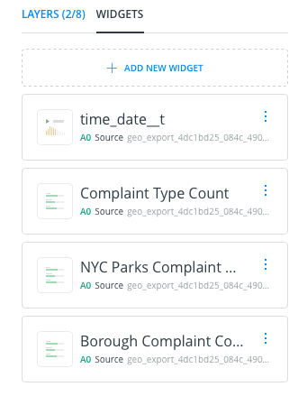
The final map was created using three different widgets as shown below:


NYPD Complaint Animated Map
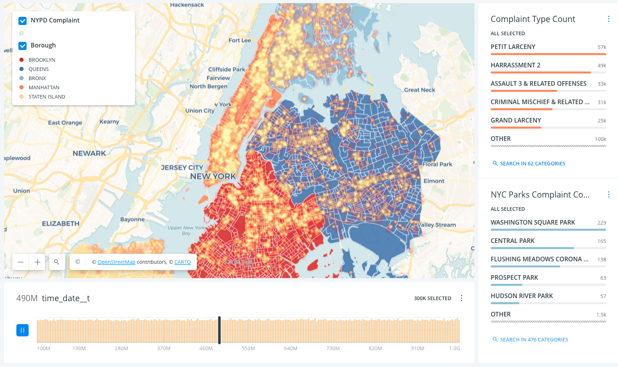
The Data:
The NYPD Complaint Animated Heatmap was created by aggregating two layers of dataset – 2020 Census Tracts (Clipped to Shoreline) GeoJSON file and NYPD Complaint Statistics . The NYPD complaint statistics dataset includes all valid felonies, misdemeanors, and violation crimes reported to the New York City Police Department (NYPD) for all complete quarters so far this year (2021). It allows us to animate the interactive complaint map in a linear order. This enables users to discover the complaint cases in different time periods.

The Tool, Style and Color:
The map was created in Carto, we chose the Voyager basemap theme and Heatmap to style this map because it gives users a thorough scope of complaint density among 5 boroughs within the relative time constraint.
Four widgets were applied to this interactive map so users could filter the complaint type based on boroughs and parks then interact in a more responsive manner. The color scheme was given based on our diverging color palette. The original usability testing was done by using the below maps-static and interactive.


After the usability testing results and feedback gathered from our presentation, we re-edited the map in response to users’ overall experiences. The modification we made is the color of the heatmap clusters. We conducted another round of A/B testing to validate which colored-clusters give a more welcoming experience to general users.
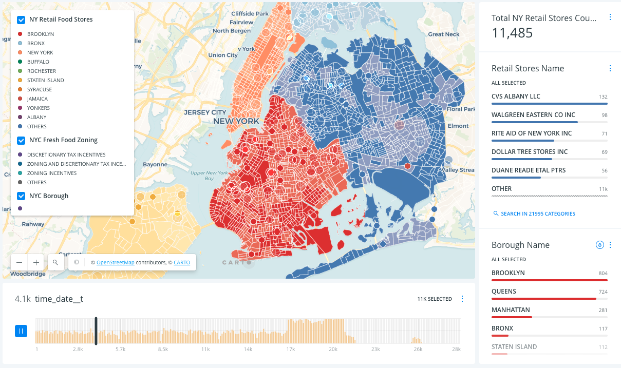
NYC Retail Food Stores Map
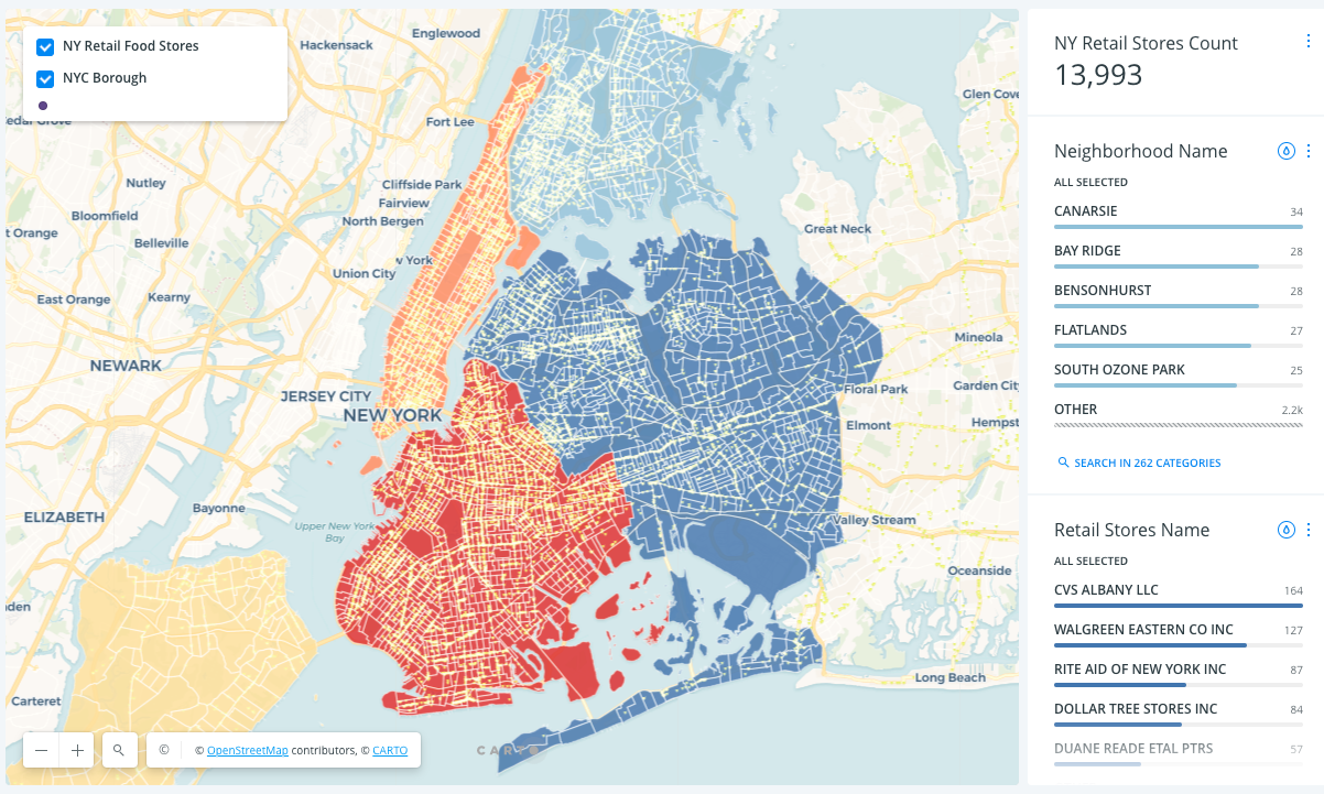
The Data:
Retail Food Stores Map comprises two layers of datasets – 2020 Census Tracts (Clipped to Shoreline) GeoJSON file and NY retail food stores. The interactive map adopted three widgets – NY Retail Food Stores Count, Retail Food Stores Name, and Neighborhood Name which enables users to search for retail food stores by name, neighborhood, and the desired retail food store in total proportion of retail food stores count.


The Tool, Style and Color:
We chose the Voyager basemap and Points aggregation in Carto to style this map. The original design was an animated map, however after receiving feedback from usability testing and peer review, we made a static map instead. We used a shopping cart icon to represent the retail food stores, the further detail color and styling valuables are as below picture.
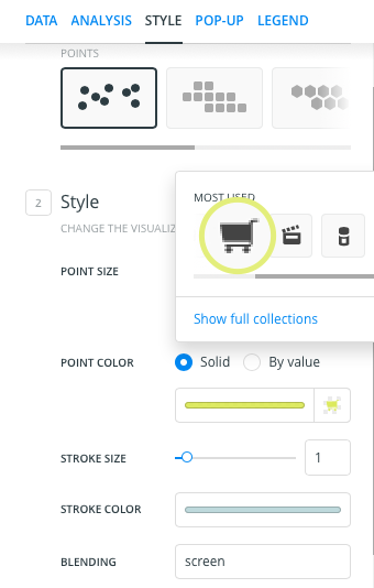
The neon green scale color was applied to represent the retail food stores(shopping cart), we also chose screen blending to create a starry visual effect.
New York City Word Cloud
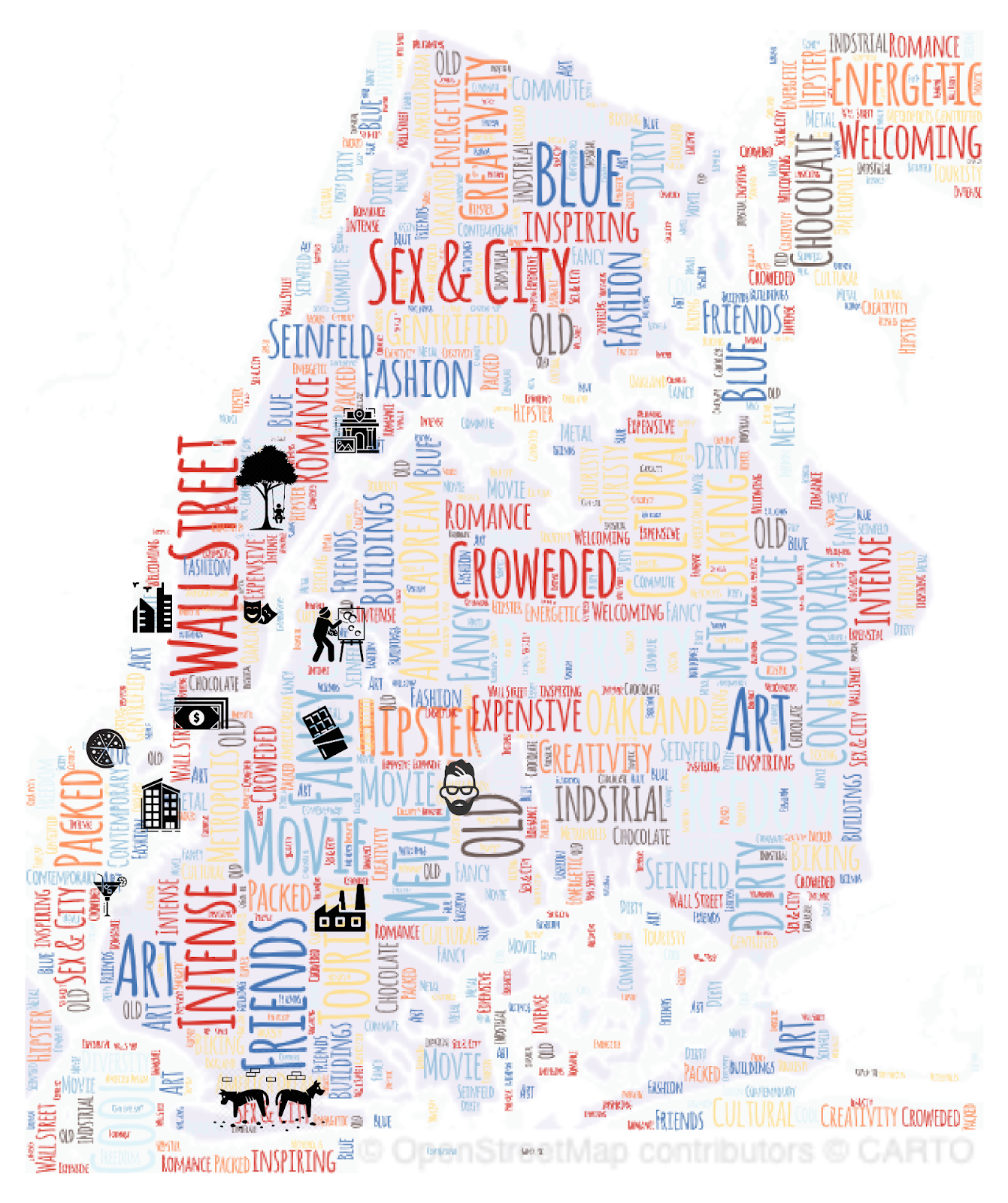
The Data:
Vibe is a valuable consideration from our survey results but it is very challenging to visualize this obscure concept. Without relevant quantitative data we had to be creative in addressing the surveyed group’s voices. After brainstorming, we came to a decision by using a word-cloud to interpret this behind rational numbers’ evaluation point. The user research shows Brooklyn, Manhattan, and Queens are the preferred boroughs to live in. Therefore, we styled the base shape according to the Borough Boundaries dataset.


The Tool, Style and Color:
After generating the borough shape via Carto, we created the word cloud with the help of WORD ART. Abiding by the consistency of our project, we applied the same color scheme to each word automatically. To make the word cloud visually appealing we used Adobe XD to polish the final touch with significant icons.


Findings
Most common ancestry by neighborhood Map
The ancestry map gave the perfect taste for what the most common ancestries are in NYC and where they are located. It is really interesting to see how these communities are living all throughout NYC. We had some ideas as to what the most common ancestries are in certain neighborhoods but this map reinforced our ideas further. What we found out from this visualization is that the most common ancestries in those neighborhoods have remained the most common ones there for years. These various people have established themselves not only by living there but also by bringing in the businesses and livelihood to those areas.
After conducting user research with the ancestry map we created, our users seemed to have the same thought when it came to understanding the map further. Our users had really liked the legend that came with the map but they would have also liked if when they hovered over a certain neighborhood, there would be a tooltip that would let them know what the most common ancestry was, as well as the name of the neighborhood.
Median rent per NYC Borough, Neighborhood, and year dashboard
- We decided to place all the charts in one dashboard for better readability. With the first chart of the median rent per NYC boroughs, we weren’t shocked that Manhattan was the highest in terms of median rent. We were a little surprised to find that Brooklyn’s median rent was almost $1,000 less than Manhattan’s. We were surprised because we all had figured that certain areas in Brooklyn were getting just as expensive to live in as in Manhattan.
For the line chart we created, we thought there would be a lot more fluctuations in the median rent from year to year. Our thoughts were debunked as we noticed that the median rent for all of NYC remained above $2,000. It is also interesting to note that from 2016-2020 it has remained pretty stable and only decreased after 2020 because of major factors like the pandemic that has affected all those living in NYC. Based on this chart, we can predict the median rent to remain above $2,000 for the next decade.
Our last visualization, shows a lollipop chart with a more in-depth breakdown of median rent for each neighborhood in NYC. Again, we knew that a Manhattan neighborhood was going to be up there but we didn’t know exactly which neighborhoods were the most expensive. Central Park South was almost double and triple the median rent for other neighborhoods in NYC.
- When conducting our user research on this dashboard. Our users found the line chart and lollipop chart to be of interest. They didn’t feel like the first bar graph provided enough information for their needs. The line chart was helpful for the users because they were able to spot trends and see how the overall rent on NYC apartments was going to be. The lollipop chart was the one that excited our users the most. One user stated that “I have never seen a breakdown of rent prices for each neighborhood like this. It helps me figure out straight off the bat whether to spend my time looking for an apartment there.” Other users had similar thoughts on this chart as they could make quick decisions as to whether the neighborhood was in their price range or not.
NYC Park Map
- The NYC park map provided a good visual representation of where NYC parks are located throughout the neighborhoods. This is something that was a huge factor that our users considered when searching for NYC apartments. We found, while studying this map, that there are a fair amount of parks spread out all throughout NYC. Most of those parks are mainly smaller but they serve their purpose: A place to go and enjoy the greenery.
- While conducting our user testing, our users found this map to be very useful because some of them were dog owners. Living in a tiny NYC apartment can be both stressful for both the owner and the dog. It was critical that users were able to find out where the nearest parks were around the areas where they were apartment hunting. One user mentioned that they are not super familiar with using Carto and so instructions would be helpful in using the map we had created.
NYC Subway Station Map
- The transportation of New York City is a complex infrastructural system with NYC being the most populous city in the United States. The city also has one of the largest subway systems in the world. That being said, transportation/subway stations were also one of the most important evaluation factors when asked during our research. We found that according to this dataset, Queens has the most number of subway stations but this also highly depends on the area of each borough.
- During our user testing, our users were keen on using the filters to understand how many subway stations are placed in each borough. Selecting the subway lines helped them understand the subway route which they said would be helpful for someone who wants to work and live in different boroughs. One of our users also mentioned that we could have used more elements in this map such as bus stops as they would like to know about other transportation options if they don’t take subways to get around.
NYPD Complaint Map
- Renters have limited options for adding security to their place of living but there are different security measures one can implement and checking the crime rates in the area can be one of them. We found that the NYPD Complaint Map can be really helpful for new renters in the city to understand the number of complaints filed in each borough and gives them an option to filter by the offense and complaint status. This map also gives insights on the following:
1. How Brookyln has the majority of complaints registered
2. Petit Larceny is the most common offense followed by harassment and assault.
This can be really helpful for someone who wants to know about specific offenses to be extra precautious. Example: The offense filter in the map can really help users understand which borough has the most amount of harassment cases and how many of these complaints were resolved or completed.
- Our users mentioned having a description section on the side as the name of the map wasn’t giving much of a reference. Once they understood the purpose, they found it very easy to interact with the map.
NYPD Complaint Animated Map
- From our first A/B testing, users showed more positive feedback on the interactive map. It allowed them to explore and search information that was more relevant to their concerns. They could easily filter the complaint types in different time values, this curated a more comprehensive and welcoming experience compared with a conventional static map that only showed the density of complaint cases. However, they felt the heatmap colored clusters were too grayish. The color was swallowed by the colorful borough shape background, they would have appreciated a brighter color more.
- The second A/B testing was conducted after the final presentation. We made two versions of heatmap colored clusters. Users associated the colored clusters on the left map with complaints more than the right one. However, with the increasing amount of the time input, they found the red clusters were more intimidating while navigating, they were more inclined on using the gold clusters for a longer experience.


NY Retail Food Stores Animated Map
- Participants found it very helpful in quickly receiving the information (location and amount) of their favorite food stores across each neighborhood.
- They found the animated map was interesting, however, it was less relevant when it came to locating the store’s information. Also, the dot’s motion troubled them from clicking on it. They would rather have still dots to hover over than being distracted by those animated ones.
New York City Word Cloud
- Overall, users showed positive feedback on the word cloud map. They thought it was a good way to communicate conceptual ideas with the audience. This helps in translating personal emotion to a more solid public understanding, and also intrigues them to delve into what the general impressions are for those neighborhoods.
- Some users proposed increasing the saturation of the color. They found the color tone was faded and less vibrant.
Recommendations
Most common ancestry by neighborhood Map
Based on our findings and user feedback, we recommend creating a map that is more interactive than static. It is possible to create a map that is interactive in both Carto and Tableau where, when you hover on an area of interest, you can see further details about the area. The way we would do this, is to transcribe the data manually to get a good level of detail. We would have to further manipulate the data so that we can ensure that the most common ancestries are displayed for the corresponding neighborhoods. This would be a bit tricky so more research would have to be done in this area on how to manipulate certain areas when there is already data available.
Median rent per NYC Borough, Neighborhood, and year dashboard
Taking into consideration our findings and user feedback, we recommend taking out the bar graph of NYC boroughs. Our users wanted more specific information when viewing this dashboard and they were able to get that from the lollipop chart we had created. Based on the feedback we received during our presentation, we had also changed the colors of the bar graph to match the colors of the boroughs on the map. In addition, we recommend having a variation of just the lollipop chart of all the NYC neighborhoods because that seemed to be the visualization that the majority of our users wanted to see. Answering to the needs of our users will ensure a pleasant user experience.
NYC Park Map
Based on our findings and user feedback, we recommend to notify users that if they scroll into a particular area on the map, they can view more information about the neighborhood and the name of the park. The best way to communicate this kind of information would be to include it in the legend since it is visible to the user while interacting with the map. These instructions can go above the legend so users can read it first. The map is really powerful and you can see lots of details if communicated properly.
NYC Subway Station Map
Taking in user’s feedback, we propose that we add other kinds of trains that are connected to the city such as Path and add features such as number of bus stops and details on the ferry into the map. Just as we have used train icons to represent subway stations, it would be really effective to use bus and ferry icons while adding that data in the map in order to maintain consistency.
NYPD Complaint Map
Based on the feedback we received from the users, our recommendation would be to add another section which can help renters understand the relevance of this complaint map in accordance with the safety of an area. This section can also give an overview of the map first because this map can also be used by someone who just wants to know about the number of complaints in each borough or the number of completed complaints. For example, someone from the government who is looking at the statistics to take next measures and not just someone who is looking at the safety of an area to rent out an apartment.
NYPD Complaint Animation Map
For a more customized experience, we suggest an interactive map with time values instead of a static map, this is based on the first round of A/B testing results.
After gathering opinions from our usability testing and final peer review, we propose changing the heatmap colored clusters to a more distinctive yet welcoming color palette. The modification is to enhance users’ viewing experience.
NY Retail Food Stores Animated Map
According to the findings from our usability testing, we recommend a static map over animated one, to make sure users are focusing on the search variables and process.
New York City Word Cloud
Taking users’ responses into consideration, we suggest increasing the saturation of the color on the word cloud.
Reflection
Working on this project proved to be challenging but fun. The challenging part was making sure we had enough datasets and ideas for visualizations to create based on those datasets. Our original idea was to create a resource for dog owners. We realized quickly that we wouldn’t be able to create anything substantial that would qualify as a final project.
Once we came across an idea, we were able to bounce other ideas off of each other and continue building a nice user journey of resource visualizations. Our idea was going to help people going through a major problem when searching for a NYC apartment. Shih Wen and Mishi both had firsthand experience in searching for a NYC apartment before coming to school. They didn’t have a resource like this to be able to refer to and to be able to make decisions off of. Making a resource that took into consideration the needs of our users would prove to be very helpful.
While working on our project, we often had previous misconceptions about where we thought people wanted to live and what the most important factors were for them in searching for an apartment. Thankfully, we were able to clear up our misconceptions by talking to our users as well as receive answers from the survey we created. This notion where our thoughts didn’t align with that of a user reinforced the idea that we should constantly be doing user research no matter if we are the user or not. Being able to conduct user research can get a sense of what our users are thinking and even get ideas from them on what we can do better.
We wish to get more datasets in a few of the factors we covered like transportation that can support the research even more. We would also like to collaborate further with our users to get more insights into this topic in order to create a fully rounded and intuitive guide.
For future directions, we would be thrilled if we could have all the visualizations we created in one place, fully interactive. A huge part in gaining information from our visualizations is by getting to interact with them. A dashboard that supports all the softwares we used with embed features would be ideal.
Sources
2010 neighborhood tabulation areas (ntas). NYC Open Data. (n.d.). Retrieved December 19, 2021, from https://data.cityofnewyork.us/City-Government/2010-Neighborhood-Tabulation-Areas-NTAs-/cpf4-rkhq
Alex. (2016, July 25). Ethnic neighborhoods in NYC by World Region. Vivid Maps. Retrieved December 19, 2021, from https://vividmaps.com/ethnic-neighborhoods-in-nyc-by-world/
Borough boundaries. NYC Open Data. (n.d.). Retrieved December 19, 2021, from https://data.cityofnewyork.us/City-Government/Borough-Boundaries/tqmj-j8zm
Chase. (2015, December 9). What percentage of their income do people spend on rent in each county? Overflow Data. Retrieved December 19, 2021, from https://overflow.solutions/demographic-data/national-data/county-level-analysis/what-percentage-of-their-income-do-people-spend-on-rent-in-each-county/
Citywide crime statistics. City Wide Crime Stats – NYPD. (n.d.). Retrieved December 19, 2021, from https://www1.nyc.gov/site/nypd/stats/crime-statistics/citywide-crime-stats.page
Income inequality in America varies dramatically by state: Express Digest. Express Digest | News, Culture & Society. (2018, September 27). Retrieved December 19, 2021, from https://expressdigest.com/income-inequality-in-america-varies-dramatically-by-state/
Kiersz, A. (2014, September 5). Here’s the most common ancestry in each NYC neighborhood. Business Insider. Retrieved December 19, 2021, from https://www.businessinsider.com/nyc-ancestry-map-2014-9
Mulbrandon, C. (2016, March 4). Inequality in New York City 2009. Visualizing Economics. Retrieved December 19, 2021, from https://www.visualizingeconomics.com/blog/2012/11/4/inequality-in-new-york-city
New York City median renter income continued its upward trend. NYU Furman Center. (n.d.). Retrieved December 19, 2021, from https://furmancenter.org/thestoop/entry/new-york-city-median-renter-income-continued-its-upward-trend
New York State Department of Agriculture and Markets. (2021, September 3). Retail Food Stores: State of New York. Retail Food Stores | State of New York. Retrieved December 19, 2021, from https://data.ny.gov/Economic-Development/Retail-Food-Stores/9a8c-vfzj
NYPD complaint map (year to date). NYC Open Data. (n.d.). Retrieved December 19, 2021, from https://data.cityofnewyork.us/Public-Safety/NYPD-Complaint-Map-Year-to-Date-/2fra-mtpn
Open space (parks). NYC Open Data. (n.d.). Retrieved December 19, 2021, from https://data.cityofnewyork.us/Recreation/Open-Space-Parks-/g84h-jbjm
Routley, N. (2019, March 12). Visualizing American Income Levels by age group. Visual Capitalist. Retrieved December 19, 2021, from https://www.visualcapitalist.com/american-income-levels-by-age-group/
Streeteasy Data Dashboard: StreetEasy. StreetEasy Blog. (2021, December 10). Retrieved December 19, 2021, from https://streeteasy.com/blog/data-dashboard/
Subway stations. NYC Open Data. (n.d.). Retrieved December 19, 2021, from https://data.cityofnewyork.us/Transportation/Subway-Stations/arq3-7z49
Template of data visualization on the world map. Dribbble. (n.d.). Retrieved December 19, 2021, from https://dribbble.com/shots/14671542-Template-of-data-visualization-on-the-world-map