Transforming Designers – A Review

I attended a panel discussion called Transforming Designers – Not Just Another Working Day. The idea behind the event was to reflect on how the role of designers is changing in modern contexts since designers are no longer limited to their studios and a wide range of organizations are now developing their in-house design teams. The event was part of a series organized in collaboration between the Service Design Drinks Milan and NYC Service Design Collective which are groups of volunteers who bring together service design academics, professionals and enthusiasts. 

The event was hosted at Foursquare.

I had two big reasons why I was drawn to this event. Firstly, I decided to pursue graduate school in the field of design because I believed that public service delivery in my home country of Pakistan needed to be improved through the principles of human-centered service design. So I was curious to hear how service design had fared in the US especially in the public service domain. Secondly, since having started graduate school, I had begun to study the emerging issues of science, technology and society, such as issues of algorithmic bias, surveillance capitalism and digital labour. I had also recently attended a talk on AIGA’s Design Futures project which proposed the idea of ‘environment-centered design’ which is design driven by core values for good. I was pondering over whether these discussions that were happening in academia also resonated with the industry and whether they influenced the professional designers.

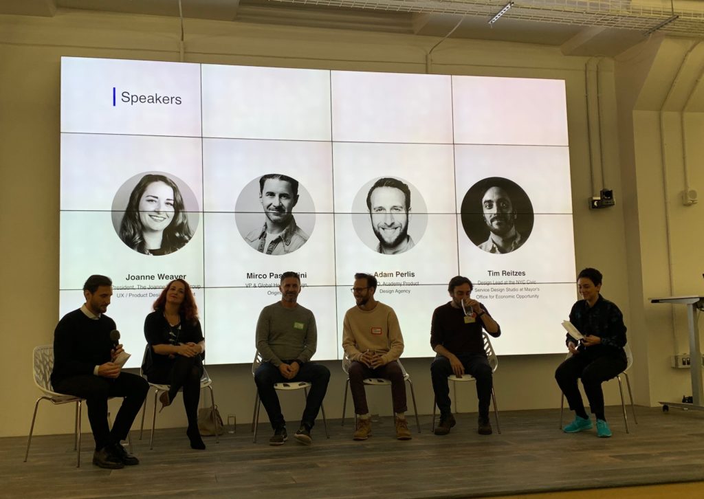
The panelists for the event were:

Joanne Weaver

President, The Joanne Weaver Group – UX / Product Design Recruitment

www.linkedin.com/in/joanneweaver

Adam Perlis

CEO, Academy Product Design Agency

www.linkedin.com/in/adamperlis

Mirco Pasqualini

VP & Global Head of Design, Originate

www.linkedin.com/in/mircopasqualini

Tim Reitzes

Design Lead at the NYC Civic Service Design Studio at Mayor’s Office for Economic Opportunity

www.linkedin.com/in/tim-reitzes-78810139

The panel discussion begins

The discussion followed five main topics which the panelists addressed one by one.

Are designers leading?

The major consensus was that up until a few years ago designers would get pushed around by product and engineering but in the last few years however this has changed a lot in the last few years. Designers are increasingly being seen as change-makers and ‘internal consultants’. Firms have identified the value of their insight. Senior designers are now applying their concepts of design to the designing of organizations and processes. However, on the public administration end this is still harder to do because of bureaucratic red tape. The takeaway was that designers need to identify the value they can create beyond their skills of design and drive this change themselves. 

Given the new roles of designers, what new design skills or areas of study are emerging?

“Design Strategist” is becoming a popular position that companies are hiring for. What they are looking for is basically a hybrid of UX researcher, digital strategist and information architect. A good reflection of this trend is that even McKinsey and Company are hiring for this position in their consulting teams. Voice Experience (VX) design is another upcoming skillset and position as voice interface and assistants become popular.

“Co-creation” is also a skill that’s being sought after, especially in the public service domain. All the panelists emphasized how valuable it is for a designer to know how to manage a co-creation process and how difficult it is to pull off. Adam Perlis gave the example of his company’s approach of trying to “be in bed” with the clients by working in their offices, pairing up with actual employees and shadowing and sharing the actual work. Tim Reitzes talked about the difficulties of convincing public service stakeholders of the value of co-creation.

Another point under discussion was that its a challenge for designers to apply for these new roles because of their legacy job titles. There was some consideration that designers should just give themselves the title they want based on the actual work they are doing. Joanne Weaver being the recruitment expert here suggested that designers can add subtitles to their resume but the actual title should remain the official one.

How do you measure the value of design?

All of the panelists agreed that this is a difficult question to answer in most circumstances. It’s the “white whale” of design, everyone is looking for the right answer but no one has figured it out. However, the general agreement was that KPIs are important and they should be chosen on a case-by-case basis. Some additional metrics may also be needed such as ‘how many opportunities did you create as a designer?’ or ‘how many minds did you open?’ with the focus being capturing the impact the designer has had.

Data & creativity – which drives what?

This is where I was most surprised by the position of the panelists. The question was in your design process, do you first start with your creativity and come up with some out-of-the-box concepts and then validate them using data or do you first use the data to find the biggest problems and then use your creativity to solve them? I expected the panelists to say that it’s a bit of both but they had a consensus that it was important to start with the data first. This is the most efficient or cost-effective way.

What is the role of ethics in design today?

All of the panelists agreed that it’s become very important for designers to understand and be aware of the ethical implications of the products they design. The panelists highlighted how technology is influencing our social fabric, there are dark UX patterns everywhere and attention is the new currency. The panelists urged designers to think and list out all possible unintended consequences of their design decisions and the long term sustainability of the solution. Adam Perlis made a point that often clients may push you away from fairness and transparency and that becomes a very difficult space to manage.

It was exciting to hear that the role of designers is expanding into areas of strategy and leadership. There was a palpable excitement in the room full of designers about the future of products with designers on the decision making table. It’s also quite empowering that the nature of this expansion of the role of designers largely lies in their own hands. Apart from that, it was also encouraging to find out that the industry professionals were also eager to think critically about the impact technology is having on our society and they acknowledged the severity of the major issues which need to be addressed.

Why more people should be critical of WhatsApp

One of the theses presented in the Pew Research Center’s report on the Future of the Internet is that by 2025 the Internet will become “invisible” and we will no longer think about “going online”. One clear example of how that has already happened is that of WhatsApp and how widely common it has become in Pakistan. Its ubiquity combined with the advent of 4G network coverage means people now expect to be instantly connected on WhatsApp and there’s no more “going online” as it runs in the background. Is this a good thing for everyone? For this field research, I tried to find people who have actively avoided using WhatsApp in order to understand if it can have any negative effects on its users. The findings show that some people have serious concerns with using WhatsApp but it has become increasingly difficult for them to avoid using it. The conclusion is that it’s important to be critical of the role WhatsApp plays in our public and private conversations.

This research involved four semi-structured interviews. All participants are current students or alumni of my former school. Participants were recruited through a social media group and shortlisted on the criteria that they must be smartphone users and they must have actively deleted or uninstalled WhatsApp from their phones. The goal for this research was to find answers to the following questions:

  • Are there people who have deleted their WhatsApp accounts? What were the reasons that drove them to this point?
  • What was it like for them to quit WhatsApp? What challenges did they face? How did they deal with those challenges?
  • Did they go back to using WhatsApp? Why or why not?

The common reason why all four of my participants had deleted their WhatsApp accounts was because they didn’t want to be “accessible”. They felt that as long as they were active on WhatsApp, they were considered “always available for a chat”. However, the reasons for seeking a break from this constant availability varied according to each person’s context. One of the participants shared that she was struggling with social pressure and anxiety and in all of this WhatsApp became one of the triggers for her panic attacks. She could see a direct correlation between how anxious she felt and whether or not she was using WhatsApp. On the other hand, another participant felt that keeping up with the conversations on WhatsApp took away too much time from her. This manifested in the form of never having time left for her non-work interests and prevented her from finding the right work-life balance ultimately leading to resentment and stress.

“…I just don’t like being that accessible. Unread messages bother me, I have to reply immediately, otherwise I start feeling terrible…its just something that never ends” – M, one of the participants of this study

Despite having such serious concerns with using WhatsApp, none of the participants have been able to stay away from it for too long. In fact, all four of them now have a sporadic on-and-off relationship with WhatsApp wherein they uninstall it from their phones every few months and then eventually ending up coming back. This is primarily because it’s just become prevalent and necessary in professional settings. One of the participants detailed an incident when she was on her longest hiatus from WhatsApp for around three months but she had to make her account again because one of her professors was using it to communicate with her class! Another participant stated that it was needed to communicate with their international team at work. When asked why their team could not use any other tool for this communication, they said the culture of using WhatsApp was already built into their organization and it just wasn’t possible to convince everyone to stop using it. 

All of the participants also talked about how they were pressured into coming back to WhatsApp by their family and friends. WhatsApp becomes the default place where people coordinate their social engagements and share links, files and photos with each other. Even though the participants tried to convert their connections to other solutions like Telegram which is a similar but less common app or websites like FileBin or Google Drive for file sharing or simply going back to email, these were not long-lasting solutions. Other people did not consider the ramifications of using WhatsApp serious enough to convert to these solutions. Consequently, the participants felt a difficult trade-off between their own privacy and peace of mind and keeping in touch with their social connections. 

Nearing the end of the discussion, I asked each participant to think about what they would change in WhatsApp to make it easier to use for themselves. This led to some interesting ideas for potential features. The justification for each feature reflects the kind of problems the participants faced and underpins our conversation on the limitations of the app. Some of the most interesting feature ideas are listed below:

  1. “Ghost mode” – Travel through the app like a ghost so that you can peacefully access all of your conversations, media and documents which are saved on the app but no one should be able to see you online or message you;
  2. Archive forever – Archive a conversation or a group forever which means you will not see them in your immediate chat list but the person or the group on the other end will not know that you have archived them;
  3. One-on-one – Conversations work more like real life so, for instance, users are only able to send one text at a time and have to wait for the other person to respond before they can say something again;
  4. Chat requests – People have to send you a request if they want to be able to chat with you on WhatsApp, they can’t automatically message you when they have your number and you have the power to turn off requests.

This report highlights how the widespread use of WhatsApp and the way it is designed can negatively influence some of its users and contribute to anxiety and stress in their lives. It is, therefore, important that we adopt a critical view of using WhatsApp, becoming aware of its drawbacks, seeking people’s consent before we engage them on it and carefully considering whether it is the best platform for our next public or private conversation.

Design is Storytelling

Person: Ellen Lupton

The person for this post is Ellen Lupton. She is a graphic designer, author and curator and is currently working as the curator of contemporary design at Cooper-Hewitt, National Design Museum in New York City. Her book Design Is Storytelling truly inspired me. Through this book Lupton uses real world examples inspired by fictional characters to depict how designers can harness the power of storytelling to create memorable experiences. I never really thought of designing as a way of telling stories. Even as a User Experience Designer, I believed that my job was to design interfaces that are intuitive and easy. “Good design is invisible”— was a motto I lived by until I came across Design is Storytelling. 

The first thing that caught my eye in the book was the phenomenology of paths. Lupton mentions various examples about how our eyes keep searching for a path (A google search for a forest will give you various results of  forests with some kind of path leading to somewhere). Another concept she talks about in her book is a Hero Story. A Hero Story is a tale about a protagonist (could be a person or a thing) that gets a call to adventure from the ordinary world to enter a new world, experiences hurdles, learns something new and then returns to the ordinary world.  Even rudimentary tasks like buying groceries or going for a jog involves a hero story and everyone desires it . A hero story creates delight. The way we design an interface or a space like organising the home page for a website or curating an exhibition can invoke a hero story for people who interact with it. Combining the two concepts here, as designers who create paths for people to navigate, to what degree do we provide infinite paths or to what degree do we limit them? Finding the right balance based on context such that it doesn’t affect the user’s hero story is how we become good designers. 

The third and most intriguing concept she talks about is that products can also have character. A product’s character could be centered around gender or age or profession and designers should use it to their advantage. For example when we think of Amazon, we associate it with quick delivery or Spirit airlines with cheap but awful flight experience. Similarly all products have some adjective associated with it and these adjectives make up their character. My favorite  aspect of reading this book was its pictorial nature. Even though the book is filled with illustrations, they are not random and meaningless. Each illustration relates to a theme Lupton tries to highlight. They all tell a story. Lupton through her book Design Is Storytelling taught me that good design is not invisible. As designers we must create products that take the user on a journey, provide them with a hero story such that their experience is memorable. Even a bad design is better than an ambiguous design. Therefore we should strive to create good experiences that are memorable.

Place : New York City Subway

Lupton’s Hero Story inspired me to select a place that resonated with this idea. That is why I chose  the NYC subway. Since I’m new to the city, traversing the subway system has been ,for the most part, a memorable experience. Even with the release of the MTA app to help you create your schedule based on the train timings, the subway has never ceased to surprise me and take me on an emotional journey. 

Atlantic Avenue Barclays Center
Atlantic Avenue Barclays Center Station

Last week my brother invited me to cook some traditional malayali food since I’ve been craving home food for a really long time. So I agreed to meet him at 11:00 am so that we’d finish cooking right on time for lunch. I checked the MTA app to see how long my commute would be and what transfers I would have to take and prepared myself to leave. As soon as I reached the station, I realised I did not have balance on my metrocard. When I tried to recharge, the metrocard recharge machine was only accepting cash in denominations of $20 or less and I had a $50 on me. I ran to a Deli store nearby to get change and finally managed to refill my metrocard but by the time I reached the platform, the train I wanted to take had left and the next one was scheduled to come in 12 minutes. This frustrated me. My next hurdle was transferring at Atlantic Avenue Barclays Center Station. I had not realised how extensive the station was and anticipated navigating through it would be difficult. On the contrary the signboards were very clear and I found my platform in less than a minute. My train immediately arrived and I was delighted by how easy that experience was. In a way I felt like a hero. Another aspect of the NYC subway that always catches my eye is the artwork at various stations. It’s also something that people keep talking about. As a matter of fact, I know people who use it to navigate. When my brother was giving me directions to his apartment, he told me to take the exit close to the mosaic of a woman in a saree. 

2nd Avenue Subway, 72nd Street Station
Exit close to the woman in a saree

The NYC subway is a great example for a good design system. Just as Lupton mentions in her book, the NYC subway system enables its commuters to create memorable experiences by taking them on an emotional journey. It helps them navigate to the path of their desire as well as provide them with a hero story. 

Thing: Nintendo Switch

For my Thing, I chose the Nintendo Switch. The Switch is both a handheld and a home console with exceptional graphics for its size and motion controls to elevate your gaming experience. The reason I love the Switch is because of how simple and interactive it is. The Switch was the first gaming console I used and even as a novice, it was extremely easy to navigate. My favourite part of the Switch are the Joy-Cons. Everytime I attach the Joy-Cons to the grip it produces a click sound which is very satisfying. As a matter of fact, the animation for the Nintendo Switch logo includes the click. In Lupton’s book, Design is Storytelling she talks about how products have character. The click sound is the character for the Nintendo Switch. Every action you perform on the Switch includes the click. 

Another thing I love about the Switch is how easily navigable the homepage is. The first thing you see are the games you have on your system below which are the menu items. The icons designed for the Switch, according to me, are well researched because even without reading the labels you can still understand what they try to convey. 

Switch homepage

The Switch includes a touch-screen interface and Joy-Cons with inbuilt gyroscopes, IR sensors and motors which create a rumble effect while playing games. The first few games I played on the Switch were Super Mario Odyssey and Okami HD, both of which used the motion detection and the rumble features. I love the rumble effect because it never ceases to amuse me. It was designed to induce delight

Nintendo Switch

Design is about creating memorable experiences and the design for the Nintendo Switch is exactly that. It caters to both seasoned gamers as well as amateurs like me. I tried using other gaming consoles like the PS4 but the interface was overwhelming. Nintendo’s user base is vast and to create something that accommodates them all is an exceptional feat. The Switch’s interface does not look extraordinary nor is it overloaded with features. What makes the Switch beautiful is that even though its design is intuitive and simple it’s not invisible and that’s the reason I chose the Nintendo Switch as my Thing. 

References

Ellen Lupton, (2017) Design is Storytelling published by Cooper Hewitt, Smithsonian Design Museum; 1 edition.

Ellen Lupton, <http://elupton.com/>

The Nintendo Switch Is the Future of Gadget Design,<https://www.wired.com/story/nintendo-switch-review/>

Nintendo Switch Technical Specifications, <https://www.nintendo.com/switch/tech-specs/>

Airplane Entertainment System Observation

In this blog post, I will present my observation of the interaction between seven airplane passengers and the in-flight entertainment system of a Eurowings A340-300 aircraft. The observation was performed during a daytime flight from Dusseldorf to New York, on Sunday the 17th of March, 2019. In addition to the observation, I evaluated my own experience of interacting with the system.

Considering that online functions of phones and other devices are unavailable on most flights, the entertainment system becomes a passenger’s main source for information and entertainment. Like most modern in-flight entertainment systems, the Eurowings interface is touch screen based. The physical design shows no buttons or indications on how to turn the system on. Despite the lack of visual signifiers on how to wake the screen up, all passengers in my observation managed to start the system without any issues. Because of cultural conventions (Norman, 2013), people nowadays assume that screens without physical buttons will respond to touching, hence making this minimalist design work.

Most in-flight entertainment systems that I have come across as a passenger provide a rather user-friendly interface. Considering that most of these systems have similar standard content and functions, such as movies, food and beverage menu, and flight information, returning flyers will generally have a good idea of how to use the systems. The Eurowings entertainment system consists of a main menu with the following content; home, movies, audio, TV, games, shop, bistro, wi-fi, and “about us” (see picture below).

The positioning of the screen and the interface design appears to be inviting to users, as all passengers in my observation, including myself, started using it immediately following getting seated. Upon entering the system, four out of the seven passengers began to browse for movies, a function which was discovered without any apparent difficulties. Though once at cruising altitude, I observed how a passenger appeared to be struggling with ordering food. The menu was presented in a PDF format, instead of a built-in menu (see picture below).

The small proportions of the screen made it difficult to read the menu, which led to the passenger picking up a physical copy of the Eurowings magazine, which luckily also contained the menu. I would suggest implementing a function to browse the food and beverage menu directly in the entertainment system to enhance the user experience. Once the passenger had decided what to order, she tapped the call-crew symbol on the screen (see picture below).

A slight moment later, a flight attendant and arrived to take the order. The call-crew button was also used on another occasion, where I observed how a passenger had a question for one of the flight attendants. These two events show how the entertainment system act as a link between a digital source of information and a human information source, i.e. an intersection of digital and physical. The fact that you can retrieve human information in addition to the recorded information within the interface implies encountering Goonatilake’s neural cultural and exosmotic flow lines (Bates, 2006).

Features on the screen further allow controlling the surrounding environment of passengers. By tapping the light bulb button on the screen, a passenger can switch the personal reading light on or off. Once again, showing how the digital interacts with the physical through the system. However, I noticed how some of the passengers got up from their seat and stretched to adjust the airflow from the ventilation above them. I would suggest making airflow adjustment a digital function placed within the interface, in order to further improve user and passenger experience.

Following the observation, I reflected on the importance of in-flight entertainment systems. In today’s society, people are used to having access to information at practically all times. I performed a minor, informal, in-flight experiment involving myself and a fellow passenger, where I decided we could not use the entertainment system for one hour. Being a daytime flight, none of us felt the need to sleep, neither did we have any books available. The prohibited use of the entertainment system resulted in reading all available papers provided in the back of the seat in front of us, and following that, a slight feeling of distress. This, somewhat disturbing observation, show how dissatisfaction can be generated when not having access to information. Conclusively, the in-flight system does not only function as a source for keeping passengers entertained and informed, but it also pleases our demand for constant information accessibility.

Another finding upon my observation was that all three information principals in Buckland’s article (1999) were encountered as passengers interacted with the entertainment system. Information as process was encountered as the flight attendant was called through the system, consequently providing information to the passenger. Information as knowledge was encountered e.g. when a passenger received insight from the flight information provided by the system. Information as thing was encountered as the screen presented informative visuals and audio through headphones to the passenger.

References:

Bates, M. J. (2006). Fundamental forms of information. Journal of the American Society for Information and Technology. 57(8), 1033-1045. Available at https://pages.gseis.ucla.edu/faculty/bates/articles/NatRep_info_11m_050514.html

Buckland, M. (1999). Information as Thing. Journal of the American Society for Information Science. June 1991, Vol. 42 Issue 5, p. 351-360.

Norman, D. (2013). The Design of Everyday Things. New York, New York: Basic Books.

Emotionally Intelligent Design Workshop

UXPA@Pratt organised the ‘Emotionally Intelligent Design Workshop’ on 16th February 2019. It was conducted by Pamela Pavliscak and the theme of the workshop was ‘Love’.

The motive of the workshop was to give the participants a basic understanding of how emotion-sensitive artificial intelligence works and how to design the same. The session was broken into parts like that of a four-course meal. The participants were divided into pairs to mimic a setting of a date. Each pair was given a topic and a situation for which they had to design an emotionally intelligent device.

Each pair conducted an interview in relation to the situation provided to them, where one played the part of an interviewer and the other, the interviewee. The situations or problems given were all with the context of love like, cohabitation or being single. The devices to be made by the end of the workshop were to solve the given problems faced the by participants.

The workshop was well-structured and all the parts were highlighted right in the beginning. All the problems and solutions were personal and unique because they were in context with the participants’ personal experiences. Ways to uncover the emotions behind every design or prototyping steps taken were shown. Methods to design any device, not only mobile or web-based applications but physical products as well so that they can read and adapt to human emotions, were discussed.

The ways emotional intelligence shapes the future of technology were discussed, where AI would be able to interact with humans on an emotional level and as Sengers describes it “The hope is that rather than forcing humans to interface with machines, those machines may learn to interface with us, to present themselves in such a way that they do not drain us of our humanity, but instead themselves become humanized.”

There has always been a debate, whether AI is a benefit or a risk to the society. But this workshop emphasized on how AI and emotional design could be used to impact society in a positive way. The participants were made to explore the world of ‘Emotional Intelligence’ in a much deeper sense, which resulted in creative and adaptive designs at the end.

References:

  • Sengers, Phoebe. (1999). “Practices for a machine culture: a case study of integrating cultural theory and artificial intelligence.”