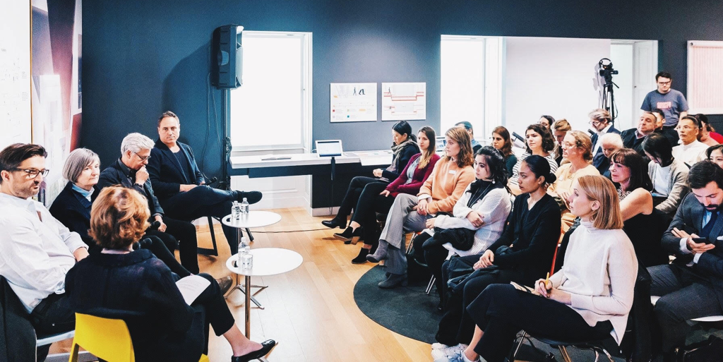
Event: National Design Award 2018 Winner’s Salon- Humen Experience/Built Environment

The Cooper Hewitt, Smithsonian Design Museum is my all time favorite, not just because of the well-curated collections or exhibitions, but the great museum experience design impresses me as well. When I searched online for events, the Cooper Hewitt Museum popped up in my head and that’s how I found this salon event as part of the National Design Award Week 2018. The 2018  National Design Award aims to honor excellent and innovative American design, and also seeks to raise awareness of the impact of design in the education sector (“National Design Award”, 2018). National Design Awards 2018 included a bunch of activities, such as workshops led by Award-winning designers, exhibitions, panel talks, and salon events. Because of my landscape architecture design background and my interest in designing for human beings, I chose to attend the “Human Experience/Built Environment” salon.

BRIEF INTRO OF HUMAN EXPERIENCE/BUILT ENVIRONMENT SALON

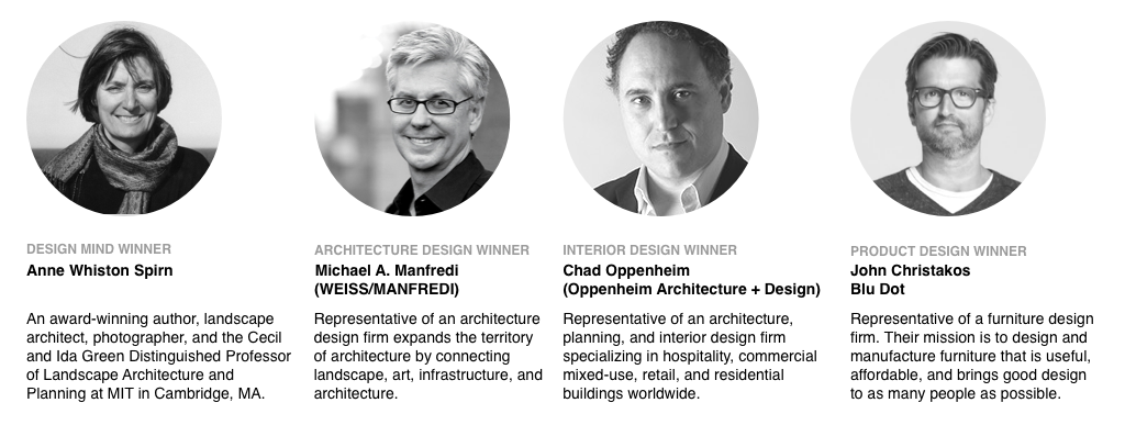
This event invited four National Design Award winners to share their creative /collaborative process for designing human experiences, challenges while designing, and the relationships between the built environment and designers (“2018 National Design Awards | Winners’ Salon & Master Classes”, 2018). Four award-winning teams/individuals are from different backgrounds. It’s a combination of a creative author, a furniture designer, an architect and an interior designer.
CREATIVE PROCESS

The salon started with inviting winners to share the creative process of their design works. Anne Whiston Spirn shared her process from an author perspective as the starting point. She is a person who would always start with an observation through her own eyes or the frame in the camera. She believes observation could reveal many things that you might ignore in your day-to-day life, for example,  a buried river in the city or any other invisible forces that support human’s life. By doing so, observation can actually uncover the truth and yell us more about how life is lived. She will also talk to locals while observing in order to get the overall picture as a whole context. Michael Manfredi, the architect who represents WEISS/MANFREDI,  added that his way of doing environmental design by talking to the local communities before even starts to sketch anything. When starting a new project, he would always keep “humanity” in mind, and reminds himself to be a person that knows nothing but eager to learn from and interact with communities. Chad Oppenheim from Oppenheim Architecture + Design tends to initiate the process from a childlike perspective. He goes to the site, wanders around and explores the environment like a boy back in the time when there was no Xbox and Gameboy. This approach helps him to discover the relationship between nature and humans, so he can really design for human experiences. Lastly, unlike other designers in this talk, as a furniture designer, John Christakos, the product designer of Blu Dot, oftentimes discusses with his partners about what piece of furniture they should design in the very beginning. Then they will sketch as a team to iterate the design work until the design goes to prototyping. That’s the reason why they never mark any of the design pieces as an individual work.

CHALLENGES AND COLLABORATION PROCESS

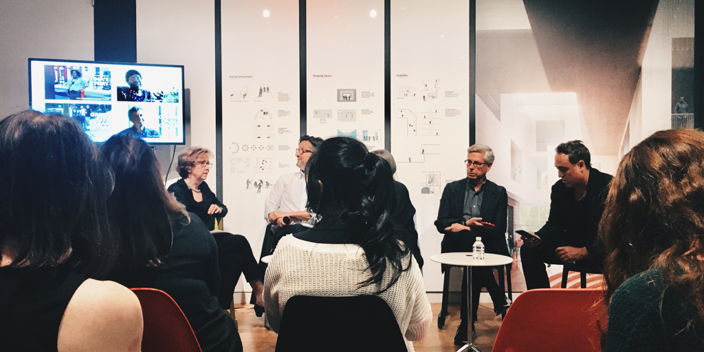
Manfredi mentioned how climate change impacts his consideration of spatial design as an architect. In the past, architects or urban planners didn’t really have to consider how to deal with the life-threatening storms, except in a waterfront neighborhood. But now, it has become a baseline requirement when designing spaces. He also shared how he collaborated with local dog owner communities in order to design a great dog park. His team facilitated a conversation of the local dog community, so each dog owner group could voice their opinion, and exchange their thoughts at the same time. After the conversation, the team sketched the park based on the discussion, then presented to the groups in order to receive valuable feedback. When the park was built and finally open to the public, the dog community was really satisfied with the outcome.
REFLECTION

1. Collaborating with communities is the key to designing good human experiences.

In my opinion, the spatial design discipline might be the pioneer of “user experience design.” For instance, when I studied landscape architecture design in college, to go on a field trip for observation already became a “must-have” process when designing a space. The purpose of going on a field trip is to understand the relationship between space/environment and the people. During the trip, designers are required to get to know about the local community as much as possible. Designers can either talk to local people directly, live with them for a few days, or just participate in local events. These methods will enable designers to discover the problems affecting an area, then explore the opportunity for solutions. Thus, it’s pretty common for architects/landscape architects to interact with communities and this “interaction” has even become part of the key process of spatial design.

Outside of the spatial design field, I feel designers tend not to have many interactions with communities (no matter if it’s a geographical community like a neighborhood, or a group of people that share something in common like small dog lovers). For example, when I worked as a UX designer, I did interact with “users” or “target audiences”, but the scale was smaller and it was more l goal-driven (wanted to know their devices usage patterns ), or task-driven (tested usability before releasing a new feature) approach.

So when Sasha Costanza-Chock wants designers to rethink the design processes in her article” Design Justice: Towards an Intersectional Feminist Framework for Design Theory and Practice”, that recalled my memory as a landscape architecture design student instantly. In her article, she encourages designers to address the challenges of communities by applying collaborative, creative methods as part of the design process, and to be a “people first” designer (Costanza-Chock 2).

When one of the winners, Whiston Spirn, works on her projects in West Philadelphia, she collaborates with locals by treating locals as experts based on their lived experiences. Her team focuses on building a sustainable, community-led living environment by inviting locals to share their knowledge and teaching them about landscape literacy. In her design process, designers are more like facilitators than experts. The other winner Manfredi, invites people  who will be impacted directly in the future to join the design discussion. He wants to create an environment in which designed is based on the prioritized impacts for the community. These methods actually match the framework mentioned by Costanza-Chock in the Design Justice article. No wonder the final design outcomes were engaging and resident friendly, and even won the prizes.

2.Lack of diversity in design industry

When I first saw the winners in front of the audience, I was a bit disappointed. Three of the four winners are male, and there were no people of color except white people, nor people with disabilities. I thought the topic is about designing human experiences in America, a place that is full of diverse cultures, languages, and people, which should lead the topic to accommodate various needs and situations that are more inclusive. This fact reminds me of Jennifer Vinopal’s article about diversity in library staffing (“The Quest for Diversity in Library Staffing” 2016). She brought up the issue about “lacking in diversity based on race and ethnicity, age, disability, educational background, gender identity, sexual orientation, and other demographic differences” (“The Quest for Diversity in Library Staffing” 2016). Vinopal’s finding could actually apply to almost all work fields, including design disciplines. Her intention to raise the awareness of lack of diversity in the workplace aims to combat “the oppression that is caused by privilege, bias, and the attendant power differentials at no matter individual or systematic levels” (“The Quest for Diversity in Library Staffing” 2016).

Incorporating every possible role to every work field seems a bit impossible for now, and I am not sure if this is a good approach to solve the problem. When we discussed difficult heritage a few weeks ago, I defended Maya Lin’s design of Vietnam Veterans Memorial by stating “designers don’t necessarily have to be part of the group they design for”, because she was being accused as an unqualified designer due to her role as an “outsider” (meaning that there is no Vietnam veterans in her family). In this case, because the objective is controversial, the interpretation of the memorial is always different for each individual, and it’s hard to find a Vietnam veteran who has the skillset, and also who is not suffering from Post-traumatic stress disorder to design this monument. Therefore I don’t think this approach works here. However, there should be a better way to address the lack of diversity issue in every work field. Costanza-Chock already initiated the solution by applying a doable design framework to improve not only the design process but also the final outcome of the design. Whiston Spirn does co-work with the communities for over decades and the result is amazingly impactful in a good way. There would definitely be more good solutions to accommodate this issue.

This event raises my awareness of two topics: design justice and work field diversity. Some of the practitioners in design disciplines already integrate similar methods into their work process to make the design more welcoming and accomondable in most situations. We should make this notion more wide spread through to different disciplines to make this change happen.

RELATED SOURCES:

  1. “2018 National Design Award – About The Awards.” Cooper Hewitt, Smithsonian Design Museum, 31 Oct. 2018, https://www.cooperhewitt.org/national-design-awards/
  2. “2018 National Design Award Winners.” Cooper Hewitt, Smithsonian Design Museum, 31 Oct. 2018, https://www.cooperhewitt.org/national-design-awards/2018-national-design-awards-winners/
  3. COSTANZA-CHOCK, Sasha.“Design Justice: Towards an Intersectional Feminist Framework for Design Theory and Practice.”  Design Research Society 2018 Catalyst, 25th-28th, June, 2018
  4. Vinopal, Jennifer.”The Quest for Diversity in Library Staffing.” In The Library With The Lead Pipe, 2016, http://www.inthelibrarywiththeleadpipe.org/2016/quest-for-diversity/
ARMA @Noon /October 18th

An ARMA Metro NYC conference names ARMA @Noon was held in NYC on October 18th.

Introduction:

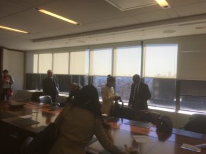
ARMA invited Richard R. Gomes, a Corporate Culture and Engagement Strategist who works for Citi Group to present some concept of corporate archives as a business setting. The conference room located in Kelley Drye and Warren, 101 Park Avenue. There are around 20 people join the event – almost half male and half female. The rough estimate of the age range is from 25 to 80. Food and beverage provided in the side of the room, eating is allowed during the meeting. Also, they said the day is the first day they try to broadcast the conference to the members with a webcam at the front of the conference room. The conference started with a relaxing atmosphere, Ricard and the chair of ARMA briefly introduced themselves then asked everyone to do so.

Most of the participants are professional archivers, while Richard himself isn’t. He called himself a businessman instead of an archiver. He also mentioned he had no archive profession. I introduced myself as a graduate student who interested in the event and encouraged by my professor. One good thing is, ARMA kindly welcomes students and washed away my worry of attending a professional conference as an inexperienced novice.

Record:

The whole content of the conference focus on how to make longevity a competitive advantage. While “trust” is the most important element of banking, the value of archives could be significant. Historical archives of a business group are literally the proof of its stability and security. Better than propaganda, fact telling is all true. Richard illustrated the concept with an experience of expanding Citi’s business to Asian countries – mainly Japan. At the time, Citi group was actively expanding branches and franchises of overseas markets.

Deposit money at one place and withdraw money at the other side of the world was still an innovative concept decades before. They had encountered regulation and document problems when trying to get permission to found their business. Citi Group got through the obstacles by showing the government that they had a lot of experience dealing with various problems. The proves are convincing. He also mentioned that not only “good history” could be beneficial.

“Do you know we are blamed for Great Depression?” He asked. The uses of archives are not limited to keep tracks of the activities. Archives could show how the group went through and recover after difficult situations. Failure taught lessons, and Citi has learned from it. Sometimes the events themselves are not the ones weighing the most, it’s the flow of it, just like the core of programming codes is usually the logic but methods. These archives could also help analysts model the data and anticipate with the models. That is, another facet of difficult heritage: Teaching groups relevant to the history there is meaning over miserable memories.

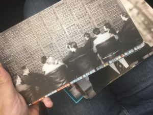
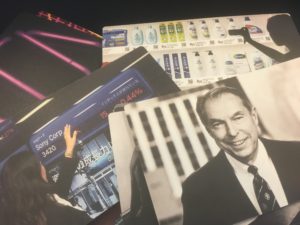
The technique of storytelling is indeed important while turning heritage into business. We were passing a beautiful book and a box of well-designed paper cards with photo and text around the conference room. All of the products we saw were charming and informative. In addition to publishing brochures and the other paper products, Citi Group created some activate spaces for clients and other business uses. Richard said that is a good way to show the history of the group by sitting inside the history and talk about the future.

Instead of trust from the clients and governments, the archives are also benefitting the recruiting. There are thousands of talented freshmen every year. Just as the clients, they are also eager to know “Why Citi?” when there are over hundreds of different choices for their career. Sometimes understanding creates value. By telling the story, the group is able to attract talented new employees sharing the same memory (of the organization) and probably the same belief. Another benefit of building and preserving these archives is, some employees might want to be remembered. (“I don’t. “Richard joked.) With recognition and sense of belonging, they might work harder in the purpose to become a name carves on the group history.

As M. Schwartz and Terry Cook claimed:” Archives – as records – wield power over the shape and direction of historical scholarship, collective memory, and national identity, over how we know ourselves as individuals, groups, and societies.”[1] These modern memories have strong power within our identity. Except for common “interface” like museums, art galleries, libraries, historical monuments, the places Citi Group build for their clients and employees are somehow ignored in most of the academic articles.

Related experience:

The history of Citi Group reminded me in my college time our class was able to interview a manager from Mitsubishi Group, a Japanese business group which has experienced the history of “Black Ship” (The history that America use military power to “negotiate” a treaty allowing American trade with Japan.) They had kept a lot of precious and unique information.  How they raised, how they traded. How people made money. I suppose with the enter of capitalist society, more and more historical footprints would be located in private cooperation but governmental record.

Conclusions:

At the end of the conference, Richard said that people should value data and archives just like valuing other resources. Longevity is resource, and it could create more resources. Knowing the importance of archives, he gave out three principles of business: Being investing, being effective and could be easily documented. Not like official files, specific collections usually don’t suffer cataloging problems like queer theories. The way people manage archives is more convenient than the official way. While they hold some control of their own event records and documents, more archives seem to be born in the way easier for archivers to deal with.

Even though Ricard doesn’t see himself as an archiver, he preserves the archives, makes use the archives and knowing the value of the archives. I would say Richard is more than an archiver but also a businessman. I was able to ask a question about one project of Citi Group – Citi Bike. There are similar things in my city. Our city government put them on the street to encourage people moving around. Richard kindly answered my question. I was so agreed with the things he said. It is important to let people know about the possibility of different choices. Whether it is shopping choice, a wider range of living area or knowledge access. The archive is the base of these possibilities.

[1] Schwartz & Cook, (2002), “Archives, records, and power: the making of modern memory”

Data Science Central Webinar: ‘Dashboard Design With the User in Mind’

Introduction

Data Science Central (DSC), a web-based Wiki-like hub for data professionals, hosted a webinar on data dashboard design. The webinar was sponsored by Tableau, hosted by Bill Vorhies, editorial director of DSC, and featured a talk by Alyshia Olsen, a UX designer at Tableau. Following the talk was a Q and A session where the host relayed questions posted digitally by the attendants of the webinar.

It's not you fault

While positioned as a dashboard design webinar, the crux of the talk was mostly focused on user-centered design strategies, though it was filtered through the process of designing data dashboards. Right from the start, Olsen brought up a concept that is central to the work of user-based designers, and somewhat codified into the space by Don Norman in his book, The Design of Everyday Things (2013): Frustration with a product is not the user’s fault, it is the designer’s. This idea and the idea that user experience design is all about the psychology of the user are the backbone of the talk reviewed here. Olsen went on to spend the bulk of the hour discussing a design-thinking process for dashboard design, in four sequential phases:

  • Discover Phase
  • Distill Phase
  • Ideate Phase
  • Validate Phase

These four phases are now discussed in depth.

User-centered Design

Discover Phase

In user-centered design, the Discover Phase is not about discovering what the system needs to do, as in system-centered design, but is instead about discovering who the system is for (Talja and Hartel, 2007). For Olsen, the Discover Phase is just that, a phase for discovery about the intended users. She uses the example of building a dashboard to support her father at his business as a way to frame what the Discovery Phase should yield to the designer.

Olsen states that the Discovery Phase for dashboard design is the opportunity for the designer to discover what the target users really need, not what they think they want built. The mantra for this phase is “question the obvious,” and it is manifested in the concept of the Five Whys, or, ask ‘why’ five times. The Five Whys method is a form of root cause analysis widely in use today to understand the deeper drivers of needs, actions, and results (Norman, 2013). It implies that even after you as a designer have found a reason for the wants and needs of the users, you should keep asking why until the root need is reached. There are many methods for employing this technique in user-centered design, but the outcome is the same: the designer understands the underlying issues and needs that contribute to why a user needs something designed.

An example of asking Why 5 times to understand the underlying need

Distill Phase

The Distill Phase is the process of taking all of the notes, learnings, ideas, and anything else gleaned during the discovery phase and distilling it all down to answer three questions:

  • Who are your users?
  • What is the primary goal of the dashboard?
  • What does the dashboard absolutely have to do (to satisfy the first two questions)?

During her review of the Distill Phase, Olsen gave insight on a number of strategies a designer could employ to distill their notes and answer the three main questions. These included Affinity Mapping, Pattern Identification, among others. The main goal of all of these strategies gets at the main crux of this sort of design: What do your users need? Designing for the user instead of for the system is a fundamentally different form of design, and Olsen’s entire process starts with the users, understand their needs before she even begins to design a product.

Ideate Phase

The third phase is the process of idea generation, rejection, and acceptance (with the caveat that ideas get iterated on). This is where a designer will come up with ideas to address the last question from the distill phase, while not violating any of the tenets established by the answers to the first two questions. Again Olsen presented a few different strategies for ideation, but I only want to mention one of them here, Blue Sky Thinking.

Blue Sky Thinking is an ideation strategy where a designer comes up with a basic idea for the design of something. This idea is known as a ground idea. Next, the designer comes with a very ‘out there’ idea, potentially something impossible to implement and is more of a dream. The results from this strategy come from combining elements of the ground idea with the blue sky idea to reach a middle ground. This sort of ideation strategy can push the designer into more creative solutions.

Validate Phase

The Validate Phase comes after something has been designed. This phase is centered around feedback and usability testing. It’s in this phase that a designer will be able to understand where they’ve succeeded and where they’ve failed, allowing for a return to the Ideate Phase to improve upon the product. This phase once again directly involves users, since watching and listening while a user uses the product can result in valuable feedback and improvements to the design.

Conclusion

As a Data Analytics and Visualization student, the dashboard design element of this talk was the bulk of my interest, and I was not expecting something as process oriented as the talk ended up being. However, having an expert walk through the process of designing dashboards from a user-centered perspective was enlightening. According to Norman in his book ‘The Invisible Computer’, one of the biggest problems in HCI is the fact that computers are rigid, precise, and thus require rigid and precise inputs. Humans are inherently imprecise, flexible, and ambiguous (Norman, 1999). Seeing the process of user-centered design outlined in such way has made obvious to me how attempting to design from the human up, considering all of the flexibilities and ambiguities inherent in us can lead to better, more flexible systems that work the way we need them to instead of us working the way machines want us to.

References

Norman, D. A. (1999). The invisible computer: Why good products can fail, the personal computer is so complex, and information appliances are the solution. Cambridge, MA: The MIT Press.

Norman, D. A. (2013). The design of everyday things. New York: Basic Books.

Talja, S., & Hartel, J. (2007). “Revisiting the user-centered turn in information science research: an intellectual history perspective” Information Research, 12(4) paper colis02. [Available at http://InformationR.net/ir/12-4/colis02.html]

The Cooper Hewitt Design Museum’s Digital Pen

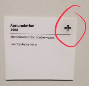
I visited the Cooper-Hewitt Design Museum to observe their “digital pen” project. Like all visitors, I was offered the pen to use for the duration of my visit in the same way many museums offer audio guides. The museum staff explained that touching the pen to a symbol on an object’s wall will save the object to a digital collection I could later retrieve on the museum’s website. The staff then handed me a ticket stub with a printed code. I would need the code to access my collection

Wall text showing symbol of digital pen contact point

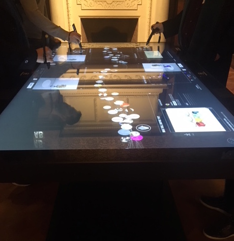
For three hours I walked through every gallery of the museum, observing how visitors were making use of their pens. I watched as visitors gathered around dining-room sized tables scattered throughout the galleries. They were using the pens to create designs on the tables’ interactive screens.

Interactive touch screen tables

I noticed a visitor struggling to use her pen on a wall label. A guard attempted to demonstrate its proper use. He struggled with the pen himself a bit and commented “These things can have a mind of their own. Sometimes it works and sometimes it doesn’t.” With assistance from the guard, the woman was finally able to save her object. The pen gave a satisfying vibration and flashed green lights to indicate successful contact. The woman then raised the pen to her ear. The guard told her “No, it’s in cyberspace. You can share your collection with a friend. Don’t lose your ticket.” I watched the woman wander into another gallery with her pen dangling from the cord on her wrist. She started taking photos with her phone. I asked the guard if people often asked for help with the pens. He replied “One hundred times a day!”

Another visitor tried to save every item along one wall. I watched as one after another, she went to each item’s label and tried out a jab-and-slide technique with a confused expression. I imagined her telling herself “it’s all in the wrist.” It was like watching a tourist re-swiping their subway card. I figured once you get it, it’s in your muscle memory.

Some visitors seemed to have mastered the object-saving usage of the pen. I observed two men saving items with ease. One of them, however, touched his pen on a waist high screen where a video was playing. A guard then intervened, letting him know that that particular screen was just a regular video and was not for meant for the pens. I could see how a visitor would make the mistake with so many interactive digital screens around.

Throughout my visit, I estimate that around half of visitors were at least trying out the pens. The other half of visitors were using their phones to capture objects and wall text. I watched one gallery for fifteen minutes. During that time, many people were twirling their pens by their cord but taking photos with their phones.

I turned my attention to the numerous digital tables throughout the galleries and watched as visitors experimented with the pens. A constant stream of images runs along the length of the rectangular screens. I watched on as a museum staff member giving a tour called the random floating images the “river of objects.” She explained that the museum has 200,000 objects in their collection but they focused on 4,000 for the river. From my estimation, there seemed to be around 100 or so images, based on the rate at which the same objects would loop through in the stream. The staff member demonstrated how you could swipe an object out of the river with a pen or finger and examine it more closely. You could then read interpretive text about the object or use the object as an inspiration for a digital design of your own.

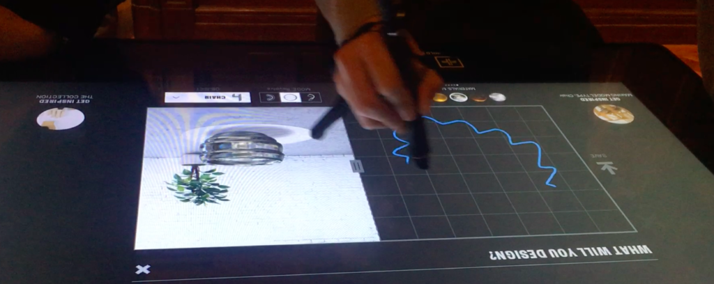
A visitor creating a digital design with a collection object to reference as a source of inspiration

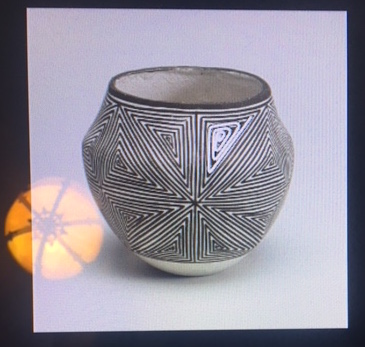
Some visitors were using their pens to make gestural strokes on the screen. Images of objects from the museum’s collection would appear on the screen highlighting how the visitors line is echoed in a an object’s contour or design element. In my observations of the digital tables, I noticed that visitors spent the least amount of time on the gesture line exercise. The novelty of it seemed to dissipate quickly.

Object from museum collection highlighting visitor’s digital gesture drawing

From my observation of visitors at the interactive tables, sessions lasted from a few seconds to about ten minutes. Visitors who created their own designs did not seem to be deliberate in their engagement. It was as if they were idly exploring the tool in free-form experimentation.

I observed several visitors loading their saved collection onto the touch screen and exploring their objects in more detail. There were multiple views, curatorial text and a scrolling bar of similar objects based on categories as varied as color, movement, and subject matter. There was no way to search for typical tombstone data like artist name, movement, object name, etc. From what I could tell, the tables did not include any typing functionality at all. The experience was gesture-oriented.

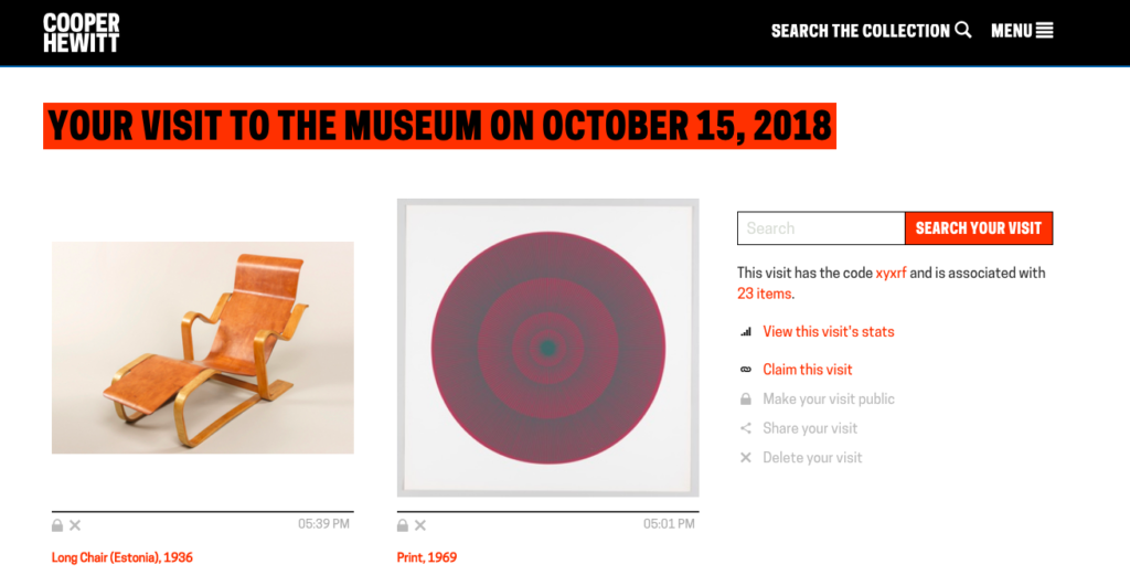
During my visit, I used the pen to assemble my own collection of objects. The museum website has a link to “retrieve your visit.” I could view most of the images I collected, although some objects that were registered by the pen were missing.

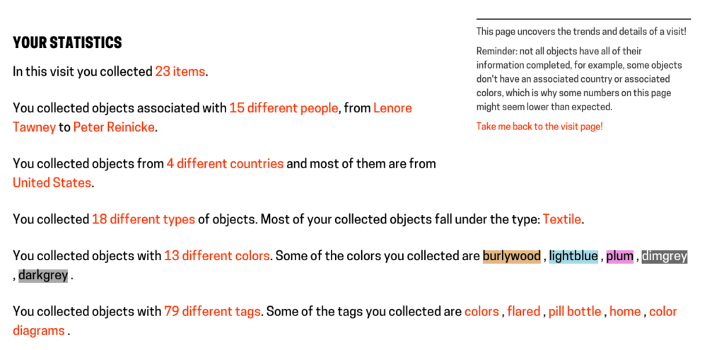
The Cooper Hewitt Design Museum Website’s portal showing objects I saved with the digital pen during my visit and the statistics about my visit.

The website portal also allowed me to view stats on my “collecting habits” during my visit. To me, this information resembled the intrusiveness of big data. I thought of the tracking of my internet habits that are used to sell me products. I could find no particular value in the data they were tracking on me. The stats, if anything, seemed more useful for the museum’s own data on how visitors move through exhibitions.

The digital pen is certainly forward-thinking in the way that it recontextualizes a museum collection and redefines the gallery space as a creative zone for the visitor. In theory, it is in keeping with the predictions of Joe Touch, the director at the University of Southern California’s Information Sciences Institute:

The Internet will shift from the place we find cat videos to a background capability that will be a seamless part of how we live our everyday lives. We won’t think about ‘going online’ or ‘looking on the Internet’ for something — we’ll just be online, and just look. (Digital Life in 2025)

However, the pen is clunky, even when it works properly. The idea seems to be to incorporate the traditional experience of looking at objects in a museum into our current compulsion for information accrual in the digital realm. But the process introduces too many new physical objects that the visitor must learn how to navigate, and in the proper sequence–carry around an additional device besides your phone, walk away from the artwork to interact with numerous touch screens, and don’t lose your ticket code or your visit will seem inconsequential. The process is far from seamless.

The digital pen is more in line with the predictions made by technologists who foresee the increased role of big data. As Judith Donath, a fellow at Harvard University’s Berkman Center for Internet and Society, puts it, “We’ll have a picture of how someone has spent their time, the depth of their commitment to their hobbies, causes, friends, and family. This will change how we think about people, how we establish trust, how we negotiate change, failure, and success.” (Digital Life in 2025)

There is something futuristic about the digital pen/touch screen experiment. It is the most technologically sophisticated tool for museum visitor experience I have seen. However, its effect is less in line with technologists’ predictions of digital life seamlessly integrated with our physical experience and more in line with technologists’ predictions of big data dictating our actions and behaviors.

Designing the Pen. Retrieved from https://www.cooperhewitt.org/new-experience/designing-pen/

“Digital Life in 2025.” (2014). Pew Research Center. Retrieved from http://assets.pewresearch.org/ wpcontent/uploads/sites/14/2014/03/PIP_Report_Future_of_the_Internet_Predictions_031114.pdf

Queer Zine Fair Observation For Dr. Rabina’s Class

Queer Zine Fair Observation 

By Taylor Norton

For my 3-hour observation, I decided to go to the NYC LGBT Center for its New York Queer Zine Fair. While this easily could have been applied to my event attendance, I decided to take this a bit further and not only attend the fair, but observe and assess the information and information users that were being shared in this temporal setting.

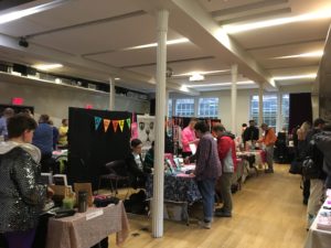
Upon entering the fair, I could see that the way the 50+ artists were set up allowed for a very specific traffic pattern for attendees.  With booths lining the outer four walls and two rows of booths in the middle, people could walk in a circle in one direction while looking at the outside booths and then in another direction for the booths set up in the middle. While there was one large room with all the booths set up, there was also another room for programs and shows. The event happening while I was there was a queer collage party that allowed attendees to make their own collage that would later be scanned and made in to a zine with others’ work.

With each new booth visited, I could see a variety of identities, sexualities, and genders represented and the ways that each person decided to present themselves and their zines were distinctly different. There were tables that shared information on that person’s experience, such as a queer femme who made zines based off of the poet, Sappho, or a gay man’s zine informing people about the different meanings of colored bandanas in the pants pocket of one’s jeans. Besides zines, I also saw t-shirts, buttons, pins, and patches that were obvious to some and not so obvious to others of the wearer’s identity. Semiology, rhetoric, and double meanings could be inferred everywhere, from cat pins to patches of fingers touching flowers to crowns and collars. There were hand-drawn zines, screen-printed t-shirts, and photography zines, among other forms of ephemera. It was fascinating for me to see all of the different expressions and to learn more about a community that I am actively involved in. Two of our class readings stuck out greatly in my mind while going through this fair.

Emily Drabinksi’s 2013 article, “Queering the Catalog: Queer Theory and the Politics of Correction,” was strong in my mind as I watched people walk by booths and engage with others because not only was this an information setting that allowed people to learn more about the community that they identified with, but they were also able to buy (or sometimes trade) items that expressed their identity; an opportunity that is not always presented to them in mainstream information settings. I saw this an opportunity for people to not only queer the hypothetical catalog by learning more vocabulary and ways of expression, but also by engaging with items and eventual artifacts that have the potential to go beyond this fair and make their way in to more mainstream cultural institutions. The more people create and share, the further their messages can go beyond such information settings.

One of Drabinksi’s quotes stuck out in my mind, “The materials themselves are linguistically controlled, corralled in classification structures that fix items in place, and they are described using controlled vocabularies that reduce and universalize language, remarkably resistant to change” (Drabinksi 2013). It was obvious at this fair that there was a vast array of different identities represented here and that both written and visual linguistics were in heavy use. However, opposed to the static ways of traditional cataloging, this fair allowed information users to go from one category to the next with each new booth visited. There was absolutely controlled language in this setting; however, the feeling of learning and being open to others’ experiences allowed users to engage with others more freely in order to further their knowledge.

Another quote by Drabinksi, “Where lesbian and gay studies takes gender and sexual identities as its object of study, queer theory is interested in how those identities come discursively and socially into being and the kind of work they do in the world” (Drabinksi 2013), resonated with me during this observation. Everywhere I looked, I could see people engaging within their own identity circles while taking the time to look at information that taught them about other identity circles. It was both a social and information setting in which discourse through artifacts was encouraged to transcend the settings of the fair.

Not only was I reminded of Drabinksi’s article, but also of Marcia J. Bates’ “Fundamental Forms of Information” article written in 2006. In this article, Bates defines the general idea of what is information and the different types of information. After seeing how intentional people were with the zines they made and the booths they set up to display them, I thought of how Bates writes that, “Other than in a few cases, such as a spontaneous cry of pain or fear, all expressed information is intentionally communicative to others in the environment” (Bates 2006).

While observing how people learned about different identities through the zines and other artifacts, I recognized three main types of information at play here: embedded, expressed, and recorded information. It is very clear that there are several different identities within the queer communities, from pansexuals to bears to doms and subs to femmes, and while observing I thought of Bates’ quote: “Because animals act, they leave evidence of their presence” (Bates 2006). Here people were acting on their gender and sexual identities and actively reaching out for shareable informational objects that represented and showcased their identities.

One example of information being produced from humans’ presence is embedded information. Bates writes, “In short, the embedded information is generally not left by its creators to be informative, but rather is informative as an incidental consequence of the activities and skills of the people leaving the artifacts” (Bates 2006). Many of the creators had started with the idea of processing embedded information from their lives and made them into recorded information. Described as “communicatory or memorial information preserved in a durable medium” (Bates 2006), these zines and ephemera were direct representations of expressed information.

While watching people interact with artists and buy zines, pins, patches, and t-shirts, I couldn’t help but consider the impact of this information setting in a wider capacity. People and their experiences were able to feel validated through the readily available and expressed information and could take this validation—in metaphorical and haptic representations—beyond the fair. As Bates writes, “Recorded information is distinguished here from expressed information because the invention of writing and the development of the technologies to produce durable recorded information appear to have had an immeasurable impact on human cultures and on the speed of development of those cultures. No longer do humans have to try to memorize all that their culture knows; now a lot of that information can be kept in durable form outside the body. The durability and storage efficiency of such information have enabled a great leap in human information processing” (Bates 2006). While seeing people use recorded representations of their identity, I could see a world of information being reborn and growing through the exchange of such information.

Help! ––I’m at a symposium and I’m trying to learn!

By Meghan Lyon

Last Friday, October 19th, I had the pleasure of observing two symposiums. I attended the first half of The Uncomfortable Archive: New York 2018 Archives Week Symposium, and the the second half of the first day of theWhitney Independent Study Program 1968-2018 50th Anniversary Symposium. These events marked my first encounter with the conference-style symposium. I have attended numerous lectures, but a presentation in the symposium format has a quality that diverges from a unique lecture; each speaker addresses their own content or area of expertise  as well as the overarching concept of the day.

According to Merriam-Webster, the definition of symposium includes: “a social gathering at which there is a free interchange of ideas”; “a formal meeting at which several specialists deliver short addresses on a topic”; “a collection of opinions on a subject”; and “discussion.” Additionally, it defines a panel as “a group of persons who discuss before an audience a topic of public interest.” The panel would be the object of attention, the body expected to enlighten the audience; it could also be the platform from which information is distributed. From my observation of the symposium as an information environment, I would define it as a learning-based information environment, where the audience is an information-seeking group whose attendance is predicated on the expectation of a conference of knowledge from the panelists. 

The Uncomfortable Archive Symposium, which I observed from 9:30 am through the lunch break at 1:15 pm, was devised to motivate the audience by revealing uncomfortable histories and truths about archives or loosely-defined archival materials. This goal manifested in multiple presentations about obstacles to record keeping and maintenance from autocrats, fascists, and capitalists. The Keynote Address was given by Anthony Clark, who played up the “uncomfortable” concept. Clark is an expert on presidential libraries and archives and discussed the more insidious aspects of presidential libraries—not just as propaganda machines but as active forces in politics, conservatively oriented towards maintaining the status quo of private interest groups. His address examined the unfortunate history and present mismanagement of the National Archives and Records Administration by the former director of NYPL, David Ferriero.

Clark addressed a room full of concerned professionals who were mostly cis-female, mostly white. The audience lights and stage lights were both on and remained on throughout the day; the AC was on, there was carpeting and plush chairs, there were no outlets throughout the seating area, and  there was no wifi and no data service in the hall at the Center for Jewish History. There was a podium for speakers and a table for panelists; I found that every panelist was an individual speaker and the “panel” discussion was, unfortunately, just an audience Q&A directed at the group of “panelists.”

The Uncomfortable Archives Symposium was crafted as a learning environment for archivists and professionals within the field of information. Most audience members were taking notes; actively engaged and trying to learn. However, several days after the Uncomfortable Archives, a peer who was also in attendance bemoaned that there was too little discussion of problems or troubleshooting thereof from within archives; in other words, she gained no knowledge that was useful to her as a professional.  Also, most talks were initiated after a precarious disclaimer: “My comments are my own and not my employers,” a common social media and web-based, personal disclaimer which has migrated towards any format that has the potential to wind up on the internet. This attempt by speakers to protect their professional status could relate to Robert Jensen’s paper, The Myth of the Neutral Professional. In order to keep their jobs, librarians and archivists are pressured to appear politically neutral. At the very least, they must attempt to be sure that they cannot be held accountable as a representative of their employer when speaking publicly. I find the disclaimers’ presence to be unsettling, and feel sorry that the speakers need to present defensively on stage.

Midday I walked over to the Whitney Museum of American Art for the ISP 50 Year Anniversary Symposium; This second observation lasted from 2:30pm – 8pm.

The Whitney Independent Study Program 50 year anniversary Symposium was a very different kind of event from the Uncomfortable Archive; It was not technically a professional event. The intended audience was ISP alumni, but the ISP program is so popular that many others were also in the audience. The 2-day event was both open to the public and free, so it drew contemporary art enthusiasts, fans of panelists, social climbers, artists, museum workers, art historians, current university students, and people in some way involved in the art world who are hungry for continued education. Because of the various points of entry, there was also a more diverse demographic. It was so packed in the lecture hall that overflow seating was made available in the Tom and Diane Tuft Trustee Room on the 8th floor, which is where I wound up for the first panel that I witnessed.

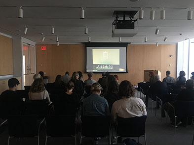
Whitney ISP Symposium from the 8th floor Trustee Room

In the trustee room, there was a monitor playing a livestream of the symposium as it occurred downstairs. This room quickly filled up, although it wasn’t totally full and people wandered in and out. There was an odd phenomenon of 8th floor of attendees clapping when speakers concluded, even though the presenters were on tv.

Another unexpected occurrence (unexpected to the Whitney staff, at least) was that people who showed up at the beginning of the symposium did not leave. This created a major occupancy problem, because people who registered beforehand, or who were ISP alum, could not enter. I believe that the organizers thought that people would come for a panel, or a particular speaker, and then leave—grossly underestimating the major interest in this kind of educational experience. After witnessing this symposium, I would conclude that multitudes of people are craving high quality, free, educational experiences. The panelists in this case were key figures in art theory, writing, criticism, contemporary studio practice, and pedagogy, and it is too often an exclusive few who are able to interact with the brilliance associated with the ISP milieu.

Like the Uncomfortable Archives’ attendees, nearly every audience member had a notebook out, although I would say the note-taking at the Whitney was a little more feverish, on both the 8th and 3rd floors. Eventually, a few people from the 8th floor went down in between panels to try and claim a few abandoned seats.

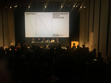
A panel in the lecture hall at the Whitney ISP Symposium

I made it into the lecture hall for the Pedagogy and Critical Practice panel. The structure of the panels were similar to those of the earlier symposium; each member of the panel gave a short presentation with slides, however, instead of a Q&A afterwards, there was a moderated discussion on the overarching theme of the panel, with a short time for  audience questions. The time-ratio weighed heavily on the lectures, clocking in at almost 2 hours of serial lectures per 20 minutes of panel discussion.

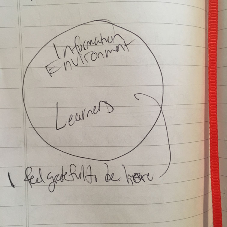
A little earlier in the evening, curator Johanna Burton had referenced  “embodied learning”—which she described as something along the lines of “trying out learning through new experiences.”  I thought this would be a good opportunity to explore  Marcia J. Bates’ paper Fundamental Forms of Information.  I could see note-taking as an interaction with recorded information, “communicatory or memorial information preserved in a durable medium,” (Bates 14)  as well as an enactment of student/teacher paradigm, and an attempt to fill a knowledge-seeking need. The symposium could be examined as a place for the expression of recorded information (lectures) to be

Single-Circle Diagram that says "Information Environment / Learners / I feel grateful to be here ----->"
“Information Environment / Learners / I feel grateful to be here ——–>”

embodied by an audience through listening and interpretation, and then enacted by their future selves as more knowledgable beings.  

Nearing the end of the ISP Symposium, Mary Kelly took the stage. Kelly was the only speaker who did not use a slide-show presentation, and she was so soft spoken yet captivating, you could feel the entire audience leaning in and opening up. I drew a small diagram of the environment and how I felt.

Sources:

Bates, M. (2006). Fundamental Forms of Information. Journal of the American Society for Information Science and Technology, 57(8) (2006): 1033-1045

Jensen, R. (2006). The Myth of the Neutral Professional. Lewis, A. (Ed.), Questioning Library Neutrality: Essays from Progressive Librarian. (pp. 89-96). Duluth, MN: Library Juice Press.


Effective Engagement @ Cooper-Hewitt

Effective Engagement @ Cooper-Hewitt

by Elizabeth Phyle

To observe an information environment I spent time at the Cooper-Hewitt Museum watching audiences interact with their exhibit. The Cooper-Hewitt is at the forefront of incorporating technology into their visitor experiences. In addition, they have “Senses: Design Beyond Vision” on view until the end of the month. I am very interested in how museums incorporate tactile activities to facilitate visitor engagement with the material. The “Senses” exhibit and their other hands-on exhibits gave me a chance to observe how these features provide deeper engagement as well as how they potentially divert attention from more substantial information.

Perspective taking

I believe that sense are an under-utilized tool in museums. We ask visitors to look, listen, and read a lot while they walk through a quiet gallery. It was shocking the difference in atmosphere between the more traditional exhibits and the “Senses” exhibit. The energy was palpable while people were engaged in touching and smelling as well as looking and listening. Some of the most interesting installments were the ones that took a risk; using the senses to convey something beyond words. For example there were translucent white boxes with phrases on top of them describing a moment or feeling that is specific enough to conjure an image in your mind. Then you press a button, lean in close, and the artist’s interpretation of that scent whiffs over you. Watching people interact with the exhibit was fascinating. People had strong, immediate reactions; often in the form of interjections, not words. The scent named “the feeling for someone once loved, but no longer” elicited pained “oohs.” The one named “being perfectly entangled with another” caused many visitors to smile and “awwhh”. Not everyone thought that every scent was a perfect representation of the emotion described, but it served as a fantastic conversation starter either way. Any good exhibit asks visitors to shift their perspective. By asking them to uses their senses in unfamiliar ways the exhibit forces perspective shift. Context shifting is an important skill in a multi media and medium world. Other museums could incorporate sound, touch and smell into their exhibit in similar ways to help visitors realize their own perspective and take on the perspective of others.

One installment that compelled the visitor to enter the life of another was called “Portal_Soundscapes” Here visitors listened to sounds from cities around the world including voices from refugee camps. I found it very powerful, but unfortunately not many people visited it while I was in that area. This may be partly because it was slightly off the main path, or it may be that visitors did not want to engage in more serious topics while they were playing. Things like this that offer a wide snapshot of human experience could be useful in history museums. Oral histories are powerful, but visitors can also benefit from abstract views of the human experience like asking “what do humans sound like?”

The nagging questions that I had all the while was, how much are people actually taking away as they flit from one thing to the next? It is a tall order to expect visitors to be able to go from scratching and sniffing a wall to reading the placard text about accessible design. I saw that some visitors would skip any exhibit here that didn’t have some of sensory activity associated with it. Like bee’s between flowers, many people would walk up to the installment, do a quick skim for any feature that they could do something with, but if all there was was something to read or information to listen to they would flutter to the next spot and repeat. This certainly telling about how we prefer to interact with our surroundings, but to what extent should museums cater to these impulses? This reminds me of the discussion of user-centered versus system-centered design that we encountered in Talja and Hartel as well as the class discussion we had surrounding it. They discuss the traps in images about user-centeredness being warm and compassionate opposed to a cold and quantitative system centered design (Talja and Hartel 2007). Compared to traditional museum experiences where the visitor is expected to conform to the museum, we can see with the rise of sensory exhibits and pop-up museums how museums are being pressured to cater to the visitor. However, museums should not lose sight of their mission and institutional strengths. The Cooper-Hewitt overall did a fantastic job of balancing education, collection presentation, and interaction.

Conscious Consuming of Information

At a small out-of-the-way alcove there was a headset with two short hospital soundscapes. One was of a traditional hospital setting with high frequency beepings, rushing of gurneys, panicked footsteps, and doctors yelling out stats. The other one was what a “humane patient experience” could sound like. It explains how information could be communicated between nurses and doctors while preserving a environment that is beneficial to the patient. This reminds me of the way they Sengers ended the article on Practices for a Machine Culture, she argues for “technical artefacts that enrich human experience, rather than reducing it to a quantified, formalized, efficient, and lifeless existence (Sengers 2000).” Hospitals are a great example of a systems-centered environment. Since their work is so technical, fast pace, and high pressure, it is unsurprising that the externalities of their system is not something that has traditionally been at the forefront. This exhibit allows visitors to think critically about these externalities as well as examine the role that sound plays in decoding our environment and on our stress levels.

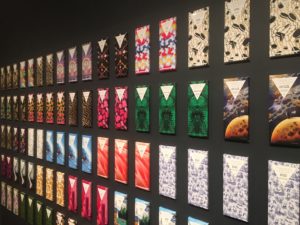
Cooper-Hewitt is a unique case for consumerism in museums because at its core it is a product design museum. The question then become are they feeding consumer culture or educating on it? There was only one stark example that I found of product promotion in the museum. There was a wall of chocolate bars in different flavors and enticing packaging, which you could conveniently find for sale in the gift shop. I could find no educational value in this installment. The purpose it served was only to generate excitement about a product. Again this brings us back to the user-centered discussion. The designers tell the user what they need and proceed to embed their product into the grooves of our lives. This is not the same as responding to a demand.

On the other hand, working through this exhibit may be an effective way for visitors to learn about the ways we react in accordance with our senses and ways we are likely to be deceived. The disability and sensory design area showed how certain scents can spark appetite and memory for dementia patients, and how color coded design can help our brains understand the functionality of items. Examples like these shows how the exhibit is educating visitors to what product design has the potential to be. In “Saturated: The Allure of Science and Color” there was a old Mac computed on display with this quote from Steve Jobs, “For most consumers, color is more important than megahertz, gigabytes, and other gibberish associated with buying a typical PC.” This placed in an exhibit about color allows visitors to reflect on their own consumer decision and how they are affected by design. This fits in to the discussion about design justice introduced to us by Constanza. The products we buy are all encoded with values, and along with the values are the frameworks of our society and all the power structures that entails (Constanza 2018). Museum experiences that let the visitor “behind the scenes” on how and why things are designed allow them to decode their consumer environment.


Talja, S., Hartel, J, (2007). Revisiting the user-centred turn in information science research: an intellectual history perspective. Information Research, 12(14).

Constanza-Chock, S. (2018). Design  Justice: towards an intersectional feminist framework for design theory and practice. Design Research Society. University of Limerick. 25th-28th June 2018.

Sengers, P. (2000). Practices for a Machine Culture: A case study of integrating cultural theory and artificial intelligence. Surfaces. Presses de l’Universite de Montreal.

I Just Learnt the Greatest Part of American History

Observation of Frances Tavern Museum

 Oct 23. 13:14-16:14


Introduction & Inspiration

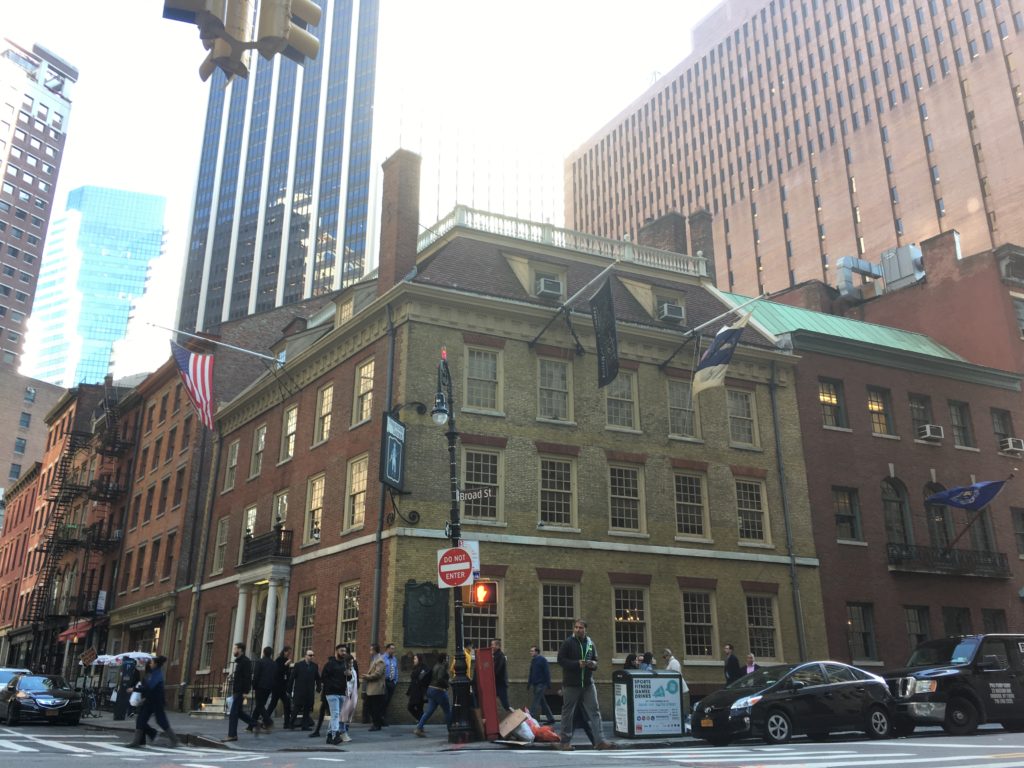
I am always a museum fan but I was too shy to be there alone. I guess it might feel different when I visit sites of culture with friends when we exchange views. I have visited museums in locations with history of 2000 years as well as galleries of world famous art collections. This time, I was going to a place with longer history, than the country I am staying. I chose this site, mainly because I know just a little about American history and I want to experience, hoping that my pieces of knowledge could revive and connect with each other.

I visited the Fraunces Tavern Museum in Oct. 23, in a different manner. I observed with my eyes big and round. Usually I visited museums casually and I believe that I can come back another time with a fresh new mood and look. I tried to grow with the communication I had with friends whom I talked with during the visit. Sometimes, it is also valuable to try to talk with yourself, when you emerge yourself in front of historical occasions and sites.

I knew I love museums, but now I understand more of why, with some knowledge from Course 601: Foundation of information.


I See Different Types of Information Interaction

Come to the Real Site of Historical Places

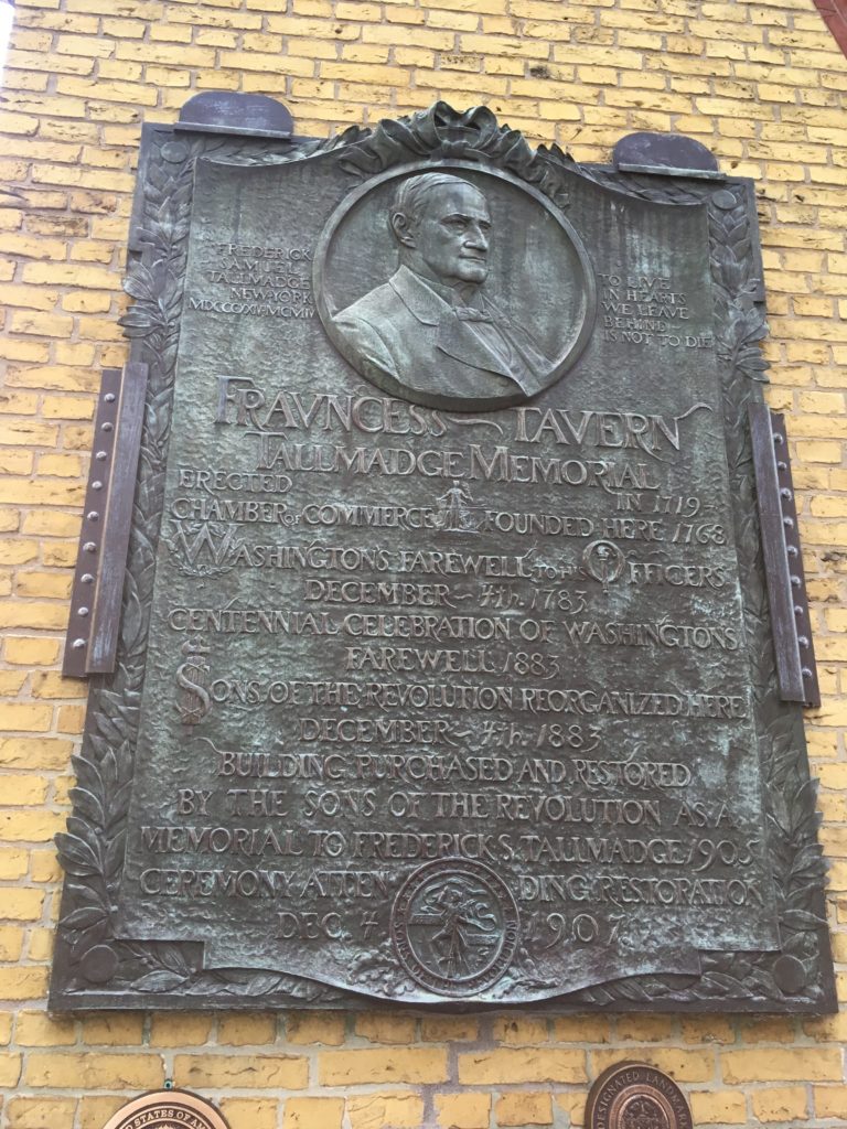
Read and Touch Tallmadge Memorial erected Dec.4, 1907

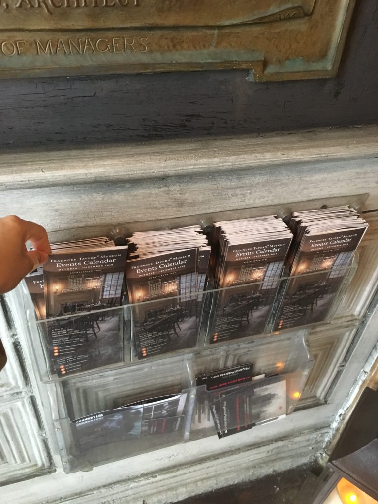
Read Event Calendar Brochure


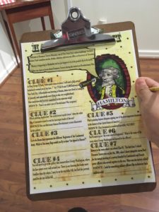
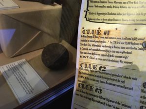
Play Scavenger Hunt

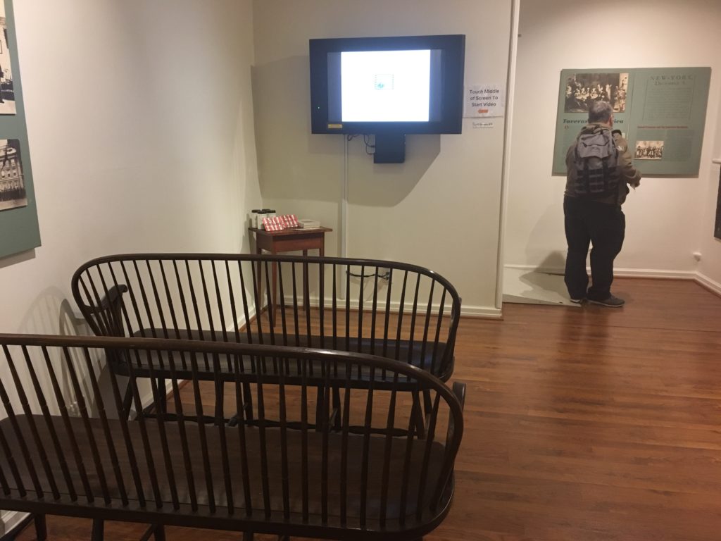
Watch Orientation Video

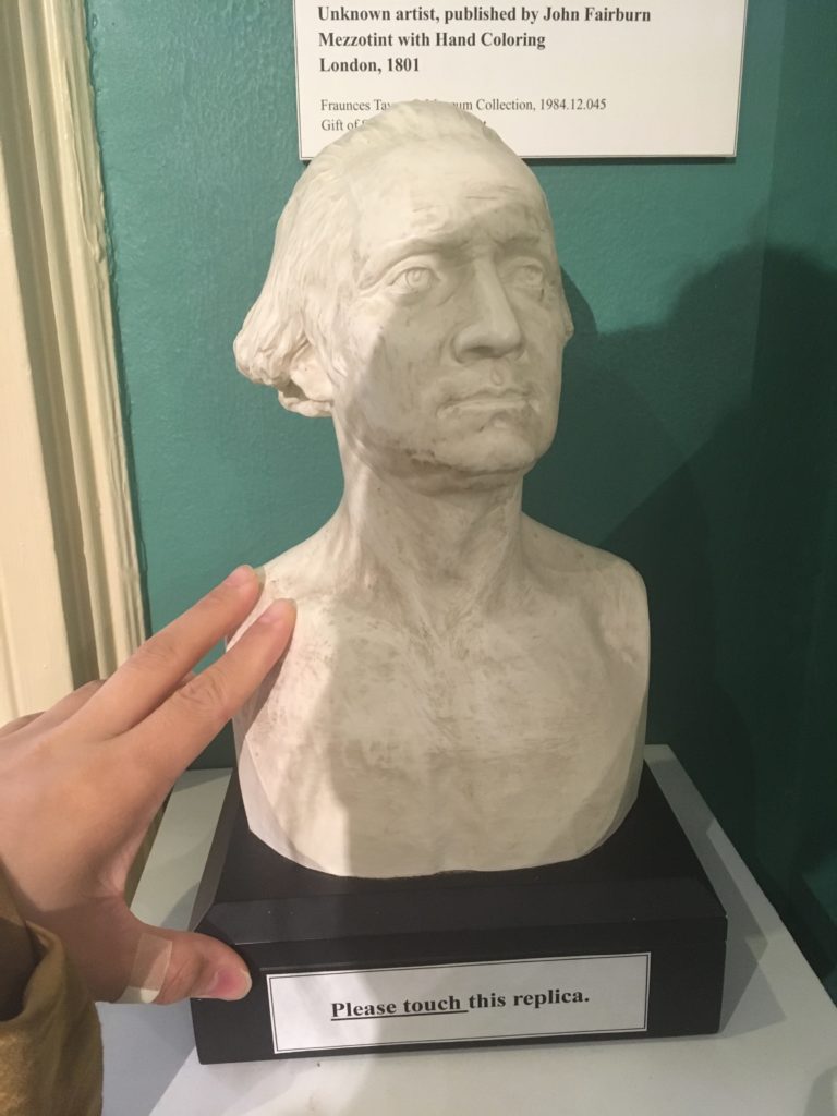
Touch Art and History

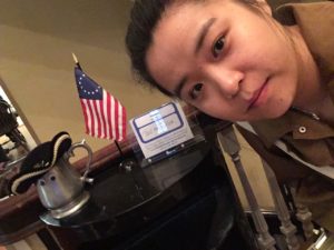
Take a Selfie with Mascot

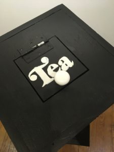
Smell the Merchandise-Tea

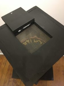
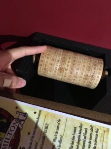
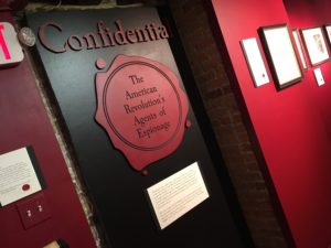
Decode Confidential

I Learnt Big Names and Great Events on Site|

Museum Collections

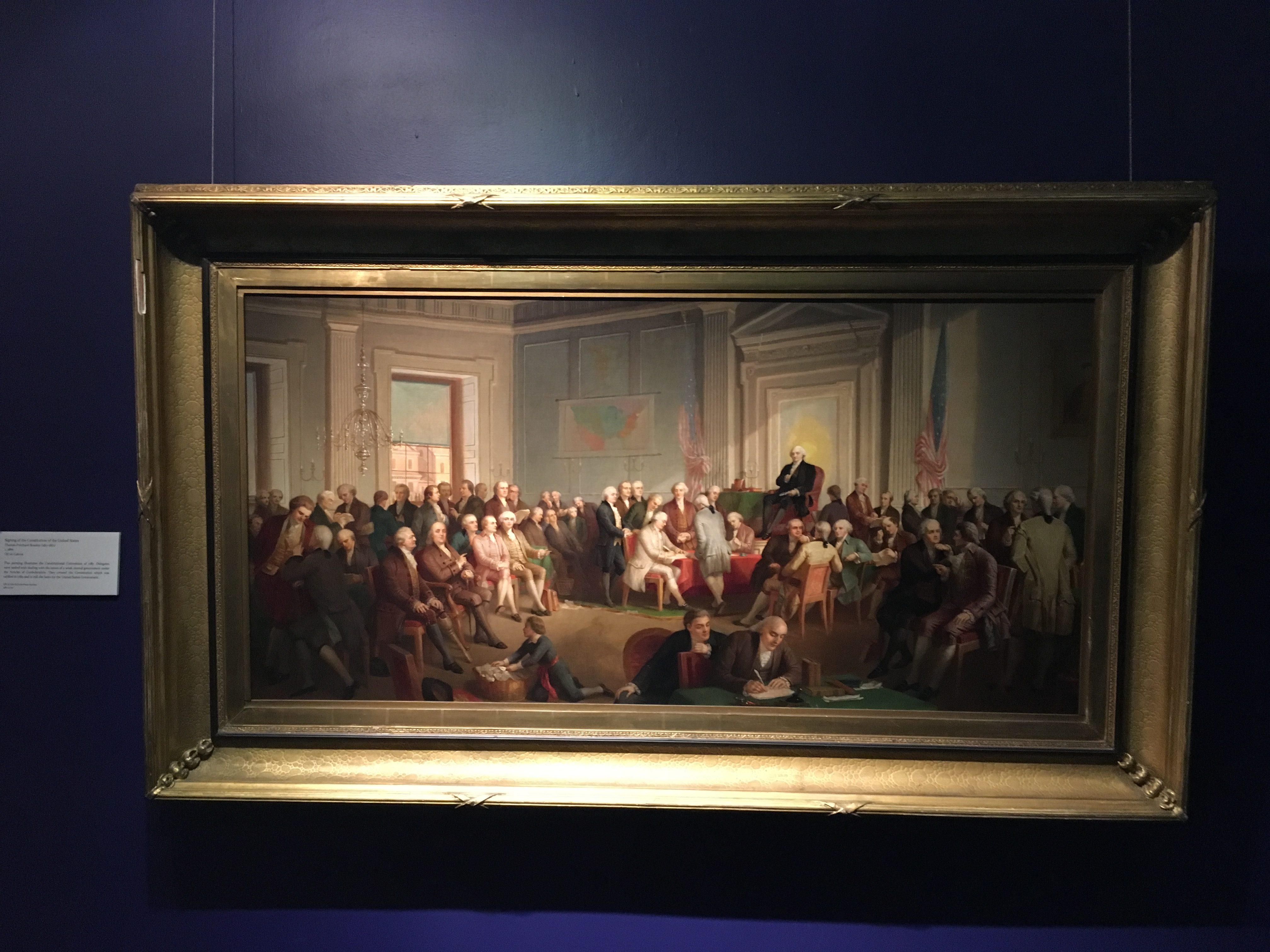
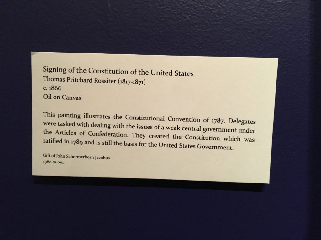
Fraunces Tavern Museum’s mission is to “preserve and interpret the history of the American Revolutionary era through public education”. On the history page of the museum online, we can find longer lines of history of Manhattan, than United States. If there is one collection to be the greatest moment, the next one would be the one: Signing of the Constitution of the United States.

It was in this room that President Washington took leave in Dec. 4, 1783, and the most emotional Memoirs of Colonel Benjamin Tallmadge, written in 1830 and now in the collection of Fraunces Tavern Museum.

“After the officers had taken a glass of wine General Washington said ‘I cannot come to each of you but shall feel obliged if each of you will come and take me by the hand.’ General Knox being nearest to him turned to the Commander-in-chief who, suffused in tears, was incapable of utterance but grasped his hand when they embraced each other in silence. In the same affectionate manner every officer in the room marched up and parted with his general in chief. Such a scene of sorrow and weeping I had never before witnessed and fondly hope I may never be called to witness again.”

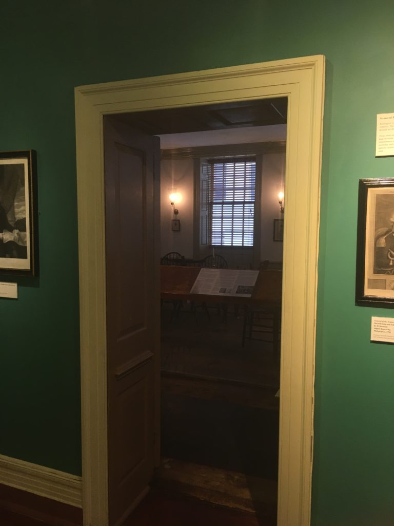
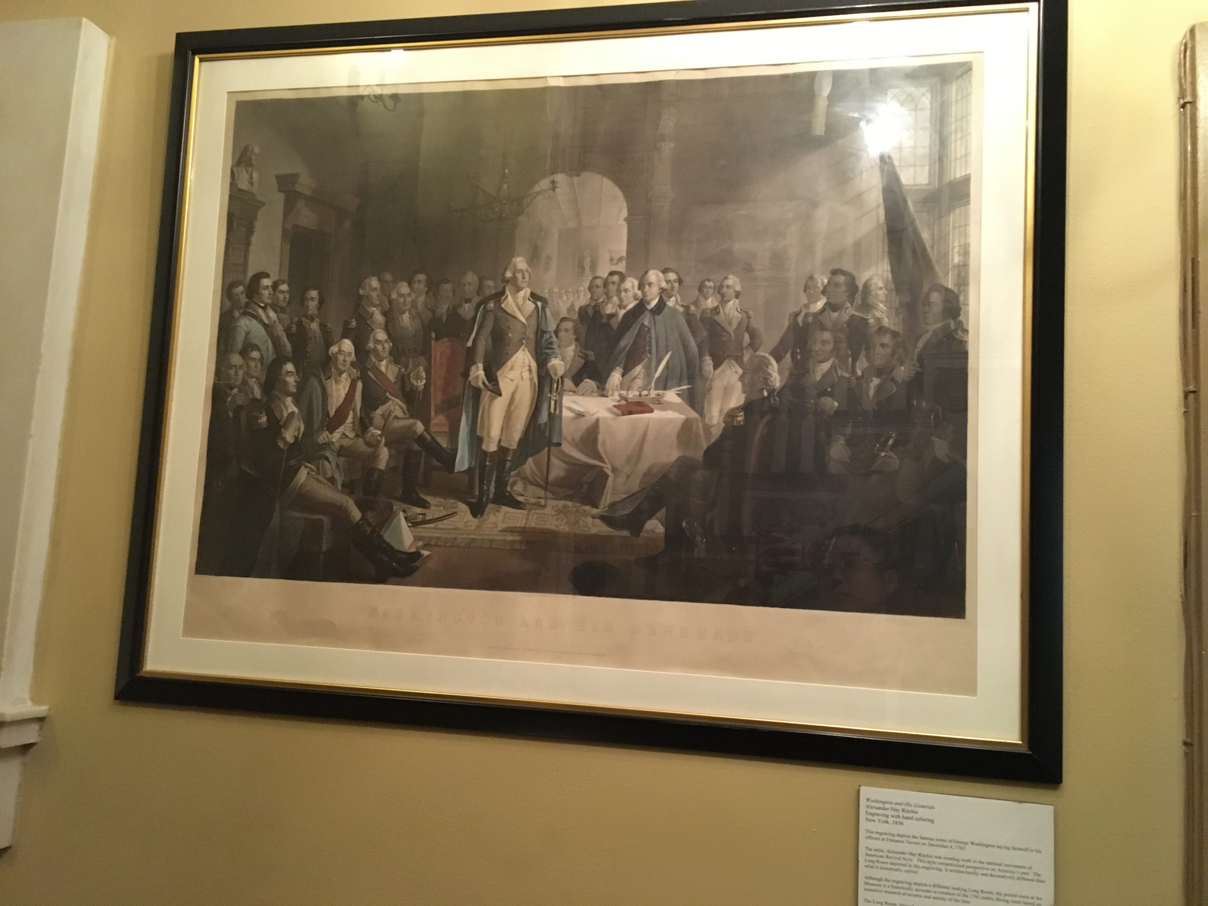
The Long Room is preserved and no photo is allowed in this room. The best picture of that moment can be found in the engraving with hand coloring below.

Samuel Fraunces, as the “inn holder” of Frances Tavern, centered in the middle of commercial district, who owns business but also brings him politics connections.”On December 4, 1783, nine days after the last British soldiers left American soil, George Washington invited the officers of the Continental Army to join him in the Long Room of Fraunces Tavern so he could say farewell.” Later from May 1789 to Feburary 1790, Fraunces was hired, by Washington, as  the newly elected President, chief steward in New York. “He was responsible for overseeing the operation of the house and a staff of twelve. ”

The “inn” is more than a living space, in 1768, chamber of commerce was founded here. It became actually the “center of politics”


Thoughts & Reflection

Museums to me,  is another form of reading, in an interactive way, from multimedia sources. Compared to watching movie or documentaries, I love more of reading text and paragraph on a piece of paper material, such as a book. In this way, the reader has more rights to break and think twice at any pace. You can also take note, ask question or scan or search back and forth. A book after a reading process is never the same book it used to be, it became a product of both the writer and the reader.

My favorite categories of reading was biography and travel notes. These are based on true stories, it is supposed to. Publishing books is a way of telling a story in author’s tone. However, it is never the same, with a realtime and real space experience. Museums, are devoted to preserving the history and culture, in a different time, but real place.

Through the real touch of the original site, I feel the strong sense of politic hand in hand with finance. This museum was established in 1907. I wondered, will there be a museum of people in general, instead of politics. In Jensen’s words, there should be a shift from capitalism to liberal and pluralist, as well as democracy rather than corporate.

In Jenson’s article, 2008, “Library-Neutrality”, with open-minded applied to sciences, innovation increases; while with progressive applied to humanities, sometimes it is dangerous, well, “American revolutionary war arose from growing tensions between residents of Great Britain’s 13 North American colonies and the colonial government, which represented the British crown”. I feel that it maybe dangerous to British government at that time, but for American at this time, it is the opposite.


Reference

https://www.history.com/topics/american-revolution/american-revolution-history

http://www.frauncestavernmuseum.org/history/


NYPL: Constraints Outside Bars by Amber Pasiak

NYPL: Constraints Outside Bars

Nestled in an unassuming building on 39thstreet in Manhattan, lies the backbone to many of the programs offered through New York Public Library. One of these outreach programs is the Correctional Services. This program is a small staffed group of librarians and volunteers who help provide reference information, circulating book service, video visitation and recorded readings for children to people in jail. These are primarily New York state jails; however, the reach and depth of this program is rapidly expanding. It is here that I got a firsthand look at what it entails to run a program of this kind. I had the pleasure of meeting and spending the morning with Emily Jacobson, aCorrectional Services Librarian.

Before I went to do this observation, I read The International Federation of Library Associations and Institutions guideline for library services to prisoners which details practices that “reflect an acceptable level of library service, which could be achieved in most countries where national and local government policies support the existence of prison libraries.” This guideline stresses the shift from punishment to education and rehabilitation, wherein the role of the library is paramount. These guidelines offer hopeful, democratic and, which I was soon to discover, slightly unrealistic in practice, suggestions. This is not to say that the staff at NYPL has disregarded the suggestions, quite the opposite actually. I felt that they were doing their best to emulate them with what they were allotted. I also want to stress that I do recognize that a large general guidebook is going to have different uses across different institutions, whether it is a federal vs state jail or prison or a different type of correctional facility.

The Day:

Emily and I started the morning with a general overrun of all the services that are provided and how. The first task of the day was to sort through the many reference letters that have been mailed in. A great many of these letters requested a copy of NYPL’s “Connections” guide. This is a reentry guide that is free to people who are in jail or prison and offers information on housing and finding a job. Most of the other letters addressed issues about self-help resources, general reference questions and legal information.

The second part of the day was the selection and shelving of books that have been donated to the program. The correctional services is a donation based service. This means that a lot of the books that are donated cannot be used for certain reasons. Although there is a very limited “banned” book list, a great many others were in too poor condition, repeats or, to my surprise, very out of date magazines.

I was also surprised to learn that the program is all analog. Emily explained that there were several reasons for this. The first was that many of the jails do not have internet access, hence why this program’s reference letters were so popular, and there are many safety procedures in place that would make carrying out a regular library check out difficult. Another reason is that there are very few library locations inside jails, and thus the library will either be a popup that happens roughly twice a month or a book cart service. Some of the jails do offer some storage space, but when everything is in constant transit it makes hard to keep track of most of the books, as checking out a book is a hand-written paper process, with just a title and a patron name.

Keeping track of the books while working in a jail is the sort of dilemma that a regular library doesn’t normally see. As Emily explained to me, a jail is where someone is either awaiting trial, or has been sentenced for less than a year. This means that the patrons to a library jail are very often in flux and books tend to go missing or get lost, making it nearly impossible to have a traditional check out system.

The Days Reflections:

Although I spent most of the morning doing physical aspects of the job, it wasn’t hard to see how the theoretical frameworks that have been discussed in class were in play. The first that struck out to me was the curating choices of the librarians. As this is donation based, the variety of books coming in was already limited, and then the books about bomb making, etc. (if any) had to be removed, any damaged or watermarked books could not be used, and any hard cover books were deemed physically dangerous. So, what does this leave you with? Well, it looked to me that it was a million copies of the same Jo Nesbo and Nikki Turner books.

How does a librarian deal with trying to offer a balanced selection with limited resources and restrictions? How does a librarian take hold of their accountability, responsibility and recognize their “power” in a much stricter and limiting politized institution? Reference letters and book requests do show how a librarian might try to build a certain collection, however, this is not always possible to do, due to funding, donations and general stigmatization of the rights owed to a person in jail. When do these critical questions about a library space overlap or go against the critical questions about the roles jails and prisons play in society? William Birdsall articulates in his article “A political economy of librarianship” that: “librarians need to devote more effort researching the political and economic dynamics that define the past and current environment of libraries. Libraries are the creation and instrument of public policy derived from political processes.” Could this also not be said about jails and prisons?

In the article, “Information needs in prisons and jails: A discourse analytic approach”, the authors Debbie Rabina, Emily Drabinski and Laurin Paradise state that the information needs of people in prison and jail are actually constructed and created by those institutions. This article was written using data from the actual reference letters that NYPL correctional services have received. The article goes on to talk about the term digital divide. This term, otherwise referred to as information poverty, has been contested due to the binaries that it creates and simplification and stigmatization that it reinforces. They state that creating binaries related to the digital divide can be dangerous by placing librarians in a higher viewed position of power. They argue that the problem of information access is not solely the result of a lack of internet.

I found this point interesting due to the already existing idea that people in jail or prison are coming from a place of poverty and that by placing them in a binary of digital divide, scholars are reinforcing that separation, while also adding another level of authoritative power above them.

Conclusion:

Although I do not have an answer to many of the questions I have raised here, I did find it enlightening to have seen how some of the critical questions and theoretical frameworks we have been introduced to as students fit into real world situations. My day spent at the NYPL correctional services has made me think about these questions in a different manner. There has already been much discussion on how some of these issues of power play out differently between public and academic libraries, however when dealing with a public library situated in a very specific authoritative politized institution they take on another new role.


“Future research should address the information that incarcerated users have, not what those of us on the outside imagine they do not.”(Rabina, 2016.)


Resources:

American Library Association. (2017) “Prison Libraries”. Retrieved from http://libguides.ala.org/PrisonLibraries/Home

Birdsall, W. (2001) “A political economy of librarianship?” Progressive Librarian, 18, Summer 2001. Retrieved from https://lms.pratt.edu/pluginfile.php/828932/mod_resource/content/0/02_Birdsall_2001.pdf

Lehmann, V., Locke, J., & International Federation of Library Associations and Institutions, T. H. (Netherlands). (2005). Guidelines for Library Services to Prisoners. 3rd Edition. IFLA Professional Reports, No. 92. International Federation of Library Associations and Institutions. Retrieved fromhttps://files.eric.ed.gov/fulltext/ED497652.pdf

Rabina, D., Drabinski, E., & Paradise, L. (2016) “Information needs in prisons and jails: A discourse analytic approach.” De Gruyter. Retrieved from https://lms.pratt.edu/pluginfile.php/829457/mod_resource/content/0/2016_Libri.pdf