Digital life: New Museum archive system ARIES

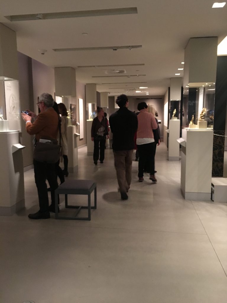
Private Tour to Frick Art Reference Collection.

In their roles of preserving tangible and intangible heritage, museums have documented a corpus of knowledge that is fundamental for societies. However, this orientation, which has paid more attention to artifacts, is one of the reasons why museums are perceived as distant institutions that are more concerned with the past, and that are more at the service of the intellectual elite of the museums (MacDonald and Alsford, 2010). Consequently, museums, beyond being places to collect, preserve, study, and exhibit, are redefining themselves and making efforts to respond to a fast paced information society by incorporating more interactive museum management information technologies.

Frick Art Reference collection is a leading organization for digitizing their collection it is dedicated their resources to collect, preserve, study, exhibit, and shared through online. Frick Art Reference Library’s mission is to provide public access to materials and programs related to the study of fine and decorative arts created in the Western tradition from the fourth to the twentieth century.

Entering Frick Art Reference Library(FARL)

In order to visit the Frick Art Reference Library, you need to be 18 and older and you need to be registered or pre-registered through online. for security issue Coats, umbrellas, camera, and laptop cases, and bags larger than 9″ x 12″ x 3″ must be checked.

Stephen J. Bury

Stephen J. Bury is a scholar, art historian and the Andrew W. Mellon Chief Librarian of the Frick Art Reference Library in New York City. Meeting Stephen J. Bury was a strange experience to me, especially right after I read his essay about his plans about digitalizing Frick Collection: Embedding a culture of innovation at the Frick art reference library in Technology and digital initiatives: innovative approaches for museums / edited by Juilee Decker.  He introduced ARIES and equipment they use for documenting works.

ARIES: ARt Image Exploration Space

Louisa Wood Ruby, the Head of Research at The Frick Art Reference Library gave us to talk about the open source program they developed. As an emerging museum and digital culture professionals, I hope to create a culture of openness and accessibility in museums, so that visitors can reduce their fear of institutions and have a better understanding of the contents of collections and exhibitions. ARIES is the perfect example for  Libraries in incorporating technologies.

ARIES is an open source developed by members of the Digital Art History Lab (DAHL) collaborated with New York University’s Tandon School of Engineering and the Universidade Federal Fluminense, Brazill. This program is originally created to help to visually compare the artwork it saves tremendous time for art historian and curator.

ARIES follows Sir Tim Berners-Lee’s theory of “information management” system and it became the conceptual and architectural structure for the Web. Berners-Lee eventually released the code for his system — for free — It became a milestone in easing the way for ordinary people to access documents and interact over the Internet. (Digital life in 2025: Experts predict the internet will become ‘like electricity’-less visible, yet more deeply embedded in people’s lives for good and ill by Prof. Janna Anderson, Lee Rainie)https://lms.pratt.edu/pluginfile.php/831785/mod_resource/content/0/PIP_Report_Future_of_the_Internet_Predictions_031114.pdf

ARIES is free program for all and it is designed not just for the art historian and researcher, it is designed for everyone who is interest in the collection in Frick Art Reference Library(FARL)

Art historians have traditionally used physical light boxes to prepare exhibits or curate collections. which is exhausting and time-consuming ARIES is created to address problems. It is an image Exploration Space, an interactive image manipulation system that enables the exploration and organization of fine digital art. The system allows images to be compared in multiple ways, offering dynamic overlays analogous to a physical light box, and supporting advanced image comparisons and feature-matching functions, available through computational image processing.


ARIES is still under the development and they recently added tracking program for dispersal of an artist’s work. Tacking work would be really useful for curating exhibitions.


The Art Gallery of Ontario: Visitor engagement in the museum with the application.(HCI)

INFO-601 Foundations of Information Dr.Sula
Juri Rhyu
Observation

Observation—Complete an approximately three-hour observation of an information environment, chosen in consultation with the professor. Your article should describe what happened during your observation and should connect those details to larger issues in the field, citing/using readings where they are relevant.

Observation: The Art Gallery of Ontario: Visitor engagement in the museum with the application.

The About the Art Gallery of Ontario (AGO)

Visiting The Art Gallery of Ontario (AGO) was one of my travel list in Canada.
The Art Gallery of Ontario (AGO) is an art museum located at 317 Dundas Street, West Toronto, Ontario. Toronto is the largest city in Canada, and the AGO is one of the largest art museums in North America. The museum has nearly 95,000 of various artworks from contemporary art to European masterpiece. They support emerging indigenous Canadian artists and collaborative exhibitions with other museums and galleries around the world. The AGO is also known for their architecture. It was designed by famous Canadian architect Frank Gehry. The AGO is the first place where he experienced art in his childhood. I always admire Frank Gehry’s works because of his design philosophy. He wanted to build a museum that connects a city and its people to great art and art experience. His design intention is exactly appropriate for AGO’s mission: “We bring people together with art to see, experience and understand the world in new ways”1.

Before visiting the AGO, I checked their website to get information about the museum. The website is well designed; the first page has all the necessary information including gallery hours, current events, how to get to the museum, getting admission tickets, education events or classes and museum news which are all I wanted to know. The AGO presents wide-ranging exhibitions and educational programs. The museum is funded by the Ontario Ministry of Tourism, Culture, and Sports and additionally supported by the City of Toronto. The AGO always invites interesting and worldwide known exhibitions as well as developing own educational programs for visitors and publications. Recently, the museum has been crowdfunding to purchase “Infinity Mirrored Room” by artist Yayoi Kusama.2 They encourage visitors to donate for the artworks. More than 3,000 people have chipped in a contribution to permanently acquire Kusama’s brand new installation, even though they haven’t seen it until now. The artwork itself costs $2 million, with $1 million of the price tag paid for by the Art Gallery of Ontario Foundation. With one more week to go, the month-long crowdfunding campaign to raise the remainder sits at nearly $413,000, as of midday Friday. The AGO says it’s hoping more people donate on next week’s “Giving

1 About the AGO. (n.d.). Retrieved from https://ago.ca/about/about-the-ago
2 Here’s a sneak peek at the new Yayoi Kusama infinity room the AGO wants your help to buy | CBC News. (2018, November 23). Retrieved from https://www.cbc.ca/news/canada/toronto/kusama-infinity-room-first-look-1.4917109

Tuesday,” a day devoted to donations following “Black Friday” shopping. Funding is not enough to buy Kusama’s work yet, but it shows how much people care about the museum and participating in the development of the museum.

Special Exhibition

Anthropocene: The Human Epoch
Anthropocene: dramatically illustrates how we, individually and collectively, are leaving a human signature on our world.3 This show is organized by the Art Gallery of Ontario (AGO) and the Canadian Photography Institute(CPI) of the National Gallery of Canada(NGC), in partnership with Fondazione MAST.

Anthropocene is the culmination of an ambitious, four-year-long collaboration by the artist and filmmakers Edward Burtynsky, Jennifer Baichwal, and Nicholas de Penciaer. Their goal is capturing the massive scope of human effects on land, sky, and water.

Technology and Art(HCI)

The field of human-Computer interaction(HCI) is expanded alongside the extensive technological developments such as the internet wireless technologies, smartphones. These had created many opportunities for augmenting extending and supporting user experience, interactions, and communication.(New Theoretical approaches for Human-Computer Interaction by Yvonne Roger University of Sussex)

AGO developed an application with the artist to provide a unique experience to the visitor.

The artists created Augmented Reality (AR) Installations which can be activated by simply downloading application AVARA. The museum places the symbol on the floor and wall labels to help visitor identify each AR activation. There are six activations in total, four-videos, and two 3D AR installations which present experiences of confiscated ivory tusks, a northern white rhinoceros and a Douglas fir tree at or near the actual scale.

Conclusion

This museum visit did remind me of the several articles about digitalizing the institution, collecting data and museum heritage. The Art Gallery of Ontario (AGO) is seeking ways to directly interact with the visitors and to create an impressive museum experience rather than delivering pieces of information. This show is well curated with care and utilized the gallery space as much as possible. I visited this museum during the weekday, and the museum had a number of people and school groups, but it was not too crowded. Since this show encourages you to be on the phone, the show prepared the charging station right below the infographic about pollution and what is co. A museum educator was at the station to explain the works and environment and to answer questions from museum visitors.

As a museum educator, getting feedback is as important as curating shows. They set up a pathway at the end of the exhibition to make people experience interactive activities with touch screens which helps museums collect data. They invite people to upload photos of the show with hashtag#. Once you upload a photo with hashtag#, it is also automatically uploaded on the museum website (https://ago.ca/exhibitions/anthropocene). In my opinion, they should not post personal pictures until they get permission. Even though people tag the museum and the show, they would not expect that their pictures could be uploaded on the museum website.

In addition, I hardly believe that digital museums can replace traditional ones because a museum is where not only provides information and archives historical heritage but also where allows people to have a physical experience with art. The Museum building itself is

3 Anthropocene. (n.d.). Retrieved from https://ago.ca/exhibitions/anthropocene

also an art piece, and viewing digital contents does not give people the same experience as physically being in the space.

Observation- Larchmont Public Library: The Provisions of a Small Local Library

Despite having consistently been a resident of New Rochelle, I have had a long-lasting connection with the nearby Larchmont Public Library. As a senior in high school I volunteered there, but quite a bit has changed both physically and technologically since I was last there on a regular basis. Extensive renovations were made in 2016.

The circulation desk is straight ahead as you walk in. Beyond that is the newly added and beautifully constructed Technology Commons, an open space with computers and tables. This serves as an excellent location for such a center. It is in close proximity to the circulation desk which always has at least one person there to assist patrons. I went on a Sunday, which usually is a relatively quiet day and most of the librarians are not there. Nonetheless, there was one man there who had quite a few patrons approach him for technological assistance. He maintained his affable demeanor throughout his exchanges with the patrons despite having quite a few people approach him. One patron’s issue seemed to be persistent and he returned repeatedly to the librarian for help. I did not detect any sense of frustration from the librarian despite the patron getting rather flustered. The librarian simply set him up at a different computer and the issue seemed to have been resolved.

Surrounding the Technology Center are enclosed areas designed for private tutoring sessions. Overlooking the Technology Center is a balcony area which hosts the adult fiction books. On the floor below is the adult non-fiction section. There is a diminutive art gallery (the Oresman Gallery) on the way to the Burchell Children’s Room which was completed in 2010. For a small public library which only has 100,00 items, there are many services which are offered.

Slightly unusual for a public library of its size, there is quite a lot of French items. The Children’s Library  has an entire section of French books and there are an abundance of French options in the adult sections as well. There is a regular French/English story time offered on Sundays. Larchmont has historically had a large number of French speaking residents. The Lycee Franco-Americain de New York is right next door to the library. It is clear that the library has this community in mind when developing the collection and organizing the programming.

The library has been wheelchair accessible since 1995, although this is possibly an area where there can be room for improvement. On the bottom floor, there is a wheelchair lift next to the staircase so as to accommodate the physically handicapped. However, it can be a bit of a pain to use. In order to operate the lift, one needs to have a key which must be obtained from the circulation desk. It would probably be simpler to have a ramp instead.

Another issue I overheard someone complain about was that the book drop was underneath the computer kiosk for searching the catalog. It is possibly a slight inconvenience and perhaps not an intuitive place for it to be, but to be honest, I found the complaint to be rather petty. Still, I suppose it is something worth considering when creating an information space.

I was also surprised by the number of research resources that are provided at the Larchmont Public Library. There are four full-time reference librarians and one part-time reference librarian (she actually used to be the assistant director of the library and my supervisor). The reference librarians are not there on Sundays, but there is permanent use of the online resources, which include materials on Arts and Literature, Biographies, Genealogy, Health and Science, History, Business and Law, Social Science, Newspapers, Serials etc. I was astounded by how much this small public library has to offer.


Achieving Digital at the Met

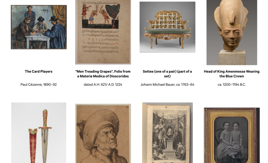
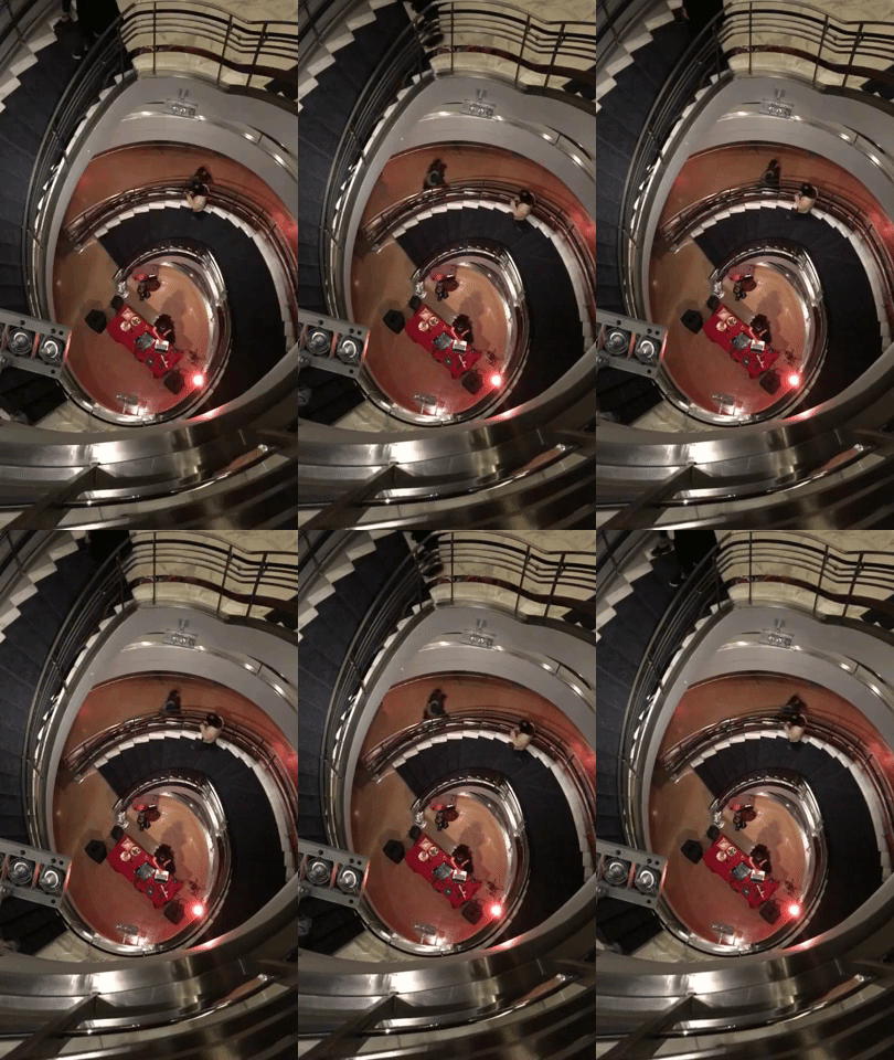
 I attended an event at the Metropolitan Museum of Art organized by Professor Villaespesa for Info School students. While there, we heard from Loic Tallon, the museum’s Chief Digital Officer, and Jennie Choi, the General Manager of Collection Information. We heard about their work at the museum and their approaches to the idea of digital at an institution as large and as entrenched in its ways as the Met can be.

One of Tallon’s central theses to his work at the Met is that “the strategy of centralizing responsibility for digital transformation within a single, distinct department is reaching its limits. Now a broader institutional approach is needed.” It’s a theme he’s written on for the Met’s blog and a topic he discussed during his talk. The boundaries for digital initiatives in museums are wavy, indistinct lines. In his blog post, he charts out different responsibilities that fall under the scope of “digital” at various museums around the country. No two museums approach it the same way, and it comes increasingly reductive to limit certain processes to a digital department, when the reality is that all departments should be examining their workflows for places they can adapt and embrace new technologies.

At the Met, the Digital department is comprised of three teams: a team dedicated to collections information and data management, a team of content producers, and a team for product development. Tallon described their work as divided between the two paths people can take to interact with the museum. The first path is the in person experience. When a visitor enters the Met’s physical spaces, what work can the digital team do to enhance their experience? The second path is for the remote user, who interacts with the Met’s collection and its services online. What does the digital team need to accomplish to present the museum to the rest of the world?

The first path is generally constrained by space and exhibit demands, but the possibilities for the second path are wide open. The questions regarding digital at the Met are similar to the ones the High asked itself for its physical gallery reinstallation. How does a museum stay relevant, provide the best representation of its collection, and engage with as many people as possible?

At the Met, the answer was to invest more heavily in digital. Tallon admitted that the museum’s online presence had very little effect on the museum’s bottom line. And yet, it’s a presence worth building on as the world increasingly engages with itself online. Last year, the Met launched it’s Open Access intiative. They made high quality images of their public domain collection available to anyone under a Creative Commons Zero license and worked with Wikimedia and Google to make their images more accessible on the web. Just last month in October, they made those images along with information about all the works in the museum’s collection available via API.

Since the launch of the Open Access initiative, the Met has been able to reach a larger audience with images from their collection. While it hasn’t resulted in a significant increase in traffic to the Met’s website, its images are available on Wikipedia pages and Google search results. These other platforms allow a wider audience to engage with the Met’s collection, including users who speak a language other than English–something the Met itself would never have been able to do on its own. The API is only a month old, so results remain to be seen. Those interested in updates should keep an eye on Tallon’s posts on the Met’s blog.

In the second half, we heard from Jennie Choi, General Manager of Collection Information. With over 20 years of experience at the Met, she had some really interesting insights into the museum’s metadata. The primary piece of software used at the Met is The Museum System, a full collections management system that feeds its information into other parts of the Met, including NetX, the museum’s digital asset management system, and the museum’s information kiosks.

The Met has a long history of making and keeping records on its collection, but it’s only in the last few years that it has created a set of cataloguing standards and worked across departments to standardize data like artist names and object provenance. Previously, each curatorial department was responsible for its own records, which created heavy inconsistencies in how works were labeled and could be found online. Choi was on a team that worked with curators over two years to bring all that metadata under one roof and continues to work with departments to bulk out information available on works from the collection.

Choi’s latest project is tagging works from the collection with content keywords–something that’s never previously been done. In an initial pass through the collection, the museum outsourced the work to a team of 70 who worked 24/7 for three months to assign various tags to works. They looked for things like objects featured in paintings, or whether the work depicted a man or woman. There have already been major challenges to this. Using such a large group of taggers created inconsistencies, and the lack of a standard created inaccuracies. There were also cultural differences that hindered the quality of the documentation. For example, it was hard for the team to accurately identify satire in the drawings collection. Given the opportunity to do it again, Choi says she would’ve preferred to work with a smaller team with more training over a longer period of time. Due to the nature of the project funding, the initial work had to be completed within three months and the tags need to be reviewed before they can be added to public-facing systems.

I thought this was a fascinating look behind the digital initiatives at the Met. It felt perfectly in line with my observation of the High. Both institutions are in the midst of interrogating their stewardship of their respective collections. In the High’s case, it was of their actual physical space. For the Met, a full scale physical reorganization is improbable, but they have untapped potential in carving out a digital space of their own.

Observation of The Rubin Museum of Art

I’ve never heard about The Rubin Museum until I had a conversation about cultural differences between Taiwan and China with my English Literature Professor Terri Bennett. After the interesting conversation with Professor Terri, I’ve decided to choose The Rubin Museum of Art to do my observation due to cultural, religious, and political related reasons. I was really excited to see how different audience behaves in such place that I defined as a “controversial museum”.

Objective

Understand how the visitors from different backgrounds (includes culture, nationalities, and even ethnicities) behave or interact with the artworks in The Rubin Museum of Art. Below are something I’d like to know from this observation:
1. Rough demographic of the visitor (age, ethnicity, gender)
2. General behavior when browsing all artworks between Asian visitors and others
3. Interaction with the installation in “The Shrine Room” on the fourth floor.

Brief intro of The Rubin Museum of Art

The Rubin Museum is a museum that aims to “stimulate learning, promotes understanding, and inspires personal connections to the ideas, cultures, and art of Himalayan regions (The Rubin Museum, 2018)” by displaying collections of Himalayan arts.

Brief intro of “The Shrine Room”

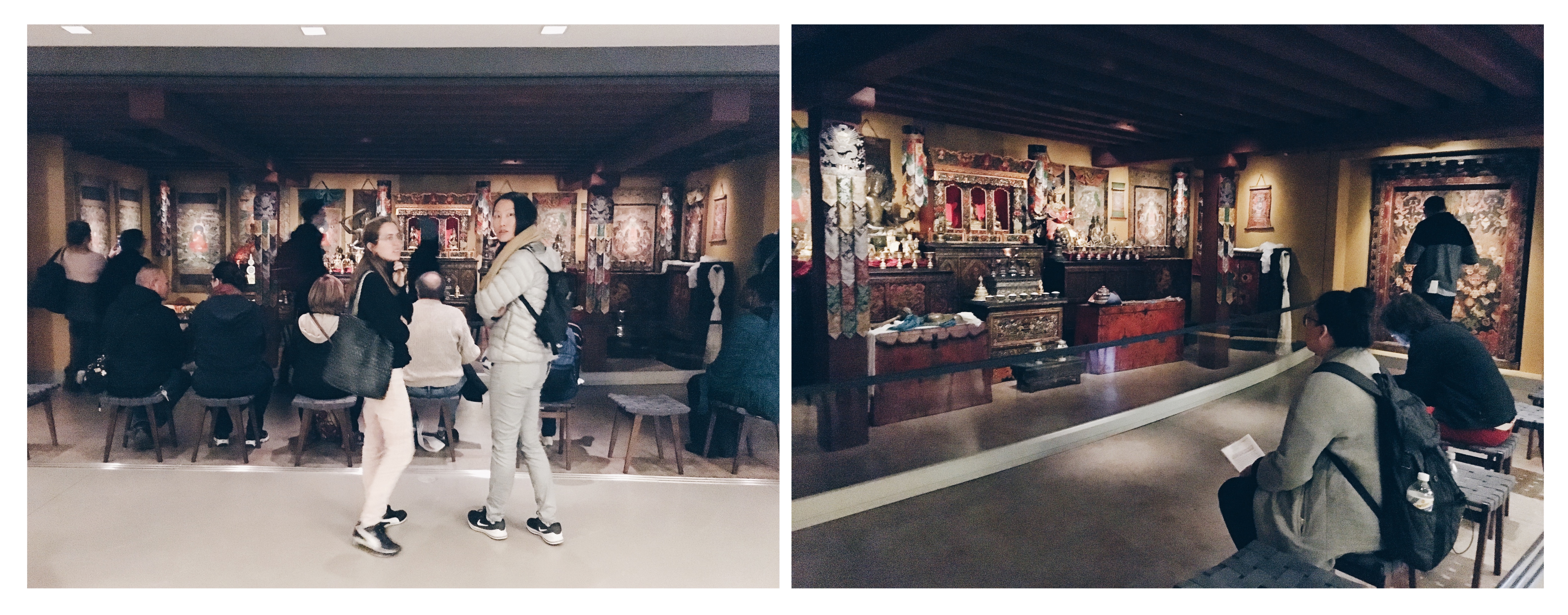
“The Tibetan Buddhist Shrine Room evokes the aesthetics and atmosphere of a traditional Tibetan sacred space and offers visitors the opportunity to experience Tibetan religious art in its cultural context (The Rubin Museum, 2018).” This is actually not a “room”, it’s more like an open space with a fence to prevent visitors get too close to the installation.
  

Results
These results are based on a three-hours long observation I did on Oct 26th, from 6:00 pm-9:00 pm. The Rubin had a free admission opening night for the renewed art installation called “The Shrine Room” on the fourth floor. All results might not be able to represent the general phenomena of The Rubin.

General

1. There were only a small amount of visitors are Asian (Only 3-4 Asian per visit group, each group has around 45-50 visitors). Most of the Asian visitors are female (Oftentimes there was only one man in the Asian visit group, each group has 3-4 visitors).
2.  Most visitors who are not Asian tend to take close-up photos for art objects like the statues of the deity. Asian visitors are opposite, few of them even pray to the statues of the deity.

The Shrine Room:

There were three types of visitors during that three hours:
a. Believer/disciple-they either prayed with beads or special hand
    gesture.
b. The curious ones-they just came and sat on one of the eight chairs in
    front of the art setting.
c. Selfie lover/Social media enthusiast-they took selfies with the
   “art installation”, and some of them upload to social media.
2. Believer/disciple are most likely female, across the races/ethics.
3. Staying time is 15-20 min for almost every group of people, no matter
     they came for praying/meditating, taking selfies, or just sitting.
4. Most of the visitors who took the seats in front of the installation did not
     cross their legs, and did not even slightly open their legs. My assumption
     of this posture is the audiences were aware of the installation is solemn
     from a religious aspect.

Reflection

1. Broad stating “Buddhist art” to “Himalayan art” doesn’t justify the misperception of The Rubin Museum of Art.
If you check the definition of Himalayan art online, no matter from academic resources or Wikipedia, the strong connection between Himalayan art and Buddhist art is undeniable. In this case, the way to display artworks and do storytelling need to handle with care, otherwise, the outcome might be misleading toward to a religious display in a disrespectful manner. When The Rubin claimed they did try to avoid creating a “faux Tibetan temple”, I can’t really find the supporting pieces of evidence while browsing their available collections. As a Taiwanese Buddhist (Which is highly influenced by Chinese Buddhism, it combines both Taoism and Confucianism), how the exhibits display in The Rubin bother me a lot for three major reasons:

A. No comprehensive review or introduction of all collection they display-
This brought up a cultural related issue: the misperception of the so-called “Himalayan art”, and how other types of Buddhists perceive the collections in The Rubin Museum. My Buddhism culture oftentimes sees religious art creations as a solemn representation of god’s wellness. Unlike Himalaya Buddhism, we worship the sculptures/paintings of deity, the mysterious powers are in those”solemn objects”. The daily ritual practice is to pray in front of those”solemn objects”, any disrespectful behavior would cause some serious punishment by the deity. The relationship between believers and the “solemn objects ” is pretty restricted to a top-down affiliation from a religious aspect, and this might be the major difference between Taiwanese/Chinese Buddhism and Himalayan Buddhism, but there is no emphasis on the differences in The Rubin as a comprehensive overview of it’s “Himalayan art” collection. I assume people have a similar religious background like me would misinterpret those art objects with existing understanding, and might not willing to visit at all.

B. Major collection/display generate a strong religious vibe like a temple-the major collection are paintings and sculptures, only a few other types of “Himalayan art” like masks or photographs are collected and displayed in the museum. The deity paintings or sculpture are the main objects of traditional ritual practice. If a place displays religious paintings or sculptures mostly without a proper storytelling or introduction, it would more likely to be treated as a “temple-like” space, I will share my findings with photos as supporting evidence later.
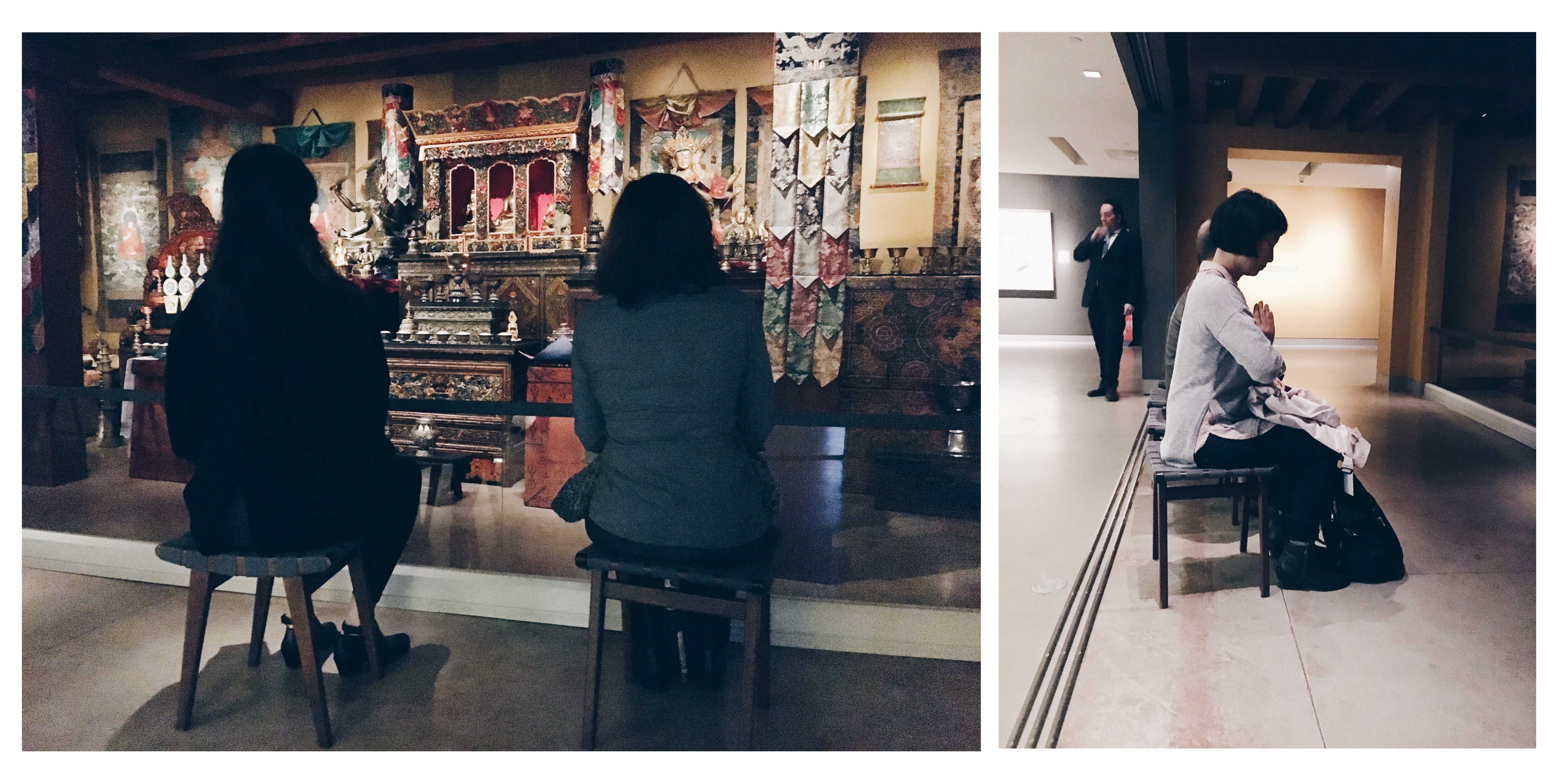
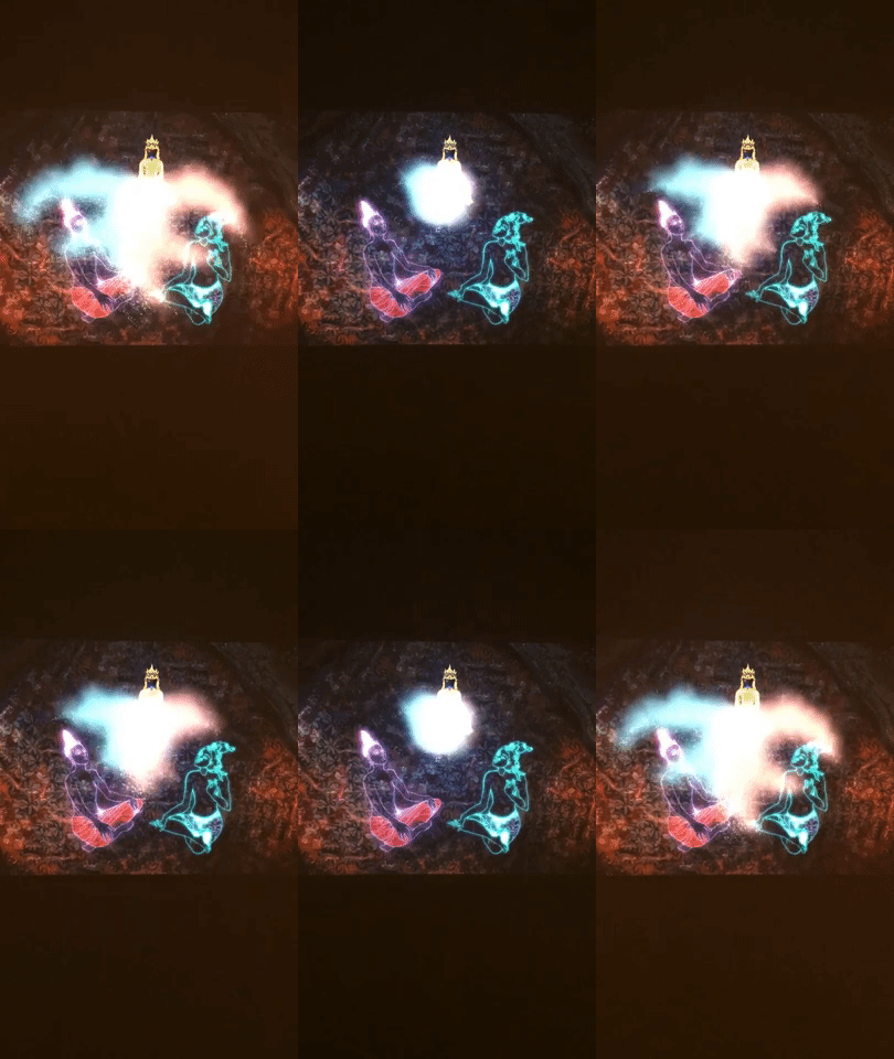
C. Lack of deep understanding of broad Buddhism culture leads to a weird contemporary “Himalayan art” outcome- there were some animated arts put Buddha and other main Buddhism figures into neon arts with some crazy cartoon-ish images. Not sure it’s because of cultural difference or other superstitious reasons, it’s pretty rare in Asia to see artist “play with” the Buddha figures. Often times people are afraid of this kind of recreation since that could consider as a disrespectful behavior and would receive a curse as a punishment. I personally feel so uncomfortable about those type of artworks, and I doubt if the museum ever considers their audience might interpret the artworks like me or not.

The Shrine Room experience is the most tricky part to me. I can’t define it as a type of recreation to provide an immersive visit experience like an “artwork”, or, it represents a type of preservation of religious art and culture. I am more tend to believe that’s a preservation, to showcase how it looks like in Himalaya’s family house, and what’s the vibe. The reason why I don’t consider The Shrine Roon as a recreation artwork, it’s because there is no obvious storytelling or blending any contemporary art factor into it.
I read that as an authentic religious display room instead of an artwork. In this case, if we see The Shrine Room as a preservation project, then I tend to agree with what Cloonan mentioned in the W(h)ither Preservation article “Preservation must be approached not only as a set of technical solutions to technical problems, but also as a more complex concept that includes social dimensions (Cloonan, 2001).” Which The Shrine Room might fail from the social aspect- it doesn’t tell a comprehensive story about the cultural, but a showroom to showcase those different objects that been used as tools in a religious ritual. This might attract the audience who just like to explore “interesting things” and don’t care about the context (for example, the visitors just took selfies and shared it to social media without knowing the culture behind this installation).

Also, the way The Rubin Museum displays The Shrine Room as an installation without the ritual, might change how the audience interprets such display as a still sacred home-deco, not a place to execute the ritual, which misses the whole context of this room. It’s already easy to change how we interpret an object over time, it would be way easier to lose the whole meaning without a proper introduction of a preservation. If “the primary goal of preservation is to prolong the existence of cultural property (Cloonan, 2001),” in order to preserve the cultural aspect, we should include the ritual or the life with the room to showcase the “culture”, not just the objects.
The whole observation was really intense for me, I can somehow to relate why there were just a few Asian visitors during the observation. The whole museum doesn’t provide a comprehensive introduction for the collections as art collections, because the museum tries to portray all those objects collections from a pure art aspect, which is impossible, since the reason why all the creation are made is to serve as a religious tool (most of the time). The Shrine Room is just not a good example as either an art installation or preservation, I’d prefer to showcase the ritual or any activity that involves those objects digitally, in order to preserve the whole “culture”, so the meaning of the preservation would really “to prolong the existence of cultural property (Cloonan, 2001).” And that’s what I think the true value of displaying all these collections.

Related Resources
  1. “About the Museum” The Rubin Museum of Art, 30 Nov. 2018,  http://rubinmuseum.org/about
  2. “The Tibetan Buddhist Shrine Room” The Rubin Museum of Art, 30 Nov. 2018,  http://rubinmuseum.org/events/exhibitions/the-tibetan-buddhist-shrine-room
  3. Michele Valerie Cloonan.“W(H)ITHER PRESERVATION?”  The Library Quarterly, Vol 71(2), 231-242, 2001

Event- Inclusive Design 24

The event I attended is an online event on web accessibility called the Inclusive Design 24 conference. It was the 5th annual ID24, which is a 24-hour live stream international event where different topics were discussed from October 10th to October 11th. I did not watch the full 24 hours, but I was able to catch some of the talks and have gone back to watch more of it since, as they were streamed and saved on YouTube. This seemed like an important event to partake in, as it is relevant to a few of my projects this semester (including my final paper for this class) as well as is a good event for everyone in the information profession to view as it provides new ideas and thoughts on the state of web accessibility. It is also a unique event because the 24 hours of streaming allows it to include numerous international voices which can often not be included in events or conferences that require physical attendance, especially for the disability community. This allows every type of person to participate in the event through presenting or watching the hours of content, without being required to travel. Additionally, because this is the 5th year of this event, it operates relatively fluidly, and the people involved seem excited by the conversation and size of the event. Everyone presenting was very happy to be representing an organization or be an expert in the field to share their insights and ideas on the issues.

What they are trying to do is not limit creativity of web design but encourage people to take into consideration a whole bunch of different disabilities, so the internet feels like a place of inclusion and equality, and helps people participating in the medium instead of discouraging them. This event also coincided nicely with our readings also discussed on October 10th on user centered design/ design justice, showing how an inclusive thought process can be implemented in the real-world practice of creation. Making everything high contrast (though high contrast is not the same for everyone) and sites easy to click is beneficial for not only low vision users, but to those users on the website outside in the sunlight. Taking into account who has access, and the value of making things accessible in a sensory way but also where connection is limited. The group is trying to connect all people, whatever circumstance, every way they can for the future.

While the event itself seemed low budget with some questionable connection and presentations at times, and I am not sure most people would actually commit to watching 24 hours of this all at once, but it was a very global event, and is an attempt to connect and take into consideration numerous types of technology consumers. There were different college groups who watched at various times, and a decent amount of twitter engagement. The hashtag #ID24, was used throughout the event, and the tweets were positive, and there is the ability to communicate with what the speakers were talking about.

The most important lesson I think I took from the event is that you are not creating an experience (even though the word user experience implies exactly that) your creating an environment for people to experience. Whether it is entirely usable at face value to the user, or if they can easily adapt and add to it (i.e. screen readers, different methods of selecting content, inverted colors or customized high contrast settings) to make it personalized and accessible, the structure of what your creating is the environment. In terms of accessibility, they also emphasized that the basics are what gets overlooked a lot of times in web design and that is what leaves people behind. Web designers often skip over the basic structure of a website, like the html, which is really where most of the accessible adaptations take place, because the websites personal style does not matter as much as the content if some sort of adapter is going to alter the style anyway.

The underlying theme is that people care about accessibility, but it is a big undertaking for people that do not know how to go about implementing components into their design. People know they are excluding people, but it is hard to start the process of designing better. They discussed a lot of different topics, from high contrast mode, accessible online payments, WordPress, the list goes on and on within the 24 hours of content.  

When thinking about the readings this semester, it goes back to design justice. They are very good at pointing out what does not work and why a lot of the websites out there are poorly designed for accessibility. Additionally, there is not one right solution for everyone, but there are things that can make it better for everyone. The more control the user in some of the design choices, like contrast and color, that might be a better solution then designing one website to fit everyone’s needs from the moment they type in the URL.

This event gives a lot of voices of the disabled design community a larger platform of which to speak. As Costanza-Chock writes,

The key lessons include: involving members of the community that is most directly affected by the issue that you are focusing on is crucial, both because it’s ethical, and also because the tacit and experiential knowledge of community members is sure to produce ideas, approaches and innovations that a non-member of the community would be very unlikely to come up with. It is also possible to create formal community accountability mechanisms in design processes (Costanza-Chock 9).

There is a lot still to be done in creating a web that is designed with all people in mind, hence this event has been occurring for the past 5 years, and likely as computer technology changes there will always be more things to discuss when it comes to designing content for inclusivity. It seems likely this event will continue for years to come bringing about new thoughts, ideas and innovations in web accessibility.

Bibliography

Costanza-Chock, Sasha. Design Justice: Towards an Intersectional Feminist Framework for Design Theory and Practice. pp 1-14.

https://inclusivedesign24.org/2018/

Visiting a Closed Museum: The High Museum’s Reinstallation

2018 Reinstallation: Refreshed. Reimagined. Revealed. from High Museum of Art Atlanta on Vimeo.

Ongoing construction in the main building.

When I visited the High Museum in Atlanta in the beginning of October, I caught it during an awkward in-between time. The museum was in the final stage of mounting a total gallery reinstallation and almost the entire space was closed. There was a single exhibit on display in an outbuilding, With Drawn Arms: Glenn Kaino and Tommie Smith, but the museum was otherwise closed. This might seem like an odd choice for an observation site. I’d never been to the High before, and I wouldn’t be able to visit it again once the galleries had reopened to the public.

I wouldn’t be able to make a before and after comparison, but I wanted to visit the High because the reasons and circumstances surrounding a complete gallery reinstallation tap into questions surrounding collections and archives and how the maintenance of them and the spaces that house them all end users to interface with them. In the case of museums like the High, that means its visitors, both from around the world and from the local Atlanta community.

As part of an FAQ (which has been archived since the museum’s unveiling) on the High’s website, the museum stated:

“Reinstallation is a planned part of the Museum’s long-term strategy. It’s an opportunity for us to rethink the way we present the artwork in our collection. Since 2005, we’ve added nearly 7,000 new objects to the permanent collection. Now feels like the right time to showcase these works, address wayfinding, spruce up the galleries, and make the collection presentations more cohesive and engaging for visitors.”

These ideas called to mind the the themes Joan Schwartz and Terry Cook addressed in “Archive, Record, and Power: The Making of Modern Memory”. The archive, or collection, and its keepers must be responsive and adaptive to context and change. Keepers should also acknowledge their responsibility in creating an archive that is representative and the archive’s role in the “exercise of power—power over information and power of information institutions. Also interwoven throughout is the crisis of representation—the power of records and archives as representations and the representation of power in records and archives” (Schwartz and Cook 9).

As of the 2010 census, Atlanta’s population was 54 percent black. The city is also the birthplace of Martin Luther King Jr. and the home of the Center for Civil and Human Rights. During my visit I was able to speak with Margaret Wilkerson, a Museum Educator and Docent Manager, who stated that part of the plan was to create more space for the High’s collection of civil rights era photography and to bring together the museum’s collections of African art, which had been previously scattered in different galleries. A review of the reinstallation in ArtsATL by Catherine Fox noted “[t]he High has made a concerted and noticeable effort to” include more art from women and people of color. A preview of the reinstallation in the Atlanta Journal-Constitution noticed that in the new layout “African art might share space with self-taught artists from the American South, and self-taught artists will be placed up against contemporary artists to show the energy exchanged between the two”–another aspect of the reinstallation that Wilkerson mentioned in our conversation.

This integration of different pieces from the collection works to create “stories linking works throughout the museum” (Fox). Wilkerson admitted that a weakness of the High in the past was it’s tendency to move from blockbuster exhibition to blockbuster exhibition, rather than focusing and drawing on the strength of its own collection. Creating narratives from work pulled from across time and location would hopefully draw in visitors who would be interested in returning to the High even when something major like it’s current Yayoi Kusama exhibition isn’t in town.

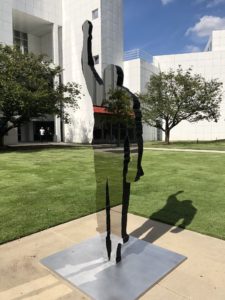
Ironically, the only work I was able to see was a temporary exhibit. But the themes of With Drawn Arms demonstrate the High’s desire to bring the past into the present and “[showcase] artworks relevant to communities from Atlanta and beyond.” A collaboration between Olympic gold medalist Tommie Smith and artist Glenn Kaino, With Drawn Arms brings together art and artifacts representing Smith’s act of protest during the the 1968 Olympic games. While the Star Spangled Banner played during his medal ceremony, Smith and teammate John Carlos bowed their heads and held up black gloved fists to represent Black Power and protest the mistreatment and denial of rights faced by black Americans. Colin Kaepernick’s Nike campaign had debuted just weeks before the exhibition opened and direct connections could be drawn between every element of Smith’s protest and Kaepernick’s.

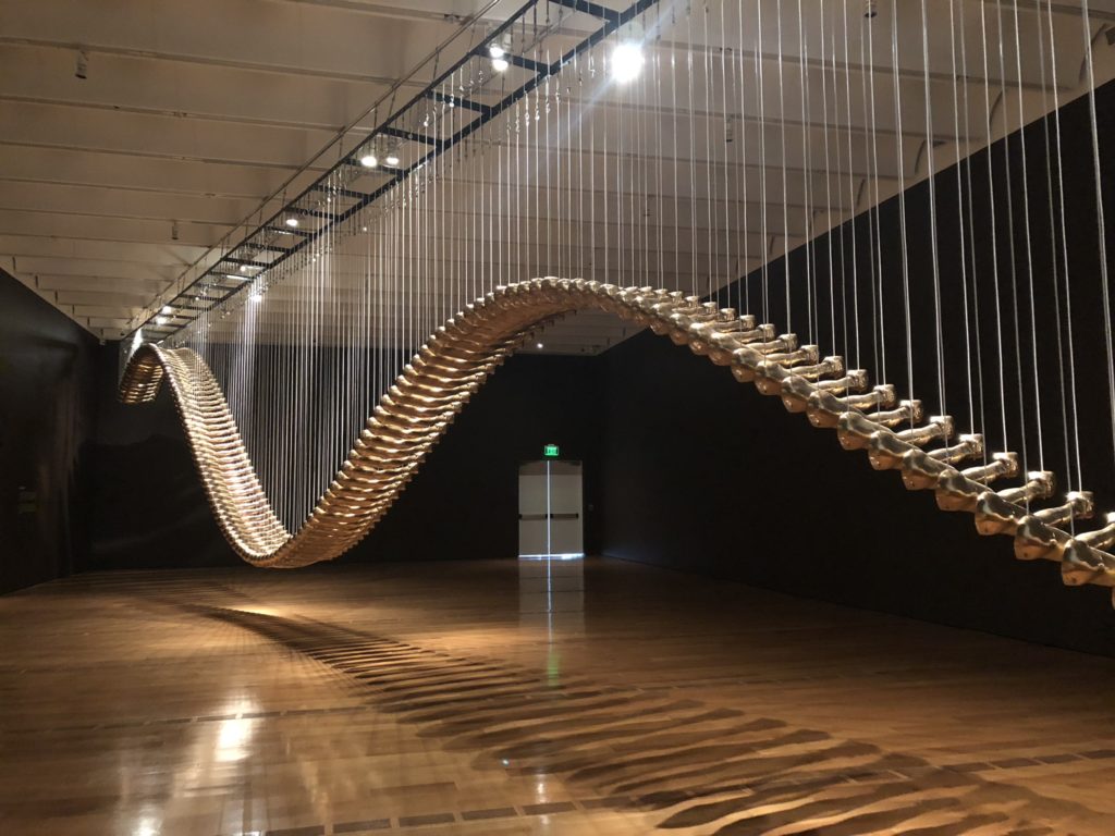
The most striking work was a series of bronze casts Kaino created of Smith’s arm. The casts were hung from the ceiling and filled the room. Titled “Bridge,” Kaino describes the work on his website as “a golden path leading forward from the present but connected to the past, a spectacular reconciliation of a historic record, an individual memory, and a public symbol all renegotiated in an infrastructure of time to creates stories of the now.”

Glenn Kaino's "Bridge"
Glenn Kaino’s “Bridge”

In visiting the High, I wasn’t able to actually observe much, but a museum (or archive) is not only it’s collection. It’s also the context and conversation around the collection. The reinstallation itself is designed to allow the museum to make adjustments and respond to its users. Whether their efforts create a successful bridge remains to be seen. I personally won’t be able to go see it for awhile. But I think the very fact that the museum recognized its need to pause and re-examine its role and the significance of its works is a good sign.

Observation: Brooklyn Museum

For my observation, I spent time watching and exploring the Brooklyn Museum. I have had to do many museum observations this semester as part of the Museums and Digital Culture program. It made the most sense for me to observe a museum, and specifically this one for longer, for the purpose of this assignment, because I have seen the evolution of this institution over many years. I observed the exhibits on Sunday mid-morning October 7th, which was potentially not the best day to go, because the museum itself was relatively empty at that time.

Growing up, I frequently attended the Brooklyn Museum, and the permanent collections remained relatively stagnant throughout the early 2000s. For years, they seemingly did not evolve or make much attempt at relevancy, in my opinion, including topical themes and creating much personal interest. I do not remember seeing many of their temporary exhibits, but their permanent collection did not use the space to its fullest. Following the redesign of the front of the museum, much of the culture has changed, and there were several people near the front of the building, as a hangout location and not so much to view the cultural institution. Recently the interior content of the museum has become increasingly socially conscious and they are clearly working on finding their voice in the greater New York art scene, while changing their curation of their permanent collection so the context of the pieces has been evolving with the space. The museum itself is experimenting with what kind of audience is wants to attract and what kind art it wants to display to be relevant, different and attractive to the wider audience, and brining people in past the outdoor seats.

The pieces I remember seeing growing up are mostly still on display, but they have become almost a scavenger hunt because their locations have moved around, and they are being curated differently with new works surrounding them to change the conversation. As Cloonan writes, “Artifacts may shed light on the past, yet when these cultural remnants are placed into contemporary context something new is created,” (Cloonan 231). They have given new context to their work surrounding new themes, in this current climate to bring out new meaning to the work. As a temporary exhibit, they have “Float” is an interesting molten glass works mixed amongst the permanent collection on the American Art floor, offers a level of intrigue and surround much older work sometimes with words that correlate with the older art.

In terms of difficult heritage, they have chosen to highlight a lot of political art topics to display, and more importantly create a conversation about. Two of their temporary collections that really stand out as making a statement on difficult heritage are the “Soul of a Nation: Art in the Age of Black Power” and “Half of the Picture: A Feminist Look at the Collection.” They are using art to display difficult moments in American history, which are still relevant in today’s political climate, and spark conversation. It should be noted however that these exhibits were not incredibly loud in terms of discussion, possibly because while most people were there alone or in groups of two, there was not enough people in the space to facilitate conversation amongst friends. For the most part people seemed very reflective. One example of this is The Dinner Party by Judy Chicago, which over the past 10 years or so now has created a whole feminist wing surrounding this piece, and an increasing focus on feminist art across the museum, when it used to be just this piece was the focal point of feminism in the Brooklyn Museum. The room housing The Dinner Party, there was only a group of two in there at the same time as myself, and it was very quiet, no one seemed to want to make any noise when viewing the pieces, likely because the walls are dark, and there is so much to see, that the conversation seemed to mostly occur outside of the space. The two temporary exhibits, the feminist wing, the American art floor and the restaurant were the most crowded for the Sunday morning. Granted, no room I went into could be considered crowded (there was plenty of walking and viewing space surrounding the wall text and images), but the other floors had hardly any foot traffic. I also did not stumble upon any walking tour groups, and I did not see many docents and museum staff, especially once in the gallery space after the front lobby where you get tickets and such. However, compared to the other floors and rooms which have very few people, the temporary and more relevant artworks were the most visited.

It is of note as well that I was there the morning after their big first Saturday event (almost always a well-attended monthly event for the museum) and a week too early for their Syrian Refugee exhibit, which obviously is very topical, in comparing Syrian refugees from the past to the present through art, and is definitely a reason to go back to the museum when I have more time, but also possibly a reason there were not as many people on the day that I went because they were timing their visits for events and certain exhibits.

Their archiving system is very open, you can observe much of the process just by being in the exhibits. In the Egyptian Art section for example, while I did not see any archivists or curators actively working at least within the public exhibit (again likely due to the time and day I was observing and exploring) but in one room there was a  relatively large area sectioned off, which was not entirely hidden, where they were clearly redoing a portion of the exhibit, and presumably getting ready to add the pieces some of which were on the tables to the display in the coming days. Their actual archives are also currently mostly closed to the public, but they have visual storage behind glass doors you can see through. There weren’t as many docent staff at work when I went there, it seemed mostly security guard and people in charge of the front of house activity, yet with the very open collection side of the museum, it is apparent that a lot of work is being done, just not as much on the volunteer/educational side of the museum, especially during one of their presumably slower hours.

Bibliography

Cloonan, Michèle Valerie. “W(H)ITHER Preservation?” The Library Quarterly, vol. 71, no. 2, 2001, pp. 231-242.

Macdonald, Sharon. “Is ‘Difficult Heritage’ Still ‘Difficult’?: Why Public Acknowledgement of Past Perpetration May No Longer Be So Unsettling to Collective Identities.” Museum International, pp. 265-268.

https://www.brooklynmuseum.org/