Category: Sula
IBM Design Thinking Workshop Report
On Oct. 4, 2019, I attended a Design Thinking Workshop held by IBM CIO Design and Pratt Institute for Pratt students. The purpose of this workshop was to introduce the concepts of Design Thinking and conducting some applications on user experience(UX) design.
8 Facilitators from IBM CIO team in this event: Chelsea Calhoun (Content Designer), Dana Chang (Manager), Kelly McGowan (Visual Designer), Shannon Andrea (UX/UI Designer), Soo Yun Kim( Visual/UX Designer), Veronica Moyer (Visual Designer), Youn Lee (UX Designer).
Soo Yun Kim was the principal lecturer, and she started with an ice-breaking activity: attenders were asked to design an alarm clock in 3 minutes and displayed and introduced their works. In the second task, attenders were asked to design an alarm clock for waking people in the morning. This time, when people talked about their designs, they were more confident and spoke with more logic reasoning. This event led us to think about how to design and who we design for, which inspired more innovative outcomes.
Discussed the definition of design with attenders, she declared that design was a discipline that required education, work, and practice to reach proficiency, demanded clarity of vision, blended science, and arts, entailed iteration with real users, and thrived with collaboration. After introducing the IBM company, she illustrated their CIO Mission, “We Make Work Better”: leading with design to drive simplicity and ease of use, engineering the systems that run the business, and innovating to transform the business. Design thinking was the key for them to achieve the mission. She elaborated that design thinking was a framework for approaching problems through collaborative activities. It required a focus on user outcomes, diverse and empowered teams, and restless reinvention. As they mentioned, these principles could guide them to see problems and solutions as an ongoing conversation. The interesting part of these principles was that they use an “infinite” symbol to represent a model Loop, a continuous cycle of observing, reflecting, and making. Repeating this process could help the design team to think about any design problem in multi-direction and through periods.
Design and develop process is always dynamic since the information in this world is transient, and people change their needs every second. Still, the design is key to people’s collective liberation, but most design processes today reproduce inequalities on the matrix of domination. Therefore, the idea of design thinking to collect diversity and repeat the Loop cycle with more participants with intersectionality involved could definitely empower the community, not merely on one single product.
The next part of the workshop was to let attenders practice design thinking through a task. We were offered with the problem to solve with design thinking, “Design a better way for students to find the right classes and professors”. Before we found a partner to start interviewing each other about our experience in choosing classes, we were offered several interview tips:
- Don’t suggest answers to your questions,
- Don’s be afraid of silence,
- Be aware of nonverbal cues,
- Stay on the same path of a question,
- Ask “WHY”.
Those tips extracted from abundant field research experiences with ethics and techniques are very important. To get valuable results from research and interview, it’s essential to concern about the formation, conduct, and communication. Developing the proposal and conducting suitable behaviors are the foundations to build trust with and receive proper feedback from the interviewees.
For the interview, we ideated interview questions, paired up with another person, and interviewed each other in 15 mins. With the interviewing results we got, all attenders were separated into six groups. Each group got one IBM facilitator to help with building up the solution, and our group worked out the procedure with Kelly. First, we needed the empathy map to gather the ideas from the interview into four sections: say, think, does, and feels. During this process, the lecturer explained what made a good empathy map:
- It is based on real research,
- It explores multiple user dimensions,
- It is verified with users or even co-created with them,
- It captures both the positive and the negative.
Based on those guidelines, we noted the top pain points on sticky notes and placed them on board. Then group the similar ones, we found some big ideas, the main concern, and pain points. Next, we used the green and pink dot stickers to vote the most valuable and feasible one. To sort out the solution for that big idea, every group needed to discuss a scenario and storyboard it. Finally, each group should make a presentation to show the result. Our group focused on the pain point that new students hardly had access to class feedbacks from the fellow students, the big idea our group valued most, and made a storyboard of how a new student forum could help through Q&A, while other groups with their big ideas offered solutions like visualizing more professor information and providing the class syllabus and requirements more directly.
This workshop was short for students to finish all the steps and run out a solution, but it gave us an overall idea of how to use design thinking in the application. At the end of this 3-hour workshop, there was the question period. Dana Chang, the design manager reasserted the importance of design thinking not only in design but all through the industry. Also, she talked about the shift of the methods and techniques of research, design and develop, and the excellence of using qualitative research and quantitive research cooperating together with the addition of the new schism based on design thinking. Although those design methods are innovated through time, design thinking is always important. Other designers also shared their experiences in this design industry, and many of them had changed their positions once or twice. It seems that this industry is really dynamic and exuberant, and people are always willing to adjust to new challenges.
Through this workshop, I could understand design thinking in the context of fundamental principles of research, which collects the true needs of the target users. The research is a vital process to learn a certain topic you are working on, both in general and in detail. How to get the information now and in the long run is a problem that leads to the request of ethical jobs. Showing respect, asking for consents, and building trust should be assured if researchers want to protect an interview-friendly environment for both interviewees and interviewers.
Reference
- https://www.ibm.com/design/thinking/page/framework/loop.
- Costanza-Chock Sasha, “Design Justice: towards an intersectional feminist framework for design theory and practice”, 2017.
- PERCS, The Program for Ethnographic Research & Community Studies, “The Ethics of Fieldwork”.
Event Review: The Future of Design and How We Can Prepare
I attended a talk called ‘The Future of Design and How We Can Prepare’ at Pratt Institute School of Information. It was conducted by Lee-Sean Huang, a Design Education Manager at AIGA (American Institute of Graphic Arts). AIGA is a professional membership organization of around 2,500 committed designers who promote a better understanding of design in the government, business and media. They host multiple events that inspire designers across all industries and enhance professional development by providing learning opportunities. The events are usually aimed at community engagement related to the future of design. Huang took us through the concept of AIGA and their strategies with the help of a sideshow. He used engaging videos and structural diagrams to give us a clear understanding of what they stand for. He began by introducing himself, the company’s efforts, their predicted trends and lastly concluded with a question and answer session.
He commenced with topics related to research and community engagement with an emphasis on their ethical guidelines. When it comes to publishing research or creating social content, designers aim to work with the users and not for the users. This brings to life a whole new concept of ‘Co-Design’. Thus, treating users as a part of the design team and using their research with consent, initiating a bond of trust. This directly relates to point numbers twenty-one and twenty-eight of PERCS “The Ethics of Fieldwork” that discusses the idea of informed consent agreements. However, Huang didn’t continue to discuss a valid point raised in the reading, which is how a designer must handle the situation when their critical subject of research changes their mind, leaving their endeavor futile.
Huang also discussed and compared the changing employment structure in the realm of design. He identified the current phase as a design boom and validated it with labor statistics. While fields like graphic design witness a significant drop in employment, software design had a 24% increase. Software design is entirely based on programming and algorithms suggesting immense dependability on machines and databases for design in the future. This raises concerns and links to Nobel’s “Challenging the Algorithms of Oppression” where she talks about critical/privately owned information in the threat of being leaked to the general public. Huang goes back to the olden times and talks about how career growth in the design field was hierarchal – people had to study the basics of design i.ie work their way form the bottom to the top. Whereas, today, people from different backgrounds directly enter the field from anywhere in between.
After discussing the future of design employment, Huang moved on to 7 trends that will possibly shape the future practice of design. These trends aim at enlightening designers about the course design is talking/will take shortly. Most of them have a few aspects that relate to our class discussions. The first one is ‘complex problems’ which urges designers to think in terms of systems- understanding problems in their physical, psychological, social, cultural, technological, and economic spheres. Thus, focusing more on the potential impact of design. This partially relates to Kincheloe and Peter McLaren’s critical theory that is grounded in the awareness of contextual and social belief systems, so insights are based on a full and truthful understanding.
The second trend is ‘curation/aggregation of content’, this works around the idea of information overload. How the emphasis shouldn’t be about making the content but on the flow of content. This links to Rozenwig’s information overload theory where the infrastructure and medium to manage all present and future digital information is questioned. The third trend is ‘Bridging Digital and Physical Experiences’ which is about creating seamless and unified experiences. Experiences should be designed keeping in mind what users do before and after using an app. This will bridge gaps between the online and offline environments.
The fourth trend is ‘core values matter’, this focuses more on a company’s ethos and whether it’s products/services represent the same. It urges businesses to create and understand the value of their social equity. This is relevant when we talk about large technology companies and their responsibility towards users regarding their data. Whether or not they should try and increase their social equity by being transparent and seeking informed user agreements. Zuboff’s theory of the public is reduced to mere ‘bystanders’ is a result of companies lacking a moral based ethos. The fifth trend is ‘Resilient Organizations’ which focuses on how to achieve and maintain a company’s position with an emphasis on innovation. Innovation related to strategic decisions, research data, and business models among the rest.
The sixth trend ‘Making Sense In The Data Economy’ explores five technologies that are instrumental in data collection – sensors, IoT, big data, the cloud, and AI. Although, unlike most of our class discussions this doesn’t take about the ethical/ lack of privacy aspect. He focused more on individual and organization interaction – where organizations aim at improving daily customer operations. And lastly, the seventh trend is ‘anticipating design outcomes’ which is based on research. Huang emphasized on how designers need to justify design decisions through research. Reiterating McGrath’s thought of research always serving as “empirical evidence”. And similar to McGrath’s “generalizability” research strategy, Huang talks about the fundamental generalizable nature of research across a variety of applications and contexts. He concluded this trend stating “designers are problem seekers and not problem solvers”. This in many ways cemented the whole generic aspect of research.
Besides this, Huang also spoke about the ‘six-word story’ technique to communicate thoughts aimed to have a greater impact on users. He emphasized on how designers strive to be concise to leave a more dramatic impression. An interesting example he used of six-word stories is “Time machine reaches future. Nobody there”. This indeed made an impact. The examples were extremely inspiring and makes me think of ways I could use this technique to present unique research facts/insights.
The talk ended with AIGA’s future plans. Huang spoke about their upcoming podcast, elaborating why they decided on this medium to voice their vision. Podcasts usually have an effortless conversational and verbal touch along with being cost-effective and accessible. Post this, there was an open question and answer session. Some students raised questions about the leadership in design while others brought up the generalist v.s specialized future of design. Huang believes that a design generalist would probably be more versatile and fit more design roles in the future. Most of us agreed with this, as to work with technology it’s essential to familiarize ourselves with other design aspects that are points of confluence. Huang seemed extremely approachable and helpful. He was friendly and encouraged discussion. The talk was more participatory rather than him doing all the talking. Overall, this experience was an eye-opener for design as a future discipline and that we should prepare to efficiently acclimatize ourselves to this change.
REFERENCES
Elon University. Program for Ethnographic Research & Community Studies. The ethics of fieldwork module. Retrieved from www.elon.edu/e-web/org/percs/EthicsHumans.xhtml
Noble, Safiya. “Challenging the Algorithms of Oppression.” YouTube, uploaded by PdF (2016).
Kincheloe, Joe L., and Peter McLaren. “Rethinking critical theory and qualitative research.” In Key works in critical pedagogy, pp. 285-326. Brill Sense, 2011.
Rosenzweig, Roy. “Scarcity or abundance? Preserving the past in a digital era.” The American Historical Review 108, no. 3 (2003): 735-762.
Zuboff, Shoshana. “Big other: surveillance capitalism and the prospects of an information civilization.” Journal of Information Technology 30, no. 1 (2015): 75-89.
McGrath, Joseph E. “Methodology matters: Doing research in the behavioral and social sciences.” In Readings in Human–Computer Interaction, pp. 152-169. Morgan Kaufmann, 1995.
Event Review: Museums and AI in the 21st Century
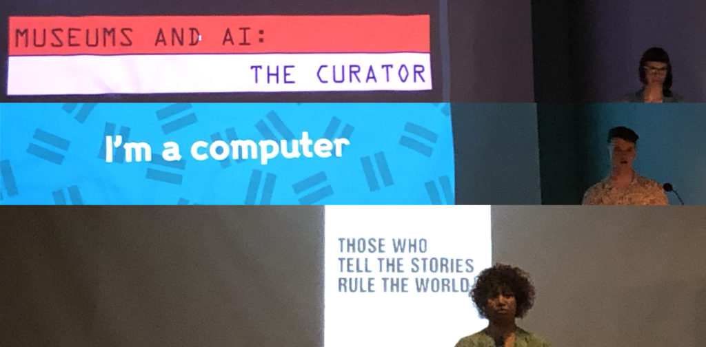
The event taken place at Cooper Hewitt, Smithsonian Design Museum on Sep 16, 2019 mainly discussed the applications of Artificial Intelligence now and future and highlighted the role of museums as making people more self-aware. There were three talks in the event given by three different perspectives (a curator, a computer and a future teller) and a free Q & A session afterwards.
Curator: Andrea Lipps, an associate curator of Contemporary Design, Cooper Hewitt
The talk given by a curator from Cooper Hewitt first discussed the impact of AI on our lives right now. As is known to all that AI could be used in different kinds of fields like education, recreation, medical treatment, marketing automation, etc. AI could analyze large amounts of data in a short period of time and help make quick decisions. The benefits of AI are undoubted and visible. However, the curator also pointed out some questions that could not be ignored:
1.How can we ensure diversity, inclusion, safety and human rights are maintained with AI?
2.What role would AI play in our future?
3.How could museum use AI to represent new things?
There is no right or wrong to these questions and we could interpret the questions from different angles. The curator also provided some frameworks that we could use to think about AI:
1.Is it active or passive? If it is active, do you have a choice? If it is passive, is it being disclosed?
2.Is it being linked to a real-world identity or just used as anonymous ID?
3.Which methods being used when connecting AI with museums?
It’s true that we could only predict the influence and applications of AI in the future but what we should pay attention to right now are our own values and priorities. Because the use of AI is designed by human beings and design is just the externalization of our own desire. “If we use, to achieve our purposes, a mechanical agency with whose operation we cannot efficiently interfere once we have started it… we had better be quite sure that the purpose put into the machine is the purpose which we really desire.” Said Norbert Weiner in 1960.
Computer: Harrison Pim, a Data Scientist from Wellcome Trust
The data scientist who represented a computer talked about his work content, that he used machine learning in dealing with loads of images, texts and collections quickly but not analyzing users or visitors, since AI in current period was parasitic on data. He also pointed out that AI was not designed to replace human beings but as tools to be used by people. So, the main point is how to use the tools to better serve people’s needs. The talk given by “the computer” reminded me of what I read in What is Computer Ethics: we are in a conceptional vacuum and policy vacuum world and we need to reexamine the regulations in the past world, from how to define tech-based concepts to create a relatively neutral algorithm. It is impossible to create something absolutely neutral but by creating diversity, the “fundamental vulnerability” could somewhat be relieved.
Creator: Karen Palmer, a storyteller from the future
The future teller first warned everyone that the technology would take over everything and individuals would find themselves lack privacy or security in the near future if we did nothing. We would be derived of the right of telling our own stories and the world was going to be consist of auto-self surveillance, weaponized technology and biased networks.
She used the example of criminal justice system to confirm us that bias would be the biggest problem in AI applications. An example used to support was the UK police using AI to inform custodial decisions which could be discriminating against the poor. Most assumptions made by AI right now were based on false theory while these assumptions are trend to take over our lives. Thus, she concluded that democratizing AI should be what we fight for in the near future.
What she highlighted was the necessary to turn the information age to an age of perception. “Those who tell the stories rule the world.” What museums should do is to make people more self-aware and create more opportunities to arouse citizens’ insights to social issues.
Q & A session
Q: How to apply machine learning in the field of design?
A: To begin with, the interactions between users and products would be changed by new technologies but the role of designers should not be overshadowed by AI. We could use AI to produce products or test prototypes faster. In a word machine learning should serve us but we should not be slaved by it.
Q: What would justice be like in the future and what is the role of machine learning in it?
A: Neither machine learning or artificial intelligence could answer future justice problems. Those concepts should be determined by human beings but not computer technologies. What would happen in the future is the living space AI help to create and people could better understand culture issues in the museums.
Conclusion
Though we have to admit human’s dominant role in the applications of AI, there are other problems about surveillance, power and constraints that could not be ignored. “In an era of extractivism, the real value of that data is controlled and exploited by the very few at the top of the pyramid.” Said Crawford & Joler. The event did not predict how the regulations could be established but just pointed out museums’ future role in arousing people’s awareness, which I think lack enough support and overly optimistic to some extent. Anyway emphasizing museums’ social responsibility is quite necessary right now and all museum practitioners should be prepared for the transformation of exhibition modes.
Reference
Norbert Weiner (1960), Some Moral and Technical Consequences of Automation;https://www.lesswrong.com/posts/2rWfmahhqASnFcYLr/norbert-wiener-s-paper-some-moral-and-technical-consequences
James H. Moor (1985), What is Computer Ethics? 1-2
Tarleton Gillespie (2014), The Relevance of Algorithms, 191; https://www.microsoft.com/en-us/research/wp-content/uploads/2014/01/Gillespie_2014_The-Relevance-of-Algorithms.pdf
Crawford & Joler (2018), Anatomy of AI system; http://www.anatomyof.ai
Event Review: Braiding Strands of Wellbeing: Reclaiming, Healing, and Sending Knowledge into the Future
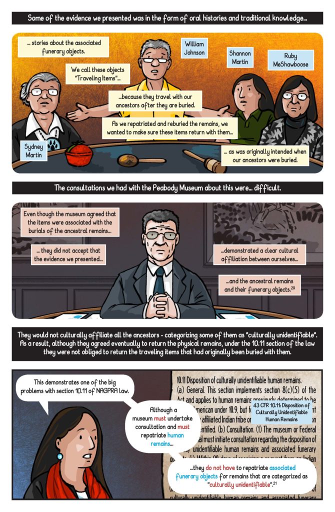
In her talk, Braiding Strands of Wellbeing: Reclaiming, Healing, and Sending Knowledge into the Future, Dr. Sonya Atalay discussed anthropologists and archaeologists can and incorporate the local and indigenous populations’ cultural practices of sharing and preserving knowledge into their studies of these cultures. An anthropologist and Ojibwe (the Native American tribe also known as the Chippewa) keeper of knowledge, Dr. Atalay has conducted anthropology and archaeology research within indigenous populations in North America as well as the Middle East. Her work, including her books Community-Based Archaeology: Research With, By, and for Indigenous and Local Communities and Transforming Archaeology: Activist Practices and Prospects, has been focused on the development and implementation of participatory research, seeking to decolonize the language and practices used by non-indigenous researchers as well as justice for communities through the collection of indigenous artifacts. Dr. Atalay is currently working on her book, Braiding Knowledge, an ethnographic review of these projects and other engaged scholarship of indigenous communities to how collaborative knowledge production are transforming research practices and outcomes. Many of her concepts are similar to practices found in the Ethics of Fieldwork by the Program for Ethnographic Research & Community Studies, expanded and adapted to the fields of Anthropology and Archaeology.
The main example used in her talk was the ezhibiigaadek asin, which translates to “the place where knowledge is written on stone”, a Saginaw Chippewa heritage site archaeologists refer to as the Sanilac Petroglyphs.The carvings on the rock face represent history of the tribe as well as instruction on how to send its knowledge into the future. A sacred site, with important physical and cultural links to the surrounding area, cultural practices involve water art ceremonies where tribal elders bring river water to wet the carvings and share the histories and practices represented. The researchers working on the site, to protect the site for their own purposes, had covered the rock face with a pavilion and installed a fence to prevent erosion and vandalism of the carvings. Gated and only available to the public upon request of a scheduled visit the indigenous community could not access the site or conduct the water art ceremonies.
A place of knowledge for both tribe members and anthropologists, the difference in approach to accessibility and use of the physical site indicates the divide in perspective each group holds about the information the site contains and how to it should be studied. Not only did researchers not take into account the indigenous people’s desires for how the site is utilized but also the outcome and application of the research. A source of contention was the misinterpretation of one petroglyph archaeologists dubbed the hunter. The carving actually depicts shkabewis, a spiritual teacher sending information and knowledge into the future. Not only had the researchers misinterpreted its meaning, fitting the colonial narrative of Native Americans as hunters rather than purveyors of knowledge and information, the University of Michigan had copyrighted the image of the carving and used it in branding. they as well as the the physical site, the information and knowledge it contains

When the researchers began consulting the Ojibwe leaders, it resulted in a shift in practices, results and use of their work. By addressing some of the concerns PERC in the such as establishing a rapport with the participating group, learning indigenous knowledge needs and desires of application of the research and the representing the participants in a recognizable and respectful way. The Saginaw Chippewa gained more consistent access to the ezhibiigaadek asin as well as influence over the conduction and results of the fieldwork. The archaeologists gained a more accurate representation of the petroglyphs and people that created them.
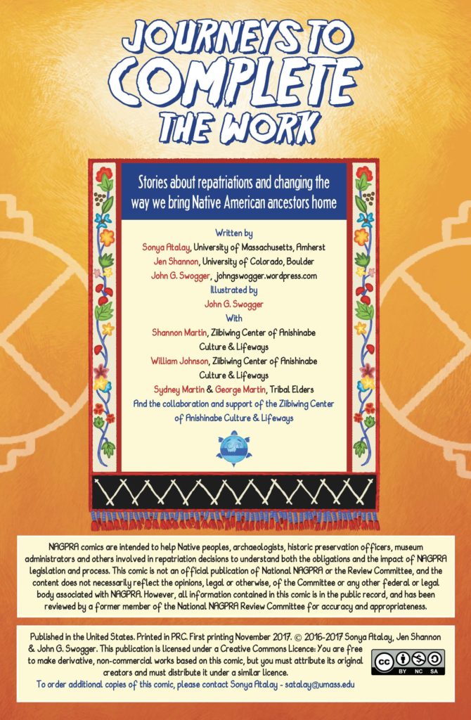
Dr. Atalay presented the ethnographic comic “Journeys to Complete the Work: Stories about Repatriations and Changing the Way We Bring Native American Ancestors Home (NAGPRA Comics: A Graphic Narrative)” she co-authored with John G. Swogger, and Jen Shannon, in collaboration with Shannon Martin and William Johnson of the Ziibiwing Center of Anishinabe Culture & Lifeways, and Tribal elders Sydney Martin & George Martin. The comic details the effort of anthropologists and tribal leaders to have the remains of Native American peoples, held by several museums, returned to their ancestors for proper burial on the basis of the Native American Graves Protection and Reparations Act. This comic, along with others Dr. Atalay has produced on similar topics, is a novel way for Ethnographers to share their research practices and results with the populations they study and the general public.
Dr. Atalay’s talk was an enlightening look at how ethical fieldwork in ethnographic studies, including the concerns outlined in the PERC document, can be practically applied to a variety of fields of study.
References:
PERCS: The Program for Ethnographic Research & Community Studies, The Ethics of Fieldwork
Atalay, S., Shannon, J., Swogger, J., (2017) Journeys to Complete the Work: Stories about Repatriations and Changing the Way We Bring Native American Ancestors Home (NAGPRA Comics: A Graphic Narrative)
Protected: Field Report: A Stroller Tour of the Brooklyn Museum
Event: Why No One is Looking at Your data
“Department heads painstakingly compile reports and analyses filled with data which are sent to executives every week. The pages are barely skimmed, if read at all. Network and security operation centers line the walls with giant screens, displaying dashboards powered by expensive big data analytics. No one ever takes more than a passing glance on the way to lunch. If data is so essential, why is it so easily ignored? Many data initiatives fail to make a real impact.”
On April 10, 2019 I attended “Why No One is Looking at Your Data”, an event hosted by Meetup featuring Clare Gollnick, the Director of Data Science at NS1. Clare Gollnick started her career as a Neuroscientist and holds a PhD from Georgia Tech and a BS from UC Berkeley. As an expert on statistical inference and machine learning, she writes and speaks often on the intersection of data, philosophy, and entrepreneurship. She was previously Chief Technology Officer of Terbium Labs, where she led a diverse team of engineers and researchers. The team released novel data intelligence solutions which prevents credit card fraud while still protecting consumer privacy. Clare has published a number of academic papers on information processing within neural networks, validation of new statistical methods and the philosophy of science.
The presentation was focused on the difference between data and information, designing data dashboards and data products and “Why No One is Looking at your Data”.
Clare starts off her presentation with the scene from Douglas Adams’ novel series, The Hitchhiker’s Guide to the Galaxy to demonstrate how difficult it is to understand data without any context. In short, a race of hyper-intelligent, pan-dimensional beings had built an enormous supercomputer named Deep Thought, which calculated over a period of 7.5 million years to answer the meaning of: life, the universe, and everything. After 7.5 million years of calculation, the pan-dimensional people gathered eagerly to watch Deep Thought finally announce the answer they have been waiting for.
The answer was “42”. But what does “42” mean? Data can mean absolutely nothing if you do not provide it with context.
Practical suggestions were provided from the presentation such as choosing initiatives for investments, and providing valuable data to deliver useful and interpretable information. To understand the personal mental logic process while looking at data, Clare provided a demonstration and suggestions on how to make inferences.
The first and most obvious suggestion was to add units to the data. Using “42” as a random piece of data, adding kilogram (kg) to 42 would make 42 into 42kg. A kilogram is a SI unit of mass, an international standard, which scientists have based their definition of the fundamental unit of mass on a a shining platinum iridium cylinder stored in a locked vault in France. However, most people have not seen this cylinder, and they would be considered non- experts. Yet they are able to develop a concept of what a kilogram means by having shared experiences with other items labeled kilogram throughout their life. For example, people at the gym might have a concept of a kilogram based on the weights they would use for a specific workout done in the past. This method can be applied with any form of information, and can be built upon as well. “Cat” was then added to 42kg, further explaining the mental logic in understanding the context of 42 kg while visualizing a 42 kg cat. Claire further explains that a person with knowledge about cats (an expert) might visualize a larger cat, such as a leopard.
Segmenting the market or the audience into experts and non-experts may be the result of a single piece of data. An expert would be someone who has a solid understanding of the given information, whereas an non-expert would have considerably less knowledge.
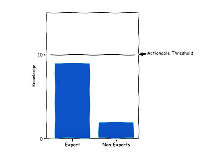
Data results from the mental model might be different given the knowledge gap between the expert and non-expert. Experts use data more effectively, and therefore reach a “threshold” in which something is actionable. Given a single piece of data, the expert crosses that threshold and catapults into another stratosphere of other questions and other types of issues they might want to know about the data. Meanwhile, non-experts are unable to obtain the minimum knowledge required to alter their action. An expert with more familiarity of the subject might ask for the raw data because they know what to do with it, whereas the non-expert would be clueless. Clare emphasized that this dynamic creates challenges for those trying to design a product. The goal of a product should deliver repeatable and scalable value with consistent outcomes across the entire target market. When you end up in this middle ground, you are stuck with a wall of data which is not viewed or seen. Experts find data at the source while others attempt to interpret information on the dashboard.
Data Does Not Speak For Itself
The presentation take away was the difficulty in making sense of data when it does not speak for itself. This belief is addressed in Boyd and Crawford’s article, Critical Questions for Big Data: Provocations for a Cultural, Technological, and Scholarly Phenomenon”. Where Big Data provides ‘destabilizing amounts of knowledge and information that lack the regulating force of philosophy’ (Berry 2011). To understand data, there needs to be context. As mentioned in the the article Critical Data Studies: An Introduction by Andrew Iliadis and Federica Russo, data is apprehended through various levels of informational abstraction (Floridi, 2011). Big data is framed within levels of informational abstraction, where the product of positionalities constrain and afford a gateway into multiple data roles including abstraction which may be adopted, manipulated, or repurposed for any number of aims. This is a crucial part of giving sense to data. Choosing a level of abstraction from which to view Big Data alters the types of conversations that can be had about data, its aims, and functions (Iliadis, Russo 2016).
Conclusion
When you fail to recognize that data is difficult to understand, you can wind up with mismatched expectations between what is promised and delivered within a data project. Overall, the main suggestion was the need for inferences, or making a comparison to existing knowledge. Data can only inform once you already know something. You need knowledge to gain knowledge.
References:
Berry, D. (2011) ‘The computational turn: thinking about the digital humanities’, Culture Machine, vol. 12, [Online] Available at: http://www.culturemachine.net/index.php/cm/article/view/440/470 (11 July 2011).
Danah Boyd & Kate Crawford (2012): Critical Questions For Big Data, Information, Communication & Society, 15:5, 662-679 http://dx.doi.org/10.1080/1369118X.2012.678878
Floridi, L (2011) The Philosophy of Information, Oxford: Oxford University Press. https://doi.org/10.1111/1467-9973.00221
Gollnick, C. (2019, April 10). Why No One is Looking at Your Data. Lecture presented at Meetup: UX+Data, New York.
Iliadis, A., & Russo, F. (2016). Critical data studies: An introduction. Big Data & Society. https://doi.org/10.1177/2053951716674238
Observation: The Bronx Museum of the Art’s Useless Machines Exhibition
Recently, I went to the Bronx Museum’s “Useless: Machines for Dreaming, Thinking, and Seeing” exhibition. The exhibition was created to highlight the opposite purpose of machines. Rather than creating machines to produce labor or fulfill a practical duty, the exhibition featured artists all over the world who constructed or depicted useless machines “to praise inutility.” The exhibition was a direct “reaction to the materialistic values promoted by capitalist society.” The artists created a collection of machines to stir dreams, feelings, critical thinking, and ironies. I thought this exhibition was interesting because of its purpose to create something useless and meaningless out of machinery. In class, we talked a lot about machine learning, artificial intelligence and how we currently live in a machine culture. And according to Sengers, machines are embedded into every aspect of our lives:
“We are no longer…simply supplied by machines; we live in and through them. From our workplaces to our errands about town to our leisure time at home, human experience is to an unprecedented extent the experience of being interfaced with the machine, of imbibing its logic, of being surrounded by it and seeking it out…” (Sengers, 2000, p.5).
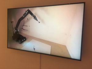
I thought that the exhibits at the museum highlighted what Sengers explained as the “shortcomings in technology.” The collection was a mixture of video, digital photographs, interactive sculptures and robotic machines behaving in curious ways. One exhibit by an artist named Fernando Sanchez Castillo displayed a video (pictured above) of a military robot that was originally designed to disarm explosives creating a painting in a slow, sarcastic manner. It was interesting how the artist inverted the function of the military robot by turning it into an artistic device. Technology is what we create it to be and as we rely on technology and machines to carry out dangerous or important tasks for us, the magnitude of its presence is felt even more when machines fail to (or are reprogrammed) complete the tasks we program it to do or they become useless. Transforming a machine so crucial as a bomb deactivating robot into a mere painting device changed the value of it as it was stripped of its former programmed task. This showed how machines can be used and recreated for other things than what it is originally meant for.
Unlike the artists, computer scientists are trained to identify these shortcomings and make solutions to those problems (Sengers, 2000, p.5). However, they are also blinded-sided by their myopic focus on improving machinery and not on the cultural context the machine is being made in (Sengers 2000). Thus, there can be unintended consequences of designing or creating a machine without discussing the need for it, the context it is being made in, and how it can be used in other ways if placed in a different environment.
I went to this particular exhibition with the intention to observe how visitors interact with the pieces within the space/ environment of the museum. But when I got to the museum, I found that visitors were not allowed to touch any of the art displays even though some of it incorporated interactive features for people to try out. I wanted to see if people were more inclined to go to the interactive exhibits which included displays of machines, video and robotic devices rather than the “non-hardware”/non-machinic ones such as photographs or drawings. Unsurprisingly, I found that people were more drawn towards the machine and robot displays. This brought to mind Norman’s Being Analog chapter, in which he explained why humans are inherently analog beings while technology and machines are created to be digital (2008).
According to Norman, “the world is not neat and tidy.” The world is naturally analog but with the advancement of technology and machines, people are forced to fit the world into digital models. Computers are logical and strict. Humans are unreliable and dramatic beings who are susceptible to making errors even if they are forced to behave in a machine-like way. Norman has described a world where technology destroys the mercurial essence of humans, but does not take into an account a world where both technology and humans are seamlessly integrated. Technology is no longer a separate entity of our world. AI and robots are becoming more human-like while humans are using advanced technology to enhance physical bodies and improve their health. In addition, AR devices are being created to integrate the real and the digital.
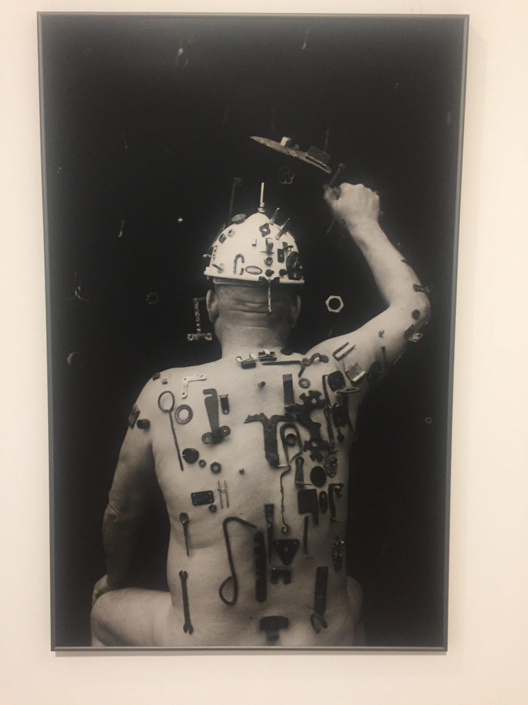
We are constantly interacting with machines and technology that someday maybe we will become as one–a concept that artist Algis Griškevičius depicted in his photographs at the museum. The photograph showed a nude man with numerous tools stuck and screwed into his body as if he was a living magnet or a hybrid. Within the scope of the exhibition’s theme of depicting useless machines, I found this photograph very telling of the future we may live in. The tools on the man’s body seemed useless, placed in a illogical or unhelpful way. It’s there because it can be; they are tools without purpose. Soon, perhaps we will live in a future world where technology is not only all around us, but just another extension of our bodies.
The exhibition’s concept of “praising inutility” reminded me of how technology cannot be studied separate from its cultural context in which it is made in. Even though the exhibition wanted to depict the uselessness of technology and machines, I realized by doing just that they created meaning out of the displays by making it art. Thus, the machines and collection of pieces were useful in an artistic setting of a museum but they, of course, will not be useful in a non-artistic setting.
References:
Sengers, Phoebe. “Practices for a machine culture: A case study of integrating cultural theory and artificial intelligence”. Surfaces, vol. 1, 2000, p. 2-58. www.pum.umontreal.ca/revues/surfaces
Norman, Don. “Being Analog”. The Invisible Computer, 2008. https://jnd.org/being_analog/
The Optimistic Road Ahead
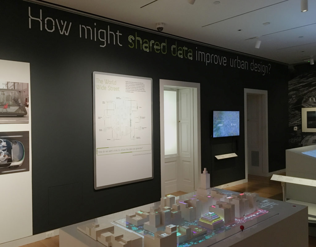
From December 14, 2018 to March 31, 2019, The Road Ahead: Reimagining Mobility at the Cooper Hewitt, Smithsonian Design Museum presented forty design projects, ranging from interactive platforms to urban design. Noting that “We are at an Inflection point”, the introductory text on the wall proposed that “the works presented here are meant to be catalysts for conversations about how we might live in the future” The attempt to start these conversations was framed by six questions that ran across the top of the exhibits including, most intriguingly for me, “How might shared data improve urban design?”
Having briefly visited the exhibit previously, I went in with a couple of questions at the ready myself (some of which I will combine to frame the comments below). The general goals were to observe both the exhibit itself and specific projects as environment and methods for gathering and presenting data.
In an attempt to observe a larger and broader population, I went on a pay-what-you-wish evening (and the second-to-last day of the exhibit), arriving early to review all exhibits and then stepping back to observe more of how they were experienced.
How did the exhibition itself collect and display data? How did an exhibit about mobility move visitors?
The visitor’s introduction to the data collection aspect of the exhibit actually started on the ground floor, with a display that asked “How was your commute to the museum?” The question was to be answered — and those answers collectively visualized — through the use of foam balls (Green = “Good”; Red = “Not too good”). This was the only interactive exhibit-specific wall graphic, but it did engage and prepare the visitor for the interactive world of touch screens and post-its in the projects two floors above.
However, this clever prelude was then undercut in the exhibit itself by framed infographics that seemed out of context or less effective than the projects exhibited. Some were predictive (Three Futures of Urban Transportation); some diagrammatic (Contested Curbs). Some were explanatory (How We Move); some illustrative (Letting go of the wheel). Collectively, they could have helped navigate a visitor through the exhibit, but instead they felt like projects of their own, ones that did not always rise to the level of the work with which they shared the space. Instead of directing traffic, they added to it, a congestion made all the more troublesome by the exhibit’s confusing start.
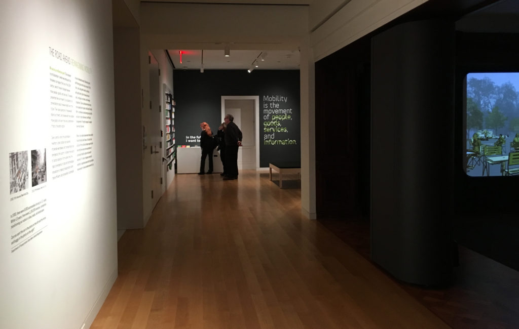
Upon arrival, and after reading the introductory text, viewers were presumably expected to move toward the opening section of the exhibit, which invites one to listen to experts and offer one’s own thoughts before diving into the projects on display. Instead, I watched visitor after visitor turn right to investigate a sound installation designed specifically for Cooper Hewitt called Sounds of the Future City (2018), which enticed them with bells, whistles and video projections, before depositing many of them out the other side — into the middle of the exhibit. This was a particularly unfortunate detour for an exhibit that states, just twenty feet from this misdirection: “Mobility is the movement of people, goods, services, and information.”
How did individual projects utilize data to tell a story? In an exhibit that aims to start conversations — that explores ‘convergence of data and technological innovations’ — to what degree do these presentations speak to and engage the visitor?
Here we come to the heart of the observation. These questions naturally overlapped in various projects and so will be addressed collectively here. Within such a dense and at times overwhelming show, the comments below will focus only on some of the projects that were most data-focused, sorting those into three areas I noted, with overlaps existing across them.
Data as Tool
As an awareness of the role of data becomes more prevalent in society, its visualization becomes an object of wonder, with the intermediary steps of the process presenting their own sense of “Look what they can do!”
The short video City Data Analytics: Modes of Travel and Commuter Walking Times (Zaha Hadid Architects, Habidatum, 2017) from the Walkable London Exhibit showed a clear visualization of data relevant to pedestrian and other metropolitan traffic. It proved a point, established patterns, but did not offer a specific ‘solution.’
The same might be said of City Scanner (MIT Senseable City Lab, 2018), a congregation of six sensors that sits atop the cab of a municipal garbage truck, gathering six kinds of data that are then visualized to show patterns and occurrences. The “think of what we could do with this” mentality was evident in the last line of its description: “City Scanner could be used to help inform decisions about public health, security, and overall better services for citizens.” Could be.
What differentiated the Los Angeles Mobility Data Specification (LADOT/ITA, 2018), however, was that this video actually spoke to how this ‘neat tool’ of data, in the form of a common vocabulary and standard, shared in real time as a software platform, could be used to efficiently manage issues of changing street capacity and public safety. This was a tool in use.
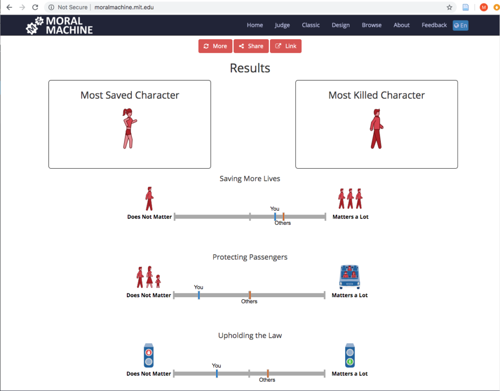
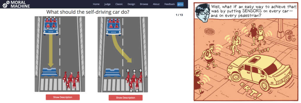
Data as Assurance
If the exhibit had a project that seemed the most fascinating to the audience the evening I visited, it was The Moral Machine (2016), an online tool created by the Scalable Cooperation Group at the MIT Media Lab to gather data related to human decisions as to which lives should be saved by a driverless car in various scenarios; a decision that was often made by one of a pair of visitors that commentated on each others’ judgments and processes:
“This is so funny… They die….”
“That was you. That was everyone else.”
“I don’t want to kill a cat…”
“This one you shouldn’t have to think about. Just kill the dog!”
And the almost unsettling: “I love judging…”
‘Assurance’ may not seem quite the right word for an interface that presents one with moral decisions, but at the heart of the project is the assurance that we are speaking with, and gathering data from, people ‘just like you’ as we make decisions about these autonomous vehicles.
Some issues arise at the end, when the machine evaluates your decisions and states whether or not a characteristic such as gender “matters a lot” in your decisions, when it cannot truly know, based on the limited data set. (It is worth noting that the original online version does offer more disclaimers, as well as a follow-up questionnaire asking one to explain their reasoning.)
The complement to all this judging was the Sensor Visualization video (Waymo, Google Creative Labs, Framestore, 2018), a very effective presentation that explains and visualizes how Waymo’s self-driving cars ‘see’ objects, pedestrians, lights and other factors to make one’s riding experience stress- and accident-free. Safe, clean projections of paths and labels for speed and distance from the car assure the viewer that Waymo has the data and as such has everything under control. It offers an assurance that there is measurement going on behind the scenes.
Data as Play
While the Moral Machine can feel like a particularly challenging game of Would You Rather?, Cityscope (City Science Group, MIT Media Lab, 2018) was Lite-Brite with building blocks, inviting viewers to redistribute structures on a street grid to visualize two possibilities of traffic density (shared vs owned driverless cars) on city streets. It was fun to move the structures around and note the changes, but it must be noted that despite its promise, and obvious ability to draw interest, Cityscope appeared to fail in communicating its intended message. This was one of those cases where the label for the project was behind the viewer. So everyone wants to play with it, but few understand it. This was exacerbated by the unfortunate choice of red (owned) and green (shared), which already tilts one toward preferring the latter, with the red definitely feeling like an indicator of intensity. All of this could be summed up in an exchange I witnessed at the table:
“Do you think red means…?”
“It’s congestion. Or something….”
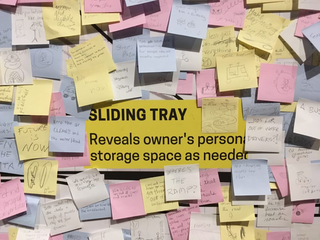
In contrast, The Future of Automobility (2014, 2017) from IDEO brought Design Thinking into the exhibit as a means of presumed research. This project invited visitors to contribute their ideas via Post-Its to a ‘vehicle inspiration wall.’ A kind of ‘free work,’ it excited the spirit of play and brainstorming in many visitors, who drew pictures and layered Post-It upon Post-It (ignoring the walls precisely drawn grid) with ideas fanciful and serious (e.g. ziplines; BAN ALL CARS).
So while acting as a tool and providing assurance, our interaction with data (whether in collection or review) can also be fun, which is a great way to engage visitors who might not otherwise consider these issues.
A Contrast
Of course, whether functioning as a tool, an assurance or a game, all of these projects were Good.
That is to say: collectively, The Road Ahead was largely about the solutions — or rather the possible solutions. It presented the problems of the world as mountains to be climbed through data and design and asked “How might we…?” In the terminology of Dan Geer shared in Terms of Service, the show’s “Tomorrow Questions” (Keller & Neufeld 8) are what-ifs of potential; “What will I gain?” Not “What will I lose?”
But, what if one combined the Moral Machine and Waymo, identifying certain members of society — those who ‘matter less’ — as it makes decisions?
The introductory text to the exhibit states “no one really knows where these mobility transformations will take us…” This is true. Before making a thing, Jentry Sayers asks us to envision “two dramatically different scenarios: one where the results are ostensibly positive, and one where the results are ostensibly negative.” (Sayers) This exhibit is only the first half of that equation. And if Cathy O’Neil, in defining ‘Weapons of Math Destruction’ speaks to the “authority of the inscrutable” which attempts to obfuscate and force acceptance (O’Neil), an environment such as The Road Ahead works through design and interactivity to make it more visible, providing, perhaps, an authority of the genuine.
It’s difficult not to look at an exhibit such as this and see in all these streets and cars the drawings from Terms of Service of car trackers and insurance premiums, pedestrian sensors and the internet of things — the connecting of dots from or by even the most (seemingly) innocuous, or even beneficial of sources to troubling ends. (Keller & Neufeld 13, 15, 23)
Yet in a world where suspicions of those connections are easier and easier to raise, The Road Ahead suggested a smoother ride than much of what we have been reading recently; an optimism and a welcome contrast to the data harms and big data that we know are the underbelly or other side of much of this technology. It offered assurances, tools, and a little bit of the play that makes any future seem a little more creative, and a little more promising.
– Michael Kelly, Info 601, Professor Chris Alen Sula
References:
– Keller, Michael & Josh Neufeld. (2015). “Terms of service: understanding our role in the world of big data.” Al Jazeera America. http://projects.aljazeera.com/2014/terms-of-service/#1.
– O’Neil, Cathy (2015). “Weapons of math destruction,” Personal Democracy Forum 2015. https://www.youtube.com/watch?v=gdCJYsKlX_Y.
– Sayers, Jentry (2018). “Before You Make a Thing: Some Tips for Approaching Technology and Society.” https://jentery.github.io/ts200v2/notes.html
Field Report – Exploring the Morris Museum
For my observation, I decided to go to the Morris Museum in Morristown, New Jersey to observe their current exhibit titled “Pen to Paper: Investigating Famous, Historical Letters.” When I saw this current exhibit online, I figured this would be the perfect exhibit to talk about the preservation of these letters and what this exhibit tried to tell the world about the famous people who wrote them. With that goal in mind, I went to the Morris Museum to view the exhibit. However once I arrived I realized that the museum also had a “traveling exhibit” about music boxes from the Guinness collection, which I found far more interesting.
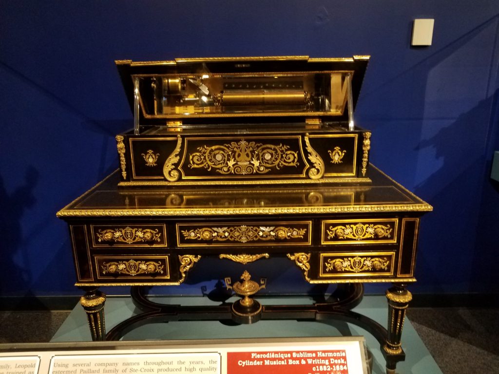
One of my favorite pieces from this collection was the Plerodiénique Sublime Harmonie Cylinder Music Box and Writing Desk (pictured below).
Another one of my favorite pieces was the Hall Clock with Compound Music Movement.
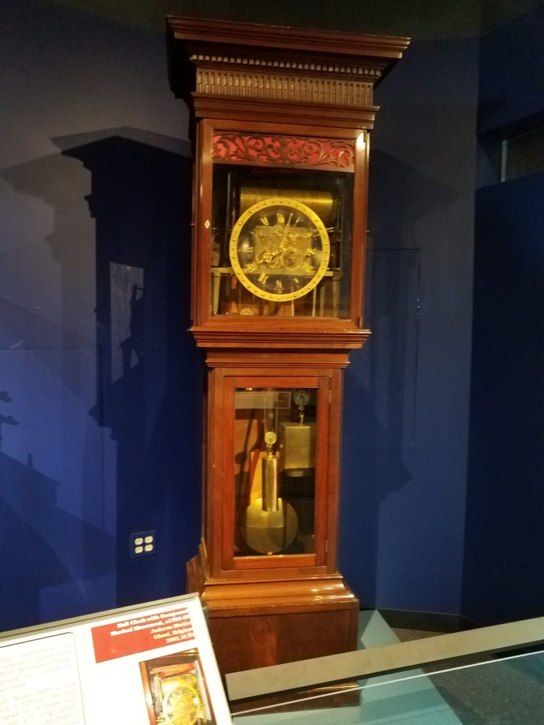
What interested me about this part of the exhibit is that they showed a lot of artifacts that had dual purposes, such as the music box that is also a desk and the clock that is also a music box. It was interesting to see that these items were created to have more than one function.
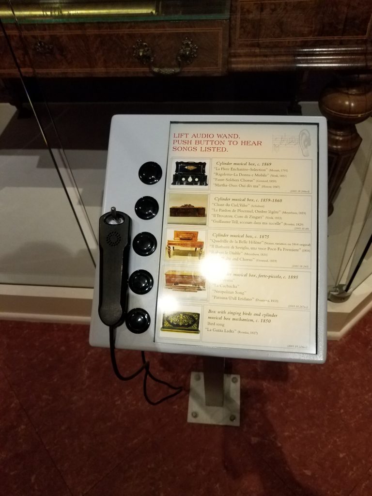
Another aspect that I enjoyed about this exhibit was that it encouraged the viewer to interact with the collection. There were display stands that had a hearing device and buttons that the viewer could press to hear what music from the presented time would sound like.
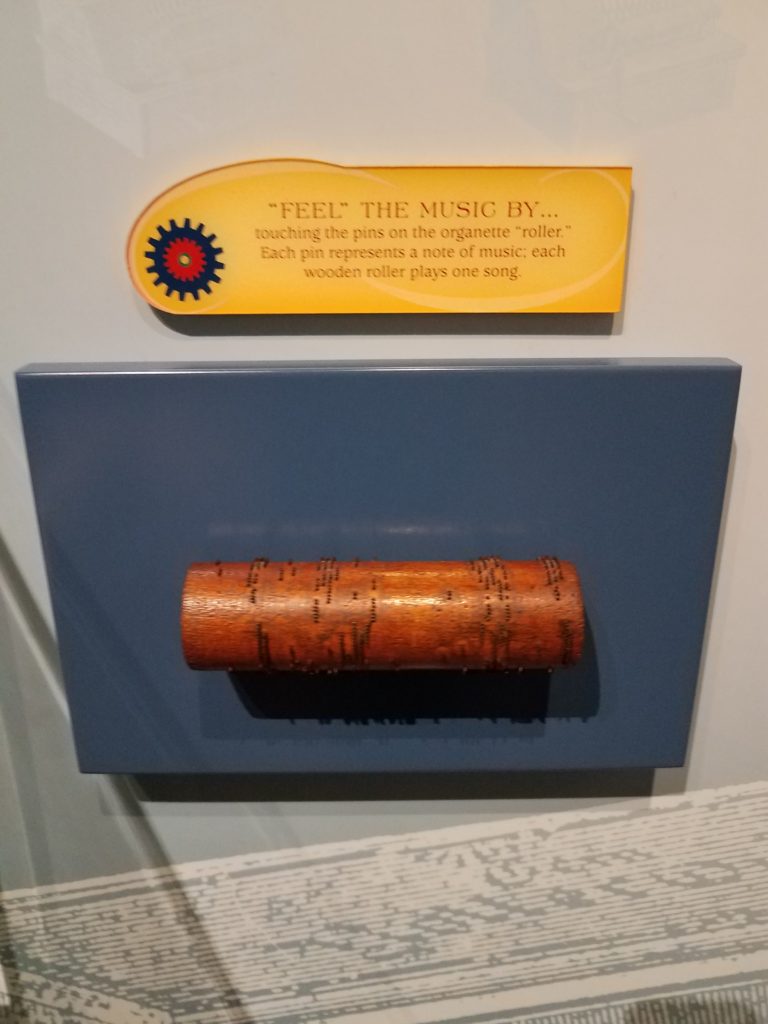
There was a wooden roller set out with pins. This was how songs used to be played during the time that these music boxes were created. It is was explained that each pin represented a note and each roller represented a song.
There was even a game that could be played at the end of the exhibit. For this game, you would put your hand on a speaker and try to feel the different vibrations that the different sounds made.
One of the reasons why I enjoyed this part of the museum so much was that it showed a time where technology was much different than it is now. These music boxes are major technological advancements when they were first created in the 1700’s-1800’s, even though in current society music boxes may not be considered a technology to a general viewer.
While touring the museum, I was surprised how small all the other exhibits were compared to the Guinness collection. I think this showed the emphasis that the museum wanted to place on this collection. I believe this is also the reason why I was much more fascinated with the Guinness collection over the other exhibits. But even though the other collections were smaller, it seemed that the museum still made a conscious effort to show the comparison of older technology to newer technology.
In the picture below, you see that the museum showed how writing has changed throughout time in their Paper to Pen collection. When I was reading Jentery Sayers article on technology throughout time, I couldn’t help but think about the collections that I saw at the Morris Museum. Originally I thought about the music boxes and how they could be considered “technology instrumentalism”m which means that they were a neutral technology. But then I realized that the Pen to Paper collection could be an example of “technology determinism” which is technology used for social progress. As Sayer mentioned most of these pieces from these two collections would be considered “symbols of progress, modernity, efficiency, and mastery over nature” (Sayers).
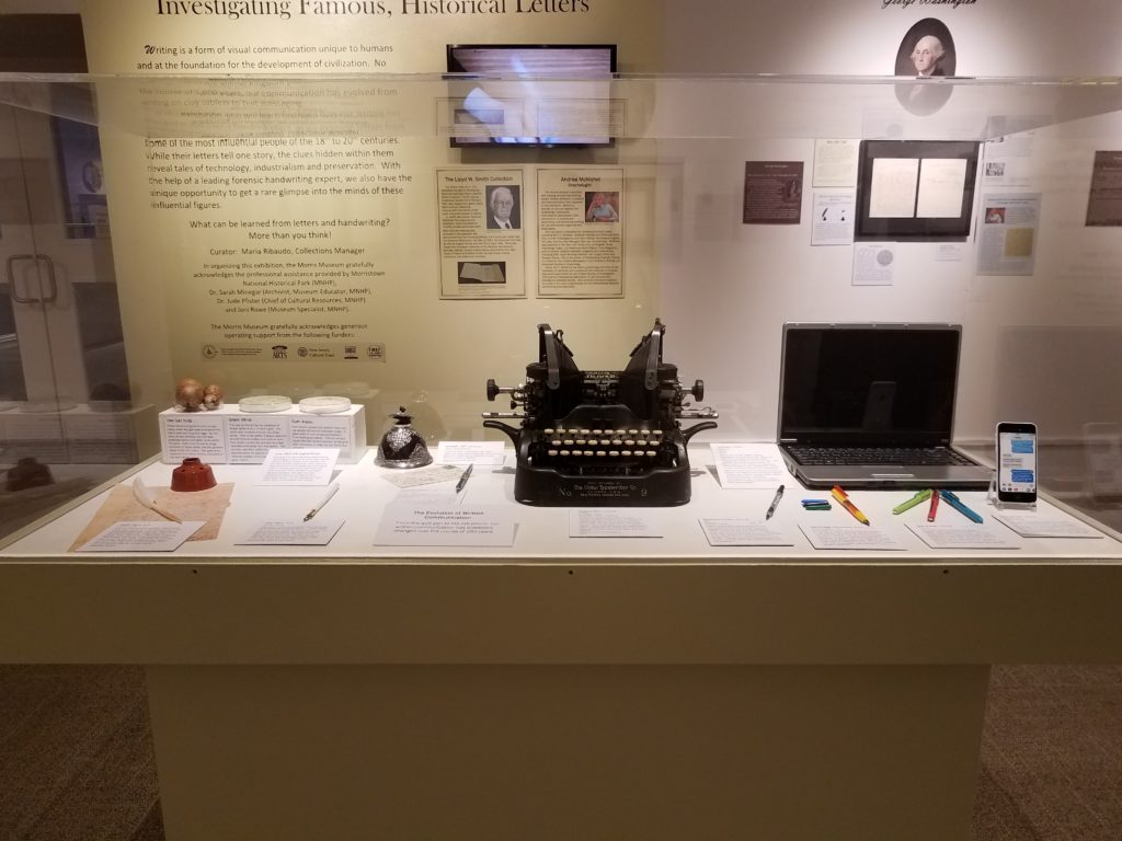
In this picture it shows elements that could have been used to make different colors of ink that would be used to write or draw, it shows a few ink wells, different types of quills and calligraphy pens, a typewriter, laptop, and cellphone. As the picture implies, these all became means of communicating. Just in this one picture, we can see the progress and change of technology throughout time.
What I found most interesting about this exhibit was its incorporation of current technology into the collection itself. It almost felt like the current technology used for this collection overshadowed the idea of the collection which was looking at old letters from famous people in history. I say this because in the room, just below one of the displays, there were two pairs of headphones and IPads that were showing a short film. Then on the wall, there was a television that told about the making of quill pens and how society portrays old quill pens wrong in movies since most of the time the hair of the feather is cut off to make it easier to hold. It just seemed like the focus was mostly on the current technology since the letters left a lot of white space on the wall, while the television area took up a lot more space and the museum had changed the color of the wall to draw attention to it (which you can see in the picture with the display of past/current technologies that is above). Also, the short film and the television were both a form of white noise in the room, which grabbed my attention and probably the attention of a general viewer, which took my attention away from the famous letters.
In the end, it was nice to see the different exhibits that the Morris Museum had on display. It was interesting to see their way of incorporating technology into their exhibits as a way to attract the audience to engage with their collections. Because of my experience with museums and my interest in continuing to work in a museum, it was interesting and educational to see how other museums use technology.
References:
Sayers, Jentry. (2016). “Technology” in Keywords for American Cultural Studies,” ed. Bruce Burgett & Glenn Hendler. NYU Press. http://keywords.nyupress.org/american-cultural-studies/essay/technology.
Morris Museum. Morris Museum. morrismuseum.org/.